
Not every button has to look the same, especially in hi-fi prototypes where the nuance between “save” and “submit” is fuzzy at best. That’s when you should customize buttons to fit your meaning.
Buttons’ styles also need to reflect their surroundings to stay on-brand. If your user interface has a slight gloss or texture, then your buttons should too. How they’re allowed to change is part of a design system.
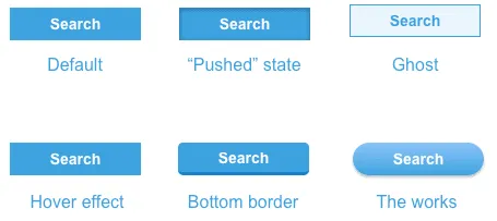
Designing a system
The trick is to figure out what should remain the same, and what’s allowed to change. Text is obvious — the same style button can say either “submit” and “create.” But what about color? If one button is green and another red, what makes still them feel like part of the same design?
Only you can decide how the design system should work. But you might consider using some of these to establish a general button-y look.
- Border radius: Make buttons look like more than content boxes with a slight curve — or a major curve that turns them into round-edged pills.
- Colors & gradients: Boxy or not, you can make buttons stand out from other elements by giving them a contrasting hue and value.
- Shadows: “Make it pop” might make designers cringe, but having an element seem to rise off the screen isn’t a bad idea when you want it to get attention.
- Text size: Boost buttons’ characters to make them more prominent than their surroundings.
Check out the live demo to see examples.
If some of the above make buttons look like buttons, then what’s left to design?
- Color: Once you’ve established a default button color in your design system, also decide what other hues and values buttons can assume based on context or function.
- Size: Big buttons mean business. Small buttons, not so much. Allow yourself some variation in buttons’ maximum and minimum dimensions to make some look more important than others.
- Font weight: An often-overlooked button attribute is how thick its characters are. Like size, you can use bold or light typefaces to indicate importance or get more attention.
If you’re making buttons in UXPin, you’ll find all of these properties in the right-hand panel of the UXPin editor. But UXPin or not, establishing conventions of “should” and “shouldn’t” will help buttons in your design systems look like siblings — or at least close cousins. Guidelines were made to be flexed. For teams building custom applications with database-driven interfaces, Adalo‘s no-code app builder makes it easy to design and publish apps with consistent button styling across iOS, Android, and web without requiring developers.

