Master the Basics of UI Mobile Design
As a UI designer, you likely already know, understand, and are passionate about the core principles, tools, and purpose of fantastic user interfaces. You may even be a propionate of the Mobile First design approach. More and more, though, the app is the end solution, with no need for a responsive design.
- As far back as 2015, Oracle published a study showing that most millennials take their app experience into account when selecting a company’s goods and services and that their recommendations are similarly influenced. They reported that 65-75% of Millennials prefer to use apps for purchases, paying bills, and reporting issues.
- More recently, COVID and other factors are changing app usage as well. According to Forbes, people are spending their money more and more on in-app purchases (within games) and subscriptions (non-game apps), staying within the ecosystem of their mobile device.
While a company’s user experience should be consistent across their products and user touchpoints, there are special considerations for web and mobile app design as compared to web design. The overall process is the same, and a design system should cover all products for branding, patterns, and other components. Apps require more simplicity, less functionality, and a deeper understanding of the platform they are used on.
Simplicity
A simple user interface is always a good idea. But for mobile apps, it’s the most crucial goal. An app should not replace a website, but enhance it and provide the absolute essential functionality for a user in their day to day activities. Additional functionality can be made available, but prioritization and clear signals to the user will help them prioritize as they interact with your app.
Minimize Cognitive Load
Attention spans are short under perfect conditions. It’s even more of an issue when you can’t predict what environment your user will be in, and what other tasks they are attempting to do simultaneously. No one should be using their phone when driving, but many people do. They could be standing in line at a busy store, on a noisy bus, or trying to wrangle kids.

Business apps are often used in challenging conditions such as low light, high noise, irregular temperatures, or any number of other distractions. Don’t make your users think too much or focus too hard. Hide content and functionality that isn’t core to the current task, but make it easy to find when they want or need it.
This doesn’t mean to hide options the user is likely to want or need though. Keeping options clear and obvious helps keep them on track and engaged with your app.
Provide Minimal Functionality
Every component and element of your app needs to be an essential function for users to complete their tasks. Not every task or feature you provide on a web platform is needed for the app. Carefully consider the minimal viable product that will give your users exactly what they need for the purpose of the task or app as a whole. The more features you provide, the more complex the navigation and overall usability of the app becomes.

For example, if your app is for a delivery driver, prioritize or stick to the primary flow of receiving, picking up, and delivering the order. They don’t need to access other data like on-time stats or wage information. Those items can be left in another tool or made available but de-prioritized in the user interface.
Chunk Content and Tasks
When complex patterns or detailed text can’t be avoided, break them up into small digestible chunks. An overwhelmed user will abandon the task and your app.
- Clear, simple language is essential for comprehension and to minimize clutter in the interface.
- Forms and long flows should be broken into steps and only presented to the user when they complete the previous step.
- Anticipate their needs by allowing them to get more information when needed, but keep it hidden and out of the way until then.
User Input
First-time users are turned off by long sign-up and set-up processes. An obstacle on their first experience with your app could drive them away entirely before they’ve really even gotten started. Whenever possible, collect and reuse data from other sources. You have the ability to leverage all the information housed on the phone and within other native apps if you know how to use it. This keeps the amount of information the user has to enter to a minimum. Designs can and should take advantage of the platform hosting them by tying into existing functionality on the phone or device.
- If they’ve already entered personal info somewhere else, pre-populate fields.
- Infer information when possible such as location from GPS data already on the phone, pre-select nearby locations.
- Features like logging in with Google or Facebook allow users to skip tedious onboarding tasks and eliminate yet another set of credentials to remember.
- Leverage the device’s security protocols by allowing face recognition or fingerprint recognition authentication options.
For information that they must enter, tailor the input to help them out.
- Order picklists based on frequency of use.
- Offer the right keyboard layout for the task, such a calendar instead of a number pad. Include field hints and other tips throughout the form and whole interface whenever possible.
- If a piece of information isn’t absolutely essential for the current task, leave it out of the form or flow and allow the user to provide the information at a later time.
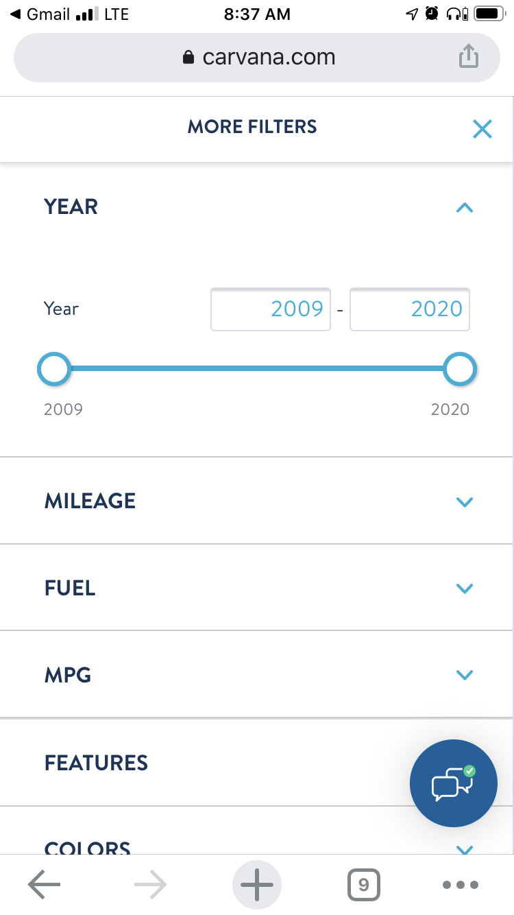
First time users aren’t the only ones that can become frustrated with your task flows. The two screens below are taken from two different car shopping experiences which users will likely use over and over throughout their car buying journey. One app forces users to go out of the primary flow to make a single model year selection.

The user then has to bounce back and forth between filters to see all of the available options. The screen on the right however, allows more flexible access to a variety of filters, staying more within the flow of the task. It also allows a range of model years so the user doesn’t have to go back and forth to view the results of each year individually.
Robust Design System
If you don’t already have one, set up a design system that supports not just your mobile or web apps, but your whole suite of products and online presence. This will save you time, increase efficiency in your internal processes, reinforce brand identity, and help you stay consistent in providing a seamless user experience. Tools like UXPin allow you to set up components, your visual language, annotate and explain design decisions, and much more for consistency and efficiency in your apps and other products.
Familiar Components
Start with simple patterns people expect. Remember, simple is always better to keep users engaged and on task without distractions. Even more so than on the web, don’t try to get too creative with icons, navigation, or fancy interactions. You can introduce creativity and personality through rich graphics or innovative features, but the basics need to stay basic to support your goals of simplicity and keeping cognitive load to a minimum.
Users expect certain components like a sign up screen, loading screens, and expandable hamburger menus. If you stick to these common conventions, they won’t need to learn anything new about using your app and can focus on their task or your service offerings.
Visual Hierarchy and Queues
Mobile offers a variety of interactions and visual elements that are harder to incorporate in a website or other software products. This could be the biggest difference in designing for mobile apps. Most interfaces do use color, typography, and placement to help guide users to the most important information or tasks, but in mobile it is both easier and more complex to do.
Device platforms allow for more animation to indicate success, next steps, and other queues within the interface. These must be used carefully though to subtly guide the user, and not overwhelm them with too much visual stimulation.
Placement is unique to the mobile device due to the size and touch interface. In computer based software or web use, reach is not an issue.
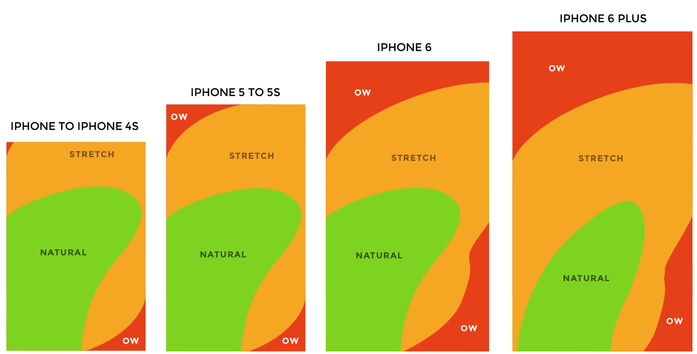
Most people use their thumb to interact with the screen while holding the device in that same hand. Larger screens make it more difficult to reach more of the screen real estate. Placing the most important elements in the right location helps users perform critical tasks more quickly and easily.
Accessibility should not be overlooked either. W3C’s guidelines on color for example explain how using color to indicate importance is not always the best due to disabilities like color blindness. Color can be great, but problems like glare and variations of screen quality can skew color, just like someone being color blind. SmartPhones offer many different accessibility settings and other settings that can impact your design. Keep in mind how your app will work, look, and gracefully degrade when these device features are enabled.
Learn More
If you are interested in learning more about mobile design or considering specializing in this area, there are a host of options for developing your skills. Treehouse is an online learning platform that helps beginners learn to code through a browser-based environment with live learning support, and many students build job-ready portfolios while learning the fundamentals of app development alongside design principles.
- Popular platforms like Coursera, Skillshare, and UX Design Institute offer a variety of UX and UI design courses, including some focused on mobile UI design. Skillshare offers a well reviewed course called “Mobile App Design from scratch with Sketch 1, 2, 3.”
- Alternatively you can check out literature, tutorials, and courses available from organizations like the Interaction Design Foundation or Nielsen Norman Group,
Conclusion
Apps are constantly evolving as the devices and platforms change, and the user needs evolve with your product or business. Be sure to tackle any app design project with the mindset of continuous improvement. It should be simple, scalable, and involve frequent user testing and analytics to identify improvements over time. Providing your users with a beautiful app that helps them complete tasks quickly while on the go will earn brand loyalty and keep your app front and center in their minds.

