HD devices are more available now than ever before.
The prevalence of HD displays today is no coincidence, and design is pairing with new and imaginative visual techniques to bring these details to life. But applying HD to web design can be as intricate as the fine details in its displays. In this article we’ll explain the basics you need to know to get started, from the technical details, to some of its most useful applications, and even including some free online resources.
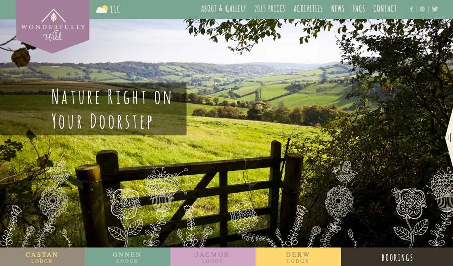
Photo credit: http://www.wonderfullywild.co.uk/
Defining High Definition Design
Before we explore the technique of HD backgrounds, we need to first examine the technical nuances of the medium.
The number of users with high definition displays – from televisions to computers to phones – is growing daily. Brands such as Apple with its standard Retina display for multiple devices are quickly gaining popularity. While it’s hard to track the actual numbers, we know anecdotally that HD is steadily becoming a core design consideration since even alternative 4K displays are falling under $600.
When you consider how much web design evolved from the CRT to LCD era during the early 2000s, it’s quite clear that affordability will only lead to more demanding visual design innovations.
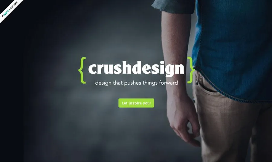
Photo credit: http://www.crushdesign.be/
When we talk about high definition, pixels are a natural focal point.
Let’s review quickly with one of the best pixel reference guides from Designmodo:
- Device pixel is the smallest physical unit displayed.
- Pixel density is the number of pixels displayed in a given space.
- Resolution is the number of pixels across the entire width or height of a device.
- Pixels per inch (DPI or PPI) is the number of pixels you get when you divide the physical width of the display by the number of horizontal pixels displayed.
- High DPI is a display density of 200 pixels per inch or greater. On the other hand, standard DPIs are usually set at 72 pixels per inch.
In a nutshell, HD devices contain twice as many pixels as a standard definition screen. In fact, the next-gen Apple 5K retina display is even more powerful since it maxes out at 5120×2880 pixels. Of course, more pixels mean more detail and crisper, sharper images – that also means these screens are less forgiving of designs with any visual imperfections.
Background Graphics: Raster vs. Vector
Now that we’ve covered the pixel nuances of HD design, let’s discuss how that affects the file formats if you’re using static HD background images.
Almost from the first days of website design, designers saved images to 72 pixels per inch – this includes everything from photos to graphic elements. The compact size improved load times while still providing plenty of resolution to render nicely. Raster formats such as jpg, gif and png were commonly accepted.
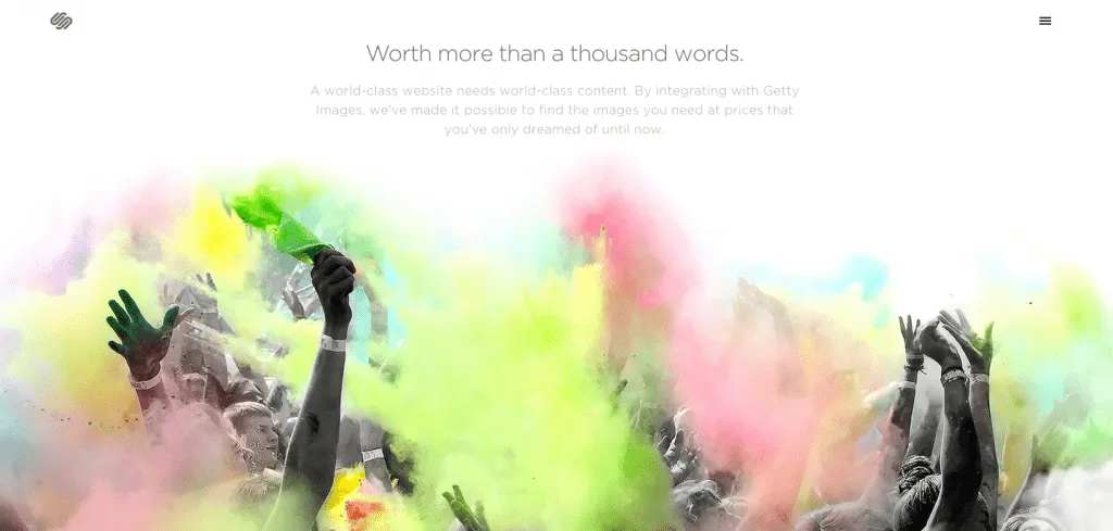
Photo credit: Squarespace
However, HD web design requires rethinking and using vector formats (while print designers have been doing it for ages, this is a comparatively new concept for the web). That’s where the Scalable Vector Format, or SVG, comes in. As with other vector graphic formats, SVG graphics use connected points and lines, rather than pixels, to create images that can be scaled to any size without a loss of quality.
Jay Yadev explains SVG: “The benefit of this image format is that when you increase the size of the image, it’ll always stay sharp, and will never get pixelated…It allows you to use the same image in different sizes without losing quality of the image. SVG images are also very small in size.”
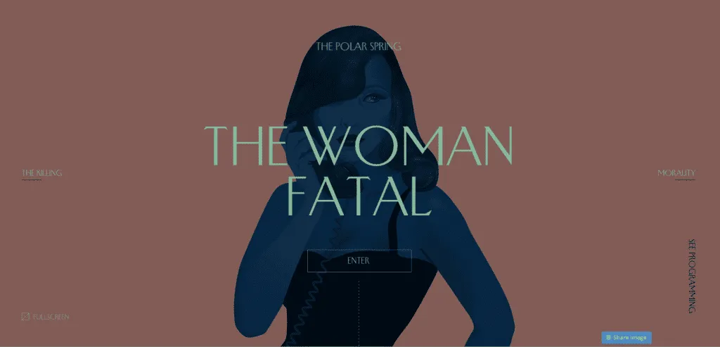
Photo credit: Femme Fatale via awwwards
But the format isn’t without its limitations. Converting a photograph to SVG, for example, won’t work because the original image was composed using pixels and will never render properly at a larger size than the actual image.
HD brings web designers almost full circle with print designers in the way they think about and plan for images. It boils down to raster versus vector.
Here’s some general guidelines for knowing when to use each type of file:
- Use raster (composed from pixels) for photographs or for formats that were created using pixels.
- Use vector (composed from points and lines) for original artwork such as logos, drawings, or user interface tools or buttons.
Aside from choosing the right format, make sure to also try out some CSS tricks to make sure the image is positioned and displayed properly in the browser. If you’re not a CSS expert, feel free to check out some alternative methods.
Enter the HD Video Background
As screen displays increase in resolution (possibly to a point where we won’t even be able to tell much difference), HD will continue to evolve as a widely-accepted design pattern – especially as designers who started with HD image backgrounds now transition to HD video backgrounds.
HD video is still new enough that much of what we have seen so far isn’t even that sophisticated – mostly just a short loop with different visual treatments. Layered on top of the video, you’ll usually find high-contrast text (usually white or black) and/or a ghost button.
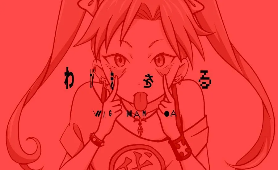
Photo credit: http://wagamama.yoani.co.jp/#
HD backgrounds also provide natural opportunities for the use of a wide spectrum of color, which includes everything from rainbow-style textures to bright color paired with HD images or video. As you can see above, Wagamama uses a full-screen video with bright color as a loading page that prepares the user for the equally bright colors throughout the rest of the site.
Another usage is “still” HD video, which contrasts the fast-paced action video that is most popular on websites right now. Combines still action with video (whether stitching together photo collages as an animated slideshow or just thinking about video production in a more subdued way) is a clever way to stay modern while maintaining a more calm atmosphere. When done well, the result is a visual experience with better pacing.
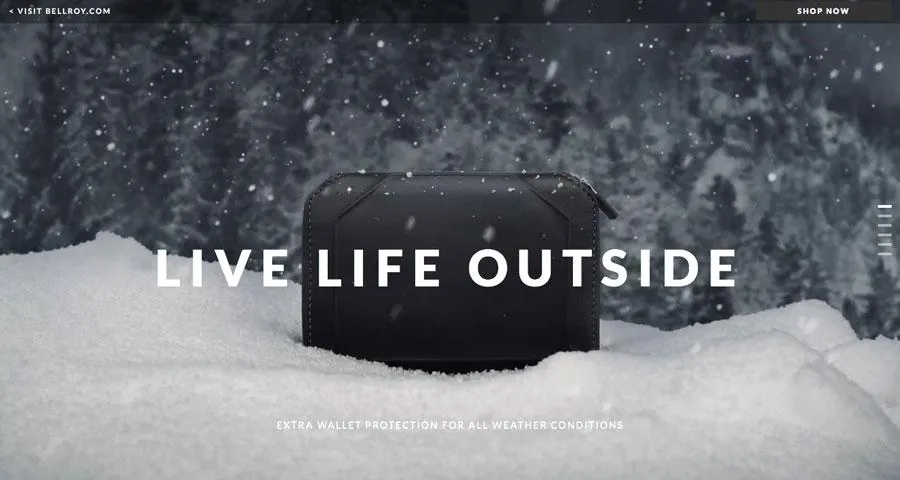
Photo credit: http://bellroy.com/live-life-outside
Bellroy (above), a wallet cover manufacturer, uses a full-screen HD video background with very little actual movement. The serene video shows the featured product standing unmoved amidst the natural motion of the falling snow, a slow-paced effect that emphasizes durability despite the elements. The three-dimensional look (created through smart use of foreground and background) grabs your attention without looking too much like the standard background video loop. For brands looking to create personalized video experiences at scale, Sendspark offers an innovative approach by enabling marketers and designers to generate thousands of individually customized videos with AI voice cloning and dynamic backgrounds.
Another variation on the typical video background is to blur it. The blurred background is a teaser that lures in the user, making them want to interact with the site as a means of revealing what’s truly going on.
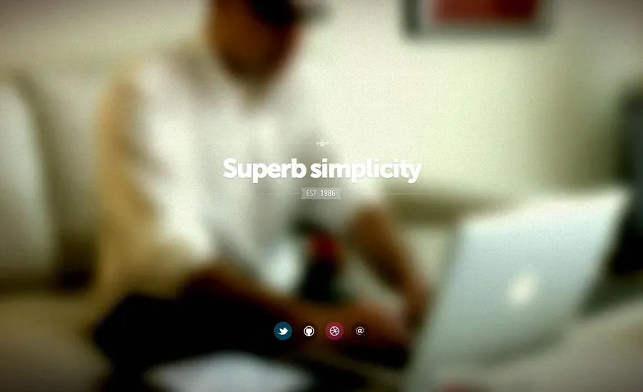
Photo credit: http://fernando.is/all-about/
The blurred technique is still effective with HD video because the motion is still discernible even though the details aren’t. While the above example from Fernando Maclen’s site stays true to its headline of “Superb simplicity” by blurring the video and only allowing users to click through to his external portfolio links, it’s not the only way to implement this technique.
For more complex sites, you could use a call-to-action to reveal the full-clarity video as the splash page transitions to a traditional sectioned landing page (with the video as the top section).
The Future of HD Backgrounds
Given the human fascination with visuals, HD isn’t going anywhere in the near future. In fact, designers are just now getting comfortable with the fundamentals, so it will be interesting to see how this tactic expands over the next few years.
As more designers experiment with HD video, we’ll continue to see layered effects used in familiar as well as creative ways. Blurring and color overlays will take center stage since they help entice the user through the power of discoverability.
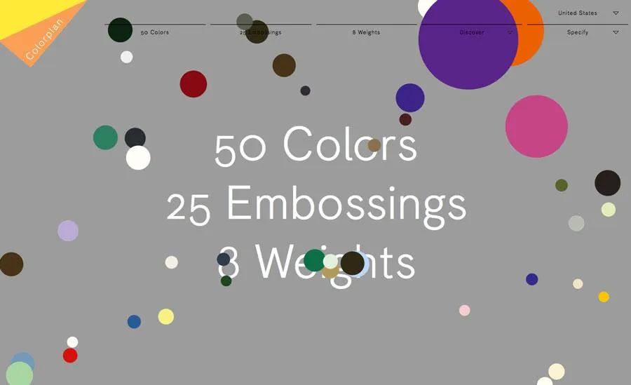
Photo credit: http://www.colorplanpapers.com/
More designers will experiment with merging foregrounds with backgrounds as they play with 3D effects. While this is an easy concept to see, it is a bit harder to explain.
Look at the site for Color Plan Papers above: The floating circles in the background add a fun animated effect, but upon mouse-hover, the bubbles expand dramatically and come to the user’s attention in crisp focus. The effect, while simple, brings the background to the foreground, blurring the lines between the dimensional worlds.
HD opens a lot of doors for designers, leaving their biggest limitations to their imaginations. By enabling finer details, HD gives designers more freedom to experiment and play with techniques we might have not quite imagined yet.
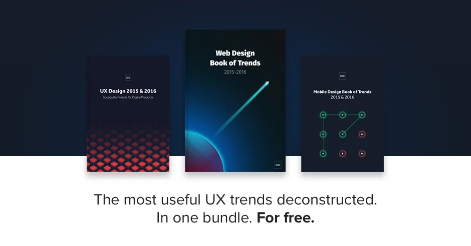
To learn more current web design techniques, check out the free Definitive 2016 UX Design Trends Bundle. The bundle explains techniques across 350+ pages and 300+ examples spanning web, UX, and mobile design.