What Is MUI and What Do You Need to Know About It?
One of the questions organizations ask themselves at the start of a new project is, “do we adopt a component library or start from scratch?” There are pros and cons to weigh, and it depends on the project’s scope and priorities.
One of the most popular component libraries is MUI – a comprehensive React UI library modelled at first on Google’s Material Design UI.
We’re going to take a look at MUI, why you’d want to use it, what makes it different from other component libraries, and how you can get started designing your next project.
Have you ever wondered what it would be like to design in code? UXPin Merge is a revolutionary technology that allows teams to create fully functioning layouts without design skills. Find out more about Merge.

What is MUI?
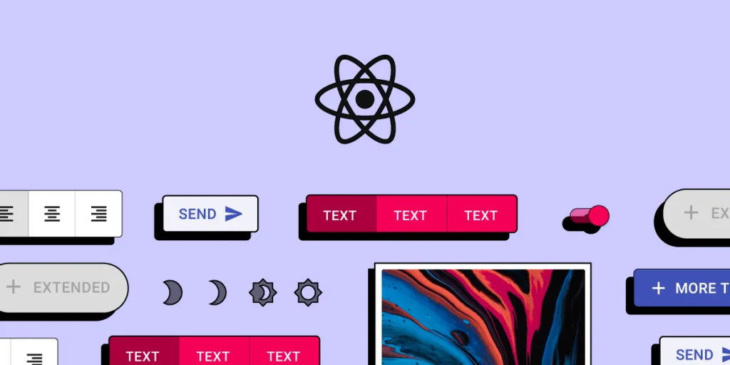
MUI is a massive library of UI components designers and developers can use to build React applications. The open-source project follows Google’s guidelines for creating components, giving you a customizable library of foundational and advanced UI elements.
MUI also sells a collection of React templates and tools, giving you ready-made user interfaces to tweak for your project.
Why Would You Use a Component Library Like MUI?
Designers often use UI kits to build new products or feature add-ons for existing projects. These libraries allow designers to drag and drop the components they need to design interfaces quickly.
Let’s explore 7 reasons why you would want to use the MUI component library.
1. Faster Time-to-Market
In today’s highly competitive tech landscape, time-to-market is a metric that organizations always seek to optimize. A component library gives designers and developers a massive headstart with thoroughly tested UI elements ready to go.
Designers can drag and drop elements to build user interfaces and customize components to meet product and branding requirements. Design teams can spend more time designing great customer experiences rather than getting bogged down building and testing UI components from scratch–a process that increases time-to-market significantly!
Usability testing is much faster because designers can prototype, test, and iterate quickly. If a user interface isn’t working during testing, they can make changes on the fly, drawing from a massive library, to get instant feedback from participants and stakeholders.
When it comes to the design handoff, engineers can install the component library and copy/paste changes from prototypes and style guides to develop the product without starting from scratch.
2. A Single Source of Truth
One of the biggest design system governance challenges is maintaining a single source of truth. It’s not uncommon for product teams, UX designers, and developers to have out-of-sync design systems–resulting in errors, rework, and massive headaches and challenges for DesignOps.
Using MUI’s component library can significantly reduce these challenges while creating a single source of truth between design and development. Designers and engineers will still have separate design systems (image-based for designers and code for engineers), but MUI gives them the same starting blocks.
When using Merge with UXPin’s code-based editor, designers and engineers use the same design system components synced via a single repository. Any updates to the repo sync back to UXPin, notifying designers of the changes. You can connect Merge using Git for React component libraries or Storybook for other popular technologies.
3. Design Consistency
Consistency is vital for user experience, building trust, and brand loyalty. Using the same UI components allows designers to increase consistency while minimizing errors and rework.
4. Scalability
Scalability is another vital product design factor. If you’re building a design system from scratch, designers must design, prototype, and test new components before scaling the product.
With MUI’s comprehensive UI library, designers can search for the components they need to prototype and scale right away. Engineers can copy/paste the identical React components from MUI and customize them to the designer’s specifications.
MUI X includes a library of advanced React components teams can use to scale complex products even faster, including data grids, date pickers, charts, pagination, filtering, and more.
5. Easy Maintenance
A component library like MUI comes with detailed documentation for installing, using, updating, and customizing components. Designers and engineers can use this framework to maintain the organization’s design system, making it easier to establish governance systems and protocols.
MUI also provides how-to guides for migrating from one version to the next. So, organizations can take advantage of the latest UI styles, technologies, and trends whenever MUI releases an update.
6. Accessibility
Those experienced with setting up a design system will know the time and money it takes to ensure every component passes accessibility standards. MUI’s designers have taken great care in designing components to meet WCAD 2.0 accessibility guidelines – reducing the work for researchers and designers.
It’s important to note that even when you design interfaces using accessible components, you must still test navigation and user flows to ensure the product as a whole meets accessibility standards.
7. Skills Empowerment
MUI’s open-source component UI library empowers startups and young entrepreneurs to build new products–especially in developing nations where they don’t have the same access to education, mentoring, and skills transfer.
The library is also incredibly beneficial for charities, non-profits, NGOs, and similar organizations who want to develop products and tools but don’t have the budget to invest in a design system.
Anyone can leverage the skills of MUI’s talented designers and developers using the same component library used by Fortune 500 companies to develop sophisticated digital products and compete in a global market.
What Makes MUI Stand Apart From Other Component Libraries?
Google’s Material Design UI is arguably one of the best and most comprehensive design libraries in the world. By building on top of Material Design, MUI delivers a React component library to match.
The ability to easily customize MUI using its Theming feature and the libraries’ excellent documentation make it accessible to build products for multinational corporations or a single developer with a product idea.
Because MUI is so widely used, there is a massive global community of designers, researchers, and developers to reach out to for guidance and support. Added to the fact that React is one of the most popular front-end frameworks, makes MUI an attractive component library.
MUI – Interesting Facts and Figures
Here are some interesting MUI facts and figures:
Note: MUI’s stats continue to climb. These facts were accurate as of Jan 2022.
- MUI started in 2014 as Material UI but decided to change its name to differentiate itself from Google. Many people assumed Material UI was a Google product.
- MUI has over 2,200 open-source contributors.
- There are over 2,3 million NPM downloads of MUI per week.
- Over 73,700 stars on GitHub.
- Of the 1,488 respondents to MUI’s 2020 survey, 35% of developers worked in an organization with less than five people.
- In the survey, 27% of developers use MUI for enterprise applications, while 20% use the library for admin dashboards.
UXPin’s MUI 5 Kit
Using UXPin Merge’s MUI integration, you can leverage the power of prototyping with UI React components.
MUI helps you create designs with fully functioning code components. With a single source of truth, designers, developers, product teams, and others can collaborate more effectively with fewer errors and friction.
Higher fidelity means better usability testing with meaningful feedback from participants and stakeholders. The result? A better overall user experience and increased business value.
Find out more about UXPin’s MUI kit and how you can sign up to request access to this revolutionary code-based design technology: MUI library in UXPin: Design Faster.
Syncing a Component Library With UXPin Merge
With UXPin Merge, you can build fully functioning high-fidelity prototypes with an open-source component library. With complex UI components like menus, forms, tabs, data tables, date pickers, accordions, and more, you can build beautiful and functional layouts in minutes. Check out Merge.


