How Design Systems Give Small Businesses a Fighting Chance

efficient design systems

At heart, design systems are all about efficiency.

Streamlining tasks, removing redundancies in the process, encouraging communication and collaboration — these money- and time-saving benefits are what makes designs systems so attractive to tech startups and small businesses. How attractive? According to our 2018 UX report, 69% of 3,157 designers surveyed said they were currently working on one for their company.

In an industry as competitive as ours, you can’t afford to waste any resources, especially if you’re still finding your foothold. When done right, design systems save countless hours of busy work and ensure greater product quality, to say nothing of how much easier they make your team’s lives. And they’re pretty easy to build from scratch, even if you’ve never seen one before.

what is a design system

Imagine this: Better products, lower costs, shorter timeframes, and happier workers, all for a small initial investment of time. So how do design systems work and — more specifically — how can they work for your company? Below we’ve laid out the top advantages design systems give small businesses.

Faster time-to-market

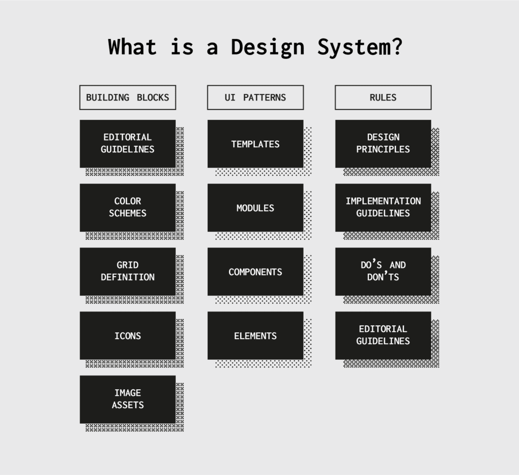
Design systems are, in essence, a centralized and communal collection of design components and assets. You want to add a slider on a new page? The design system will have all the guidelines on usage, visual examples, and even code snippets for copying-and-pasting.

Among other perks, using pre-existing components makes the product design process move much, much faster. Design and development becomes a simple matter of mixing and matching premade pieces, rather than creating everything from scratch. That frees up extra time for experimenting on better designs, or simply launching ahead of schedule.

Less errors

Another benefit of using prebuilt and standardized component is less errors. Because you’re copying from a master version, there’s no chance of making a mistake. As long as the components in your design system are accurate, their use in your products will be accurate.

This is especially good news for developers, who have all the code snippets they need right at their fingertips.

Consistency across the board

Consistency is vital to a user’s experience, but it can be hard to come by with multiple designers working separately. Design systems allow easy access to universal versions of design assets (and their rules) to keep everyone on the same page, and ensure components remain consistent from one page or section to another.

That also holds true for different products. Brands looking to build their identity can use the exact same assets for all their products, giving everything a unified feel and rewarding loyal customers with familiar usability.

Easier onboarding for new team members

Don’t forget that design systems also act as an official reference document for a company or brand. If your team-members ever forget stylistic preferences, a specific value for an asset, or need input on a tough design choice, they can find the answer to any question in the design system.

This goes double for new employees who have yet to learn the ropes. Especially for small companies that train new hires individually, onboarding is less time-consuming if the trainee handles much of the learning on their own. Think of design systems as a user manual, with all the instructions clearly written and easy to find. You choose how detailed to make your design systems, so you can also include other resources like style guides, color palettes, and pattern libraries — a one-stop reference for any question a team-member has.

Enhanced collaboration

During the initial creation of a design system — and its periodic updates — design systems get the right conversations started. Which logos go with different screen sizes? How do you want to handle the search function? What is the best accent color for call-to-action buttons? Simply setting out to make a design system forces your team to answer these questions, and make those answers easily accessible to everyone.

Having this kind of master reference guide also helps avoid miscommunication. By offering a definitive protocol and standards for otherwise ambiguous elements, design systems keep everyone on the same page. No guesswork, assumptions, or “going rogue.”

Design systems also do wonders for sometimes-problematic dev handoffs. Because technical specs are embedded in the document, there’s less confusion about how to build something in the backend, or whether it can be built at all. Designs systems give designers and developers a shared language.

collaborative design process
Photo by NESA by Makers on Unsplash

No version control problems

It’s understood that the design system is the official document: every time a change needs to be made, it’s made there. Whenever a bug gets fixed or a new design component is introduced, it’s recorded into the design system so that the next person to use it stays up-to-date automatically. We like to call it a “living document” because it’s always updating.

This format of using only one, agreed-upon master document also ensures that every update gets made to the same file. You never have to merge multiple files that were updated independently of each other by different team members. Whenever you pull from the design system, you know you’re always using the most recent version. This significantly reduces the margin for error.

Stronger, data-driven UX

So much of UX design depends on customer feedback. Different customer groups have different tastes and preferences, and they can be hard to keep track of, especially if your company is targeting more than one group.

Design systems help keep your UX data organized by optimizing your favorite patterns. Discovered your users favor thumb-friendly navigation on the bottom of the screen? All you have to do is update the design system, and every designer knows it’s the new norm going forward.

Also, since everyone shares the same components, you only have to modify one copy every time you make a small tweak. That’s a huge time-saver if you decide you want to introduce a new element or make a drastic change. Because every second counts with small teams, using premade, already-optimized components could be the deciding difference in whether you launch on time.

Final thoughts: How to build a design system

Design systems are a (relatively) new idea, so a lot of companies may be confused about how to build one. That’s why we’ve implemented special design system features into UXPin’s software.

For starters, our design system libraries feature easily lets you create design system modules and store assets at the click of a button. Our simple, intuitive interface makes it perfect for people who’ve never made a design system before. Collaborative teams also appreciate UXPin’s native communication features, with real-time update notifications and note sharing.

Try it out risk-free:

Join the world's best designers who use UXPin.

Sign up for a free trial.

Build A Design System from Scratch in 7 Steps

What do you think of faster project turnarounds? How about consistency in all of your products? Does better UX and customer satisfaction sound good to you? This isn’t some new miracle product that’s available to buy — but you can build it yourself.

Designs systems are sweeping the tech world right now, with advocates like TrelloAtlassianStacks, and Shopify (Check out a complete list of companies with links to their design systems here at Adele). This wave of popularity explains why 69% of designers surveyed in the 2017–2018 Enterprise UX Industry Report said that they either already had a design system or were currently planning on building one.

And why are design systems suddenly so popular, you ask? Because they’re exactly as effective as everyone says. The hype is real. Incorporating a design system in your company brings a variety of benefits:

  • Faster time to market. By breaking design elements into homogenized components, design systems make the whole process more efficient. Planning, designing, testing and coding are all streamlined to reduce wasting time.
  • Improved UX and customer satisfaction. They make it easy to keep track of what your users like and dislike, retaining the former and disregarding the latter. They ensure all your products use only the UX elements your customers prefer.
  • Better internal communication. As a standardized document, design systems minimize the amount of miscommunication. They keep everyone on the same page to avoid confusion.
  • Consistency across all products. Your loyal customers expect a certain level of excellence on all the products, apps, and sites you launch. Deliver consistent quality and familiar usability on every single product by using identical components.
  • Less version control issues. Updating the same bug on different products can get annoying, not to mention time consuming. With design systems, you update once and it populates all occurrences.

Design systems are a clear advantage to companies that have already implemented them, and in a few years they’ll be the norm. So how can you build a design system now to utilize their benefits yourself? We’ll explain how in just 7 easy steps… but first, let’s talk a little about what they are.

What’s a Design System?

Formally, a design system is a master collection of the key standardized documentation every company needs to, in the words of AirBnB Principal Designer Karri Saarinen, “define the overall design of the product.” This includes your usual documents like pattern libraries, guideline texts and styles guide, but also more technical aids like reusable codes for common components and other time-saving design assets.

The true beauty of design systems, though, is that all of the components in these areas are already optimized and coded. That means whenever you’re designing a new project or updating an old one, all the pieces you need are already ready — you just have to put them into place.

Textual documents like the style guide and rule guidelines are not exactly coded components, but we still recommend them. Including these documents creates an all-inclusive reference guide that covers every roadblock your designers might have. Whenever someone has a question, they can always refer to the design system.

Now, chances are you won’t have all these documents lying around already. Most companies compile these only as needed, so it’s common to have gaps and oversights. That provides one more advantage of creating a design system: an excuse to gather and formalize these materials for your company once and for all.

In this article, we’ll assume you need to create all of these areas — after all, this is a guide on building a design system from scratch. Startups especially have to tackle all these issues all at once, but even long-established companies may have ignored one or two (or ten) of these areas in their focus on fast growth. Either way, the 7 steps below can lead you to a fully functional design system, even if you’re starting from nothing.

7 Steps to Building a Design System

1. Evaluate your current UI inventory and note inconsistencies

The best place to start is evaluating what you already have. Which elements do you like? Which do you want to replace? Where are there inconsistencies between products or pages?

You’ll want to review every digital asset and all pre-existing reference materials. The end goal is to create a universal guidebook and resource library, so everything that can be included, should be included. Specifically, take a good look at:

  • Color schemes and how each color is used
  • Stylistic text choices, like specialized grammar selections, voice, etc. — choices that would be outlined in a style guide
  • Icon libraries
  • Photo libraries, both stock and custom
  • Other graphics, especially your logo — now is a good time to reevaluate your logo and make a new one if you were planning to
  • UI patterns (note which ones need to be updated)
  • Page templates

If you’re a new startup and don’t have any finalized design elements to review, think critically on each of these areas to determine the choices that best fit your brand. Later, you’ll have to create a master list anyway, so it’s never too soon to start deciding on these.

2. Get the entire team on board

True, you could do this step first before evaluating your UI inventory; however, we recommend looking for inconsistencies first to give your argument leverage if you’re met with resistance. Nothing like a laundry list of design inconsistencies to get naysayers on board.

Regardless of how many errors you collect, you should highlight to the team the efficiency bonuses of using a centralized design system. Repeat everything mentioned above in the introduction, and accent the amount of time and work a design system saves by streamlining the entire design process beginning to end.

A common complaint about design systems is that the company doesn’t have time to set aside on a side project, but the truth is design systems make up that time — and much, much more — in the long run.

3. Color palette

Now we get into the nitty-gritty of design systems: creating a master list of all your design choices, whether you’re choosing among existing elements or creating them from scratch. It goes without saying that you should rectify the inconsistencies from the first step before adding them in the master.

Your color palette is a good place to start. Maybe you’ve noticed the company uses more than a hundred different shades of gray. How much easier would it be if everyone just used one shade, and that one could be grabbed in a readily available design system?

Identify your chosen shades and hues for every color you use repeatedly, and write definitive guidelines for how to use them. Of course this includes your primary branding colors, but also pay attention to your secondary colors. For example, what color is your text? Your links? Special buttons? Backgrounds?

Remember to include HEX, RGBA, or HSL codes to be as precise as possible.

4. Typographic elements guide

Next, you want to review and finalize your typographic choices. If you already have a style guide, most of the work is done for you. If not, this free style guide eBook will tell you what you need.

Design systems can be more technical than static style guides, so take advantage of this. Note your preferred text sizes, spaces, fonts, etc., as well as any rules on where and when to use them. For example, how big are section headings in your blog articles? What font do you use for on-site calls-to-action?

Don’t neglect the fine details, like font weights, line heights, or custom kerning rules if applicable.

5. Graphic design assets

A well-made design system allows you to simply drag and drop visual components right into your new prototype. The more graphic design assets you collect in a design system, the faster your workflow for future projects.

Don’t forget to include the proper code snippets or any other documentation developers may need. This small inclusion is an enormous help during the development stage.

Among your graphic design assets, you’ll need libraries for

  • Icons — All the icons your products, apps, or sites use. Having a standardized icon library ensures consistency across your entire brand.
  • Photography — A single go-to reference for all your company photography, both custom images and purchased stock photos. Not only is it easier to pull these from a design system, it also allows workers to browse the selection for ideas and inspiration.
  • Illustrations — Likewise, compile all the custom illustrations you’ve commissioned, including page flourishes or border designs.
  • Branding images — This is a place for your standardized logos and other branding images, like mascots. Rules for logo usage can get strict, so it’s better to pull pre-approved images to ensure compliance.

Moreover, you may want to include a list of design principles for everyone to follow if they’re creating a new graphic asset. Sizes, colors, compatibilities, preferred file formats — having a rulebook helps ensure your company’s style remains intact in the future.

6. Pattern library

Finally, include a pattern library of all your common design elements, especially interactive ones. There may be some overlap between UI patterns and graphic assets. On the whole, your UI patterns are more advanced than stagnant visuals.

To be clear, UI patterns are any design elements you use consistently for the interface of your site, app, or product. For example, how you treat your search function is a UI pattern, including how the magnifying glass icon looks, whether the input window expands or remains open, where it’s located on the screen, and if you include placeholder text or not.

Don’t forget, once again, to include code snippets and other development documentation. This is even more significant for UI patterns, as they tend to be more technical.

When organizing your UI patterns, include usage notes to clarify the specifics of how to use it. It also helps to use screenshots or visual cues to make searching for them easier.

It also helps to organize your pattern library into subsections. Try categorizing them by function, such as “navigation,” or by type, such as “drop-down menus.”

7. Upload the select UI elements in a design system document

Lastly, you need to house your design system somewhere that’s convenient and easily accessible. The UXPin Design Systems platform was created for this in particular, with a template-like format where all you have to do is input your components in the appropriate space or upload them from Sketch.

You also have the options of dragging and dropping your elements into the prototyping software, which means easy, DIY designing and a fully-coded handoff to developers with complete documentation (full markup, information about imports, and names of javascript components, etc.). If you want to optimize your time-to-market, this all-inclusive solution is the way to go.

Conclusion

Design systems are a relatively new addition to the world of digital design, but they’re already changing the game. Given the depth of what they’re capable of, we can’t fully explain their usage here; this is just an introduction on how to get started.

This article originally appeared here on Medium.

UXPin is the design process tool that helps product teams around the world turn ideas into products faster.

With Merge, UXPin’s revolutionary technology, companies like PayPal can easily solve DesignOps challenges. UXPin Merge allows you to design with React components to achieve full consistency with the final product.

MergeAccess Blog 12