Struggling with design-to-development handoffs? These 10 strategies can help reduce miscommunication, speed up workflows, and ensure your final product aligns with the original design vision:
- Use a Shared Design System: Standardize UI components and guidelines for consistency.
- Create Interactive Prototypes: Simulate functionality to clarify designs for developers.
- Write Clear Documentation: Include specs, interactions, and implementation notes.
- Track Design File Versions: Avoid confusion with organized version control.
- Build with Components: Reusable elements save time and ensure consistency.
- Connect Design and Development Tools: Sync resources for smoother collaboration.
- Automate Style Guides: Keep design and code aligned with real-time updates.
- Set Up Communication Systems: Use tools for feedback, updates, and collaboration.
- Hold Regular Design Reviews: Align teams and address issues early.
- Share Design Decisions with Developers: Explain the "why" behind choices for clarity.
These steps combine tools, communication, and processes to streamline handoffs and reduce friction between teams. Start small – like adopting a design system or interactive prototypes – and build from there for better collaboration and faster results.
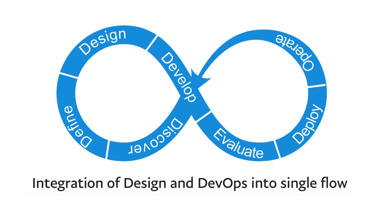
How to Hand-off UI Designs to Developers
1. Create a Shared Design System
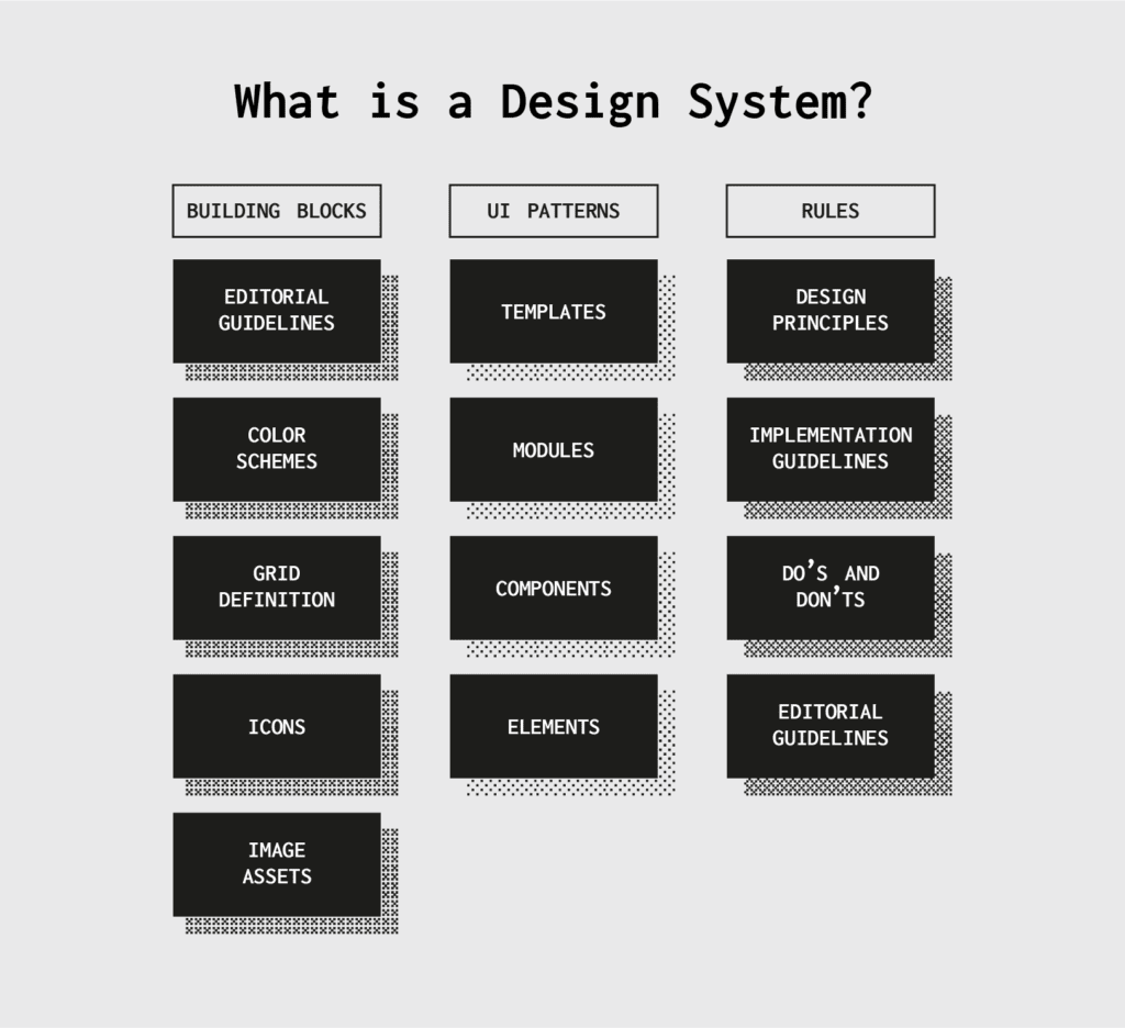
A shared design system helps reduce miscommunication during the handoff process by aligning design and development teams around a single, unified framework. By using a shared system, workflows become smoother, and consistency is easier to maintain.
Key elements of a shared design system include:
- Component Libraries: Ready-to-use UI elements with matching code for easy integration.
- Style and Usage Guidelines: Clear details on colors, typography, spacing, and practical examples.
- Design Assets: Centralized resources accessible to everyone on the team.
"A great handoff addresses those gaps in information… When both the design and development teams are consulted throughout the production process, resentment won’t have a chance to build up." – Lucidchart Blog
For example, Airbnb‘s Design Language System (DLS) cut handoff time by 34% and reduced design inconsistencies by 68%, proving how effective shared systems can be.
Tools like Figma and Sketch are great for creating and managing these systems, while platforms like Storybook and Bit make it easier to document and share components across teams.
To build a shared design system, follow these steps:
- Review your existing design patterns and components.
- Set clear standards for colors, fonts, and spacing.
- Create a library of reusable components with matching code.
- Document all guidelines and usage instructions.
- Train your team on how to use and contribute to the system.
Consistency and regular updates are key. Over time, refine components, improve documentation, and incorporate feedback from your team to keep the system relevant and useful.
Once your design system is in place, the next step is creating interactive prototypes to further bridge the gap between design and development.
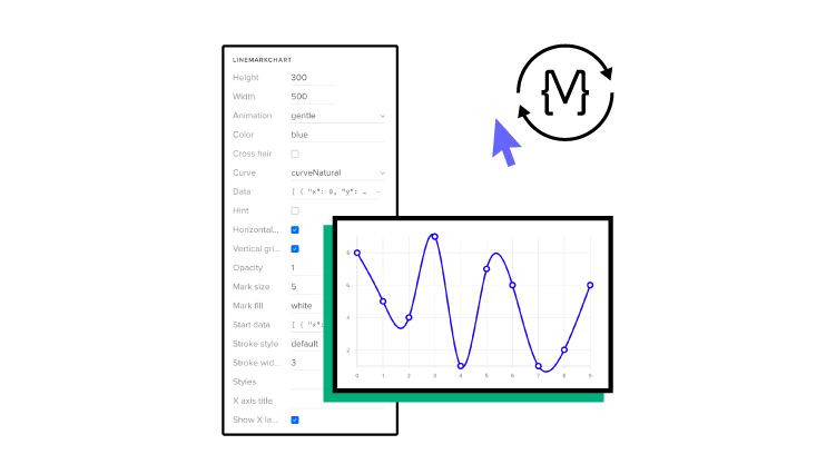
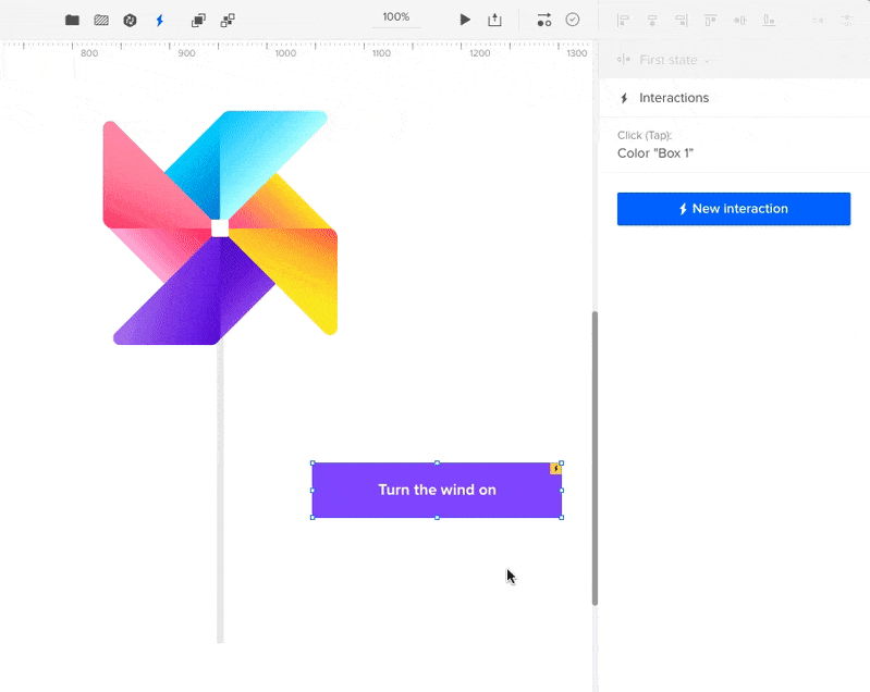
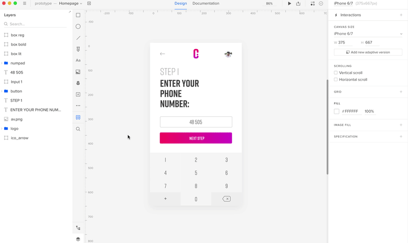
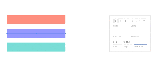
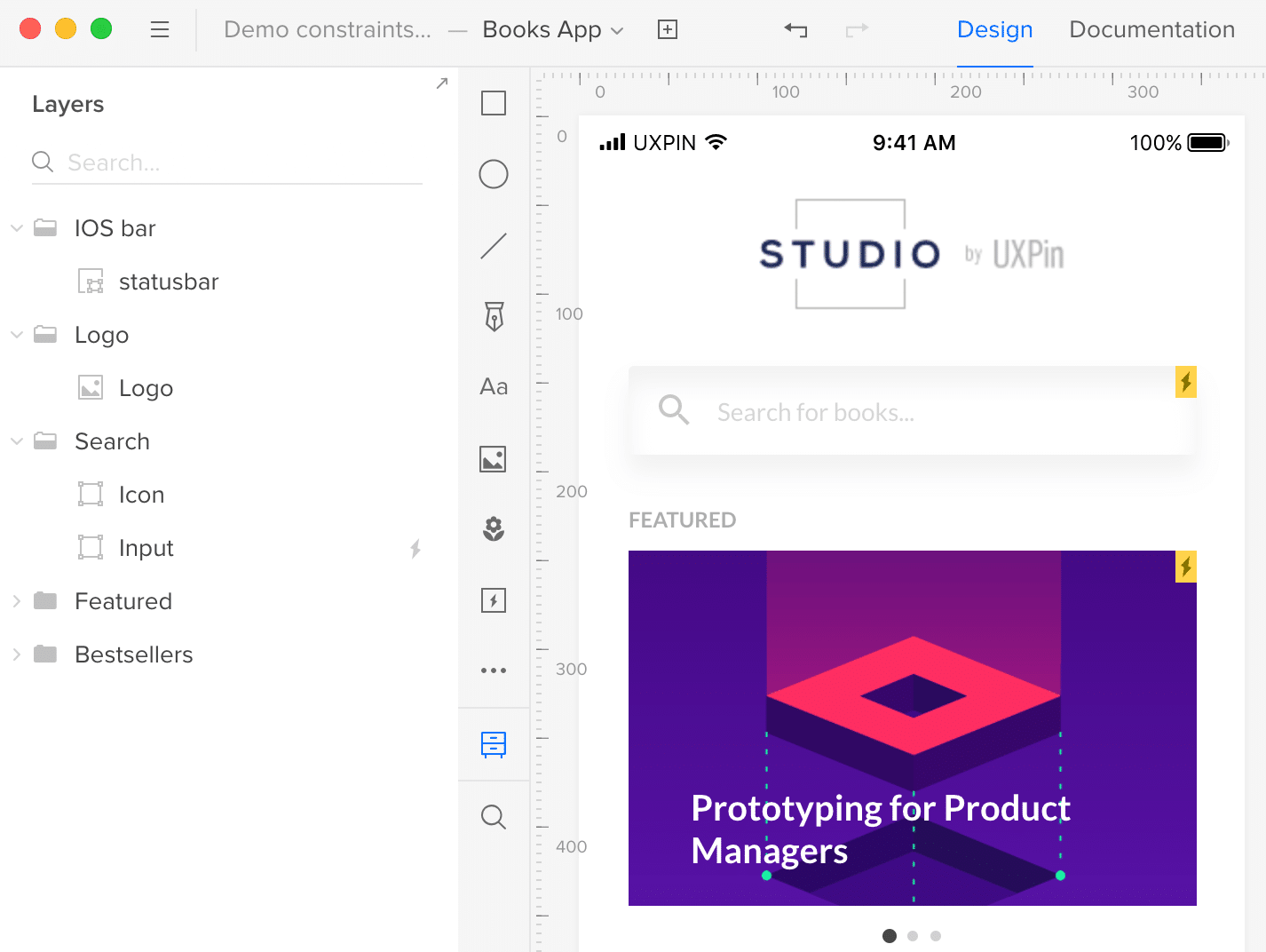
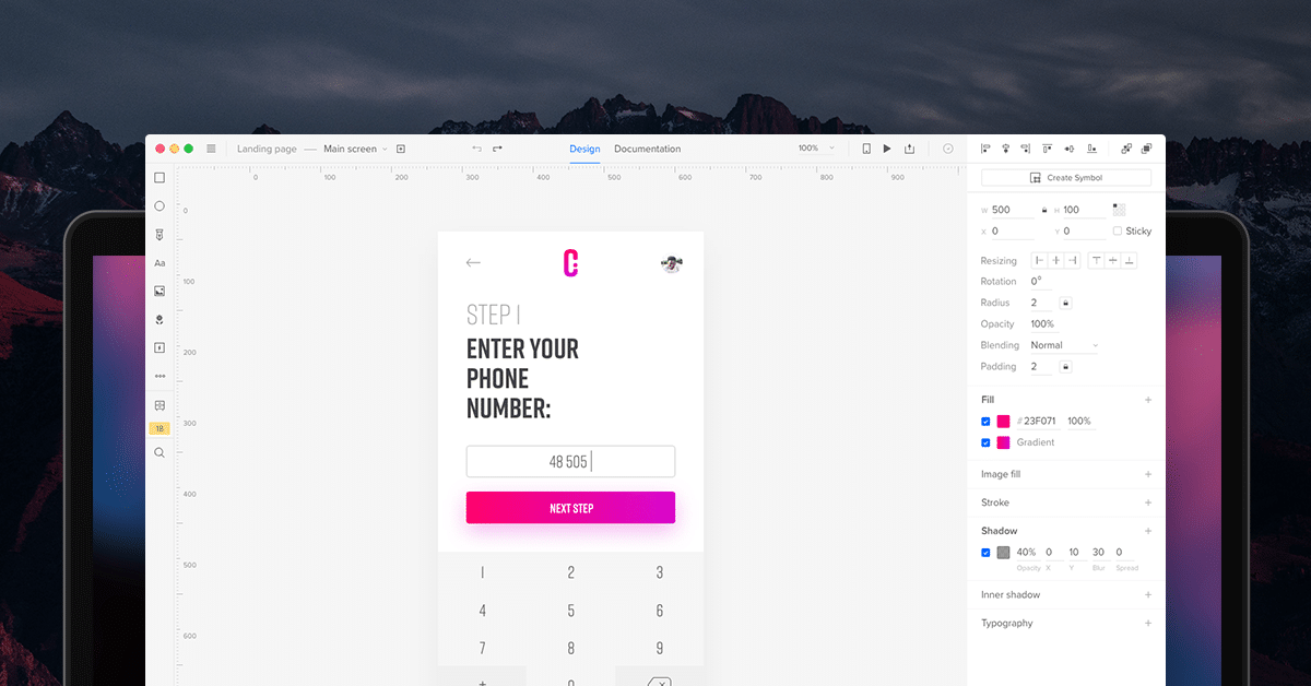
2. Use Tools for Interactive Prototypes
Interactive prototypes act as a link between design and development teams, offering a dynamic, clickable preview of what the final product will look and feel like. These prototypes help bridge the gap between static designs and functional applications, cutting down on miscommunication and improving collaboration.
Why interactive prototypes matter:
- They simulate real-time behavior, showing exactly how interactions will work.
- Interactive elements visually explain functionality better than lengthy documentation.
- They help spot usability issues and technical challenges early, saving both time and effort.
"Interactive prototypes are a game-changer for design-to-development handoffs. They help us catch errors and misunderstandings early on, saving us time and resources in the long run." – Marcin Treder, CEO of UXPin
Key features to include in prototypes:
| Feature | Purpose | Impact |
|---|---|---|
| Dynamic Layouts & Real Data | Ensure prototypes work across devices and use realistic content | Creates an accurate representation across platforms |
| State Management | Show how the interface behaves in various scenarios | Makes interaction patterns clearer |
Best practices for using prototypes:
- Focus on the most important user flows.
- Get developers involved early to address any technical limitations.
- Use prototypes to demonstrate how components from your design system work in practical situations.
Tools like UXPin’s Merge technology take this a step further by letting teams use actual React components in their prototypes. This method has been shown to cut implementation time by up to 50% and reduce the number of design-related questions during development.
For more complex features, advanced interactions can help clarify edge cases. While prototypes are great for showing functionality, pairing them with clear documentation ensures that no details are missed during the development process.
3. Write Clear Documentation
Prototypes might show how something looks, but documentation explains how it works. It provides the technical details developers need to bring designs to life. Well-written documentation minimizes misunderstandings and avoids costly mistakes during development.
Key Documentation Elements
| Component | Key Details |
|---|---|
| Design Specifications | Dimensions, spacing, color codes |
| User Interactions | State changes, animations, transitions |
| Implementation Notes | Technical needs, dependencies |
Think of documentation as a "living" resource that evolves with your project. Tools like Zeplin can help by centralizing design and development references in one place.
How to Keep Documentation Effective:
- Track updates so developers always have the latest information.
- Use annotated wireframes to visually explain design decisions and context.
- Organize content logically by breaking it into sections that align with the development process.
"Design handoff is actually about delivering specs, sharing design intention, giving context about user journeys, and reinforcing a design system so that developers can do their job efficiently." – Zeplin Blog
For even better results, align your documentation with your design system. Teams using design-to-code tools often find this reduces questions during implementation by offering a single, reliable reference for designers and developers alike.
Additional Tips:
- Include detailed notes for complex interactions.
- Link back to related components in your design system.
Once your documentation is clear and thorough, the focus shifts to keeping design files clean and up-to-date for smooth teamwork.
4. Track Design File Versions
Keeping track of design file versions is just as important as version control for code. It helps teams stay organized, avoid mix-ups during handoffs, and ensures developers always have the correct files.
Key Practices for Version Control
| Practice | Purpose | Benefit |
|---|---|---|
| Single Source of Truth | Keep all definitive design iterations in one place | Prevents duplicate files |
| Clear Naming Convention | Make files easy to identify | Reduces confusion |
| Change Documentation | Record modifications clearly | Allows quick rollbacks |
| Regular Backups | Protect against data loss | Keeps work secure |
Tools like Figma simplify this process with built-in version history. It automatically saves changes and lets teams label important iterations. This makes it easier to refer back to specific stages during the development process.
How to Implement Version Control
Adopt a consistent file naming system, such as ProjectName_v1.2_ComponentName. Using tools like GitHub for design teams can significantly lower file conflicts and mismatches – by as much as 60%.
"Version control ensures design integrity by tracking changes and preventing errors during development." – UXPin Documentation Team
Tips for Managing Versions Effectively:
- Centralize master files and archive older versions to keep things clear.
- Use branching for testing out new design ideas.
- Document major updates to track changes easily.
Once version control is set up, the next step is integrating design and development tools for smoother teamwork.
5. Build with Components
A component-based approach simplifies the handoff between design and development by promoting consistency, reusability, and faster execution. Standardizing components removes confusion and ensures a smoother transition from design to code.
Component libraries serve as a shared resource, aligning teams for quicker and more uniform workflows. In fact, teams using these systems have reported up to 70% faster development cycles compared to older methods.
| Benefit | Design Impact | Development Impact |
|---|---|---|
| Consistency | Standardized UI elements | Reusable code patterns |
| Speed | Quick prototyping | Faster implementation |
| Maintenance | Centralized updates | Reduced technical debt |
| Scalability | Easy design iterations | Modular architecture |
For example, Airbnb’s shared component library cut handoff time by 35%, showcasing how effective this method can be.
Key Strategies for Using Components
- Begin with simple building blocks and combine them into more complex components.
- Fully document how each component behaves.
- Ensure design and code components remain synchronized.
"Component-based design systems play a crucial role by providing a centralized repository of components, guidelines, and assets that ensure consistency and efficiency across the product." – UXPin Documentation Team
Tools like Storybook and UXPin make managing components easier. UXPin’s Merge technology allows teams to work with the same React components in both design and development, eliminating mismatches during handoff.
When adopting a component-based workflow, prioritize creating a shared library that is accessible and understandable for both designers and developers. This method not only improves handoff efficiency but also ensures your product’s interface is easier to maintain over time.
To take this approach even further, integrating tools that bridge the gap between design and development is the logical next step.
sbb-itb-f6354c6
6. Connect Design and Development Tools
Bringing design and development tools together streamlines workflows and cuts down on rework caused by miscommunication. By using shared design systems and component libraries, teams can keep resources consistent and easily accessible. According to research, 62% of developers spend too much time redoing designs because of communication breakdowns.
Modern tools bridge the gap between design and development, offering a single source of truth. For example, UXPin’s Merge technology allows designers to use the same React components as developers, closing the gap between design and implementation. This method is particularly useful for keeping projects consistent, especially when they’re complex.
| Integration Type | Key Benefits | Impact on Workflow |
|---|---|---|
| Design-to-Code & Prototyping Tools | Automated spec generation and interactive specifications | Cuts down on manual documentation and clarifies implementation |
| Component Libraries | Bi-directional updates between design and development | Maintains real-time alignment between design and code |
Choosing the right tools is essential. Look for platforms that fit into your current workflow. A great example is pairing Storybook for component documentation with design tools that support code components. Together, they create a smooth handoff process.
"When handoffs become several recurring occurrences rather than one waterfall event, the solution is better implemented, fewer issues arise, and all parties are happier." – Lucidchart Blog
Key Practices for Tool Integration
Here are some practices that make tool connections more effective:
- Automated updates for assets and specifications
- Real-time syncing between design and development libraries
- Keeping components aligned across all platforms
Connected tools save time and cut down on back-and-forth communication by syncing design specs, assets, and documentation automatically.
If your team is new to integrating tools, start small. Focus on tools that address your biggest handoff issues, then expand as your team becomes more comfortable.
Once your tools are connected and workflows are running smoothly, the next step is setting up systems that promote open communication across the team.
7. Generate Style Guides Automatically
Automating style guides can save time, reduce errors, and boost design workflow efficiency by 34%. These guides act as a central reference for design specifications and implementation standards, ensuring consistency across projects.
Tools like story.to.design, a Figma plugin, help create UI kits directly from component library code, keeping design assets aligned with development resources. Similarly, UXPin offers advanced features like synchronized design systems with built-in React libraries, enabling both designers and developers to work from the same set of components.
| Style Guide Element | Automation Advantage |
|---|---|
| UI Components | Automatically generates variants from code |
| Styling Variables | Updates in real-time from development |
| Documentation | Creates specifications automatically |
Choosing the right tools and integration methods is crucial for successful automation. Focus on these key aspects when setting up automated style guides:
- Use standardized elements like UI components, color palettes, typography, and layout guidelines.
- Ensure real-time updates between design and development teams.
- Integrate tools seamlessly with your current tech stack.
"Automated style guides simplify the complex task of keeping design and code in sync, saving teams time and effort."
8. Set Up Team Communication Systems
Having a strong communication system in place makes feedback and collaboration much easier, which helps teams work more efficiently. Clear communication reduces misunderstandings and leads to smoother project handoffs. For example, teams using tools like Microsoft Teams often see fewer communication issues.
A good communication setup should include both instant and delayed communication options. Platforms that combine chat, video, and documentation features make it easier to collaborate and avoid miscommunication.
| Communication Channel | Primary Use | Key Benefit |
|---|---|---|
| Real-time Chat | Quick questions & updates | Fast problem-solving |
| Video Meetings | Design reviews & demos | Share visual context |
| Project Management | Task tracking & documentation | Centralized information |
| Design Tools | Asset sharing & feedback | Maintain version control |
Using these systems helps teams keep documentation and feedback organized, making collaboration seamless. Tools like video walkthroughs can explain complex designs clearly, cutting down on confusion. Integrated platforms also let designers add comments directly to design elements, so developers can see feedback in the context of their work.
To get the most out of your communication tools:
- Use shared platforms to keep everyone working from the same information
- Keep meetings short and focused, especially when discussing technical challenges
- Set up clear processes for asking and answering design-related questions
"Early collaboration and clear communication channels can reduce design implementation errors by up to 60% and accelerate the development cycle significantly"
A great example of this in action is UXPin. Their platform allows designers to attach comments directly to design elements, giving developers instant access to relevant feedback. This approach has helped teams like Airbnb stay consistent with their designs while speeding up implementation time.
With a solid communication system, teams can stay aligned through regular reviews and collaborative decision-making.
9. Hold Regular Design Reviews
Regular design reviews help design and development teams stay aligned by addressing potential issues early and refining designs before they move into development. Plan these reviews at key points in the project, such as after finalizing major UI components or before starting development sprints, to make critical decisions more effectively.
Here’s what an effective design review should cover:
- Walkthrough of design decisions: Explain the reasoning behind key choices.
- Feasibility checks: Assess whether the designs can be implemented technically.
- Feedback sessions: Gather input that can lead to actionable improvements.
- Review of documentation: Ensure design documents are clear and detailed.
Use collaborative tools that allow real-time feedback and annotations. This makes it easier for developers to understand the goals and limitations of the designs. When paired with a strong design system, these reviews can focus on specific components and their implementation, streamlining the entire process.
Companies that integrate regular design reviews with design systems have reported up to 60% fewer implementation errors and quicker development timelines. To evaluate how well your reviews are working, consider tracking:
- The number of design-related issues or revision requests
- Time saved in the implementation phase
- Team feedback on how clear and actionable the designs are
During these discussions, focus on balancing technical constraints with the original design vision. This ensures that both designers and developers feel their input is valued and that the final product meets everyone’s expectations.
Once regular design reviews are in place, the next step is making sure developers fully understand the design decisions to maintain alignment throughout the project.
10. Share Design Decisions with Developers
When developers understand the reasoning behind design choices, they can better align their work with the intended user experience. This approach not only enhances teamwork but also reduces friction during the handoff process.
One common hurdle is the communication gap between designers and developers. Research highlights that these teams often use different professional terminology, which can lead to misunderstandings about design goals. Sharing the "why" behind decisions – whether it’s addressing user needs or dealing with technical limitations – bridges this gap.
Here’s how to communicate design decisions effectively:
- Document Key Rationales: Write down the reasoning behind your design choices, including user needs, business objectives, and even the options you decided to exclude. This gives developers a clearer picture of your overall strategy.
- Encourage Open Dialogue: Create opportunities for informal discussions where designers and developers can tackle edge cases or clarify any unresolved issues. Ongoing conversations help keep everyone on the same page.
A Framework for Communication
To streamline the process, use this framework for sharing design decisions:
| Communication Level | Purpose | Frequency |
|---|---|---|
| Documentation & Reviews | Record design decisions and technical requirements | Bi-weekly or as needed |
| Quick Syncs | Resolve immediate questions and uncertainties | 2-3 times per week or as needed |
Interactive tools like UXPin can be especially helpful. They allow designers to create prototypes that showcase both static layouts and dynamic interactions, making it easier for developers to visualize and implement designs.
Another tip: include explanations for discarded options. This extra context helps developers make better decisions when translating designs into code.
To gauge how well this process is working, track metrics such as:
- The number of design-related questions during development
- Time spent revising designs after implementation
- Developer confidence in executing design features
These indicators can reveal areas for improvement and ensure smoother collaboration between teams.
Conclusion
To effectively implement design-to-development handoff strategies, teams need to combine technical tools with strong communication practices. This can be broken into three main areas of focus.
First, integrating design systems, prototypes, and documentation is essential for smooth collaboration. Teams should aim for tools that work well together to minimize technical hiccups, establish clear communication channels to avoid misunderstandings, and refine processes to boost efficiency.
Success can be measured by fewer revisions, quicker project delivery, and improved team morale. Encouraging designers to learn basic coding and helping developers understand design principles can also bridge gaps between roles.
Involving developers early and maintaining ongoing feedback helps reduce miscommunication and keeps everyone aligned. Paired with design-to-code software, this ensures both designers and developers work toward shared objectives.
Start with small changes and expand as needed. By focusing on strong communication, shared goals, and the right tools, teams can create smoother and more enjoyable collaboration workflows.