
Components
The concept of Components saves you plenty of time and spares you repetitive and tedious work, allowing you to reuse existing parts across the design. A button, a footer, an icon or even a cell in a table can be a Component. You can also share them across your projects by means of Design System Libraries.
Every Component has two aspects:
- Master Component, which defines the properties of the Component.
- Instance Component which is a single layer that mirrors the content from its master.
Since Instances are linked to the Master Component, any changes you make to the Master immediately propagate to its Instances. Once you select a Component on the canvas, you will see a preview of its Master with its name.
Tip
Check out our easy to follow video tutorial about Components.
Creating Components
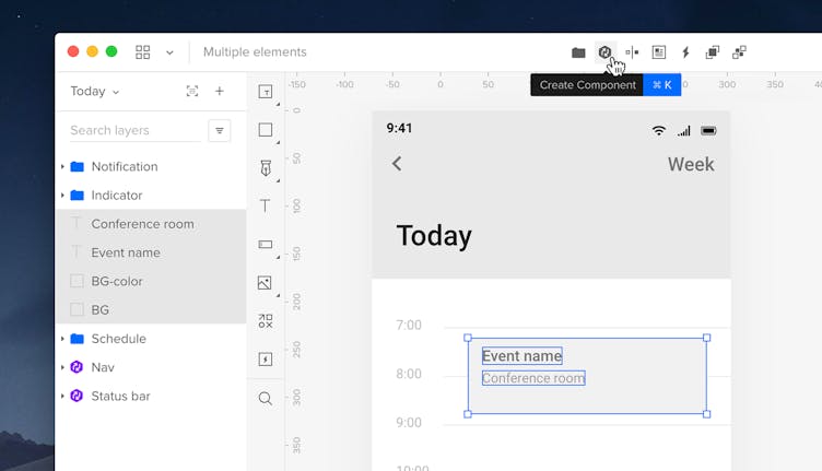
You can create a Component in 3 ways. Select the elements you want to turn to a Component and:
- Click Create Component in the Top bar
- Open the context menu and choose Create Component
- Use the
Ctrl
"K"
shortcut.
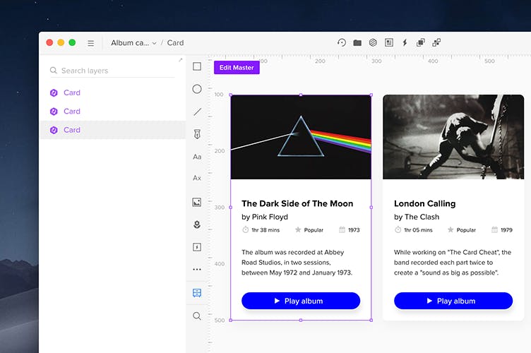
The Component will appear in the Layers panel with a purple outline, but once you select a Component, the purple icon turns gray.
In the Layers Panel, you can expand each Component to see all the elements it consists of – just like with groups. It's also possible to lock or toggle the visibility of Components, as well as their selected elements. To create Component Instances, select a Component and hold
Alt
and drag it on the canvas. You can also use the Duplicate action, or simply copy-and-paste a Component – all Instances will be linked. To duplicate a layer from a Component to the outside, use
Alt
and drag on the Layers list.
Note
If you use Merge components, converting or nesting them with Classic Native Components (Symbols) is not supported.
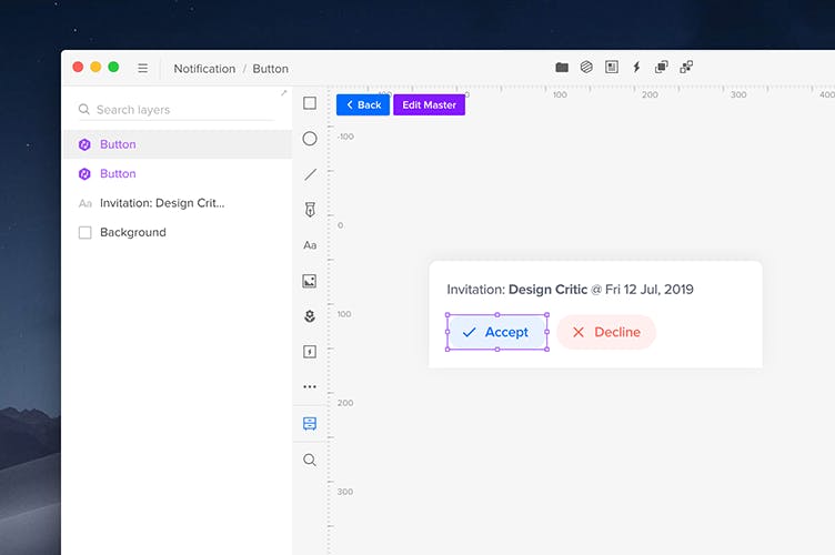
Breaking and Unlinking Components
If you want to turn a Component back into a regular element, select the Component on the canvas and click Break Component in the Top bar or in the Properties panel. You can also open the context menu and choose Component › Break, or use the
Ctrl
"Shift"
"B"
shortcut. This will turn it into a group of elements. Breaking a Component also removes all its interactions pointing to external elements.
It’s also possible to unlink an Instance from its Master Component. Once you unlink it, a new Master is created for that Component. This is useful when you want to create a new, independent Component. You can also unlink an instance from the context menu.
Note
You can only unlink Components which have been added on the canvas directly from a Design System Library.
Editing the Master Component
You can edit Components in two ways – the Master with all its Instances, or edit each Instance independently.
To edit a Component’s Master, select an Instance and click the Edit Master button in the top left corner of your workbench, click Edit Master in the Properties panel, or open the context menu and go to Component > Edit Master – this will open a separate view for the master component. Any changes you make there will immediately propagate to all Component Instances.
You can also change the Master Component's name in the left corner of the Top bar. When done, click Back. The Master Component’s name appears in the Properties panel in the Instance section, not in the Layers panel.
Tip
Activate auto-size for dynamic boxes and buttons in Edit Master mode by toggling the icon next to the Master Component's name to switch between Fixed and Auto-Size.
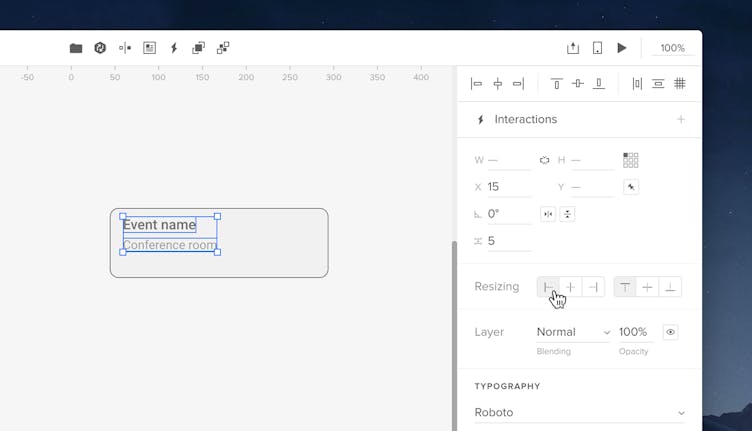
Editing Instances with Overrides
Whenever you update an Instance with unique content, we call this an Override. Once you select an element inside an Instance, you will see the properties you can edit.
You can override all properties apart from size, rotation, constraints, and alignment. You can't change the position on x and y axes, but you can set a fixed position for elements inside Instances.
You can’t delete elements or add new ones to an Instance, group and ungroup elements or turn them into new Components. Deleting an element inside an Instance will hide it.
Thanks to that, Instances keep the properties defined in the Master but have their own unique content.
Note
Any edited properties in the Instance are not affected by the changes you make to the Master Component later.
Resetting Overrides
You can reset overrides for the Instance or for a selected element inside an Instance:
- For a selected Instance you can reset overrides in the Instance section in the Properties panel and in the Top bar by clicking Reset or in the context menu. You can either reset all overrides or its size.
- For a selected element you choose which specific property you want to reset. To do that, click on the Reset icon at the top of the Properties panel and click on the properties you want to reset.
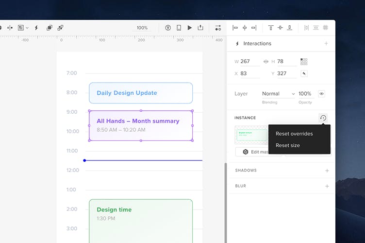
Resetting overrides for a selected element.
Nested Components
Nested Components are the components you create inside another Component – any changes in a nested component will propagate to its Instances. Apart from that, you can also create nested components by selecting numerous Instances on the canvas and turning them into a Component. Nested Components, just like regular Components, can also be overridden. There’s no limit to how deep you can nest Components, but remember that a Master Component can’t contain its own Instance.
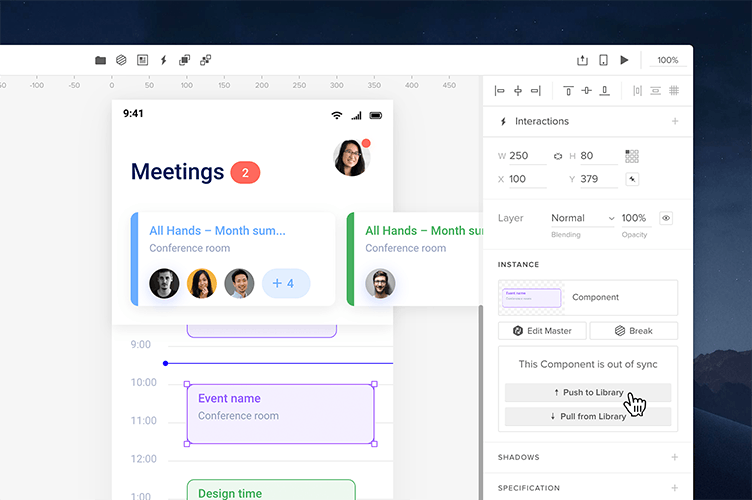
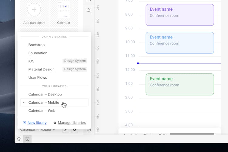
Updating Library Components
When Library Components used on your prototype have been changed in the Edit Master mode, you’ll see a box in the Instance section of the Properties panel that says This Component is out of sync. If you want to update that Component in your Library, click Push to Library. This will bring up a Component update modal and you will be able to see what has changed. Click Update. The preview of your Component in the Library will also be updated. You can also push changes to the library from the Component context menu.
Note
You can only push changes made to the Master to the Library from unedited Component Instances. The sync box with Push/Pull options is not available for edited Instances
Pulling changes from the Library
To update all Instances of a Library Component with its version from the library, select the Instance and click Pull from Library in the Properties panel, in the Component context menu or by clicking the Component Updates... badge in the bottom left corner of the editor.
Every prototype that uses Instances of an updated Library Component will show the Component Updates... badge in the bottom left corner of the editor. The number on the badge is the number of Library Components that are out of sync with their Instances on the canvas. Clicking it will bring up a modal and you will be able to see what has changed. Click Update if you want to update the Instances. This does not affect previously overridden Instances.
Tip
To stop a Component from updating to the Library, right-click any of its Instances on the canvas and choose Unlink in the Component context menu. This will create an independent Component.
Best Practices
There’s an endless number of things to consider when creating Components, naming, and managing them. That's why we put together a best practice guide to help you out.
When to Start Creating Components?
We recommend turning things into Components early in the design process. Even if you work on a lo-fi prototype and you have repetitive elements, it’s good to make them Components at that point. This can save you time when making changes across the entire prototype later. Instead of changing every element separately, you’ll only edit the original Master Component.
Set Constraints
We recommend setting constraints for Components in the Edit Master mode to set a predictable and intended behavior when you resize them.
Organize Libraries
As you scale your design across products and teams, you need to have a way to organize and distribute Components for everyone. The people using your libraries are your end-users.
How Many Libraries Do I Need?
If you’re wondering whether you should keep everything in a single library or create multiple libraries for your Components, the answer is: it depends. Here are some aspects you’ll need to consider. We also listed the pros and cons of each to help you make the right decision:
Keep All-In-One
A single library where all your Components live is a good solution when you work in a smaller team and you want to keep things simple.
Pros
You and anyone else who uses this library can simply treat it as one source of truth for all designs. There is no confusion as to where to look for assets. Also, having one library is a time saver when it comes to maintenance.
Cons
If you work at a big company with plenty of Components used for different products and platforms, a single library will grow exponentially. Things can get tricky once you need to browse through hundreds of Components you hardly ever use to find the one you want now.
Create Multiple Libraries
Some teams take the approach to divide Components into multiple libraries which is usually a great solution if you know that your libraries will scale with time.
Pros
First of all, by keeping Components in different libraries you can decide who has access to which library. For example, if there’s a team that works only on mobile products, there’s no need for them to have access to desktop assets. So a good practice would be to keep assets for mobile and those for the desktop in two separate libraries with different access permissions. This saves time for both teams as they won’t have to browse through Components they never use.
Cons
An obvious disadvantage is a fact that the more libraries you have, the more effort you need to put in to maintain them and keep them updated.
Carefully Consider Component Names
Last but not least, Component names. Your libraries are not only for current designers but also for anyone else who will use it them the future, so it's good to give them reasonable and consistent names in libraries. That way, everything will be easier to use and read.
Component names need to be:
- Clear
- Consistent
- Meaningful