
Today as we celebrate the release of our new version, we want to take you behind the scenes and show you the lessons we learned while building it.
The first thing we learned when embarking on a redesign was that it isn’t enough that you use your product. You can’t just eat your own dog food and leave it at that.
As pointed out in this Forbes article, no one uses your product as much as you do, and not everyone is a power user as much as you. You can only know so much by using your product yourself. But if you only do that, you can become myopic in your approach. You have to seek outside perspective from your users.
You have to talk to them and learn from them, while still eating your own dog food.
That’s precisely what we did with the UXPin redesign. We used UXPin to redesign UXPin, while at the same time spending hundreds of hours talking to our users.
Before and after of the UXPin design editor.
Learning From Previous User Experience
We didn’t embark on our redesign on a lark. After all, the decision to do one should be based on data and feedback from users.
As we said in the free e-book The Guide to UX Design Process and Documentation, you always need to know why you’re building something. You have to do a bit of legwork and research, analyzing users. We won’t get into creating user personas. If you’re embarking on a redesign, you probably already know a lot about users’ motivations, fears, mentality, and, of course, behavior.
But it’s the last bit that’s going to be really useful to you. How do users behave in your application? What works for them? What doesn’t? More importantly, do they have workarounds to accomplish what your product actually promises?
For us, past usability tests and user feedback via customer service, as well as various “engagement metrics” were strongly suggesting that the learning curve is too steep for a design collaboration solution.
Having the lowest learning curve is important to us because we’re not only a tool for designers.
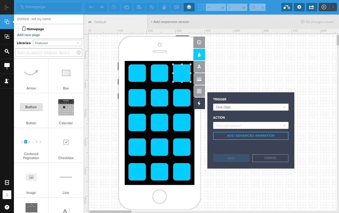
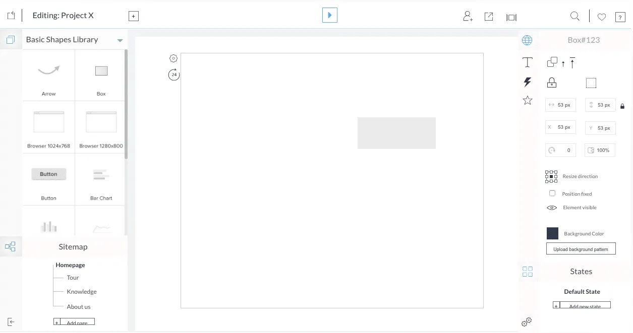
A close up of the redesigned UXPin editor.
For instance, Ingrid Brummer, a product manager at e-commerce site CHECK24, uses UXPin with her team because it allows her to fully articulate her ideas. As she told us, “I really appreciate that with UXPin I, as a non-designer, am able to produce really exact designs.”
Since non-designers are also involved in the design process, we needed to lower the barrier to entry.
With that knowledge, we dove back into our app, taking inventory of how we can create a better user experience across UXPin. OK, here’s where things get a little meta. As we said before, we actually used UXPin to redesign UXPin.
Why a Redesign?
Let us repeat again: a redesign isn’t a lark.
Learning from previous experience is the first part of that. Next, you have to decide why a redesign and set goals.
A redesign starts very much by asking the same questions you would before embarking on any other design project, such as “what is the purpose of this?” “What are our goals?” “How does this affect our users?”
Certainly, users were at the heart of our decision to redesign. We wanted to create a smoother experience for them all around, making it easier to use UXPin and increase the speed of our platform. But to get to specifics, these were the factors that went into our decision:
- Design debt. Having grown fast through the years, we took on “design debt,” where legacy elements didn’t really align anymore with our vision and just bogged down the experience.
- Experience debt. We saw visible patterns of pain from customer service and our usability tests.
- Practical inspiration. This may seem like a lofty goal, but we wanted a tool that inspired others to build better products. A tool that was rooted deeply in usability principles and that invoked the timeless and iconic designs of yesterday.
- Room to grow. Our previous design and backend didn’t give us to flexibility to build out new features easily. Since we were going to overhaul our entire engine, we faced less creative constraints with our new features.
And all these reasons were for our users, first and foremost. If we sound like a broken record, it’s because we can’t emphasize enough that our users drove our decision.
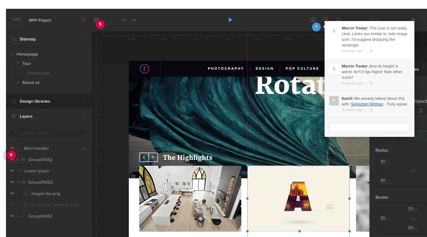
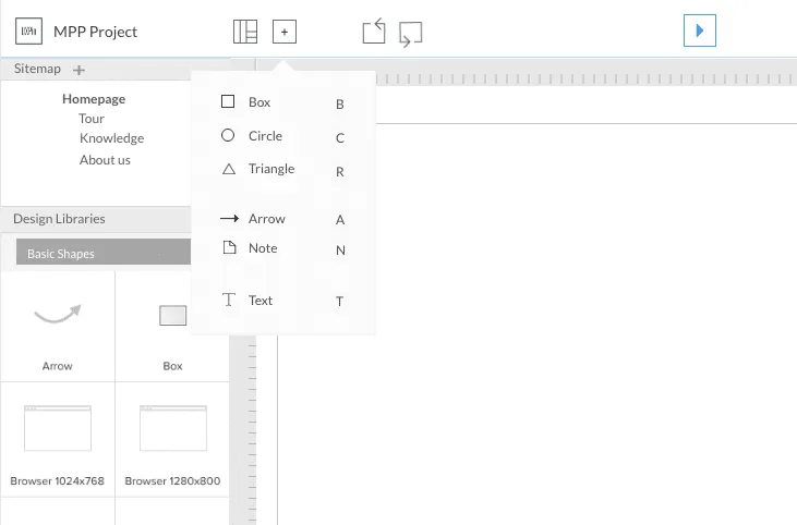
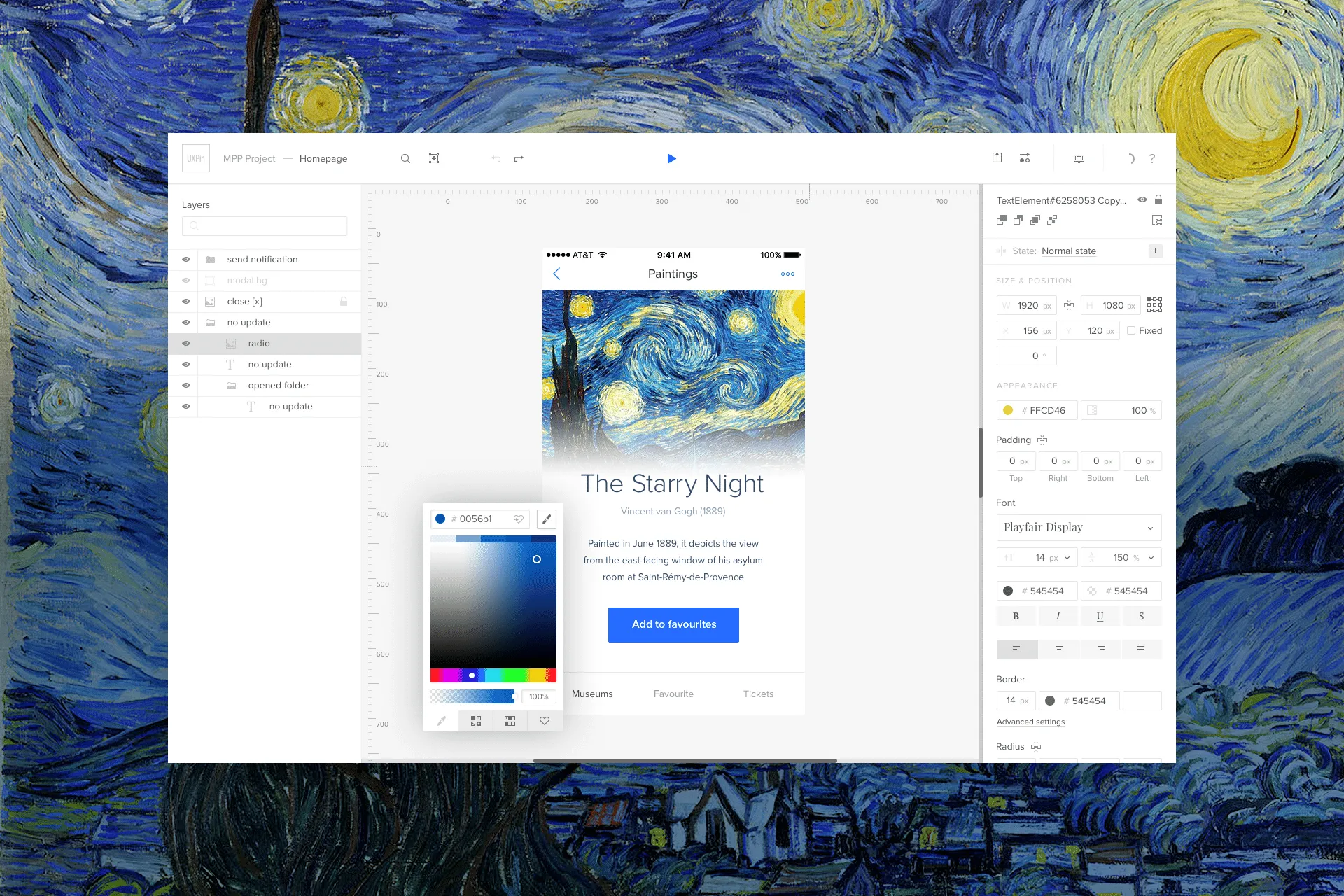
Using UXPin to redesign UXPin. Here you can see us leaving comments on the live preview of the prototype.
Our Redesign Process
Any design effort begins with research. And we didn’t have to look far for it. Luckily, we’d been collecting data over the years already.
We had behavioral metrics, SaaS business metrics, and customer service had data from the front lines. Finally, we had qualitative usability tests, with our existing customers.
The data gave us a jump start on our redesign process. Let’s walk through the highlights rather than go point-by-point.
Laying down your design principles
Before designing a single pixel, we outlined the design principles for project.
Think of this as a combination of requirements, our goals and our aspirations. And our research helped inform these principles.
As Robert Hoekman Jr. outlines in The Field Guide to UX Strategy, you’ll want to ask the right questions to formulate your UX strategy. You can do the same thing when it comes to your design principles. Let’s review some of those questions:
- What’s your reason for being? This question may seem philosophical, but it really isn’t. Simply put, it’s asking you to understand how your product fits into your users’ workflows.
- Where are you now? This is your product as it stands today. Understanding this is deadly important to deciding whether you’re ripe for a redesign.
- Where have you been? For use, this was an easy question to answer. As we said previously, we had all the metrics in front of us. We just needed to dive deep and put two and two together.
Finally, one last question to ask and probably the most important one:
- Where do you want to be? Where do you go from here? How do you change? And how do you measure that change? Hoekman suggests using specific numbers, which is always a good idea. For now, we’ll focus on the design aspect for this article.
Now let’s take a look at the principles we created:
- No distractions. Every redundant piece of an interface — lines, buttons, shadows, animations — is a source of distraction. As such, you should eliminate it to empower user creativity.
- Design centric. User designs should be at the center of UXPin. Our interface shouldn’t obstruct their work.
- Adaptive interface. Our interface should always act in context of the user. That means any “interactive” features should be hidden until the user needs them.
- Space. Users should have a lot of space to work so as to trigger their creativity. A cluttered interface is a source of stress.
- Inspiration. UXPin design should inspire and can’t derive from design other SaaS apps. We should strive for original aesthetic inspired by the best products ever created, such as the Pilot Vanishing Point Matte Black fountain pen, Harman Kardon’s Sound Stick, Pro-Ject record player, and DALI Zensor speakers.
- Interactive Consistency. Interface components, icons, and fonts should all be consistent to create a predictable experience.
- Predictable Architecture. The architecture must be predictable and natural. Features should be placed in the right context for easy discoverability.
Design principles allows you to focus your efforts and keep scope creep at bay. Our principles certainly kept our course steady and true throughout the redesign.
Usability testing and iteration
Of course, it’s not enough to just come work off design principles and call it a day. Once we started to implement our revised UI, we took it to users to get their take and to ensure there wasn’t any big errors.
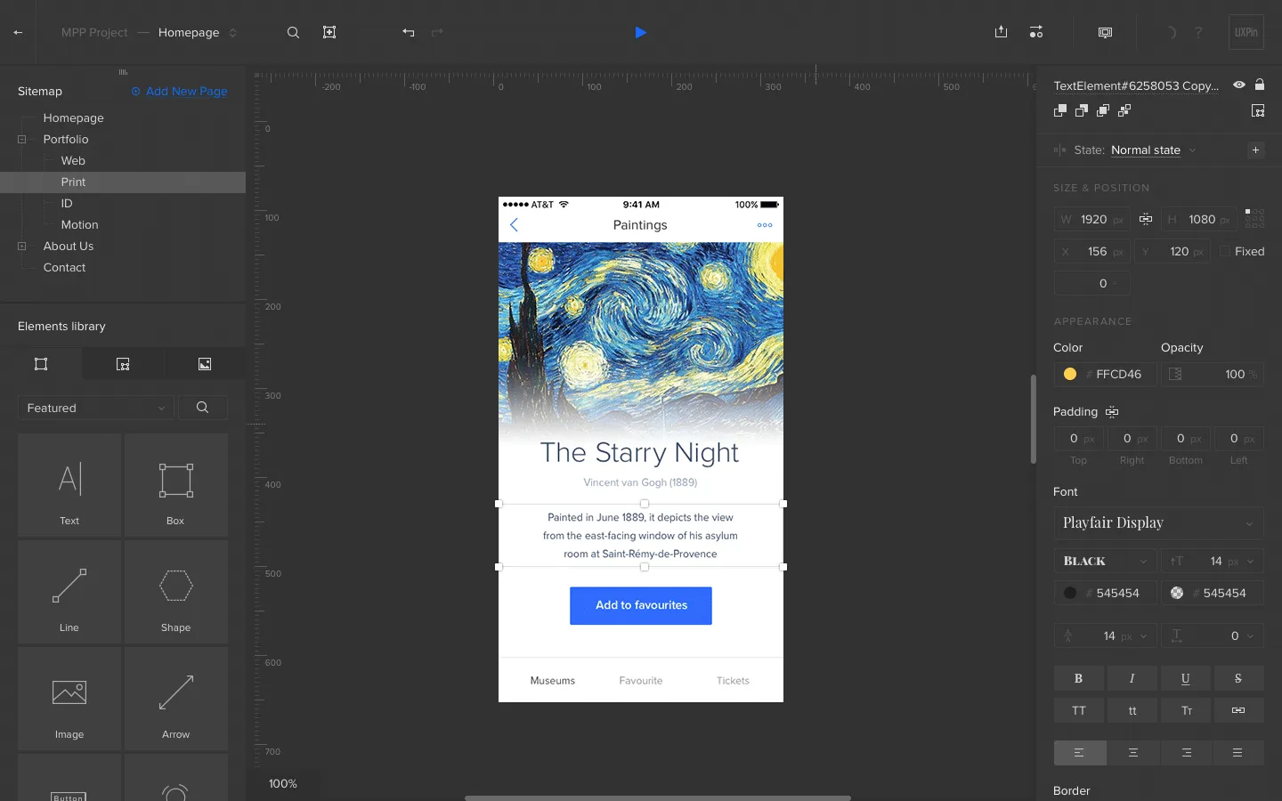
An early concept built of the revamped editor, built in UXPin.
And like with our design principles, we categorized our usability goals. We knew there were a few things that we need qualitative data on:
- The new canvas. We were making significant changes to the new canvas. We needed to know if it would distract users, turn them off or hinder their work in any way.
- The left/right tool bars. We needed to know if these were in the way as well. Or whether users found them helpful or not. Did they understand what the tool bars were for?
- The functionality. Would people know how to use the new interface in the same way as the old one?
One of our biggest changes in the new UXPin was the removal of the contextual menu, which is displayed next to the selected elements. In the past, many people experienced difficulty with this component. We needed to test to see if users would be okay if we removed the menu.
While somewhat difficult at first, we found that people were more attuned to having elemental options to the right bar, partially because of its similarity to other design tools.
User researcher Ben Kim testing our redesigned interface with designer Jessica Tiao of Kissmetrics.
Another key finding was the total lack of understanding of icons residing in the top bar. While some, such as search, are universal, most of the icons we employed clearly needed labeling. During our early iterations of the redesigned UXPin, labels to icons were quickly added for the usability of users.
Labeled icons in the dropdown, prototype built in UXPin.
Closed beta
But you don’t just test early on. As we outlined in the Guide to Usability Testing, as a product gets into later stages of development, you have to launch it to a small, select group of testers. Call it a private release, or you can call it by the common name — a closed beta.
We put together an MVP to get in front of a small group of 50 accounts — hand-picked to participate. Right away, we got feedback on some small usability issues that we quickly ironed out.
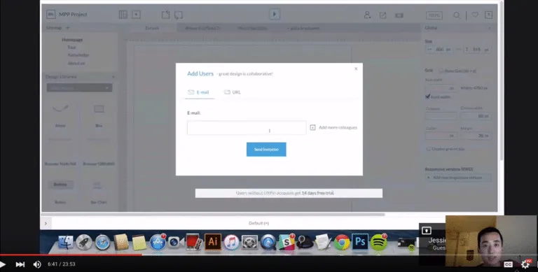
We used Slack to talk with our beta users.
One thing that give us issues right away was our left-right bar menu. It took up too much real estate on the canvas. Based on feedback, we decided to change it up. Instead of a persistent menu, we added a feature that allowed the user to choose which menu to show, as well as a hover-show function.
More importantly, with a closed beta you’ll learn things that you’ll never be able to learn with a mockup or prototype. For example, users loved the dark version of our new UI in the mockup. But when it came to actually using it, we discovered it was hard to navigate at the smallest level of detail. We realized we’d gone a bit too far in trying to make the design too visually appealing.
The lesson: usability shouldn’t be sacrificed for visuals. With that lesson, we lightened up the dark version so that it was easier to navigate. And that’s something we wouldn’t have learned had we not let a small group of users play with the redesign.
Open Beta
Slowly but surely, we went from 50 accounts to 500 to 2,000, transitioning ourselves into an open beta.
With open beta, we wanted to gather quantitative data — looking more at hard numbers. For instance, we found our conversions to be lower at first because of some unexpected issues with e-mail onboarding, which we corrected.
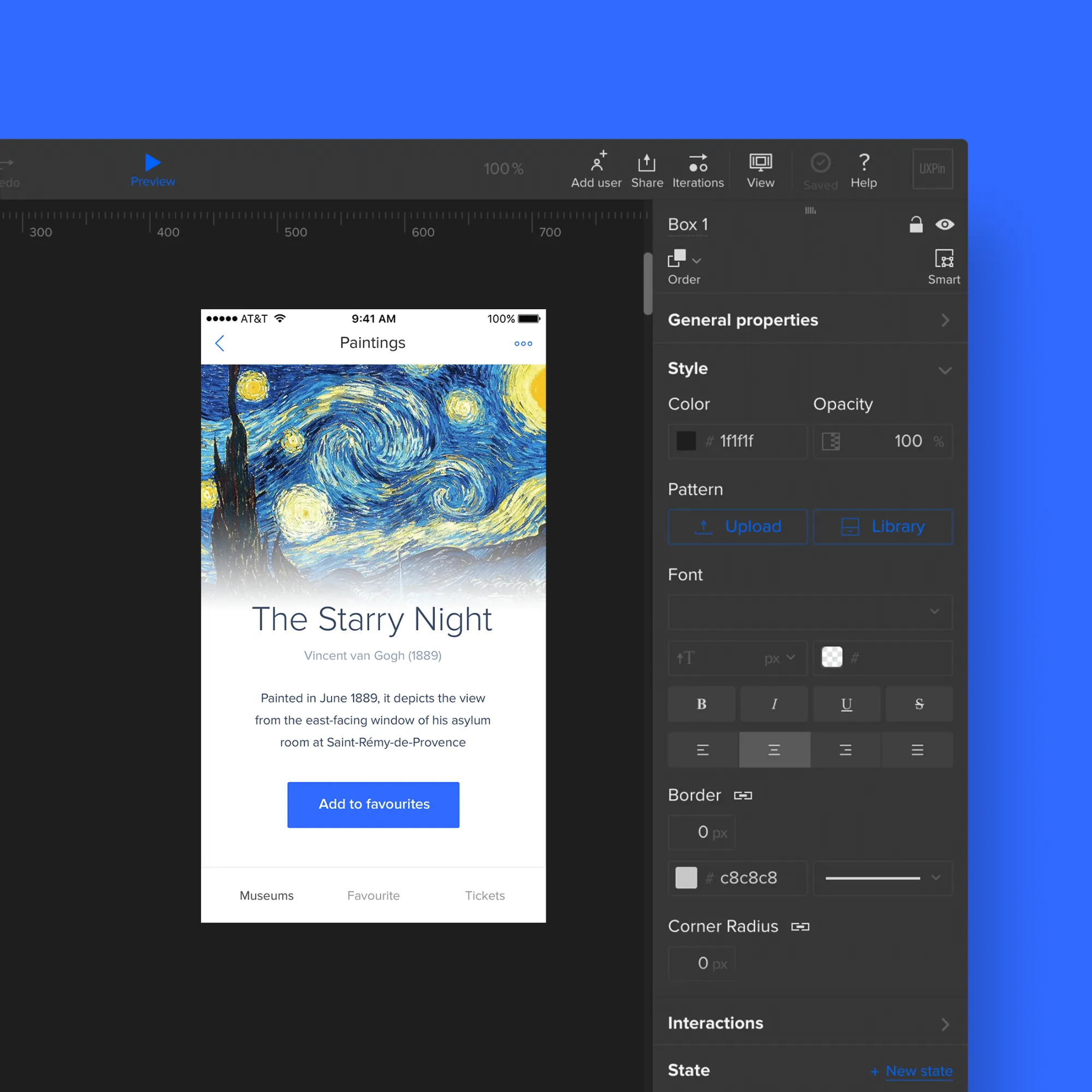
Our new UI also comes in a light version.
We also started to quantify the user experience as well by paying close attention to bugs and requests. Using three categories — user pain, strategic value and cost — were able to set objective priorities around those issues. With this, we attacked the most painful issues first.
And that led to us adding labels to icons, changing inputs for radius and dozens of other improvements.
Throughout the whole beta phase, we did sentimental analysis to check the number of positive and negative mentions. Think of it as a happiness check-in.
Open beta is a great period to learn more about the redesign. What works. What doesn’t. And whether people will respond will to what you’ve built. It’s also a crucial time that can’t be skipped. If you do, you risk putting out a product that isn’t viable for a large group of customers.
Conclusion
Using your own product, you learn what is working and what is not working. It gives you a good baseline. But you have to take it further. You have to talk to your customers to give you additional perspective. You’ll learn even more.
That combined with data will allow you to tackle a redesign on your own product.
As for us, we’re not done yet. Soon we’ll release a new version of our dashboard, and we have a few other projects in the works. So stay tuned!

