Material UI Design Library in UXPin

Designing for Android?

Use the free Material UI kit built straight into a design tool. Utilize high-quality elements with interactions. Easily resize to any screen.

Start using in UXPin now Available on Windows, Mac and in a browser.

Design UI and prototype in one place

Material UI Design Library is the ultimate collection of UI elements for you to create Android and web apps. Combining the power of UXPin, with the simplicity and beauty of Material UI, you will achieve amazing results in line with Google guidelines.

Design UI and prototype

Complete Material Design library

Detailed, beautiful, high fidelity elements that are neatly organized into cards, navigation, buttons, banners and more.

Interactive, resizeable components

Interface components that are easy to resize and adjust for specific screen sizes. All elements come as symbols with fully editable layers that you can easily adapt to your project. Use interactions built-in buttons, switcher, or navigation elements to quickly make clickable prototypes.

Material color palette

Use built-in color swatches to create your own Material Design color theme. Define your palette once and keep full consistency across all screens of your Android app or web prototype.

Defined typography styles

UXPin’s Material Design kit includes all text styles based on the Roboto font. You can apply defined styles that reflect the font’s size, weight, and letter-case.

Text Styles

Icons library

Take advantage of a comprehensive collection of Material Design icons. Simply drag and drop them from UXPin’s integrated library and use them in your project.

Icons

Get started with UXPin now

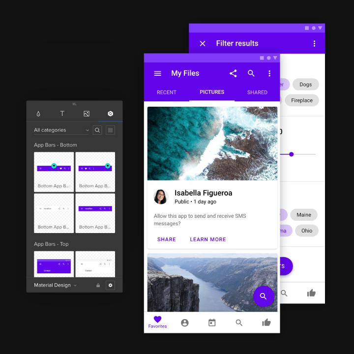
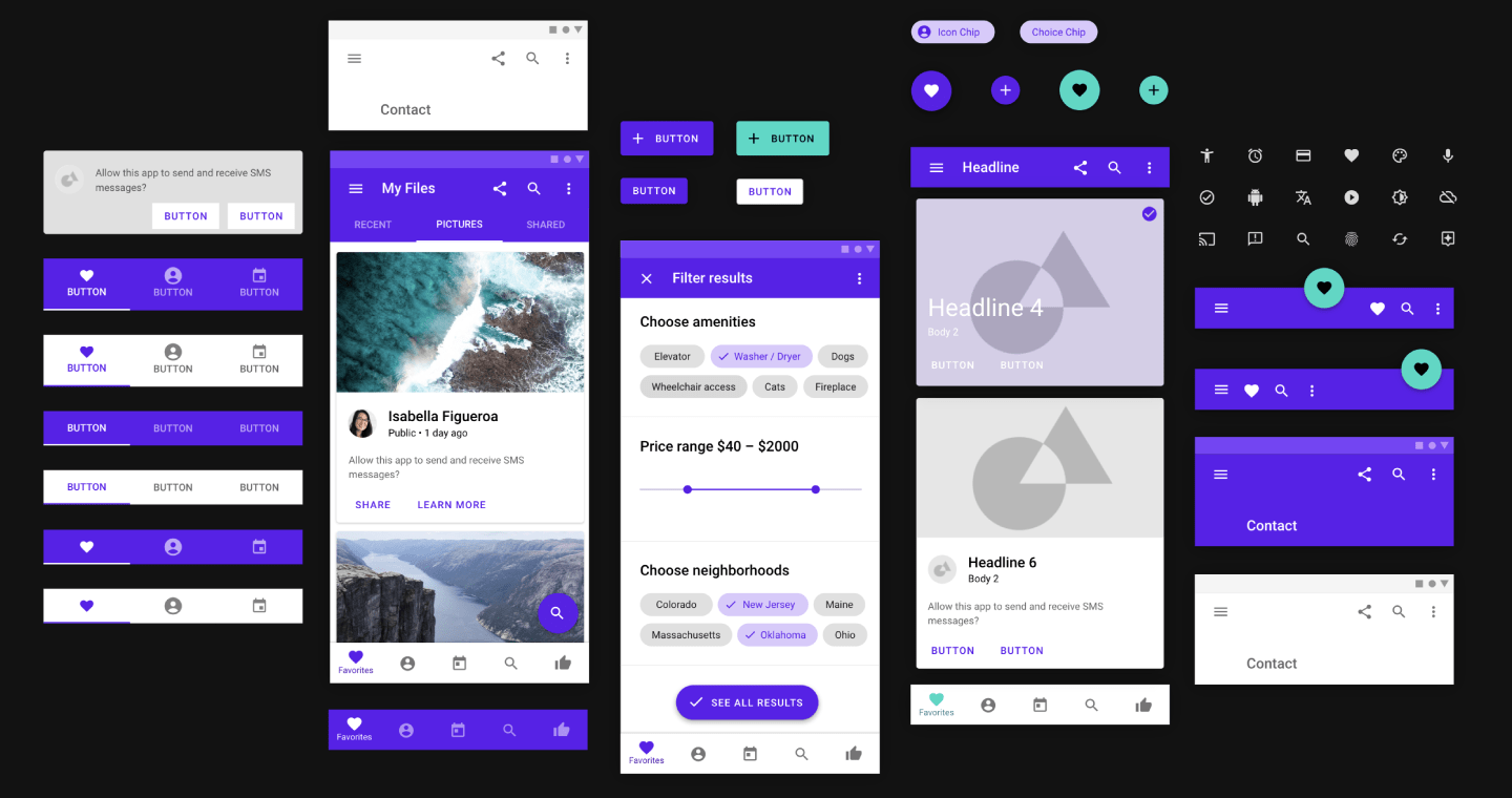
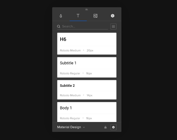
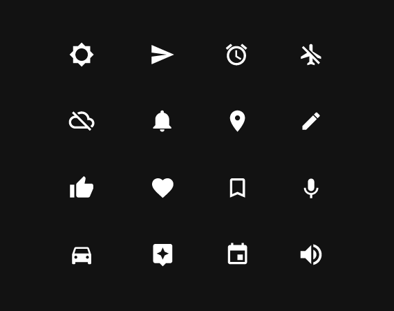
Design for Android quickly and efficiently with built-in Material Design UI kit.

Start using in UXPin now Available on Windows, Mac and in a browser.