Building a component library solves two major problems for product teams: speeding up development and ensuring consistent user experiences. Instead of recreating the same UI elements repeatedly, a centralized library provides reusable, pre-built components that streamline workflows and reduce errors. This approach eliminates inconsistencies, saves time, and simplifies maintenance.
TechFlow Solutions, a fintech company, faced challenges like inconsistent UI elements, redundant development efforts, and inefficient workflows. By creating a centralized component library, they achieved:
- Faster development: Pre-built components replaced repetitive coding tasks, boosting delivery timelines.
- Consistent design: A single source of truth ensured uniform styling and behavior across products.
- Stronger collaboration: Designers and developers worked more efficiently with shared resources and clear guidelines.
- Reduced maintenance: Updates applied to the library automatically propagated across all products.
The process wasn’t without challenges, including aligning distributed teams, integrating with legacy systems, and creating thorough documentation. However, solutions like a design audit, a central repository, and tools like UXPin helped overcome these obstacles. The result? Improved workflows, better user experiences, and a scalable system for future growth.
Key Takeaways:
- Perform a design audit to identify inconsistencies and prioritize updates.
- Create a centralized hub with production-ready components and clear documentation.
- Use tools like UXPin for prototyping and collaboration to streamline design-to-development workflows.
- Regularly update and refine the library to maintain its effectiveness.
Why it matters: A well-organized component library is a game-changer for teams managing multiple products, reducing inefficiencies, and ensuring a polished, consistent user experience.
Case sudy: Lucentum, creating our own React component library – FLAVIO CORPA
Project Background and Goals
TechFlow Solutions, a fintech company based in Austin, Texas, found itself at a pivotal moment in its growth. Transitioning from a startup to a multi-product organization, the company managed a portfolio that included web platforms, mobile apps, admin dashboards, and customer microsites. However, as each product evolved independently, challenges began to emerge, affecting both team efficiency and the overall user experience.
During a quarterly design review, the Head of Design noticed a troubling trend: multiple versions of common UI elements – like buttons – were being used across products, despite the brand guidelines specifying a limited set of styles. This inconsistency extended to forms, navigation menus, and data visualization components.
Meanwhile, the engineering team faced its own frustrations. Code reviews regularly stalled as developers debated the implementation of components that should have been standardized. A significant amount of development time was spent recreating UI elements that already existed elsewhere in the codebase.
Identifying the Problems
An internal audit shed light on the scope of these issues. While the design inconsistencies were the most obvious problem, they were just the tip of the iceberg. User feedback and support data revealed that these inconsistencies were negatively impacting the overall experience.
Teams across the company were building their own versions of common components. This meant bug fixes and accessibility updates had to be applied multiple times across different codebases, increasing the workload and the likelihood of errors.
The design-to-development process was another pain point. Designers often created detailed specs for components that already existed, leading developers to rebuild elements from scratch instead of reusing existing code. This redundancy slowed down production and wasted valuable resources.
New team members also struggled to navigate the disconnect between the documented design system and the actual products. Without a clear source of truth, it was difficult to determine which components to use, perpetuating the cycle of inconsistency. As a result, product development slowed, and the company found it increasingly difficult to stay competitive in the fast-moving fintech sector.
Defining Project Goals
To address these challenges, TechFlow formed a cross-functional team and set clear, actionable goals to guide the initiative.
The primary objective was to establish a single source of truth for all UI components across TechFlow’s products. The team envisioned a comprehensive component library that would include everything from visual designs to production-ready code, along with detailed documentation and usage guidelines. This would allow any team member to quickly find, understand, and implement the correct component.
Another critical goal was improving the design-to-development workflow. By ensuring that every component in the library had a corresponding, ready-to-use coded version, the team aimed to significantly reduce the time it took to move from design to implementation – a recurring bottleneck identified in earlier reviews.
Scalability was also a major focus. With plans for future product expansion, the team needed a component ecosystem that could grow seamlessly while maintaining consistency with existing design patterns.
Accessibility was another cornerstone of the project. Every component would be built to meet established accessibility standards, including proper keyboard navigation, screen reader compatibility, and appropriate color contrast ratios. This approach ensured that accessibility wasn’t an afterthought but an integral part of the product experience.
Finally, the team set measurable quality metrics to track the initiative’s success. These included reducing customer inquiries related to UI issues and improving development efficiency. A detailed timeline and dedicated resources were allocated for auditing, component creation, and implementation. Governance processes, such as a component review board, were also put in place to ensure the library remained effective and up-to-date as the company continued to evolve.
Challenges in Building a Component Library
During the development of the component library, the team faced several obstacles that highlighted the complexities of creating a unified system.
Maintaining Consistency Across Teams
One of the biggest hurdles was ensuring consistency across geographically dispersed teams. With team members spread across different regions and time zones, aligning on design guidelines became a significant challenge. Each team had its own methods for implementing common components, which led to visual and functional inconsistencies. Communication delays and fragmented updates only made the situation worse. The issue was further amplified during rapid onboarding, as new team members often adopted inconsistent practices due to the lack of a centralized standard. These challenges underscored the importance of establishing a single source of truth for design components.
Integrating with Existing Tools and Workflows
Bringing the new component library into TechFlow’s established development environment wasn’t straightforward. Legacy systems and a mix of technology stacks created compatibility issues. Components had to work seamlessly across various platforms, which required creating compatibility layers and tweaking build processes to address conflicts between old code and the new component styles. Additionally, aligning the diverse workflows of different teams required retraining and standardizing processes, adding another layer of complexity.
Creating Documentation and Discoverability
Even after the components were built, locating and using them effectively posed a challenge due to incomplete documentation. As components evolved, the documentation often lagged behind, causing confusion and leading to duplicated efforts. The lack of clear visual examples and limited access to centralized resources made it harder for designers, developers, and product managers to collaborate effectively. Without proper guidance, the full potential of the library remained untapped.
These hurdles laid the groundwork for the innovative solutions discussed in the next section.
Solutions and Implementation Methods
To tackle the challenges mentioned earlier, TechFlow’s team took a structured approach by setting up clear processes, centralizing resources, and using key tools to drive meaningful results. The first step? Evaluating the current state of their UI components.
Running a Design Audit
Fixing inconsistencies started with a thorough audit of all design elements used across products and platforms. This audit cataloged every UI component to uncover discrepancies. For instance, the team found multiple button styles performing the same function but differing in design, spacing, and interaction patterns. They also identified "orphaned components" – outdated elements no longer in use but still lingering in style guides and code repositories.
This review provided clarity on which components to standardize, refine, or retire. It also helped the team prioritize updates based on how much they would improve overall consistency.
Creating a Central Component Hub
With the audit complete, TechFlow built a centralized repository to serve as the single source of truth for all design components. This hub was crafted to be user-friendly and accessible to designers, developers, and product managers – regardless of their time zone or technical expertise.
The repository was designed using tools that paired each component with its production-ready code. Every element came with detailed specifications, including spacing, color values, typography, and interaction states.
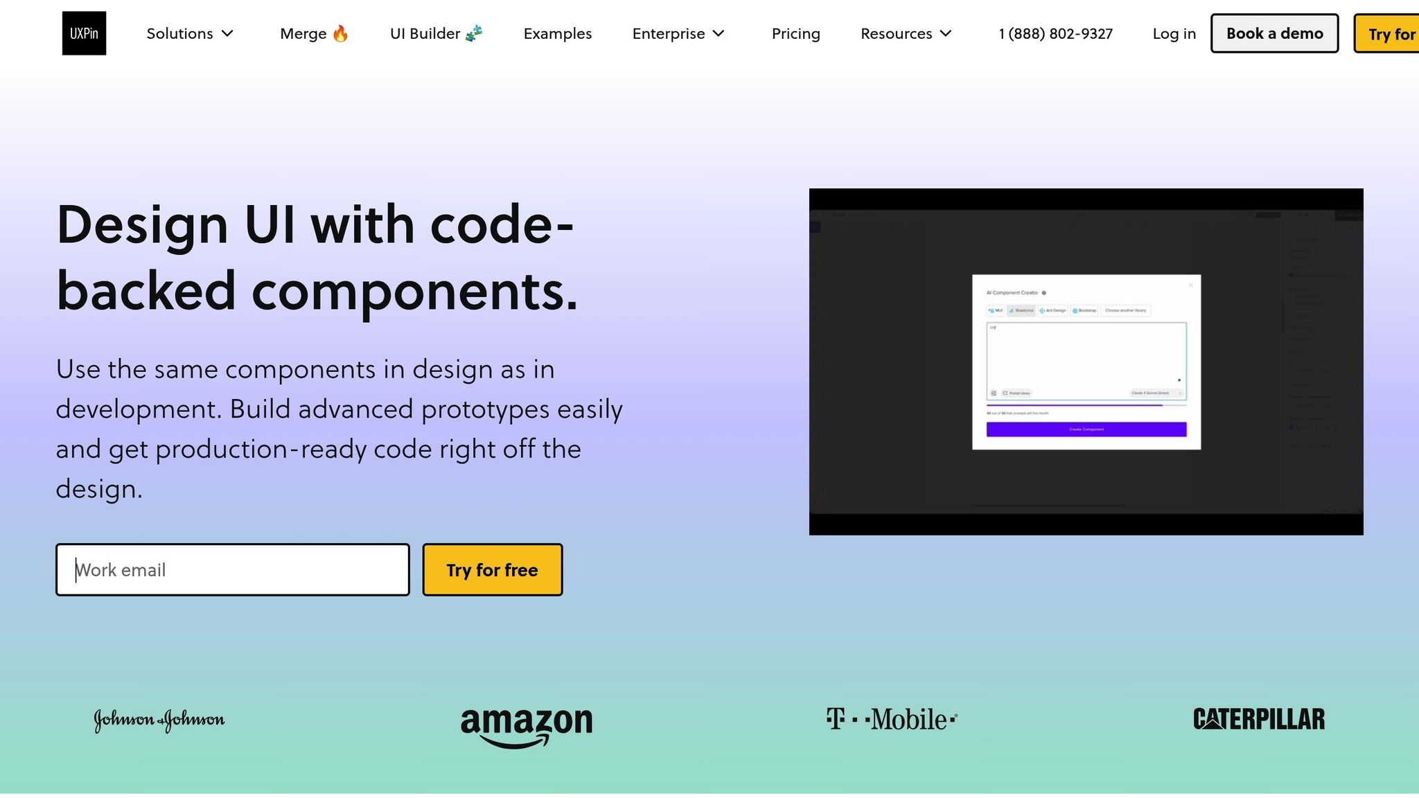
UXPin played a key role in this effort, offering a platform where the team could create interactive, code-backed prototypes with their standardized components. Once the repository was live, the focus shifted to ensuring consistent component behavior and usage.
Setting Component Standards and Guidelines
After organizing components into a central hub, the team established clear guidelines to ensure long-term consistency. These guidelines outlined naming conventions, usage patterns, accessibility requirements, and responsive behaviors.
For example, buttons were categorized into groups like "Primary-Large" or "Secondary-Medium" to clarify their specific use cases. This systematic approach extended to all components, creating predictable patterns that were easy for new team members to grasp.
Accessibility was a top priority, with all components meeting WCAG 2.1 AA standards. This included defined states for keyboard navigation, screen reader compatibility, and sufficient color contrast. Addressing these needs upfront saved time and costs by avoiding retroactive fixes later.
Using UXPin for Prototyping and Collaboration
UXPin’s code-backed prototyping changed how TechFlow’s designers and developers worked together. Instead of relying on static mockups, designers created prototypes that behaved like the final product.
The platform’s real-time collaboration tools allowed team members across different time zones to review and refine designs without delays. Developers could inspect the underlying code, while designers could see how their work translated into functional components.
UXPin also supported advanced interaction prototyping, enabling the team to simulate complex behaviors like multi-step forms, dynamic data loading, and responsive layouts. This helped identify potential issues early, well before development began, saving both time and effort.
sbb-itb-f6354c6
Results and Lessons Learned
TechFlow’s component library project brought noticeable improvements in development speed, team collaboration, and product delivery timelines. These achievements highlight the value of streamlining processes and fostering teamwork while maintaining a focus on ongoing refinement.
Improved Workflow Efficiency
The project drastically cut down development time. Tasks that used to demand significant effort – like crafting consistent form layouts or managing various button states – became much quicker thanks to the availability of pre-built components. Design handoffs also became more seamless, reducing friction between teams.
Additionally, reusing standardized interface elements not only saved time but also ensured a consistent user experience. This uniformity made it easier to roll out new features without compromising quality.
Better Team Collaboration
The component library strengthened communication between designers and developers throughout the development cycle. Comprehensive documentation and interactive prototypes, created using UXPin, helped resolve routine questions quickly, cutting down the need for lengthy cross-team meetings.
Sarah Chen, TechFlow’s Lead Designer, noted, "The standardized naming conventions established by the component library fostered a shared vocabulary that minimized confusion during discussions."
Having clear, consistent terminology allowed team members – regardless of their role – to easily understand design elements and expectations. This improvement streamlined code reviews and made onboarding new team members smoother. Even remote collaborators benefited from having a centralized and reliable resource to reference.
Continuous Improvement for Long-Term Success
From its initial launch, the component library proved to be a dynamic tool requiring ongoing care. TechFlow quickly realized that to maintain its value, the library needed regular updates and responsiveness to team feedback. Structured review sessions became a key part of this process, providing an opportunity to discuss adjustments for existing components, address underused elements, and brainstorm ideas for new additions.
To guide these updates, the team relied on usage analytics and a built-in feedback system to identify which components were most effective and where improvements were needed. Robust version control practices and detailed migration guides ensured that updates could be implemented without disrupting ongoing projects. By treating the component library as a living product, TechFlow has created a foundation that continues to evolve alongside its product ecosystem.
Best Practices for Component Libraries
When it comes to creating a component library, clarity, accessibility, and maintenance are key to ensuring it remains a valuable resource. These best practices can help maximize component reuse and keep teams aligned.
Use Clear Naming Conventions
Good naming conventions are the backbone of an effective component library. Poorly chosen names can lead to confusion, slow down development, and cause redundant work when teams struggle to locate existing components. Think of naming conventions as the "common language" that bridges the gap between designers and developers.
To keep things consistent, use the same conceptual name across platforms, with formatting tailored to each. For instance, a "Quick Actions" component might be called QuickActions in React, quick-actions in CSS, or quickActions in JavaScript – but the base name remains the same.
Avoid assigning multiple names to the same component. Sticking to a single term, like "Quick Actions", across all libraries makes collaboration smoother and components easier to find. Prefixes can also help. For example, naming a button myDSButton can distinguish it as part of your design system, especially when migrating or integrating with older libraries.
When it comes to design tokens, clarity is equally important. Instead of vague names like primary or default for colors, use names that reflect their purpose and context. A layered naming approach – starting with a base value and adding numeric increments for tints and shades – can simplify communication and make the system easier to maintain.
Clear naming is just the start. To truly empower teams, you’ll need strong documentation.
Create Complete Documentation
Documentation is what transforms a component library from a mere collection of code into a fully realized design system. Without proper guidance, even the best components can become obstacles.
A strong Design API is essential. It should detail every component variation, including options, booleans, enumerations, combinations, mutual exclusions, and defaults. This ensures consistent implementation across platforms and reduces ambiguity. Adding visual examples, practical code snippets, and clear usage guidelines further enhances understanding and helps teams maintain consistency.
Organizing your documentation for easy searchability is equally important. Whether you structure it by function, visual hierarchy, or stages of the user journey, the goal is to make information quick to find. A dual focus – providing technical details for developers and design specifications for creative teams – makes the library a collaborative tool that benefits everyone involved.
Conclusion: Building for the Future
Creating a component library lays a solid groundwork for scaling teams and products. It’s an investment that pays off in the long run, offering both efficiency and consistency.
Key Takeaways for Teams
From analyzing successful component libraries, three key elements stand out: thorough preparation, centralized organization, and ongoing maintenance.
A detailed design audit sets the stage for consistency. By tackling this upfront, teams can avoid technical debt and ensure the library addresses actual needs instead of introducing unnecessary complications.
Centralizing components establishes a single source of truth. When teams know exactly where to find what they need, development speeds up, and consistency becomes second nature. However, centralization works best when paired with clear standards and guidelines. These help teams understand not just what components exist but also when and how to use them effectively.
Documentation is the linchpin of any reusable component library. Teams that prioritize clear naming conventions, visual examples, and practical usage guidelines experience higher adoption rates and fewer questions. This upfront effort reduces time spent on explanations and troubleshooting.
Finally, regular reviews and updates keep the library relevant. Neglecting components can slow progress, so fostering a culture of continuous improvement is crucial for long-term success.
These insights highlight the importance of structured, ongoing component management in scaling design systems efficiently.
How UXPin Supports Component Management
Having the right tools can elevate the process significantly. Modern component libraries thrive on tools that seamlessly bridge design and development. UXPin stands out with its code-backed prototyping capabilities, enabling teams to work directly with React components instead of static mockups. This ensures prototypes mirror the final product with precision.
UXPin also includes built-in libraries for MUI, Tailwind UI, and Ant Design, offering ready-to-use components that teams can customize and expand.
With features like the AI Component Creator, integration with tools like Storybook and npm, and real-time collaboration, UXPin streamlines development and keeps design in sync with production. Updates are instantly visible, cutting down on communication delays.
For teams scaling their design systems, UXPin’s enterprise features – such as enhanced security, version control, and advanced integrations – provide the necessary support for large organizations. By focusing on code-backed design, UXPin eliminates the traditional handoff friction between designers and developers, ensuring component libraries transition seamlessly into production code.
FAQs
What are the main steps to create a centralized component library, and how can it boost team productivity?
Building a centralized component library requires a few important steps. Start by auditing your current design elements to identify what can be reused. Next, document these reusable patterns clearly, ensuring they’re easy to understand and implement. Then, organize your components in a logical structure so they’re accessible and intuitive to use. Finally, focus on designing small, reusable components with clear, meaningful names and detailed documentation to guide their usage.
When done right, this process can bring consistency to your projects, cut down on repetitive tasks, and improve collaboration between designers and developers. A well-organized component library doesn’t just save time – it also boosts the quality and efficiency of your product development workflow.
How can TechFlow Solutions keep their component library effective as the company grows and evolves?
To keep their component library running smoothly, TechFlow Solutions should focus on frequent updates and upkeep to meet changing design and development requirements. Setting up a clear governance model is key to maintaining consistency and scalability, while encouraging collaboration between designers and developers helps keep ideas fresh and aligned with project goals.
Equally important is having detailed documentation and using version control. These steps make workflows more efficient and ensure that every team member can easily find and use the library. Regularly revisiting and improving components ensures they stay useful and flexible as the company continues to evolve.
How does UXPin help with creating and managing a component library while improving collaboration between designers and developers?
UXPin makes it easier to create and manage a component library by providing a single platform where you can build, store, and reuse UI components. This approach helps maintain both visual and functional consistency across projects while cutting down on time and effort.
Key features like code-backed components, shared design systems, and real-time collaboration tools allow UXPin to connect designers and developers seamlessly. By creating a shared design language, it simplifies handoffs, minimizes miscommunication, and speeds up development cycles, resulting in a smoother, more unified workflow.

