Building a Component Library – A Step-by-Step Guide
Whether you’re creating a design system from scratch or want better front-end development cohesion and consistency, building a component library is an excellent way to improve your product’s user experience.
A component library will save you significant time in the long run, but it will require a lot of resources and attention to detail to build from scratch. Engineers must consider the product’s current priorities and future possibilities to ensure the component library is scalable.
With UXPin Merge, you can create fully functional prototypes with the UI elements that come from your component library that preserves its functionality when imported into the design editor. Share a single source of truth across design and development. Visit our Merge page for more details and request access.

Table of contents
Component libraries help unify code for improved front-end cohesion and consistency. It also minimizes how much code developers must write to release new products and features.
Most engineers decide to build a component library because they recognize one of several common problems:
- UI inconsistencies–multiple variations of the same component
- Programming syntax and markup inconsistencies–different ways of writing and structuring code
- Ever-increasing front-end debt–backlog of programming bugs and fixes
- Missed deadlines due to redundant programming and workflows
A component library aims to solve or reduce these issues while providing engineering teams with a scalable front-end framework.
Step 1. Create Interface Inventory
An interface inventory or UI audit is a crucial first step. Audits often uncover many UI and programming inconsistencies engineers must address before building a component library. Sometimes these inconsistencies are subtle, like two slightly different HEX codes, while others are more obvious, like multiple button variants (various sizes, shapes, colors, CTAs, etc.)

Design systems expert Brad Frost recommends screenshotting every user interface and cutting out each component. It’s a tedious, time-consuming but essential task to take stock. It’s important to do this inside the actual product rather than relying on project files because it’ll tell you exactly what customers see and expose any errors/inconsistencies.
Sort your components into categories to see what you’re working with. These categories will also form the foundation for your component library.
If you need help sorting your component types, consider copying Google’s Material Design or Apple’s Human Interface Guidelines. Alternatively, you can use Atomic Design to organize UI elements.
An interface inventory is also an excellent resource for advocating your component library to stakeholders. Showing these inconsistencies is often the best way to demonstrate the scale of the problem and the necessity to allocate resources for a component library.
Step 2. Select Tools and Framework
Once you know what to build, you must decide how to build it. If you’re using a Javascript framework (React, Angular, Vue, etc.), we recommend using Storybook to develop and manage individual components.
Storybook allows engineers to build and test components in isolation. You can also create documentation, set up development workflows, and collaborate with engineers and stakeholders.
Syncing design and development
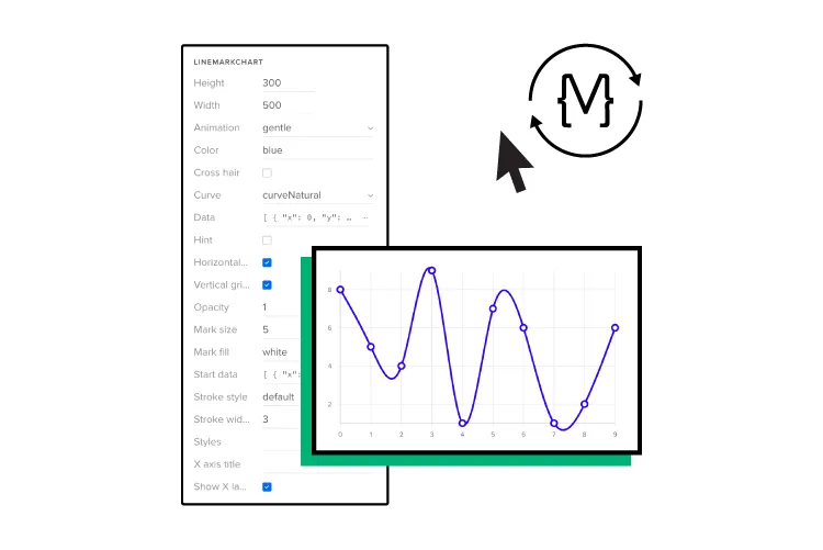
The added benefit of Storybook is that it syncs with UXPin Merge–technology for component-driven prototyping. So, once your component library is complete, you can connect it to UXPin so design teams can build fully functioning prototypes.
Merge isn’t only for UX designers. TeamPassword doesn’t have a design team, so the engineering team (of two) must prototype and test user interfaces. TeamPassword used to do this by writing code but wanted a faster method for prototyping and testing.
TeamPassword syncs its custom MUI component library to UXPin using Merge technology, where they build and test prototypes.
“The process of taking the finished design and developing it into a product got way faster, too. It is so rapid to export the prototype with all the specification and production-ready code. The time that the team normally had to spend on writing front-end code is saved.”
Step 3. Get Components
With your list of components and corresponding categories from the interface audit, it’s time to develop your component library–but where do you start?
Here are some techniques for building a component library from scratch. We’ve also included some technical resources for developing your library in Storybook.
We recommend following Brad Frost’s Atomic Design methodology to develop components from the ground up. This method will create a modular system to build new patterns and scale your component library.
Atoms
Atoms are components you cannot break down further. They’re also the building blocks or dependencies for the rest of your component library. Atoms include:
- Labels
- Input fields
- Buttons
- Color palettes
- Fonts
- Icons
- Animations
- Design tokens
Molecules
Multiple atoms combine to construct molecules–the individual UI components users interact with, including forms, tabs, accordions, etc. For example, a search component = label + text field + button.
Organisms
Organisms are UI patterns that combine two or more molecules. A navigation bar is a common organism example:
- Logo (molecule)
- Navigational links (molecule)
- Search bar (molecule)
Templates
Templates feature multiple organisms and molecules to make a complete user interface. These templates help eliminate redundant workflows to deliver products faster. Some examples include:
- Admin UIs
- Enterprise dashboard
- Product news feed
- eCommerce shopping cart
Design tokens
Design tokens are vital for building scalable cross-platform component libraries. These tokens contain UI data, including colors, spacing, typography, assets, animations, etc., to style UI components.
A single token contains properties formatted for each platform. For example, Android, iOS, and web browsers use different measurement units:
- Websites and web applications (pixels/em/rem): 1 pixel
- Android (dp density-independent pixels/dips): 1 pixel = 1dp
- iOS (points): 1 pixel = 0.75pt
Engineers can program a token to accommodate each unit of measurement to ensure consistency across every operating system.
Design tokens also make updates much more straightforward. Instead of modifying multiple files, engineers update the token to make cross-platform changes.
Creating design tokens from the start reduces redundant work while building your component library while future-proofing your code.
Remember documentation!
The most common recommendation from people who have built component libraries from scratch is documentation! Your component library’s docs make collaboration easier by informing other engineers how to develop and maintain components.
You should document every component as you complete it while it’s fresh in your memory. Additionally, you should document every change.
Mikael Sukoinen from Vaadin recommends documenting each component as follows:
- Overview: component name and description
- Instructions: how to install and use the component
- Visual examples: demonstrating a use case for the component
- Code samples: how to use the component’s API

Your documentation must also include:
- HTML, CSS, and Javascript guidelines
- Testing components
- Instructions for props for React components (or Args in Storybook)
- Versioning
- How to collaborate and share work (project management tools like Jira, Trello, Notion, etc.)
Building a component library in Storybook
Here are some technical guides for building a component library:
- How To Build JS Components with Storybook
- Build a React Native component library with Storybook
- How to Build a Component Library with Angular and Storybook
- Building a Component Library with React and Storybook
- Build a Component Library with Storybook (step-by-step tutorial)
- Atomic Design Systems: A Checklist for Each Individual Design Component
- Storybook Best Practices That Will Improve Your Product Development Process
- Storybook Frameworks You Can Use to Build Component Libraries
Leverage Open-Source Component Libraries to Build Faster
Open-source component libraries provide a foundation to build a component library fast. Engineers also benefit from a scalable syntax–a process requiring many hours of friction and debate among developers.
Customization is the most important thing to consider when choosing an open-source component library. Make sure the library is themeable, preferably through design tokens. You also want something that’s regularly maintained with comprehensive documentation.
While open-source component libraries are themeable, there are limits to how much customization you can do to get a unique aesthetic. You’re also constrained by the library’s syntax and design language, so do your research before making a final decision.
Prototyping and Testing in UXPin With Merge Technology
Storybook is an excellent tool for building your components in isolation and testing them internally–but what about user testing? Unfortunately, Storybook has limitations regarding usability testing in browsers or mobile devices.
Yes, you can build a prototype with code, but making changes and iterating is time-consuming.
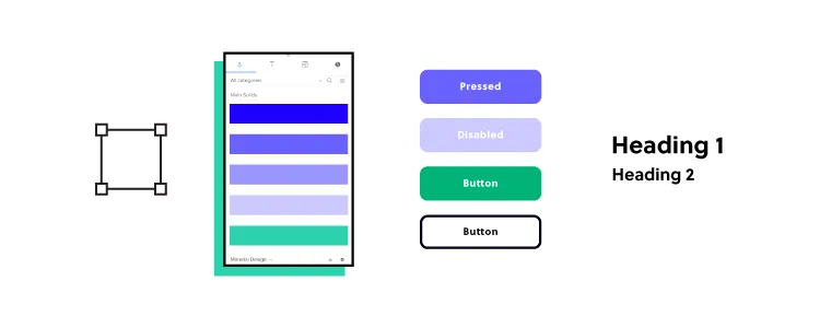
Merge allows you to import your component library from a repository to UXPin’s design editor so you can build prototypes to test your new component library. Merge creates a drag-and-drop prototyping environment, eliminating the steep learning curve required for traditional design tools.
This prototyping workflow has worked for tech giant PayPal and a startup of five, TeamPassword. Interestingly, both organizations switched to Merge due to UX scalability challenges. PayPal and TeamPassword have teams with little or no design experience completing UX tasks like prototyping and testing using Merge.
PayPal had five UX designers to over 1,000 engineers servicing more than 60 products. After switching to UXPin Merge, PayPal’s product teams (who had no previous design tool experience) complete 90% of design projects 8X faster than experienced UX designers could using image-based tools.
As a cash-strapped startup, TeamPassword doesn’t have the resources for a UX team but understands the importance of user experience to be competitive. Merge gives TeamPassword’s two-person engineering team a platform to prototype and test user interfaces with end-users–filling the UX designer void. Like PayPal, TeamPassword delivers products and features faster with Merge.
Building a component library requires significant resources. Often engineers don’t have access to a UX team or the knowledge to create and test components using a design tool. UXPin Merge bridges the gap between design and development, so designers and engineers speak the same language.
UXPin Merge empowers designers to build superior prototypes and solve more problems during design projects, but it also empowers engineers to prototype and test in situations where they don’t have UX resources.
Build your component library with Storybook and UXPin Merge. Visit Merge page for more details and how to request access.


