The Subtle Detail That Gives A Design Its Entire Personality

empathy in design

What’s the biggest difference between your designs and a $20 template?

Companies ask themselves this every time they enter the market. With the widespread advertising from website builder tools, it’s an entirely rational question to ask.

What do you have that they don’t? Turns out, there’s one subtle detail that gives design its entire personality… that extra “oomph” that no template or builder could ever hope to provide.

In this post we’ll unpack what that subtle detail is, and why it matters so much. This will help us to better appreciate the skills offered by designers and give us language to articulate this value.

Let’s go on a little journey through how successful websites are designed:

1. Reading the story

The design process starts with the copy being written and handed to the designer. This copy contains the story. As designers, it is our duty to bring it to life by giving it a visual form.

It’s essential we understand the value of the story being told before we begin.

This is why we read with the mindset of a designer. We engage our mind’s eye to seek out the narrative, the journey, and the key messages. The narrative is the thread that runs through the text and ties the events together. The journey is layered on top of and responds to the narrative. It can be emotional or factual. The key messages are the most important points in the narrative or the journey that we can take from the copy.

Identifying these elements is imperative to understanding why this page exists and what is happening in the overall story.

At this stage, we only have words on a page. There are no visuals, no fonts, or anything else. The visual story will come later.

elements of the design

Photo by Jelleke Vanooteghem on Unsplash

For now, we should:

  • Focus on the words. That is to say that we shouldn’t get too far ahead of ourselves and begin imagining what the design may look like, yet. The temptation may be there but resist it till the next stage. For the time being, we’ll give our all to studying the words and their meaning.
  • Embrace and experience the story from a designer’s perspective. Designers have a special ability to feel what a story is telling us. This is what separates quality designers from the rest of the pack. Use this ability to see beyond the words and understand the story and its constituent parts.
  • Use your intuition to delve into the details. As you read, think through what’s being said underneath the words. What isn’t written, but shows through in the copy anyhow? What has the writer hinted at without saying explicitly?

2. Asking “What did I just see?”

After a thorough read through, it’s time to dig deeper into the story. This can be done by asking questions like:

  • What big feelings did the copy leave me with?
  • What did I see with my mind’s eye?
  • What texture did the story have?
  • Were some sections of the story particularly dramatic?
  • Did any patterns or colors come to mind?

This step seems abstract at first, but building an initial rich mental picture of the story is key to the success of the final design. After all, it’s our responsibility as designers to bring that story to life.

The best designers do this. They’re able to say “look at this” rather than “look at me”. How? They’re adept at creating a very rich and developed understanding of the stories they work with.

When we understand the story entirely – its tone, background, and key messages, etc. – we can convey it to readers who aren’t designers and don’t have that gift of expression.

After asking questions about the story, it’s essential to sum up the key emotions we’re left with. Listing a range of emotions felt can help us in the design phase. We need to reflect those emotions through design. Pinning them down will ensure our final design captures the story fully.

3. Checking that perceptions are aligned

Now that we have a fleshed out idea of the story we’re working with, it’s time to confirm how accurate our interpretation is.

Did we see what the target audience will see? Did we see what the project owner wants them to see?

If our interpretation is different, the copy gave us the wrong impression and it will have to be adapted and refined before the design process goes ahead. It will make the story clearer going forward.

Once our understanding of the story is aligned, it’s time to look at it from the perspective of our target audience.

what's the difference between a design and a template

Photo by Emily Morter on Unsplash

We should ask questions about our audience to better understand how the story will be framed in their minds:

  • Who are they? Consider putting together personas (or using existing ones related to the project) to segregate your audience and understand each individual group on a deeper level. Think of things like age, profession and interests.
  • What’s their experience? After understanding the personas that’ll interact with your story, ask how their unique experiences will affect their view of it. Are they related to the story somehow? Will this help or hinder them when it comes to understanding it?
  • What are their needs, hopes, desires, dreams and fears? There are no more powerful motivators than these. Put yourself in the shoes of your audience and consider each of the above to gain a deeper perspective of how they’ll approach the story. Their needs are especially important here – what can’t they live without?

4. Bringing it to life

At this point, you’re probably wondering, “Jeez, we have done a lot of work, but  only have text on a page.” However, we now also have a totally developed understanding of the story, and it’s time to breathe life into it with the design.

Promoting story through design

Every choice that we make – font, color, size, composition, motion graphics, etc. – should reveal and promote the story. We must use our designer’s mind to make sure the story is brought to life.

Begin by gathering images based on what we saw in our mind’s eye. Did we see any faces, objects, scenes or other elements?

Illustrations, with their ability to unpack and simplify abstract concepts, will probably play a part too.

Think about the hierarchy of information and how it’ll be organized. There may be core pieces of information and more supplementary pieces – how will these be presented and differentiated?

All of these decisions will help tell the story. Some people see design as the decoration of a page before putting words onto it. But as this process reveals, it is far more:

We are visual storytellers.

drawing UI mockups

Photo by Kaleidico on Unsplash

Remaining focused

It’s inevitable that we’ll think ahead. We may begin to blend form and function. For example, we might wonder how sticky navigation could be used. Could a carousel work with the images we’re envisioning?

Abandon those ideas for now. They’ll have their time to shine.

Of course, our page has to function properly and have a focus on conversions. However, none of that matters if our design doesn’t first connect with our audience.

And this, folks, is the subtle difference that we have been alluding to throughout this entire post: connection.

The importance of connection

By connection I mean an empathic, deep, visceral appreciation and understanding between the story being told and the person hearing it.

With a finite number of options and restrictive choices, no template or theme can hope to achieve this. This is what makes designers unique and valuable – we breathe life into stories and build strong bonds.

Picture a children’s book…

To better understand this idea, imagine the process of creating a children’s book.

It’s impossible to illustrate one before knowing the story. And to write the story first and then find a template with illustrations that fit perfectly? Unheard of.

In both scenarios, there would be no cohesion and the story would be lost.

Conclusion

To sum it up, themes, templates, and “done-for-you” tools can’t offer the subtle difference that gives design its personality. The elements that make up these tools have not been designed to champion the story from the very beginning. Frankly, they suffer for it.

This is exactly the point where our designs differ from the $20 template: we have a capacity to infuse meaning through deliberate design choices. The story is more effectively communicated because of them.

Learning to articulate this value is both a very important skill and a vital tool to counter the prevalent advertising from website builder tools. As designers, our work has irreplaceable value. If we communicate it effectively, our clients will not only appreciate it, they’ll crave it.

Join the world's best designers who use UXPin.

Sign up for a free trial.

What Restaurants Can Teach You About Onboarding

What does Gordon Ramsey screaming at people about overcooked food have to do with good user onboarding? As entertaining as it would be to answer that question, there’s something far more exquisite about a fine-dining experience than the food: the onboarding experience.

In this article, we’re going to unpack what’s so special about restaurant onboarding, and how you can apply it to your next UX design.

1. What’s behind your door?

The last time my wife and I were in Paris, we dined out frequently, as tourists do when in places like Paris. The theatrical preparation and delicious dishes are hard to forgo.

What I enjoyed most about our dining experiences, though, was watching how each restaurant tried to get people through their doors. After all, they all knew the chances of visitors sitting and staying is significantly higher, if only they would step through those doors.

The best restaurants seemed to use the same model. And it’s this: as we wandered along the sidewalk, soaking up the Parisian architecture, we had to deliberately avoid the menus that had been put in the middle of the sidewalk.

In effect, they were saying, “This is what we have to offer you. You don’t have to walk in to know what’s available, now you know. Now you can wander in with confidence if there’s something that tickles your fancy.”

That’s something many product designers would love to get across, although not many do. A common UX design mistake is assuming people know what you know, or that they’ll take a leap of faith to find out. Most won’t.

The menus made it much easier to decide where to eat, even if we weren’t in the mood for that type of cuisine. Because we’d seen what they had available, because we knew what it was going to look like, the decision became easy: “Yeah, alright, let’s have some of that, that’d be lovely.” Decision made.

It overcame inertia, concerns about whether the restaurant would be nice inside, and whether it would be a total rip-off. It gave us the confidence to go inside knowing we’d enjoy the place.

The same principles apply to UX design as well. A great example is TeuxDeux’s homepage.

TeuxDeux home page

As soon as I load their homepage, I can start using the product. I don’t have to rely on a combination of screenshots and imagination. If I want to continue, I can sign up later.

Lesson: The clearer visitors are on what’s behind your door, the more likely they are to open it.

2. Pay attention to the seams

So, what happened when we ate at two different restaurants? Two different things.

The first response was wonderful. We were greeted, and guided to our preferred seating. They knew the common questions, “The bathrooms are over there. This is our special. This is for gluten-free, this is for vegans. Our steaks tend to be a little rarer than average, so order them a little over.” We could relax into complete confidence about our surroundings and our experience. We felt looked after.

The second restaurant experience was less enjoyable, but equally memorable. We were called over to a table, rather than being led. Their English was worse than our French, making it impossible to communicate “lactose intolerant” without considering illustrative hand-gestures entirely unfit for the table.

Which of the two types of restaurant do you think we stayed at?

In UX design, there are a few commonly underserved areas of digital products, which need as much attention as the latter restaurant did.

What happens as soon as you walk “through the door” of a digital product? It’s probably a thank-you page, or a web app dashboard, or a verification page. Something like that.

These are pages that designers frequently forget. They’re not something you can critique while idly clicking through a site or UI you’ve worked on. Instead, they’re often tucked away in application logic, making them trickier to experience without signing in and trying to access deep pages as need requires.

But any bridge between two states, front and back, marketing and app, are almost always weak-spots in a UX. That’s where you need to be strongest.

A great example of this is RedPen.io, which I tried last week when one of our designers linked me to it (thanks Alex!).

RedPen signup form

Upon loading the page, I got to upload an image and make my notes right away. No “create an account” page.

It was only after I’d posted a few notes onto the image that a modal appeared saying, “Well said! I’m sure you’ll want to know when anyone replies, so tell us your email and we’ll keep you in the loop.”

It complimented my note, and offered email capture as a benefit to me, rather than as a barrier of entry.

Lesson: Pay attention to the seams. So few people do, yet they’re some of the most important steps in the whole UX.

3. Make them an instant success

This is an area where the US beats Paris, in terms of restaurant experience.

Everyone likes the feeling they get when they get something right the first time, especially if it’s something they’ve not tried many times (“He’s a natural”).

The best Parisian restaurants we visited had, at best, water at the table when we arrived. The fancier ones may have brought out several bread selections and entrées (it means “starters”, I wish American restaurants would figure that out). But only in America have I yet to experience water and bread hitting the table almost as quickly as I did.

Restaurants should make a priority of helping a visitor to eat something as quickly as possible while they peruse the menu for their dish.

I came to the restaurant to eat, and enjoy an hour of entertainment. The sooner I’m eating, the sooner I’m doing what I set out to do.

It’s a common mistake among UX designs for digital products is to delay “feeling the benefit”. Bread and water may now what I set out to eat that evening, but it’s giving me the sensation of their product: food.

Like restaurants that offer bread from the start, HelloFax does a great job of getting people committed to their service. They offer five additional fax credits for each task their users complete after signup. Since signing up only requires an email address, even choosing a password for your account is a task worthy of credit. By building up credits, you like you and the tool have history.

Hello Fax form

Lesson: Make users feel the benefit as soon as possible. That’ll make them feel like a success (“good restaurant choice, darling”), and want to stick around.

4. Hide the edges

“Hiding the edges” reminds me of my road trip of the East Coast shortly after moving to the US six years ago.

We made a chickenhearted stop for chicken-nuggets at a McDonald’s somewhere in the middle of nowhere. They blew my mind when I attempted to purchase a refill of my drink.

“They’re free? All over this country?” You can imagine the look on the server’s face.

After pondering briefly why anyone would ever subsequently buy a “large” drink when all drinks are “bottomless”, it stood out to me as a fantastic way of hiding the edges.

Worldwide, restaurants endeavor to fill your glass before you finish your drink. In America, the goal is to avoid the slurping sound of grown men using sippy-straws. Taking initiative makes sure people never feel the boundaries of their experience, or your hospitality.

Common mistakes here in UX Design are all tied to usage barriers. You try to upload one too many files, create one too many projects, or listen to one too many songs. Up pops up a message: “You can’t do that… unless you give us some more money.”

That digital bouncer, gently asserting that you can’t enter their establishment because of the way you’re dressed, is a major turn-off for users.

What if we said this instead: “That’s actually a premium feature we launched for our most dedicated users, like you! Here, try it out a little bit, see what you think. If you like it, we can upgrade you to a Premium account and give you unreserved access.”

Both messages say the same thing. Only one of them makes users feel like crap.

Basecamp has a great example of hiding the edges. There are no “Oops, you can’t do that” moments in Basecamp. Unlike many SaaS products, upgrading doesn’t mean permission to continue using the product because you used it too much. Instead, upgrading unlocks new features you didn’t previously have access to.

Basecamp purchase options

Lesson: Stop telling your users “no” all the time. Don’t let them anticipate the next ceiling of hospitality to bump their heads into, because it’ll make them crouch in their usage. Instead, reward usage and celebrate their tier changes so that upgrading feels great.

Despite talking about great restaurants throughout this post, we’ve managed to avoid an integral part of the dining experience. The food. This was intentional.

The quality of the food is not what left the best taste in our mouths. Instead, it was the onboarding experience.

Designers: What kind of restaurant are you building?

Join the world's best designers who use UXPin.

Sign up for a free trial.

How to Guide People Down a True Path to Success

UX Designers (rightly) pride themselves on crafting intentional, memorable experiences between real people and their tools. Experiences that are a delight to use. But you know what? I’ve grown to dislike the term “human-centered design.” I believe it demeans the essence of a UX Designer’s best work. And by the end of this article, I hope you’ll see why, and what to do about it.

In this post I’m going to unpack the human-centered design mindset and replace it with something better: the destination-centered design mindset. But first, let’s quickly check in on a fundamental component of both mindsets: leadership.

What is Leadership?

“Leadership is a choice, not a position.”
— Stephen Covey
I’ve found that the term “leadership” turns a lot of people off in the Designer space. Yet it’s fundamentally important to the role of a UX Designer. Look at the definition:

lead·er·ship
ˈlēdərˌSHip/
Noun: The action of leading a group of people or an organization.

It’s the responsibility of a UX Designer to plot an elegant, deliberate, natural course for the recipients of the experience being designed. And then take them there with as little resistance as possible. Put another way, it’s to steer a group of people to success. Good design is not forceful, vague, selfish, ignorant or accidental, but intentional. Good design leads people.

Let’s look at a bad example, followed by a good example. Which have you been using?

Aaron does human-centered design

Regardless of your faith, there’s no denying how many great design and leadership examples there are in the Bible. And when it comes to the lauded Human-Centered Design Mindset, Aaron is—in my opinion—one of the best examples.

Aaron was the older brother of Moses, who you’ll likely know as the chap who led the Israelites out of Egypt and through the Red Sea.

Aaron as a design leader

Aaron’s leadership

We’re told of a time when Moses lead many Israelites out of slavery. Moses climbed a mountain called Mount Sinai, where the 10 commandments were born. While he was up there, Aaron became interim-leader of the exodus. This is when Aaron learned a UX Design lesson: Users can be sort of weird.

“When the people realized that Moses was taking forever in coming down off the mountain, they rallied around Aaron and said, “Do something. Make gods for us who will lead us. That Moses, the man who got us out of Egypt—who knows what’s happened to him?”
— The Bible

The people asked for something to worship. So Aaron gave them one. The dude took their gold and made a golden calf for them to worship. Problem solved, right?

User feedback was very positive. This is human-centered design at its best: listen to users, respond to their immediate needs, get hugely-positive feedback. Isn’t that what UX Designers live for?

Unfortunately that wasn’t really the destination they wanted. The experience Aaron designed took them all to where they thought they wanted to go, but it was a dead end. Inappropriate direction, but entirely human-centered design.

Moses knows his audience

Humans can only verbalise and articulate the Aaron-style of leadership. Put another way, “They only know what they know.”

As a UX Designer, it’s critically important to collect human-centered design feedback, but you don’t necessarily want to implement the design that those humans you’re talking to are telling you about. Sometimes, the data is just wrong.

Moses as a design leader

Moses’ leadership

“When Moses came near to the camp and saw the calf and the people dancing, his anger flared. He threw down the tablets and smashed them to pieces at the foot of the mountain. He took the calf that they had made, melted it down with fire, pulverized it to powder.”
— the Bible

Woah. Clearly, this is a guy who cares about good design, and getting to the right destination.

If you read the whole story, you’ll realize Moses was far from perfect. But he knew where the people wanted to go: The Promised Land. So that’s where he headed. Aaron had a human-centered design mindset.

Moses had a destination-centered design mindset. The difference? Destination-centered design moves “design” from a satisfying aesthetic to a vehicle for change. When we design experiences for our users, change is what they’re looking for: that’s why they’re using the product we’re designing for.

As a UX Designer, no amount of implementing user requests verbatim is going to drop attrition rates below a certain threshold. At some stage, the design must ask, “Is this experience leading people to the right destination?” By using destination-centered design, experiences can lead people toward their Promised Land.

What better case study are you likely to find from a user than that?

Action steps

Every UX designer should adopt the mantra of destination-centered design. When we build websites that are BuiltForImpact specifically for cause-driven companies, all roads point to the destination, by design. Here’s how you can start introducing destination-centered design in your work:

  • Seek to understand first, then to be understood. The users’ language is the most important language of all, so speak it fluently and natively.
  • Be proactive. Don’t wait for data to come to you. Most people want to talk about their experiences. You need only ask. But listen carefully; people don’t always know what they want, and they don’t always know the best way to their destination.
  • Be data-guided, not data-driven. You can reject data that points away from your destination, rather than accept them blindly.
  • Begin with the end in mind. Where does the user want to go? With that goal clearly defined, you’ve found your true north.

People don’t always know what they want, and they don’t always know the best way to their destination. That’s where you come in. A UX designer should focus on where their users want to go, and take responsibility for them getting there, rather than taking them at their word alone.

My parting question for you: Where do your users want to go?

10 Everyday Shortcuts for Better Responsive Design

Many myths have been built up around responsive design. Arguments have been made that responsive design is too costly in times and resources. But building a responsive site doesn’t have to be a time suck. There are shortcuts you can take for effective responsive design.

In this post, we’ll show you 10 responsive design shortcuts that will speed up your design workflow and create responsive sites in no time.

1. Get Away from the Computer

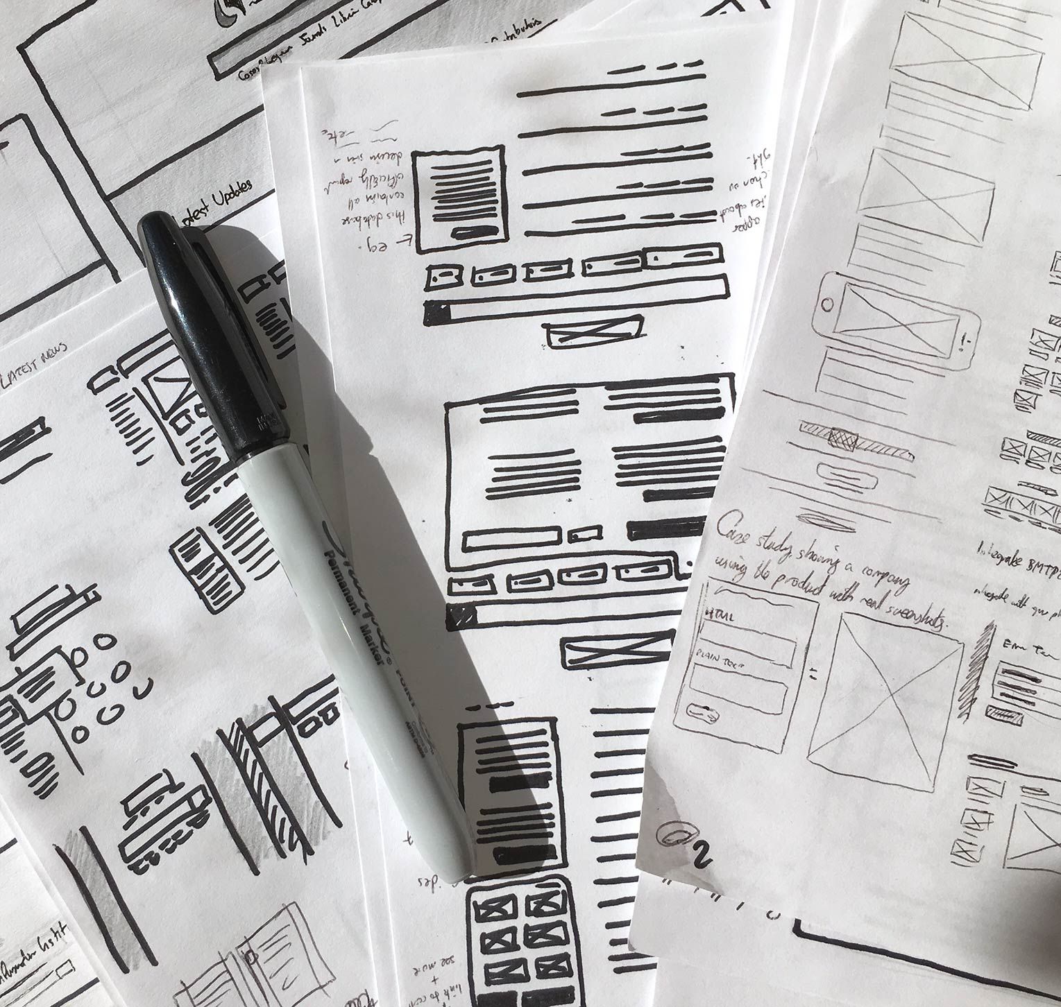
This might be antithetical to a designer. And it may very well be the least popular piece of advice I give to web designers, because we designers love our shiny tools so much. But every once in awhile, you need to close photoshop, put down your fancy touch pen and trade those in for some old fashion designer tools.

image06

Photo Credit: Fairhead Creative

Try this: grab a Sharpie, and some plain printer paper. Nope, no Montblancs and Moleskines here. You’ll get precious about how you use those. Sketching allows you to burn through ideas quickly and relieves you from the pressure of getting everything pixel perfect. Which is why it’s important to do it on scratch paper than a treasured notebook.

Here’s the benefits to taking pen to paper:

  • It’s faster. You can burn through ideas much more quickly than you can if you were pushing pixels around your screen.
  • It leads to better designs. Brains are for having ideas, not for storing them. By visualizing your ideas as they come, you’ll be able to build upon previous ideas too, and find totally new avenues to explore. This often leads to more considered, tighter initial design.
  • It focuses you on designing, not decorating. You can’t worry about border colors and font choices when your borders are wobbly and your fonts are lines. You’ll get the architecture right before worrying about the details.

By processing your ideas and options more quickly —  by getting that pen moving — you’ll find that your sketches will flow from you much faster. Timid moments of pause, those “is that one worth drawing?” thoughts, will be history.

  • Start by loosening up. Maybe you need to take a sheet of paper and scribble all over it. Or maybe you need to just start sketching out thoughts and ideas in your head as rapidly as you possibly can. Whatever works for you, start by loosening up. It’ll make your lines more confident, and your sketches stronger.
  • Iterate as the ideas happen. Don’t question your ideas as they come – just let them out. You can question them all later. Remember, sometimes great ideas can come from a little detail within a terrible idea. Let them out, nobody’s judging you!
  • Avoid feedback loops. Encourage liberal, actionable feedback to match your liberal sketches. But don’t let them take over: all feedback should either help you take a step forward, or it should be saved for a later stage in the process.

Save yourself some time with sketching by taking mobile into consideration. Because of the limited space on a mobile viewport, you’ll be forced to prioritize content. You’ll be able to suss out what content is pertinent on mobile and then sketch to scale for desktop.

2. Start Small, Go Big

Considering content first is practicing mobile-first design. Design for the small screen first and work your way up.

As UXPin outlined in the free ebook Responsive and Adaptive Design, mobile-first is a tenet progressive enhancement, which says you should design on the most constrained screen first. Once you design for that, you’ll be able to easily build up to larger screens.

By tackling the smallest screen-size first, you’re allowing yourself to focus on visualizing a 320px-width story of priorities, then taking advantage of all the extra space available, to your user’s advantage.

  • Let content drive your design. Write the content first, before you design anything at all. Your design helps communicate the story of the content and, on smaller screens, you’re forced to focus on that content whether you want to or not. By forcing focusing on the content, your design will retain focus as viewports grow.
  • Embrace the constraints. By starting with the laptop-sized screen you’re designing on first, you’re sacrificing many of the benefits of constraint. Creativity happens when you make those constraints work for you: start small, go big.

Your site will translate better to all devices once you get it looking good on a mobile device. One thing to keep in mind: what content works on mobile won’t necessarily work for desktop users. You’ll want to gauge context to determine what’s more appropriate for desktop users or what works best for mobile users.