Make Words Your Greatest UX Weapon

UX content

That’s what Copywriters are for right? Content Strategists? Definitely! However, words are part of the user experience and at minimum, the first pass, belongs to UX Designers.

Not only do clients appreciate seeing the first look of their product with copy that isn’t in Latin, but users appreciate it too. I’ve walked out of many usability tests and realized that 4 out of 5 issues could be solved with copy edits, whether it’s misleading button text, a confusing headline or confusion during sign up. No matter the language or place, words and conversation are universal. They are our secret weapon and one of the most valuable tools in our toolbox.

Your leading H1 hero copy shouldn’t read like Shakespeare*

*exceptions may be made for a poetry based product

You can be direct, speak with human language, and still have sophistication and a brand voice.

When someone visits the hero of a landing page on a website or web app, we give them a first impression as to who we are as a company – through a combination of words, color, graphics, imagery. First impressions are extremely important, not just in social settings. They set the tone for the entire user experience. As an H1 writer, take lessons from journalism. The two clear goals when creating H1s are:

  1. The user immediately knows what the product is and offers
  2. The user engages by learning more or signing up

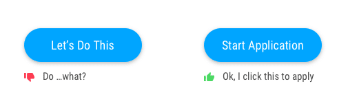
When you ‘Call To Action’ make the action crystal clear

CTA copy is arguably the most important copy on the page. It’s the engagement point where we ask users to buy, sign up, join a cause, etc. It takes wordsmithing and is not easy (how ironic). A CTA should have three important qualities:

  1. Honest. For example, don’t use ‘complete’ or ‘submit’ and then ask for more information. Humans feel a sense of relief when they finish something. If they’re then told they aren’t actually finished, they’re unhappy.
  2. Concise. This article is about words but the irony is that people scroll past words. They like things to be short and sweet. Use the minimal amount of words needed to help the user understand what the button beckons for.
  3. Clear. No guessing as to what the button is for. Users are much more likely to click a button if they know where it goes.
microcopy dos and donts

Use Microcopy in these 3 places to increase your product engagement

Microcopy, or small bits of copy, throughout your site or product can make or break the user experience. These bits of copy should have these 5 important qualities:

  1. Add value
  2. Don’t overpower other words and visuals on the page
  3. Flow with the brand tone and voice of the product
  4. Short and sweet, never longer than necessary
  5. Provide the user with answers and not raise more questions

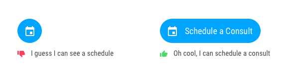
1. Increase engagement by pairing icons with words

Using words with an icon is a better user experience and a more accessible design. It’s clear what the icon means and takes all of the confusion off the table. Many icons are used for multiple purposes, like the calendar icon.

UX copy dos and donts

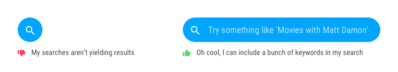
Some icons, such as search, are commonly known. However, using words we can make the search functionality more clear. Some search queries only allow one word searches, and other more sophisticated queries (like Google) allow phrases, questions and ideas.

UX writing dos and donts

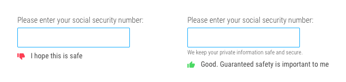
2. Take the frustration out of transactional flows

The best UX example for this is including the password rules before the user submits a password that doesn’t have a special character. However, there are more subtle ways to improve that aren’t just best practice UX. During transactional flows, users give up personal information such as emails, credit card numbers and addresses. Many people are skeptical. However, giving a simple nod to the fact that tech can be creepy can make users feel a lot more comfortable.

transactional copy email form

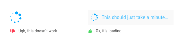
3. Leave no questions unanswered

Users have great expectations. Delight them by telling them what to expect next, so they don’t have to guess and get frustrated. I always joke that part of my job is mind-reading. We must guess how people will respond to the things we show them– this is how we can respond to some of those guesses.

UX writing best practices

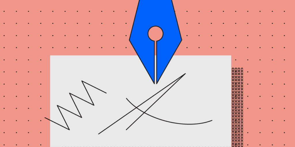
Words are part of the process

I start every project with pen and paper – jotting down ideas. These ideas are always a combination of words and sketches dancing around each other. Just as we walk away from user testing and stakeholder reviews with a list of changes to visuals, also consider how words can elevate the design. When preparing to test, review and ultimately launch, always ask these questions:

  • Where might a user need extra help?
  • How can this be more clear?
  • What are all the points a user could become confused?
  • Where can we delight and elevate with copy?

Join the world's best designers who use UXPin.

Sign up for a free trial.

The Subtle Detail That Gives A Design Its Entire Personality

empathy in design

What’s the biggest difference between your designs and a $20 template?

Companies ask themselves this every time they enter the market. With the widespread advertising from website builder tools, it’s an entirely rational question to ask.

What do you have that they don’t? Turns out, there’s one subtle detail that gives design its entire personality… that extra “oomph” that no template or builder could ever hope to provide.

In this post we’ll unpack what that subtle detail is, and why it matters so much. This will help us to better appreciate the skills offered by designers and give us language to articulate this value.

Let’s go on a little journey through how successful websites are designed:

1. Reading the story

The design process starts with the copy being written and handed to the designer. This copy contains the story. As designers, it is our duty to bring it to life by giving it a visual form.

It’s essential we understand the value of the story being told before we begin.

This is why we read with the mindset of a designer. We engage our mind’s eye to seek out the narrative, the journey, and the key messages. The narrative is the thread that runs through the text and ties the events together. The journey is layered on top of and responds to the narrative. It can be emotional or factual. The key messages are the most important points in the narrative or the journey that we can take from the copy.

Identifying these elements is imperative to understanding why this page exists and what is happening in the overall story.

At this stage, we only have words on a page. There are no visuals, no fonts, or anything else. The visual story will come later.

elements of the design

Photo by Jelleke Vanooteghem on Unsplash

For now, we should:

  • Focus on the words. That is to say that we shouldn’t get too far ahead of ourselves and begin imagining what the design may look like, yet. The temptation may be there but resist it till the next stage. For the time being, we’ll give our all to studying the words and their meaning.
  • Embrace and experience the story from a designer’s perspective. Designers have a special ability to feel what a story is telling us. This is what separates quality designers from the rest of the pack. Use this ability to see beyond the words and understand the story and its constituent parts.
  • Use your intuition to delve into the details. As you read, think through what’s being said underneath the words. What isn’t written, but shows through in the copy anyhow? What has the writer hinted at without saying explicitly?

2. Asking “What did I just see?”

After a thorough read through, it’s time to dig deeper into the story. This can be done by asking questions like:

  • What big feelings did the copy leave me with?
  • What did I see with my mind’s eye?
  • What texture did the story have?
  • Were some sections of the story particularly dramatic?
  • Did any patterns or colors come to mind?

This step seems abstract at first, but building an initial rich mental picture of the story is key to the success of the final design. After all, it’s our responsibility as designers to bring that story to life.

The best designers do this. They’re able to say “look at this” rather than “look at me”. How? They’re adept at creating a very rich and developed understanding of the stories they work with.

When we understand the story entirely – its tone, background, and key messages, etc. – we can convey it to readers who aren’t designers and don’t have that gift of expression.

After asking questions about the story, it’s essential to sum up the key emotions we’re left with. Listing a range of emotions felt can help us in the design phase. We need to reflect those emotions through design. Pinning them down will ensure our final design captures the story fully.

3. Checking that perceptions are aligned

Now that we have a fleshed out idea of the story we’re working with, it’s time to confirm how accurate our interpretation is.

Did we see what the target audience will see? Did we see what the project owner wants them to see?

If our interpretation is different, the copy gave us the wrong impression and it will have to be adapted and refined before the design process goes ahead. It will make the story clearer going forward.

Once our understanding of the story is aligned, it’s time to look at it from the perspective of our target audience.

what's the difference between a design and a template

Photo by Emily Morter on Unsplash

We should ask questions about our audience to better understand how the story will be framed in their minds:

  • Who are they? Consider putting together personas (or using existing ones related to the project) to segregate your audience and understand each individual group on a deeper level. Think of things like age, profession and interests.
  • What’s their experience? After understanding the personas that’ll interact with your story, ask how their unique experiences will affect their view of it. Are they related to the story somehow? Will this help or hinder them when it comes to understanding it?
  • What are their needs, hopes, desires, dreams and fears? There are no more powerful motivators than these. Put yourself in the shoes of your audience and consider each of the above to gain a deeper perspective of how they’ll approach the story. Their needs are especially important here – what can’t they live without?

4. Bringing it to life

At this point, you’re probably wondering, “Jeez, we have done a lot of work, but  only have text on a page.” However, we now also have a totally developed understanding of the story, and it’s time to breathe life into it with the design.

Promoting story through design

Every choice that we make – font, color, size, composition, motion graphics, etc. – should reveal and promote the story. We must use our designer’s mind to make sure the story is brought to life.

Begin by gathering images based on what we saw in our mind’s eye. Did we see any faces, objects, scenes or other elements?

Illustrations, with their ability to unpack and simplify abstract concepts, will probably play a part too.

Think about the hierarchy of information and how it’ll be organized. There may be core pieces of information and more supplementary pieces – how will these be presented and differentiated?

All of these decisions will help tell the story. Some people see design as the decoration of a page before putting words onto it. But as this process reveals, it is far more:

We are visual storytellers.

drawing UI mockups

Photo by Kaleidico on Unsplash

Remaining focused

It’s inevitable that we’ll think ahead. We may begin to blend form and function. For example, we might wonder how sticky navigation could be used. Could a carousel work with the images we’re envisioning?

Abandon those ideas for now. They’ll have their time to shine.

Of course, our page has to function properly and have a focus on conversions. However, none of that matters if our design doesn’t first connect with our audience.

And this, folks, is the subtle difference that we have been alluding to throughout this entire post: connection.

The importance of connection

By connection I mean an empathic, deep, visceral appreciation and understanding between the story being told and the person hearing it.

With a finite number of options and restrictive choices, no template or theme can hope to achieve this. This is what makes designers unique and valuable – we breathe life into stories and build strong bonds.

Picture a children’s book…

To better understand this idea, imagine the process of creating a children’s book.

It’s impossible to illustrate one before knowing the story. And to write the story first and then find a template with illustrations that fit perfectly? Unheard of.

In both scenarios, there would be no cohesion and the story would be lost.

Conclusion

To sum it up, themes, templates, and “done-for-you” tools can’t offer the subtle difference that gives design its personality. The elements that make up these tools have not been designed to champion the story from the very beginning. Frankly, they suffer for it.

This is exactly the point where our designs differ from the $20 template: we have a capacity to infuse meaning through deliberate design choices. The story is more effectively communicated because of them.

Learning to articulate this value is both a very important skill and a vital tool to counter the prevalent advertising from website builder tools. As designers, our work has irreplaceable value. If we communicate it effectively, our clients will not only appreciate it, they’ll crave it.

Join the world's best designers who use UXPin.

Sign up for a free trial.