Want to design production-ready UIs faster? Combining GPT-4.1, Bootstrap, and UXPin Merge can help you bridge the gap between design and development. Here’s the process in a nutshell:
- GPT-4.1 generates clean, structured UI code based on your prompts.
- Bootstrap provides a responsive framework with pre-built components for styling and structure.
- UXPin Merge allows you to design directly with real React components, ensuring your prototypes match the final product.
This method eliminates design-to-development handoff issues, speeds up workflows, and improves collaboration between designers and developers. By using these tools together, you can create functional, code-backed prototypes that are ready for deployment.
Key Steps:
- Use GPT-4.1 to generate Bootstrap-compliant components.
- Customize and refine components with Bootstrap’s grid system and utilities.
- Import components into UXPin Merge for interactive, production-ready prototypes.
These tools ensure your designs are consistent, responsive, and aligned with your development team’s needs.
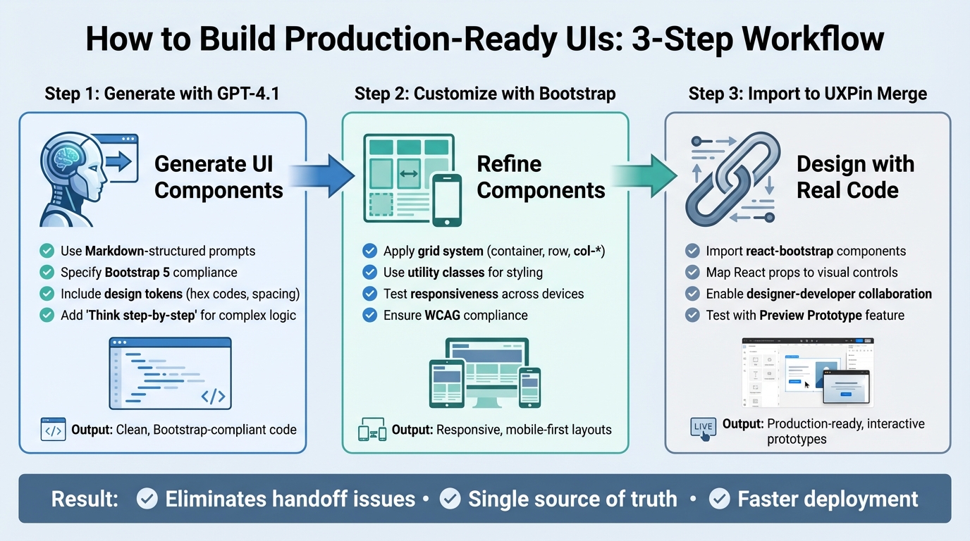
3-Step Workflow: Building UI with GPT-4.1, Bootstrap, and UXPin Merge
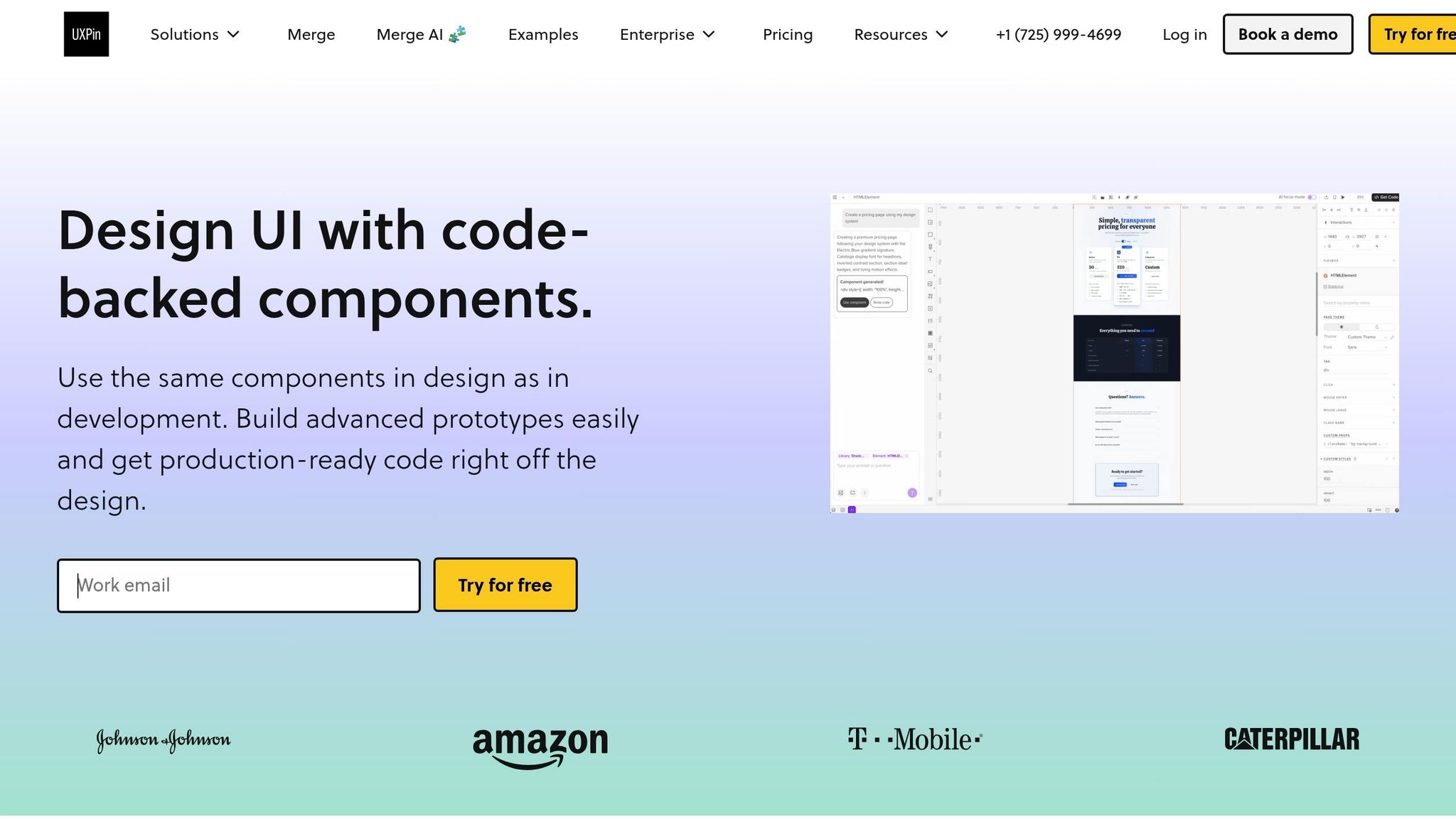
UXPin Merge AI: Smarter UI Generation That Follows Your Design System
sbb-itb-f6354c6
Step 1: Generate UI Components with GPT-4.1
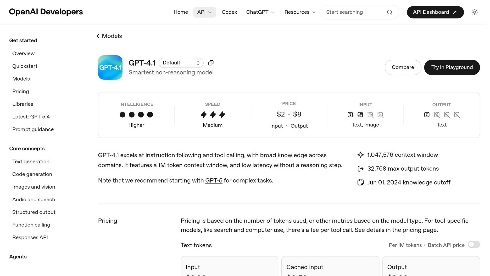
When working with GPT-4.1, you can generate clean, Bootstrap-compliant code by providing clear, concise instructions. One of GPT-4.1’s strengths is its ability to follow directions closely, so a straightforward approach works best – no need to overcomplicate your prompts.
How to Prompt GPT-4.1 for Component Code
To create effective prompts, structure them in Markdown. Use headings like ## Header or ## Footer to organize different UI sections, and emphasize key details with bold text (**bold**). This setup helps the AI interpret your request more effectively.
"Markdown naturally has a content hierarchy… offers a logical grouping of UI sections, and provides better readability for both humans and AI models." – Nick Babich, Editor-in-Chief, UX Planet
In April 2025, Nick Babich showcased this technique by crafting a structured prompt for a mobile UI. His prompt detailed seven specific sections – Status Bar, Header, Location/Search, Carousel, Filter Row, Restaurant List, and Bottom Nav – and included explicit style attributes like "rounded, 32px" and "orange text." The result was a high-fidelity UI generated with accurate text rendering.
When writing your prompt, be specific about using Bootstrap 5 and clearly list the components you need, such as buttons, cards, forms, or navigation bars. Include design details like primary hex codes, spacing scales, and any custom CSS variables for consistency with your design system. Adding "Think step-by-step" at the end of your prompt can help GPT-4.1 handle more complex UI logic. Here’s an example:
"Generate a responsive Bootstrap 5 card component with an image, title, description, and call-to-action button. Use Bootstrap 5 CSS variables for colors and spacing to match our design tokens. Think step-by-step."
You can also upload screenshots of existing Bootstrap designs and ask GPT-4.1 to "Describe this screen" to help it align with your style preferences and visual density. This approach ensures the generated code matches your brand’s design language.
Once your prompt is ready, review the output to confirm it aligns with your design system.
Align Components with Your Design System
To ensure consistency, include branding details like hex codes, spacing scales, and CSS variables in your instructions. If you’re using a custom React component library with UXPin Merge, let GPT-4.1 know which framework to target. Setting these parameters in a system message at the start of your session ensures the AI maintains a consistent output style across interactions.
Keep your prompts focused and avoid overloading them with unnecessary details. This clarity helps the AI deliver better results.
Once the components are generated, it’s time to validate and refine the code.
Review and Refine AI-Generated Code
After generating components, validate the code for compatibility and responsiveness. Check that the JSX or HTML matches the Bootstrap version you’re using – Bootstrap 5 is recommended for its modern features and improved security.
Test the code in UXPin Merge to ensure it meets accessibility standards, such as proper color contrast, keyboard navigation, and form control usability (aligned with WCAG guidelines). Replace hardcoded values like hex codes or pixel sizes with design tokens to maintain consistency across your design system.
In March 2025, designer Xinran Ma used a concise Markdown prompt to generate a responsive UI with ChatGPT’s Canvas feature. By iterating with a follow-up prompt to "scale down the UI by 20%", she refined the visual mockup to avoid image cutoffs, showcasing the model’s ability to handle precise adjustments. This highlights the importance of iterative refinement – perfection rarely happens on the first try.
Finally, import the code into UXPin Merge to test Bootstrap grid behavior and responsiveness. This feedback loop allows you to identify and fix issues early, ensuring the components are ready for further customization with Bootstrap utilities in the next step.
Step 2: Customize Components with Bootstrap
With Bootstrap, you can refine AI-generated components and bring a polished, production-ready consistency to your UI. Since May 5, 2021, Bootstrap 5 has been the standard version, offering a mobile-first approach and improved tools for customization.
Apply Bootstrap’s Grid System
Bootstrap’s grid system uses a container, row, and column structure to organize content neatly across different screen sizes. To align and distribute your AI-generated components, wrap them in .container, .row, and .col-* classes. For instance, a card component generated by GPT-4.1 can be placed inside a .col-md-4 class. This setup ensures the card takes up one-third of the screen on medium and larger devices, while stacking vertically on smaller screens.
The grid system also utilizes CSS variables, making it easy to tweak spacing and breakpoints without needing to recompile Sass.
"Bootstrap 5 further enhances the grid system with additional utility classes and improved customization options, making it even easier to create complex layouts." – Bootstrap Documentation
To further refine your layouts, take advantage of Bootstrap’s utility classes, which offer precise control over styling and spacing.
Use Bootstrap Utilities for Styling
Bootstrap’s utility classes let you handle spacing, typography, and colors without writing custom CSS. For example, you can use .mb-3 for a 1rem bottom margin, .text-primary for blue-colored text, or .fw-bold for bold font weight. These classes help maintain a consistent look across your design system.
Bootstrap 5’s expanded utility API includes tools for flexbox alignment, shadow effects, and more. If you’re working in UXPin Merge, you can easily switch between component variants – like button states or color themes – directly in the editor. This allows you to preview how utility classes affect your design in real time.
Test for Responsiveness and Usability
Once your layouts and styles are customized, test them across different devices to ensure they perform as intended. UXPin’s Preview Prototype feature allows you to interact with your layouts and confirm that breakpoints activate correctly. For a more in-depth test, export your design to Stackblitz using Spec Mode. This feature copies the exact code behind your components, enabling you to test them in a live development environment.
During testing, focus on ensuring mobile-first layouts, proper spacing, and compliance with WCAG standards for color contrast and keyboard navigation.
"Bootstrap 5… embraces best practices for responsive design, encouraging a more mobile-first approach to layouts and interactions." – Bootstrap Documentation
Finally, remember that Bootstrap 4 reached its end of life on January 1, 2023, and no longer receives security updates. Make sure you’re using Bootstrap 5.x to access modern features like the offcanvas menu, which is tailored for enhanced mobile usability.
Step 3: Import Components into UXPin Merge
Bring your customized Bootstrap components into UXPin Merge to streamline design and development collaboration – eliminating the need for a traditional handoff.
What Is UXPin Merge?
UXPin Merge is a code-based design tool that allows you to design with production-ready UI components directly on the canvas. Instead of working with static placeholders, you’re using the exact components that will be implemented in production. For Bootstrap users, this means you can import react-bootstrap components and use them as fully interactive and editable elements, complete with their props, variants, and styles.
Merge supports native integrations with libraries like Bootstrap, MUI, Ant Design, and ShadCN. To get started, you simply select Bootstrap from the library options, and you’re ready to design with real code components – no extra setup needed.
Now that you know what UXPin Merge can do, here’s how to bring your components into it.
How to Import Components into UXPin Merge
If you’re using the native Bootstrap integration, the setup is simple. Start by creating a new project in UXPin, select "Design with Merge components", and choose Bootstrap to load the pre-built components.
For custom components, the process involves a few extra steps. Use the npm integration by creating a project, selecting "Import React Components with npm integration", and adding the required packages: react-bootstrap and bootstrap. Don’t forget to link the CSS file path: bootstrap/dist/css/bootstrap.min.css.
Next, open the Merge Component Manager and click "Add new component." Enter the component name exactly as it appears in the React Bootstrap documentation (e.g., "Button" or "Alert") and assign it to a category like "Components" or "Forms." Once the components are imported, click "Publish Changes" and then "Refresh Library" in the UXPin editor to make them available.
To make the components editable for designers, map their React props to visual controls. In the Merge Component Manager, select the imported component and click "Add property." Define the prop name (use lowercase, like variant or children), select the property type (string, boolean, etc.), and assign a control type – for example, a text field for labels or a dropdown for variants. After configuring the props, click "Save Changes" and "Publish library changes" to sync everything with the design editor.
Collaborate Across Teams with Merge
Once your components are imported, UXPin Merge makes it easy for teams to collaborate seamlessly.
Designers can simply drag and drop Bootstrap elements onto the canvas and tweak their properties – like button styles, grid layouts, or text labels – using the Properties Panel. Because these are real code components, developers receive designs that are already production-ready. This shared source of truth ensures that both design and development teams stay aligned, speeding up the journey from concept to deployment. It’s a straightforward way to keep everyone on the same page while delivering high-quality results.
Best Practices for Efficient UI Development
Building on the step-by-step setup, these best practices help streamline the process of UI generation and customization, creating a workflow that’s ready for production. By adopting these methods, you can improve speed, maintain quality, and ensure team alignment.
Maintain Consistency with Design Systems
One of the biggest perks of using code-backed components is that your design and codebase naturally stay in sync. Tools like UXPin Merge help maintain a single source of truth. When designers and developers use the same Bootstrap components, the chances of visual inconsistencies or misinterpretations drop significantly – reducing the friction between design and development.
To start, define which Bootstrap utilities, grid settings, and component variations are approved for your product. Document these choices directly in your UXPin library. This ensures that designers can only choose from pre-approved options, like specific button styles, spacing values, or color tokens. Whether you’re prototyping a new feature or refining an existing flow, this approach keeps everyone working within the same boundaries.
Use AI Responsibly
AI can be a powerful tool, but it requires careful oversight. Always review AI-generated code for accessibility, proper semantic HTML, and alignment with your system before integrating it.
"Design is a Craft. AI is Just a Better Workshop." – UXPin
Instead of relying on AI to build entire layouts, use it to complement your component library. For example, let AI generate a custom FAQ accordion or an interactive contact form. When using tools like GPT-4.1, be specific in your prompts. For instance, instead of asking for "a card component", specify "a Bootstrap card with an image header, title, body text, and a primary button aligned to the bottom." This level of detail ensures the output requires less manual tweaking.
Before handing off AI-generated components, inspect them in UXPin’s Spec Mode. This step helps identify issues like missing props, hardcoded values, or non-responsive layouts. By catching these problems early, you ensure the components meet high design and coding standards before moving forward.
Iterate Faster with Feedback Loops
Speed is important, but it only matters if you’re building the right thing. The quickest way to validate ideas is by prototyping with real components and gathering feedback early. Since UXPin Merge uses actual Bootstrap elements, stakeholders can interact with functional prototypes – complete with hover states, responsive breakpoints, and real data – instead of static mockups.
Share these early prototypes with your team. Developers can review the code in Spec Mode and provide technical input before the design is finalized, avoiding last-minute implementation issues. This method aligns with the goal of eliminating handoff delays through code-based design.
When feedback calls for changes, AI can help you adjust components quickly. For example, if a stakeholder requests a different layout, you can modify the grid structure or swap components without starting from scratch. By using production-ready, interactive components, you keep the prototyping process smooth and efficient, avoiding unnecessary delays.
Conclusion
Key Takeaways
This method simplifies UI development by bridging the gap between design and development, thanks to tools like GPT-4.1, Bootstrap, and UXPin Merge. By starting with code-backed components, prototypes become functional previews of the final product, removing the usual design handoff challenges. This approach ensures a single source of truth, keeping designs and development perfectly aligned.
"Code-backed UI design flips the script by letting designers work with actual code from the start. Instead of static representations, you’re working with live components – ensuring that what you design is exactly what developers will build."
This workflow delivers three main benefits: faster progress through AI-assisted component creation, scalability using Bootstrap’s production-ready libraries, and seamless collaboration between designers and developers working within the same system. With these advantages in mind, the next steps are clear.
Next Steps
Dive into UXPin’s built-in Bootstrap library, which is preloaded and ready to use for designing with production-grade components. Use GPT-4.1 to generate custom layouts or variants, then fine-tune them with Bootstrap utilities and the UXPin Properties Panel. For custom libraries, link your Git repository or npm package to keep everything in sync.
Validate your prototypes on real devices through the UXPin Mirror app to check responsive behavior early. Share preview links with developers, allowing them to inspect the code and offer technical input during the design phase. This collaborative process ensures everyone stays aligned, speeding up the journey from concept to deployment.
FAQs
What should I include in a GPT-4.1 prompt to get clean Bootstrap 5 code?
To get clean Bootstrap 5 code from GPT-4.1, make sure your instructions are clear and focused on producing well-structured, valid, and responsive code. For example, you could say:
"Generate a responsive Bootstrap 5 HTML snippet for a navigation bar. Ensure it adheres to best practices, includes valid HTML, and is ready for testing."
By using specific prompts like this, you’ll guide GPT-4.1 to create high-quality, functional code that aligns with your requirements. Tailoring your requests ensures the output is both practical and easy to implement.
How do I make AI-generated Bootstrap components match my design tokens?
Start by defining core design tokens – the essential elements that form the backbone of your design system. These include:
- Colors: Primary, secondary, accent, and neutral shades.
- Typography: Font families, sizes, weights, and line heights.
- Spacing: Margins, paddings, and gaps.
These tokens ensure consistency across all components and layouts.
Integrating Tokens into Bootstrap
To align Bootstrap with your design system, customize its Sass variables using your core tokens. Bootstrap’s Sass architecture makes it easy to override defaults, allowing you to inject your colors, typography, and spacing values directly into its framework. This ensures that your components inherit your design system’s foundation seamlessly.
Leveraging GPT-4.1 for Component Generation
When working with GPT-4.1 to generate components, include your design tokens directly in the prompt. For example:
- Specify your color palette (e.g.,
$primary-color: #0056b3;). - Define typography rules (e.g.,
$font-family-base: 'Roboto', sans-serif;). - Highlight spacing guidelines (e.g.,
$spacer: 1rem;).
This approach helps the AI produce components that align with your system right out of the gate.
Finalizing AI-Generated Components
After generating components with GPT-4.1, review and fine-tune them to ensure they adhere to your design tokens. Check for consistency in:
- Color usage: Ensure primary and secondary colors are applied correctly.
- Typography: Verify font sizes and weights match your specifications.
- Spacing: Adjust margins and paddings to align with your defined scales.
This process ensures your components maintain a cohesive and polished look throughout your project.
Do I need React Bootstrap to use Bootstrap components in UXPin Merge?
No, you don’t need React Bootstrap to work with Bootstrap components in UXPin Merge. With UXPin Merge, you can directly integrate production-ready Bootstrap components into your prototypes using tools like npm or other component libraries. This approach removes the need for React Bootstrap as an extra dependency, making the process smoother and more efficient.

