Dark Patterns in UX Design — Which Ones Are the Most Deceptive?
User experience design is a powerful discipline with a fine line between assistance and manipulation. Organizations often use dark patterns to trick users into decisions they otherwise wouldn’t choose. Sometimes these dark patterns don’t have malicious intent, but the result is the same.
Understanding dark patterns and their consequences is crucial for UX design teams. These deceptive design techniques harm users and could have legal consequences resulting in hefty fines from organizations like the FTC (Federal Trade Commission).
Get accurate results during usability testing using fully functional interactive prototypes from UXPin. Sign up for a free trial.

What are Dark Patterns?
Dark patterns are design techniques that manipulate and deceive users into taking specific actions–or directing them away from an intended action, like unsubscribing or downgrading. These techniques exploit cognitive biases or misdirect users to benefit the organization at the expense of their customers.
UK-based UX specialist Harry Brignull coined dark patterns when he started darkpatterns.org–an organization founded to educate companies about deceptive design patterns.
Do Dark Patterns Work?
The short answer–Yes! Dark patterns are highly effective. And many organizations, including leading tech businesses and online retailers, use these shady design techniques.
In 2018, the Norwegian tech watchdog Forbrukerrådet published a report showing how tech companies nudge users into sharing personal information. This report leads to changes in legislation, including GDPA and CCPA.
In 2021, the California Consumer Privacy Act made “a range of privacy-related dark patterns illegal – including certain kinds of trick wording, hidden small print, misdirection, and bait and switch.”
Common Types of Dark Patterns

Bait and switch
Bait-and-switch dark patterns lure customers into using a product under attractive terms, then change the conditions once engaged, forcing them to accept the outcome–usually a paid service. Many apps use this bait-and-switch strategy to trick customers.
For example, imagine you download a “free” filter application and spend time adjusting the settings. When you achieve your desired result and go to export the image, the app informs you that you’re using one of the “paid” features and need to pay to save this image or upgrade to a premium plan.
Users will often accept these terms begrudgingly because they’ve already invested the time, and the feature they use is essential for the desired result.
Disguised ads
Disguised ads look like regular content, so users click them. These are common in newsfeeds, where the ads are designed to look like any other article with a headline and image. You’ll also find these in search engines where the top few results are ads, but they look like actual results.
Search engine providers place a small “Ad” tag to differentiate these, but it’s easy for someone not paying full attention to click it thinking it’s a regular search result.
Forced continuity
Forced continuity occurs when someone signs up for a free trial which rolls into a paid subscription. This dark pattern is prevalent in SaaS, and many companies are guilty of deploying this strategy. Services like Baremetrics, which help SaaS companies monitor subscription analytics and recover failed payments, exist partly because forced continuity and billing issues are so common in the industry.
The best way to avoid forced continuity is by not taking credit card details for free trials or not automatically continuing the service at the end of the trial without the user explicitly accepting.
Hidden costs
Hidden costs are fees or charges not disclosed until the user is about to confirm payment. Have you ever got to the final step and gone, “Hey! Why is it $28? The price quoted was $19.99.” And then you see a “service fee” or some other ambiguous term.
Sometimes the hidden costs are more legitimate, like VAT which the company only discloses at checkout. Companies can avoid these hidden costs by notifying customers below pricing–for example, “VAT and taxes calculated at checkout.”
Misdirection
Misdirection uses design patterns commonly used for one action for another that favors the company’s business interests. For example, you’re unsubscribing from a paid service, so you click “Cancel” in your billing account.
The next screen is a confirmation screen, but the company shows the primary CTA as “Keep subscription” and the confirmation to unsubscribe in a smaller text link like this example below.
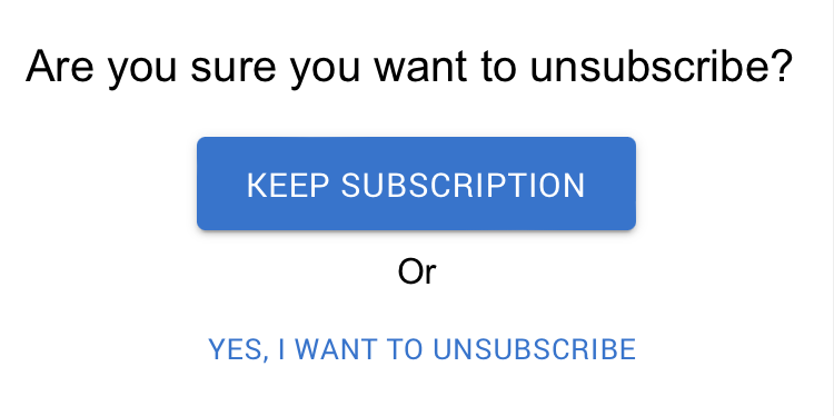
Companies know that most people function on “autopilot,” thinking that the primary CTA is the requested action, and unconsciously click “Keep subscription.”
Roach motel
Roach motel is another sinister dark pattern designed to keep users from canceling a paid service. Companies intentionally hide the cancel feature using several techniques:
- Placing the cancelation at the bottom of an unsuspecting screen
- Making users contact customer support–and jump through multiple hoops
- Only allowing users to cancel on the desktop app and not mobile
Ironically, these products’ signup and payment features are usually super efficient and helpful, with immediate access to customer support during checkout. The second you’re signed up, the efficiency to leave disappears, and you feel trapped in an irreversible contract.
Confirmshaming
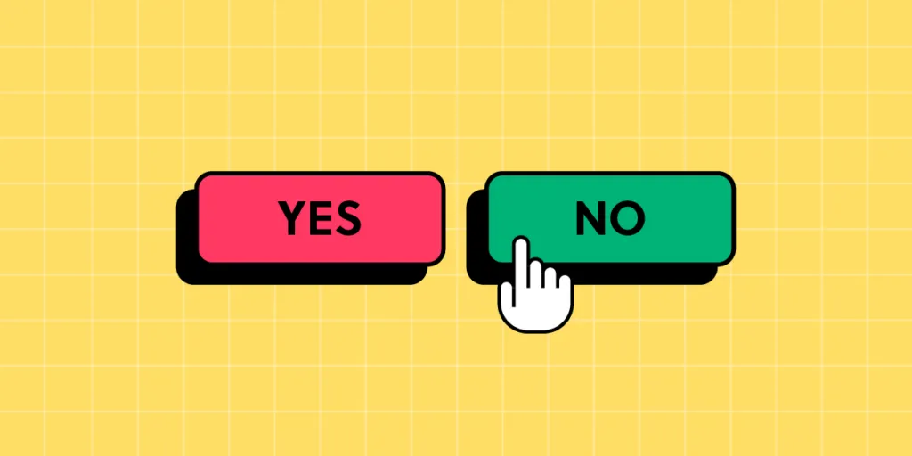
Confirmshaming is another tactic companies commonly use to guilt or shame someone for making a choice contrary to the company’s interest. The most common example is when an eCommerce store offers shoppers a discount for signing up for their newsletter with two options:
- “Yes, I want to save 20% on my order!”
- “No, I prefer to pay full price for my items.”
The second option makes people feel foolish, “why would you want to pay more?” Confirmshaming dark patterns are highly manipulative and exploit human emotions, forcing them into actions they otherwise wouldn’t have chosen.
Trick questions
Trick questions use words or phrases that mislead users. Like the misdirection tactic, trick questions prey on people’s unconscious actions to mundane tasks like clicking terms and conditions when signing up.
For example, a user might mistakenly check a box saying, “Would you like to opt out of not receiving exclusive offers and promotions from our partners?”
Read that carefully…
“Would you like to opt out of NOT receiving exclusive offers and promotions from our partners?” Most people will miss the double negative connotation and check the box, thinking they’re opting out when the opposite is true.
These trick questions are especially problematic for users with cognitive disabilities or non-native language speakers who don’t fully understand the sentence.
Privacy Zuckering
Privacy Zuckering is named after Facebook CEO Mark Zuckerberg, infamous for misleading privacy policies and settings. This type of dark pattern is still prevalent across every industry and country because data is so valuable–some call it the new gold.
Companies that make privacy policies difficult to understand with convoluted legal jargon or intentionally hide privacy settings (like turning data sharing on and off) are guilty of Privacy Zuckering.
This dark pattern is so problematic that Apple released a privacy update to iOS 14, allowing users to opt out of tracking and choose which apps they share data with.
Pre-selected options
Pre-selected options used to be more prevalent until the release of GDPR and CCPA, which prohibit this dark pattern–like pre-selecting the checkbox to confirm someone has signed up for a mailing list. New legislation requires users to check these boxes themselves, with instructions to review the terms and conditions. Still, this practice occurs, leading to users signing up for services they don’t want.
UX Designers – The Adults in The Room
UX designers are crucial in advocating for users (their fellow humans) and ensuring user interface design follows the highest ethical standards and intent.
Here are ten ways designers can avoid dark patterns and ensure non-designers understand the ramifications of using them (which may include costly legal issues for an organization):
- Prioritize user needs: focus on addressing user needs over exploiting them for short-term gains. This focus will build trust and increase the customer life cycle.
- Clarity and simplicity: make sure content and instructions are easy to understand. Avoid using confusing jargon or hiding important information.
- Transparency: ensure users fully understand the implications of their choices and the data you collect. Use opt-ins with plain language, so people always know what they’re signing up for.
- Opt-out by default: never pre-select options, even for mundane tasks and features. Users must always have control over what they want and take explicit action to opt in.
- Easy opt-outs: conversely, companies must make it easy for users to end paid features or unsubscribe from services. Avoid burying opt-outs or making users jump through hoops to cancel something.
- Establish ethics: creating internal ethical guidelines signed off by key stakeholders ensures teams follow best practices and avoid dark pattern strategies.
- Education and awareness: create resources that explain dark patterns and how these negatively impact people.
- Advocate for users: UX designers must be the voice of users within an organization and call out unethical conduct.
- Testing and user interviews: design teams must test content and UIs regularly with end-users to determine whether content or features are confusing or misleading.
- Accessibility and inclusivity: designers must consider the needs of diverse people, including those with disabilities, to ensure everyone understands critical language and features–particularly for decisions with financial and personal data implications.
Prototype and Test With UXPin
Build fully interactive prototypes that accurately replicate the final product experience with UXPin’s code-based design tool. Unlike image-based tools, UXPin allows designers to achieve fidelity and functionality similar to code, increasing testing scope so design teams can solve more usability issues and identify better opportunities during the design process.
Sign up for a free trial to build your first interactive prototype with UXPin and deliver the meaningful user experiences your customers deserve.


