Design-in-code simplifies collaboration between designers and developers by using live, production-ready code to create interfaces instead of static visuals. This method eliminates the need for design handoffs, reducing misalignment, delays, and rework. By working directly with HTML, CSS, and JavaScript components, teams share a single source of truth – the codebase – ensuring consistency throughout the product lifecycle.
Key Insights:
- What is it? Designers create interfaces using actual code components, skipping the traditional mockup-to-code translation.
- Why it matters: Reduces design drift, speeds up workflows, and aligns teams by integrating design and development processes.
- How it works: Leverages tools like UXPin Merge, design tokens, and component libraries to connect design tools to production code.
Benefits:
- Cuts engineering time by up to 50%.
- Speeds up product development by as much as 10x.
- Ensures consistent design updates through versioned code.
This guide covers the technical aspects of implementing design-in-code, from setting up design tokens and reusable components to integrating tools like UXPin Merge for real-time code synchronization.
Design to Code // HTML & CSS from scratch // Frontend Mentor Form
sbb-itb-f6354c6
Core Principles of Code-Backed Design Systems
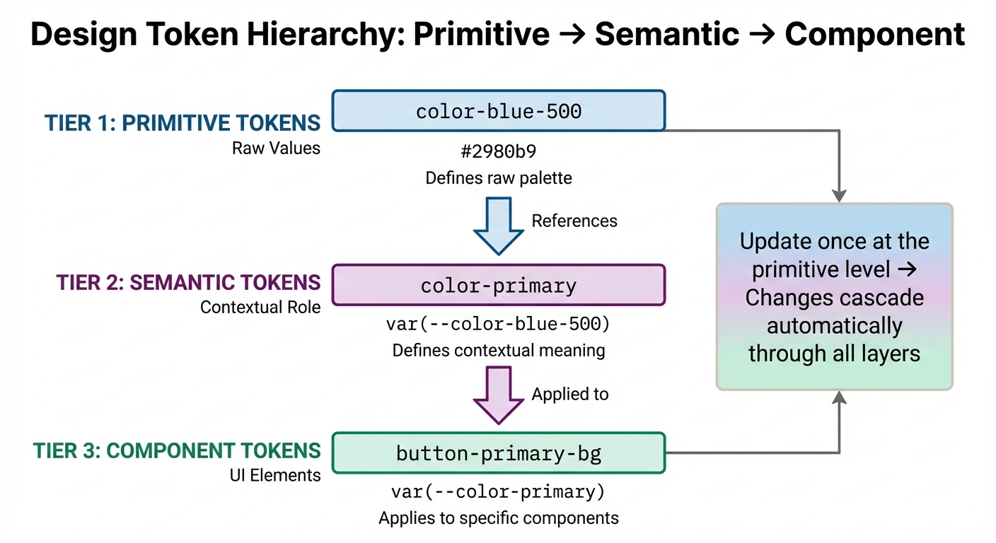
Design Token Hierarchy: From Primitive to Component Level
Code-backed design systems rely on three main principles: design tokens, component-driven architecture, and dynamic theming. Together, these principles create a unified framework for both designers and developers, ensuring design changes are implemented consistently while streamlining workflows and minimizing miscommunication.
Design Tokens: The Bridge Between Design and Code
Design tokens are essentially design decisions stored as data. They define key elements like colors, typography, and spacing, making these values accessible to both designers and developers.
Tokens are structured through layering, which establishes a hierarchy for better flexibility and maintainability. Here’s how it works:
- Primitive Tokens: These store raw values, such as a specific color code (
#2980b9). - Semantic Tokens: These assign a contextual role to the raw value, like
color-primary. - Component Tokens: These apply the semantic value to a specific UI element, such as
button-primary-bg.
For example, updating a brand color globally only requires changing a single primitive token, and the change automatically propagates across all components without rewriting their individual styles.
| Token Level | Purpose | Example Name | Example Value |
|---|---|---|---|
| Primitive | Defines raw palette | color-blue-500 |
#2980b9 |
| Semantic | Defines contextual role | color-primary |
var(--color-blue-500) |
| Component | Applies to UI elements | button-primary-bg |
var(--color-primary) |
The W3C Design Tokens Community Group has developed a standard format to ensure tokens can be shared across platforms, making them compatible with various tools and codebases. To maintain clarity, always document the purpose of each token – explain when and why it should be used as your system grows.
Once tokens establish the foundation, the next step is assembling them into reusable components.
Component-Driven Architecture
Component-driven architecture builds on the foundation of design tokens by using reusable UI elements as building blocks. By connecting a design editor to a code repository (e.g., Git, Storybook, or npm), both designers and developers work with the exact same components, closing the gap between design mockups and production code.
This method ensures consistency and eliminates design drift, where discrepancies arise between design and development. Components come pre-configured with standardized styles – sizes, colors, typography, and interactions – ensuring uniformity across teams and products.
"We synced our Microsoft Fluent design system with UXPin’s design editor via Merge technology. It was so efficient that our 3 designers were able to support 60 internal products and over 1,000 developers." – Erica Rider, UX Architect and Design Leader
When developers update a component in the repository, those changes automatically sync with the design tool. This guarantees everyone is working with the latest version, reducing errors and inefficiencies. Additionally, non-designers like product managers can use these coded components to create high-fidelity prototypes, freeing up designers to focus on strategic tasks.
Dynamic theming adds another layer of adaptability to these reusable components.
Dynamic Theming with CSS Variables
CSS variables bring design tokens to life in the browser, enabling real-time theme switching.
"Design tokens define what the design values are and their semantic meaning. CSS variables determine how these values are implemented in the browser." – Laura Kalbag, Penpot Blog
CSS variables follow the cascade, allowing global values to be set on :root and overridden with more specific selectors. This makes scoped theming possible, where different sections of an application can have distinct themes. For instance, switching from light mode to dark mode only requires remapping semantic tokens to new primitive values, such as changing surface-primary from white to black.
JavaScript can also dynamically update CSS variables using document.documentElement.style.setProperty(). This enables user-controlled themes or interactive UI states. Additionally, media queries like prefers-color-scheme can automatically align themes with the user’s system preferences. To avoid naming conflicts in large codebases, adopt kebab-case conventions like --color-background-button-primary-active.
Design-in-Code with UXPin Merge
This section dives into how UXPin Merge bridges the gap between design and development by directly connecting your design tools to production code. Instead of relying on static mockups, designers can work with actual production-ready components – whether they come from MUI, Ant Design, Bootstrap, ShadCN/ui, or your custom codebase. The beauty of it? Any updates made to components in the repository automatically sync with the design tool, ensuring everyone is always working with the latest version. This seamless integration reinforces the principles of design system consistency and real-time code synchronization.
Designing with Real Code Components
Merge offers three ways to integrate: syncing directly via Git, connecting through Storybook (compatible with over 15 frameworks like Vue and Angular), or importing packages through npm. Once set up, designers can drag and drop real, production-ready components onto the canvas. Every interaction, style, and behavior is exactly how it will function in the final product. This eliminates the risk of design drift, ensuring what’s designed is precisely what developers will build.
When it’s time for handoff, developers receive auto-generated JSX code that mirrors the prototype down to the smallest detail – including props and dependencies. They can even open it directly in StackBlitz for immediate implementation, saving countless hours.
Efficiency Gains from Merge
Teams using Merge report incredible efficiency improvements, building products up to 10x faster and cutting engineering time by half. For instance, Mark Figueiredo’s team at T.RowePrice found that feedback cycles that used to take days now happen in just hours, shaving months off their project timelines. Similarly, at PayPal, processes that once took two to three months for design alone now encompass design, testing, and delivery within the same timeframe.
"When I used UXPin Merge, our engineering time was reduced by around 50%. Imagine how much money that saves across an enterprise-level organization with dozens of designers and hundreds of engineers." – Larry Sawyer, Lead UX Designer
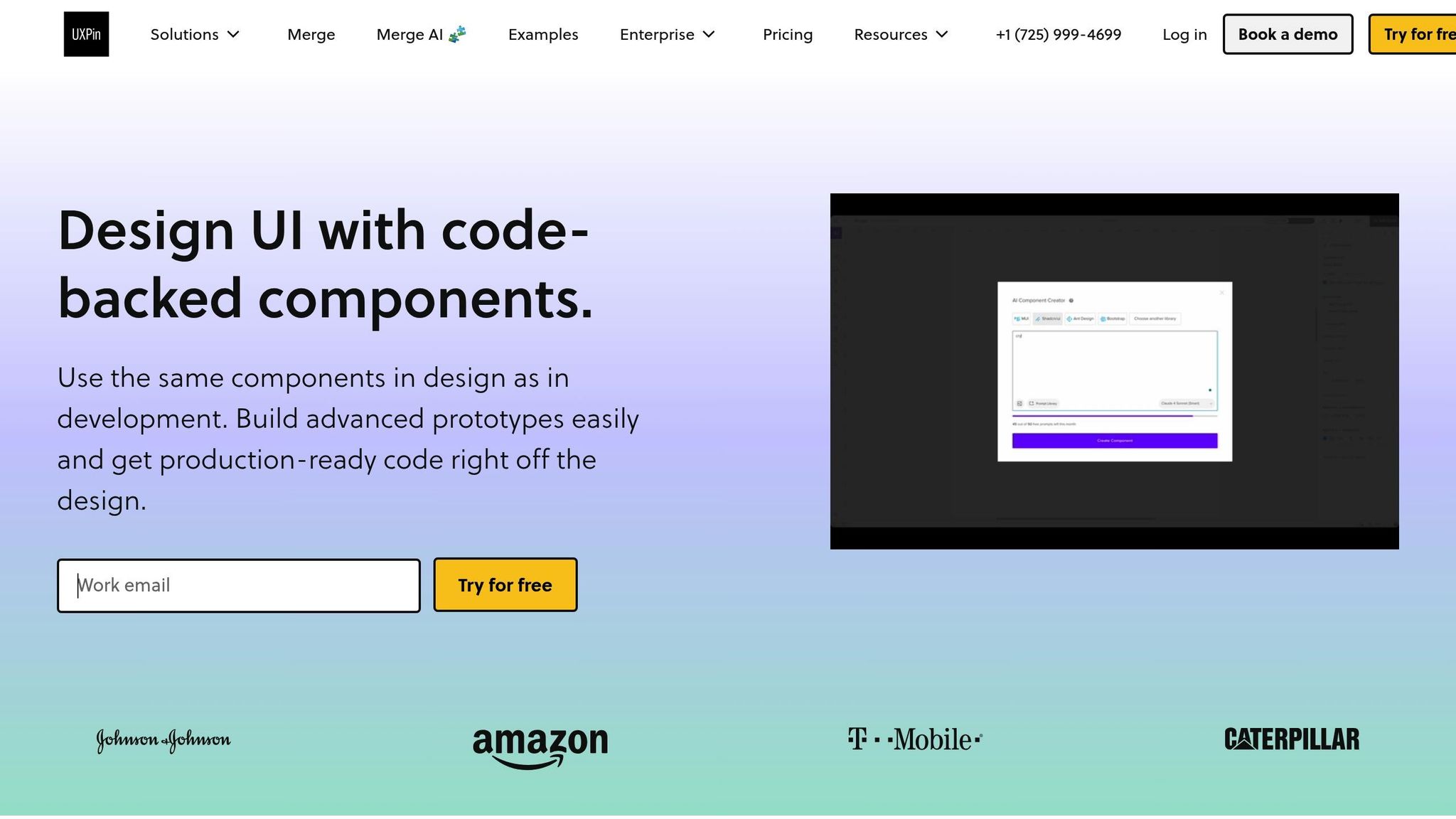
Merge AI: Faster Design Generation
Merge AI takes things a step further by generating layouts from text prompts or images, using only components from your approved design system. Whether your components come from MUI, Ant Design, Bootstrap, ShadCN/ui, or a custom library, every AI-generated output is ready for production. This eliminates the hassle of cleaning up or reworking designs, ensuring every layout aligns perfectly with your codebase.
How to Implement Design Tokens and Component Libraries
Integrating design tokens and component libraries into your workflow helps bridge the gap between design and development. By defining tokens in a universal format, converting them into usable code, and syncing components, you ensure that designers and developers work with the same elements. Let’s dive into the steps to implement design tokens and integrate them with component libraries.
Setting Up Design Tokens
Design tokens replace hard-coded values with reusable identifiers, typically defined in JSON. These tokens represent visual elements like colors, typography, and spacing. To implement them:
- Define tokens in JSON, using a multi-layer structure: base, semantic, and component layers.
- Use tools like Style Dictionary to transform tokens into CSS variables or platform-specific code. Automate this process with the command:
style-dictionary build --config config.js.
This ensures CSS variables are updated automatically. - For theme switching, utilize the
data-themeattribute on your HTML root element. This allows you to toggle between themes (e.g., light, dark) using CSS variables.
"The key insight: use semantic token references ({Colors.Brand.500}) instead of hard-coded values. This creates a dependency graph that makes your design system adaptive and future-proof." – Rahul Maheshwari, Frontend Developer
Integrating Custom Code Libraries in UXPin Merge
Once your tokens are ready, the next step is to bring your production components into your design workflow. UXPin Merge supports three integration methods:
- Git: Sync directly from your repository.
- Storybook: Connect components built with React, Vue, Angular, or Web Components.
- npm: Import packages directly.
Organize your components using a one-component-per-folder structure, where the folder or file name matches the component’s default export.
To tailor components for design needs, start with Wrapped Integration using Higher-Order Components (HOCs). This allows you to modify components – like adding controlled states or context providers – without altering production code. Use a Global Wrapper Component in your uxpin.config.js file to apply themes, context providers, or global styles across all components. Ensure styles are scoped locally to avoid interfering with the UXPin interface.
For automated updates, integrate CI/CD tools like CircleCI or Travis. Set your UXPIN_AUTH_TOKEN as an environment variable and add uxpin-merge push to your build script. This keeps components in sync with production code. For example, Microsoft’s UX team used this method to align the Fluent design system with UXPin Merge, enabling 3 designers to support 60 internal products and over 1,000 developers by maintaining a unified source of truth.
Scalable Token Strategies
For large-scale systems, tokens need to support multi-theme environments. Use the token layers – primitives, semantic tokens, and component-specific tokens – to ensure consistency across themes. This approach allows for base themes, vendor-specific overrides, and context-aware tokens that adapt dynamically.
Consistency in naming conventions is crucial. If your Figma variables use Colors.Text.Primary, ensure your code tokens match exactly. Avoid hard-coding hex values; instead, reference primitive tokens. This keeps your system flexible and future-ready, allowing updates without directly modifying components.
Best Practices for Developers in Design-in-Code Workflows
Setting up a design-in-code workflow takes more than just technical know-how. It requires clear guidelines, validation processes, and strategies to avoid conflicts as your system grows. These practices help keep your design tokens and components manageable across teams and projects.
Token Naming Conventions and Scope Management
A solid naming system is the backbone of any scalable design token setup. Many advanced systems rely on a three-tier hierarchy to keep things organized:
- Global/Base Tokens: These are the raw values like
color-blue-60orspacing-16that form the foundation. They should avoid any semantic meaning. - Alias/Semantic Tokens: These link global tokens to specific roles, such as
color-primaryorcolor-error, enabling features like theming (e.g., dark mode) without changing the component code. - Component-Level Tokens: These are specific to UI elements, such as
button-primary-bgorcard-border-radius, allowing for detailed overrides.
Interestingly, 48.1% of design system practitioners prefer creating their own naming conventions, with "ease of understanding" being the top priority.
"Naming isn’t just labeling – it’s a core part of your design system architecture."
When structuring tokens, use platform-friendly delimiters. For example, CSS variables often use dashes (-), while JavaScript objects might use dots (.). This means --color-primary-500 in CSS becomes color.primary.500 in JSON.
To avoid naming conflicts, use string representations for fractional values. For instance, spacing.1half works better than 1.5, as tools can mistakenly flatten 1.5 and 15 into the same identifier (e.g., spacing15). Also, steer clear of special characters like commas, curly brackets ({}), or emojis, as they can cause issues during transformation.
Avoid using reserved words such as name, type, value, or description, as these are often part of design token specifications and can lead to parsing errors.
Adobe’s Spectrum design system is a great example of this approach, using a brightness scale (50 to 900) to name colors in a logical and flexible way. This makes the system intuitive and adaptable across themes without requiring developers to remember arbitrary names.
Once you’ve nailed your naming strategy, you can focus on managing themes and component-specific overrides for added customization.
Theming and Component Overrides
Balancing flexibility and control is key when managing themes and customizing components. The goal is to adjust components for specific needs without introducing unnecessary complexity or straying from your production codebase.
One effective approach is using Wrapped Integration via Higher-Order Components (HOCs). This allows you to tweak component behavior in design tools without affecting production code. For example, you can create versions of checkboxes or add context providers specifically for the design environment. This keeps your design and production components aligned.
When implementing themes, scope styles locally to avoid conflicts between your design system’s CSS and the design tool’s interface. This is especially critical when using tools like UXPin Merge, where your component styles must coexist with the editor’s styling.
Another helpful tool is Storybook Args, which lets designers adjust properties, slots, and styles directly – no code changes required. This self-service approach allows designers to explore component variations on their own, cutting down on back-and-forth with developers.
Consistency is crucial. For instance, if your directory is named Button, ensure the exported component matches that name exactly. This clarity extends to both your code repository and the design tool’s spec mode.
| Integration Type | Benefits | Considerations |
|---|---|---|
| Clean Integration | Easy to maintain, no extra work for updates | Requires strict adherence to standards; limited flexibility |
| Wrapped Integration | Offers flexibility for design-specific tweaks | More complex to maintain; may need manual updates for wrappers |
With clear naming and override strategies in place, the next step is integrating validation and Storybook to maintain consistency.
Code Validation and Storybook Integration
Validation tools and Storybook integration are essential for keeping components consistent and error-free as they move between design and development environments. UXPin Merge supports over 15 Storybook frameworks, including React, Vue, Angular, and Web Components, making it compatible with most modern setups.
For private Storybook libraries, use the @uxpin/storybook-deployer CLI tool with token-based authentication to establish a secure connection between your component library and the design environment. If you’re using Vite as a bundler, set config.base = ' ' in viteFinal to ensure assets load correctly.
Storybook’s Args feature is a game-changer, enabling designers to dynamically modify component properties, slots, and styles within the design editor. This creates a unified source of truth, allowing designers to work directly with the same components developers ship to production.
"We synced our Microsoft Fluent design system with UXPin’s design editor via Merge technology. It was so efficient that our 3 designers were able to support 60 internal products and over 1,000 developers."
- Erica Rider, UX Architect and Design Leader
To maintain this level of efficiency, validation must be baked into your workflow. Use linters to catch token naming errors, validate component props against TypeScript definitions, and run automated tests with every commit. These safeguards ensure that broken components never make it to designers or production environments.
Conclusion
Key Benefits of Design-in-Code
Design-in-code brings designers and developers together by creating a single source of truth, cutting down inconsistencies and slashing engineering time by 50%. It can speed up product development by as much as 10× compared to older, image-based workflows. This method encourages shared ownership of code, bridging the gap between design and development. Plus, it offers perks like runtime adjustments, batch updates through inheritance, and automated documentation – all while keeping governance overhead minimal.
With these advantages in mind, let’s look at how you can begin integrating design-in-code into your process.
Next Steps for Adopting Design-in-Code
To bring design-in-code into your workflow, focus on using tools like design tokens, component libraries, and dynamic theming.
Start by setting up design tokens – such as colors or spacing – in a version-controlled repository. These tokens act as a shared resource for your team. Test theming branches to observe how changes ripple through your designs.
Then, choose the right integration for your team. For example, UXPin Merge allows you to work with React or web components via Git, connect to Storybook for interactive previews (compatible with frameworks like Vue and Angular), or use npm for easy package updates. If you’re new to this, start with a wrapped integration using Higher-Order Components (HOCs) for flexibility, then move to direct production code when you’re ready.
Adopt clear naming conventions, like BEM, and manage token scopes carefully to make overrides simple and enable dynamic theming with CSS variables. Using Storybook can also ensure that your code validations and previews align with your design definitions.
To hit the ground running, you might want to import pre-built libraries like MUI, Ant Design, or Bootstrap. These provide immediate access to interactive, code-ready components.
For enterprise teams looking to eliminate handoff challenges completely, UXPin Merge offers the ability to design directly with production-ready components inside the design canvas. Visit uxpin.com/pricing to find the plan that works best for your team.
FAQs
When should a team use design-in-code instead of mockups?
When teams prioritize high fidelity, consistency, and efficiency, design-in-code becomes the go-to approach. It’s especially useful for crafting interactive prototypes that use production-ready code, cutting down on errors and fostering better collaboration across teams. This method also supports scalability, accelerates deployment timelines, and ensures everyone is aligned by using shared components as a single source of truth.
While mockups work well for early brainstorming and ideation, design-in-code shines in workflows that demand precision and scalability – making it a perfect fit for enterprise-level projects.
How do design tokens stay in sync across apps and platforms?
Design tokens serve as a shared, platform-neutral foundation for design decisions, ensuring consistency across apps and platforms. By leveraging tools like CSS variables, they make it possible to implement changes at scale, updating multiple elements and projects seamlessly. This approach streamlines workflows and helps maintain a cohesive design system.
What’s the quickest way to start using UXPin Merge with our component library?
If you’re looking to jump into UXPin Merge quickly, the best approach is to use the boilerplate repository they provide. Here’s how to get started:
- Fork and clone the repository from GitHub to your local environment.
- Set up the project using Node.js by running
npm installfollowed bynpm run start. - Test the sample components included in the repository to see how everything works.
Once you’re comfortable, you can take it a step further by integrating your own React components. UXPin offers detailed guidelines to help you through the process. This method is especially straightforward if you’re already familiar with tools like GitHub and Node.js.

