What Actually Constitutes Design Language?
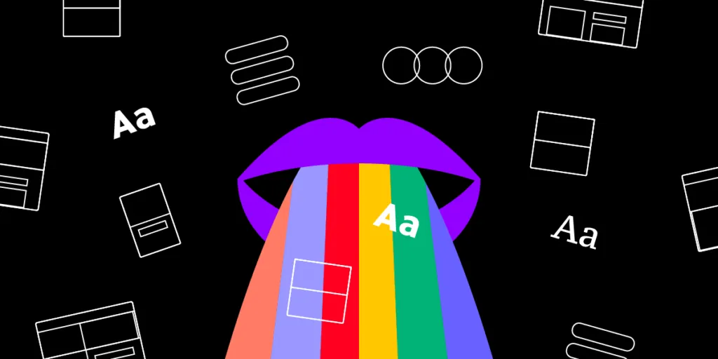
Visual communication is exceptionally complicated. It’s diverse, boundless, and relentless. A design language establishes principles and constraints that induce the clarity, consistency, and cohesion necessary for designers to communicate with end users.
Developing this design language is a time-consuming undertaking requiring feedback and collaboration from multiple departments and stakeholders.
The final result will allow an organization to create convergent and coherent experiences, significantly decrease spending, and set a high design standard that’s easy to follow.
Bake your design language into your component library with a single source of truth from UXPin Merge. Visit our Merge page for more details and how to request access to this revolutionary technology.

What is design language?
Design language is the collection of visual and interactive elements designers use to communicate with users. It ensures that designers create cohesive and consistent user experiences across platforms, products, user interfaces, and features.
The design language typically relates to the company’s brand values and identity–allowing people to recognize a brand through its designs and content.
There are two perspectives of design language: internal and external.
- Internal: ensures that every team follows the same rules and methodologies using a set of reference points and coordinates, making the design process efficient and free of confusion.
- External: facilitates familiar, intuitive user experiences for customers across multiple platforms and products.
By blending these two perspectives, companies create more efficient design processes, craft a memorable brand identity, and enhance usability.
What goes into a design language?
A design language covers many facets of a product, such as
- Colors
- Fonts
- Icons
- Sounds
- Spacing and layouts
- Copy
- Graphic design and illustrations
- Data visualizations
- States
What’s the difference between design language and design system?
A design language typically exists within a design system or style guide, providing product teams with guidelines, usage, and instructions. In a 2017 article, UXPin founder Marcin Treder made the argument that design systems are a language:
“A design system is a dynamic dictionary that describes the ever-changing current state of the language, prescribes the proper usage of it, and invites all the users of the language to extend it.” – Marcin Treder.
If you aim to build a design system, defining your visual language first will help guide the development of your UI components and pattern library.
Why is having a design language important?
A design language is a set of rules and principles that guide an organization’s visual identity, ensuring designs have a sense of continuity.
A well-defined design language offers many benefits, including:
- Ensuring design teams deliver consistent and coherent results, no matter who works on the project
- Streamlines onboarding and handovers by providing new team members with instructions and guidelines
- Creates brand consistency which helps develop a strong brand identity and trust
- Makes digital products more intuitive by providing users with a familiar and consistent user experience
- Provides a foundation for scalability because product teams make fewer design decisions, increasing efficiency and productivity
Design Language Examples
There are two organizations many designers use as models for developing their design language and building a design system:
- IBM
- Airbnb

IBM Design Language
Part of IBM’s design philosophy is to create instantly recognizable designs. Users must be able to identify an IBM product by its design characteristics rather than the logo itself.
A distinguishable visual identity is vital for building brand recall and user fidelity. One of the ways IBM achieves that is by engineering its grid systems like the 2x Grid.
“Precise use of the grid, along with consistent shapes, angles, and radii, help define a particular aesthetic that’s critical in expressing the “IBMness” of our illustrations and reveals a well-considered and systematic approach” – IBM.
Airbnb’s Visual Language
Airbnb’s Visual Language aims to achieve similar results but with the flexibility to scale. The company’s design language prioritizes speed and growth while preserving Airbnb’s strong brand identity.
“Here’s the simple truth: you can’t innovate on products without first innovating the way you build them.” – Alex Schleifer, VP of Design at Airbnb.
Airbnb’s language makes communication between designers and stakeholders much easier and standardizes practices across platforms and devices.
How to Create a Design Language
Developing a design language is arduous and time-consuming but well worth the effort. The earlier you start, the less work you’ll have, and the sooner your teams will start reaping the rewards.
Start with UI audit
It’s often best to complete a UI audit before developing your design language. An audit will allow you to identify issues, inconsistencies, or design decisions that don’t align with your principles or values.
Create a vocabulary
A vocabulary should contain and clearly define a product’s visual elements. The aim is to include a systematized pattern library and UI components accompanied by a style guide.
Your style guide must provide directions for each element’s purpose and how they promote consistency and clarity–for example:
“This [design element] from the [library] allows us to express [purpose].”
Keeping these directions (principles) succinct, easy to understand, and implement is crucial. For example, Shopify Polaris, used by thousands of designers worldwide, articulates its design principles in fewer than 100 words:
- “Fresh visual style: A clean, simple style makes things feel approachable and efficient.
- Faster performance: Elegant code and lightweight assets means pages load more quickly.
- Future-friendliness: Built for flexibility, design tokens and new infrastructure let us iterate easily across experiences.
- Purposeful brand presence: Being intentional about when the Shopify brand comes forward, and when it takes a backseat, directs the focus to where it matters most.
- Familiarity across experiences: Defined patterns and guidelines help us design a wide variety of experiences that still always feel like Shopify.”
Polaris uses this simplified approach across its documentation.
This simplification enables organizations to establish the meaningful constraints mentioned above while allowing designers to streamline decision-making. For example, here’s how Atlassian explains the logic behind their color palettes:
“Our primary palette is comprised of neutrals, white, and blue to bring boldness to our brand and is used in logical ways throughout product and marketing to guide the eye and highlight the important bits. We pepper warmer, secondary palette colors throughout to soften the experience and to impart confidence and optimism.” – Atlassian Design System.
Defining your design principles
The principles behind a product’s design philosophy are a litmus test for evaluating a design’s quality and purpose. It allows an organization to assess whether prototypes adhere to its general guidelines.
Some key points to consider include:
- Consistency
- Clarity
- Simplicity
- Usability
- Accessibility
For example, Airbnb’s design principles prioritize accessibility and functionality. They aim to create “unified, universal, iconic, and conversational” designs.
IBM’s principles aim to create “carefully considered, uniquely unified, expertly executed, and positively progressive” designs.
Set the rules
Principles define what your organization’s values are, while the rules guide teams on how to achieve them. These rules are essential for creating consistent workflows and outcomes to deliver great user experiences.
The rigidity of your rules will vary–some will be strict, while others will promote creativity and flexibility to innovate. You might not recognize these differences from the beginning, so it is crucial to encourage feedback from team members.
Facilitate growth
Your design language and system are ever-evolving organisms adapting to product, market, and technological changes. The design system team must adjust to these changes while encouraging users to contribute.
“A unified design language shouldn’t be just a set of static rules and individual atoms; it should be an evolving ecosystem.” – Karri Saarinen, Principal Designer at Airbnb.
Here are three ways to remain flexible and update your design language:
- Follow market trends and adjust to ensure your design language stays relevant to users.
- Keep personas up-to-date so that your design language aligns with the people your products serve.
- Monitor your competitive landscape to explore strategic design opportunities and create a distinct visual identity.
Who’s Responsible for Creating a Design Language?
While designers are responsible for developing an organization’s design language, it’s a collaborative effort requiring input from multiple departments and stakeholders. This collaboration increases adoption and ownership across the organization.
Here are some key departments and specialists you’ll want to include when developing a design language:
- UX/UI Designers: responsible for the visual components of the language.
- Accessibility specialists: ensure that the language abides by accessibility standards.
- UX writers or Content strategists: responsible for the tone of voice guidelines and brand spokesperson parameters.
- Researchers: provide valuable insight into the needs of the end-users.
- Front-end developers: instrumental in writing efficient programming syntax and assisting with documentation.
- Stakeholders: ensure that the language aligns with the organization’s goals and identity.
Unify Design Language With UXPin Merge
UXPin Merge is a technology for syncing a product’s UI library with UXPin’s design editor. By bridging the gap, Merge enables designers to use the same components during the UX design process as engineers use to develop the final product.
This single source of truth eliminates design drift and enhances designer/developer collaboration with built-in properties, principles, and constraints.
Instead of designing from scratch, designers use these components like building blocks and create prototypes for user testing. Because engineers already have the same UI library, design handoffs are smoother, almost non-existent, thus reducing time-to-market with minimal errors and debt.
Unify your product development process with a single source of truth from UXPin Merge. Visit our Merge page for more details and how to request access.


