How to Design With Contrast
When you begin studying graphic design, you probably think that color plays the most important role in contrast. A lot of people immediately think of the stark contrast between white and black. As you gain more skills and become more aware of trends in the design world, though, you will likely notice that some professionals don’t need to use color much when they design with contrast.
Sophisticated approaches to designing with contrast can relying on textures, typefaces, size, and other values. These contrasts often have subconscious effects on people. Your audience might not know why they feel drawn to a design, but they still have positive responses.
If you want to learn more about how to design with contrast in mind, follow the below tips. Then, learn why website and app designers love using contrast in their products.
Effective ways contrast can make design more effective and interesting
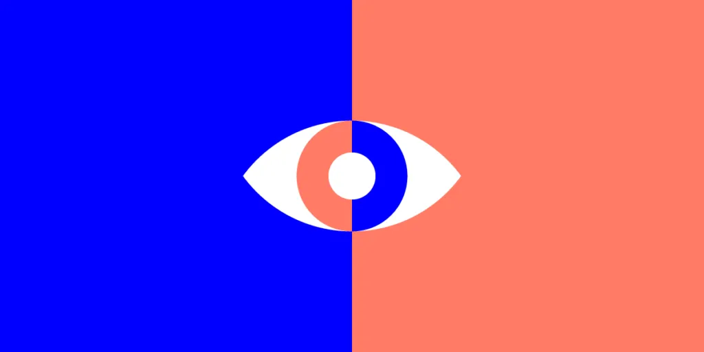
Creating contrast with dark and light color
Let’s start with dark and light colors, potentially the most obvious way to add contrast to a design.
The French artist and graphic designer Guillaume Grimaud offers several examples of creating contrast with light and dark colors on his CREATIVEPARK website. He uses black and white exclusively on his site designs. Surprisingly, the pages never look boring. His expert technique makes each page look like an intentional statement about the merits of minimalism.
Black and white are extremes. You can use lighter and darker versions of any color to create contrast in your designs. A tool like Coolors can help you explore colors that you might want to use in your work.
Create contrast with color temperature

Contrasting color temperatures can create eye-popping, modern designs. You only need to know the basics of color theory to try temperature combinations.
Warm colors include:
- Red
- Orange
- Yellow
Neutral colors include:
- Gray
- Tan
- Brown
Cool colors include:
- Green
- Blue
- Purple
Keep in mind that RGB and CMYK color models work a little differently from each other. You can get very similar results by pairing warm and cool colors, though. Experiment to see which ones pop and which ones fizzle.
Download the ebook Web UI Design for the Human Eye to read more about how color temperature can add to a design’s appeal.
Contrast with texture can make designs more interesting

Contrasting textures can make designs more interesting to look at. Designers and artists often use texture in physical works. You can use it with smartphone apps and websites, too.
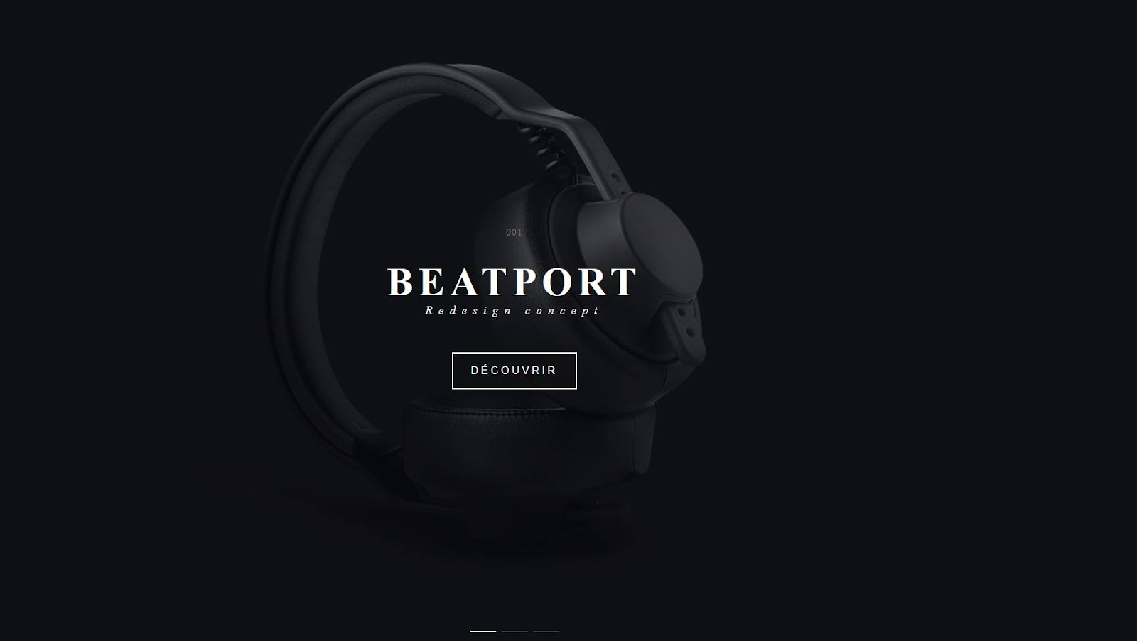
One option is to use a smooth, consistent color as the background and place a rough image on top. For example, you might have a stark black background with black-and-white speckled words printed on top.
You can also add contrast to the design by combining photographs and text. Blur the picture slightly to use it as the background. Any plain text printed on top of it will stand out.
You can even go in the other direction by making the text slightly fuzzy and emphasizing amazing food.
White space can contribute to contrast
Never forget about the important role that white space plays in website and app design. White space does several crucial things, such as:
- Create distance between calls to action.
- Emphasize a product, message, button.
- Make people feel relaxed (as opposed to a crowded design that can make them anxious).
Learn more about the benefits of white space in UXPin’s ebook Zen of White Space in Web UI Design (Balance and Contrast).
Typeface contrast in design
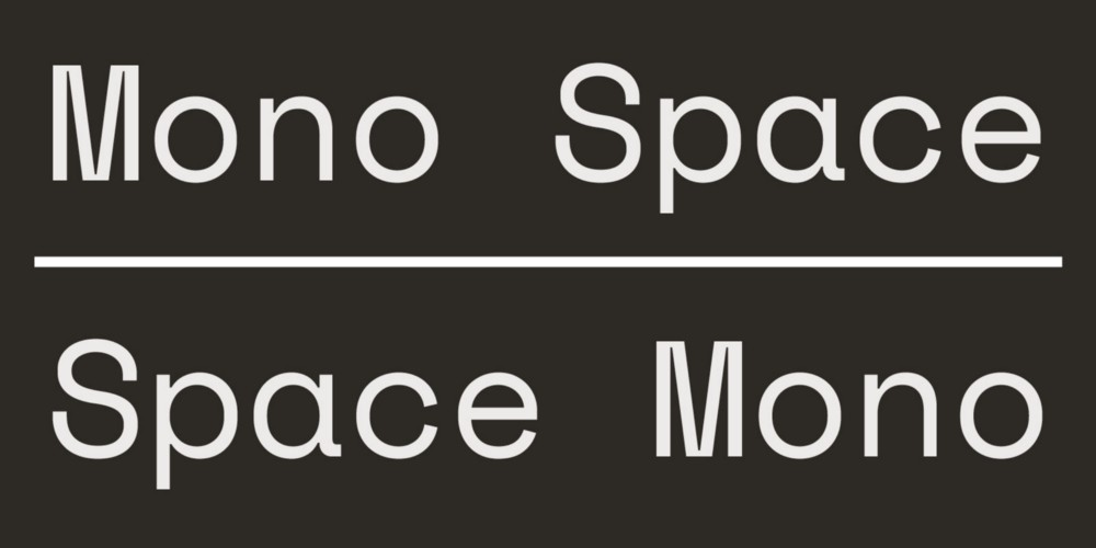
People outside of the design world often forget that text does more than represent words and meanings. Every letter has a design that professionals can use to create contrast in their work.
By mixing and matching typefaces, you can make certain sections of text stand out from the rest of the page. You might want to use a bold typeface to emphasize a pullout quote or important message. Conversely, you can use a light typeface to provide small details that most people won’t need to read.
Google Fonts work in UXPin, so you can access thousands of typefaces without paying a graphic designer to develop custom fonts.
Patterns can add contrast to your designs
Fashion designers know that contrasting patterns can elevate clothing—but only when paired well. You can get similar results with patterns on a screen.

Once you find patterns that work for your project, add them to your design system. By creating a project-specific library of patterns, you encourage other designers on your team to explore fresh ideas without going off the rails.
Benefits of learning to design with contrast
Learning how to use contrast in design isn’t all about making websites and apps look attractive. Your design skills can have a significant influence on a client’s success.
In all seriousness, though, you can learn to use contrast to influence behavior. As long as you also make attractive designs, you can feel good about subtly manipulating viewers.
Contrast can affect how people consume content
- The viewer’s eye doesn’t observe passively. It consumes images. You have some control over which parts of your design the eye looks at first and last. Placing heavy, dark text on a white background will force visitors to look at the text. Adding a textured arrow to the side of a page will encourage visitors to look at what’s below.
Contrast can influence consumer behavior
- White space can increase conversions. If your clients need to generate income through sales, learn how to use white space to convince visitors to buy more.
- Bright letters on a dark background get noticed. You can use them to tell consumers that they need to take advantage of opportunities immediately. A large, bright red 75% OFF – LIMITED TIME graphic will convince a lot of people to start browsing online catalogs for sales they don’t want to miss.
Contrast can keep people on pages longer
- The amount of time that people spend looking at a website page isn’t a high priority for most companies. Still, you can use contrast to keep visitors engaged and on the page. Offer a variety of colors, textures, and fonts to keep them reading.
Test your design ideas with UXPin
You never know whether a design idea will work until you test it. As Joe Cahill says, “the idea of color contrasts—that was never a thing until somebody started talking about it, and now you run everything through a plugin that checks your accessibility and makes sure your color contrast is good.”

UXPin makes it easy for you to generate fully functional prototypes that you can share with colleagues and stakeholders. They don’t even need a UXPin account to view your prototype and leave feedback. Strong collaboration features like that make UXPin one of the most effective tools for designers and developers. Start your free UXPin trial today to see how its features can improve your work. After your 14-day trial, you will understand why so many professionals choose UXPin as their go-to prototyping tool.

