Product Announcement – Helping You Bring Design Vision to Life
We are excited to share what we’ve been working on in the past few months. We’ve been doing extensive research and development concerning the technology behind UXPin Merge, and today’s the day when we announce it all.
Evolution of UXPin
Our tool was grounded in a passion for innovation and a strong desire to make design accessible to anyone. It started as a paper prototyping notepad, aimed at democratizing prototyping and making it a universal concept that can be used to conceptualize design ideas fast.
Around 2011 we developed a digital wireframing solution. At that time, this type of design work had its limitations. UXPin emerged as a solution to overcome existing flaws and introduce new advantages – from better collaboration with teammates outside of design to the challenges of quick iterations.
UXPin was dedicated to reinventing the design process from the very beginning. Instead of operating on pixels, the tool was backed with code. Instead of focusing on flat mockups, it gave users the power to build highly interactive prototypes. Instead of following a well-threaded path of making a design handoff an afterthought, it married it into the design process from the very beginning.
All of that is backed up with many interesting feature releases, such as Spec Mode, an advanced version of Figma’s “Dev Mode” which UXPin has had for about 8 years. With Spec Mode, developers could inspect properties, measure distance, and get a generated style guide from the design.
We’ve never stopped innovating – the next step was developing a unique design technology – UXPin Merge – meant to bridge the gap between design and development by making teams share a single source of truth (coded UI components.)
And now, we clarified our mission even further – we want to foster an even more inclusive design environment for everyone.
The Journey to Change
Our journey began with a critical realization – developers often struggle to find a designer and need to build a UI by themselves. This sparked the inspiration to refocus UXPin Merge to cater specifically to design-less or developer-driven teams, seeking a more straightforward way to create highly interactive and beautifully-looking user interfaces.
After talking to the users, we understood that UXPin Merge can play a key role in making design accessible and heralding the new era of design – one in which you can blend both design and development into one cohesive process.
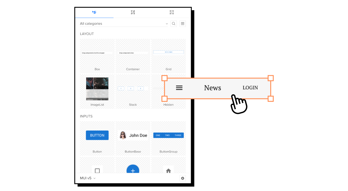
Starting with the most popular coded component libraries, MUI, Ant Design, Bootstrap, and Tailwind UI, we transformed UXPin Merge into a drag-and-drop UI builder that serves as a powerful tool for anyone who wants to design fast without compromising on quality, interactivity, and documentation.
UXPin Merge Update – Drag-and-Drop UI Builder with Code Export
To achieve our mission, we introduced key functionalities that make the product development process easier. Let’s explore them one by one.
AI Component Creator
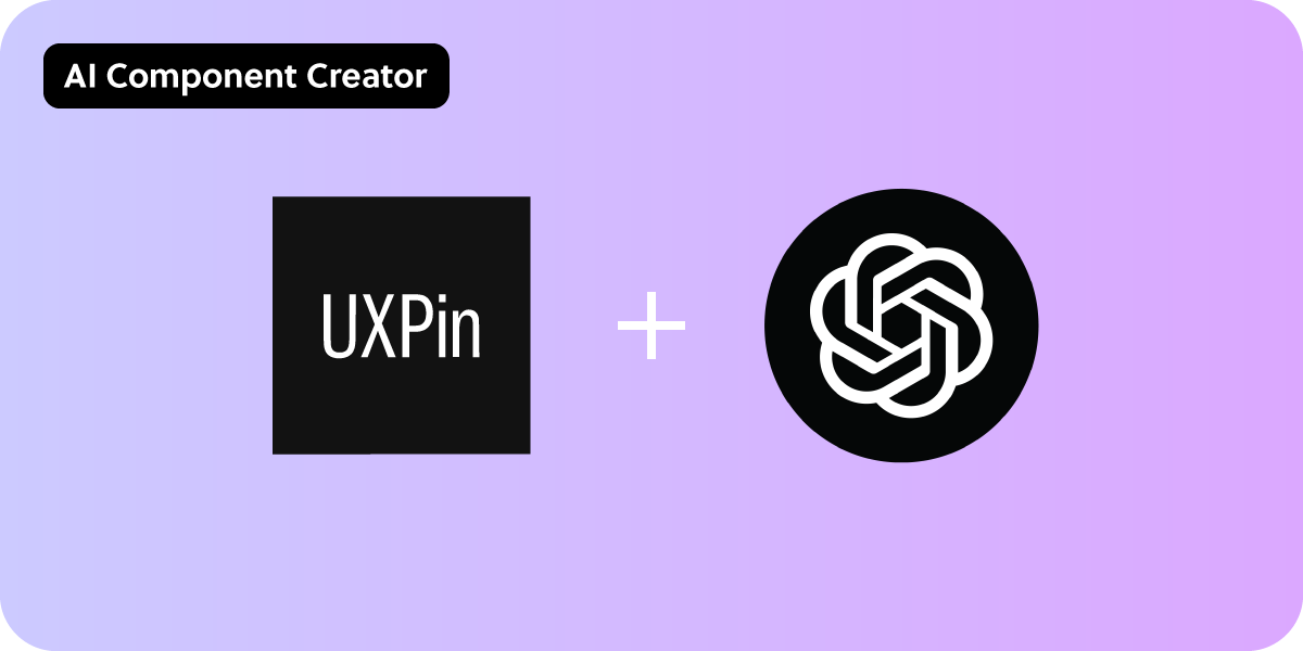
AI proved itself to increase productivity, speed of work, and when it comes to the world of UI and code – product development. That’s why we decided to include it in our design tool.
Our built-in ChatGPT integration can help you get AI-generated fully customizable components based on the prompts you use. Just describe the component you need, and in seconds, it will appear on the canvas. If you need to reuse it or share it – save it as UXPin Pattern.
The AI Component Creator is located on the left (see the screenshot below.) For now, it works with the Tailwind component library (you will read more about that in a separate article.)
It’s a great tool for getting custom components to complement your Tailwind UI library. A form field, menu, modal – the AI Component Creator can generate fully coded components. Once you finish up your AI-generated design, you can copy the working code off the prototype, and kick off the product development phase.
The plugin requires an OpenAI API key, but we’re ready to help with that. Anyone interested in the plugin is welcome to write to our support team or read our help documentation.
Open-source UI component libraries
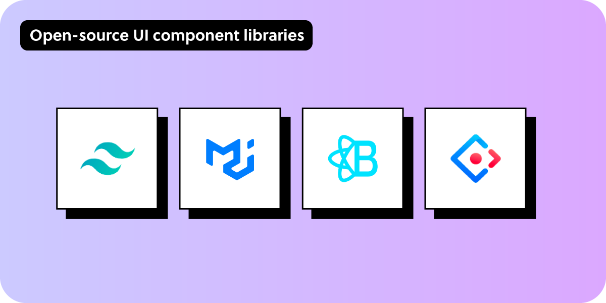
We’re adding new UI libraries, so that you can enjoy 100% code parity between design and development. This release includes MUIv5, Ant Design, React Bootstrap, and Tailwind UI – four powerful UI libraries that are fully themeable, customizable and their elements can be copied to the development environment without translation.
What’s worth highlighting is that since code comes from open-source libraries, you are the owner of it! You can copy the entire code and use it outside UXPin Merge. We’re giving you a safe design environment to do UI and code exploration. Without making you dependent on our tool.
1. Tailwind UI
We’re adding a full library of Tailwind UI components that is available in UXPin. Tailwind is one of the best choices for reusable CSS code and it’s a great fit for anyone who wants to rapidly build a polished front-end without the need to start from scratch.
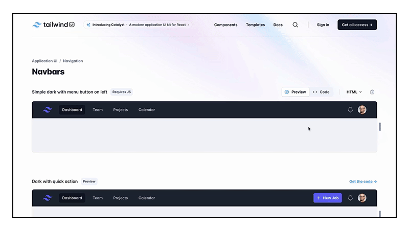
It works like this: open Tailwind library in UXPin, pick components that you need, adjust their props, go to Spec Mode and copy the code off your design with one click. We’re including 18 components (button, alerts, input, avatar group, dropdown, and more,) plus we’re giving users the option to add custom Tailwind components, be it with AI Component Creator or just the “Custom component” option in the library.
With Custom component, you can take any code from Tailwind UI and paste it into UXPin. Let’s say you want a Hero Section. Go to Tailwind UI > Components > Marketing > Hero Sections (quick link here.) Then, copy the code by clicking the icon on the right. Go to UXPin’s Tailwind library and click the first component named “Custom component.” Paste the code and watch how your hero section gets dropped on the canvas.
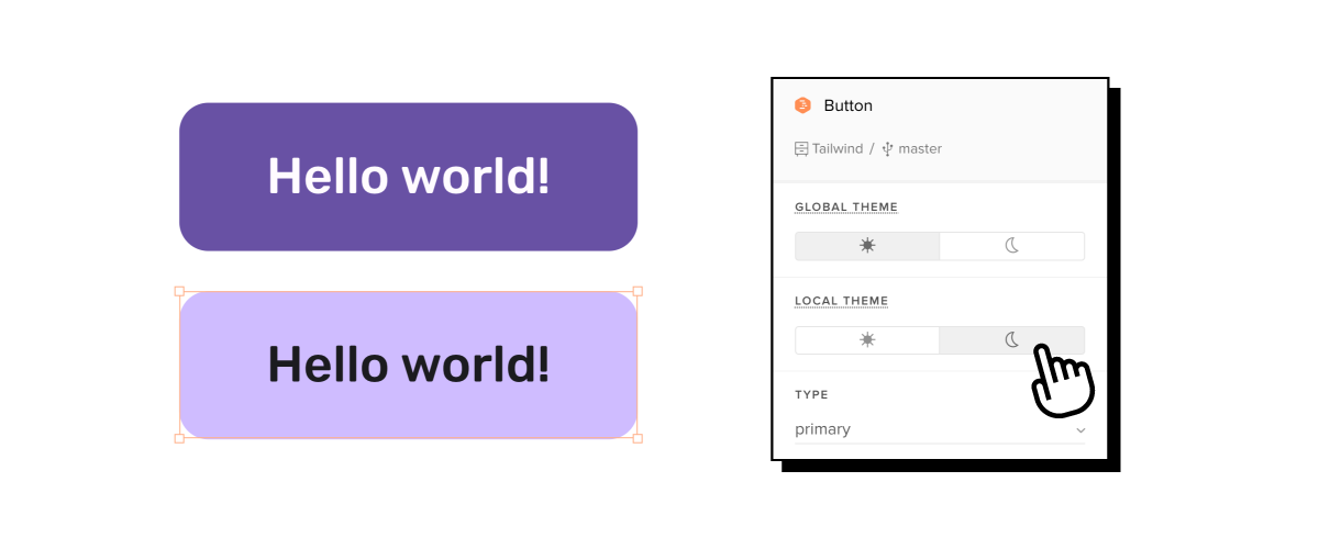
Additionally, with this integration, users can set up themes:
- Global theme property to have the theme propagated across the entire prototype.
- Local theme property to change a theme only on a specific page.
To read more about Tailwind, head to our help documentation.
2. MUIv5
Another new built-in library in UXPin is MUIv5. You’re free to use it on a trial and we have a tutorial plus fully-functional layouts waiting for you. As with Tailwind, just take the component that you like out of a built-in library, place it on the canvas, adjust properties, and copy code.
MUIv5 is a React library that many teams use as a design system. With UXPin, you can easily do that too, and get consistent UI without constantly updating two environments.
- Access documentation with one click – place a component onto the canvas, click on it, and preview its official documentation, linked in the Properties panel.
- Switch themes to make your design unique – MUIv5 is fully themeable and you can update it to match the theme you want to use.
- Forget about redesigning the same element over and over again – most design tools keep the look of your components consistent, we’re going a step further. With our tool, components’ states are also baked in the library..
What’s amazing about this and the rest of libraries in this update is that you get clean code behind every component that you use. Unlike in other design tools, you don’t need to translate components to be usable in the dev’s environment.
Here’s a guide on how to use MUIv5 library components: How to build a simple and responsive dashboard.
Want to get skilled at using MUIv5 in design? Follow our mini-course with Rachel. Here’s the first episode.
3. Antd (Ant Design)
This release also includes Ant Design. Ant Design is a React component library and like any library in UXPin, it works in a drag-and-drop mode. Search for a component you want to use, use it in your design, and copy the clean code that’s fully consistent with official documentation.
If your team is looking for a design system, Antd can be your React component library to base it on. The components that are inside UXPin include avatar, breadcrumbs, cards, inputs, but we also have elements for building layout, adding feedback, such as alerts, and navigation.
You’re free to check it out on trial. Sign up for UXPin Merge.
4. React Bootstrap
We’re also integrating React Bootstrap to UXPin Merge. Next to MUI, Bootstrap is one of the most popular open-source React component libraries that forms a foundation for design systems.
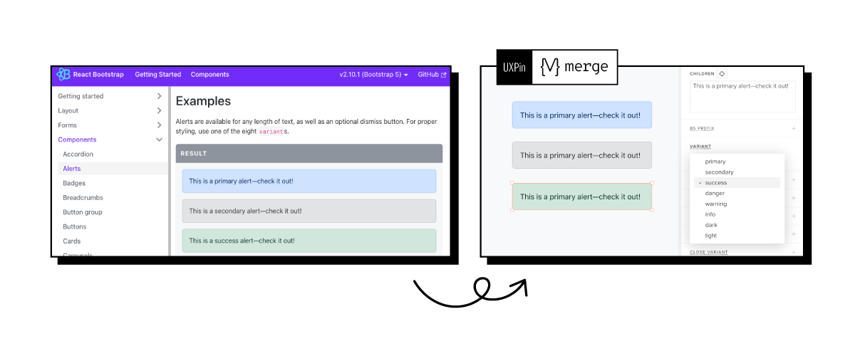
Just navigate to Design Systems Libraries in the Editor, pick React Bootstrap and explore dozens of built-in components that are fully consistent with official Bootstrap documentation.
Drag and drop React Bootstrap components on the canvas, manage their props, arrange the layout, and go to Spec Mode to copy the code.
Do you want to learn how to use it? Great! React Bootstrap is available on trial and comes with its own trial kit. Dive into this React library. Try UXPin Merge for free.
Templates
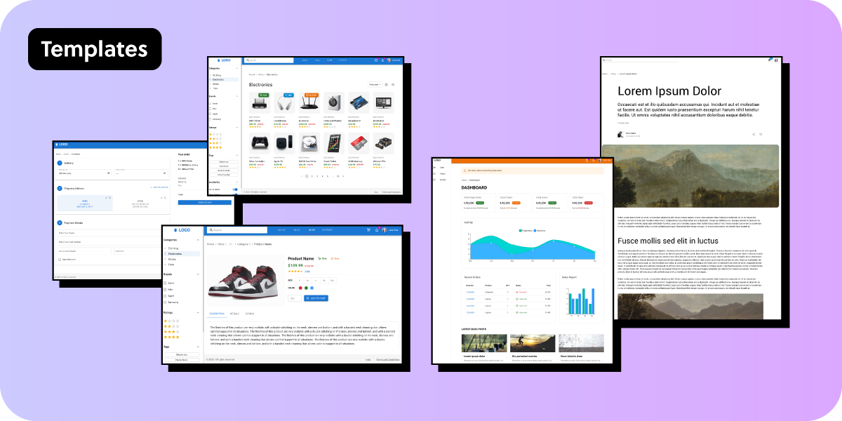
A blank canvas can be quite scary. For that reason, our release comes with a host of customizable templates. Pick a layout that fits your use case, edit it as you like, and ship it as your own UI.
The templates are not exclusive to UXPin. As with coded components, you can copy the code behind the elements and use it to build your own product.
We’ve built the templates with the MUIv5 component library mentioned above. They are based on the official documentation, contain clean React code, and are a great representation of what UXPin Merge is capable of.
The templates include:
- Dashboard – get a template of a fully-fledged UI dashboard with an activity chart, order history, sales report, and search bar; perfect for internal tools.
- Blog – use a layout for a blog with an article structure, images, author avatar, tags, and breadcrumbs.
- Store – copy the store template and populate the images with your own content, adjust tags names, edit prices, and add your own ranking.
- Product details – edit the product card that contains UI elements like image, star rating, price changes, and more.
- Checkout – play around with a checkout page, personalize it to your product needs, and copy the code behind it.
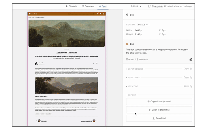
Spec Mode Improvements (Beta)
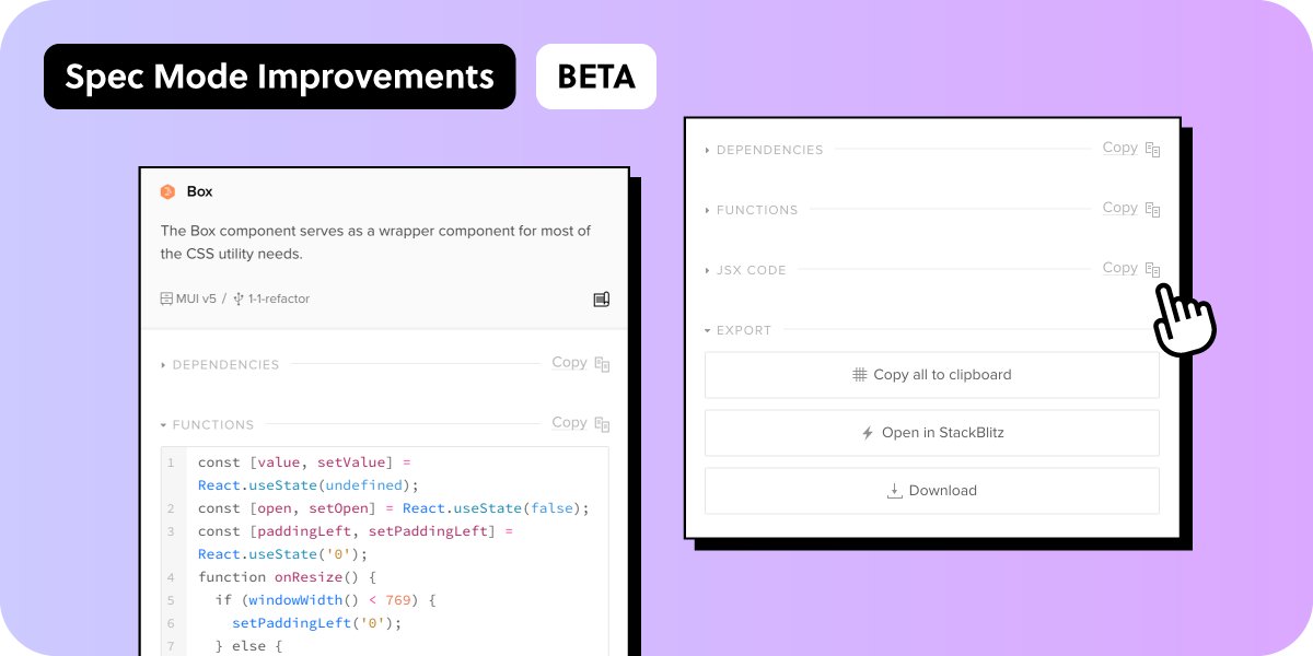
Our Spec Mode also got revamped. Right now it’s available with MUIv5 library, but we plan to do a full release later on. UXPin’s Spec Mode is a feature that allows developers to copy specifications, assets, and HTML, CSS, and JSX code.
When building a prototype with MUIv5 components, Spec mode has additional features. What are they?
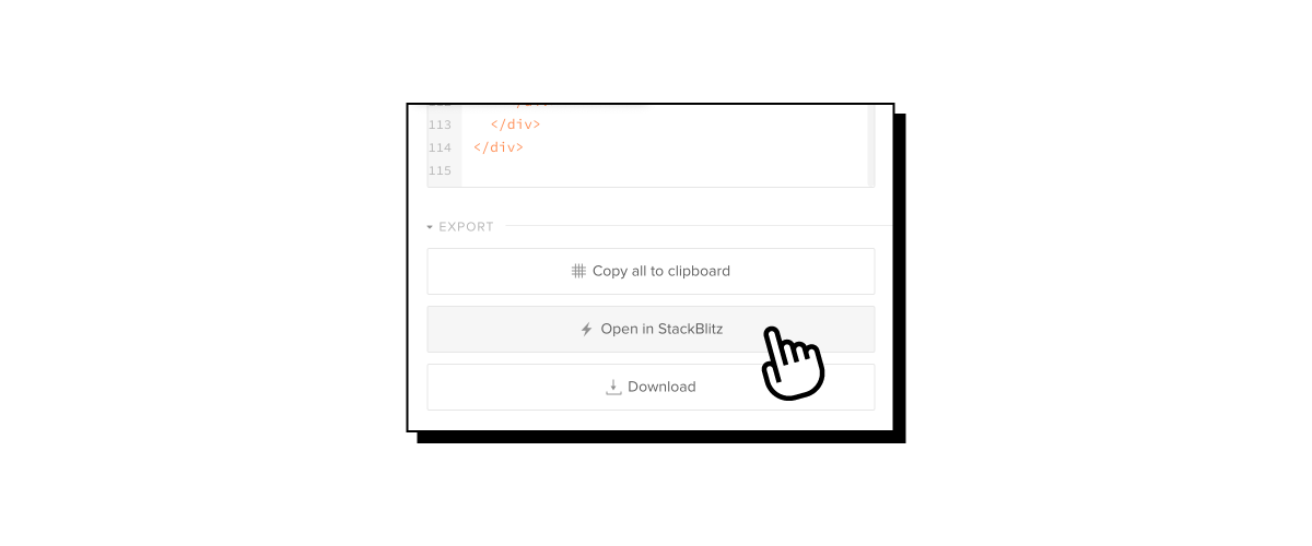
- Stackblitz integration – with a click of a button, users can copy the code to Stackblitz, a popular front development environment.
- Clean React code that’s fully consistent with official documentation – get clean working code that you can copy to your developer’s environment or use one of our available integrations.
- Resizable Spec Panel – users can change the size of Spec Panel instead of using a fixed size.
- Collapsible code sections – a small but mighty usability improvement in which you can collapse sections that you don’t want to see.
JSON Tree Viewer
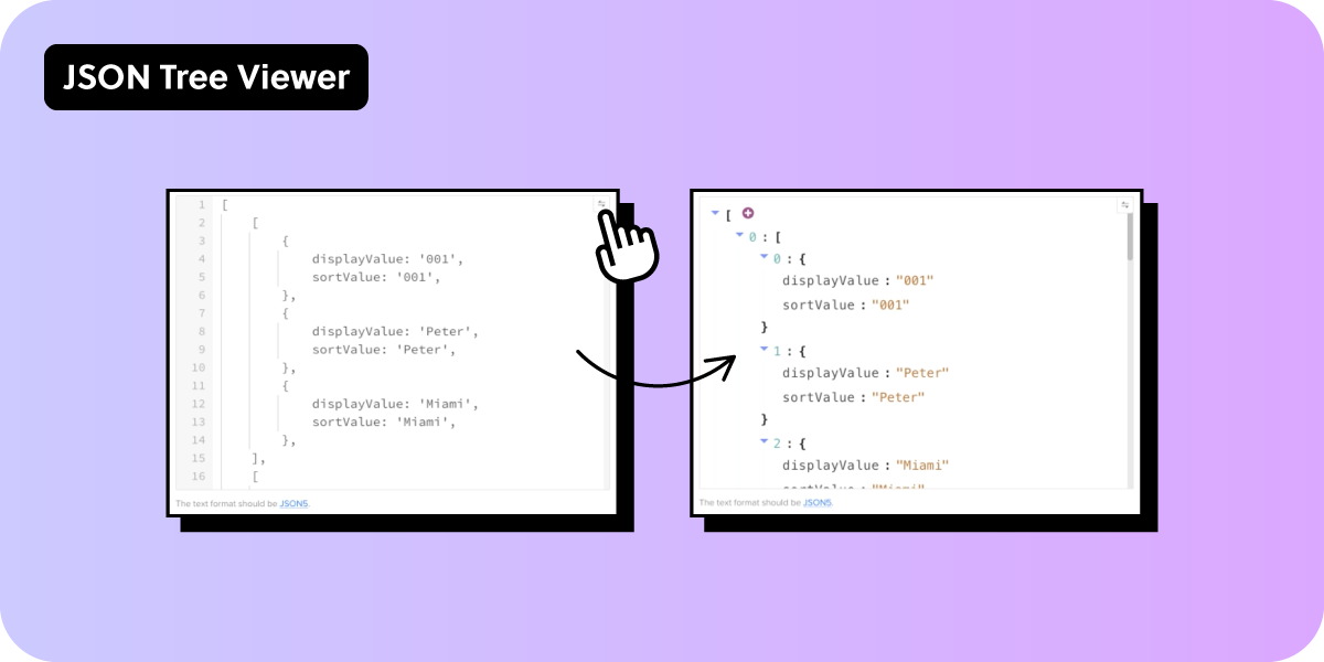
We’re releasing a user-friendly version of a JSON code editor – JSON Tree Viewer. Users can expand and collapse nodes, easily navigate through the data, and make modifications visually.
We also support JSON5 format, so there’s no need to use double quotes for keys. Read how to use JSON Tree Viewer in our help documentation.
Start Using UXPin Merge
With this strategic shift, we look forward to a future where developers can create stunning user interfaces, marking a new era for UXPin Merge and the design community as a whole. Join us in this exciting chapter as we redefine the way teams approach design and product development. The capabilities you’ve seen are available on trial – try them out, post your feedback, and spread the word about UXPin Merge new directions.
Another great news is that we have a new pricing plan that includes all those features: Merge AI, an option tailored for those of you who want to use UXPin Merge technology, AI Component Creator, and code export to their full extent. So, go ahead and try UXPin Merge for free.
If you happen to have a React-based component library of your own, we can integrate it so that you can keep designing with your own code components. Talk to us to get it synced.


