How to Design with Coded Components – Simple & Responsive Dashboard Tutorial
Dashboard is an essential part of most apps. It summarizes key events within the application or shows stats that can be used for further analysis. That’s why it’s so common in business tools for teamwork, sales, marketing, and other apps.
At first, dashboard design seems complicated – it integrates loads of information and datasets. When you actually get to create one, it can be quite easy to put together. The key thing is to have out-of-the-box components that will help you guide design decisions.
In this article, we will walk you through designing a responsive dashboard with a coded component library – Material UI, one of the best, thoroughly documented libraries of ready-made elements.
Create responsive layouts blazing fast. Drag and drop fully interactive elements to assemble professionally-looking UI in minutes– as easy as pie. Discover UXPin Merge.

Why use MUI components to build a dashboard
MUI created its design library following Google’s Material Design standards. Back in the day, it was a revolutionary component library, helping React developers build responsive layouts faster. It is still relevant to this day, as the MUI team continues to evolve its library, releasing new versions every now and then. To read more about it, check out our article about MUI.
MUI is full of data display components
MUI offers many user interface elements that are perfect for dashboards. They’re customizable to a great extent. Let’s highlight some of them:
- Cards – You can create cards representing a specific data point or a group of related data that you want to highlight.
- Data table – MUI published to a clean-looking React component that has built-in sorting and filtering features.
- Date and time pickers – If you need to be super specific and sort by date or time, Material-UI components have you covered.
- Input components – You’ll find every type of button and input field you’d like to have in a data table, be it a checkbox, rating, select, and more.
It’s a well-documented library
Material UI is one of the most documented UI component libraries. It has comprehensive official documentation, stemming from its commitment to keeping the documentation aligned with the evolving nature of the library.
Aside from the effort of MUI’s team to keep its library up to date, the library enjoys strong community support. Developers often share tutorials on building apps with Material UI and they’re ready to help out others.
It is accessible and responsive
There are two major characteristics of MUI: accessibility and responsiveness which are key when it comes to modern interface design.
MUI places a strong emphasis on accessibility. Its documentation contains tips on accessibility best practices, including using ARIA attributes. When it comes to responsive design, MUI is one of the best component libraries to use. You can easily create responsive layouts that will work across devices and screen sizes.
How to Build a Simple Dashboard with MUI components
We’ll show you how to use UXPin Merge to build a simple – yet fully functional and responsive – dashboard with MUI components. If you want to follow along, create a UXPin account or log into it if you already have one.
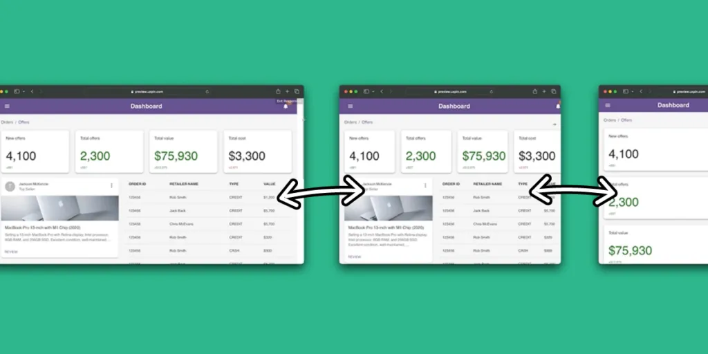
Here’s what we’re going to create. To see it up close, inspect its code, and see how interactive and responsive it is, open this UXPin preview.
Step 1: Create a new prototype
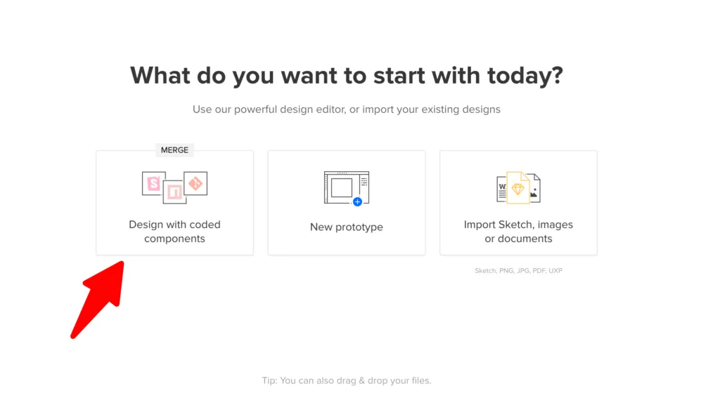
When in UXPin’s dashboard, start by creating a hover on “Design with coded components” and pick MUI library.
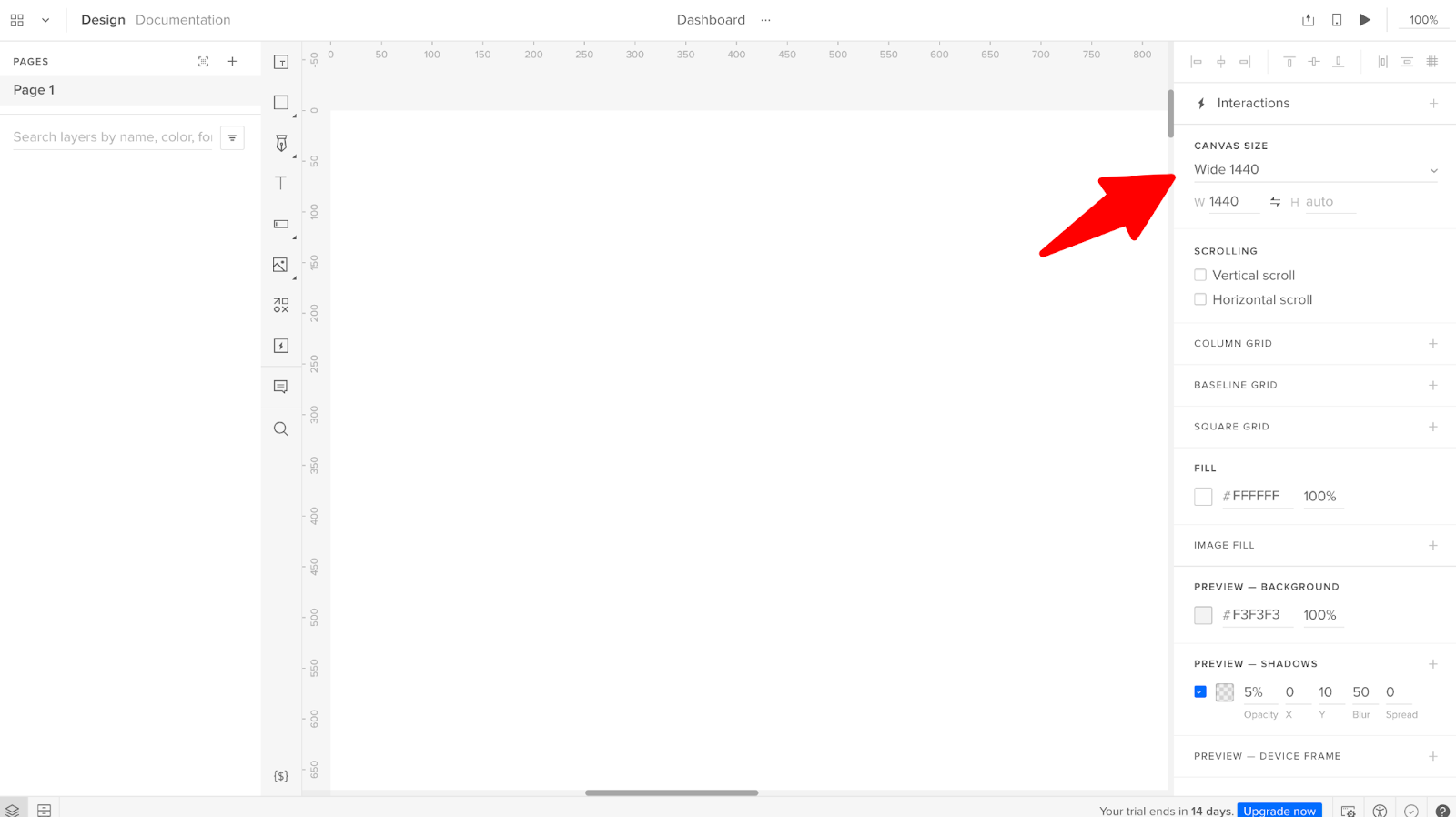
An editor will pop up. In the center of it, you have a canvas. It’s your work field. Adjust the canvas size to match the device you want to design your layout for. You can do that in the right-side menu. In this menu, you can also change the background colors and add grids to help you align elements.
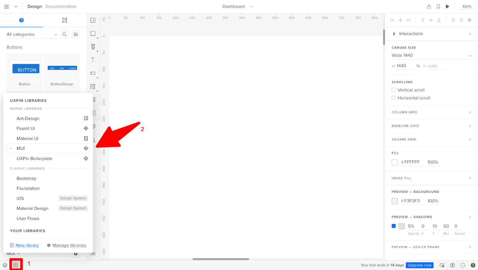
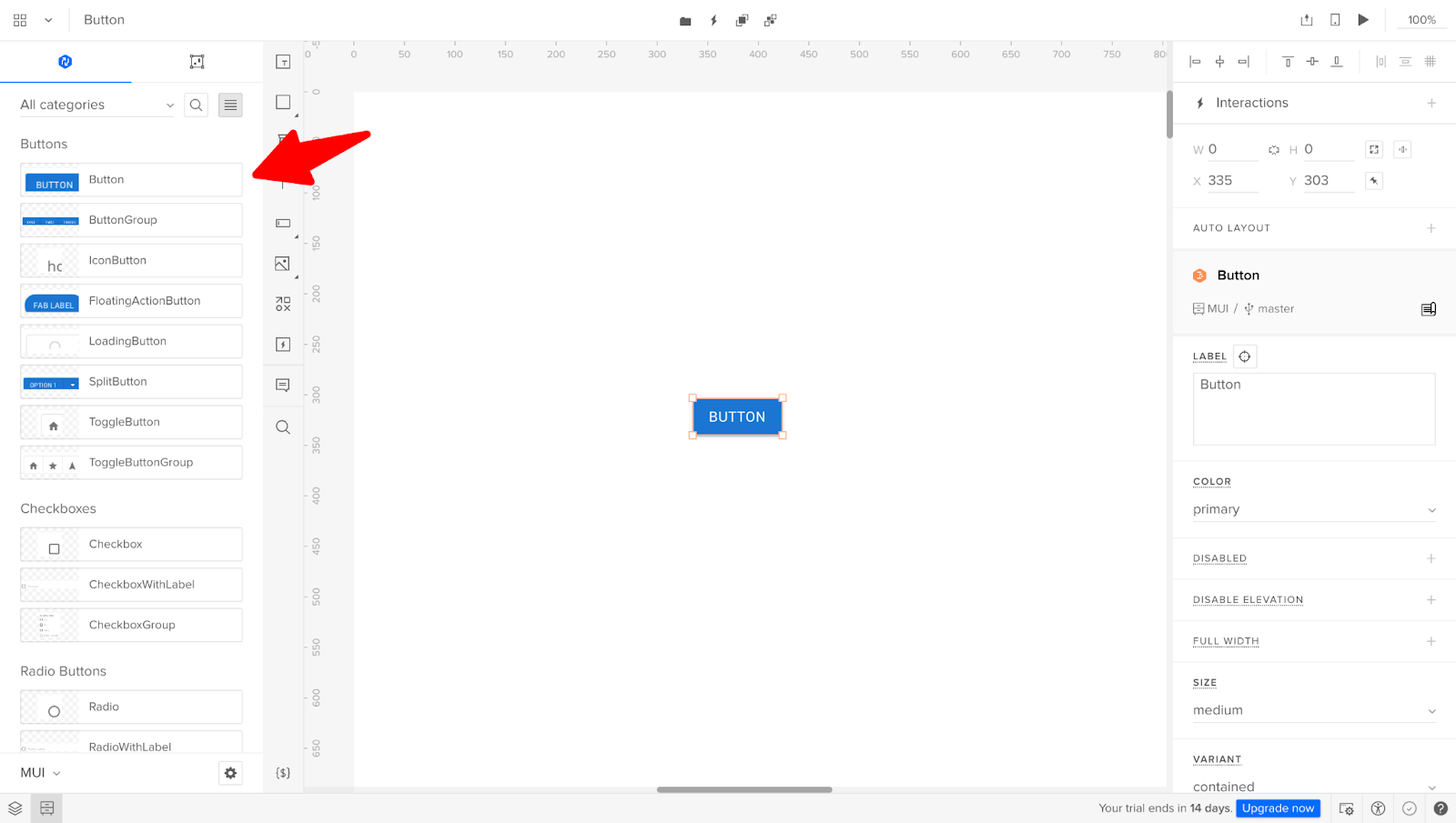
On the left side of the canvas, you have a menu where you can find all the pages and layers or ready-made components. To find the MUI library, go to Design System Libraries in the bottom left corner and pick MUI V5 (you’ll find it under Merge libraries.)
Now, you can click on any component you like and drag it onto the canvas or just click on it to have it appear in the center. See how easy it is.
Step 2: Access ThemeCustomizer
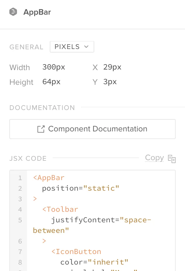
Open the MUI library and search for ThemeCustomizer – you can use the search bar. It will come in handy when you want to adjust the look of your MUI components. Place ThemeCustomizer above and outside the canvas, so you’re able to navigate to it easily.
Step 3: Place MUI components on the canvas
Pick the components that you want to design with. Start with navigation, such as an app bar and breadcrumbs UI elements. The app bar will help users access other pages and move around the app. When it comes to breadcrumbs, they allow users to orient themselves within the app. Watch this part of the tutorial:
You can easily adjust the size of the components by clicking on their corners and expanding or contracting them.
We’re also pulling out:
- Cards – We will duplicate this component to highlight different insights.
- Paper – It will be our textbox.
- Typography – We drag it out of the library and put it into the Paper components. It helps us manipulate fonts.
- Table – It will be our data table that we can sort through.
Now that we have the components ready. We can switch their theme with ThemeCustomizer which we placed above the canvas.
Step 4: Customize components
Now the fun part! Move the components around, fill them with your own content and data, and edit their padding and size. Arrange them in any way you want. This is also a step in which you can create complex components from the basic ones.
Just look at how we took our textbox components and copied a few children inside. Then, we filled them with real content, adjusted text size, and added padding. Same goes with the table. We added more rows by simply copying the Table cells and pasting them in the Pages and Layers panel.
Step 5: Set up grids and layout
Make sure that our layout can be responsive. Push your components out of the canvas for a moment and place the layout elements in. Here’s how you can do it.
Start with a container for a menu. Place the container on top of the canvas, resize it to fit the width, and place the app bar back in. Make sure that your container is set to “responsive.”
After that, drag a box for our breadcrumbs and put grids for our data table, cards, and text boxes.
It’s super easy to do that because you are just moving the components in the menu, copying the grids, and placing different components inside of them.
Step 6: Preview and share your design
You are ready to see your dashboard and share it with others. Go to “Share,” copy a URL to preview the prototype, and paste it in the browser or click the preview button ▶️.
Do you have it? Great! Now, you can change the size of the window to see if your prototype adjusts its size as a truly responsive design would. Share your link with others, so they can preview it too.
Step 7: Develop the dashboard
The design is done, so the last step is to copy the code into your React application.
We have provided a starter React App boilerplate, containing all the dependencies and configuration needed – or begin editing right-away in CodeSandbox or StackBlitz (click to go to the preferred one.)
Installing and running the React App Boilerplate:
- Download or clone the Starter React App boilerplate repo
- Install the project by running: npm install
- Run the project by running: npm start
Importing the theme:
- From UXPin’s spec mode, copy the JSX of the ThemeCustomizer component.
- Paste JSX into the theme.js file of the project
Here is a video example of using the starter React App repository.
Importing the components:
- From UXPin’s spec mode, copy the JSX of the desired component composition.
- Paste JSX into to the App.js file
- Make sure you have added import statements for each component that you are importing from MUI. Example: import Button from ‘@mui/material/Button’
For the more in-depth instructions, see the last part of CoderOne’s video tutorial.
Build layouts 10x faster with UXPin Merge
That’s it! You’ve now set up a new dashboard for your app that is fully responsive and consistent with the MUI component library. Check if your dashboard looks exactly, as the dashboard in our Preview.
With UXPin Merge, you can build way more than just dashboards. Create full user interface designs of apps, websites, and other digital products that can be easily translated into code – without advanced design skills. Get started with UXPin Merge.


