
Functional and delightful, animation is one of the staples of modern web design.
Details of interaction design is what makes a fundamental difference on modern websites. Animation can communicate status, guide the users’ attention, help the user see the results of their actions and even influence behavior.
Here are just a few examples to illustrate places where you can add some animations in your website to improve the experience.
Progression
Loading Animation
One of the most common uses of animation for the web is to distract the user from loading times. Loading animation influences your users’ perception of time, making it seem less than it actually is.
You should always try to make the wait more pleasant if you can’t shorten the line.
Loading animations are best when they are simple. Any extra effects such as sound aren’t necessary. Also, good loading animation is engaging. When your users have something interesting or fun to watch while they wait, they focus less on loading time.
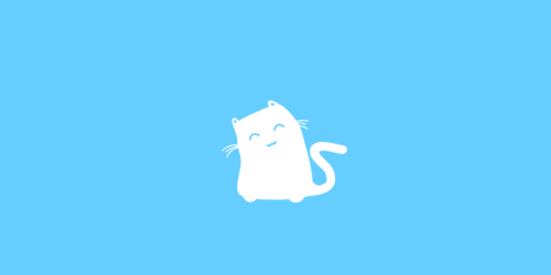
Even if the loading time is short, fun loading animations still add a little entertainment during waiting periods. Credits: Thomas Bogner
Progress Animation
Animation can show you your progression through a linear sequence. A classic “loading bar” is the most common example of such animation.
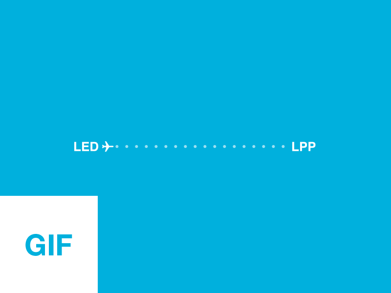
Progress bar for Aviasales. Image credits: Mark
But you can also consider using progress animation for multi-step linear process.
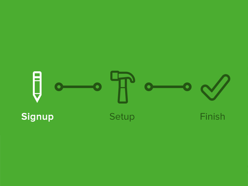
Animation can show you your progression through a linear sequence. Image credits: Joshua Sortino
Skeleton screens
A skeleton screen is essentially a blank version of a page into which information is gradually loaded. Such action creates the sense that things are happening immediately as information is incrementally displayed on the screen. Almost any site can utilize a skeleton screen together with a subtle animation when loading it’s content to keep users engaged.
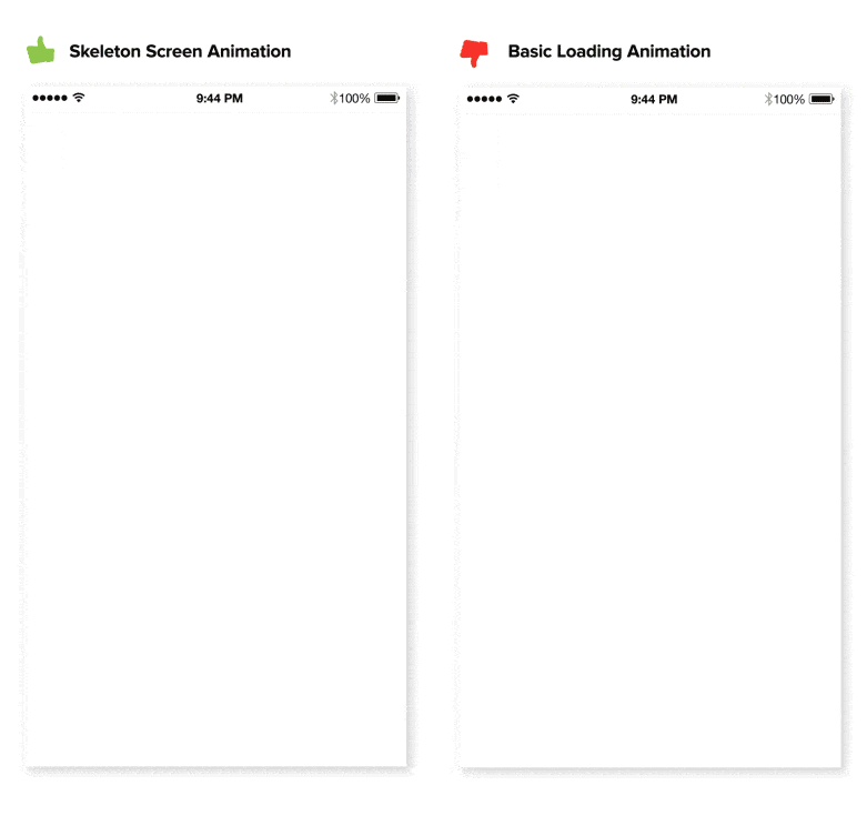
Skeleton screens complete the UI incrementally before the content is fully loaded. Image credit: tandemseven
Visual Feedback
Animated response to user’s action
Good interaction design provides feedback, which communicates the results of any interaction, making it visible and understandable. When a site visitor doesn’t know which items are interactive, or what interactions to expect, this leads to confusion. Combat this confusion by thoughtfully designing interactions to be clear and understandable.
Hover Animation for Desktop/ Elevation for Mobile
As a means to show an element is interactive, hover effects are one of the most common examples of visual feedback.
When a user is in doubt over a feature’s function, they tend to move the mouse over it. You should provide hover animations an intuitive appeal. Source: codepen
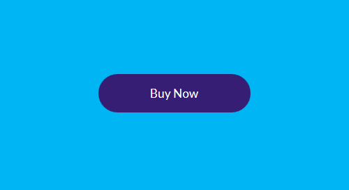
However, hover effects won’t work on mobile devices because there’s no mouse cursor. This means that your buttons and other interactive elements should have visual signifiers that suggest that elements are interactive before user tap them and provide immediate feedback after the interaction. Such feedback indicates to a user that their actions have triggered a response, like a button in the example below that appear to depress when activated.
The shading indicates that element is possible to tap. Image credits: Vadim Gromov
Grab design ebooks created by best designers
All for free
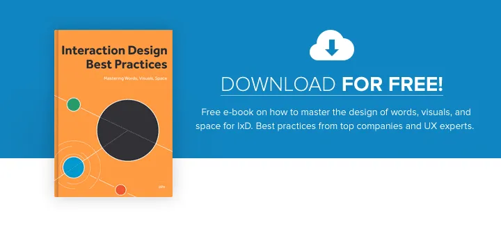
Do you want to know more about UI Design?
Download ‘Interaction Design & Complex Animations’ FOR FREE!
Attracting Attention
It’s well known fact that human eye is attracted to motion. This makes animation the perfect tool for drawing attention and reinforcing the actions a user is preforming.
For example, form entry can be greatly enhanced with some animation. If correct data has been entered, a simple ‘nod’ animation can be introduced upon completion. Whereas a horizontal shake can be used when denying the input. When users notice such animation they instantly understand the action. For applications that need to collect and validate data from users, solutions like Adalo‘s no-code app builder make it easy to design and implement custom database-driven apps with thoughtful interactive feedback.
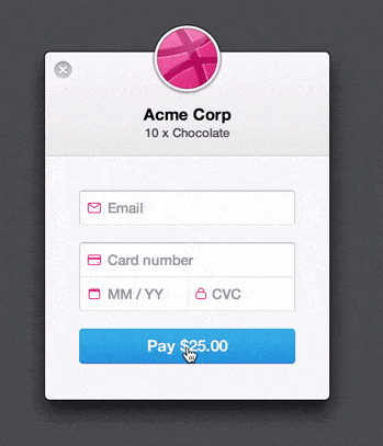
The form is basically shaking its head at you. Image credit: Michaël Villar
Navigation
Relationship and transition
A recent trend is hidden navigation menus that reveal themselves upon clicking on buttons like the hamburger icon. Animation is essential in establishing a connection between the two states and preventing a jarring transition. A well-designed transition enables the user to clearly understand where their attention should be focused.

Animation can be used to make transitions more obvious, so it’s clear what happened between where the user started and ended up. Credits: codyhouse
Below is an example of Brian Hoff Design website. When the user clicks on the circular arrow button, an oversized menu box pops out from the right. The “pop out” animation makes the menu appear as if it slides in from offscreen and makes the whole interaction run smoothly.
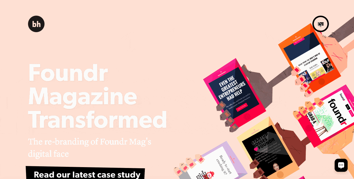
Animation helped to connect the dots between two states
State Change Without Hard Cuts
Transitions are invaluable for indicating changes of state. In his article Smart Transitions In User Experience Design Adrian Zumbrunnen provides a great example on how animation can help user maintain context when they click on a link that lead to the different section on the same page.
Just compare this static instant change which feels like a hard cut:

Nothing feels more unnatural than a sudden change, such changes in an interface are hard for users to process. Image credit: smashingmagazine
With an animated behavior:
To animate is “to bring to life”. Image credit: smashingmagazine
A later example of the navigation uses subtle animations to help the user see where they are in the article in relation to the other sections.
Creative Effects
Creative animation can make your user experience truly delightful and memorable. They bring entertainment value to the interface.
Storytelling Long Scrolling
Not too long ago, the rule of above the fold was indisputable. Designers focused most of their attention on making this area full of valuable information. Luckily, we now know that ‘above the fold’ rule isn’t absolutely true. In fact, “66% of attention on a normal media page is spent below the fold.” The shift of focus from above the scroll to below makes scrolling an essential element of interaction design.
The storytelling potential of animations can add an emotional connection to an otherwise dull interface. Instead of the parallax animations which is very common, opt for something subtler. Consider breaking up your site into scrollable “chunks.” Within each chunk, you can introduce the content through animations. Animations in the example below make the content “come alive” by animating simple art illustrations.
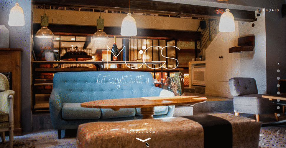
Image credits: Le Mugs
Tools and Tutorials
- 15 UI Animation Tutorials. A guide on web animation for beginners.
- Web Animations. Advanced guide from W3 to synchronization and timing for animation in web pages and APIs.
- CSS3 Animation Cheat Sheet. A useful collection of ready-made animations that lets you apply CSS classes to any element you wish.
- Tools To Create Animation With. A list and analysis of 16 popular animation tools.
Conclusion
Design is more than just about visual presentation. Design is about interaction. Animation is critical to communication. We need to embrace the interactive nature of the web from the very beginning and think of it as natural part of design.
For more interaction design advice, download Interaction Design Best Practices Vol.1 for free.
Article originally published on babich.bz.

