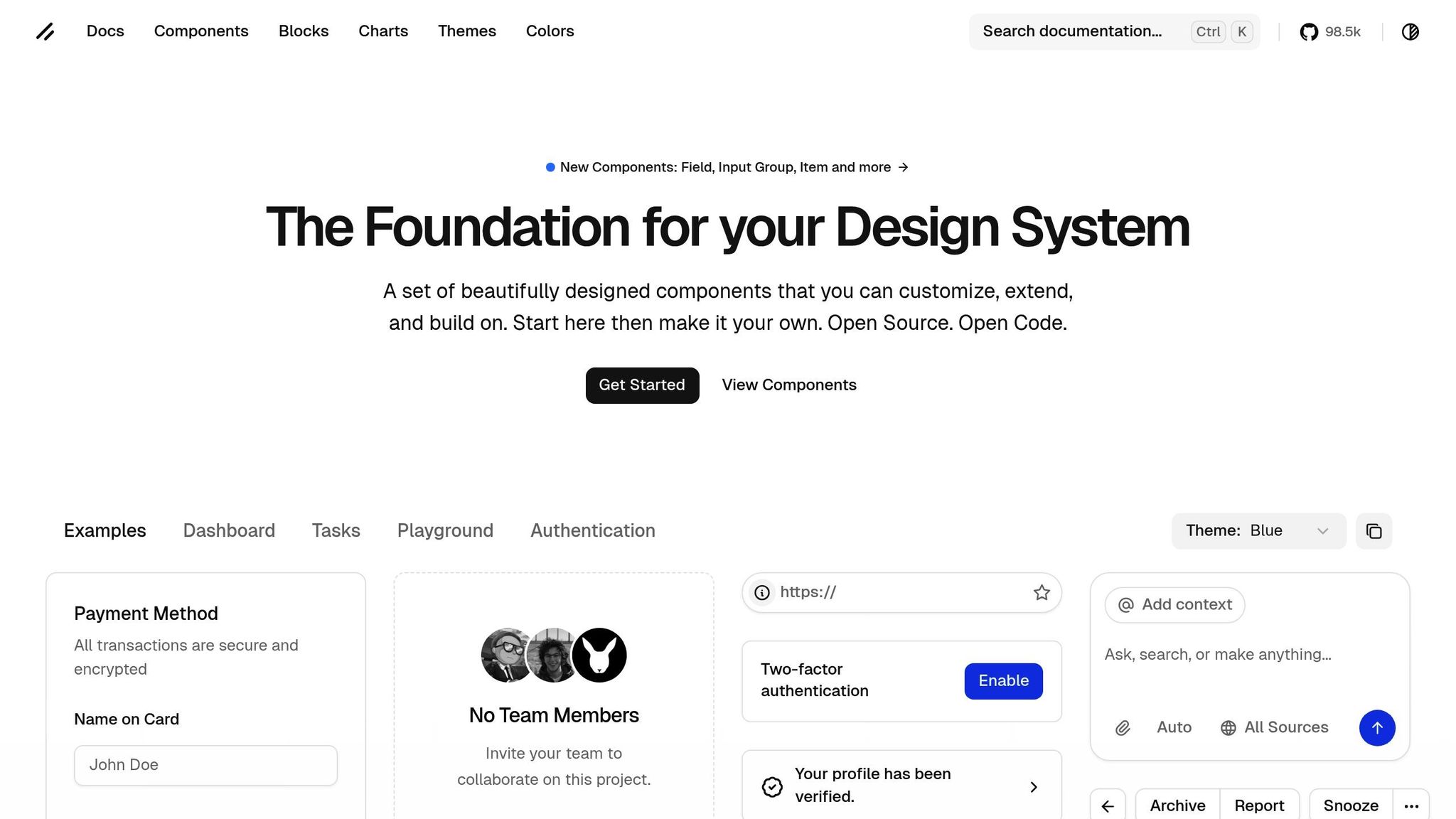
React component libraries simplify cross-platform development by providing pre-built UI components that work across web, mobile, and desktop. They enhance consistency, reduce development time, and improve user experience. Popular options like Material UI, Chakra UI, Ant Design, and Radix UI offer features like accessibility compliance, theming, and design tool integration. These libraries help US-based teams meet accessibility standards, maintain brand consistency, and streamline workflows.
Key Takeaways:
- Material UI: Over 100 components, advanced theming, and Figma integration.
- Chakra UI: Built-in accessibility, dark mode, and responsive utilities.
- Radix UI + Tailwind CSS: Headless components with utility-first styling.
- Ant Design: Enterprise-focused with localization support.
- shadcn/ui: Flexible, copy-paste model for custom designs.
Tools like UXPin further enhance productivity by integrating these libraries into interactive prototypes, enabling faster handoffs and reducing errors.
5 Awesome (FREE) React UI libraries to use in 2024
Key Features to Look for in Cross-Platform React Libraries
When choosing a React library for cross-platform development, it’s important to pick one that functions seamlessly across devices. The most effective libraries share certain traits that ensure your app delivers a consistent experience across platforms while meeting the high expectations of US-based teams. These features help maintain cross-platform reliability and simplify the development process.
Accessibility and Compliance
Accessibility isn’t just a nice-to-have; it’s a legal requirement. In the US, digital products must comply with the Americans with Disabilities Act (ADA), which means your app needs to meet accessibility standards like the Web Content Accessibility Guidelines (WCAG) and Accessible Rich Internet Applications (ARIA) specifications. Non-compliance can lead to legal risks.
Top libraries such as Material UI, Chakra UI, and Radix UI come with built-in accessibility features. These include essentials like keyboard navigation, screen reader compatibility, and ARIA attributes that work without additional setup. For instance, Material UI offers over 100 components with advanced ARIA support, while Radix UI focuses on headless components that remain accessible no matter how they’re styled.
Selecting libraries that automate accessibility tasks can save your team significant time. Features like default focus management, pre-configured keyboard shortcuts, and automatic screen reader announcements allow developers to prioritize building features instead of troubleshooting compliance issues. Once accessibility is covered, the next step is ensuring your app reflects consistent branding through robust theming options.
Theming and Customization Options
Maintaining a consistent brand identity across platforms requires strong theming capabilities. The best React libraries offer advanced tools like design tokens, dark mode support, and customizable color schemes, ensuring your app looks polished and cohesive on desktops, mobile devices, and tablets.
Material UI’s ThemeProvider component, for example, lets developers define design tokens that ensure uniformity across the app. Similarly, Chakra UI’s color modes system makes it easy to implement dark mode and custom themes without compromising functionality.
Responsive design tools are another critical feature. Libraries like Material UI and Chakra UI include grid systems and adaptive components that adjust layouts automatically for different screen sizes. This ensures your app performs well on the wide range of devices US users rely on. A well-executed theming system also sets the stage for smooth collaboration between design and development teams.
Design Tool Integration
Efficient collaboration between designers and developers is essential, and high-quality React libraries simplify this process by integrating with popular design tools.
For instance, Material UI offers Figma kits that replicate its React components, allowing designers to create mockups that align perfectly with the components developers will use. Tools like UXPin go a step further by enabling interactive prototypes built with real React components.
These integrations offer practical advantages for US-based product teams. Designers can test changes in real-time, seeing how components behave under actual conditions. Developers, in turn, receive precise specifications that eliminate guesswork about interactions or states. Additionally, design token synchronization ensures that updates made in design tools are automatically reflected in the codebase, reducing inconsistencies and minimizing the need for rework.
Finally, don’t overlook performance. Libraries that include features like code-splitting, tree-shaking, and server-side rendering help ensure your app remains fast and scalable, delivering a smooth user experience across different platforms and network conditions.
Best React Component Libraries for Cross-Platform Design
When it comes to building seamless cross-platform applications, certain React libraries stand out for their versatility, strong community backing, and proven success in real-world projects. Here’s a closer look at five standout options that are widely used across the US market.
Material UI (MUI)
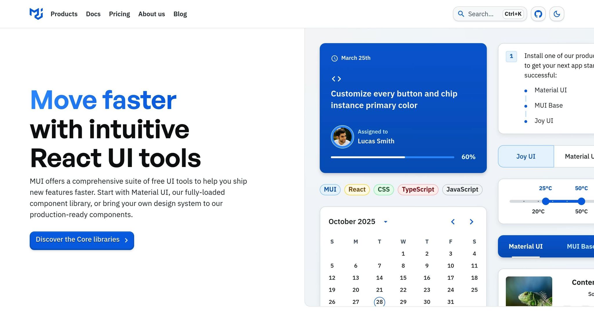
Material UI is a go-to choice for React developers, offering over 100 customizable and accessible components for web, mobile, and desktop platforms. What makes MUI shine is its advanced theming features and design token systems, which ensure consistency across platforms.
Big names like Netflix and Spotify rely on MUI for their tools and dashboards. Netflix uses it to power their internal admin tools, while Spotify employs it for their marketing dashboards, showcasing its adaptability in large-scale applications.
One of its standout features is the ThemeProvider, which allows for deep customization and consistent designs across platforms. This is especially useful for teams under tight deadlines who need to maintain a unified look and feel. Additionally, MUI’s Figma design kits bridge the gap between designers and developers, making it easier to translate designs into functional, pixel-perfect code.
Chakra UI
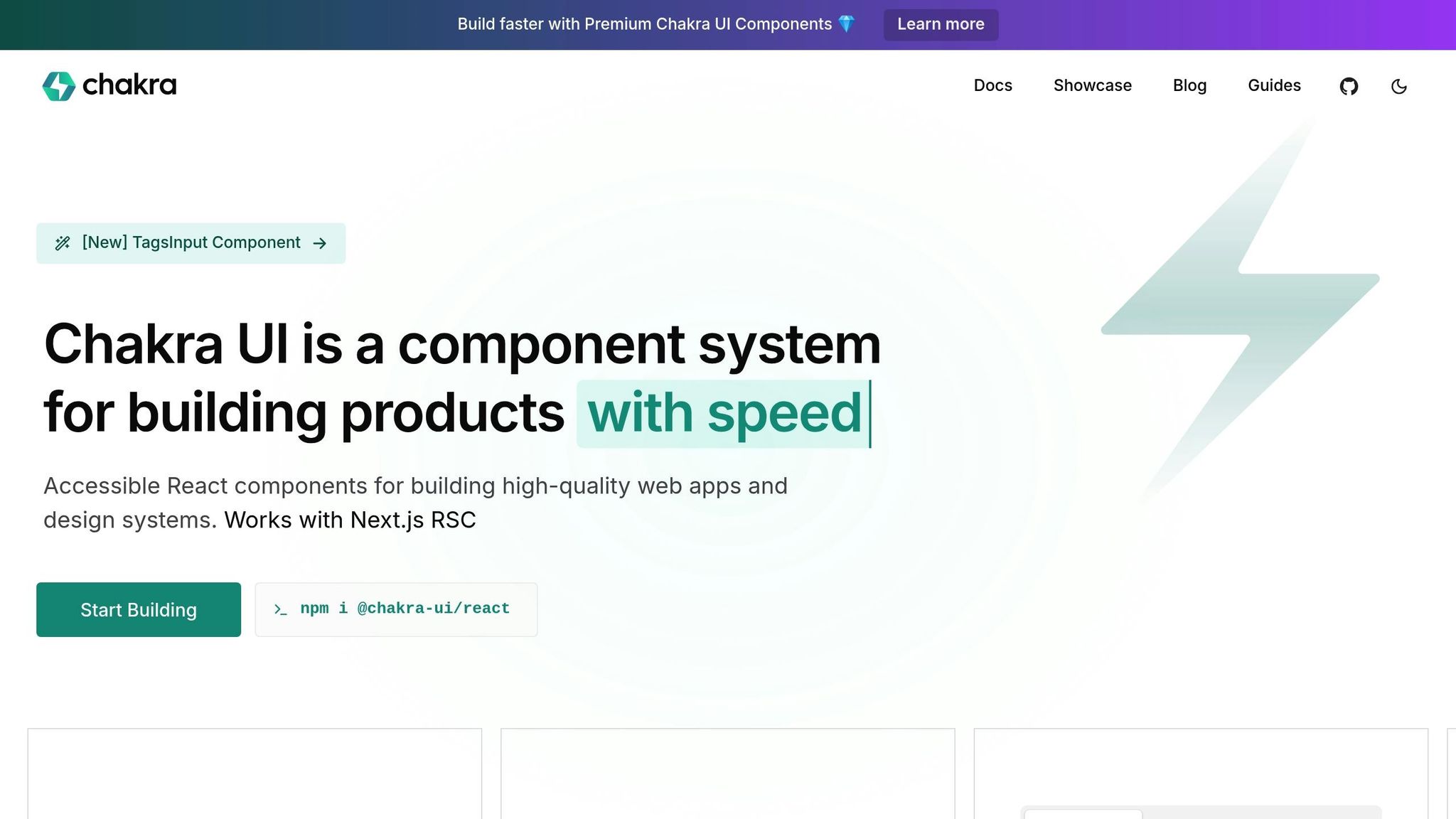
Chakra UI is built around a composable component system, making it easy to create complex UIs from reusable building blocks. Accessibility is baked in, meeting ADA compliance out of the box, which ensures your app works well for everyone, regardless of the platform.
The library’s motion system adds smooth animations, while its advanced form handling streamlines validation and responsiveness. For projects requiring dynamic interfaces that adapt to various devices, Chakra UI is a solid choice. It also comes with built-in dark mode support, allowing for customizable color modes that align with user preferences and system settings.
For those looking for more, Chakra UI Pro offers extended features, making it an excellent option for teams building polished, professional-grade applications.
Radix UI + Tailwind CSS
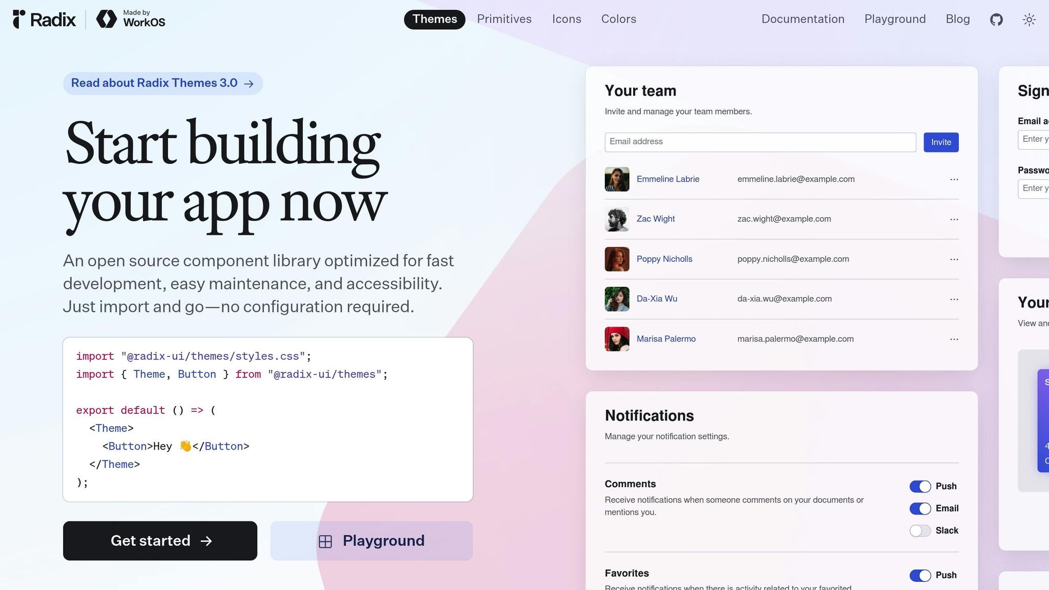
This combination is perfect for developers who want flexibility and control. Radix UI provides unstyled, accessible primitives (headless components), while Tailwind CSS offers utility-first styling to create highly customizable user interfaces.
The decoupling of logic and presentation makes this pairing ideal for cross-platform projects. Radix UI ensures robust functionality with features like advanced state management and cross-browser compatibility, while Tailwind’s utility classes make it easy to adapt designs to different screen sizes and orientations.
This setup is particularly effective for teams building custom design systems that need to maintain consistent behavior across web, mobile, and desktop environments. While it requires a bit more effort upfront, the result is a highly flexible and performant UI.
Ant Design
Ant Design is tailored for enterprise-level applications, offering over 50 components designed for sophisticated use cases like data tables, forms, and navigation systems.
Its built-in internationalization (i18n) support makes it a favorite for US companies with a global reach, enabling seamless localization without sacrificing design consistency. Whether you’re targeting web browsers, mobile web views, or desktop apps built with frameworks like Electron, Ant Design ensures a cohesive experience across platforms.
The library’s detailed documentation and well-established patterns make it a time-saver for building complex features. However, its opinionated design language may require some tweaking to align with specific branding requirements.
shadcn/ui
shadcn/ui takes a unique approach by using a "copy-paste" model. Instead of installing a package, developers copy the component code directly into their projects, giving them full control over customization.
This model is particularly appealing for teams that need to tailor components to specific platforms without being restricted by a library’s design choices. Vercel uses shadcn/ui for its UI patterns and examples, highlighting its flexibility for custom design systems.
Built with Tailwind CSS and Radix UI primitives, shadcn/ui ensures modern styling and accessibility right out of the box. It’s especially suited for SaaS applications, developer tools, and marketing sites where customization and minimalism are key priorities. However, this approach does require more hands-on maintenance, as updates need to be managed manually.
These libraries provide a solid foundation for creating cross-platform applications, each catering to different needs and priorities. Whether you prioritize flexibility, accessibility, or enterprise-level features, there’s a solution here to match your goals.
sbb-itb-f6354c6
Cross-Platform Feature Comparison
When selecting React libraries for US development teams, evaluating cross-platform features is essential. This comparison builds on earlier discussions about accessibility, theming, and integration, offering a clear overview of how each library performs in key areas.
| Library | Accessibility | Theming & Customization | Performance | Design System Integration |
|---|---|---|---|---|
| Material UI (MUI) | Advanced ARIA support, WCAG 2.1 compliant, keyboard navigation | AI-assisted theming, ThemeProvider, design tokens, dark mode | Automatic code-splitting, optimized rendering, tree-shaking | Figma design kits, real-time collaboration, seamless handoff |
| Chakra UI | Built-in ADA compliance, composable accessibility, motion system | Customizable theme object, color modes, intuitive API | Lightweight rendering, smooth animations, responsive utilities | Figma integration, design tokens, rapid prototyping support |
| Radix UI + Tailwind CSS | Headless accessible primitives, cross-browser compatibility, ARIA | Complete styling control and a utility-first approach | Minimal bundle size, purged CSS, optimized rendering | Enables custom design systems via integration with design tokens and utility-first styling |
| Ant Design | Built with WCAG considerations and internationalization support | Themable via Less variables, comprehensive customization | SSR support, optimized components, potential for larger bundles if not tree-shaken | Figma resources, enterprise design systems, robust documentation |
| shadcn/ui | Built on Radix UI’s accessible foundation with maintainable compliance | Full code ownership, Tailwind integration, zero lock-in | Minimal footprint with only essential code | Fully editable code for building custom design systems |
The table outlines each library’s capabilities, but let’s dive deeper into the key criteria.
Accessibility is a top priority, ensuring compliance with ADA and WCAG 2.1 standards. Libraries like MUI and Chakra UI excel with built-in accessibility features, offering developers ready-to-use tools. Radix UI, on the other hand, provides a headless approach, giving teams the flexibility to style components while maintaining accessibility.
Performance depends on how each library is structured. Radix UI paired with Tailwind CSS and shadcn/ui stands out with minimal bundle sizes, achieved by purging unused CSS or importing only essential components. MUI’s automatic code-splitting and Ant Design’s server-side rendering (SSR) make them ideal for larger-scale applications, though careful tree-shaking is necessary to avoid bloated bundles.
Theming and customization options vary widely. MUI simplifies the process with AI-assisted theming and design tokens, while Chakra UI’s intuitive API and color modes make it easy to adapt to brand requirements. For teams needing complete control, Radix UI with Tailwind CSS and shadcn/ui allow for unparalleled flexibility, letting developers style from scratch or own the entire codebase.
Design system integration plays a vital role in bridging designers and developers. Radix UI’s headless structure and shadcn/ui’s fully editable approach are perfect for creating bespoke design systems. Meanwhile, MUI and Ant Design provide robust tools like Figma kits and real-time collaboration features, which are particularly appealing to enterprise teams.
For larger organizations with established workflows, MUI and Ant Design offer reliability and a proven track record. Startups or teams seeking flexibility often gravitate toward Chakra UI or shadcn/ui for their developer-friendly approaches and customization options.
Ultimately, the right library depends on your team’s specific needs. Tools like UXPin can further streamline the process by integrating these libraries into consistent, interactive prototypes, ensuring a smooth design-to-code experience.
Adding React Libraries to Design Automation Workflows
Bringing React component libraries into design automation workflows transforms how cross-platform development operates. By using code-backed components as the backbone of your design system, you bridge the gap between design and production. This creates a seamless workflow where components stay consistent from prototype to final product, no matter the platform. Such integration lays the groundwork for smooth component synchronization.
Component Synchronization Best Practices
To keep components synchronized effectively, start by selecting the integration method that best suits your team. Options include using pre-built libraries like Material UI, Tailwind UI, or Ant Design, or syncing custom Git repositories for proprietary design systems.
Managing shared components across platforms requires robust version control. Implementing semantic versioning and automating CI/CD pipelines across web, mobile, and desktop environments ensures consistency and prevents version drift. This also helps maintain uniform styling across platforms.
Design tokens act as a bridge, ensuring visual consistency while allowing for platform-specific tweaks. They handle accessibility and theming seamlessly across devices and screen sizes, supporting a unified user experience.
Regular component audits are essential. Conduct these monthly to spot inconsistencies early. Document any platform-specific variations and establish clear rules for when such variations are acceptable.
Automated testing is another key piece of the puzzle. Set up tests to check accessibility compliance, responsive behavior, and cross-browser compatibility for every component update. Early detection of issues through automated testing reduces the need for extensive manual checks. These practices not only strengthen component synchronization but also enhance design-to-code workflows, as explained below.
Improving Design-to-Code Workflows with UXPin
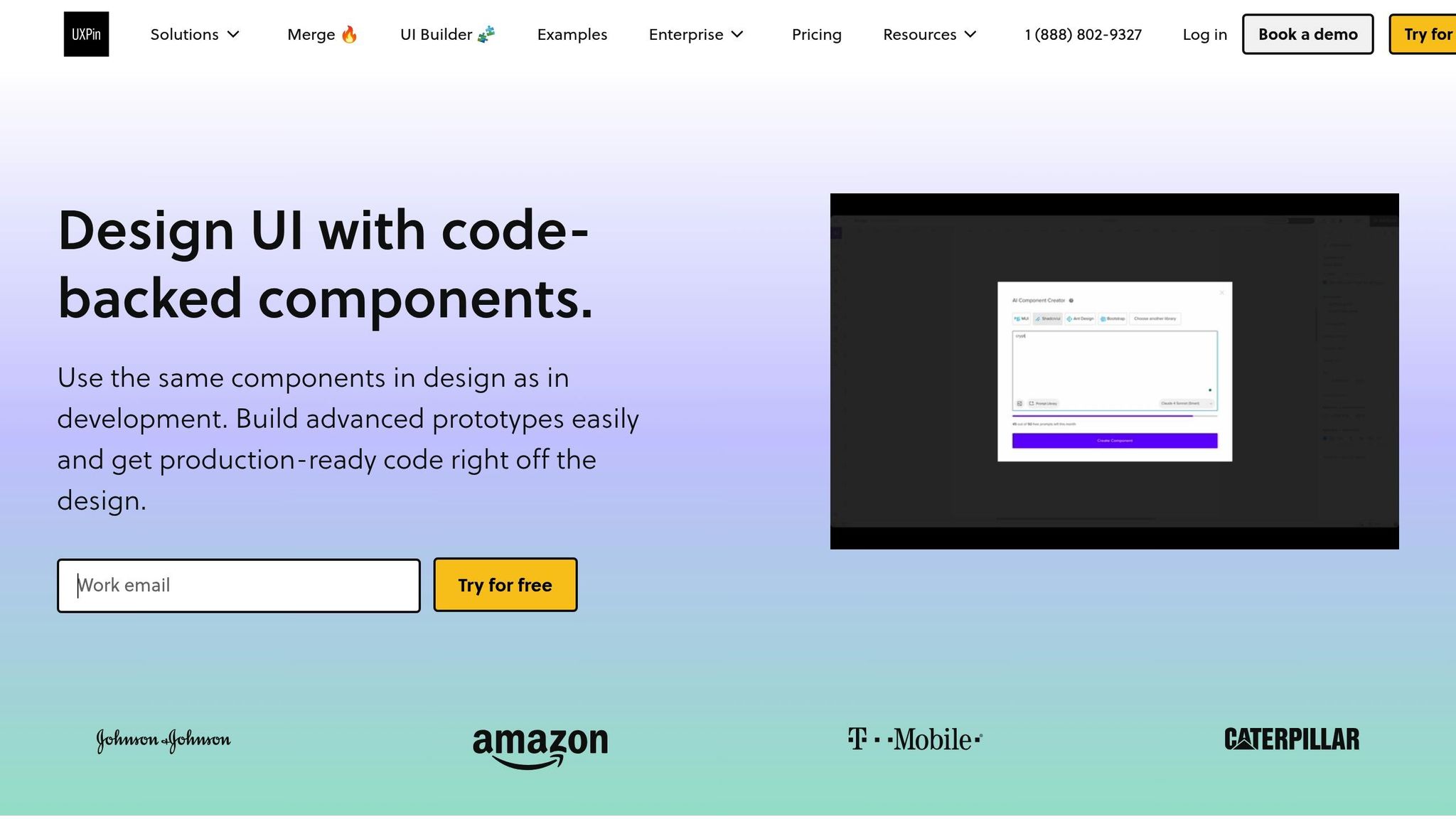
UXPin tackles the common challenges of design-to-development handoff by incorporating React components directly into the design process. When designers use the same components that developers will implement, the traditional translation step disappears entirely.
The platform’s AI Component Creator speeds up the early design stages by generating code-backed layouts from simple prompts. Teams can quickly create complex elements like data tables or forms and then customize them with the same properties and behaviors that will be used in production.
With advanced prototyping features like interactions, variables, and conditional logic, UXPin enables the creation of high-fidelity prototypes that closely mimic the final product. This level of detail allows stakeholders to experience functionality upfront, reducing costly revisions during development.
Real-time collaboration tools further streamline workflows. Designers and developers work in the same environment, using identical components, which speeds up feedback cycles and minimizes miscommunication.
"What used to take days to gather feedback now takes hours. Add in the time we’ve saved from not emailing back-and-forth and manually redlining, and we’ve probably shaved months off timelines." – Mark Figueiredo, Sr. UX Team Lead at T.RowePrice
Another standout feature is the ability to export production-ready React code directly from prototypes. This means developers receive not just visual specs but fully functional component implementations, complete with dependencies. This dramatically reduces development time and the risk of errors.
UXPin also integrates seamlessly with popular React libraries like Material UI, Chakra UI, and Ant Design. This allows teams to use established design systems while retaining the flexibility to tailor components to their specific needs. It’s a blend of reliability and adaptability that supports unique product requirements.
To measure the impact of these workflows, teams should track metrics like design-to-development handoff time, component reuse rates, and cross-platform consistency. These insights help identify areas for improvement and highlight the benefits of investing in design automation tools.
Conclusion
Choosing the right React component library is key to creating consistent, accessible, and scalable products. Libraries such as Material UI, Chakra UI, and Ant Design form a solid base for building applications that work effortlessly across web, mobile, and desktop platforms, all while adhering to US accessibility standards like ADA compliance.
Integrating these libraries into design-to-code workflows amplifies their impact. By using unified, code-backed components, teams can avoid the common pitfalls of handoff errors, saving time and ensuring consistency across platforms. This streamlined approach not only accelerates development but also reduces errors and ensures a polished, cohesive product.
Real-world examples back up this strategy. Major US companies like Netflix, Spotify, and Scale.ai have shown how leveraging the right component libraries enables rapid development while maintaining long-term scalability and maintainability.
For teams in the US, tools like UXPin offer an additional advantage by bridging the gap between design and development. With interactive, code-backed prototypes that integrate built-in or custom React component libraries, teams have reported up to 50% reductions in engineering time and faster feedback loops. These efficiencies can have a profound impact on productivity and collaboration.
"When I used UXPin Merge, our engineering time was reduced by around 50%. Imagine how much money that saves across an enterprise-level organization with dozens of designers and hundreds of engineers." – Larry Sawyer, Lead UX Designer
FAQs
How do React component libraries support accessibility across platforms?
React component libraries are crucial for promoting accessibility, as they offer pre-built components that align with accessibility standards like ARIA guidelines. These components are crafted to function smoothly across different platforms, ensuring a consistent and inclusive experience for all users.
Using tools like UXPin, you can integrate code-backed components directly into your prototypes. This ensures that your designs are not only functional but also accessible right from the beginning. This method enables teams to test and fine-tune accessibility features early in the process, making the transition from design to development much more efficient.
What are the advantages of using React component libraries with design tools like UXPin?
Using React component libraries alongside design tools like UXPin comes with some clear advantages. One standout benefit is the ability to design using code-backed components, which guarantees that your design stays consistent with the final developed product. This means teams can build interactive, high-fidelity prototypes that look and behave much like the finished product, cutting down on revisions later.
Another major perk is how this integration simplifies the design-to-development workflow. By reusing the same components in both design and development, teams can work more efficiently, collaborate more effectively, and accelerate product development – all while ensuring quality and alignment throughout the process.
How do React libraries help ensure brand consistency across web, mobile, and desktop platforms?
React component libraries that offer strong theming and customization capabilities are essential for ensuring brand consistency across different platforms. By leveraging reusable components across web, mobile, and desktop applications, teams can deliver a seamless and unified user experience that stays true to the brand’s identity.
Platforms like UXPin make this process even smoother by enabling designers and developers to collaborate using custom or pre-built React component libraries. This not only simplifies workflows but also ensures design precision and fosters better alignment between design and code, ultimately helping teams create consistent, top-notch products.

