Fluent UI vs MUI – Designer’s Comparison
Building scalable React applications from scratch is a challenging, resource-hungry endeavor. Fluent UI React, and MUI streamline this process by giving product teams comprehensive UI libraries to design, prototype, test, and develop high-quality, scalable digital products faster.
We explore these popular open-source ReactJS UI libraries in 2023 and why you might choose Fluent UI or MUI for your next project. We also introduce code to design and how to bring components from these design systems into the design process to enhance prototyping and testing capabilities.
Introduce fully interactive Fluent UI and MUI components at the prototyping phase. Build high-fidelity prototypes that have code-like fidelity and functionality. Discover UXPin Merge, a solution that makes it possible to introduce code to design. Learn more.

An Introduction to Fluent Design System and MUI
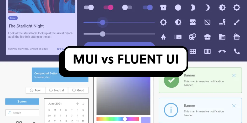
The Fluent Design System (Fluent UI React) and MUI (Material UI) are popular design systems primarily used for cross-platform products. The comprehensive front-end Javascript libraries include patterns like charts, graphs, advanced tables, data grids, and more, making it easy for product developers to build and scale enterprise user interfaces.
Microsoft developed the Fluent Design System in 2017 to rebrand the Microsoft Design Language (Metro). Microsoft used Fluent UI across its product ecosystem, including Windows and Microsoft 365.
While MUI is based on Google’s Material Design, the open-source project has no affiliation with Google. MUI’s founders created the UI library in 2014 to unify Material Design and React. It’s now one of the most widely used React libraries, with over 2.5 million weekly downloads on npm.
Code-to-Design Approach – A Single Source of Truth

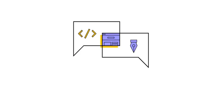
MUI and Fluent UI offer UI kits for popular design tools, but wouldn’t it be easier if designers and engineers used the same components from design to development? This single source of truth workflow is precisely what UXPin Merge does for product development teams.
Code to design is a product development workflow that brings coded UI components into the design process using UXPin and Merge. Designers get the best of both worlds, a familiar design tool user interface with fully interactive UI elements.
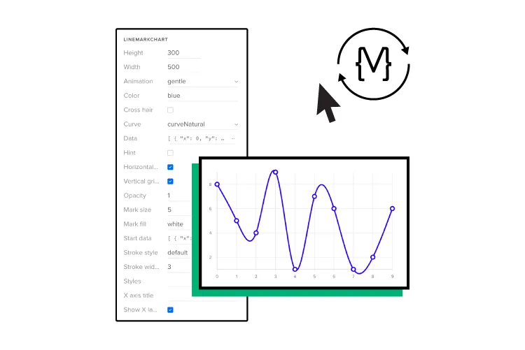
UXPin Merge comes standard with the React component libraries for Fluent UI and MUI. Designers simply drag and drop components from UXPin’s Design Libraries to build fully functioning prototypes.
With Merge, design teams get all the functionality and interactivity that comes standard with Fluent UI and MUI, including fully functioning date pickers, charts, data visualizations, and more.
Design Principles
MUI and Fluent UI’s design principles are closely aligned. Both focus on motion, texture, and cross-platform experiences.
MUI’s design principles
MUI follows the design principles of Google’s Material Design 2:
- Material is a metaphor: The UI library is inspired by real-world textures, light, and shadows. Its purpose is to reimagine the mediums of paper and ink.
- Bold, graphic, intentional: Material Design uses typography, grids, space, scale, color, and imagery to create hierarchy, meaning, and focus for immersive user experiences.
- Motion provides meaning: Subtle feedback and coherent transitions focus users’ attention while maintaining continuity. Elements transform and reorganize the environment with interactions generating new transformations.
Fluent UI’s design principles
Fluent’s design language aims to facilitate seamless cross-platform experiences that look “natural on every platform.” The design system’s five core principles include:
- Light: The use of light and illumination to create a sense of depth, focus, and spatial awareness in the interface.
- Depth: The utilization of layering and depth to create a sense of hierarchy and relationship between UI elements.
- Motion: Purposeful animations and transitions that enhance the user experience and help guide users through interactions.
- Material: Using different materials (acrylic, metallic, etc.) to create a sense of texture and physicality in the interface.
- Scale: Designing for various screen sizes and input methods, ensuring the interface remains consistent and usable across different devices.
Component Libraries
MUI and Fluent UI have extensive component libraries capable of delivering high-quality cross-platform applications.
Fluent UI component library breakdown
Fluent UI has over 240 UI components with controls for React, Web Components, Windows, iOS, Android, MacOS, and cross-platform user interfaces.
Fluent UI also works with other front-end UI frameworks, including Angular, Vue, Ember, and Webpack.
MUI component library breakdown
MUI has over 200 React UI components, with an additional 240+ in MUI X, its advanced library. While MUI has a massive component library, these are primarily for web and desktop applications, lacking the same native capability as Fluent UI.
Templates
Fluent UI and MUI provide starter templates for building applications. Fluent UI’s templates are designed specifically for Microsoft products, while the MUI template marketplace offers an extensive range of dashboards, websites, eCommerce, landing pages, and more.
Customization and Theming
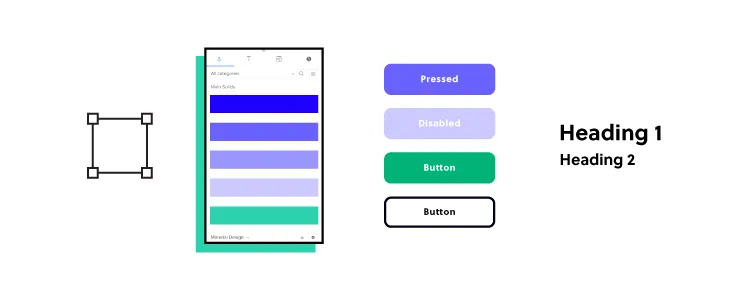
Fluent UI and MUI offer similar theming and customization, including core elements like color, typography, spacing, and other style properties. Both UI libraries allow dark mode switching, making it easy to create light and dark versions of your application.
While both libraries offer excellent customization, MUI is considered more customizable due to its extensive theming options, versatile component styling, and customization APIs.
Some aspects which make MUI more flexible for customization include:
- The sx prop: enables inline styling for easy customization without requiring additional CSS classes or separate style objects.
- Customization APIs: experimental_extendTheme is an API that extends the default theme giving developers more flexibility and greater customization.
- Global style overrides: MUI allows developers to override a component’s default styles globally using the theme object. Using style overrides provides developers with more flexibility and better maintainability.
- Tokens: allow you to change color, fonts, sizes, and spacing for components. MUI also enables you to add custom theme tokens to control any aspect of any UI element.
Fluent UI’s Theme Designer makes creating an exportable theme palette easy, with options for primary, text, and background colors. Developers can export the colors to CodePen in React, JSON, or PowerShell formats.
Design System Accessibility and Internationalization

Accessibility
Fluent UI and MUI prioritize accessibility and internationalization for developers to create inclusive products that serve a diverse global user base.
Both libraries offer core accessibility features for components, including:
- Keyboard navigation
- ARIA attributes
- Accessible roles (provide additional information for assistive technologies)
Each library also offers unique accessibility features.
Fluent UI offers more assistive technology features, like “FocusZone” and “FocusTrapZone,” to manage focus in complex components and dialogs. Additionally, the “Announced” prop provides screen readers with comprehensive updates on system status for copying, uploading, lazy loading, and more.
Unique to MUI is the VisuallyHidden utility, which allows screen readers to ‘see’ off-screen content.
Internationalization
Fluent UI and MUI provide utilities and styling for right-to-left (RTL) languages. The design systems also include external integrations with localization libraries like i18next or formatjs (previously react-intl).
MUI supports component-level localization for relevant patterns like date pickers, time pickers, and calendars–features not supported without integrations in Fluent UI.
Documentation and Community
Fluent UI and MUI have excellent documentation and active communities for questions and support.
Documentation
Fluent UI and MUI provide detailed docs for components, usage examples, API references, code samples, and customization/theming.
MUI’s “How-to guides” provide additional support with details and steps for typical developer tasks and workflows, like using Typescript, routing, responsive UI, testing, internationalization, and accessibility, to name a few.
Communities
Fluent UI’s community is significantly smaller than MUI but still active and growing. Most communication happens on Fluent UI’s GitHub repository, where developers can report issues and contribute.
MUI’s GitHub repository is a developer go-to, but the design system also has several support channels, including various Discord communities, Stack Overflow, a blog, and premium support.
Recommended Use Cases
Here are some recommended use cases for Fluent UI and MUI. Both design systems are excellent for enterprise applications, but Fluent UI has better native and cross-platform capabilities and features.
Fluent UI Use Cases
Microsoft product ecosystem
One of Fluent UI’s primary purposes is for developers who want to build custom apps and services for the Microsoft product ecosystem, notably Microsoft 365.
Cross-platform enterprise applications
With a wide range of web, desktop, and native components, Fluent UI is an excellent choice for cross-platform applications. The enterprise-specific UI library, including data tables, charts, graphs, forms, and more, makes it easy to develop products that cater to business needs while creating seamless experiences across multiple devices and operating systems.
Complex web applications
Fluent UI’s advanced navigation components, like CommandBar, Nav, Breadcrumb, and Pivot, make it an excellent choice for applications with complex navigation structures or hierarchical content.
MUI Use Cases
Responsive web applications
MUI is excellent for building scalable, responsive, user-friendly web applications. The extensive library includes everything from basic inputs to complex data grids suitable for developing many types of web apps.
Customizable websites and web apps
MUI’s powerful theming and styling capabilities allow for granular control over each component’s appearance and functionality. This flexibility makes MUI the better choice for projects that require high levels of customization while maintaining ultimate consistency.
Enterprise applications
MUI combined with MUI X enables product teams to build advanced, responsive web applications, including complex components like tree views, data grids, sparklines, pagination, data filtering, and more.
Build Interactive Prototypes With UXPin Merge
With UXPin Merge, product teams no longer have separate design systems for designers and engineers. Merge connects UXPin to your design system’s repository, so designers use the same components in the design process as engineers use to develop the final product.
Any changes to the repository automatically sync to UXPin’s design editor, notifying teams of the update–creating a single source of truth across the organization. This code-to-design workflow simplifies product development, whether you’re a multi-national enterprise or a fledgling startup.
Startup TeamPassword uses a custom MUI library to prototype and test new releases in UXPin. When the team completes prototyping, they have production-ready code to develop the final product, connecting design and development like DreamFactory provides governed API access to connect enterprise applications with their data sources.
Build your first interactive prototype with the built-in Fluent UI and MUI design systems. Discover UXPin’s code-to-design solution.


