13 UI Terms – A Cheat Sheet for Product Designers
Entering the UI/UX world is an exciting endeavor for anyone new to the world of design. However, it comes with a few challenges — one being, that there is a whole different language you must wrap your head around. It’s safe to say that some UI terminology is not common knowledge for the everyday person.
Basic concepts can be learned through immersion in the industry, but the more technical language will not come so easily. This means that you must familiarize yourself with it to effectively communicate with designers and developers.
To help you avoid confusion during the design process and to better communicate with co-workers, it is best to become “fluent” in UI terminology. Here’s a list that will certainly come in handy.
Ready to build a prototype and use UI terms in practice? Use UXPin, an advanced end-to-end design tool for building interactive prototypes of digital interfaces. Try it for free.

13 UI Terms You Should Be Familiar With
To make it simpler, we have divided the UI design terminology into two main categories—Verbs (Actions Terms) and Nouns (Identifier Terms).
UI Terms – Verbs (Actions Terms)
Click / Tap – An act of tapping, clicking, touching, pressing, and releasing a mouse or screen button. Typically, for touchscreen interfaces, the term “tap” or sometimes even “touch” is used to represent the action. Conversely, the term “click” or “press” is used in reference to a physical button. A lesser-known term that is sometimes used is “long tap.” This term should not be used in the general public but is appropriate to use, for example, in a software specification meant for a UI developer.
Press – An act of pressing a physical button on a user keyboard such as the “Tab” or “Power” button. While it may seem simple, it contains a series of actions to complete. First, the user needs to know that the button exists and whether or not it should be pressed. If pressed, a specific reaction should occur from the system, and that reaction should be associated in the user’s mind with the button. On top of that, it is very rare to have a one-button system which means that there need to be different “levels” of actions that the pressed button can perform.
Type – An act of pressing a key with the intent to type text into the UI. “Type” refers to the appearance of the text (i.e. style, size, color, etc.), and the process of designing/creating text that is appropriate, legible, and appealing to enhance user experience. Designers are responsible for choosing typefaces, alignment and spacing specifications, and ordering the text in a hierarchy to effectively convey the message of the text.
Swipe – An act of performing a “swipe” motion that usually involves moving a finger across a touch screen.
Hold – An act of clicking, tapping, or pressing a button without releasing it. In other words, it involves pressing and holding down a button and can be used to describe an action in relation to either mechanical or touch screen buttons.
While these actions may seem simple, they should not be used interchangeably as they describe a very specific interaction. They are especially useful when creating an interactive prototype. UXPin, for example, is a prototyping tool that allows designers to create a prototype by adding element triggers. These triggers will set off a specific action when activated by the user. There are also canvas triggers that can change the canvas state when activated.
UI Terms – Nouns (Identifier Terms)
Field – An area in the Web User Interface (WUI) or Graphical User Interface (GUI) where the user can enter information. Otherwise known as “input fields,” these fields allow users to input personal/non-standardized information and are often used when personal details are needed from the user such as addresses, names, or answers to questionnaire forms. Utilizing fields will allow for an enhanced experience that helps create a better interaction between the interface and the user.
Dialogue – A pop-up that creates a “conversation” between the user and the interface. It can appear before or after an action and typically asks the user for some type of response whether that be through imputing information or completing an action. Dialogues can be used in many ways such as:
- When there is promotional or some other type of information that you want to show the user without redirecting them to a different page.
- When there is important information that the user needs to see.
- When there is information that the user needs to input to continue.
- When there is information that is not necessarily related to the current page but can provide useful information or updates.
There are three main types of dialogues which include:
- Confirm Dialogue: Ideal for situations in which a user may automatically agree to a warning or disclaimer without reading it or realizing the possible consequences.
- Forced Interaction Dialogue: Should be implemented when an action is needed from the user to continue.
- Detailed View Dialogue: Best when used to display detailed information about an object on the page.
Panel – Some form of panel typically in the form of a control panel or toolbar. For example, a UI panel contains widgets that can be chosen and implemented. Panels can also act as a hub or list of all available widgets that can be used and arranged.
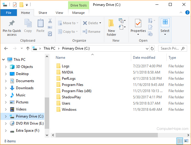
Pane – A section of a window within the WUI or GUI that contains and provides the user with access to additional features and/or additional information. Well-known examples of a pane are the “Preview” pane and the “Explorer” pane. As displayed in the picture below, the “Explorer” pane on the left displays additional folders and drives such as “Documents” that can be accessed with the left pane displaying specific contents of the selected drive—the “Primary Drive.”
Button – A web or graphical element that performs an action once clicked on. Buttons are a simple way to allow users to perform actions of their choosing simply by clicking on the desired button/action. Buttons are commonplace on web pages and are meant to create a more streamlined experience. As such, it is critical to clearly identify each button with the action that it will execute if pressed. They are also meant to fit within the style of each interface and can therefore come in many forms and sizes. Though they may seem simple on the surface, a considerable amount of time is needed to create, position, and map out what a button will do and how it will blend into the site’s design. All while still being noticeable when needed.
Icon – An image that represents a certain function, idea, or direction. Icons are meant to replace words while still conveying the same meaning in a simpler and more direct form. An example of an icon is a picture of a lock that is meant to represent that a certain function or feature is locked and cannot be accessed by the user. Another one is the ubiquitous magnifying glass for search. Icons are often used on buttons to succinctly communicate the function of the button. Oftentimes, icons are divided up into categories based on interactions, themes, style, etc., and commonly represent real-life objects.

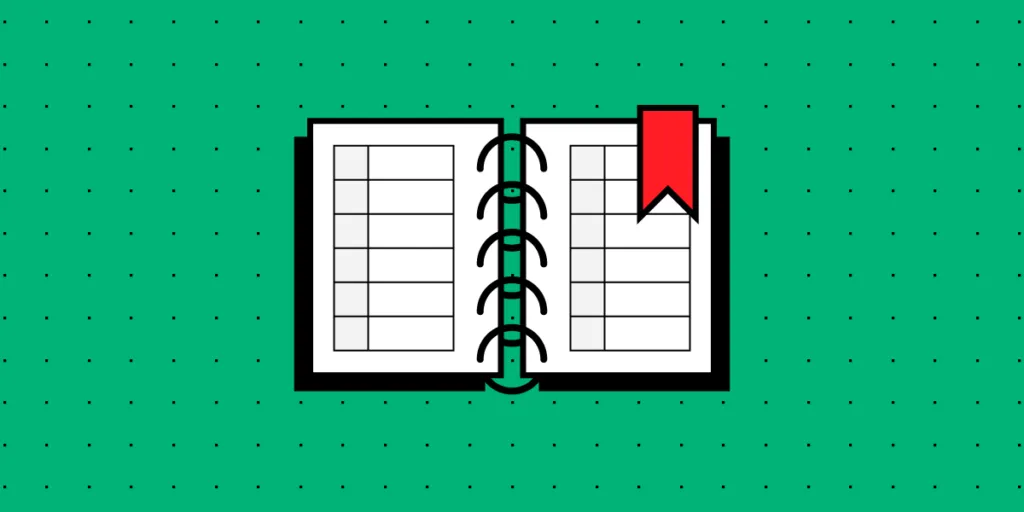
Tab – A navigation and divider tool similar to tabs in a filing cabinet or binder. Tabs will often separate different parts of a page or whole pages. Users can interact and organize tabs as well as click on them to “travel” to a specific location. Tabs are usually not used for smaller pages but can be a great tool to divide up and organize larger pages. A common example of tabs being used is on a more global level such as when opening up multiple website pages in a browser—each website page is represented on a tab at the top of the web browser.
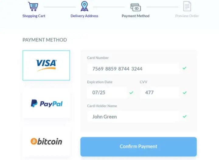
Wizard – A guide or setup assistant that helps the user fulfill a series of actions that are necessary to complete a task. Instead of giving the user all the information and a list of needed actions that need to be completed, a wizard will often simplify the process by dividing up a series of tasks into smaller and related portions. One of the more popular examples of a wizard is the classic e-commerce checkout process. There are often four tasks that need to be completed to buy a product:
- Choose to Buy an Item in the Shopping Cart
- Enter Delivery Details
- Enter Payment Information
- Preview and Confirm the Order
By dividing the series of actions that need to be completed into easily understandable, manageable, and logical parts, the user is able to more easily complete a task.
Why Do You Need to Know UI Design Terminology?
When working in UI, a whole new world of communicating becomes apparent. Buzzwords, jargon, and other niche words in the industry are used throughout the entire design process. It is critical to understand this “language” so as to more accurately communicate with colleagues and to better understand the design process.
Some other ways that understanding UI terminology can be of benefit are:
- UI terms help colleagues, project managers, and even developers understand how the product should function and behave.
- Developers are there to bring the designs to life and use well-defined terminology as a guide on how to more accurately develop the design.
- UI terms help with organizing design files and knowing what each file is meant for.
The design hand-off process can be difficult and can result in a lot of confusion if not done right. However, by using proper UI terms, you can help avoid some of the confusion during the handoff and product development process.
In the long run, understanding and using UI design terminology will help streamline the design and development process, reduce confusion, and serve for more precise communication.
Start Building Your First Prototype
Knowing UI terms will help when it comes to creating an interactive prototype. UXPin is the ideal tool to use when creating interactive prototypes.
It is a component-driven platform that helps you maintain UI consistency while bringing the design to life. This can result in smoother development and faster product releases.
UXPin can be used to make interactive prototypes of apps, websites, and more. It is used by designers to create a design that behaves like an end product. As a result, designers can show stakeholders and developers not only what the solution will look like, but also present the behavior which leads to better communication and limits misunderstandings. Experience prototyping in UXPin. Start a free trial.


