Material Design Icons – Building Blocks of Web and App Design
Material Design is one of the most popular design systems. If you own an Android device, you use Material Design daily. Many companies use the Material Design System as a foundation for building mobile and web applications.
The system’s comprehensive component library and resources, including Material Icons (now Material Symbols), give organizations and startups the building blocks to scale products infinitely without designing from scratch.
This article explores Material Symbols and other Material resources you can use for your next product development project.
Table of contents
Material Design UI and Icons come standard with every UXPin plan. Sign up for a free trial to build beautiful apps with UXPin and Material Design today!

What is Material Design?
Material Design is a design library developed by Google, including UI components, icons, typography, and more. Every Material component includes guidelines for implementation, usage, anatomy, behavior, and more to help designers and engineers achieve the best results while delivering high-quality user experiences.
Google launched the first version of Material Design at the 2014 Google I/O Conference. In May 2021, Google released Material Design 3, including notable features like Dynamic Color, foldable device components, and design tokens.
Material Symbols Launch
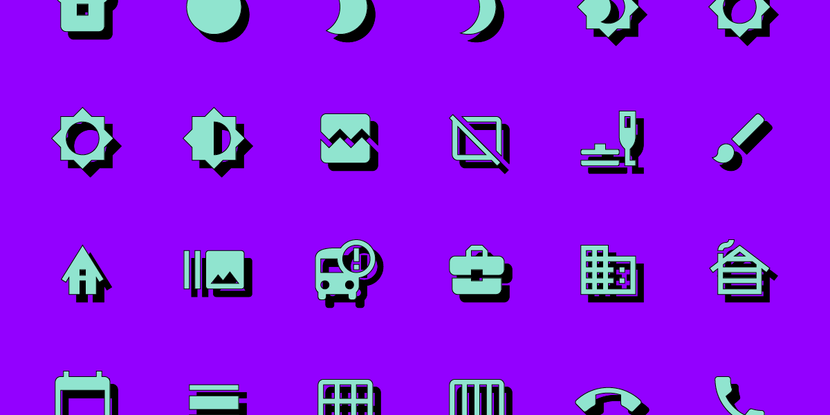
One of Material Design’s most exciting recent updates was the launch of Material Symbols–a customizable icon set with over 2,000 open-source icons in five styles. You can still find all your favorite Material Icons, but now you have more flexibility and customization to meet your product and brand’s requirements.
Material Icons are still available but don’t offer the same customization as Symbols. You can only adjust the size and density versus the four variable options with symbols.
Material Icons Set
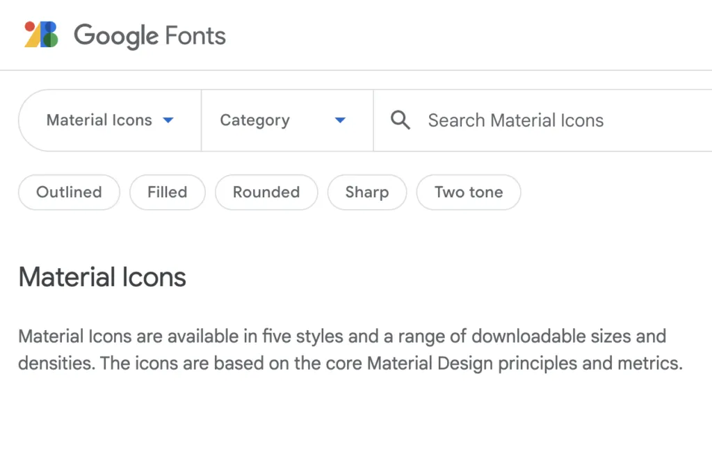
Google has kept the old Material Icons, albeit fewer than the Symbols catalog. Icons are available in five styles, Outlined, Filled, Founded, Sharp, and Two-tone.
Material Symbols – What’s New?
Material Icons has moved under Google Fonts, offering a variable icon set in three styles, Outlined, Rounded, and Sharp. Designers also have the option to customize the icon set with four variables or axes:
- Fill: Fill or unfilled appearance
- Weight: Defines the symbol’s stroke from 100 to 700 weight
- Grade: Granular adjustments to the symbol’s thickness to convey emphasis
- Optical size: Size icons to 20, 24, 40, or 48 pixels
The variable methodology allows engineers to store multiple variations in a single font (or icon) rather than several files. By reducing the file size and number of files, engineers enjoy better performance and fewer assets to manage.
Three Styles
Google also introduced three new styles to match a brand’s identity and UI design.
- Outlined: Clean and light. Designers can adjust the icon weight to complement the product’s fonts.
- Rounded: The curved aesthetic works well with rounded logos and heavier fonts.
- Sharp: Designed to match UIs with straight edges and 90-degree corner styling.
Build Your Own Material Icons
If you can’t find the icon you need in Material Symbols’ vast catalog, Google includes guidelines for designing custom icons, including:
- Design principles: best practices to create clear iconography that’s meaningful and helpful to users.
- Icon sizes and layout: how to set up the grid size and layout for designing icons using a design tool.
- Grid and keyline shapes: techniques for creating consistent a consistent icon set.
- Icon metrics: icon design anatomy including corners, weight, stroke, and complexity.
Following these helpful guidelines, you can utilize Material’s comprehensive icon set while including a few relevant to your brand.
How to Use Google’s Material Icons & Symbols
There are several ways designers and engineers can use Material Icons and Symbols.
Downloading SVG or PNG
You can download Icons and Symbols in SVG or PNG format. We recommend using SVG for its performance and customization benefits. PNG files are much larger and more complicated for designers and engineers to edit and resize.
Google allows you to customize your Icons and Symbols before downloading, so you have a finalized asset to use in your project.
CSS/CDN
Material Symbols provides a CSS file for website installations similar to what you use for Google Fonts. The problem with this method is that it requires your website to make additional requests, which can severely affect performance.
If you’re planning to use more than one Material Symbol, it’s better to use another method for installation.
Operating Systems & Frameworks
Material Icons and Symbols offer downloads for Android and iOS to install as project assets, with code snippets for implementation. Material Design includes instructions for Flutter (a Google-developed programming language) and Angular. React instructions are available in MUI’s documentation.
Designer Usage
Most design tools offer plugins or extensions for Material Icons. If you’re using UXPin, the complete Material Icons set comes standard with every plan.
You can also import your own SVG icons, edit them in UXPin and save them to your Design System to share with other team members.
Using Material Icons and Symbols With Typography
Google’s Material 3 documentation offers tips and best practices for pairing icons with typography.
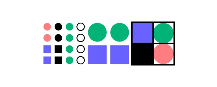
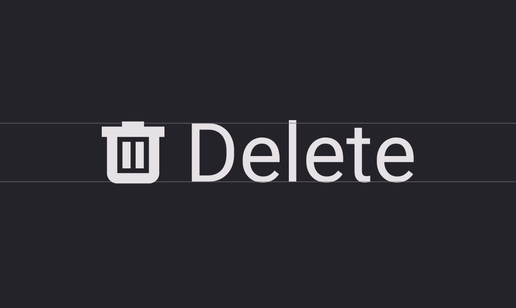
Weights
Never use different weights for your icons and text. Google makes it easy to pair these assets with Material Symbols’ Weight customization variable. Ensure you always match the font weight with the icon weight to achieve a clean and consistent aesthetic.
Correct font weight.
Incorrect font weight.
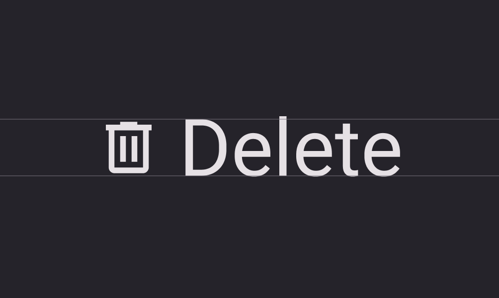
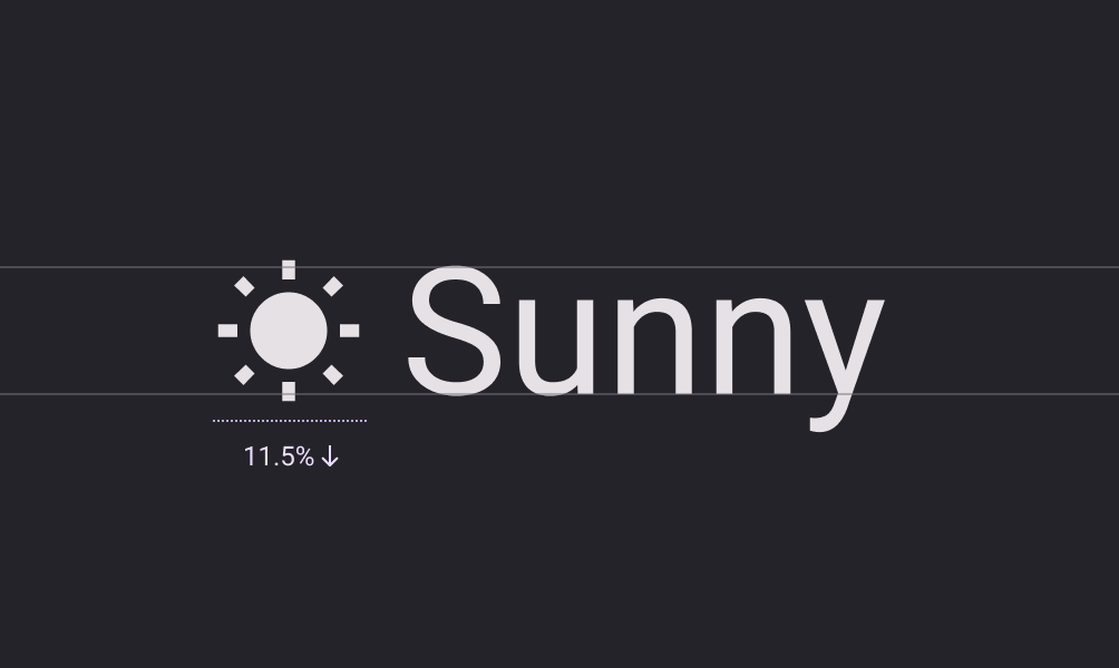
Sizing & Alignment
Always match the icon size and alignment with the text. Users must be able to read both and recognize they’re related. Google recommends designers “shift down the baseline of symbols to approximately 11.5% of the type size.” This technique will keep icons and text uniform and aligned.
Material Icons Accessibility
Google provides brief but helpful advice to designers about icon accessibility. Designers must always use meaningful, descriptive labels with icons, especially for navigation. Icons without text labels can appear ambiguous and confusing to users. Designers must also include alt text for screen readers and other assistive technologies.
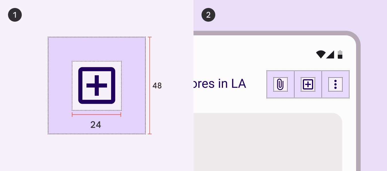
Target size is also a crucial factor for icons. People with large fingers or hand disabilities might accidentally hit the wrong icon button, causing confusion and frustration.
Google recommends designers use a minimum target size of 48 pixels. If you’re using a 20-pixel icon, provide enough padding to make the total target area 48 pixels.
Designing with Material Design’s Icons in UXPin
With several icon sets, including Material Icons, preinstalled with UXPin, designers don’t have to install plugins or upload external files. Here’s how easy it is to add icons to your project.
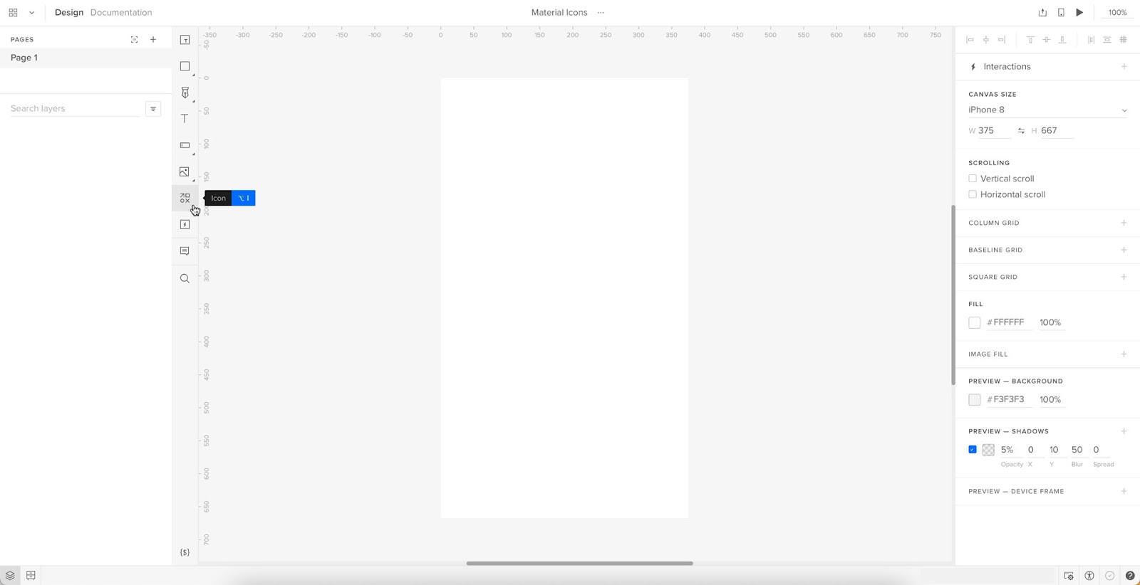
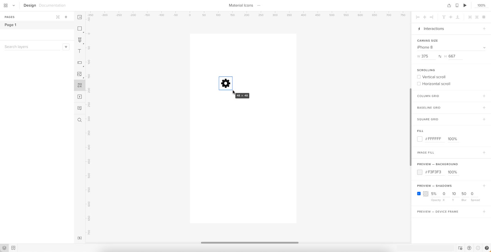
Step One – Click the icon element
Click the icon element in the Quick Tools panel to the left of the canvas. Alternatively, you can use the keyboard shortcut OPTION+I (on Mac) or ALT+I (on PC).
Step Two – Draw an icon on the canvas
Click and drag a square where you’d like the icon to appear on the canvas. Hold down SHIFT to maintain an equal width and height.
Step Three – Icon properties panel
Once you draw an icon, an icon properties panel will appear on the right Properties Panel. You can select Material Icons or one of the other sets, including Fonts Awesome, Retina Icons, and a UXPin set, to name a few.
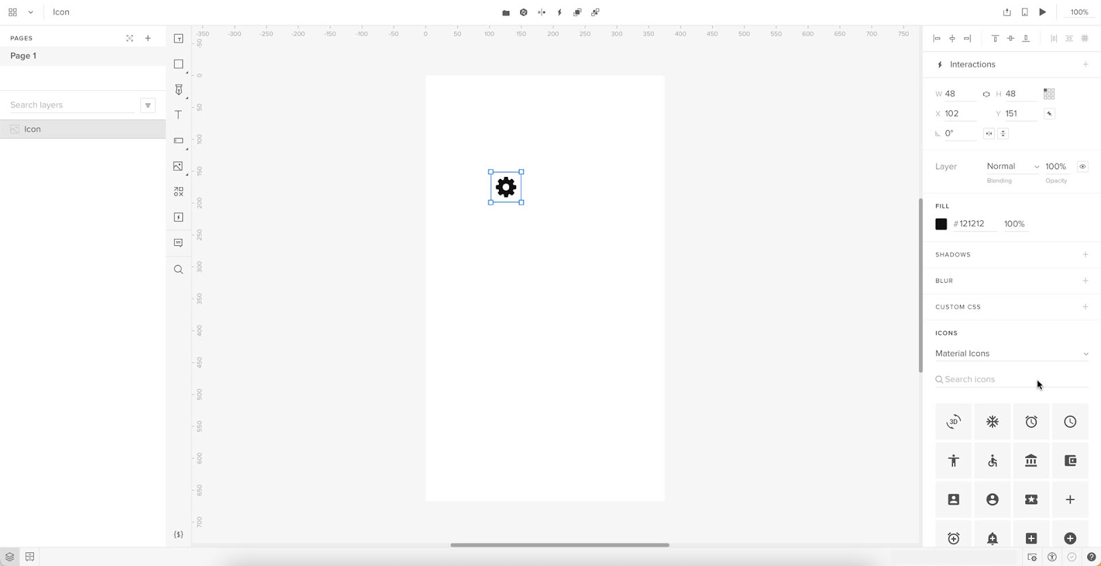
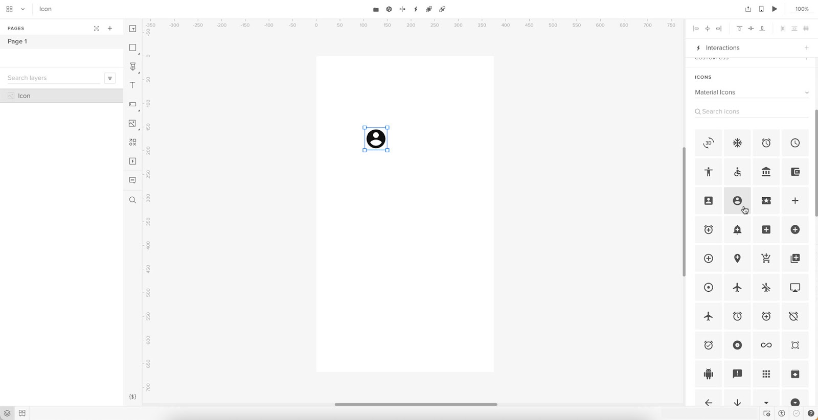
Step Four – Select an icon
Scroll through the available Material Icons to find what you need. Click on any icon in the properties panel (while you have the icon selected on the canvas) to make your selection.
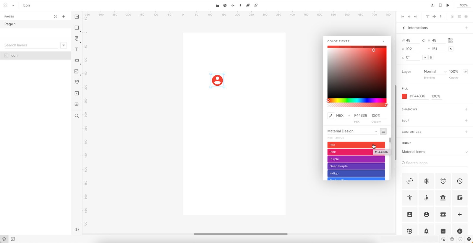
Step Five – Adjust icon properties
Once you have chosen an icon, you can style it using the Properties Panel above the Icon section. Below the Color Picker is a dropdown with available design systems, including Material Design, so designers don’t have to copy/paste HEX codes from elsewhere.
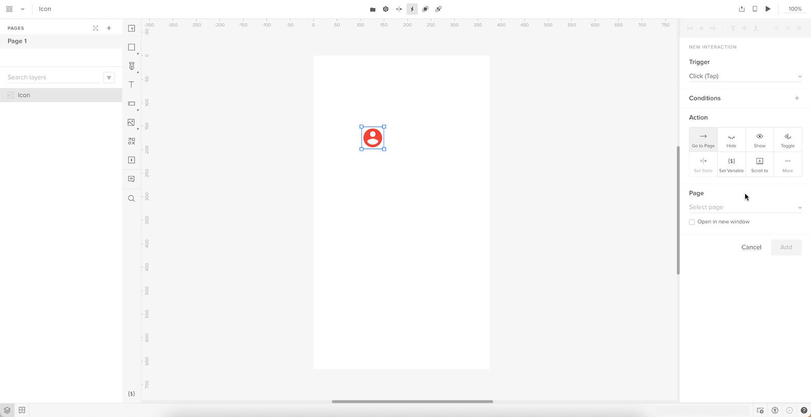
Step 6 – Add interactions
At the top of the Properties Panel, you’ll find Interactions. Add interactions, animations, transitions, etc., to make your icons interactive. For example, we might want this user icon to open a personalized profile page.
Check out UXPin’s Interactive UI Patterns and App Examples to see how UXPin’s features work and what’s possible with code-based design.
Improve Prototyping and Testing With UXPin
Material Icons are just one convenience of working in UXPin. Our goal is to help designers build prototypes quicker and with greater functionality and fidelity as image-based design tools.
Using one of UXPin’s built-in design libraries, designers can drag and drop elements to build interactive prototypes in minutes. We’ve included five popular design libraries to accommodate every type of project, from websites to web and mobile applications for enterprise and B2C products.
Every UXPin plan includes Material Design, iOS, Bootstrap, Foundation, and User Flows, with each library’s interactive elements, colors, text styles, and icons.
UXPin’s Design Systems feature allows designers to build a design system from scratch, automatically categorizing the library into Colors, Assets, Typography, and Components. You can also set up permissions and include documentation for designers and engineers to follow.
Build better prototypes that accurately replicate the final product experience using UXPin’s code-based design tool. Sign up for a free trial to discover the possibilities of designing with UXPin.


