Color Schemes for Apps – How to Choose One [+ 5 Examples]
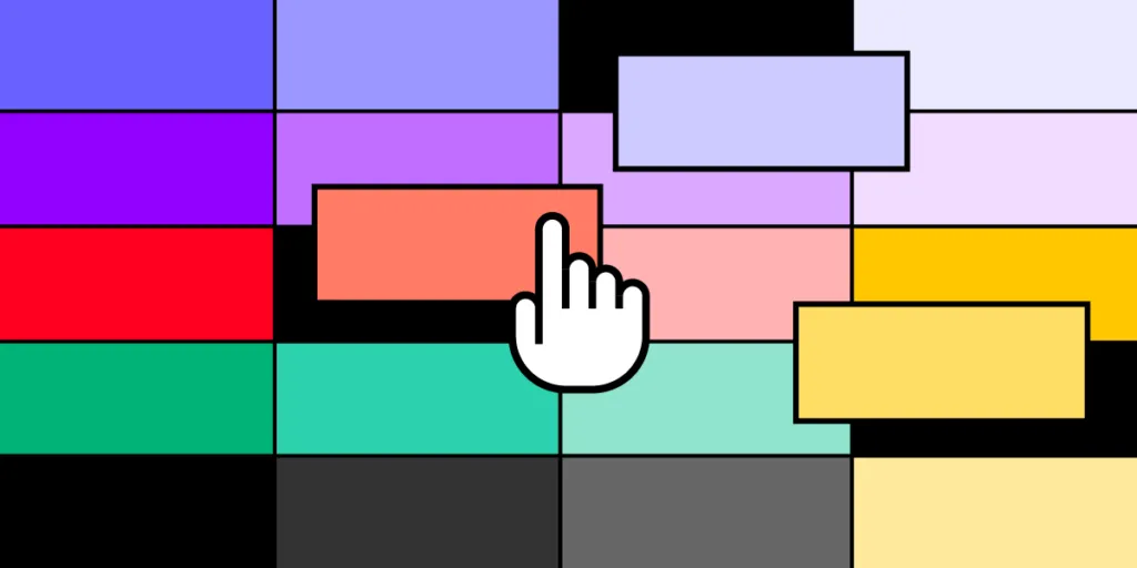
Color scheme is a combination of colors that are used in projects or products in order to communicate or evoke emotions. An artist, designer or anyone responsible for visual communication of a project or a product picks colors that go well together and help achieve desired outcome.
An app’s color scheme makes user experiences familiar and memorable, setting your brand apart from competitors. Color also helps maintain UI and brand consistency, fostering trust with users.
A color palette impacts readability of an app’s text and navigation. For example, poor color contrast makes text legibility difficult for most users but nearly impossible for visually impaired users. Designers must assess how fonts and other design elements appear on the user interface’s background color to balance brand requirements and aesthetics with usability and accessibility.
Create a prototype of your app that will use your brand colors and test it with users. UXPin is an end-to-end prototyping tool for making UI design not only look good but also behave like a real app. Try it for free. Sign up for a free trial.
How to Use Color Psychology for Mobile App Design
Color psychology explores how hues influence human behavior, feelings, and decision-making. This color theory is a fascinating intersection of art, science, and culture.
Color psychology examines how color impacts our daily lives–from purchasing decisions to moods. It also plays a significant role in marketing and branding, “In an appropriately titled study called Impact of Color in Marketing, researchers found that up to 90% of snap judgments made about products can be based on color alone (depending on the product).” Gregory Ciotti, The Psychology of Color in Marketing and Branding.
For designers, this field offers invaluable insights. By grasping the emotional and psychological effects of colors, designers can craft more effective and resonant designs. They can curate experiences that align with a brand’s identity, drive user engagement, and elicit desired user responses. Incorporating color psychology isn’t just about aesthetics. It’s a strategic move to enhance user experience and satisfaction.
How do colors evoke emotions and feelings?
Colors carry an inherent emotional weight, eliciting strong feelings and responses and shaping a user’s perception and experience within an app. Here are some examples of colors and their effects on humans:
- Blue: Often associated with trust, calmness, and reliability.
- Red: Evokes feelings of passion, urgency, or even danger.
- Green: Symbolizes growth, harmony, and health.
- Yellow: Represents optimism, warmth, and energy.
- Black: Can signify elegance, power, or mystery.
- White: Denotes purity, simplicity, and clarity.
What are the cultural implications of color choices?
Color perceptions aren’t universal; they vary significantly across different cultures. For example, people perceive the color white differently across Eastern and Western cultures:
- In Western cultures, it represents purity, innocence, and weddings.
- In Eastern cultures, white is traditionally linked to mourning and death.
These vast differences underline the importance of cultural consideration in UX design. For global applications, understanding color implications in varied cultural contexts is essential to creating a universally resonant user experience.
When to use color gradients
A color gradient refers to transitioning from one color to another. It can add depth, dimension, and visual interest to app designs. Here are key considerations when integrating gradients:
- Highlighting a focal point: Gradients can direct users’ attention to specific sections or elements, such as call-to-action buttons or banners.
- Background enhancement: Instead of a flat color, a subtle gradient can add richness and depth, providing a more immersive experience.
- Creating depth and dimension: Gradients combined with shadows can make UI elements appear more tactile and three-dimensional.
- Eliciting emotions: Just as individual colors evoke emotions, gradients can blend these feelings, creating a broader emotional palette.
How to Choose a Color Scheme for Your App
Designers must consider usability, brand perception, and user engagement when determining the right color palette, including:
- The app’s purpose and the mood it aims to set.
- The existing brand identity and ensuring visual consistency.
- Insights from user research to match user preferences and expectations.
Decide on an app’s purpose and mood
Each app serves a unique purpose and aims to evoke specific feelings and emotions. A meditation app might lean towards calming blues or earthy greens, while energetic oranges or motivating reds would benefit a fitness app.
It’s vital to align the color palette with the intended mood. Before selecting colors, define the emotions and reactions you want your app to elicit. These emotions will guide color and design decisions, ensuring the chosen hues reinforce the app’s core objectives.
Incorporate brand identity and visual consistency
Your app should be an extension of your brand, and consistency is key to brand recognition. Begin by assessing your existing brand colors. Can they be directly integrated, or do they require adjustments to fit the app environment?
It’s important to note that colors render differently across various browsers, devices, and platforms, so it’s crucial to test color schemes thoroughly. Designers must ensure that hues maintain a strong brand identity while optimizing for digital displays, usability, and accessibility.
Conduct user research to determine your color scheme
Designers must include user research to understand the target audience’s preferences, cultural associations, and potential colorblindness concerns. UXPin offers built-in accessibility features for color testing, including a Color Blindness Simulator and Contrast Checker so designers can evaluate designs on the fly.
Start by conducting surveys or focus groups, asking users about their color preferences in similar apps. A/B testing with different color schemes can also offer data-driven insights.
How Top Tech Brands use Color for Their Digital Products
Each of these brands has chosen colors that align with their brand identities and the emotions and values they aim to evoke in their users. The color choices aren’t just visually appealing; they resonate with the brand’s core mission and vision.
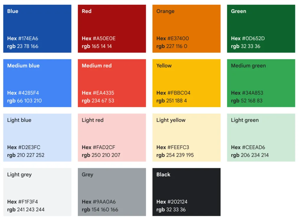
- Primary Color: Blue
- Secondary Colors: Red, Yellow, and Green
- Google’s colorful palette represents the brand’s playful and innovative nature. The four colors are prominently used across many of its products and logos, signifying diversity and inclusivity.
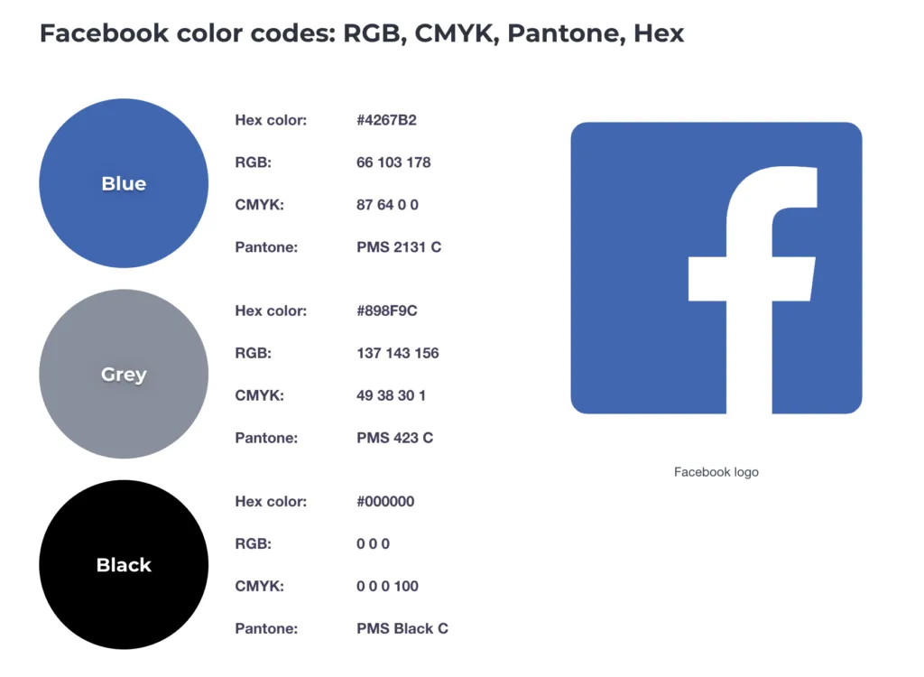
- Primary Color: Facebook Blue
- Secondary Color: Light Gray
- Facebook’s dominant blue color scheme exudes a sense of trust, reliability, and connectivity. It’s calm yet authoritative.
Apple
- Primary Color: Black for logos and white for products.
- Secondary Color: Silver/Gray tones for product designs.
- Apple’s palette is minimalistic and sleek, reflecting its focus on innovation and user-centricity. The simplicity of the colors aligns with their ethos of sophisticated and intuitive design.

Headspace
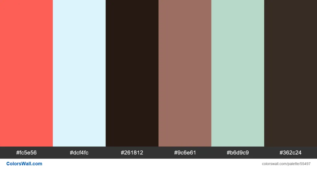
- Primary Color: Orange
- Secondary Colors: Soft Yellow, Pale Blue, Light Green, and Light Lavender.
- Headspace’s calming and varied color palette mirrors its mission: to improve health and happiness through mindfulness and meditation. The primary orange denotes enthusiasm and encouragement, while the secondary colors radiate tranquility and balance.

Robinhood
- Primary Color: Robinhood Green
- Secondary Colors: Dark Green, Dark Gray, and Light Gray
- Robinhood’s dominant green, especially the minty shade, symbolizes wealth, growth, and prosperity. The name itself, derived from the Middle Ages hero who took from the rich to give to the poor, is represented by the green shade synonymous with money. At the same time, the grays provide a solid, stable backdrop, reflecting the stability one desires in finance.
Duolingo
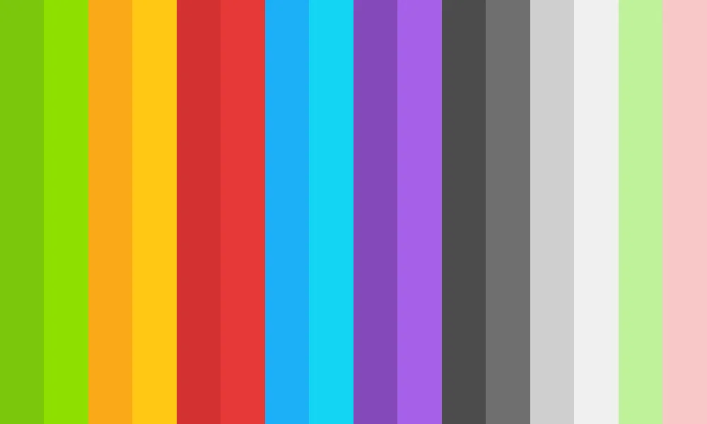
- Primary Color: Duolingo Green
- Secondary Colors: Light Green, Dark Green, Lighter Gray, and Dark Gray
- The lively and vibrant shade of green is a nod to growth, learning, and progress–precisely what Duolingo aims to achieve in language learning. The shades of green represent the different stages and paces of learning, and the grays offer a neutral balance to the overall energetic palette.
How UXPin Helps Streamline Digital Product Color Testing
UXPin’s advanced prototyping features allow designers to go beyond static mockups when testing app UIs to determine how interaction design, animations, and functionality will influence color choices.
With built-in accessibility features like the Color Blindness Simulator and Contrast Checker, UXPin ensures designers can quickly evaluate and refine their color choices during the design process to create digital experiences that are both visually captivating and universally inclusive.
Create high-quality, visually appealing mockups and interactive prototypes using the world’s most advanced user experience design tool. Test your app’s color scheme in a prototype built with UXPin. Sign up for a free trial.
Frequently Asked Questions (FAQs) About Color Schemes for Apps
1. Why is choosing the right color scheme important for app design?
A well-chosen color scheme enhances user experience, improves readability, and reinforces brand identity. Colors influence user perception, emotions, and interaction with your app.
2. How do I choose the best color palette for my mobile app?
Start by understanding your brand identity and target audience. Use color psychology, contrast principles, and accessibility guidelines. Consider tools like color wheel generators and UI design platforms to create a balanced palette.
3. What are the best color schemes for improving app usability?
High-contrast color schemes improve readability, while minimalistic palettes create a clean and modern look. Accessible designs should follow WCAG guidelines to ensure text is easily legible against background colors.
4. How does color psychology impact user behavior in apps?
Different colors evoke different emotions—blue promotes trust, red stimulates urgency, and green symbolizes growth. Understanding these associations helps in creating an engaging and effective user experience.
5. What are some trending color schemes for apps in 2024?
Popular trends include dark mode themes, pastel gradients, neomorphism-inspired palettes, and high-contrast accessibility-friendly colors. Many designers are also incorporating AI-generated palettes for unique and dynamic aesthetics.
6. How do I ensure my app’s color scheme is accessible to all users?
Follow accessibility standards such as WCAG 2.1, ensuring sufficient contrast between text and background. Use tools like color contrast checkers to validate readability, and consider features like color-blind modes for inclusivity.
7. Should I use dark mode in my app’s color scheme?
Yes, if it aligns with your user preferences and brand identity. Dark mode reduces eye strain, saves battery on OLED screens, and enhances visual appeal, especially in low-light environments.
8. What tools can help me create the perfect color palette for my app?
Popular tools include Adobe Color, Coolors, Color Hunt, and Figma’s color palette generator. These help designers experiment with different shades, gradients, and harmonious color combinations.
9. How do I test my app’s color scheme for usability?
Conduct A/B testing with different color variations, gather user feedback, and use heatmaps to analyze user interaction. Additionally, usability testing with real users can reveal how colors impact navigation and engagement.
10. Can I change my app’s color scheme after launch?
Yes, but it should be done carefully to avoid disrupting user experience. Gradual changes, user testing, and clear communication can help users adapt to the new color scheme without frustration.
