Filter UI and UX 101 – An In-Depth Guide

Filters are powerful user interface patterns, streamlining user journeys and driving engagement by increasing efficiency and content discovery. We explore UI filter design, providing insights and best practices to help you design user-friendly patterns, including examples from leading tech companies and how they simplify the user experience through filters.
Key takeaways:
- UI filters are design elements that aid search within an app or a website.
- They directly influence user navigation, ensuring efficient and tailored content discovery.
- Prioritizing simplicity, responsiveness, and user control is paramount for effective filter design.
- Cross-platform filter design requires a harmonious blend of platform-specific patterns and consistent core functionalities.
- Incorporating natural language, progressive disclosure, and accessibility ensures filters cater to all users and their diverse needs.
- Advanced design tools like UXPin enable designers to prototype and test interactive filter components, maximizing their impact on the final product.
Design intuitive filters and other interactive components with the world’s most advanced UX design tool. Sign up for a free trial to build your first interactive prototype with UXPin today.
What is UI Filter in UX Design?
A UI filter is a design element that allows users to narrow down a data set or options based on specific criteria. For example, we use filters for eCommerce stores to find products by size, color, price, etc. A filter UI lets users find what they want quickly, saving time and reducing frustration.
Designers design filters based on user needs to help them navigate content or offerings efficiently. When implemented correctly, filters streamline navigation, making interfaces user-friendly and intuitive.
How Do Filters Affect User Experience?
Filters empower users by controlling how they find and experience content, speeding up tasks, and enhancing engagement with digital products.
Here’s how filters enhance the user experience:
- Navigation efficiency: Users don’t waste time scrolling through irrelevant data. For example, instead of browsing through hundreds of shoes on an eCommerce site, users can filter for their size, preferred color, or brand to find the most relevant results.
- Personalized content delivery: Filters cater to individual preferences. Consider a news app; by selecting specific categories like ‘Technology’ or ‘Health,’ users receive news tailored to their interests.
- Decision-making support: Overwhelming users with options can paralyze decision-making. Filters limit choices, making it easier for users to decide. In a streaming app, rather than sifting through thousands of movies, filters can display only “Top-rated” or “New releases.”
- Reduction in cognitive load: Users don’t need to process excessive information. Filters help display only what’s necessary, ensuring users aren’t overwhelmed or fatigued.
- Improved Satisfaction and Retention: When users find what they’re looking for quickly and efficiently, they’re more likely to be satisfied and continue using the platform.
What are the Principles of User-Friendly Filter Design?

Simplicity and clarity
The filter interface should be straightforward to understand. Avoid overwhelming users with too many options or using ambiguous names. For example, an online clothing store should have clear categories like size, color, fit, brand, price, etc., rather than intricate sub-filters that confuse shoppers.
Responsiveness and feedback
Filters should apply changes quickly and give users feedback about their actions. For example, displaying a result count of the applied filters tells users how many options they must scroll through, setting expectations and preventing frustration.
Prioritization of filters
Not all filters hold the same importance. By understanding user needs, prioritize the most commonly used filters and hide the rest. For example, an accommodation filter might display the dates, guests, and location in the primary UI with a “View all filters” button or icon to access the rest.
Flexibility and control
Users should feel in command. If they make a mistake, it should be easy to rectify. For example, a “reset filters” button lets users revert to default quickly.
Visibility and accessibility
Filters must be conveniently located and accessed on a page. For example, users are used to seeing filters above results near the search field.
Designing filter user interfaces for cross-platform applications
Building filters for cross-platform applications demands awareness of varying platform-specific UI patterns and best practices. Ensuring consistent user experience across different operating systems while adhering to platform-specific guidelines is vital.
Here are some design decisions to consider when designing cross-platform filter patterns:
- iOS Platform-Specific Patterns: iOS design often uses segmented controls for filters. For instance, in a shopping app, ‘Men,’ ‘Women,’ and ‘Kids’ might be segmented controls at the top of the browsing screen.
- Android Platform-Specific Patterns: Android UIs frequently employ tabs for primary filtering options. Dropdowns are also standard for secondary filtering or sorting options.
- Consistency Across Platforms: While it’s essential to respect platform-specific patterns to maintain a native experience, ensure that the core functionality remains consistent across all platforms and mobile apps. If a filter option exists on iOS, the same should be accessible on Android, even if represented differently.
- Adaptive UI Components: Utilize components that adapt to the user’s device and operating system, providing a seamless experience regardless of device.
How to Design Effective UI Filters

Use natural language for filter options
Use words and phrases users naturally use or expect to ensure users understand filter options without ambiguity.
For example, instead of using “Canine” and “Feline” as filter options on a pet eCommerce store, use “Dogs” and “Cats”. The latter terms align more with common user language.
Provide search within filters for extensive lists
When dealing with long lists of filter options, a search function aids users in finding their choice without scrolling endlessly.
For example, an online bookstore with multiple genres provides a search bar within the filter instead of listing every genre. Users can type “thriller” and directly access that genre without navigating a lengthy list.
Utilize progressive disclosure
First, display the most commonly used filters and provide an option to see more if users need further granularity.
For example, a real estate site might show Price, City, and Price Range filters upfront with a “Show More” filtering option for users who want specifics like Bedrooms, Suburbs, and other property features.
Employ visual cues
Visual elements, like colors, icons, and typography, effectively guide users, clarify options, and enhance filter understanding.
For example, color swatches beside filter options give users a visual cue to scan results faster.
Design filters for accessibility
Filters should be usable by everyone, including those with disabilities, considering contrast, screen reader compatibility, and keyboard navigation.
For example, if your app uses color for filter categories, consider adding icons to help color-blind users navigate and scan results.
What are Some Use Cases of Good Filter UI Design?
Airbnb

Airbnb redesigned its filter UI in 2023 to be more accessible and user-friendly. Users can access the search filter overlay via a universally recognizable icon next to the search filter.
Recognizing that price is most important to users, Airbnb offers two UI design patterns for price filtering. Users can scroll to get more granular using large buttons, icons, checkboxes, sliders, and switches to apply preferences.
Booking.com

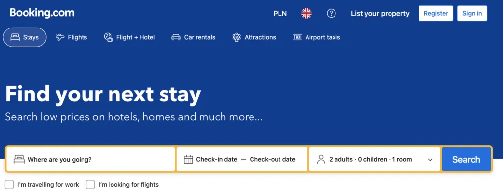
Like Airbnb, Booking.com must display millions of properties to travelers and uses filters to help narrow options. Booking.com uses a slightly different pattern with the filter icon and label to help with accessibility.
Booking.com also displays a price filter at the top and a list of popular filters below, enabling users to apply choices without too much scrolling. Beside each filter is a number displaying the amount of results per filter, providing users with helpful feedback and managing expectations.
For example, you don’t want to apply a filter and discover no properties, forcing you to return and try again–possibly several times, causing immense frustration.
Spotify

Filter doesn’t always apply to search. It can also help users decide what content they want to access. Spotify has three primary categories:
- Music
- Podcasts & Shows
- Audiobooks
The streaming service uses a button for each category on the home screen for users to filter what content they want to consume. These filters make Spotify’s home screen user-friendly and efficient because users can apply a preference in one click, eliminating the need to search or access navigation.
Amazon

Amazon’s desktop interface displays a search field at the top of the page and filters in a neatly organized left sidebar. Users can apply filters using icons, checkboxes, buttons, or form fields for custom pricing. Selecting an item automatically loads the filter results, eliminating the need for an “Apply Button,” reducing clicks and interactions.
This highly granular filtering is crucial for large databases like Amazon’s product inventory. In the example above, we apply two options in the filtering sidebar to get shoe results from over 50,000 to 202, streamlining the browsing experience to checkout faster.
Google Maps

Google Maps uses a horizontal scroll navigation pattern to display a list of common search categories. Once users apply a broad term like “Coffee,” they can use the secondary filters to apply more granularity and narrow results.
Google Maps’ filtering interface is an excellent example of how designers can help users find what they want with minimal clicks and typing, even when diverse, seemingly endless options are available.
6 Filter UI Design Patterns to Use
On-Screen Filter
- Description: This pattern displays filter options directly on the screen without additional interactions. It’s ideal for contexts where users need to quickly toggle or adjust filters, such as eCommerce sites that allow sorting by price, popularity, or category.
- Best Use Cases: Suitable for interfaces with few filter options and where users want immediate control without navigating away.
- Example: Amazon’s product filters, which show categories and price ranges directly on the results page.
- Enhancements: Combine with sticky headers or floating filter bars to keep filters accessible as users scroll.
Filter Drawer
- Description: A filter drawer reveals options upon interaction, typically through a tap or swipe. This pattern is useful for mobile devices where screen real estate is limited.
- Best Use Cases: Ideal for apps or websites with a large number of filter options that need to be hidden by default.
- Example: Airbnb uses a filter drawer that slides in from the side, allowing users to refine search criteria without leaving the results page.
- Considerations: Ensure the drawer is easily dismissible and accessible, especially on small screens(Smashing Magazine).
Filter Dialog
- Description: A modal or pop-up dialog that presents filters as a separate overlay. This design pattern forces users to focus solely on filtering before returning to the main content.
- Best Use Cases: Best for complex filters that require multiple inputs or selections, such as finding specific product attributes or searching flights by multiple criteria.
- Example: Expedia uses a filter dialog that allows users to specify flight durations, number of stops, and preferred airlines(Smashing Magazine).
- Accessibility Tip: Make sure the dialog is keyboard-navigable and supports screen readers.
Filter Tabs or Scrolling Bar
- Description: A horizontal scrollable bar with filter options presented as tabs. Users can switch between tabs to filter content based on specific categories or attributes.
- Best Use Cases: Effective for media-rich content like news articles or image galleries, where users need to filter by type (e.g., “All,” “Videos,” “Images”).
- Example: Google uses a scrolling filter bar in its search results to switch between different types of content, such as “Images” or “News.”
- Key Consideration: Ensure the filter tabs are visible and intuitive to use, with clear labels for each category.
Scoped Search or Pre-Filters
- Description: This pattern allows users to define their search criteria before viewing results. Commonly seen as part of a search form, scoped search helps users narrow down the number of results early on.
- Best Use Cases: Useful for large databases or eCommerce sites where users might know exactly what they are looking for (e.g., searching for hotels with specific amenities).
- Example: TripAdvisor’s search form uses pre-filters to refine the search criteria before displaying results(Smashing Magazine).
- Implementation Tip: Use placeholders and tooltips to guide users on how to define search criteria effectively.
Combination Filter (Multi-Select)
- Description: This pattern combines multiple filter types, such as checkboxes, dropdowns, and sliders, within one interface. It’s useful when users need to apply a combination of filters, like selecting multiple categories, price ranges, or product attributes.
- Best Use Cases: Suitable for complex datasets where users need to refine results based on many criteria.
- Example: Zappos uses a multi-select filter interface to refine product options by size, color, brand, and price.
- Interaction Design Tip: Allow users to see how each filter affects the results dynamically without reloading the page.
Design Better Filter UI and UX with UXPin
Designing and prototyping filters is challenging in image-based tools like Figma, Adobe XD, and Sketch. While you can achieve excellent visual design results, these design tools lack the features to create interactive prototypes–a big problem for testing an interactive filter component.
UXPin is a code-based design tool. Instead of generating vector graphics, UXPin renders HTML, CSS, and Javascript behind the scenes, giving designers the power of code without writing a single line.
Advanced prototyping features
Designers can use UXPin’s code-based features to build functioning filters that look and feel like the final product without plugins or external tools:
- States: create multiple states for a single UI element and design complex interactive components like dropdown menus, tab menus, navigational drawers, and more.
- Variables: capture data from user inputs and create personalized, dynamic user experiences–like displaying a user’s selected filters with results.
- Expressions: Javascript-like functions to create complex components and advanced functionality–no code required!
- Conditional Interactions: create if-then and if-else conditions based on user interactions to create dynamic prototypes with multiple outcomes to accurately replicate the final product experience.
Enhanced testing
With UXPin’s advanced features, design teams can test ideas and get accurate, actionable feedback from end-users and stakeholders. This meaningful feedback allows designers to solve more usability issues and identify better business opportunities during the design process, maximizing their impact within the organization.
Design better interactive components like UI filters with the world’s most advanced digital product design tool. Sign up for a free trial to explore UXPin’s features and create your first interactive prototype.


