What Is a Tooltip? Types, Best Practices & Design Tips (2026)
A tooltip is a small UI element that displays contextual information when a user hovers over, focuses on, or taps a trigger element. Tooltips provide on-demand clarification — they surface the right information at the right moment without cluttering the interface.
When designed well, tooltips reduce confusion, speed up task completion, and improve discoverability. When designed poorly, they obstruct content, frustrate users, and create accessibility barriers. This guide covers everything you need to know: tooltip types, placement rules, content guidelines, interaction patterns, accessibility requirements, and the most common mistakes to avoid.
Key takeaways:
- A tooltip is a contextual overlay that appears on hover or focus to provide supplementary information about a UI element.
- The four main types are informational, instructional, validation, and progress tooltips — each serving a distinct purpose.
- Effective tooltips are concise (under 150 characters), positioned near their trigger element, and designed with keyboard and screen-reader accessibility.
- Tooltips should supplement the UI, not replace labels, instructions, or error messages.
Build and test fully interactive tooltips in UXPin — with real states, hover triggers, and transitions — before committing to code. Sign up for a free trial.

What Is a Tooltip?
A tooltip is a floating text label that appears when a user interacts with a trigger element — typically by hovering with a mouse, focusing with a keyboard, or long-pressing on a touch device. The tooltip disappears when the user moves away from the trigger.
Tooltips belong to a broader category of UI components called overlays (which also includes popovers, dropdowns, and modals). What distinguishes a tooltip from other overlays is its purpose: tooltips provide supplementary, non-essential information. They should never contain content that a user needs to complete a task — if the information is essential, it belongs in a label, description, or inline message instead.
Where Are Tooltips Used?
You’ll find tooltips throughout modern interfaces:
- Icon buttons: Describing the action performed by icon-only buttons (e.g. hovering a pencil icon reveals “Edit”)
- Truncated text: Showing the full text of a label that has been shortened with an ellipsis
- Form fields: Providing additional context about what a field expects (e.g. “Must be at least 8 characters”)
- Data visualisations: Displaying exact values when hovering over chart segments or data points
- Toolbar icons: Labelling tools in a toolbar (e.g. “Bold”, “Italic”, “Insert Link”)
- Feature discovery: Highlighting new or less-obvious features
Types of Tooltips
Informational Tooltips
The most common type. Informational tooltips provide a short definition or description of the trigger element. Examples: explaining a technical term, describing what an icon does, or clarifying a setting.
Best for: Icon buttons, technical labels, abbreviations, and settings with non-obvious effects.
Instructional Tooltips
Instructional tooltips guide the user on how to interact with an element. They’re commonly used during onboarding flows or to teach keyboard shortcuts (“Press ⌘K to open command palette”).
Best for: Onboarding, progressive disclosure of advanced features, and shortcut hints.
Validation Tooltips
Validation tooltips provide real-time feedback on user input — typically in forms. They appear when a field receives focus or when the user’s input triggers a validation rule. Example: “Password must include at least one number.”
Best for: Form fields with specific formatting requirements. Note: validation tooltips should supplement, not replace, persistent error messages.
Progress Tooltips
Progress tooltips display status information attached to progress bars, step indicators, or loading elements. Example: hovering over a file upload progress bar reveals “3 of 7 files uploaded — 42%.”
Best for: Progress bars, multi-step workflows, and loading indicators.
How to Design Effective Tooltips
Placement and Positioning
Tooltip placement is critical — a misplaced tooltip that covers the trigger element or overflows the viewport destroys its utility.
- Preferred position: Above the trigger element, centred horizontally. This is the convention users expect.
- Fallback positions: Below, left, or right — used when the preferred position would cause the tooltip to overflow the viewport edge.
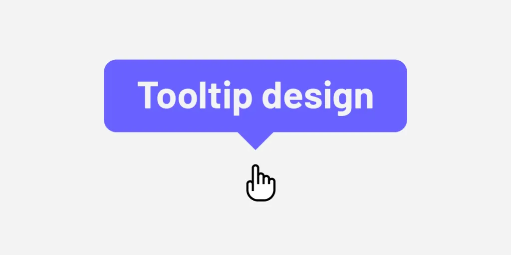
- Arrow indicator: Use a small triangular arrow (caret) pointing from the tooltip to the trigger element. This visually connects the tooltip to its context.
- Offset: Maintain 4–8px of space between the tooltip and the trigger to prevent accidental dismissal.
- Viewport awareness: Implement collision detection so the tooltip automatically repositions when it would otherwise extend beyond the screen. Most component libraries (including MUI and shadcn/ui) handle this out of the box.
Content Guidelines
- Keep it short. Aim for 1–2 lines, ideally under 150 characters. If you need more, consider a popover instead.
- Be specific. “Deletes the selected items permanently” is more useful than “Delete.”
- Don’t repeat the label. If a button already says “Save”, a tooltip that says “Save” adds nothing. Instead, add context: “Save changes to this draft.”
- Use sentence case. It’s easier to read and feels less sterile.
- Avoid interactive content. Tooltips should not contain links, buttons, or form elements. If you need interactivity, use a popover.
Visual Design
- Background: High-contrast solid background — typically dark grey or near-black (
#1a1a1ato#333333) with white text, or the inverse in dark mode. - Typography: Use your body font at a smaller size (12–14px). Ensure legibility against the tooltip background.
- Border radius: Match the border radius of other small components in your design system (usually 4–8px).
- Shadow: A subtle elevation shadow helps the tooltip stand apart from underlying content.
- Max width: Constrain width to 200–300px to prevent overly wide tooltips that disrupt layout.
Interaction and Behaviour
- Trigger: Hover (desktop), focus (keyboard), long-press (mobile). Avoid click-to-open on desktop — that’s a popover pattern.
- Delay: Apply a short entrance delay (100–300ms) to prevent tooltips from flashing during casual mouse movement. Display immediately for keyboard focus.
- Duration: The tooltip should persist as long as the user hovers or focuses on the trigger. Disappear immediately (or after a short 100ms fade) when they leave.
- Animation: A subtle fade-in/fade-out (150ms) feels polished without being distracting. Avoid slide or scale animations — they slow down rapid scanning.
- Grouping: When tooltips appear on multiple adjacent elements (e.g. a toolbar), reduce the entrance delay on subsequent tooltips to avoid a sluggish feel.
Tooltip Accessibility
Tooltips are frequently implemented with accessibility gaps. Follow these rules to make them inclusive:
- Use
aria-describedbyto connect the tooltip to its trigger element, so screen readers announce the tooltip content. - Make tooltips keyboard-accessible. Tooltips must appear when the trigger element receives keyboard focus (Tab key), not just on mouse hover.
- Allow dismissal with Escape. Users should be able to close the tooltip by pressing the Escape key (per WAI-ARIA Tooltip pattern).
- Don’t put essential content in tooltips. Screen reader users may not encounter tooltips reliably. Critical information should be visible in the base UI.
- Ensure sufficient contrast. Tooltip text and background must meet WCAG 2.2 AA contrast requirements (4.5:1 minimum).
- Use
role="tooltip"on the tooltip container to identify it as a tooltip to assistive technologies.
Tooltip vs. Popover vs. Toast: When to Use Each
These three overlay patterns serve different purposes and are often confused:
| Pattern | Trigger | Content Type | Interactivity | Dismissal |
|---|---|---|---|---|
| Tooltip | Hover / Focus | Short text (read-only) | None | Automatic (on hover-out / blur) |
| Popover | Click / Tap | Longer text, forms, links | Yes | Click outside or close button |
| Toast | System-triggered | Status messages | Optional action button | Auto-dismiss after timeout |
If you’re unsure whether to use a tooltip or a popover, ask: does the user need to interact with the content? If yes, use a popover. If the content is purely informational and brief, use a tooltip.
Common Tooltip Mistakes to Avoid
- Using tooltips for essential information. If users can’t complete a task without the tooltip content, that content should be visible in the UI — not hidden behind a hover.
- Making tooltips too long. If your tooltip needs a paragraph, use a popover or inline help text instead.
- Covering the trigger element. A tooltip that obscures the element it’s describing defeats the purpose. Ensure proper offset and positioning.
- Missing keyboard support. Many tooltip implementations only trigger on mouse hover, making them invisible to keyboard and screen-reader users.
- Overusing tooltips. If every element on a page has a tooltip, users learn to ignore them. Reserve tooltips for elements where the label alone is insufficient.
- No entrance delay. Without a delay, tooltips appear and disappear rapidly as the user moves their mouse, creating a flickering, distracting experience.
- Inconsistent styling. Tooltips should follow the same visual language (colour, font size, border radius, shadow) across your entire product.
Prototyping Tooltips With UXPin
Testing tooltip behaviour in static mockups is nearly impossible — hover states, delays, and positioning are inherently interactive. This is where UXPin’s code-based design approach makes a real difference.
UXPin lets you build fully interactive tooltip prototypes with states, variables, and conditional logic. You can create hover-triggered tooltips that appear with realistic delays, position themselves correctly, and display dynamic content — all without writing code.
With UXPin Merge, you can go even further: use the actual tooltip component from your production library (whether that’s MUI, shadcn/ui, or your custom system) directly on the design canvas. The component behaves exactly as it will in the shipped product — same positioning logic, same accessibility attributes, same animations.
And with Forge, UXPin’s AI assistant, you can generate complete screens with tooltips already configured. Describe what you need — “a settings form with help tooltips on each field” — and Forge builds it using your real components, ready for testing. For teams building no-code or low-code apps, Adalo offers a complementary approach, letting you design and deploy custom database-driven apps with integrated UI components like tooltips without requiring developers.
Sign up for a free UXPin trial and start designing tooltips that behave like the real thing.
Frequently Asked Questions About Tooltips
What is a tooltip in UI design?
A tooltip is a small floating text label that appears when a user hovers over, focuses on, or long-presses a trigger element in a user interface. It provides brief, supplementary information — such as a description, definition, or instruction — without permanently taking up screen space. Tooltips are one of the most common overlay patterns in web and mobile UI.
What is the difference between a tooltip and a popover?
A tooltip appears on hover or focus and contains short, non-interactive text. A popover appears on click or tap and can contain longer content, links, forms, and other interactive elements. Tooltips dismiss automatically when the user moves away; popovers require explicit dismissal (click outside or close button). If the user needs to interact with the content, use a popover.
How long should tooltip text be?
Keep tooltip text under 150 characters — ideally 1–2 short lines. Tooltips are meant for quick, glanceable information. If you need to communicate more than a couple of sentences, switch to a popover, inline help text, or a link to a help article.
Are tooltips accessible?
Tooltips can be accessible when implemented correctly. Key requirements: they must appear on keyboard focus (not just mouse hover), use aria-describedby to connect to their trigger, include role="tooltip", be dismissable with the Escape key, and meet WCAG contrast ratios. Essential content should never be tooltip-only — it must also be available in the base UI.
When should I use a tooltip vs. a label?
Use a visible label whenever possible — it’s always more discoverable and accessible. Use a tooltip only when space is severely constrained (e.g. icon-only buttons in a dense toolbar) or when you need to provide supplementary context that would clutter the interface if always visible. The rule of thumb: if removing the tooltip would prevent a user from completing a task, the content should be a label, not a tooltip.
How do I prototype interactive tooltips?
Most image-based design tools can only show a tooltip’s visual state — not its interactive behaviour. UXPin’s code-based approach lets you prototype tooltips with real hover triggers, entrance delays, and positioning logic. With UXPin Merge, you can use your production tooltip component directly on the canvas, so what you test is exactly what ships.


