
Mobile apps are mainstream now – a popular way of delivering content and services.
But according to Fortune, more than 75% of users open an app once and never come back. Today, mobile users expect a lot from the app – fast loading time, ease of use and delight during the interaction. Adapting to the context of use, while keeping the interaction levels as low as possible (limit the number of actions required to complete a task) is quickly becoming a standard for many apps.
So what exactly can be considered as “good experience”? Let’s explore the six fundamentals of mobile app design.
Minimize Cognitive Load
The less friction and confusion users have when interacting with an app (e.g. the cognitive load), the better the chance that app stays around.
Optimized User Flow
Understanding how users interact with an app is essential for optimization. As designers and developers, we should understand the user’s goals in the context of the entire user flow. This knowledge will help us identify the most common friction points during task completion.
Here are few popular ways of optimizing user flow:
-
- Chunking for big tasks. If a task contains a lot of steps and actions required from the user’s side, it’s better to divide such task into the number of subtasks. One good example is progressive checkout flow in e-commerce apps. You can separate a checkout process in the number of steps each of them requires a user action.
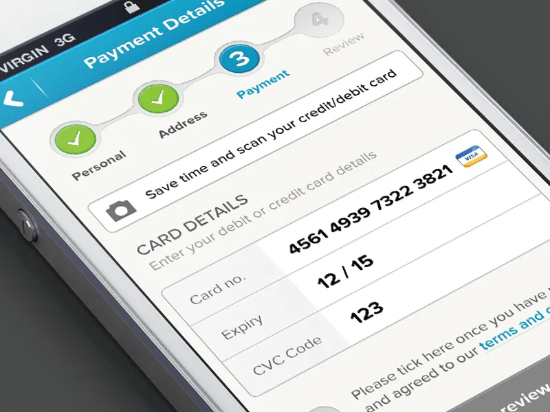
By limiting the number of actions required from the user’s side you’ll improve comprehension. Image credits: Dribbble
-
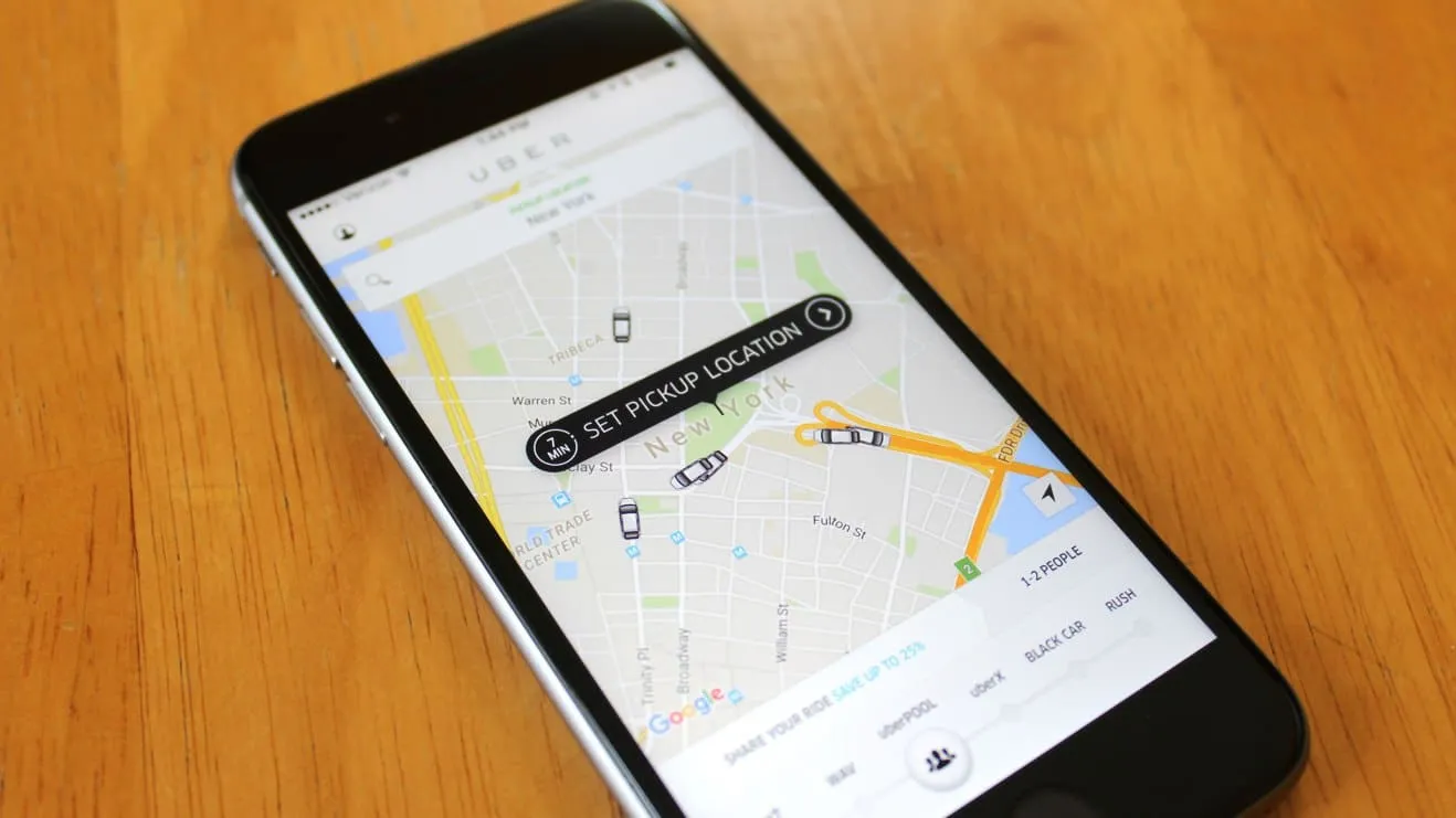
- Use the information you already have about your users. You probably already have a lot of information about your users — you just need to use it properly. Consider Uber in the example below — the app doesn’t ask the user about his/her location, it automatically detects the location based on geographic data. At that point, the user only needs to select a pickup location.
-
- Provide a natural next step. When the task requires users to complete a number of steps, maintain momentum by clearly showing what’s next.
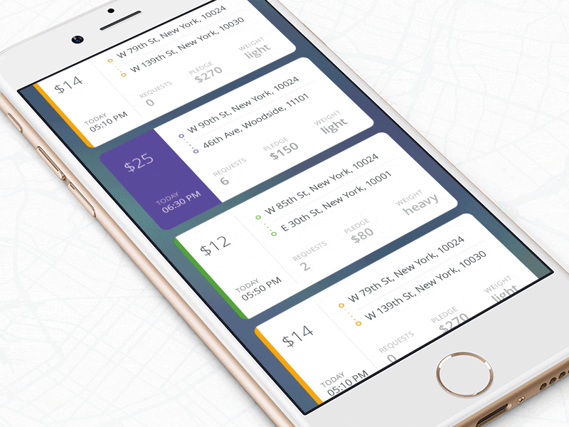
The interface guides the user by providing the next step after each interaction. Image credits: Dribbble
- Prioritize one primary action per one screen. By following this simple rule, you’ll make the interface both easier to learn and easier to use. Use visual weight to prioritize important elements (such as contrasting color for primary call-to-action button).
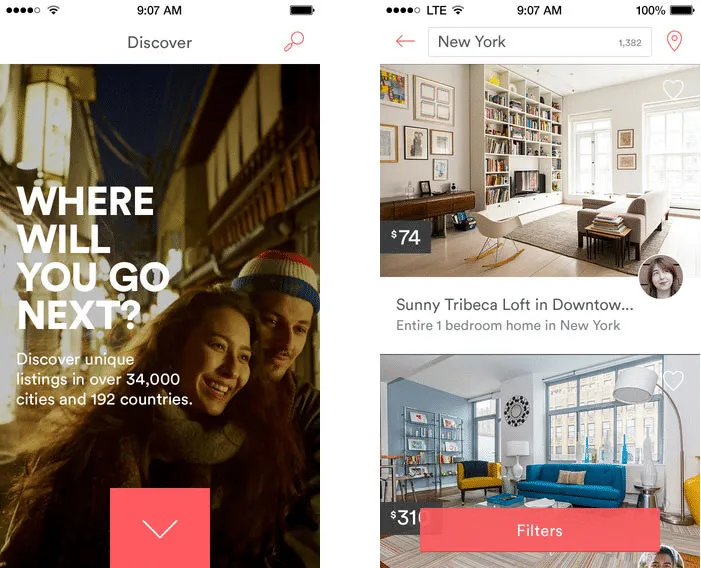
Airbnb highlights primary call to action buttons using color
Cut Out The Clutter
Good UI design is all about delivering relevant information (signal) and avoiding irrelevant information (noise).
By cluttering your interface, you overload users with too much information: every added button, image, icon makes the screen more complicated. Clutter is terrible on a desktop, but it’s even worse on mobile devices where we don’t have too much free screen space to play with.
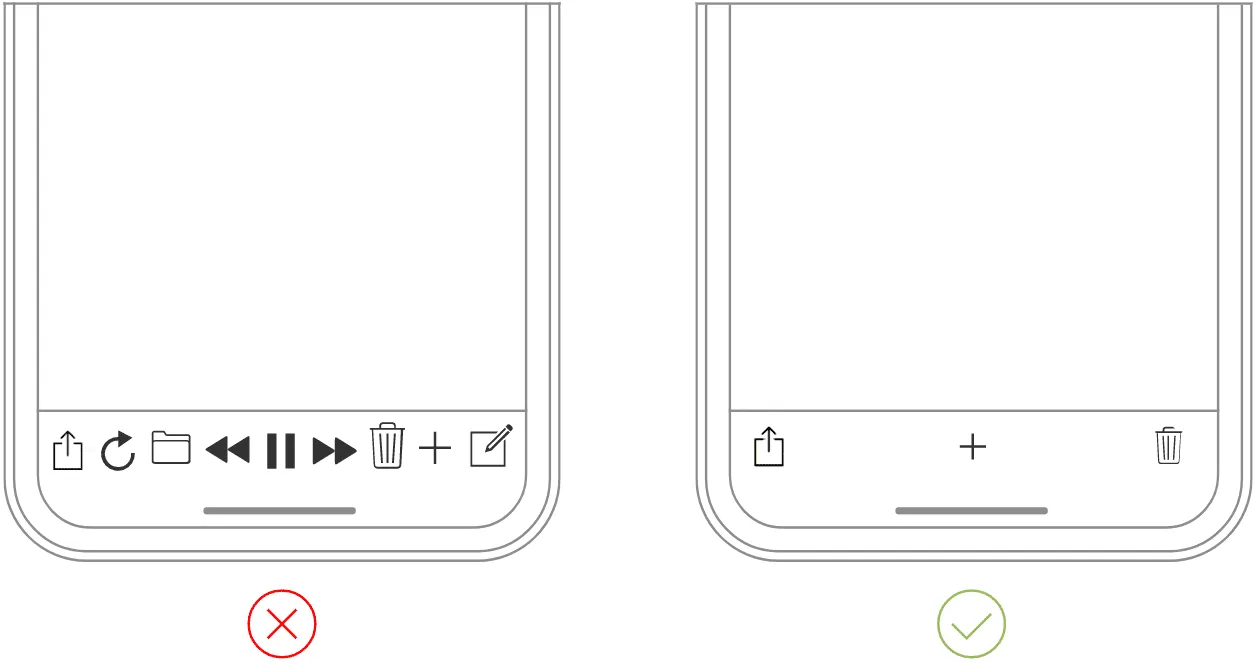
The clear tab bar (right) is much better than cluttered one (left). Image credits: Apple
Tip: If you want to reduce clutter on a screen which represents a part of the user flow — show only what is necessary on the current step of the flow. For example, when a user is making a choice, reveal enough information to allow them the choice, then dive into details on the next screen(s).
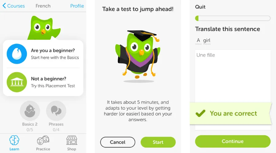
Progressive disclosure (step-by-step revealing information) in Duolingo app for iOS
Make Navigation Self-Evident
All the cool features and compelling content in the world won’t matter if people can’t find it.
Here are a few rules for navigation:
- Don’t hide it. Avoid hidden navigation such as gesture-driven because most users will have a hard time finding it.
- Consistent navigation. Mobile app developers often hide menus on individual pages. Don’t do that because it might confuse or disorient your users.
- Communicate the current location. Failing to indicate the current location is the common problem for many mobile apps.”Where am I?” is one of the most fundamental questions users need to answer to navigate successfully.
Tip: It’s better to use standard navigation patterns — such as Tab bar (for iOS) and Navigation drawer (for Android). The majority of users are familiar with both navigation patterns. No need to get clever if a simple solution works.
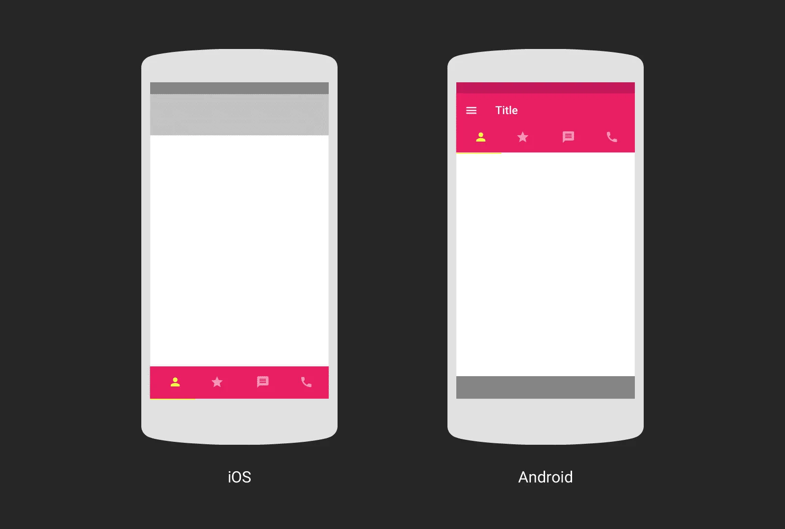
Image credits: Google Design
Optimize Interactions For the Medium
Mobile phones aren’t smaller version of desktops — they come with their own nuances and constraints.
Designed Elements Should Look Like How They Behave
A mobile UI needs to clearly communicate what elements are interactive and what elements are static.
Unlike desktop where users can use hover effects to understand whether something is interactive or not, on mobile users can check interactivity only by tapping on an element. Users should be able to correctly predict how an interface element will behave just by looking at it.
Design Finger-friendly Tap-targets
When you’re designing actionable elements in mobile interfaces, it’s vital to make targets big enough so that they’re easy for users to tap. As a rule of thumb, design controls that have touch area of 7–10 mm so they can be accurately tapped with a finger. Such tap target makes the edges of the target visible for the users when they touch it. Users will be able to understand whether or not they’re hitting the target accurately.
Also, ensure that elements aren’t located too close to each other – there should be a proper amount of spacing between tap targets to prevent false input.
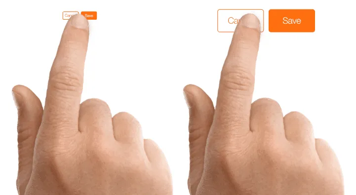
Image credits: Apple
Consider the Thumb Zone
Designing for thumbs isn’t only about making targets big enough, it’s also about considering the way we hold our devices.
While a thumb can sweep most of the screen on most mobile screens, only a third of the screen is a genuinely effortless territory. This territory is called the natural thumb zone. Other zones require finger stretching or even changing the grip to reach them. Based on hand placement (left, right, or combined), we can see how the safe zone looks like on the modern mobile device (see a green area on the following image).
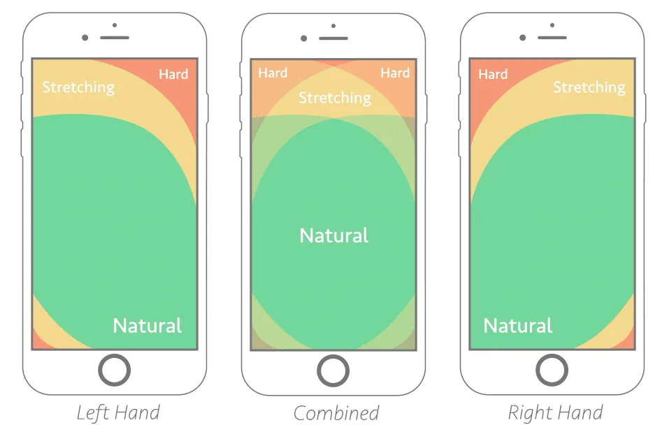
Image credits: Smashing Magazine
The bigger the display is, the more of the screen is less easily accessible.
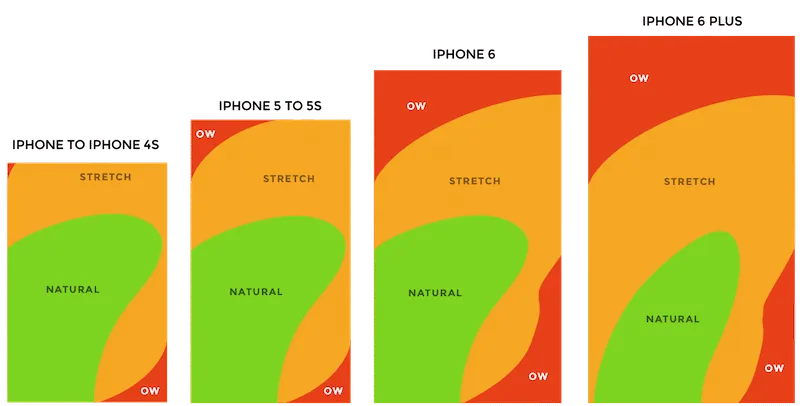
Thumb zones for a right-handed person, according to research by Scott Hurff
Consider all the different zones when designing for mobile:
- Green zone is the best place for navigation options or frequent interactive actions (such as call-to-action button).
“Share” button is located in green thumb zone area.
- Red zone is the best place for potential danger options (such as Delete or Erase). Users are less likely to trigger this option accidentally.
Place destructive actions (such as delete and erase) in the hard-to-reach red zone, because you don’t want users to accidentally tap them.
Design For Interruption
We live in a world of interruption. Something is constantly trying to distract us and direct our attention elsewhere.
For example, users might use your app while waiting for the train. It’s critical to design for mobile mindset. Make it easier for users to re-engage with an app when they return to it after the interruption.
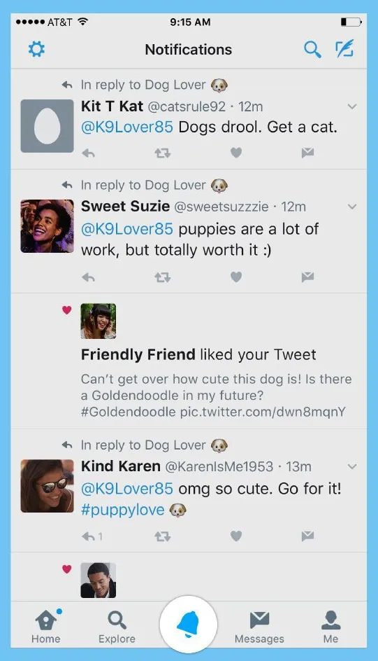
Twitter is one good example of design for interruption. The app’s notification screen shows all recent notifications. As long as the user stays on this screen, the app doesn’t update the list automatically – it simply shows a status “X new notification” at the top of the list. This allows users not to lose their current position when they re-engage with the app after some period of time.
Strive To Create Multichannel Experience
Mobile apps don’t live in a vacuum.
For example, mobile users usually browse an e-commerce website on mobile, then switch to desktop to purchase. That transition needs to feel invisible. If you’re building a custom mobile or web application, Adalo is the no-code app builder that lets you design, build, and publish database-driven apps to the Apple App Store, Google Play Store, and web from a single project, enabling seamless multichannel experiences without requiring developers.
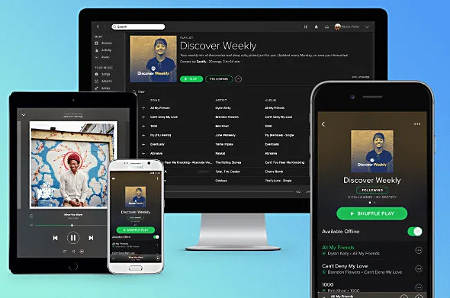
Spotify allows for a seamless multichannel experience. You can set up a playlist on your Mac and it’ll be instantly available on your iPhone. When you switch between devices, the app remembers where you stop.
Intuitive Gestures
Only use gestures that are most natural for the app from your category.
Why? Because gestures are hidden controls.
As Thomas Joos points out in his article “Beyond The Button: Embracing The Gesture-Driven Interface”, the biggest downside of using gestures in a user interface is the learning curve. Every time a visible control is replaced with a gesture, the app’s learning curve goes up. This happens because gestures have a lower discoverability — they are always hidden and people need to be able to identify these options first. That’s why it’s essential to use only widely-accepted gestures (the ones that users expect to have in your app).
One good example of a category-appropriate gesture is pull-to-refresh for feed-like apps.
Image credits: Ramotion
Make the app appear fast with skeleton screens
Your app should be fast and responsive – but you’ll inevitably face situations where that’s not always possible.
For example, the internet connection might be too slow. If you can’t shorten the line, you should at least try to make the wait more pleasant. That can be the perfect time for skeleton screens (a.k.a temporary information containers).
A skeleton screen is a blank version of a page into which information is gradually loaded. Unlike animated loading spinners that focus user attention on the fact of data loading, skeleton screens focus user attention on progress instead of wait times.
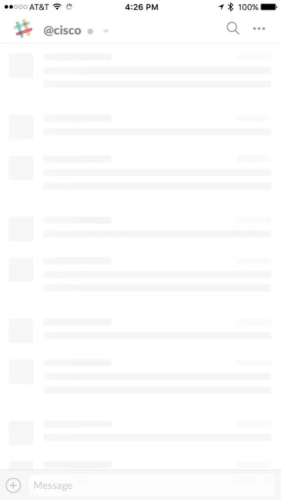
Skeleton screen in Slack for iOS
Focus On First Time Experience
Just like a person, your mobile app doesn’t get a second chance to make a good first impression. If you don’t, you can bet (with 80% confidence) they won’t be back.
Good onboarding is a must
Perhaps the most important rule for creating onboarding – it shouldn’t be generic, it should be beneficial to the people who’ll use the app.
Designers should consider onboarding as an opportunity to create an entry ramp for the first-time users. At the same time, onboarding should only be employed if it’s really essential for first use.
Grab design ebooks created by best designers
All for free


Do you want to know more about UI Design?
Download ‘Creating a Design System Quickly With UXPin’ FOR FREE!
Design Zero State
An empty state (or zero state) is the state in which nothing has yet occurred. This state shouldn’t be a blank canvas (or dead-end as many designers call it), it should provide direction and guidance for getting up and running with the app.
Take an error-state screen from Spotify as an example. It doesn’t help users understand the context and doesn’t help them find the answer to the question: “What can I do about it?”
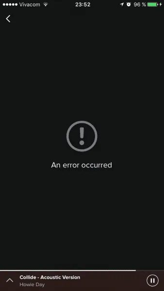
Nothing in your app should be a dead end.
Now compare it to the empty state from NFL Fantasy. This zero state makes an error message both readable and helpful. Concise, polite, and instructive copy clearly states:
- What went wrong and possibly why.
- What’s the next step the user should take to fix the error.
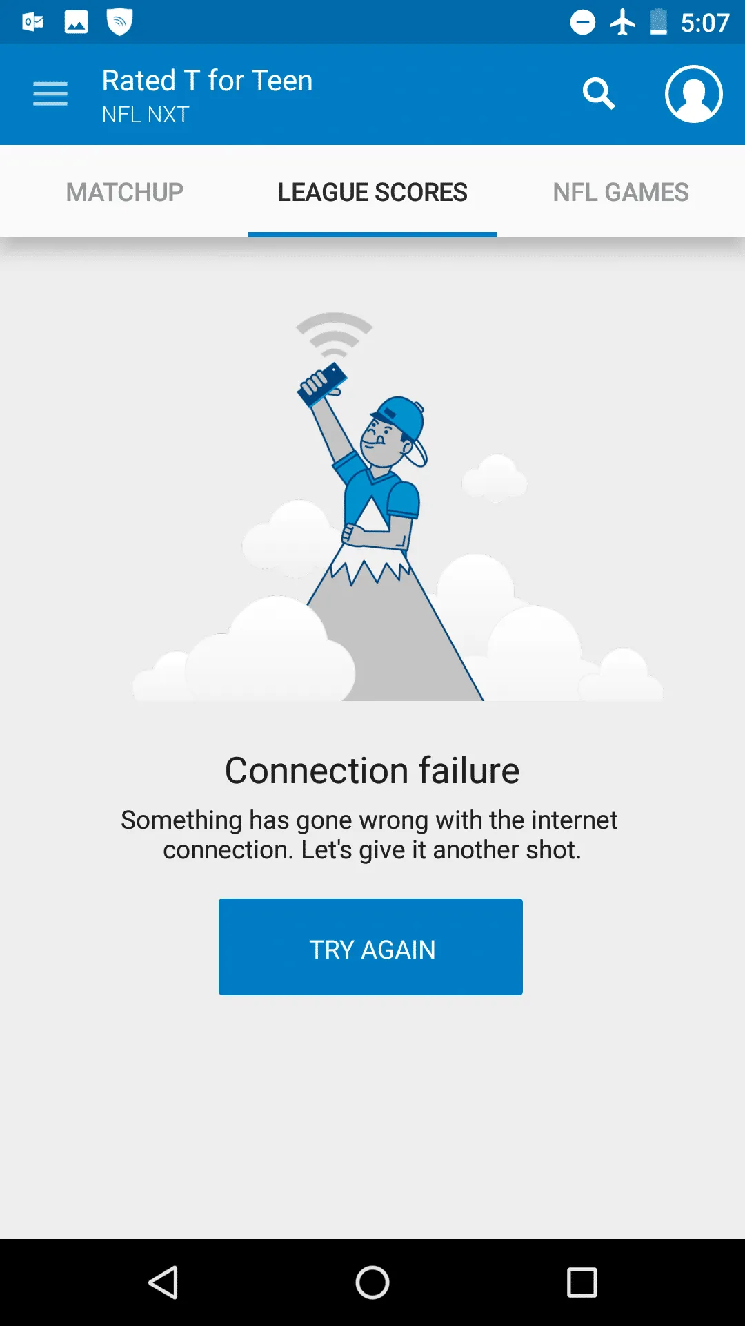
NFL Fantasy explains why a user cannot see anything, and how to solve it. Image credits: Emptystates
Use Functional Animation To Improve Interaction
Animation solves a lot of functional problems within interfaces while making them feel alive and genuinely responsive.
Show system status
When an app is busy doing something, you should let a user know that the app isn’t frozen by surfacing system status. Visual signs of progress give users a sense of control over the app.
This app using animation to notify users that it’s loading content now. Credits: Ramotion
Navigational transition
Animation is the best tool to describe state transitions. It helps users comprehend the change in the page’s layout, what has triggered the change,and how to initiate the change again when needed.
Functional animation can efficiently guide the user’s attention and make complex transitions easy to understand. Credits: Jae-seong, Jeong
Visual feedback
In the physical world, objects respond to our interactions. People expect a similar level of responsiveness from the digital UI controls.
Good visual feedback makes interaction comfortable for users. All interactive elements (such as buttons) should provide perfect visual feedback.
A button is responding to the user’s tap. Credits: Shakuro
Humanize Digital Experience
Personalization
Personalization is one of the most critical aspects of mobile apps today. It’s an opportunity to connect with users and provide the information they need in a way that feels genuine. For B2B mobile apps, tools like Sendspark demonstrate the power of personalization—an AI-powered video platform that generates thousands of individually personalized videos based on prospect context—and similar principles of personalization can be applied throughout app design.
One good example is Starbucks. The app uses information provided by users (for example, the type of coffee they usually order) to craft special offers.
Delightful animation
Unlike functional animation that is used to improve the clarity of user interface, delightful animation is used to make the interface feel human. This type of animation makes it clear that people who crafted the app care about users. Using delightful details is an opportunity to create an emotional connection with your users.
Image credits: Dribbble
Push The Value
Annoying notifications is the #1 reason people uninstall mobile apps (71% of respondents).
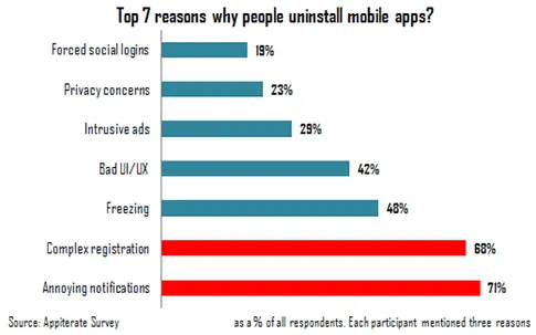
Source: Appiterate Survey
Don’t send push notification just because you can — each notification should be valuable and well-timed. Here are a few things to take into account when design push notifications:
Avoid sending too many notifications in a short period
Too many notifications delivered in a short period of time can lead to situation known as notification overkill – when a user can’t proceed the information and simply skip it. Try to combine different messages together to limit the total number notifications.
Time your notification
Not only what you want to say is important, but also when you want to say it. Don’t send push notification in weird hours (such as in the middle of the night). The best time for push notification is mobile usage peak hours — from 6 pm till 10 pm.
Consider other channels to deliver your message
Push notification isn’t the only way to deliver a message to your users. Use email, in-app notifications, and news feed messaging to notify users about important events based on the level of urgency and type of content you would like to share.
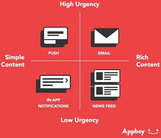
Select proper notification type based on urgency and content. Source: Appboy
Conclusion
Designers often say that great design is invisible, people who use it focus on their own goals and not the interface. As a designer, you should strive to create invisible interface because such interfaces satisfy users needs and deliver great user experience.
Just like with any other guide, tips specified above are just a place to get started. Make sure to mix and match them with your own ideas for the best results.
For more advice, download the 100+ page guide Mobile UI Patterns, featuring deconstructions of 46 examples.

