By Cesare Rocchi
The short answer, the one we all use, is: it depends. But the smart guy doesn’t stop there and asks: it depends on what? Here is my answer to that.
Introduction
I have built an app, should I put in a walkthrough? Probably many of you had to answer these questions. In my experience the sooner you address it (even at design phase) the better because it will inform other choices you’ll make along the path to shipping. Like many other debates (e.g. skeuo vs flat) it’s easy to fall in theoretical discussions and semantics. Here, I promise, I’ll stick to the pragmatic side of things, taking inspiration from other products, not necessarily software products. So, it depends on what?
Walkthough as a kind of manual
Shipping an application with a guided walkthrough is like selling a product with a manual. Think of the last time you have checked a manual bundled with a product. My answer is “around 10 years ago”. There is a reason for that: as a user, I am an explorer, and I will explain that later. Even Apple, known to be pretty minimal when it comes to manuals, ships the iDevices with a little booklet. I see it as a sort of “placeholder”, something to avoid the complaint: “why there is no manual?” You see where we are going: if you don’t provide instructions people will ask for them if you do – people won’t look at them. So the manual for products like TVs, fridges or cars has become an object, ignored by default, but with the function to reassure customers: if I need it, it’s there.
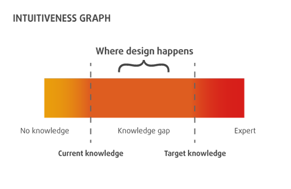
Things are a bit different when we talk about software. Those of you over thirty might remember the big manuals bundled with Microsoft Office, but we are talking about ages ago. In 2008 the introduction of mobile applications as we know them today was disruptive in many ways: the SDK, the distribution system and also the manuals. Has any of the apps bundled in iOS a walkthrough? No. Apple provides a support website where you can find all the manuals. This is a big switch with respect to bundled-with-huge-manuals desktop apps we were used to: the manual is online, check it if you need it and nobody shoves in your face a walkthrough when you start an application for the first time. When I started developing and doing research on mobile applications (it’s was 2003) there was a term that implicitly expressed the lack of a manual: “wake up and use”. The rationale behind this expression is: “the application is so intuitive that there is no need for a walkthrough”. Bullshit. I am afraid I have used the adjective “intuitive” in previous writings (even academic papers) but now I think it is too generic and pointless. Not to mention that people are so different at many levels (cognitive, social, cultural) that a universally intuitive UI is like a unicorn. So you don’t want your walkthrough to be considered as the manual of the fridge. What are the options?
Standing on the giant’s shoulders
You can build on previous knowledge or well-known patterns. There’s a treasure out there, use it. Let’s put aside walkthroughs for a second and talk a bit about icons of visual cues. For example, the “sandwich” icon, adopted by the Facebook app and many others, is so widespread and adopted in a mobile application that you can safely assume almost everybody would know the meaning of that and would expect a panel with sections to open up when you tap it.
Is it intuitive? No. It might stand for a pile of paper, a cake, a sandwich, and many more meanings. But so many applications use it that it has just become a sort of convention, much like the floppy disk icon was (and probably still is) a symbol to convey the “save” meaning. So if you build an application inspired to the UX patterns and icons of famous and well-known applications it is very likely you don’t need a walkthrough. Just be aware it is not about intuitiveness, it is just “standing on the giant’s shoulders”. People are used to it much like they are used to hold a fork because they have learned it from someone else. Intuitive encompasses way more wizardry. Something intuitive does not require conscious reasoning, you just use it as if you had always known how to use it, though in software intuitive is usually synonymous of easy to use. For example, the switch component in iOS is not intuitive, though people use it as if it were intuitive, because it resembles a real-world switch and they already know how it works. Paraphrasing: some components in iOS are “standing on real world’s shoulders”, that is exploiting a metaphor.
If the UX of your application builds on top of well-known patterns and visual cues, it is likely you do not need a walkthrough. But don’t take my word for it, if you want to be sure, test it.
The power of testing
This is the leitmotiv of any good UX designer: test it. You are not building an app for you, you are building that for people. Then why don’t you let people use it and collect some feedback? If you are an indie developer you can ask a few friends of yours to use it. Just don’t tell them anything, otherwise, you blow the test off. Think-aloud techniques are good to spot macro issues, e.g. something does not look “tappable”. If you have a budget you can even try A/B testing, showing two of a more alternative version of your UI and measuring which one is the most “successful”. In both cases you collect data, evidence to inform your design choices. Any opinion on UX out there is questionable, so – if you can afford it – I really encourage you to validate decisions with tests. To test something you need at least a beta version, with no data available. Instead of building something “in the dark” you can create something based on two common-sense properties: the type of customers and the nature of your app.
Types of Customers
As I have mentioned before, customers can be very different by culture, society, and personal traits. A broad distinction to start with is the following: explorers and by-the-book guys.
The Explorer is the guy that opens the box of the TV and does not even touch the manual. You can expect this guy to complain if forced to view a walkthrough. Your only escape, in this case, is to offer the possibility to skip the walkthrough at any time.
The by-the-book guy is the one that follows the manual slavishly. In this case, a walkthrough is needed, or a one-star review will pop soon.
These are not two mutually exclusive sets but the extremes of a spectrum. Just think where the majority of your customers are placed along the spectrum. You might have no idea, and that’s fine, but if you do try to exploit this information.
Nature of the app
Types of customers is a subjective trait but there is also a more objective side of things. Is your application disruptive? Are you “standing on the giants’ shoulders”? When the Clear app was released there was nothing like that and customers, used to buttons, would have felt lost. That’s why a walkthrough was needed. Sure, they could have run tests, come up with something more inspired to the real world and hope people to get it. But I think the essence of the app was also to be different, to show something new and that generated good traction. So, if you build something so disruptive that is inspired to neither the real world (like the switch component) nor to well-known applications (like the sandwich icon/panel of the Facebook app) you’ll probably need some walkthrough.
You have two options here: instructions-along-the-way, like flipboard, or instructions-at-first, using static screenshots and labels to explain. This is very specific to your application and it’s hard to provide general rules about that. One tricky thing to explain is gestures.
If buttons are a hack then gestures are… hidden!
There is a famous piece by Josh Clark advocating the usage of gestures instead of buttons. If you show me a globe on an iPad I will be tempted to spin it and if it does not I’ll think it’s a bug. This is due to the “affordance” of the globe as we know it in the real world: it is meant to be explored by spinning it. But what about direct manipulation of an items’ list in iOS? Is the swipe-to-delete action intuitive? Absolutely not. Come see my father using that. If I hadn’t told him, he would have never discovered the archive/delete option in the Mail application. Why? Because the affordance of an item in a list does not tell me it is meant to be swiped. This means that either I discover it somehow (accidentally or somebody teaches me) or I’ll never get it because there is no hint. Nowadays swipe-to-delete is probably so common on iOS that you could avoid to explain it, but that really depends on your target. When it comes to gestures, either your metaphor is very adherent to reality (as in the globe example) or you’ll need to provide some clues to the customer: you can do it along the way or provide all the instructions at the beginning. The point is: you are building a “realm” which is potentially new and unfamiliar to the user and you want to avoid him to get lost.
Author:
Cesare Rocchi is a speaker, writer, UX designer and developer specializing in web and mobile applications. He began working on interactive applications while he was a researcher in the academia. He runs Studio Magnolia, an interactive studio that creates compelling web and mobile applications. He blogs at upbeat.it. You can find him on Twitter or app.net. When off duty he enjoys snowboard and beach tennis. Now he is busy working on Neater.
 Photo Credit
