Are UI Patterns Like Cartoon Characters?

This article was cowritten with Aniko Kocsis.

Have you ever watched the movie Snow White? Did you notice she moved  exactly the same way as characters from your other favorite childhood movies? I hadn’t either.

Maid Marian and Snow White
Source: “Maid Marian and Snow White” – © by Jim MacQuarrie, source: https://geekdad.com/2015/06/disneys-recycled-animation/; animation stills: Maid Marian, Snow White – © by The Walt Disney Company”

Recently, I found an article about recurring animations in cartoons. And now, I completely get it. They are much like UI patterns. And that is why UI patterns are a genius hack for being efficient.

In this article we’ll cover:

  • What are UI patterns?
  • Why should designers use UI patterns?
  • How can UI patterns help users?
  • How can designers apply UI patterns?

Think about it: is creating a UI design from scratch the best solution when designing a product? Even run a design sprint? Not necessarily. UI design patterns are repeatable solutions for a recurring problem.

You think that is cheating? Users don’t. Just as you didn’t when you were watching cartoons! Same difference.

What are UI design patterns?

When implementing a new feature or creating a product from scratch, you don’t have to come up with brand new solutions every time you come across an interface problem.

Designers want to figure out the easiest way users should interact with a product by cutting down on time and effort needed to navigate through it.

It’s already challenging to create a useful and intuitive interface that retains users. Therefore, it’s very important to remember that there are existing patterns that incorporate the best practices for every function.


UI patterns
Screenshot search example (Source: UIpatterns)

Why should designers use UI design patterns?

1. They speed up and simplify the design process

Look into repositories of existing patterns like Design Patterns or best-known design systems like Google Material Design, ADG by Atlassian, Airbnb Design System, etc. Then tweak them according to your needs, so you can turn your focus to other issues.

low fi prototyping

2. UI patterns increase engagement with a product

When people see a product for the first time, it has to be very easy to use and to understand; they shouldn’t have to think too much. This is one of the first steps to increasing its engagement.

3. Use common vocabulary

When you say “You need to check-in at the airport”, frequent flyers know what you mean. It’s simply mentioning the name of a pattern instead of explaining to others what it does and how it works.

Familiarity and affordance are key components of “Easy to use” as Peter Zalman explains. A repeated experience of using familiar patterns reduces cognitive strain.

How can UI design patterns help users?

1. Intuitive navigation

It’s similar to going into a supermarket and always finding the baked goods in the back of the store. These are common practices that make you get used to navigating accordingly.

nonintuitive interface design
Could you tell where to turn off your computer? A new UI can be challenging for users. (Source: Conceptdraw)

Based on their prior experiences, when users access an app or website for the first time they already think they know where to click and what to do. They don’t have to ask, “Where are the dairy products?”

When those interfaces use common patterns, navigation becomes a simple task.

2. Understanding the function

Imagine you’re on a flight search website and want to choose the dates of our departure and/or return trip. You expect to have an overview of those dates in a calendar to find or submit information based on a date or date range.

wizzair calendar UI
The example of WizzAir for UI patterns

3. Ease of use

A date picker displays two calendars side by side, and lets users pick a date or a range of dates in a few clicks without entering them manually.

Although this is an example of a common pattern solving a common problem, let’s analyze its efficiency. Maybe the dates are more easily inputted via writing the date as text due to its extensive range. In this case, this pattern may not be ideal.

How can designers apply UI design patterns?

UI design patterns are solutions to usability problems, so if it ain’t broke, don’t fix it.

It might seem simple to choose which pattern to apply to a problem, but it’s quite challenging to pick one most relevant to your needs.

After determining the visual hierarchy, the look and feel of the product, you can start the process of selecting patterns.

drawing UI early prototype

This can be simplified into four basic steps:

1. Figure out the problem to be solved

Several methods exist to detect usability issues presented in the interface.

If it’s a new product in its exploration phase, try in-person surveys, interviews or a simple online research.

If it’s an existing product or in an advanced stage of development, try user tests or A/B testing. Such methods will help you figure out what users don’t like about the current design solutions and what the interface lacks.


2. Understand how other products solve similar problems

For example, imagine you’re trying to figure out the best navigation method for a certain section in your product. Research different apps or websites that solve that similar problem with different navigational patterns.

3. Examine the efficiency of solutions used on other products

How often are these solutions used? Future success can be derived from that, as users can get used to the road already taken.

4. Analyze the patterns’ proper usage to recreate it for your own needs

If you know the exact solution you’re looking for, this will come easy. Get straight with yourself and you’ll get a clear image of how your own version should work.

5. Look for tools to help you in the use of UI patterns

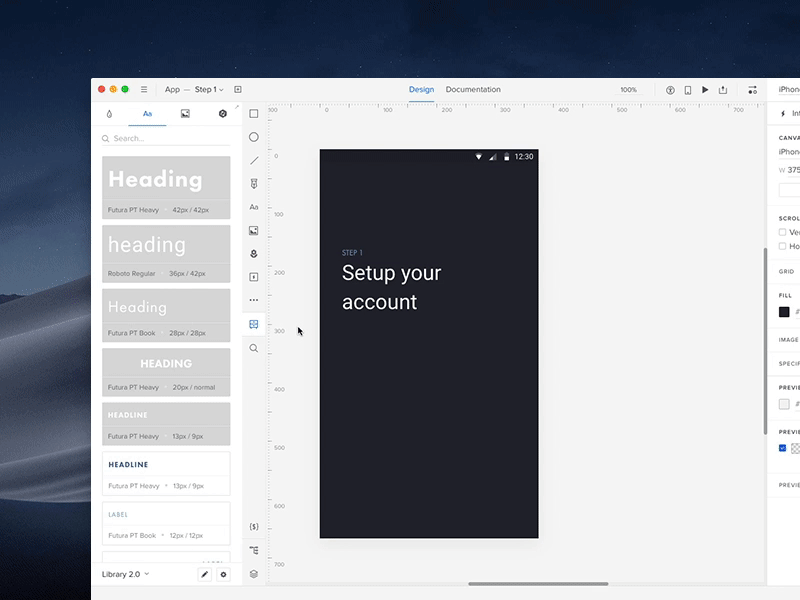
For instance, UXPin provides shared libraries to store and reuse UI patterns, which are accessed by the whole team. You can start with one of thousands of prebuilt elements for extremely rapid prototyping. Start quickly and mess with screen layouts. Then, you can make it interactive and go from static mockup to interactive prototype within a few clicks.

Once the interactions are added and components grouped into a pattern, you can choose to add documentation to the pattern. Suddenly, you have the start to a complete design system (containing not only the visual layout and documentation, but also the functional interactions!). Working on multiple products or with different clients? You can create multiple libraries that can be accessed from whatever project you’re in!

UXPin UI patterns library
UXPin UI library in action!

UI pattern comparison
Which one is a pattern? (Source: Balraj Chana, weandthecolor)

Takeaways: How can UI patterns help users?

As you now know, UI design patterns are repeatable solutions for a recurring problem. Just like reused cartoon animations. And they work super well!

They are common, known solutions. They help users:

  1. Navigate
  2. Understand
  3. Use the functions on the interface

The benefits for UI designers include:

  1. A sped up and simplified design process
  2. Increase engagement with a product
  3. A common vocabulary between the user and designer

Make sure to identify a user problem that needs solving before considering using UI patterns. Then, you can start hunting for a solution. There are lots of resources out there!

Join the world's best designers who use UXPin.

Sign up for a free trial.

Build A Design System from Scratch in 7 Steps

What do you think of faster project turnarounds? How about consistency in all of your products? Does better UX and customer satisfaction sound good to you? This isn’t some new miracle product that’s available to buy — but you can build it yourself.

Designs systems are sweeping the tech world right now, with advocates like TrelloAtlassianStacks, and Shopify (Check out a complete list of companies with links to their design systems here at Adele). This wave of popularity explains why 69% of designers surveyed in the 2017–2018 Enterprise UX Industry Report said that they either already had a design system or were currently planning on building one.

And why are design systems suddenly so popular, you ask? Because they’re exactly as effective as everyone says. The hype is real. Incorporating a design system in your company brings a variety of benefits:

  • Faster time to market. By breaking design elements into homogenized components, design systems make the whole process more efficient. Planning, designing, testing and coding are all streamlined to reduce wasting time.
  • Improved UX and customer satisfaction. They make it easy to keep track of what your users like and dislike, retaining the former and disregarding the latter. They ensure all your products use only the UX elements your customers prefer.
  • Better internal communication. As a standardized document, design systems minimize the amount of miscommunication. They keep everyone on the same page to avoid confusion.
  • Consistency across all products. Your loyal customers expect a certain level of excellence on all the products, apps, and sites you launch. Deliver consistent quality and familiar usability on every single product by using identical components.
  • Less version control issues. Updating the same bug on different products can get annoying, not to mention time consuming. With design systems, you update once and it populates all occurrences.

Design systems are a clear advantage to companies that have already implemented them, and in a few years they’ll be the norm. So how can you build a design system now to utilize their benefits yourself? We’ll explain how in just 7 easy steps… but first, let’s talk a little about what they are.

What’s a Design System?

Formally, a design system is a master collection of the key standardized documentation every company needs to, in the words of AirBnB Principal Designer Karri Saarinen, “define the overall design of the product.” This includes your usual documents like pattern libraries, guideline texts and styles guide, but also more technical aids like reusable codes for common components and other time-saving design assets.

The true beauty of design systems, though, is that all of the components in these areas are already optimized and coded. That means whenever you’re designing a new project or updating an old one, all the pieces you need are already ready — you just have to put them into place.

Textual documents like the style guide and rule guidelines are not exactly coded components, but we still recommend them. Including these documents creates an all-inclusive reference guide that covers every roadblock your designers might have. Whenever someone has a question, they can always refer to the design system.

Now, chances are you won’t have all these documents lying around already. Most companies compile these only as needed, so it’s common to have gaps and oversights. That provides one more advantage of creating a design system: an excuse to gather and formalize these materials for your company once and for all.

In this article, we’ll assume you need to create all of these areas — after all, this is a guide on building a design system from scratch. Startups especially have to tackle all these issues all at once, but even long-established companies may have ignored one or two (or ten) of these areas in their focus on fast growth. Either way, the 7 steps below can lead you to a fully functional design system, even if you’re starting from nothing.

7 Steps to Building a Design System

1. Evaluate your current UI inventory and note inconsistencies

The best place to start is evaluating what you already have. Which elements do you like? Which do you want to replace? Where are there inconsistencies between products or pages?

You’ll want to review every digital asset and all pre-existing reference materials. The end goal is to create a universal guidebook and resource library, so everything that can be included, should be included. Specifically, take a good look at:

  • Color schemes and how each color is used
  • Stylistic text choices, like specialized grammar selections, voice, etc. — choices that would be outlined in a style guide
  • Icon libraries
  • Photo libraries, both stock and custom
  • Other graphics, especially your logo — now is a good time to reevaluate your logo and make a new one if you were planning to
  • UI patterns (note which ones need to be updated)
  • Page templates

If you’re a new startup and don’t have any finalized design elements to review, think critically on each of these areas to determine the choices that best fit your brand. Later, you’ll have to create a master list anyway, so it’s never too soon to start deciding on these.

2. Get the entire team on board

True, you could do this step first before evaluating your UI inventory; however, we recommend looking for inconsistencies first to give your argument leverage if you’re met with resistance. Nothing like a laundry list of design inconsistencies to get naysayers on board.

Regardless of how many errors you collect, you should highlight to the team the efficiency bonuses of using a centralized design system. Repeat everything mentioned above in the introduction, and accent the amount of time and work a design system saves by streamlining the entire design process beginning to end.

A common complaint about design systems is that the company doesn’t have time to set aside on a side project, but the truth is design systems make up that time — and much, much more — in the long run.

3. Color palette

Now we get into the nitty-gritty of design systems: creating a master list of all your design choices, whether you’re choosing among existing elements or creating them from scratch. It goes without saying that you should rectify the inconsistencies from the first step before adding them in the master.

Your color palette is a good place to start. Maybe you’ve noticed the company uses more than a hundred different shades of gray. How much easier would it be if everyone just used one shade, and that one could be grabbed in a readily available design system?

Identify your chosen shades and hues for every color you use repeatedly, and write definitive guidelines for how to use them. Of course this includes your primary branding colors, but also pay attention to your secondary colors. For example, what color is your text? Your links? Special buttons? Backgrounds?

Remember to include HEX, RGBA, or HSL codes to be as precise as possible.

4. Typographic elements guide

Next, you want to review and finalize your typographic choices. If you already have a style guide, most of the work is done for you. If not, this free style guide eBook will tell you what you need.

Design systems can be more technical than static style guides, so take advantage of this. Note your preferred text sizes, spaces, fonts, etc., as well as any rules on where and when to use them. For example, how big are section headings in your blog articles? What font do you use for on-site calls-to-action?

Don’t neglect the fine details, like font weights, line heights, or custom kerning rules if applicable.

5. Graphic design assets

A well-made design system allows you to simply drag and drop visual components right into your new prototype. The more graphic design assets you collect in a design system, the faster your workflow for future projects.

Don’t forget to include the proper code snippets or any other documentation developers may need. This small inclusion is an enormous help during the development stage.

Among your graphic design assets, you’ll need libraries for

  • Icons — All the icons your products, apps, or sites use. Having a standardized icon library ensures consistency across your entire brand.
  • Photography — A single go-to reference for all your company photography, both custom images and purchased stock photos. Not only is it easier to pull these from a design system, it also allows workers to browse the selection for ideas and inspiration.
  • Illustrations — Likewise, compile all the custom illustrations you’ve commissioned, including page flourishes or border designs.
  • Branding images — This is a place for your standardized logos and other branding images, like mascots. Rules for logo usage can get strict, so it’s better to pull pre-approved images to ensure compliance.

Moreover, you may want to include a list of design principles for everyone to follow if they’re creating a new graphic asset. Sizes, colors, compatibilities, preferred file formats — having a rulebook helps ensure your company’s style remains intact in the future.

6. Pattern library

Finally, include a pattern library of all your common design elements, especially interactive ones. There may be some overlap between UI patterns and graphic assets. On the whole, your UI patterns are more advanced than stagnant visuals.

To be clear, UI patterns are any design elements you use consistently for the interface of your site, app, or product. For example, how you treat your search function is a UI pattern, including how the magnifying glass icon looks, whether the input window expands or remains open, where it’s located on the screen, and if you include placeholder text or not.

Don’t forget, once again, to include code snippets and other development documentation. This is even more significant for UI patterns, as they tend to be more technical.

When organizing your UI patterns, include usage notes to clarify the specifics of how to use it. It also helps to use screenshots or visual cues to make searching for them easier.

It also helps to organize your pattern library into subsections. Try categorizing them by function, such as “navigation,” or by type, such as “drop-down menus.”

7. Upload the select UI elements in a design system document

Lastly, you need to house your design system somewhere that’s convenient and easily accessible. The UXPin Design Systems platform was created for this in particular, with a template-like format where all you have to do is input your components in the appropriate space or upload them from Sketch.

You also have the options of dragging and dropping your elements into the prototyping software, which means easy, DIY designing and a fully-coded handoff to developers with complete documentation (full markup, information about imports, and names of javascript components, etc.). If you want to optimize your time-to-market, this all-inclusive solution is the way to go.

Conclusion

Design systems are a relatively new addition to the world of digital design, but they’re already changing the game. Given the depth of what they’re capable of, we can’t fully explain their usage here; this is just an introduction on how to get started.

This article originally appeared here on Medium.

UXPin is the design process tool that helps product teams around the world turn ideas into products faster.

With Merge, UXPin’s revolutionary technology, companies like PayPal can easily solve DesignOps challenges. UXPin Merge allows you to design with React components to achieve full consistency with the final product.

MergeAccess Blog 12