Skeuomorphism gives way to flat, and flat gives way to … something in between. One technique that’s taken hold in recent years is parallax scrolling — a visual effect that adds the illusion of depth to your site.
In this piece, we’ll explain a few things you must consider if you want this technique to work for you.
Having both the foreground and background content scroll at different speeds creates an illusion of depth. As Jacqueline Kyo Thomas points out in her excellent UX Matters article on the subject, “Parallax scrolling is very effective in guided storytelling.” In other words, you can help sell your products or services through a scrolling storybook.
Sites such as “The Boat” by Nam Lee use parallax as a narrative device. However, that raises the question: do they actually deliver a good UX?
When it comes to parallax, you must consider multiple factors ranging from SEO to usability best practices.
1. Parallax and SEO Don’t Usually Mix
As described in the free e-book Web UI Best Practices, parallax can come at an expense – your site’s search engine optimization.
Lindsay Kolowich in her Hubspot article “Is Parallax to Blame for Poor SEO?” says that the dent to SEO comes from placing an entire site on one URL — something that parallax scrolling encourages.. That means search engines – like Google – will only index that single page. Having content spread across more pages gives your site more search engine visibility.
Image Source: Flat Design vs Realism 2013
But there are a few ways around this. Let’s take a look at them:
- Add parallax to selective parts of your pages. In her article, Lindsay recommends using parallax in specific areas on your pages to illustrate smaller stories rather than larger narratives.
- Use jQuery to divide content for search engines. You can use jQuery to slice up a page into different sections with different URLs (for search engine indexing). Kevin Ellen, of iProspect, has an excellent tutorial on how to implement a jQuery solution.
- Optimize around one keyword. It’s never a bad idea to target a single keyword in your H1 header and body paragraphs.
The SEO experts at Moz have written an extensive article on other workarounds, including Kevin Ellen’s jQuery solution, if you want to dive deeper into the specifics around SEO and parallax.
2. Parallax Can Be Slow and Isn’t Mobile Friendly
Other downsides are speed and mobile-friendliness.
Parallax’s heavy JavaScript use can increase load times, which wreaks havoc on mobile users. Featuring all the content on a single page certainly doesn’t help site speeds either.
Let’s walk through an example of a well-done parallax site, Cyclemon that takes mobile into consideration.
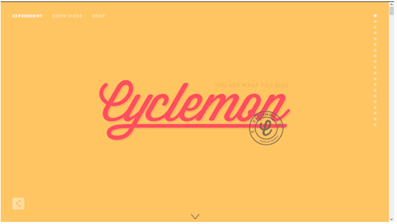
Image Source: Cyclemon
As you scroll down, the image above changes the image of the bike and it’s not especially slow to load.
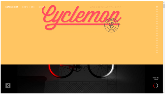
Image Source: Cyclemon
As you begin to scroll down, a bike appears. As you continue to scroll, you see that the bike also has a title, which describes what type of rider you might be.
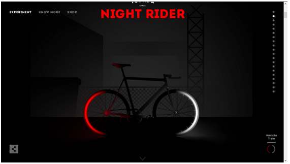
Image Source: Cyclemon
There are twenty different types of bikes illustrated as you move down the page.
Note that there is also a basic navigation menu at the top left of the page, which doesn’t detract from the design at all.
It’s only when you click on the “shop” link that you realize that it’s not a site selling bikes at all, it’s a site for two graphic artists selling their work (which includes the bike graphics). They’ve certainly used some sleight of hand, but it works because the parallax scroll entices users with a rich visual teaser.
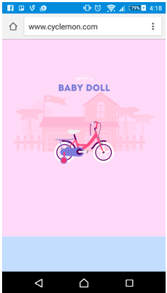
Image Source: Cyclemon
Let’s go to mobile. The parallax effect is lost.
The site loads quickly enough and while it doesn’t offer the same effect, the imagery is still there.
The imagery on its own is good enough to pull a mobile user in and not much is lost. The navigation menu is still available and users can easily get around the rest of the site.
While the parallax on this site isn’t groundbreaking, the designers exercised sound judgment in providing a backup design for mobile users. Their strategy, nonetheless, is quite clever for using parallax to create an interactive showroom of their art.
3. There’s No Real Usability Advantage
The Journal of Usability Studies did a study on parallax. The verdict: it’s a satisfying experience but there’s no real difference between a site that uses parallax and one that doesn’t.
One test group used a parallax site and another group used one without it. Both groups had to complete the task of booking a hotel room.
Testers reported the parallax site as being more fun. But that may be all it was good for. Among both groups, the parallax site didn’t gain an edge in terms of usability, satisfaction, or overall enjoyment.
However, the study did find that two of the participants using the parallax site suffered from “motion sickness and experienced significant usability issues while interacting with the parallax website.”
The bottom line? Parallax isn’t the best choice if users are looking to accomplish clear-cut tasks (like online shopping). Imagine for instance, how frustrating Amazon would become if you had to scroll through 8 sections of unrelated products to find the hard drive you want.

Image Source: Cyclemon
On the other hand, parallax is a strong choice for sites aiming to immerse users in a visual narrative. For example, take a look at how The Dangers of Fracking allows the user to control a droplet of fracking fluid through its entire journey. In this case, parallax is certainly a compelling technique for condensing a complex topic into an enticing (and almost fun) experience.
A Final Word On UX and Parallax
Parallax scrolling can be used to great effect but requires trade-offs.
There are serious UX issues that you must consider before deciding to use the effect.
Let’s review them:
- Parallax encourages bad SEO practices. While there are a few workarounds, SEO can be seriously hampered. That’s because if all the content is on a single page with a single URL, search engines will only index the site once.
- Parallax isn’t mobile compatible. Load times are atrocious because parallax makes heavy use of JavaScript. This makes it impractical for both mobile and responsive design.
- Parallax doesn’t have much of an edge for usability. It’s great for fun websites, but doesn’t necessarily make it more usable than one without it. However, we all know UX requires more than usability. If your goal is interactive storytelling, then parallax certainly adds a layer of delight.
With this in mind, any project that considered parallax scrolling will need budget set aside for thorough usability testing. Testing with users, after all, is the only true indication of whether parallax will improve or damage your site’s UX.
If you’d like to learn about other practical web UI techniques, check out the free e-book Web UI Design Best Practices. The 109-page ebook includes analysis of 30+ examples from top companies like Spotify, Apple, and Skullcandy.