Visualizing data comes up more and more in my work as a UX Designer. Data can be visually striking, but it needs a language and story to follow in order to be effective.
Over the years, the art of storytelling has become the structure I use as the foundation of my designs. Every good story has a hero who is on some sort of quest. And like every quest, there’s always a monster that must be slayed. Describe your user and the problem, then craft a story that helps everyone better understand the journey.
I’ll explain a process I followed on a recent project that will help you with your own UX design project. Feel free to follow along in UXPin.
Seek Inspiration Outside of the Project
Visual language taps into the foundation of human-centric design.
Humans created visual language before the alphabet we use today. Cave paintings were man’s earliest form of communication. Like a good tooltip, the drawings explained issues and how to solve problems. Those early drawings weren’t intended as a primitive form of interior design. Cave drawings told topical news stories. They warned of potential danger. They shared tips for survival. Essentially, cave drawings are visualized data.
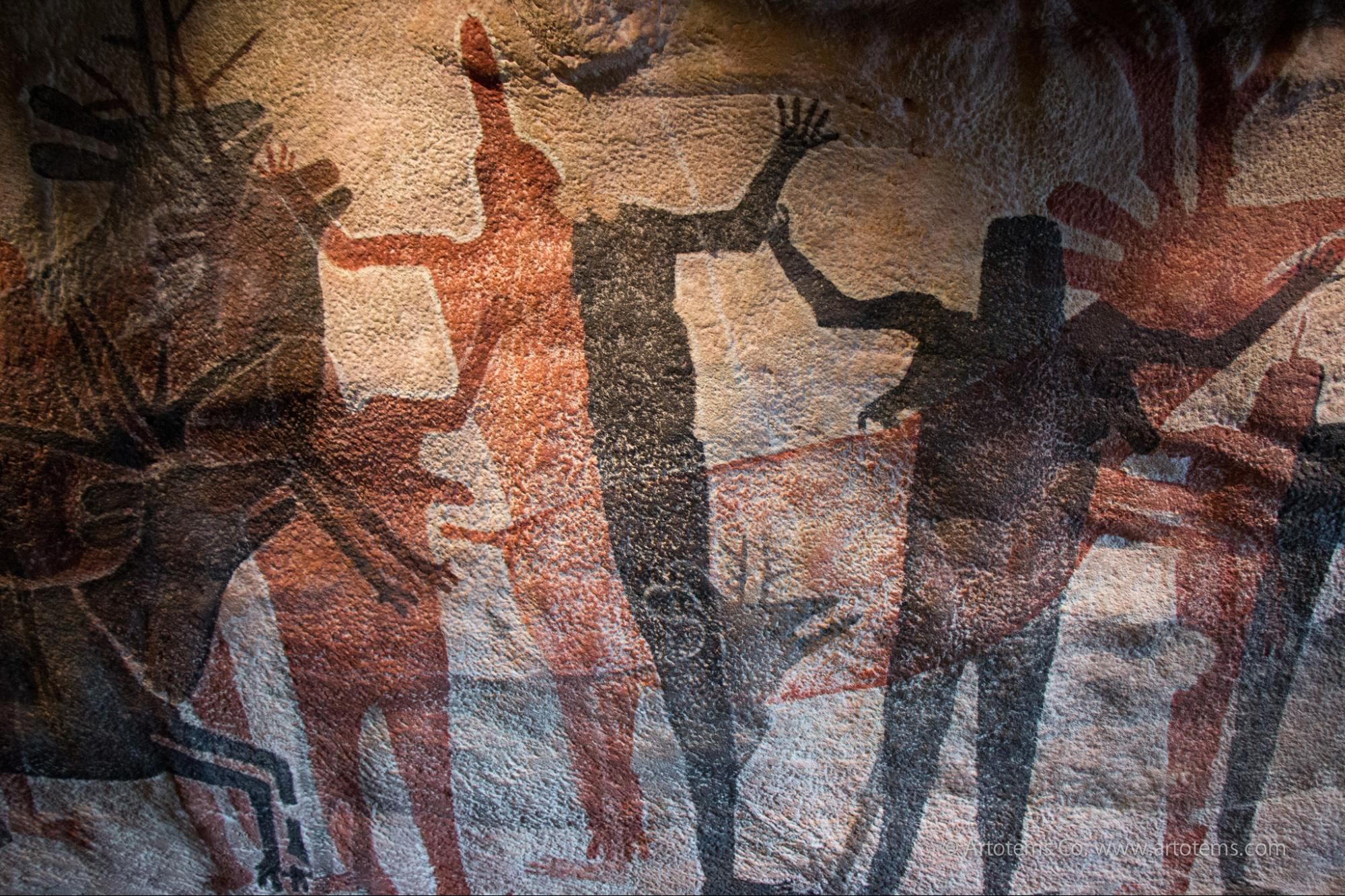
“Cave Painting”. Artotem. Creative Commons.
As described in the free e-book Web UI Design for the Human Eye, the eloquent simplicity of an image holds a lot of communicative power. But how do you harness this power into pixels?
Recently I needed to design an interactive system map that conveyed several key factors including:
- Size
- Distance
- Risks
- Activity
- Paths
- Connections
Essentially, the network security app needed to help find a dangerous needle in a haystack while showing how that needle got to that specific location in the stack.
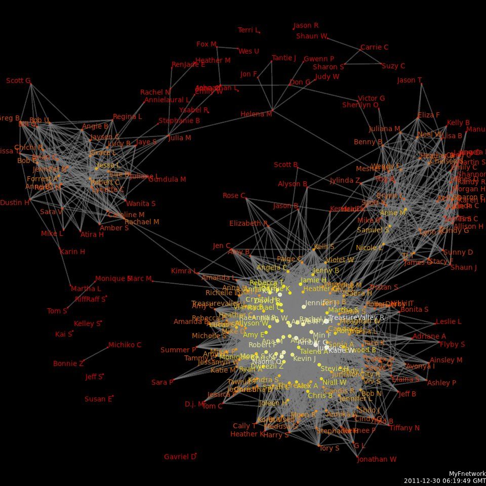
Photo credit: Wikipedia. Creative Commons.
Looking at examples of clustered network data, the images were elegant, but highly impractical from an interactive perspective. Yes, it is possible to make networks look beautiful, but it’s hard to make them functional once interactive. I saw little usability in designing the interactive map in a traditional way. I needed to find inspiration from another place. Something outside the existing examples of visualized network data.
In order for visualized data to be easy to read, there needs to be distinguishable attributes. This is where the structure of a visual language comes into play.
Embrace the Storytelling Power of Metaphors
My inspiration often comes from nature. Within nature is perfect design. A forest is chaotic, but there is a method to the madness.
The story of a forest isn’t understood by it’s larger holistic view, but rather the intimate view when standing within it. The same principles applied to the system network I needed to design as a map.
Data on it’s own means nothing. An overview of data presents high-level information that is helpful but rarely actionable. Context matters and must be presented with data. The ability to understand connections requires a closer view.
Once you start to zoom-in, the forest takes on a whole new meaning. When you look at a single tree up close, it’s perceived in a whole new way. The closer you look, the more texture and detail you see. And at a microscopic level, the relationship between forest elements illustrates how the forest grows.
I thought about how everything grows in partnership of each other in a forest. It’s a network of layers and natural laws dictating how plants grow. Color plays into how living things survive and a plant’s proximity to the sun. Everything grows and dies in perfect harmony. When a plant dies, it becomes food for the next generation.
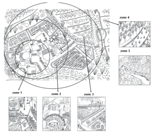
Photo credit: The Resilience Initiative.
I decided that a flat map-like experience was easier on users’ cognitive load than a 3D shape. Reducing cognitive load made it easier to tell the story. Interactive components should help focus the user on the key areas of the map. I studied different treemaps in search of the right treatment for the data within a mapview.
Creating the Story
Putting these elements together took time. What helped me was the creation of a story, which was:
“A user is flying in a plane above a dense forest looking for a place to drop into in order to locate a single red seed. This red seed was introduced to the forest by an outsider who wants the plant grown from the red seed to eliminate other plants. The damage is unacceptable. There is more than one red seed, and the user needs help locating the seeds and removing them before they grow into plants.”
This story helped me identify the types of interactive features necessary for the user to complete the tasks described below:
- The user must fly over the entire forest.
- The user must isolate the color red.
- The user must distinguish between seeds and other elements of the forest.
- The user must find the seed before it turns into a plant.
- The user must understand the relationships between trees, plants, leaves and seeds.
- The user must understand growth patterns in order to establish a timeline.
- The user must find paths to follow on the ground.
Obviously, all of this is a fictionalized version of the real tasks performed by users within the product. But by using a story as a metaphor, it was possible to design a themed experience that shared a common language. This was especially effective when communicating the product’s key features with the team and client. All of us were able to share the same mental model created by our common story metaphor.
Based on our metaphor, real user tasks are translated as:
- The user needs a holistic view of the network.
- The user needs to isolate targets within the network.
- The user needs to be able to isolate key attributes of the network.
- The user needs to filter network activity by date.
- The user needs help navigating the network.
Turning Stories Into Reality
I researched a lot of examples of visualized networks and found this plot lines tree diagram on Buzzfeed. It became the perfect visual model for the network security app I was working on.
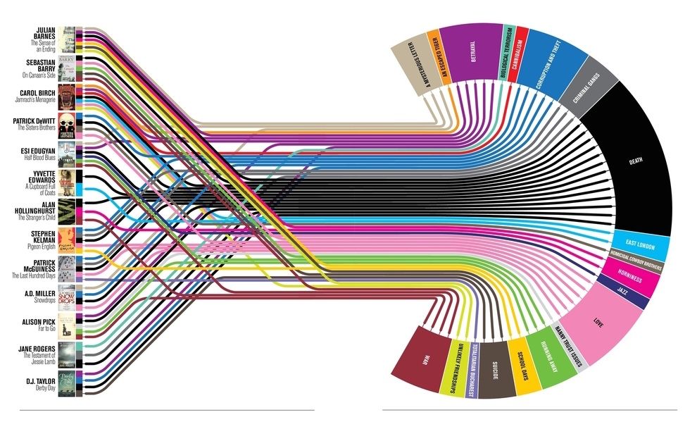
Photo credit: Buzzfeed
As a tree diagram combined with a subway map, it’s really easy to understand high-level information. It makes perfect sense because it fits into the forest metaphor. We see roots representing the accounts of focus and the branches representing the entire forest (network). Color coding calls out what’s most important, as well as the sources which are; groups, account types and devices. And we see the high-level relationships of everything as an easy to digest image.
The model allows users to immediately view the entire forest (whole network), the red seeds (security breaches), and how they entered the forest and if they’re growing (paths of entry and destination).
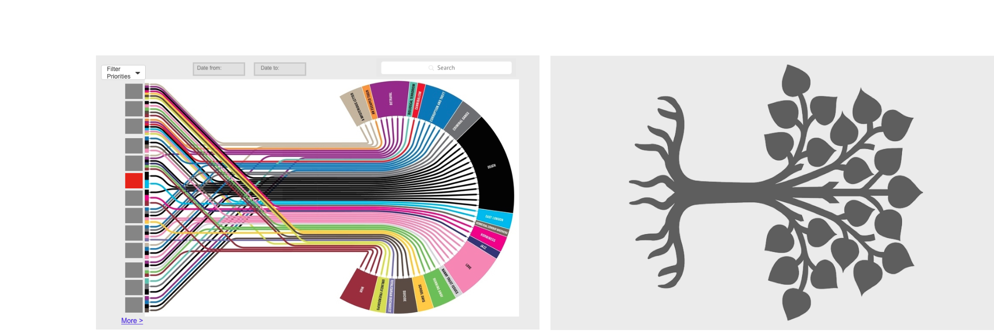
Photo credit: Jessica Lowry via Buzzfeed
When the user flies over the flat forest, the key areas are easy to identify. As you can see in the below lo-fi mockup created in UXPin, I used color coding to highlight the time between a red seed finding it’s way into the ground (a security breach) and beginning to grow into a plant with roots and leaves (a spreading virus). The red seed is a risk. The development from seed into plant is an even greater risk. The different colors visually told the user which seeds to investigate first.
I’ll admit it’s not the prettiest prototype, but it illustrates the rough functionality – and that’s exactly what we’re looking for.
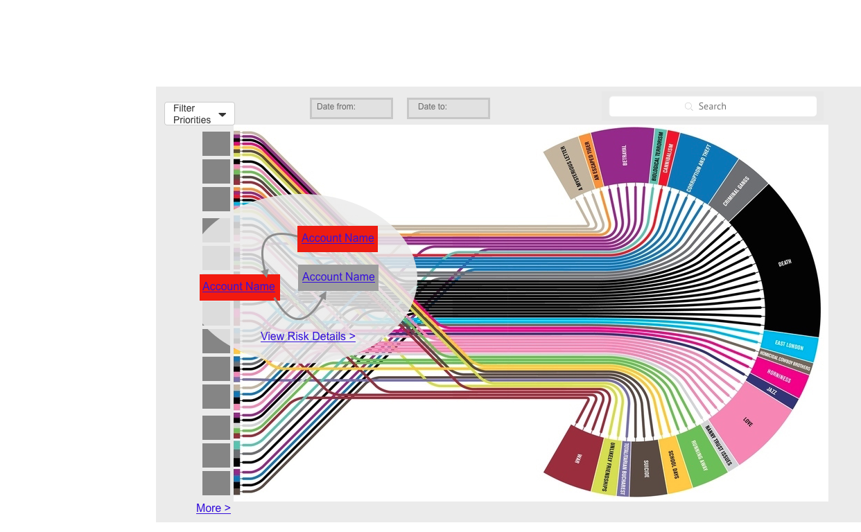
Photo credit: Jessica Lowry via Buzzfeed
Once the user selects a seed to investigate, the path to take becomes clearly highlighted. The other elements of the forest are still visible, but aren’t distracting. In fact, all the unnecessary layers peel back to reveal the journey of the red seed and its current development status (which is what users care about most).
Next Steps
For the above prototype, I simply dragged an existing image into a UXPin project, added hotspot elements to where I wanted interactions, then dropped in the boxes on the left-side to build out the pop-up modal.
To design more narrative-driven interfaces, seek inspiration outside of the office. Pay attention to nature, to great visual artists, to anyone who boils down complex structures into simple emotional understanding. Once you have your direction, go ahead and start prototyping in UXPin with a free trial like I did.
To know more about designing compelling visual stories, check out the free e-book Web UI Design for the Human Eye. You’ll learn from example with the 33 design teardowns included.