A Guide to Responsive Design – 8 Easy Steps
In a world filled with an extensive range of devices and different screen sizes, it’s safe to say that responsive design is design. Organizations cannot afford to build any website or application for a single device or screen size because they’ll lose out to a competing product that’s more accommodating to more users.
This step-by-step responsive website design guide walks designers through the process of designing for multiple viewport widths. Incorporating these processes into your UX workflow will ensure that design teams consider various screen widths when designing user interfaces.
Design responsive prototypes without adjusting multiple layouts for different screen sizes Try the power of UXPin’s Merge technology and bring React components to a design tool. Discover UXPin Merge.

What is Responsive Design?
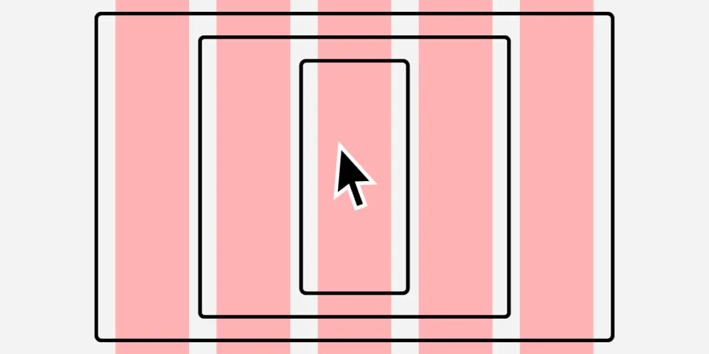
Responsive design is the process of designing user interfaces to accommodate multiple viewports. The aim is to provide a consistent user experience no matter what device someone uses.
Traditionally, responsive web design considered three primary screens, mobile phones, tablets, and desktops. Nowadays, designers have more screens and devices, including smartwatches, TVs, vehicle dashboards, and fridges, to name a few. Some products also include voice, meaning design teams must also incorporate VUI (voice user interface).
Understand Responsive Design
Before designers start designing responsive UIs, they must understand responsive design and the techniques developers use for their products.
For example, engineers can use CSS to serve users different-sized images based on their screen size or use an optimization tool that does this automatically. If engineers use the former, designers must supply assets for multiple screen sizes, whereas the latter only requires one.
So, before designers start a project, they must consult with engineers to understand the technical requirements and constraints. Some questions designers need to ask include:
- Does the product use a responsive grid or a fluid grid?
- What are the product’s breakpoints?
- Does the operating system (Apple iOS, Android, Windows) impact the product’s layout?
- How do engineers scale and serve images?
- What formats do engineers use for videos, images, icons, and other media?
- What grid system does the product use?
- Does the product use Flexbox or regular CSS?
Responsive Grid vs. Fluid Grid
A responsive grid uses a standard 12-column grid system with pixels for sizing. Using pixels means engineers set the size of a component or container that only changes with CSS media queries. A fluid grid uses percentages, allowing UI elements to resize according to the available space.
Define Your Breakpoints
Listing the breakpoints allows designers to plan information architecture, layouts, and features for each device. For example, some complex features limit what you can do on mobile vs. desktop application versions.
The most common breakpoints include:
- Desktops – max-width: 1200px
- Laptops – max-width: 991px
- Tablets – min-width: 768px and max-width: 990px
- Smartphones – max-width: 500px
Designers must also consider screen orientation and how designs adjust to a landscape layout. For example, the iPhone 13 is 390 pixels × 844 pixels, more than double the width in landscape vs. portrait.
Content Strategy Approach
Designing layouts around content enables designers to build intuitive, easy-to-navigate UIs. Defining your content hierarchy allows designers to organize layouts according to breakpoints.
Designers must consider hierarchy relating to the action they want users to take. For example, a blog feed’s purpose is to show users a list of articles and get them to click on something of interest. The blog feed’s most essential elements are the featured image and headline that entice users to click on an article.
On a desktop feed, designers have space to include more information, like the article’s excerpt, published date, author, and category tags. User research and interviews can guide responsive design according to what matters most to users.
Mobile-First Design
Mobile-first design is a process of starting with the smallest screen size and scaling up. This design strategy offers two primary benefits:
- The constraints of small screens force designers to include only the most critical features and UI components. Reducing unnecessary features reduces costs and time to market.
- It’s easier and faster to convert a mobile layout to larger screens than the other way around. Designing desktop-first often leads to compromises and redesigns to scale down to a mobile version.
A mobile-first approach also makes business sense for web design. Google prioritizes mobile-friendly content, which means a responsive design could benefit SEO to rank higher and generate more clicks.
Prioritize Content
Part of a mobile-first and content-first approach is prioritizing content that is always visible on smaller devices and what to hide behind navigational drawers, dropdown menus, or accordions.
For example, on a desktop layout, designers often show the questions and answers to users for an FAQ section. This layout would mean users would have to scroll over every Q&A to find what they want on mobile devices. Instead, designers can show users the question on smaller screens with the answer hidden behind an accordion, reducing scrolling for mobile users.
Responsive Images & Videos
Deciding on media formats at the start of the project could save designers rework later. For example, designers might use PNG for icons, but engineers use SVG because they adapt better to responsive layouts and deliver better performance.
Engineers might require several sizes and formats to serve different media depending on the device or viewport for complex responsive designs. Agreeing on these formats from the beginning ensures designers test prototypes correctly while preparing assets for a smoother design handoff.
Responsive Typography
Typography is a crucial design component impacting brand/identity, readability, voice, and readability. Selecting a typeface that translates across multiple devices is something designers spend hours, days, or even weeks deliberating.
In A guide to responsive typography, UX designer Augustine Thomas talks about what designers must consider for responsive typography, including:
- Choosing the right typeface
- Selecting a typography scale
- Alignment and spacing
Your project’s content, like images, video, graphics, etc., has a significant impact on all three of these elements. So, always test your typeface pairings with real content and avoid dummy text to get accurate results.
Responsive Design Performance Optimization
While performance is often a developer’s job, there are some things designers can do to make their job easier:
Use System Fonts
Every operating system has a font stack. iOS uses San Francisco, Android Roboto, and Windows Segoe UI, to name a few. Using these default fonts means the responsive website or application doesn’t have to make additional requests, improving performance.
If your product prioritizes performance over aesthetics, consider using system fonts instead of a custom one. Make sure you test your product with each font to get consistent results across all operating systems.
Animations
CSS and Javascript animations impact performance and could adversely affect the user experience. Conversely, designers can use animations when engineers need a few seconds to load a feature. Finding the right balance between these two takes collaboration and testing with designers and engineers.
Responsive Design with UXPin Merge
One of the challenges with responsive design is that the static nature of image-based design tools doesn’t allow designers to test UIs and components across multiple viewports accurately.
The only way to test a web page accurately is by using HTML, CSS, and Javascript–languages most designers don’t speak.
UXPin Merge is a code-based design tool allowing designers to prototype and test using the same components engineers use. Engineers can also program responsive properties, so UI elements function in prototypes as they do in the final product.
What is UXPin Merge?
UXPin Merge allows you to sync your product’s component library to UXPin’s design editor so designers can prototype using fully functioning code components.
You can connect a React component library direct to Merge using Git or our Storybook integration for Angular, Ember, Vue, and other front-end frameworks.
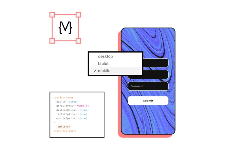
Creating Responsive Components Using Merge
Using a React component library, engineers can program an IFrame component to respond to responsive properties, media queries, and styling, providing the same responsive functionality as components in the final product.
Check out this step-by-step tutorial for building responsive components with UXPin Merge.
Enhance Testing
Instead of using multiple frames, designers can achieve the same responsive functionality as code using a single frame and component. These UI elements also have the same fidelity and functionality as the final product providing designers with meaningful feedback from usability testing and stakeholders.
With Merge, designers can prototype and test using fully functioning, responsive UI elements from a component library without writing code or relying on engineers to build it.
Streamlining the Design Handoff
These responsive Merge prototypes also streamline design handoffs, reducing time to market. Engineers no longer have to inspect multiple mockups and documentation to convert designs into responsive code; they simply copy/paste components from the repository plus any JSX changes from UXPin to start the web development process.


