
How to prototype using GPT-5 Mini + Bootstrap – Use UXPin Merge!

Prototyping just got faster and easier for enterprise teams with GPT-5 Mini, Bootstrap, and UXPin Merge. This workflow lets you design directly with production-ready code components, cutting development time by up to 8.6x. By combining AI-driven layout generation with Bootstrap’s responsive framework, you can create functional prototypes in hours – saving time, reducing revisions, and ensuring alignment between design and development.

Key Highlights:

  • AI-Powered Design: Use GPT-5 Mini to generate React Bootstrap components with simple text prompts or uploaded sketches.
  • Seamless Integration: UXPin Merge syncs directly with Bootstrap, so prototypes match final product performance and appearance.
  • Time Savings: Teams report up to 50% less engineering time using this workflow.
  • Customizable Components: Easily refine layouts and styles using natural language commands.
  • Code-Backed Prototypes: Export production-ready React code for faster developer handoffs.

This approach is perfect for enterprise teams managing multiple products, working with established design systems, or aiming to speed up the design-to-development process. Start designing smarter by integrating these tools into your workflow.

Generate Bootstrap Dashboard Using AI (No Coding, Free Tools!)

Bootstrap

Prerequisites and Setup

Before diving into prototyping, make sure you have everything you need. The process is simple, thanks to Bootstrap’s built-in integration – no extra steps like importing packages or setting up repositories are required.

What You Need to Get Started

First, you’ll need a UXPin account with Merge access. This feature is available starting with the Core plan, which costs $29/month and includes 200 AI credits along with basic models. If you’re looking for more, the Growth plan at $40/month offers 500 AI credits and access to advanced models.

To use the GPT-5 Mini AI Component Creator, you’ll also need an OpenAI API key. This key links UXPin to OpenAI’s models, and you may face additional charges depending on how much you use the API. You can get your API key directly from OpenAI’s website.

While having some familiarity with Bootstrap is helpful, you don’t need to be an expert.

How to Enable Bootstrap in UXPin Merge

UXPin Merge

Bootstrap integration in UXPin Merge is seamless – there’s no manual setup required. Unlike custom libraries that demand Git or Storybook integration, Bootstrap components are ready to go without importing packages or configuring CSS paths.

To activate GPT-5 Mini for creating components, follow these steps:

  1. Open the AI Component Creator in the Quick Tools panel within the UXPin Editor.
  2. Go to the Settings tab and paste your OpenAI API key into the provided field.
  3. Once the key is active, choose GPT-5-mini from the AI Models dropdown menu. This model is designed for speed and is perfect for generating quick layout variations.

"GPT-5-mini – Fast and efficient. Best for quick tests, layout variations, or when you need results right away."

After completing the setup, you’re ready to start generating AI-powered Bootstrap components effortlessly. This allows you to quickly move from basic layouts to a high-fidelity prototype that looks and behaves like the final product.

How to Create a Prototype with GPT-5 Mini and Bootstrap

GPT-5 Mini

GPT-5 Mini Bootstrap Prototyping Workflow in UXPin Merge

GPT-5 Mini Bootstrap Prototyping Workflow in UXPin Merge

Building on a streamlined setup, here’s how you can create effective prototypes using GPT-5 Mini and Bootstrap, ensuring production-ready code every step of the way.

How to Access GPT-5 Mini in UXPin

UXPin

To get started, open the AI Component Creator in UXPin and select GPT-5-mini from the AI Models dropdown. This model is designed for speed and excels at generating quick layout variations. It integrates seamlessly with Bootstrap’s React library, ensuring that every component adheres to Bootstrap’s design standards and responsive functionality.

How to Generate Components with AI Prompts

Switch to the Prompt tab and describe the component you need in plain language. For instance, you might type:

  • "Create a responsive navigation bar with a logo and menu items."
  • "Generate a card grid with product images and titles."

Start by building essential sections like the navigation bar, followed by the hero section, and then the card grid. This step-by-step approach enhances precision and keeps your design modular.

You can also upload wireframes or mockups to guide the AI. Low-fidelity sketches help outline basic structures, while high-fidelity designs provide more detail, including typography, colors, and spacing. This added input ensures the generated components align closely with your vision.

How to Customize AI-Generated Components

Once the AI generates a component, you can refine it using the "Modify with AI" tool. Simply click the purple icon on the component to access the AI Helper. Then, use plain text instructions to make adjustments. For example:

  • "Make the button text bold."
  • "Add a solid bottom border to the card."
  • "Change the grid to four columns on desktop."
  • "Add padding around the card content."

This method eliminates the need for manual tweaking, making it easier to achieve your desired look. After refining, preview the changes to ensure everything aligns with your design goals.

How to Preview and Export Your Prototype

Click the Preview button in the top toolbar to test your prototype’s responsiveness across desktop, tablet, and mobile views. Thanks to Bootstrap’s responsive design, your layout will adapt seamlessly to different screen sizes.

Once you’re satisfied with the design, export your prototype for developer handoff. Since every component is backed by code, the exported design mirrors the final development output, cutting down on the usual back-and-forth between designers and developers.

"Being able to jump straight from design to having code ready to going to be a huge time-saver for our team." – Allison Barkley, Director of Operations, Baremetrics

Best Practices for GPT-5 Mini and Bootstrap

Building on your prototype creation process, here are some strategies to boost both efficiency and quality.

How to Improve AI Results with Iterative Prompts

Start with clear, detailed instructions. When asking GPT-5 Mini to create Bootstrap components, be as specific as possible. For example, instead of saying, "Create a card", provide detailed requirements: "Create a card with a 16px bold title, 14px body text, and a 2px solid bottom border." This precision ensures the output aligns closely with your expectations from the very beginning.

Tackle complex designs in smaller steps. If you’re working on something as intricate as a dashboard, avoid generating it all in one go. Break it into manageable sections – like a navigation bar, sidebar, content grid, and footer. Generate each part separately, then assemble them. This method not only improves accuracy but also gives you greater control over the final result.

Leverage the AI Helper for quick tweaks. Once a component is generated, use the purple AI Helper icon to refine it through text-based commands. For instance, you could say, "Add 24px padding around the card content" or "Switch the grid to four columns on desktop." This iterative process makes it easy to fine-tune components without starting from scratch.

How to Get More from UXPin Merge Features

UXPin Merge offers tools that go beyond basic component generation, streamlining your workflow while maintaining flexibility. The AI Helper integrates with popular React libraries like Bootstrap, MUI, Ant Design, and Tailwind, enabling seamless component modifications across frameworks. Additionally, uploading high-fidelity mockups helps the AI better interpret typography, colors, and spacing, giving you a more accurate starting point for your Bootstrap components.

Test responsiveness early. Use the Preview button to see how your prototype adapts to various screen sizes, including desktop, tablet, and mobile. This early testing helps you identify and address any design inconsistencies before handing off your work. It’s a small step that can save significant time later on.

AI-Generated vs. Manual Prototyping: A Comparison

AI-driven prototyping delivers noticeable time savings and consistency improvements. Larry Sawyer, Lead UX Designer, highlights the benefits:

"When I used UXPin Merge, our engineering time was reduced by around 50%. Imagine how much money that saves across an enterprise-level organization with dozens of designers and hundreds of engineers".

Feature AI-Driven Prototyping (UXPin Merge) Manual Prototyping
Speed 8.6x faster development Slower, pixel-based assembly
Consistency High; adheres to library rules (Bootstrap/MUI) Variable; depends on manual precision
Code Output Production-ready React code Requires translation from design to code
Iteration Instant via AI Helper prompts Manual property/layer adjustments

The advantages are especially clear during design handoff. AI-generated prototypes provide clean React code and dependencies, eliminating the need for redlining or manual coding, which is often required with traditional methods.

Conclusion

Key Takeaways

GPT-5 Mini, Bootstrap, and UXPin Merge come together to create a prototyping workflow that bridges the gap between design and production-ready code. This approach can speed up development by 8.6 times and cut engineering time in half.

With Bootstrap’s mobile-first framework and AI-driven tools, responsive prototyping becomes simpler. Features like the AI Helper allow for quick iterations, while the Preview button ensures designs look great across different screen sizes. Developers can then work with clean React code, making handoffs seamless. As Erica Rider, UX Architect and Design Leader, highlights:

"It used to take us two to three months just to do the design. Now, with UXPin Merge, teams can design, test, and deliver products in the same timeframe".

These tools aren’t just about saving time – they set the foundation for more efficient workflows and better collaboration.

Next Steps for Your Team

Take advantage of these time-saving tools by integrating UXPin Merge into your process. Since Bootstrap is built-in, you can start prototyping right away. For larger teams, the Enterprise plan offers perks like custom component library integration, unlimited AI credits, and dedicated support to meet your specific needs.

Ready to get started? Visit uxpin.com/pricing to compare plans and find the best fit for your team. If you’re part of an enterprise-scale operation, reach out to sales@uxpin.com to discuss tailored pricing and onboarding options. The sooner you embrace code-backed prototyping, the faster your team can deliver products that match the design vision perfectly.

FAQs

How does GPT-5 Mini improve the prototyping process with Bootstrap?

GPT-5 Mini streamlines the prototyping process by leveraging AI to transform text prompts or images into polished UI components. This means designers can quickly craft layouts and interactive elements without spending hours on manual adjustments, significantly speeding up their workflows.

Paired with Bootstrap’s responsive framework, GPT-5 Mini ensures that these components are aligned with production-ready code, making the shift from design to development smoother. Its AI-powered recommendations also help maintain a cohesive design, automate tedious tasks, and reduce the chances of errors, allowing teams to build functional prototypes with greater speed and efficiency.

What are the costs of using GPT-5 Mini with UXPin Merge?

The cost of using GPT-5 Mini with UXPin Merge will depend on your usage and the subscription plan you choose. Here’s a quick breakdown:

  • GPT-5 Mini Pricing:
    • Input tokens: $0.25 per 1 million tokens
    • Output tokens: $2.00 per 1 million tokens

Your total expense will vary based on the volume of AI-generated content used during prototyping.

UXPin offers subscription plans starting at $29 per month for the Core plan, with additional Enterprise options available for larger teams. These plans include AI-powered features and built-in credits, which can help offset some costs depending on how extensively your team integrates AI tools.

For teams looking to streamline workflows and cut down on development time, combining GPT-5 Mini with UXPin Merge can offer an efficient solution. However, your final cost will ultimately hinge on your usage patterns and the subscription tier you select.

How does AI help maintain design consistency when using Bootstrap?

AI plays a key role in maintaining design consistency with Bootstrap by generating components that adhere to Bootstrap’s production-ready code. This ensures that the components used during prototyping are not only functional but also align perfectly with the standards of the final implementation.

Thanks to UXPin’s integration, designers can work directly with actual Bootstrap components, making the shift from prototype to production effortless. On top of that, AI-powered tools in UXPin can create components that respect your design guidelines while staying true to Bootstrap’s structure, ensuring both visual harmony and functional consistency throughout the design workflow.

Related Blog Posts

How to prototype using GPT-5 Mini + Ant Design – Use UXPin Merge!

Prototyping just got faster and easier. By combining GPT-5 Mini, Ant Design, and UXPin Merge, you can create production-ready prototypes directly from text prompts. This workflow eliminates the traditional design-to-code gap, saving time and ensuring consistency between design and development. Here’s how it works:

  • GPT-5 Mini: Generates layouts based on natural language prompts like “Create a dashboard with a data table, filter bar, and action buttons.”
  • Ant Design: Provides a pre-configured library of React components that align with your design system.
  • UXPin Merge: Lets you design with real, production-ready components, ensuring your prototypes match the final product.

Teams using this approach report up to 10x faster product development and 8.6x faster coding workflows. Whether you’re a designer, developer, or DesignOps leader, this method streamlines prototyping and ensures design consistency.

Key steps:

  1. Set up UXPin Merge and connect Ant Design components.
  2. Use GPT-5 Mini to generate layouts with plain-language prompts.
  3. Fine-tune designs, add interactions, and test for responsiveness.
  4. Export production-ready React code directly from the prototype.

This workflow bridges the gap between design and development, helping teams deliver faster, more accurate results.

4-Step Workflow for Prototyping with GPT-5 Mini, Ant Design, and UXPin Merge

4-Step Workflow for Prototyping with GPT-5 Mini, Ant Design, and UXPin Merge

UXPin Merge AI: Smarter UI Generation That Follows Your Design System

UXPin Merge

Setting Up UXPin Merge with Ant Design

Ant Design

Getting started with UXPin Merge and Ant Design is straightforward. The built-in library offers immediate access to production-ready components, so you can start designing with real React code from the antd npm package in no time.

Activating UXPin Merge and Using Ant Design

UXPin Merge is available with all pricing plans, including the Core plan starting at $29/month. Once logged into your UXPin account, you can access Merge directly. Open the Libraries panel in the UXPin editor and select Ant Design from the built-in options. The full component library will load, giving you access to elements like buttons, forms, tables, and navigation components.

Before diving in, check your AI credit balance under account settings. Core plans come with 200 AI credits per month, while Growth plans include 500 credits. Enterprise users can request custom limits based on their team’s needs. If you’re working on a large-scale project, confirm you have enough credits to avoid interruptions.

The library is pre-configured with all necessary CSS files, ensuring components render properly right from the start. This setup is ideal for teams using standard Ant Design components without needing additional customization.

If your team requires tailored integrations or specific Ant Design versions, move to the Custom Library Integration section below.

Custom Library Integration for Enterprise Teams

For teams that rely on specific Ant Design versions or custom themes, you can integrate your own npm package instead of using the pre-configured library. This approach ensures your prototypes align precisely with the components developers use in production.

To set up a custom library, go to the Merge Component Manager in your UXPin settings. Enter the npm package name (e.g., antd@5.2.1 for a specific version) and specify the CSS file path, typically antd/dist/antd.css. This process gives you complete control over the version and styles you’re working with, creating a seamless connection between design and development. For enterprise teams, proprietary design systems can also be integrated via Git or Storybook, though this requires close collaboration with developers and involves more complex setup.

Here’s a quick comparison of the available integration methods:

Integration Method Best For Setup Complexity
Built-in Library Quick prototyping Low (No setup needed)
NPM Integration Custom versions or specific packages Medium (Requires package name & CSS path)
Git/Storybook Proprietary libraries or enterprise systems High (Requires developer collaboration)

Once your library is connected, use the Properties Panel to map custom design tokens, ensuring that component properties match your codebase. This step is essential for maintaining consistency across large teams and complex projects.

Configuring GPT-5 Mini for Ant Design Prototyping

GPT-5 Mini

When working with Ant Design, you can set up GPT-5 Mini to generate prototypes seamlessly. This AI model integrates directly into the AI Component Creator, ensuring that the components you use remain consistent with the Ant Design library.

Selecting GPT-5 Mini and Setting Constraints

To get started, open the AI Component Creator from the UXPin editor toolbar. From the dropdown menu of available AI models, choose GPT-5 Mini, which is specifically tuned for quick layout testing.

Before generating any components, link your OpenAI API Key. Navigate to the Settings tab within the AI Component Creator, and paste your key into the ‘OpenAI API Key’ field. This step connects GPT-5 Mini to your workspace.

Once connected, the AI automatically aligns itself with the active Ant Design library. This ensures that every component it generates – whether it’s a Button, Table, or Form – is directly sourced from the antd npm package. This removes the possibility of introducing custom or mismatched elements. Keep in mind that the AI Helper currently supports only built-in React libraries, which includes Ant Design.

Now, let’s explore how to write effective prompts to make the most of GPT-5 Mini.

Writing Effective AI Prompts

The quality of your prompts directly impacts the prototypes you generate. Clear, detailed instructions are key. For example, instead of saying "create a button", provide more specifics: "create a primary Button labeled ‘Submit’ with a loading state." Use CamelCase for component names (e.g., Select, RangePicker) and define properties like type, disabled, or danger.

For more complex user interfaces, break your request into smaller, manageable parts. For instance, instead of asking for an entire dashboard at once, focus on individual sections. Start with a Table for displaying data, add a Form for user input, or create a navigation bar using Menu components. This step-by-step approach improves accuracy and gives you more control over the final design.

When it comes to layouts, be explicit about spacing and structure. For example: "Two-column layout using Grid with 16px padding." While longer prompts might take slightly more time to process, the added detail often leads to better results. After the AI generates your initial design, you can refine it further using the AI Helper (marked by the purple "Modify with AI" icon). This tool allows you to tweak styles, adjust typography, or update text content without needing to start from scratch.

Building Prototypes with GPT-5 Mini and Ant Design

Once your setup is ready, it’s time to dive into creating and fine-tuning prototypes. By outlining your requirements clearly, you can generate complete prototypes efficiently.

Generating Prototypes with AI

Start by opening the AI Component Creator and entering a prompt that describes your desired design. For instance, you might try: "Create a dashboard with a Table showing user data and a Card displaying summary statistics." GPT-5 Mini will then generate Ant Design components that align with your request.

The AI directly integrates components from the antd npm package, ensuring you receive authentic elements like Table, Card, and Button that function just as they would in a production environment. By crafting detailed prompts, you can achieve highly specific component results. To further refine your design, use the "Modify with AI" icon. For example, you could input, "Add three more columns to the table" or "Change the card background to light gray."

Adding Interactions and Conditional Logic

Bring your prototype to life by adding interactive features. Use the Interactions panel to define actions such as click events or state changes. You can also refine these behaviors with the "Modify with AI" tool.

For example, you might configure a Button to open a modal when clicked or set up a Form to validate user input before submission. With UXPin’s support for variables and expressions, you can incorporate conditional logic to simulate real-world application behavior. Prompts like "Make this button show a loading spinner when clicked" or "Update the dropdown to filter the table results" allow the AI Helper to handle these adjustments, saving you from manually tweaking properties.

Once you’ve set up interactions, test them to ensure everything works as expected.

Previewing and Testing Prototypes

Thorough testing is essential before moving forward. Use the Preview feature to test interactive elements in action.

Check for responsiveness by resizing your browser window to see how components adapt to various screen sizes. Ant Design components are designed with responsive behavior in mind, but it’s still important to confirm that your layout functions well across mobile, tablet, and desktop views. If you notice any issues, return to the editor and make the necessary fixes. This step is especially critical for enterprise teams that need prototypes to meet high-quality and compliance standards before advancing to production.

Once your prototype passes testing, you’re ready to export and scale it for production use.

Exporting and Scaling Prototypes for Production

Once your prototype has been tested, you can export it as production-ready code. UXPin Merge simplifies this process by exporting React code that aligns seamlessly with the Ant Design library. Every component, interaction, and dependency is translated into code that developers can immediately use. Using Spec Mode, you can access JSX, CSS, and design tokens, and even launch directly in StackBlitz for live editing. PayPal adopted this method to ensure their prototypes matched the final product perfectly, establishing code as the single source of truth between design and development.

Scaling with UXPin Merge for Enterprise Teams

With production-ready prototypes, you can scale your workflow to handle the demands of enterprise-level projects. These teams often need tools for governance, version control, and maintaining component consistency.

UXPin Merge integrates with Git and Storybook, enabling teams to import and manage proprietary components. When developers make updates to components in the codebase, those changes are automatically reflected in the design tool, keeping everything synchronized as a single source of truth. For enterprise teams needing to streamline data access across backend systems, DreamFactory provides a self-hosted platform for governed API access to any data source, which can complement your prototyping workflow by enabling rapid integration testing with real backend environments.

For large-scale operations, you can manage component properties through GitHub using prop-types and TypeScript interfaces. This setup ensures that designers stick to approved styles and configurations, reducing the risk of design inconsistencies across teams.

"We synced our Microsoft Fluent design system with UXPin’s design editor via Merge technology. It was so efficient that our 3 designers were able to support 60 internal products and over 1,000 developers" – Erica Rider, UX Architect at Microsoft.

Strategically manage token consumption: use GPT-5 Mini for high-volume, low-latency tasks, while reserving full GPT-5 for critical analysis. Establish feedback loops to capture failed queries and refine your prompt templates as needed, ensuring your AI-driven workflow becomes more effective as your team scales.

Advanced Tips for Enterprise Prototyping with GPT-5 Mini

Building on earlier discussions about setup and workflows, these advanced strategies can help you get the most out of GPT-5 Mini while ensuring compliance for enterprise-scale projects.

Optimizing AI Performance for Large-Scale Projects

To fine-tune GPT-5 Mini for specific tasks, adjust the reasoning_effort parameter. For straightforward tasks like generating simple Ant Design button layouts, set it to minimal or low to cut down on latency and token consumption. For more complex tasks – like managing intricate state logic or handling multi-step processes – switch it to high for deeper reasoning capabilities.

The verbosity parameter is another useful tool, allowing you to control the length of the AI’s output. Use low for concise responses and high when detailed documentation or explanations are needed.

GPT-5 Mini stands out with its ability to handle a 400,000-token context (equivalent to about 300,000 words per session). It also boasts a reduced likelihood of factual errors, with a hallucination rate of just 4.8%.

"The Responses API is the path forward for new reasoning capabilities. Building here keeps you off legacy APIs when the most powerful features ship." – OpenAI Practical Guide

To further enhance performance, consider metaprompting, where GPT-5 Mini refines its own instructions. Short, clear prompts tend to yield better results than those overloaded with excessive scaffolding. Additionally, using the json_object parameter ensures the extraction of valid JSON for defining component properties.

These optimizations not only improve AI efficiency but also set the stage for robust compliance measures.

Meeting Enterprise Compliance Standards

Once performance is optimized, it’s critical to implement strong compliance measures to meet enterprise requirements.

Using the Responses API with UXPin Merge enables Zero-Data Retention, ensuring that prototype data isn’t stored or used for model training.

To align with regulatory standards, assign specific roles in prompts, such as Senior UX Architect or Compliance Officer. You can also use the allowed_tools parameter to restrict the model to a predefined set of tools, which enhances security and predictability in complex workflows.

For high-stakes tasks, build explicit validation steps into your prompts. For example, you can instruct the model to pause and provide summaries before making significant changes to component libraries or design tokens. Additionally, define "escape hatches" that require user confirmation before executing critical actions like deletions or major refactoring.

GPT-5 Mini is also cost-effective for enterprise use, with pricing set at $0.25 per 1M input tokens and $2.00 per 1M output tokens. You can ensure prototypes follow US formatting standards – like MM/DD/YYYY for dates, imperial units, and dollar signs – by specifying localization requirements in your prompts.

Conclusion

Bringing together GPT-5 Mini, Ant Design, and UXPin Merge is changing how enterprise teams handle prototyping. With production-ready components available right from the start, AI-generated layouts strictly adhere to your design system’s guidelines, ensuring accuracy and consistency through to development. These tools have already made a measurable impact for teams at major companies.

At PayPal, Erica Rider shared how her small team of three designers was able to support 60 internal products and over 1,000 developers using UXPin Merge with Microsoft Fluent. She explained:

"It used to take us two to three months just to do the design. Now, with UXPin Merge, teams can design, test, and deliver products in the same timeframe".

Larry Sawyer, Lead UX Designer, highlighted the efficiency gains:

"When I used UXPin Merge, our engineering time was reduced by around 50%. Imagine how much money that saves across an enterprise-level organization with dozens of designers and hundreds of engineers".

This approach not only speeds up prototyping but also streamlines code integration. UXPin Merge connects directly to your codebase via Git, Storybook, or npm, ensuring that updates sync automatically between design and development. Developers can even pull production-ready JSX code directly from Spec Mode, cutting out manual rebuilds and guaranteeing precise implementation.

Whether you’re overseeing a small design team or coordinating efforts across hundreds of developers, this method scales effortlessly. By combining AI-driven, component-based prototyping with tools like UXPin Merge, teams can stay aligned, deliver faster, and ensure every design is technically sound from the start. Together, these tools create a seamless pipeline from concept to production.

FAQs

How does GPT-5 Mini improve prototyping with UXPin Merge?

GPT-5 Mini makes prototyping in UXPin Merge faster and easier by using AI to create and refine UI components from simple, natural language prompts. Designers can simply explain what they need in plain English, and GPT-5 Mini generates functional, code-backed components in no time – cutting down on manual work and saving valuable time.

Beyond that, it can turn static images into interactive, coded UI elements. It also works seamlessly with libraries like Ant Design, allowing teams to build scalable, production-ready prototypes. This tool helps close the gap between design and development, speeds up iteration cycles, and eliminates repetitive tasks, making workflows more efficient and consistent across projects.

What are the advantages of using Ant Design components with UXPin Merge?

Using Ant Design components in UXPin Merge brings a range of benefits for design and development teams. By utilizing actual, production-ready React components, you can build prototypes that closely resemble the final product. These components come with built-in interactivity and behaviors, which minimizes the chances of errors during handoff and ensures a smoother transition into development.

Ant Design tokens for elements like colors, spacing, and typography help maintain a cohesive and polished visual style across your project. The drag-and-drop functionality for components such as buttons, tables, and date pickers makes the design process quicker and more efficient. Since these components are fully functional, they also allow for more precise testing and validation, ensuring your designs are development-ready with minimal tweaks.

This integration bridges the gap between design and development, boosting efficiency, maintaining consistency, and aligning teams for faster project completion and higher-quality results.

How can I create production-ready prototypes using GPT-5 Mini and Ant Design in UXPin Merge?

To build prototypes that are ready for production, try combining UXPin Merge, GPT-5 Mini, and Ant Design for a streamlined process. UXPin Merge allows you to work with actual React components directly in your prototypes, so they behave just like they will in the final product. This approach eliminates any mismatch between design and development.

With GPT-5 Mini, you can quickly create or tweak UI components using simple natural language prompts. This speeds up the design process and helps reduce manual errors. Meanwhile, Ant Design offers a solid library of components that are consistent, scalable, and come with built-in interactivity and responsiveness. This ensures your prototypes are not only visually accurate but also functional and ready for deployment.

By combining these tools, you can work faster without sacrificing accuracy, ensuring your prototypes align perfectly with production requirements.

Related Blog Posts

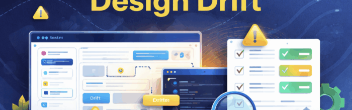
Design Drift: What It Is, Why It Happens, and How to Prevent It at Scale

UXPin Merge lets teams design and prototype with the same production React components used in their products—whether from standard libraries (MUI, shadcn/ui) or an internal design system—so UI stays consistent, governed, and ready to ship without redesign-to-dev rebuilds.
Teams can compose screens manually or use Merge AI to generate layouts with approved components, accelerating iteration while maintaining design-system compliance.

TL;DR

  • Design drift is the slow divergence between your design system’s intended patterns and what ships in production.

  • Drift is usually caused by translation steps (static mockups → rebuild), uncontrolled variants, and token overrides.

  • Governance prevents drift when it includes clear decision rights, a component lifecycle, an exception path, and metrics that surface non-compliance early.

  • The fastest way to reduce drift is system-first prototyping: prototype using the same components engineers ship, so reviews happen against reality.

Related reading: Design System Governance (models, roles, and operating cadence)

What is design drift?

Design drift is the gap between the UI your design system intends and the UI that actually ships across teams and products. It often starts as “small inconsistencies”—spacing, type, component states—and becomes fragmentation that users notice and teams pay for.

You can have a design system and still have drift if teams can’t (or don’t) use the real system in their day-to-day workflow.

How design drift shows up in real products

If you’re DesignOps or running an enterprise system, drift usually looks like:

  • Multiple “almost identical” components (ButtonPrimary, ButtonMain, ButtonNew)

  • Inconsistent states (hover/focus/disabled differ by team)

  • Token overrides and one-off spacing values in production

  • Different density and layout rules across products

  • Accessibility regressions (focus rings, contrast, semantics)

  • “Last-mile substitutions” (engineering swaps components late to ship)

Why design drift happens

Design drift is usually a workflow problem, not a taste problem.

1) Static mockups don’t carry real constraints

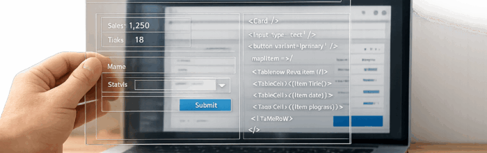
Vector-based mockups can’t naturally express production constraints: props, responsive behavior, edge states, content bounds, and system tokens. Teams review something that cannot be reproduced exactly—so drift becomes inevitable.

2) Rebuild handoffs introduce interpretation

When engineers rebuild UI from scratch based on mockups, interpretation creeps in (especially under time pressure). That “translation layer” is where drift grows fastest.

3) Variant sprawl becomes permanent

Teams create “just one more” variant to solve a real use case. Without a gate and lifecycle, variants multiply and the system stops standardizing anything.

4) Token overrides normalize

Overrides are sometimes necessary—but without explicit policy and measurement, overrides become the default. Over time, teams stop trusting the system and treat it as optional.

5) Ownership and decision rights are unclear

If nobody can approve new components/variants quickly, teams route around governance. If too many people can approve changes, the system fragments anyway.

The governance playbook that prevents drift

Governance isn’t “policing.” It’s the operating model that makes consistency the easiest path.

A) Decision rights (RACI) that teams actually follow

Define who can approve:

  • new components

  • new variants

  • token changes

  • exceptions (“one-offs”)

  • deprecations and migrations

Practical rule: if nobody can say “yes” quickly, teams will bypass governance.

B) A component lifecycle that stops chaos

Use a lightweight lifecycle so changes are intentional, traceable, and reusable:

Propose → Review → Build → Document → Release → Measure adoption → Deprecate

C) A fast exception path (with an expiry date)

Exceptions will happen. The key is: explicit, temporary, measurable.

  • log each exception

  • require an expiry date or migration plan

  • review exceptions monthly (promote to system vs sunset)

D) Monthly rituals that keep drift from hiding

A simple cadence prevents “silent fragmentation”:

  • review adoption metrics + exception volume

  • review drift incidents surfaced in QA

  • identify system gaps that caused workarounds

  • decide: add to system, document guidance, or deprecate duplicates

The most effective drift-killer: prototype with real components

Drift collapses when the prototype behaves like production.

When prototypes are built from the same components engineering ships, you reduce the biggest drift driver: translation. This is also why teams use workflows that keep design artifacts synced with code-driven components (for example via Storybook syncing or Git-based component sourcing).

Why this changes governance outcomes

When prototypes use real components:

  • reviews evaluate system compliance, not visual interpretation

  • feasibility is validated early (states, props, constraints are real)

  • drift is easier to detect because artifacts match production behavior

  • engineers spend less time rebuilding UI from mockups

Implementation checklist: prevent drift in 30–60 days

Use this as a minimum viable rollout:

  1. Define your approved component sources (internal library + any approved external libraries).

  2. Publish governance decision rights (who approves what).

  3. Implement a component lifecycle with visible ownership.

  4. Introduce an exception path with expiry dates and review.

  5. Lock down variant creation rules (what requires approval).

  6. Define token override policy (allowed vs forbidden, with examples).

  7. Require system-first prototyping for key flows and new surfaces.

  8. Add system compliance checks to design reviews and UI QA.

  9. Release system changes with versioning + changelog + migration guidance.

  10. Run a monthly drift review ritual (exceptions, QA findings, adoption).

Metrics DesignOps should track to spot drift early

Pick a few you can measure consistently:

  • System usage rate: % of shipped UI built from approved components

  • Variant sprawl rate: variants created per month + duplication rate

  • Override rate: token/prop overrides outside policy

  • Exception volume + aging: number of active exceptions and time-to-close

  • Drift incidents: QA bugs tied to inconsistent components/states/tokens

  • Rebuild / rework time: time spent translating designs into production UI

Simple north star: % of shipped UI built from approved components without exception.

How UXPin Merge helps prevent drift in practice

1) Keep design and production aligned on the same components

With component-driven workflows, teams can keep prototypes aligned to the same components used in production—especially when components are synced from a shared source like Storybook or sourced from a Git repository.

2) Governed AI: generate layouts using approved components

If AI invents off-system UI, it can increase drift. The safe enterprise approach is AI constrained to approved components, so generation accelerates iteration without breaking your system.

3) Reduce the “translation tax” that creates drift

The less you rebuild, the less you reinterpret. Prototypes built from production components reduce the handoff gap that causes drift.

A practical playbook: how to stop drift across multiple teams

Step 1: Standardize inputs

  • define an “approved libraries list”

  • enforce versioning and change visibility (release notes)

Step 2: Make prototyping governance-ready

  • critical flows must be prototyped using approved components

  • exceptions must be logged, reviewed, and time-boxed

Step 3: Make drift visible

  • review adoption + exceptions monthly

  • connect QA drift findings to a system backlog item (“fix the system, not the symptom”)

Step 4: Close the loop

  • promote repeated exceptions into the system

  • deprecate duplicates and migrate teams off legacy variants

FAQ

What is design drift in UI design?

Design drift is when shipped UI diverges from your design system’s intended patterns—often due to rebuild handoffs, uncontrolled variants, and token overrides.

Why does design drift happen between design and production?

Because static prototypes don’t carry production constraints, and engineering must rebuild and interpret them—introducing inconsistencies under real-world constraints and deadlines.

How do you prevent design drift across multiple teams?

Combine governance (decision rights, lifecycle, exceptions) with system-first prototyping using approved components and metrics that reveal drift early.

How do you stop variant sprawl in a component library?

Require approvals for new variants, measure duplicates, and deprecate or merge near-duplicates with clear migration guidance.

What metrics should DesignOps track to measure drift?

System usage rate, variant sprawl, override rate, exception volume/aging, drift incidents found in QA, and rebuild/rework time.

Can AI generate UI layouts that follow a design system?

Yes—if AI is constrained to approved components rather than inventing new UI. That’s the difference between “fast mockups” and “governed generation.”

What’s the most effective way to keep prototypes aligned with production UI?

Prototype using the same components engineering ships, so reviews happen against real constraints and states—not approximations.

Where can I learn about design system governance models?

See our Design System Governance guide for governance models, roles, and a step-by-step operating process.

How to prototype using GPT-5 Mini + shadcn/ui – Use UXPin Merge!

Design faster and smarter with GPT-5 Mini, shadcn/ui, and UXPin Merge. This trio allows you to create functional prototypes directly from production-ready React components, eliminating design-to-development inconsistencies. Here’s how it works:

  • GPT-5 Mini: Generates layouts and components based on your prompts or uploaded mockups.
  • shadcn/ui: Provides a React component library with theming support for consistency.
  • UXPin Merge: Brings it all together, allowing you to design with real code components, add interactivity, and export production-ready React code.

With this setup, you can cut prototyping time by over 8x and reduce engineering effort by 50%. Whether you’re a designer or developer, this workflow simplifies collaboration and speeds up delivery without compromising quality.

Ready to transform your prototyping process? Let’s dive in.

From Prompt to Interactive Prototype in under 90 Seconds

What You Need to Get Started

To dive in, you’ll need a few key tools and some basic understanding of how they work together. UXPin brings these elements together effortlessly. Let’s break down what’s required.

Tools and Accounts You’ll Need

First, you’ll need a UXPin account with access to its Merge technology. UXPin offers three paid plans:

  • Core: Around $29/month, includes 200 AI credits.
  • Growth: Around $40/month, includes 500 AI credits.
  • Enterprise: Custom pricing tailored to your needs.

To work with shadcn/ui and GPT-5 Mini in UXPin, you’ll use the AI Component Creator tool. To enable AI features, you’ll need an OpenAI API key. This key links your UXPin account to OpenAI’s models, including GPT-5 Mini.

Understanding GPT-5 Mini and UXPin Basics

GPT-5 Mini

You don’t need coding experience, but crafting effective AI prompts can make all the difference. GPT-5 Mini is known for being “fast and efficient” in UXPin, making it perfect for testing ideas or generating layout variations quickly. For better results, include detailed instructions in your prompts, like specific color codes, typography choices, and layout details.

You can refine outputs by adjusting your prompts or breaking down complex components into smaller, manageable tasks. Another option? Upload low-fidelity wireframes or high-fidelity mockups to guide the AI in understanding structure, typography, and spacing. Familiarity with UXPin’s interface will also be helpful, especially when switching between the AI Component Creator and the AI Helper tool. The latter allows you to update components using straightforward text commands.

Setting Up Your Design System

For seamless integration, select shadcn/ui as your design library. This ensures that AI-generated components adhere to its design standards. If you’re using a custom version, you can sync it through Git, Storybook, or npm.

When using the AI Component Creator, choose GPT-5 Mini for quick prototyping. The generated components will automatically align with your design system’s tokens, spacing, and styles. This keeps everything consistent and on-brand.

How to Create Prototypes with GPT-5 Mini + shadcn/ui

shadcn/ui

Jump straight into prototype creation by setting up a project, generating AI-driven components, and tailoring them to your needs. This process seamlessly connects setup with creation, paving the way for rapid prototype development.

Creating a New Project in UXPin Merge

UXPin Merge

Start by opening the UXPin Editor and selecting shadcn/ui from the available React component libraries. This ensures that the AI works with the correct design system components. From there, choose the components you’ll need for your project. Next, access the AI Component Creator from the Quick Tools panel. In the Settings tab, paste your OpenAI API key to enable AI-powered features. Then, select GPT-5-mini from the model dropdown to prioritize speed during generation. Once this setup is complete, your project is ready for prototype creation.

Generating Prototypes with GPT-5 Mini

Navigate to the Prompt tab and provide clear, specific instructions. For example, you could write: "Create a responsive dashboard header with a search bar and user profile icon using shadcn/ui." The more details you include – like color codes, typography preferences, or layout specifics – the better the results. You can also upload wireframes or mockups directly from your clipboard. The AI will analyze elements such as structure, typography, and spacing to generate components that align with your design system. If the output isn’t quite right, tweak your prompt or break down complex elements into smaller tasks instead of starting over.

Editing and Customizing Generated Prototypes

Once the AI generates your prototype, you can fine-tune it directly in the UXPin canvas. Use the AI Helper (the purple icon in the component info section) to make quick edits with text commands. For example, type something like "increase padding to 16px" or "change button label to ‘Submit’." Everything – from visual styles to layout and content – remains fully adjustable. This blend of AI automation and manual editing gives you both speed and control, ensuring your final prototype meets your exact needs.

Adding Interactivity to Your Prototypes

Taking AI-generated designs to the next level means adding interactivity. This step transforms static prototypes into dynamic, testable experiences that closely mimic real-world product behavior. Static prototypes are limited – they can’t validate design decisions effectively. But with interactive prototypes, you can simulate functionality, making it easier for stakeholders and users to engage with and evaluate your designs. UXPin’s prototyping engine equips you with tools like conditional logic, variables, and expressions to turn AI-generated components into fully interactive experiences.

Using Conditional Logic and Variables

Variables are the backbone of dynamic prototypes. They store data like usernames, cart totals, or menu states, allowing you to create more personalized and responsive interactions. In UXPin, you can set up variables in the Variables panel, assigning them initial values to get started. Once configured, these variables can be linked to components using "if-then" rules. For example, you can trigger an error state for a shadcn/ui input field when required fields are left blank.

"UXPin is packed with advanced features like states, variables, and expressions, making it ideal for designers looking for powerful design and prototyping tools."

  • Jana Filusova, Marketing Executive, UXtweak

States add depth and realism to your prototypes. By selecting a shadcn/ui component on your canvas and using the "States" button in the Properties Panel, you can define states like hover, active, disabled, or error. These states can then be tied to user actions, such as clicks or focus events. For even more complex interactions, Expressions come into play. They enable you to perform calculations (like adding tax to a total) or manipulate strings, giving your prototype a level of functionality that feels like the real thing. Once your interactions are set up, you can test everything in Preview mode to ensure it works as intended.

Testing and Previewing Your Prototype

After configuring variables and states, it’s time to test your prototype. Click Preview to interact with your design and confirm that all states and conditional flows behave as expected. If something isn’t working, you can easily return to the editor to tweak your configurations without starting from scratch.

For an in-depth look at your design’s technical details, switch to Spec Mode in the preview window. Here, you’ll find JSX code, CSS properties, spacing measurements, and component specifications – everything developers need to bring your prototype to life. You can also generate a shareable preview link, making it simple for stakeholders and team members to explore your high-fidelity design and provide feedback before moving to production.

Exporting and Syncing Code

Once your prototype has been tested, the next step is to connect it to your development workflow. UXPin Merge simplifies the design-to-development process by using code as the single source of truth. The components you create are exported as production-ready React code, complete with all necessary dependencies and interactions. This approach is at the heart of UXPin Merge’s mission to close the gap between design and development.

Syncing Prototypes with Your Code Repository

UXPin Merge works seamlessly with platforms like GitHub, GitLab, and Bitbucket, ensuring that both designers and developers are working with the same components. Any updates to components are automatically synced to the UXPin Editor. For teams using CI/CD pipelines, you can automate syncing by setting the UXPIN_AUTH_TOKEN variable. Additionally, version control is easy to manage with Git branches and tags, allowing teams to test new component updates in UXPin without interfering with the main design library. This integration ensures a smooth and efficient handoff process.

"We synced our Microsoft Fluent design system with UXPin’s design editor via Merge technology. It was so efficient that our 3 designers were able to support 60 internal products and over 1,000 developers."

  • Erica Rider, UX Architect and Design Leader

Exporting HTML, CSS, and React Code

React

Once your prototypes are synced with your code repository, you can export production-ready code for developers. UXPin generates complete React (JSX) code, including CSS and detailed component specifications, directly in Spec Mode. The "Copy to StackBlitz" feature makes it even easier by exporting your design to a live, browser-based IDE in just one click. Developers can then view, edit, and test the code without needing to switch tools.

"Your design IS code! It works as simple as Google Translator and you don’t need to double-check anything."

  • UXPin

This workflow has had a major impact on product teams. Larry Sawyer, Lead UX Designer, shared that using UXPin Merge helped reduce engineering time by approximately 50%.

Benefits of Using GPT-5 Mini + shadcn/ui in UXPin Merge

Standard Workflow vs UXPin Merge Workflow Comparison

Standard Workflow vs UXPin Merge Workflow Comparison

Integrating GPT-5 Mini with shadcn/ui in UXPin Merge transforms the way design teams tackle common challenges like handoff inefficiencies and the dreaded "blank canvas" problem. With AI-generated, production-ready components created from simple text prompts or images, teams can skip tedious setup and dive straight into building. The use of real React code ensures that prototypes aren’t just static mockups – they’re fully interactive and responsive.

Prototyping with Merge is 8.6 times faster than traditional vector-based design tools, giving teams more time to focus on delivering features instead of reworking designs.

Another game-changer? Designing with the same shadcn/ui components used in production eliminates the dreaded design-to-code drift. Erica Rider, UX Architect and Design Leader, highlighted this efficiency when her team seamlessly synced the Microsoft Fluent design system with UXPin Merge:

"It was so efficient that our 3 designers were able to support 60 internal products and over 1,000 developers."

The AI Helper further streamlines the process by refining colors, spacing, and layouts instantly, making iterations faster and smoother. GPT-5 Mini’s optimization for speed and precision makes it perfect for quick tests and layout tweaks.

Standard Workflow vs. UXPin Merge Workflow

Here’s a clear comparison of how UXPin Merge + GPT-5 Mini stacks up against traditional workflows:

Feature Standard Vector Workflow UXPin Merge + GPT-5 Mini Workflow
Prototyping Speed Time-intensive manual drawing 8.6x faster with AI-powered generation
Consistency Prone to design-to-code inconsistencies 100% alignment with production-ready shadcn/ui code
Handoff Efficiency Requires developers to recreate designs One-click code export or StackBlitz sync
Interactivity Limited to static or basic click-throughs Fully functional React components
Iteration Manual adjustments for every change AI-assisted updates via text prompts
Engineering Effort High; developers rebuild from scratch Cuts engineering time by 50%

"Being able to jump straight from design to having code ready is going to be a huge time-saver for our team."

  • Allison Barkley, Director of Operations at Baremetrics

Conclusion

The combination of GPT-5 Mini, shadcn/ui, and UXPin Merge transforms prototyping from a tedious process into a streamlined workflow. By using the same React components developers rely on, this approach removes the typical handoff challenges that slow teams down.

With AI-powered tools, prompts turn into prototypes in minutes, and real code ensures a smooth transition from design to deployment. This eliminates design drift and keeps design and development perfectly aligned.

"Designers who can think in components and contribute to the codebase are becoming 10x more valuable. Code-based design isn’t just a workflow shift – it’s a career advantage." – Andrew Martin, CEO, UXPin

Teams adopting this method have reported cutting engineering time by 50%, enabling them to manage extensive product portfolios even with limited design resources. This efficiency underscores UXPin Merge’s ability to bridge the gap between design and development.

Want to take your prototyping to the next level? Start using UXPin Merge today and experience a faster, AI-driven workflow that keeps your design and development teams in sync.

FAQs

How does GPT-5 Mini enhance prototyping with UXPin Merge?

GPT-5 Mini revolutionizes how designers approach prototyping in UXPin Merge. With just natural language prompts, it enables the creation of functional, interactive UI components. This means designers can skip much of the manual effort traditionally required for design and coding, producing detailed, production-ready React components that mimic the behavior of the final product.

By blending AI-driven tools with a component-based design approach, GPT-5 Mini helps teams streamline workflows, improve precision, and cut engineering time by as much as 50%. The result? Faster, more consistent prototypes that are simpler to refine and align seamlessly with development efforts – speeding up the entire product development cycle.

What are the advantages of combining GPT-5 Mini with shadcn/ui for prototyping?

Combining GPT-5 Mini with shadcn/ui creates a powerful setup for prototyping in UXPin. By leveraging fully functional React components, your prototypes not only look like the final product but also behave like it, offering a higher level of precision in both design and functionality. This minimizes discrepancies between the prototype and the actual application.

What’s more, shadcn/ui components simplify workflows by cutting down on manual handoffs. Developers can work with auto-generated JSX and access detailed specs, making development faster and collaboration smoother. With GPT-5 Mini, you can quickly generate, tweak, and test components directly in UXPin, saving time while keeping designs consistent. Together, these tools boost efficiency, precision, and teamwork, helping you build better products faster.

How do I make sure AI-generated components fit my design system?

To make sure AI-generated components match your design system, it’s crucial to use production-ready components that mirror the final implementation. By combining tools like GPT-5 Mini with the shadcn/ui library through UXPin Merge, you can work directly with real React components. These components maintain their styling, props, and interactions exactly as they would function in production, ensuring a seamless connection between design and development.

Start by setting up your project with tools like Tailwind CSS, React, and the UXPin Merge CLI. Then, configure your components in the uxpin.config.js file. This setup ensures your components are synced, fully customizable, and testable within the prototyping environment. Using these components streamlines the design process, reduces manual handoffs, and keeps your AI-driven prototypes aligned with your design system’s standards.

Related Blog Posts

How to prototype using GPT-5 Mini + MUI – Use UXPin Merge!

Prototyping tools like GPT-5 Mini, MUI, and UXPin Merge are changing how teams design products. They help you create interactive, production-ready prototypes faster by combining AI-driven layouts, code-backed components, and seamless design-to-development workflows.

Here’s what you’ll learn:

  • Set up MUI with UXPin Merge to access 90+ React components that work exactly like in production.
  • Use GPT-5 Mini for AI-driven layouts, tweaking designs with simple prompts.
  • Bridge design and development by eliminating handoff issues – your prototypes are ready-to-code.

This guide walks you through the setup, tips for writing AI prompts, and how these tools save time while keeping designs consistent across teams. By the end, you’ll know how to cut engineering time by 50% and simplify your workflow.

From Prompt to Interactive Prototype in under 90 Seconds

Setting Up Your Prototyping Environment

Complete Setup Guide for GPT-5 Mini, MUI, and UXPin Merge Prototyping Workflow

Complete Setup Guide for GPT-5 Mini, MUI, and UXPin Merge Prototyping Workflow

MUI integrates seamlessly with UXPin, and GPT-5 Mini becomes accessible after a straightforward setup. Here’s how you can configure both tools to create a streamlined prototyping workflow.

How to Set Up MUI with UXPin Merge

MUI

In UXPin, you can access over 90 interactive MUI components directly in the editor. These are fully functional React components that behave exactly as they would in a live environment.

To get started, open the UXPin editor, create a new project, and select the MUI library. This gives you immediate access to components like data grids, date pickers, buttons, and more. Since these components are code-backed, developers can implement your designs without needing to recreate or translate them.

This approach has proven to save significant time. Larry Sawyer, a Lead UX Designer, shared:

"When I used UXPin Merge, our engineering time was reduced by around 50%."

Similarly, Erica Rider, a UX Architect and Design Leader, highlighted the efficiency gained in her organization:

"We synced our Microsoft Fluent design system with UXPin’s design editor via Merge technology. It was so efficient that our 3 designers were able to support 60 internal products and over 1000 developers."

How to Access GPT-5 Mini in UXPin

GPT-5 Mini

To use GPT-5 Mini, you’ll need an OpenAI API key. Once you have it, go to the AI Component Creator in UXPin, open the Settings tab, and paste your API key. This enables you to generate layouts using natural language prompts.

After setup, select GPT-5 Mini as the model in the AI Component Creator. The AI will generate designs using the MUI components already configured, ensuring everything stays code-backed and ready for production. You can also refine existing components using the AI Helper tool. Just select any MUI element on your canvas, click the purple "Modify with AI" icon, and adjust styles or spacing through conversational prompts.

Setup Tips for a Smooth Workflow

To maximize efficiency, take some time to organize your component library after configuring MUI and GPT-5 Mini. Familiarizing yourself with the available components and their properties will help you write better prompts for GPT-5 Mini.

When crafting prompts for the AI Component Creator, be specific. Mention details like colors, typography, and layout preferences. For complex UI requests, break them into smaller, more manageable instructions to ensure clearer results. The system automatically handles dependencies between components, so you don’t have to worry about managing those relationships manually.

Lastly, all generated designs export as clean React code that matches the MUI library. This ensures developers can implement your designs directly, reducing handoff issues and maintaining a unified source of truth between design and code.

How to Create Prototypes with GPT-5 Mini, MUI, and UXPin Merge

Once your environment is set up, you can combine code-backed components with AI-generated layouts to create production-ready prototypes more efficiently.

Designing with MUI Components

Start by dragging MUI components directly onto your design canvas. With over 90 interactive elements available – like data grids, date pickers, buttons, and text fields – these React components work exactly as they would in production. When you select a component, the properties panel shows all available React props, making it easy to adjust variants, colors, sizes, and states without writing a single line of code. Since these components are sourced from the same library your developers use, there’s no need for additional translation during the handoff process.

Once you’ve placed your MUI components, you can use GPT-5 Mini to generate layouts that complement your design.

Using GPT-5 Mini for AI-Generated Designs

With GPT-5 Mini enabled, open the AI Component Creator and describe your design requirements in detail. For example, you might prompt: "Create a login form with email and password fields, a primary ‘Sign In’ button, and a right-aligned ‘Forgot Password’ link." If you need to tweak the design, simply click the purple "Modify with AI" icon and describe the changes you want.

Adding Interactivity and Logic

To incorporate interactivity, include functional details directly in your GPT-5 Mini prompts. For instance, you could specify: "Input field shows a blue border on focus" or "Disable the submit button until both fields are filled." The AI processes these instructions and generates components with the correct states and logic. Meanwhile, UXPin Merge simplifies managing these component interactions, ensuring everything works seamlessly.

This blend of AI-powered design and production-ready components is changing the game. As Ljupco Stojanovski put it:

"Adding a layer of AI really levels the playing field between design & dev teams."

Practical Use Cases for Enterprise Teams

GPT-5 Mini, MUI, and UXPin Merge address some of the most common development hurdles faced by enterprise teams. By enhancing workflows and simplifying transitions between design and development, these tools provide practical solutions to streamline processes.

Reducing Handoff Friction Between Design and Development

One of the biggest challenges in enterprise workflows is the gap between design and development. When designers rely on vector-based tools, developers often have to rebuild components from scratch, which can lead to misinterpretations and inconsistencies. UXPin Merge solves this issue by allowing designers and developers to work with the exact same MUI React components, both in design and production.

With code-backed prototypes, the guesswork is eliminated. Developers receive components that are production-ready, complete with accurate props, states, and accessibility features. This ensures that the final product matches the original design intent without unnecessary back-and-forth.

Faster Design Iterations with AI

The GPT-5 Mini tool speeds up the design exploration phase, allowing teams to test multiple layout ideas in minutes instead of hours. Within the AI Component Creator, designers can quickly generate components and experiment with simple UI patterns, making it an ideal solution for early-stage design iterations.

The AI Helper feature takes this a step further by enabling teams to modify existing MUI components with simple text prompts. Whether adjusting spacing, colors, or text, these changes can be made instantly – no need for manual property adjustments. This flexibility is especially helpful when experimenting with different design system structures before committing to a final approach.

What sets this workflow apart is that GPT-5 Mini generates components directly from your MUI library, ensuring that every element aligns with your developers’ existing codebase. This approach allows teams to iterate quickly while maintaining consistency with established design patterns, creating a seamless and efficient process.

Building Scalable Design Systems

For enterprise organizations managing multiple teams and products, maintaining consistency is critical. UXPin Merge simplifies this by syncing your component library directly with the design editor. Any updates made to the repository are automatically reflected in UXPin, ensuring that everyone works with the most up-to-date components.

Using code-backed components ensures scalability. As Erica Rider noted:

"It used to take us two to three months just to do the design. Now, with UXPin Merge, teams can design, test, and deliver products in the same timeframe."

This workflow is built for scale. Designers can access over 90 interactive MUI components to create complex enterprise applications without needing developer assistance. Global themes ensure consistent styling, and React props allow for full customization without additional coding.

For organizations overseeing multiple products, this centralized system ensures that all teams use approved, tested components. By pulling from the same code-based library, design drift is eliminated, and consistency is maintained across every project.

Conclusion

Main Benefits of This Workflow

Using GPT-5 Mini, MUI, and UXPin Merge reshapes the way enterprise teams handle prototyping. By bridging the gap between design and development, teams can work with identical React components from the prototype stage all the way to production.

The results speak for themselves. Larry Sawyer, Lead UX Designer, shared:

"When I used UXPin Merge, our engineering time was reduced by around 50%."

This streamlined process allows teams to design, test, and deliver products in just two to three months – timeframes that previously only covered the design phase.

AI-powered tools like GPT-5 Mini speed up iterations by generating production-ready layouts with real MUI components that align perfectly with your existing codebase. Developers receive fully detailed specifications, complete with JSX code that’s ready for production – no manual translation needed.

The workflow also scales effortlessly. For instance, at Microsoft, a team of just three designers managed to support 60 internal products and over 1,000 developers by syncing their Fluent design system with UXPin Merge. This approach eliminates inconsistencies across teams, ensuring everyone uses pre-approved, thoroughly tested components.

How to Get Started

To take advantage of this workflow, you can begin integrating it right away. This setup not only reduces handoff challenges but also speeds up design iterations. For teams looking to build internal apps or require custom backend connectivity, consider pairing this workflow with a self-hosted data access platform like DreamFactory, which provides governed API access to your enterprise data sources and can seamlessly integrate with your application layer.

Start by connecting your component library to UXPin. If you’re working with MUI, you’ll gain immediate access to over 90 interactive components with no additional setup. For teams using custom React libraries, you can integrate them via Git, Storybook, or npm to bring your proprietary components directly into the design environment.

From there, create a prototype using MUI components and experiment with GPT-5 Mini to generate layouts or tweak designs using text-based prompts. Link your components to documentation to maintain a consistent design system that effectively serves both designers and engineers. For more advanced enterprise needs, including custom library integration and AI control, explore pricing options at uxpin.com/pricing or contact sales@uxpin.com to discuss tailored solutions.

FAQs

How does GPT-5 Mini make prototyping with UXPin Merge faster and smarter?

GPT-5 Mini transforms the prototyping process when paired with UXPin Merge. It uses AI to generate and customize UI components based on simple text prompts or even images. This makes it easier and faster to create interactive, code-backed prototypes that stay true to your design system.

By automating repetitive tasks and reducing the need for manual coding, GPT-5 Mini can save teams a significant amount of time – cutting engineering efforts by as much as 50%. This allows for quicker design iterations and smoother collaboration between design and development, helping teams work more effectively.

What are the advantages of using MUI components in UXPin for consistent design?

Using MUI components in UXPin helps ensure design consistency by utilizing pre-built, customizable elements that follow Material Design principles. These components not only create a unified visual style but also enable prototypes that closely match the final product, cutting down on errors and reducing the need for rework during development.

Integrating MUI components allows teams to work from a shared source of truth, making collaboration between designers and developers much smoother. This setup accelerates workflows, ensures a consistent user experience across projects, and simplifies updates with reusable, standardized components. The outcome? Faster iterations, clearer communication, and a more streamlined design-to-development process.

How can I optimize GPT-5 Mini prompts for better design results?

To get better design results from GPT-5 Mini, focus on creating precise and detailed prompts. The clearer your instructions, the less room there is for confusion, which helps ensure the AI delivers accurate and relevant outputs. For example, if you’re aiming to generate UI components, layouts, or production-ready code snippets, your prompts should explicitly reflect those goals.

Another way to enhance results is by specifying the desired output format. Including examples can also guide the AI more effectively. Additionally, using tools like prompt optimization features available in some AI platforms can refine your instructions further. By applying these strategies, you can achieve more reliable and polished design outputs.

Related Blog Posts

Prototype with GPT-5.1 + Custom Design Systems

Want to create prototypes that look and function like the final product? Combining GPT-5.1 with UXPin Merge lets you build production-ready prototypes directly from your design system. This method eliminates the gap between design and development, saving time and ensuring consistency.

Key Takeaways:

  • Prototypes with production-level fidelity: Use real React components (e.g., MUI, Ant Design) synced via Git, Storybook, or npm.
  • Faster prototyping: Generate layouts up to 10x faster and reduce engineering time by 50%.
  • AI-powered customization: GPT-5.1 creates layouts and refines components using simple text prompts.
  • Enterprise-ready: Ideal for design teams managing multiple products and large-scale systems.

Getting Started:

  1. Connect your design system to UXPin Merge via Git, Storybook, or npm.
  2. Set up GPT-5.1 with an OpenAI API key.
  3. Use the AI Component Creator to generate layouts and refine them with prompts.
  4. Add interactivity and logic to match real-world use cases.

This approach ensures your prototypes are ready for user testing and design-developer handoff, cutting down inefficiencies and improving collaboration.

UXPin Merge AI: Smarter UI Generation That Follows Your Design System

UXPin Merge

Prerequisites for Prototyping With GPT-5.1 and UXPin Merge

UXPin

Before diving into prototyping, you’ll need a few key tools to get started. The setup process is straightforward, but each element plays a crucial role.

To begin, you’ll need a UXPin account with access to Merge technology, an OpenAI API key, and a design system or component library. This library can be a custom React library or one of the built-in options, such as MUI, Ant Design, Bootstrap, or Tailwind CSS. These tools form the backbone for integrating AI-driven prototyping into your design workflow.

Setting Up UXPin Merge

UXPin Merge allows you to link your component library directly to the design editor. Depending on your team’s needs, there are three ways to integrate:

  • Git Integration: Perfect for teams that require real-time Git synchronization. It supports React and Web Components, ensuring any changes pushed to your Git repository automatically reflect in the UXPin editor.
  • Storybook Integration: Connects to public or private Storybooks and supports 15 frameworks, including Vue and Angular.
  • npm Integration: Enables quick importing of React or Web component packages, eliminating the need for developer assistance.

Once your library is connected, these coded components become the building blocks for all AI-generated layouts. This ensures GPT-5.1 works exclusively with trusted, well-maintained components.

Configuring GPT-5.1 for Prototyping

To enable GPT-5.1 in UXPin, you’ll need to acquire an OpenAI API key from the OpenAI website. Once you have it, paste the key into the Settings tab of the AI Component Creator tool, located in the Quick Tools panel within the UXPin Editor.

The AI Component Creator offers flexibility by letting you choose between different GPT models based on your needs. For quick layout variations, GPT-5-mini is an excellent choice, while GPT-4.1 is better suited for more complex and detailed structures. These models ensure smooth performance, even during high-demand periods.

After configuration, you can also take advantage of the AI Helper feature. This purple icon appears on supported components, allowing you to adjust visual styles, layouts, or text content using simple text prompts – no manual tweaking required.

With GPT-5.1 set up, the next step is to ensure your design system is ready for seamless AI integration.

Preparing Your Custom Design System

Having a well-organized design system is crucial for maximizing the potential of GPT-5.1. When your component library includes clear naming conventions, documented properties, and consistent theming, the AI can generate layouts that are both accurate and practical.

For custom libraries connected via Git, ensure your components follow standard React patterns and are thoroughly documented. This helps GPT-5.1 interpret and use each component correctly, aligning with your organization’s specific rules, structures, and branding. A well-structured design system ensures that AI-generated layouts match your production code, strengthening collaboration between design and development.

If you’re using built-in libraries, these come pre-configured with documentation, so GPT-5.1 already understands how to work with them effectively.

Requirement Purpose Source/Method
UXPin Account Access to the design and prototyping platform uxpin.com
OpenAI API Key Enables GPT-5.1 functionality openai.com
React Library Provides UI components (e.g., MUI, AntD) Built-in or via Git/npm
AI Component Creator Interface for text-prompt-based design UXPin Quick Tools Panel
AI Helper Adjusts styles and layouts via prompts Component Info Section

How to Prototype With GPT-5.1 and UXPin Merge

GPT-5.1 and UXPin Merge Prototyping Workflow - 3 Step Process

GPT-5.1 and UXPin Merge Prototyping Workflow – 3 Step Process

Want to combine the speed of AI with production-ready code? With GPT-5.1 and UXPin Merge, you can create prototypes that are not only visually polished but also functional enough for high-fidelity user testing or developer handoff. The process is simple: generate layouts, refine components to meet your design standards, and add interactivity. Here’s a step-by-step guide to get started.

Step 1: Generate Initial Layouts With GPT-5.1

First, open the AI Component Creator in the Quick Tools panel of the UXPin Editor. Go to the Prompt tab and describe your desired layout in as much detail as possible. Instead of a vague request like "create a dashboard", try something more specific: "a dashboard with a top navigation bar, a left-hand sidebar, and a main content area featuring three metric cards in a row." The more detailed your prompt, the better the results.

GPT-5.1 uses your linked design system – whether it’s MUI, Ant Design, Bootstrap, or your custom React library – to generate clean JSX code for your UI. You can also convert static assets into functional components by right-clicking them and selecting the AI option.

"UXPin Merge lets teams design and prototype with the same production React components used in their products… Teams can compose screens manually or use Merge AI to generate layouts with approved components." – UXPin

Your design system’s predefined themes are applied automatically, ensuring consistency with your brand guidelines right from the start. Rachel, a React Developer, notes that this method allows teams to "build projects at a speed that’s 10x faster than usual." Once your layout is ready, it’s time to refine and customize.

Step 2: Refine and Customize Components

After generating your layout, use the AI Helper tool to fine-tune components. Select a component, click the purple "Modify with AI" icon, and provide simple prompts to adjust styles, spacing, or text. For example, instead of manually tweaking settings, you could type, "make the button use the brand-primary color with 16px side padding and a 4px border radius."

For more complex adjustments, break your instructions into smaller steps to ensure precision. If you have a high-fidelity mockup of your design system, upload it via the AI Image Upload feature. This allows GPT-5.1 to identify your typography, colors, and spacing patterns for even greater accuracy.

One tip: don’t deselect a component while AI processes your request – it will cancel the operation. Once you’re happy with the results, developers can copy the JSX code directly from the design interface. This eliminates the need for manual handoffs, speeding up implementation.

Step 3: Add Interactivity and Logic

To make your prototype interactive, include behavior requirements in your prompts. For instance, you could specify, "make the input field show a blue border when focused" or "disable the submit button until all required fields are filled." Use the AI Helper to update the component logic accordingly.

This method is particularly useful for enterprise teams, enabling small design teams to manage large-scale projects efficiently. By incorporating interactivity, your prototypes will closely mimic the final product, allowing for meaningful user testing. This means you can gather feedback on functionality, not just aesthetics, making the entire process more effective.

Example: Prototyping an Enterprise Dashboard

Common Design Challenges in Enterprise Dashboards

Designing enterprise dashboards comes with its own set of hurdles. These tools need to handle intricate logic, pull data from multiple sources, and adapt to various screen sizes. Traditional vector-based design tools often fall short because they can’t simulate how a dashboard will function when loaded with actual JSON or CSV data. Enterprise organizations increasingly turn to solutions like DreamFactory, which provides governed API access to any data source, making it easier for design systems to work with real backend integration during the prototyping phase. This limitation often leads to time-consuming iterations between designers and developers as static visuals are translated into working code.

This back-and-forth creates inefficiencies. Developers are stuck recreating static mockups, which not only wastes time but can also lead to inconsistencies in the final product. Larry Sawyer, Lead UX Designer, shared his experience:

"When I used UXPin Merge, our engineering time was reduced by around 50%. Imagine how much money that saves across an enterprise-level organization with dozens of designers and hundreds of engineers."

These challenges make it clear why a more efficient prototyping workflow is essential.

Workflow: From Layout to Production

Imagine building a fully functional enterprise dashboard in just 15 minutes. Start by using the AI Component Creator and prompt GPT-5.1 with instructions like: "Create a dashboard with an App Bar at the top, a left sidebar with navigation links, and a main content area containing three metric cards in a row above a sortable data table." The AI instantly generates production-ready React code, leveraging your MUI components.

This approach eliminates the disconnect between design and development, ensuring the final product stays true to the original vision. Once the layout is generated, you can fine-tune it further. Place the ThemeCustomizer outside the canvas for quick global style adjustments, and use the AI Helper to refine specific elements. For example, you can instruct it to "adjust the data table to display 10 rows per page with pagination controls at the bottom." Populate the data table with actual JSON or CSV data for a realistic preview. To ensure the dashboard works seamlessly across devices, wrap elements like the App Bar and data tables in responsive containers.

When the design is complete, developers can copy the JSX code directly – no manual rebuilding required. This guarantees that what you design is exactly what gets implemented. By working with real React components from the start, you eliminate the risk of design inconsistencies. This streamlined process not only accelerates the workflow but also ensures teams can deliver high-quality dashboards in record time.

Wrapping It All Up

The strategies discussed above are reshaping how enterprise prototyping is done. By combining GPT-5.1 with UXPin Merge, you’re no longer stuck with static mockups that require developers to start from scratch. Instead, you’re designing with production-ready React components right from the beginning. This eliminates the usual back-and-forth between design and development, ensuring your vision translates seamlessly into the final product.

The results? A massive boost in efficiency. Syncing your design system with UXPin Merge allows small design teams to manage dozens of internal products and support hundreds of developers. This level of productivity is something traditional prototyping methods just can’t compete with.

Why This Matters for Enterprise Teams

This unified workflow doesn’t just streamline processes – it ensures your designs are consistent, accurate, and fast to implement. Here are the standout benefits:

  • Consistency at every level: Production-ready components eliminate design drift and reduce front-end technical debt.
  • One source of truth: Designers and developers work with identical components, keeping stakeholder-approved designs perfectly aligned with what users experience.
  • Speed and savings: Prototyping becomes up to 10x faster, with engineering time slashed by 50%, saving both time and money.

This approach bridges the gap between creative ideas and functional code, making prototyping faster, smoother, and error-free.

Ready to Start With UXPin Merge?

Getting started is simple. Dive into prototyping with built-in libraries like MUI, Ant Design, Bootstrap, or ShadCN – no setup needed. Have a custom design system? Integrate it via Git, Storybook, or npm to ensure components align with your brand guidelines.

Plans start at just $29/month, or you can reach out to sales@uxpin.com for Enterprise options. Visit uxpin.com/pricing to take the first step toward transforming your prototyping workflow.

FAQs

How can GPT-5.1 improve prototyping with UXPin Merge?

GPT-5.1 takes prototyping in UXPin Merge to a new level by using AI to simplify the creation of functional, code-backed prototypes. With this tool, you can generate production-ready UI components from simple text prompts or even images. This eliminates much of the manual coding and repetitive design adjustments, making the workflow faster and more efficient while ensuring designs stay consistent with production standards.

By incorporating GPT-5.1, teams can quickly prototype even the most complex interfaces while keeping everything accurate and aligned between design and code. This not only speeds up the prototyping process but also enhances collaboration between designers and developers. The result? A smoother transition from concept to deployment. With GPT-5.1 integrated into UXPin Merge, enterprise teams can deliver polished results faster and with less effort.

How can I connect my design system to UXPin Merge?

You can integrate your design system with UXPin Merge by connecting production-ready components using a few different methods.

One popular method is importing React UI components via npm packages. This approach makes updates straightforward and ensures your prototypes remain consistent with the actual development components – without the need for constant developer involvement.

Another way is to link components directly from repositories such as Git or Storybook. This method allows you to integrate code-backed components seamlessly into your prototypes, keeping everything aligned with your development workflow.

Additionally, AI tools like GPT-5.1 can generate UI components based on text prompts. These components can then be added to UXPin Merge through npm, Git, or Storybook.

By using these methods, teams can ensure their prototypes are always in sync with production-ready components, making updates smoother and maintaining consistency across design and development.

How can I use AI prompts to customize components in UXPin Merge?

AI prompts make it easy to create and customize components in UXPin Merge using simple, natural language descriptions. For example, you can type something like "design a pricing table with three columns and a CTA button," and the AI will generate components that meet your requirements while staying true to your design system.

These prompts aren’t just for building new components – they can also modify existing ones or turn static designs into fully functional, code-based elements. This approach simplifies workflows, cuts down on manual tasks, and ensures your designs stay consistent with your standards, enabling faster and more efficient prototyping.

Related Blog Posts

How to prototype using GPT-5.1 + Bootstrap – Use UXPin Merge!

Prototyping with GPT-5.1, Bootstrap, and UXPin Merge simplifies product design and development. This method combines AI layout generation, a trusted UI framework, and real React code to create functional prototypes that developers can use directly. Here’s how it works:

  • GPT-5.1: Generates layouts from text prompts using your design system.
  • Bootstrap: Provides consistent UI components for reliable designs.
  • UXPin Merge: Links design and development by using production-ready React components.

This approach eliminates static mockups, reduces rework, and speeds up workflows by up to 10x. Designers, developers, and managers can collaborate more effectively, ensuring designs align with production standards.

What you’ll learn:

  • Setting up UXPin Merge with Bootstrap.
  • Using GPT-5.1 for layout generation.
  • Customizing components and adding interactivity.

Ready to streamline your design process and cut development time by 50%? Dive in to see how this trio transforms prototyping.

UXPin Merge Tutorial: Intro (1/5)

UXPin Merge

Prerequisites for Prototyping with GPT-5.1 and Bootstrap in UXPin Merge

Bootstrap

Before diving into prototyping, make sure your workspace is ready and all necessary access is in place. UXPin simplifies the process by integrating Bootstrap and AI models directly, so there’s no need for manual library imports or separate AI accounts.

Requirements Checklist

To get started, you’ll need a UXPin account with Merge AI access. This includes tools like the AI Component Creator, Merge technology, and code export capabilities. Bootstrap components are already built into the platform.

Next, activate GPT-5.1 layout generation by entering your OpenAI API key in the AI Component Creator’s Settings. The platform also supports other AI models, such as GPT-5-mini for quicker iterations and GPT-4.1 for tackling more detailed, structured designs.

Setting Up Your UXPin Workspace

Once inside UXPin, create a new project and select "Design with Merge components." Choose Bootstrap as your framework. From there, you’ll have immediate access to a library of UI components, including buttons, forms, and navigation elements, all ready to use without extra setup.

If you’re working with a custom design system, you can import React components via npm or Git. Use the Merge Component Manager to map component props, enabling designers to tweak components visually without touching code. For teams that rely on version control, UXPin’s Enterprise plan supports Git integration, allowing seamless syncing of design updates with your codebase.

How AI Constraints Work in Merge

Merge AI respects the boundaries of your design system. When using GPT-5.1, it generates layouts exclusively from your integrated Bootstrap library, ensuring all designs align with your production standards and design rules.

The AI uses Bootstrap’s React components to create layouts. You can refine these layouts with the AI Helper (the purple icon). For instance, type commands like "increase padding to 20px" or "change button color to #0056b3", and the AI will make the adjustments while staying within Bootstrap’s guidelines. This minimizes the risk of AI producing off-brand or unusable designs, a common issue known as "hallucinations."

"The AI component creator is a favorite!"

With everything set up, you’re ready to move on to building your prototype in the next section.

How to Build Prototypes with GPT-5.1, Bootstrap, and UXPin Merge

3-Step Workflow for Prototyping with GPT-5.1, Bootstrap, and UXPin Merge

3-Step Workflow for Prototyping with GPT-5.1, Bootstrap, and UXPin Merge

Follow these steps to create a prototype: generate layouts using AI, adjust Bootstrap components, and incorporate interactivity.

Step 1: Generate Prototype Layouts Using GPT-5.1 Prompts

Start by opening the AI Component Creator in your UXPin project. From the model dropdown, select GPT-5.1 – this version excels at creating detailed and structured layouts, unlike GPT-5-mini, which is better for quick, smaller iterations.

Use precise prompts, like: "Create a dashboard with a top navigation, sidebar, and three metric cards." The AI will generate a layout using Bootstrap components from your integrated library, ensuring it aligns with your design system.

For more intricate interfaces, break your requests into smaller sections. For instance, instead of asking for a complete checkout flow, generate the payment form separately from the order summary. This segmented approach improves precision and gives you better control over each part.

Not satisfied with the initial output? Use the purple "Modify with AI" icon to refine the design. For example, you can request changes like: "Change the button color to #0056b3 and add 20px padding." This iterative process saves time and keeps your workflow efficient.

Step 2: Customize Bootstrap Components in UXPin Merge

Once the layout is generated, move on to refining individual components. In UXPin Merge, you can customize Bootstrap components directly using the Properties Panel. These components are real React elements, so all the props and variants from the Bootstrap library are at your disposal.

Click any component on the canvas to access its editable properties. You can adjust button variants (e.g., from "primary" to "outline-secondary"), tweak input sizes, or fine-tune spacing. The Merge Component Manager links these React props to visual controls, allowing you to make updates without touching code.

Need brand-specific tweaks? The AI Helper can apply changes across multiple components. For example, you can type: "Update all primary buttons to use color #007bff and increase font size to 16px." This ensures consistency throughout your prototype.

Step 3: Add Interactivity and Logic to Your Prototype

With your layout and components in place, it’s time to add interactivity. Bootstrap components in UXPin Merge come with built-in features like hover states, focus indicators, and responsive behavior – no extra coding required.

For advanced functionality, use UXPin’s Variables, Expressions, and Conditional Logic. For example, create a variable called "isLoggedIn" to control navigation visibility based on user status. Or link form inputs to variables for dynamic updates as users type.

The Interactions panel lets you add click events, page transitions, and animations. Since these are real Bootstrap components, the interactions will behave exactly as they would in a live production environment. For teams managing multiple backend integrations or complex data flows, a platform like DreamFactory can provide governed API access to your data sources, ensuring your prototypes can connect seamlessly to real backend systems.

Best Practices for Prototyping with GPT-5.1 and UXPin Merge

Take your AI-driven prototyping to the next level with these strategies. By combining GPT-5.1 with UXPin Merge, you can ensure that every component aligns perfectly with your design system.

Ensuring AI-Generated Components Align with Your Design System

For precise AI results, detailed prompts are key. When using GPT-5.1 in the AI Component Creator, specify exact design values. For example, you might input: "primary button with color #007bff, 16px font, and 12px 24px padding" to ensure the output matches your design system perfectly.

If the result needs tweaking, use the purple "Modify with AI" icon to describe the changes – like adjusting border styles or spacing.

Since UXPin Merge incorporates real React components from your design system (whether you’re using Bootstrap, MUI, or a custom library), the outputs are production-ready. Unlike visual mockups, these prototypes function as fully interactive interfaces that developers can implement directly. Larry Sawyer, Lead UX Designer, shared:

"When I used UXPin Merge, our engineering time was reduced by around 50%".

Leveraging Bootstrap for Consistent and Scalable Design

Bootstrap’s responsive grid system and CSS variables make it an excellent choice for creating adaptable interfaces. Its expanded CSS variables allow for theme customization while retaining the framework’s core structure.

In UXPin Merge, you can use the Properties Panel to adjust component variants, sizes, and spacing. The Merge Component Manager connects React props to visual controls, enabling quick updates to button styles, input fields, and layouts with just a few clicks.

Improving Team Collaboration

UXPin Merge streamlines collaboration by removing the traditional design-to-development handoff. Everyone – from designers to developers – works with the same component library. Designers build with real Bootstrap components, while developers inspect those same components in Spec Mode, copying JSX directly for production. This eliminates rebuilds, translation errors, and design inconsistencies.

Integrating UXPin with tools like Jira and Slack ensures smooth project updates. When a designer modifies a prototype, developers and product managers are notified instantly. Additionally, public comments allow stakeholders to provide feedback without needing an account, speeding up approvals and fostering transparency.

Erica Rider, UX Architect and Design Leader, explained:

"We synced our Microsoft Fluent design system with UXPin’s design editor via Merge technology. It was so efficient that our 3 designers were able to support 60 internal products and over 1,000 developers".

This efficiency is possible because Merge directly connects to your component library, ensuring consistency across every platform and product.

Conclusion

Key Takeaways

This workflow reshapes how teams approach prototyping. By combining GPT-5.1, Bootstrap, and UXPin Merge, you get AI-powered efficiency, consistent code, and prototypes that behave just like the final product. The usual handoff challenges disappear – designers and developers collaborate using the same react-bootstrap components, ensuring a unified process.

The impact is clear. Teams leveraging UXPin Merge can develop products up to 10 times faster and cut engineering time by about 50%. These aren’t just static mockups; they’re fully interactive, responsive interfaces built with production-ready code.

From generating layouts with GPT-5.1 to fine-tuning Bootstrap components, this workflow offers rapid results without compromising on quality.

Next Steps

Now that the framework is laid out, it’s time to put it into action. Start by exploring UXPin Merge’s Bootstrap library. Use the AI Component Creator to generate your first layout and refine it with the "Modify with AI" feature.

For teams aiming to scale with custom design systems or manage multiple products, check out the Enterprise plan at uxpin.com/pricing. Enterprise users gain access to custom library AI integration, unlimited AI credits, Git integration, and dedicated support for a smooth transition. Reach out to sales@uxpin.com and take your workflow to the next level.

FAQs

How does GPT-5.1 enhance prototyping with UXPin Merge?

GPT-5.1 makes prototyping faster and more efficient by enabling designers to generate Bootstrap components using simple text prompts or even images. This approach simplifies the creation of detailed, code-supported prototypes, cutting down on time while boosting precision.

When combined with UXPin Merge, GPT-5.1 helps teams minimize design-to-development bottlenecks, maintain consistency, and speed up their workflows. The result? Sleek, functional prototypes that closely match development-ready code.

What are the advantages of using Bootstrap components with UXPin Merge?

Using Bootstrap components in UXPin Merge comes with several practical benefits. First, it promotes consistency between design and development. Designers can work directly with the same code-based UI elements – like buttons, forms, and modals – that developers use. This shared foundation minimizes errors and streamlines the design-to-development workflow.

Another advantage is Bootstrap’s pre-built, responsive components, which make it simple to create mobile-friendly prototypes quickly. Teams save time by skipping the need to design elements from scratch. Plus, these components are customizable, allowing teams to tailor them to fit specific branding requirements while keeping their functionality intact.

By combining Bootstrap with UXPin Merge, teams can enhance collaboration, efficiency, and precision in prototyping, enabling them to produce polished, production-ready designs more quickly.

How can teams ensure AI-generated designs match their design system?

To make sure AI-generated designs stick to your design system, start by pairing tools like GPT-5.1 with platforms such as UXPin Merge. This platform uses production-ready components from libraries like Bootstrap, which are already tailored to match your design standards. This integration helps maintain consistency right from the start.

It’s also important to establish clear rules and metadata that reflect your design language and branding guidelines. Regular testing of AI outputs against your design system is key, along with implementing feedback loops to improve results over time. By combining design tokens, consistent component libraries, and thorough validation processes, teams can ensure that AI-driven designs align seamlessly with their existing systems.

Related Blog Posts

How to prototype using GPT-5.1 + Ant Design – Use UXPin Merge!

Tired of design-to-development bottlenecks? Here’s a faster way to build production-ready prototypes: combine GPT-5.1, Ant Design, and UXPin Merge.

This workflow lets you:

  • Use AI to create functional UI layouts from text prompts.
  • Design with Ant Design’s enterprise-grade React components.
  • Eliminate manual handoffs with UXPin Merge’s code-backed prototypes.

By working directly with real code, you’ll save time, reduce errors, and ensure your designs are ready for production.

How it works:

  1. AI-Powered Prototyping: GPT-5.1 generates layouts and adjusts designs with simple text commands.
  2. Ant Design Integration: Drag and drop pre-built React components with customizable properties.
  3. Code-First Approach: UXPin Merge syncs designs with development, removing translation errors.

This approach cuts prototyping time by up to 8.6x and ensures design consistency across projects. Let’s dive into the details.

GPT-5.1 + Ant Design + UXPin Merge Prototyping Workflow

GPT-5.1 + Ant Design + UXPin Merge Prototyping Workflow

UXPin Merge AI: Smarter UI Generation That Follows Your Design System

UXPin Merge

Setting Up Your Prototyping Workflow

Ant Design integrates seamlessly with UXPin Merge, letting you dive straight into designing with production-ready components.

Connecting GPT-5.1 to UXPin Merge

UXPin

To enable AI-assisted prototyping, start by connecting your OpenAI API Key to UXPin Merge. You can get your API key directly from the OpenAI website. Once you have it, open the UXPin Editor and find the AI Component Creator in the Quick Tools panel. Head to the Settings tab and paste your API key into the specified field to complete the connection.

After the connection is set up, choose your preferred AI model in the Prompt tab. For quick tests or basic layout adjustments, GPT-5-mini is a solid choice. For tackling more detailed and structured designs, GPT-4.1 is the better option. Once selected, the AI Helper tool becomes available, allowing you to modify Ant Design components with simple text commands – like "change all buttons to the danger state" or "increase spacing by 8px."

Working with Ant Design Components in UXPin Merge

Ant Design

When creating a new project, choose "Design with Merge Components" and select the Ant Design library from the Existing Libraries list. The components you drag onto the canvas are actual React components, complete with real HTML, CSS, and JavaScript, just like developers use in production.

Each component comes with adjustable properties, which you can tweak in the UXPin Properties Panel. For example, a Button component includes props like type, size, and loading, all of which can be modified using dropdowns, checkboxes, or text fields. These options directly correspond to React props, making it easier for developers to work with your designs.

Once your components are in place, you can configure Merge AI to generate layouts tailored to your design system.

Setting Up Merge AI for Your Design System

Using AI for detailed instructions can significantly speed up the design process. To generate layouts that align with your specific requirements, provide clear and precise prompts. For instance, instead of saying "create a form", try something more detailed like, "create an input field with a 16px bold label ‘Email’ and a blue focus border." The more specific your instructions about colors, typography, and layout preferences, the closer the AI output will align with your vision.

For more complex UI designs, break your instructions into smaller tasks. Instead of asking the AI to design an entire dashboard in one go, request individual sections – such as navigation, a data table, and a filter panel – and then piece them together. This step-by-step approach ensures greater accuracy and gives you more control over the final design. You can also use the AI Helper to tweak components with text prompts, saving time compared to starting from scratch.

Building a Prototype: Step-by-Step Process

Generating Ideas and Layouts with GPT-5.1

Once your workflow is set up, you can dive into creating detailed layouts using GPT-5.1. Start by opening the AI Component Creator from the Quick Tools panel. Assuming your API integration is ready, head over to the Prompt tab and select GPT-5.1 as your model. This version strikes a balance between precision and speed.

For the best results, use a detailed prompt. Instead of something generic like "create a dashboard", go for specifics: "Design a user analytics dashboard with a top navigation bar, a sidebar featuring menu items, a data table displaying user activity, and three metric cards showing total users, active sessions, and conversion rate." GPT-5.1 will then generate React components using the Ant Design library, ensuring consistency with the components your developers will use in production.

If the output isn’t quite right, you can refine it further using the AI Helper. For instance, you might adjust the number of table rows to 10 or switch the metric cards to a primary color scheme.

Building Prototypes with Ant Design Components

Once you have your components, you can customize them directly in the Properties Panel. This allows you to tweak properties that mirror the React props used when the components go live.

For more complex interfaces, simply drag and drop additional components onto the canvas. For example, to create a login form, combine Input fields, a "Remember me" Checkbox, and a primary Button. Since these are functional React components, you can configure features like form validation, disabled states, or loading spinners – all without writing any code.

"UXPin Merge allows you to visually design your user interfaces using components that you’re familiar with without needing to step out of your developer comfort zone." – Rachel, React Developer, UXPin

The efficiency here is a game-changer. Teams leveraging UXPin Merge and AI tools can complete projects 10 times faster than with traditional workflows. When it’s time to hand off the prototype, developers can directly copy clean JSX code from the interface, skipping the hassle of converting static designs. After assembling your prototype, move forward to testing and refining.

Testing and Iterating on Your Prototype

Before testing your prototype, define measurable success criteria, such as navigation flow, form usability, or clarity in information hierarchy. This step ensures your design aligns with production standards and user needs.

For analyzing feedback, GPT-5.1 Thinking is incredibly useful. It can process complex feedback and synthesize insights from multiple testing sessions. This model adjusts its reasoning time based on the complexity of the task, making it ideal for understanding dense feedback patterns. For quicker adjustments in real-time testing, switch to GPT-5.1 Instant, which offers faster responses.

Keep older versions of your prototype instead of overwriting them. This practice helps avoid setbacks when fixing one issue inadvertently causes another. Use the AI Helper to implement changes efficiently – just select a component, describe the update, and let the AI handle the rest while maintaining alignment with your Ant Design system.

"When GPT-5.1 makes a mistake, it adapts, continues, and succeeds." – Paweł Huryn, AI Product Manager

Benefits of Using GPT-5.1, Ant Design, and UXPin Merge Together

Reducing Time from Design to Production

By leveraging real Ant Design components, you can generate production-ready JSX that developers can copy and implement directly. GPT-5.1 takes prototyping to the next level, creating live layouts from detailed prompts. Its AI Helper simplifies the design process even further with text-based commands like "make this denser" or "swap primary to tertiary variants", eliminating the need for manual property adjustments. This streamlined approach speeds up prototyping and aligns seamlessly with a code-driven design workflow.

Maintaining Consistency with Code-Backed Prototypes

Code-backed prototypes are a game-changer for maintaining design consistency. UXPin Merge uses actual HTML, CSS, and JavaScript, ensuring that designs behave exactly as they would in a browser by relying on production-ready code. Ant Design’s tokens for color, spacing, and typography integrate directly into the design canvas, while the Merge Component Manager maps React props to a Properties Panel. This setup limits designers to pre-approved options, like restricting a Button component to specific variants such as "primary", "default", or "dashed." The result? No unexpected styling variations.

Preventing Design Debt and Reducing Rework

Efficiency isn’t just about speed – avoiding design debt is equally important. UXPin Merge syncs directly with your Git, Storybook, or npm repository, ensuring that only the latest approved components are used. This reduces the risk of outdated designs and minimizes the need for rework.

"New AI model – You can now use GPT-5.1 in AI features across UXPin to generate more consistent results." – Andrew Martin, CEO at UXPin

In January 2026, GPT-5.1 replaced GPT-3.5 in UXPin after the older model fell short in delivering consistent results and precise layouts. Designed to respect design system constraints, GPT-5.1 ensures that AI-generated layouts adhere to your system’s rules from the start, cutting down on revisions before development begins.

Conclusion

Bringing together GPT-5.1, Ant Design, and UXPin Merge reshapes how enterprise teams handle prototyping. Instead of relying on static mockups that often require tedious manual work to translate into code, this approach uses real React components that can go straight into production. This eliminates the traditional gap between design and development.

This shift isn’t just about working faster – it’s about ensuring consistency. When prototypes are built with components directly from the antd npm package, updates to your design system automatically reflect across all projects. Plus, GPT-5.1’s component-aware AI ensures that layouts align with your design system constraints right from the start, reducing the need for revisions and avoiding design inconsistencies.

"We synced our Microsoft Fluent design system with UXPin’s design editor via Merge technology. It was so efficient that our 3 designers were able to support 60 internal products and over 1,000 developers." – Erica Rider, UX Architect and Design Leader

Studies indicate that combining AI with coded components can accelerate product development by 8.6x. Features like the AI Helper enable on-the-spot refinements and provide production-ready JSX handoff, letting teams focus less on repetitive tasks and more on addressing user needs. The outcome? Faster launches, a unified design language, and a significant reduction in design debt across your organization. For teams managing complex backend systems and data integrations alongside frontend prototyping, DreamFactory can provide governed API access to ensure your prototypes connect seamlessly to enterprise data sources.

FAQs

How does GPT-5.1 enhance prototyping with UXPin Merge?

GPT-5.1 simplifies the prototyping process in UXPin Merge by allowing teams to create and adjust components through straightforward natural language prompts. This minimizes the reliance on extensive coding, cutting down on both time and effort during the design phase.

When paired with UXPin Merge’s capability to integrate live Ant Design components, GPT-5.1’s AI-powered workflows enable teams to build functional, code-based prototypes more quickly and consistently. This combination helps enterprise product teams speed up development while ensuring top-notch UX/UI quality.

What are the advantages of using Ant Design components for prototyping in UXPin Merge?

Using Ant Design components in UXPin Merge brings a blend of speed, uniformity, and realism to your prototypes. Thanks to Ant Design’s React-based UI library, you can seamlessly incorporate pre-built, ready-to-use components like buttons, tables, and date pickers directly into your designs. These components come with built-in interactivity, meaning your prototypes will function just like the final product.

By tapping into Ant Design tokens for elements like colors, spacing, and typography, you ensure your prototypes align perfectly with your design system. This alignment reduces errors during handoff, eliminates the need to recreate mockups, and accelerates development timelines – helping teams work up to 50% faster. In short, integrating Ant Design components simplifies workflows and guarantees a smooth handoff from design to development.

How does UXPin Merge help maintain design consistency and minimize rework?

UXPin Merge streamlines the design process by allowing teams to prototype with real, production-ready React components. These are the exact components used in the final product, ensuring that design, behavior, and functionality stay consistent from start to finish.

By pulling components directly from sources like Git, Storybook, or npm, Merge eliminates the hassle of manually recreating or tweaking UI elements. This approach reduces errors and saves valuable time. Plus, any updates made by developers in the codebase automatically sync with the prototypes, ensuring designs always reflect the latest changes. This efficient workflow not only enhances collaboration but also accelerates prototyping, enabling teams to test realistic user flows and identify potential issues early in the process.

Related Blog Posts

How to prototype using GPT-5.1 + shadcn/ui – Use UXPin Merge!

Prototyping digital products no longer has to be a struggle between speed and precision. By combining GPT-5.1, shadcn/ui, and UXPin Merge, you can create interactive prototypes directly with production-ready React components – saving time and aligning design with development from the start. Here’s how it works:

  • GPT-5.1: Generates layouts with advanced AI coding capabilities.
  • shadcn/ui: Provides pre-built, accessible, and responsive React components.
  • UXPin Merge: Bridges design and development by rendering live, editable code in your design canvas.

This workflow eliminates the traditional design-to-development handoff, reduces engineering time by up to 50%, and accelerates product development up to 10× faster. Teams can create prototypes that look and behave like the final product, ensuring consistency and functionality.

Setup Essentials:

  1. Use React.js, Tailwind CSS, and Node.js in your environment.
  2. Connect your OpenAI API key to access AI-powered tools.
  3. Sync your shadcn/ui library with UXPin Merge for seamless integration.

Key Steps:

  1. Generate layouts with GPT-5.1 using precise prompts.
  2. Customize components with UXPin Merge, adjusting styles and layouts.
  3. Add interactions and logic using pre-coded shadcn/ui features.
  4. Preview, share, and iterate based on feedback.

This method not only improves collaboration between designers and developers but also ensures prototypes are functional, responsive, and accessible from the start. For large teams, maintaining a shared component library and leveraging AI for bulk updates ensures consistency and efficiency across projects.

UXPin Merge AI: Smarter UI Generation That Follows Your Design System

UXPin Merge

What You Need Before You Start

Before diving into GPT-5.1, shadcn/ui, and UXPin Merge, there are a few things you’ll need to have in place. Thankfully, most setup steps are straightforward and don’t require additional integrations. As of January 2026, all UXPin plans come with Merge+AI technology, so the core infrastructure is already included.

Your development environment should support React.js (^16.0.0+), Webpack (^4.6.0+), and Tailwind CSS. For the smoothest experience, use the Chrome browser. You’ll also need the latest LTS version of Node.js and a package manager like NPM, Yarn, pnpm, or bun.

If you want to unlock AI-powered features like the AI Component Creator, you’ll need an OpenAI API key. You can get this key from the OpenAI website and add it to the Settings tab of the AI Component Creator in the UXPin Editor. This allows you to use GPT models such as GPT-5-mini (optimized for speed) or GPT-4.1 (focused on detailed outputs) in your workflow. If you’re working with a custom shadcn/ui repository instead of the built-in library, you can connect it via Git to ensure your design system remains the single source of truth.

For a manual setup, install the UXPin Merge CLI as a project dependency by running npm install @uxpin/merge-cli --save-dev. You’ll also need to create a uxpin.config.js file in your root directory to define component categories and paths. If you’re managing CSS-in-JS or SVG assets, you’ll need a dedicated webpack.config.js for Merge. Additionally, shadcn/ui requires specific packages such as class-variance-authority, clsx, tailwind-merge, lucide-react, and tw-animate-css to function properly.

Setting Up UXPin Merge

To get started, create a new library in the UXPin Editor. Choose "Import react.js components" and copy the authentication token into your CI environment variable (UXPIN_AUTH_TOKEN). This syncs your local environment with UXPin, enabling you to push components directly to the design canvas.

Make sure your project includes a components.json file in the root directory and that path aliases (e.g., @/*) are configured in your tsconfig.json or jsconfig.json. Your globals.css file should also include @import "tailwindcss" along with the necessary CSS variables for theming. These configurations ensure that shadcn/ui components render correctly in UXPin.

When naming components, keep the parent directory name and the exported component name the same. This consistency ensures the names appear correctly in the UXPin Editor and spec mode, avoiding confusion. If you’re working with complex themes or providers (common with shadcn/ui), create a Higher Order Component (HOC) Wrapper to wrap components in the required ThemeProviders so they render properly in UXPin.

Once your environment is synced and your components are configured, you’ll have seamless access to the shadcn/ui library.

Using the shadcn/ui Library

The shadcn/ui library is a built-in open-source React library in UXPin Merge. This means you can start using it immediately without extra setup. It’s the quickest way to prototype with production-ready components. The library includes a comprehensive set of accessible, responsive components built with semantic HTML and ARIA roles.

Configuring GPT-5.1 for Prototyping

To enable GPT-5.1 in UXPin, open the Quick Tools panel in the UXPin Editor and access the AI Component Creator. Head to the Settings tab and paste your OpenAI API key. This unlocks AI-powered features, allowing you to choose between models like GPT-5-mini for speed, GPT-4.1 for detailed layouts, or Claude Sonnet 4.5 for consistent designs.

For optimal results, use precise prompts that specify design details such as hex codes (e.g., #0000FF), font sizes (e.g., 16px), border styles (e.g., 2px solid), and focus states. The more detailed your instructions, the better the AI-generated components will match your needs. You can also use the "Modify with AI" purple icon in the component info section to make quick visual or layout updates to shadcn/ui components without manually tweaking properties.

With these steps completed, you’re ready to move on to building interactive prototypes.

How to Build Prototypes with GPT-5.1 and shadcn/ui

4-Step Workflow for Prototyping with GPT-5.1, shadcn/ui, and UXPin Merge

4-Step Workflow for Prototyping with GPT-5.1, shadcn/ui, and UXPin Merge

Once your environment is set up, you can create interactive prototypes using real React components in just four steps.

Step 1: Generate Initial Layouts with GPT-5.1

Start by opening the UXPin Editor and clicking the AI button. Select shadcn/ui as your component library, then type your prompt or choose a pre-made template. These templates can range from individual components to complete layouts.

For example, if you’re building a dashboard, you might use a prompt like:
"Create a dashboard with a sidebar navigation, header with user profile dropdown, and a main content area with three metric cards showing revenue, users, and conversion rate."
The AI will generate this layout using real shadcn/ui components – not static images or vectors.

If you already have a design or sketch, you can upload it directly into the AI Component Creator. The system will analyze your screenshot and recreate the structure using components from the shadcn/ui library. This is particularly handy when transitioning older designs into a modern design system.

"AI should create interfaces you can actually ship – not just pretty pictures." – UXPin

You can refine the layout right away by giving additional instructions like "make this denser" or "swap primary to tertiary buttons." The AI will adjust the layout while preserving the integrity of the components.

Once your layout is ready, you can move on to customizing it with Merge AI.

Step 2: Customize shadcn/ui Components with Merge AI

With your layout in place, you can tweak colors, spacing, and typography to match your brand. Select any component, click the "Modify with AI" purple icon in the component info section, and specify your changes. For example:
"Button background: #0000FF, padding: 16px, border: 2px solid."
Detailed instructions yield better results. For complex components, break them into smaller parts and provide separate instructions for each.

Larry Sawyer, Lead UX Designer, shared his experience with this approach:

"When I used UXPin Merge, our engineering time was reduced by around 50%. Imagine how much money that saves across an enterprise-level organization with dozens of designers and hundreds of engineers." – Larry Sawyer

The AI Helper can handle updates to visual styles, layout adjustments (like alignment, padding, and margins), and even text changes. If you’re working with high-fidelity mockups, uploading them can help the AI identify specific design elements like fonts and color schemes. Make sure to keep the component selected while the AI processes the changes.

Once your design matches your vision, it’s time to add functionality.

Step 3: Add Interactions and Logic

shadcn/ui components in UXPin Merge come with built-in interactions, such as hover and focus states, as well as responsiveness. These are already coded into the library, so you don’t need to start from scratch.

For custom logic, use UXPin’s interaction tools. You can add variables, conditional logic, and advanced interactions to simulate real functionality. For example, you might create a variable to track whether a modal is open and then connect a button’s onClick event to toggle that variable.

The AI Helper can also make quick interaction updates. Just describe what you need, like:
"Change this button to a loading state" or "Add a side navigation that slides in from the left."
The AI ensures that the code structure remains intact while applying these updates.

UXPin Merge claims to speed up product development by up to 8.6 times, allowing teams to go from design to code-ready prototypes faster. The December 2025 release of Merge AI 2.0 was specifically designed to keep AI aligned with your team’s component library throughout the process.

Now, it’s time to test and refine your prototype.

Step 4: Preview and Iterate

Preview your prototype in UXPin Merge to test interactions, states, and responsiveness. All behaviors will function as they would in a live application. Share the preview link with stakeholders for feedback, and you can even password-protect it for added security.

Make changes based on feedback without starting over. Use the AI Helper for targeted tweaks, like:
"Increase the spacing between cards by 8px" or "Change the primary CTA to a ghost button variant."

As you refine the prototype, check the component properties in the info section. Many shadcn/ui components include interactive props (like isOpen for dialogs) that you can toggle without needing to add extra logic. This keeps iterations fast and ensures the prototype stays aligned with how developers will build the final product.

Tips for Large-Scale Prototyping

Maintaining Design Consistency Across Teams

When teams are spread across different time zones, keeping design consistent becomes a major challenge. A unified component library can solve this. Tools like UXPin Merge allow designers to work directly with coded React components pulled straight from Git repositories. This ensures that everyone uses the exact same shadcn/ui components that developers will implement in production.

For example, at Microsoft, UX Architect Erica Rider used UXPin Merge to integrate the Fluent design system. This setup enabled just three designers to support 60 internal products and over 1,000 developers. Such efficiency is only possible when your design tools and codebase are perfectly synced.

To manage this effectively, establish a governance committee with senior designers, developers, and product managers. Their role is to review and approve new components before adding them to the shared library. Create a clear submission process that evaluates each component for brand alignment, reusability, accessibility, and performance. For AI-generated components, consider fast-tracking variations of existing components but require full reviews for entirely new ones.

Structure your custom shadcn/ui libraries in a hierarchical manner. Place base components under /components/ui/base and brand-specific variations in /components/ui/custom. Keep everything documented in a components.json file. This file should include details on all available components, their variants, usage guidelines, Tailwind CSS settings, and your icon library.

Using AI to Speed Up Prototyping

AI can do more than just maintain design consistency – it can also save time during prototyping. To get the best results, be as specific as possible with your prompts. For instance, instead of saying, "Make this button bigger", try something like, "Button padding: 16px vertical, 24px horizontal, font size: 16px, weight: 600."

AI tools can also handle bulk updates across multiple components. If you need to change the primary color on 20 different screens, describe the change once, and let the AI apply it across the board. This speeds up your workflow while ensuring the design system stays intact.

For more complex enterprise-level interfaces, break them into smaller components and generate each piece individually. This approach helps AI produce better results and makes it easier to review and approve each part before assembling them into a full layout.

Scaling with shadcn/ui and Custom Libraries

Once you’ve established consistent design practices and incorporated AI for faster iterations, scaling your component library becomes much easier. Start by initializing shadcn/ui with npx shadcn@latest init. Add specific components using npx shadcn@latest add button card, and use the -p ./custom/libs flag to keep proprietary components separate from the base library.

Many large companies rely on shadcn/ui for scalable deployments because its composable design and consistent API make it easy to use across big teams. The shared patterns in these components also help new designers get up to speed quickly.

To manage updates, implement semantic versioning (e.g., 1.0.0, 2.0.0). This helps teams track changes, stay informed about updates, and refer to a changelog that explains what was updated and why. Use a staging environment to test new versions before rolling them out to all projects. This way, teams can avoid working with outdated components while still allowing flexibility for projects that need to stick with older versions temporarily.

Leverage UXPin Merge’s "Patterns" feature to save frequently-used component combinations. If a specific variant hasn’t been added to your core library yet, saving it as a Pattern makes it instantly accessible to your team without waiting for a development cycle.

Conclusion

The combination of GPT-5.1, shadcn/ui, and UXPin Merge is transforming enterprise prototyping. By replacing static mockups with production-ready React components, this approach bridges the gap between design and code, ensuring prototypes align perfectly with the final product.

Enterprise teams have reported notable efficiency improvements with this workflow. These gains highlight how AI simplifies and enhances the design process. GPT-5.1 takes over repetitive layout tasks, while shadcn/ui’s straightforward API and open-code structure enable smooth integration. This setup allows designers to concentrate on strategic decisions and fine-tuning. The result? A workflow that eliminates handoffs and guarantees consistency from concept to deployment.

What truly sets this approach apart is its scalability without compromising uniformity. When teams operate from a shared component library synced through Git, everyone works with the same production-ready elements. Changes are automatically updated, governance stays intact, and prototypes maintain the functional accuracy needed for effective user testing. For enterprise teams juggling multiple products across distributed groups, this method isn’t just faster – it lays the groundwork for consistent, high-quality design across projects.

FAQs

How does GPT-5.1 enhance prototyping with UXPin Merge?

GPT-5.1 takes prototyping in UXPin Merge to the next level by using AI to transform natural language prompts or sketches into production-ready UI components. This drastically cuts down on manual work, streamlines workflows, and ensures that every component aligns with established design systems. The result? Greater consistency and fewer errors.

With its advanced ability to understand natural language, GPT-5.1 enables teams to make quick adjustments and iterate on prototypes without needing extensive coding skills. This means you can create interactive, high-fidelity prototypes that mirror the final product more accurately. The process saves time and fosters smoother collaboration between design and development teams.

What are the benefits of using shadcn/ui for prototyping with UXPin Merge?

Using shadcn/ui with UXPin Merge simplifies and accelerates the design and development process. These production-ready React components allow designers to create prototypes that closely mirror the final product in both appearance and behavior. This means accurate styling, interactions, and functionality are built right into the prototypes, cutting down on errors and eliminating the need for extra manual tweaks.

UXPin Merge makes it easy to customize shadcn/ui components within a single environment. Teams can adjust props, styles, and behaviors without hassle, fostering better collaboration between designers and developers. This streamlined process not only saves time but also ensures prototypes align closely with the end product, leading to smoother handoffs and a more efficient development cycle.

How does AI help ensure design consistency for large teams?

AI has become a key player in ensuring design consistency for large teams, simplifying workflows by automating repetitive tasks and upholding design standards. For example, tools like UXPin Merge use AI to create layouts and components that seamlessly align with existing design systems, cutting down on potential inconsistencies.

In addition, AI helps bridge the gap between design and development by ensuring that code-backed components faithfully represent the final product. By standardizing outputs with predefined rules and metadata, teams can work together more smoothly, reduce mistakes, and deliver a unified user experience. This approach helps organizations scale their design systems efficiently without compromising on quality.

Related Blog Posts

How to prototype using GPT-5.1 + MUI – Use UXPin Merge!

Prototyping just got faster and easier. By combining GPT-5.1, MUI components, and UXPin Merge, you can create high-fidelity, production-ready prototypes directly in React code – no coding expertise required. Here’s how:

  • Generate layouts instantly: Use GPT-5.1 prompts to create coded UI designs in seconds.
  • Work with real components: MUI’s 90+ interactive components include forms, buttons, and data tables that behave exactly as they would in production.
  • Eliminate design-to-code handoff: Export clean JSX or test directly in tools like StackBlitz, saving developers from recreating designs.
  • Streamline collaboration: Designers and developers work with the same components, ensuring consistency across teams.

This guide walks you through setting up UXPin Merge, using GPT-5.1 for layout generation, and refining designs with AI – all while reducing engineering time by up to 50%.

Why it matters: Faster prototyping means quicker feedback, fewer bottlenecks, and a smoother path to delivering polished products.

From Prompt to Interactive Prototype in under 90 Seconds

What You Need Before Starting

To access GPT-5.1 and the full MUI library, you’ll need to subscribe to the right UXPin plan. The Growth plan costs $40/month (billed annually) and includes GPT-5.1, full MUI access, and 500 AI credits per month. For $29/month (billed annually), the Core plan offers GPT-4.1, GPT-5-mini, and 20 MUI components. If your team needs custom libraries, Git integration, or unlimited AI credits, you’ll need to contact sales at sales@uxpin.com for an Enterprise plan. All subscriptions come with a 14-day free trial. For more information, visit uxpin.com/pricing.

Once you’ve subscribed, you’ll need to configure UXPin Merge to start using these features.

Setting Up UXPin Merge

UXPin Merge

After activating either the Growth or Enterprise plan, MUI components are automatically integrated – no need to install external libraries. You’ll have immediate access to over 90 interactive MUI components. These components are production-ready, complete with interactivity, state management, and responsiveness.

Here’s how to get started:

  • Open a new project in UXPin.
  • Navigate to the component library panel and select MUI to view the full catalog. You’ll find components like buttons, forms, data tables, and navigation elements.
  • Drag any component onto your canvas, and it will behave exactly as it would in a live application.

UXPin’s Patterns feature allows you to combine multiple MUI components into reusable layouts without writing a single line of code. Save these patterns to quickly apply them across projects, ensuring both speed and consistency.

This integration streamlines your prototyping process, keeping everything efficient and ready for production.

What GPT-5.1 Can Do

Once UXPin Merge is set up, you can explore the full potential of GPT-5.1 as your AI Prototyping Assistant. For example, you can type a prompt like, "Create a dashboard with a data table, filter controls, and a summary card," and GPT-5.1 will generate a complete layout using real MUI components – not placeholders.

Here’s what else GPT-5.1 can do:

  • AI Component Creator: Turn text descriptions or uploaded images into coded layouts.
  • AI Helper: Use natural language commands to refine your designs. For instance, you can say, "Change the button color to match the primary theme" or "Add validation to this form field." All adjustments align with your MUI design system, ensuring only approved, production-ready components are used.

Since the output is React code, you can export clean JSX directly from UXPin or test it immediately in StackBlitz. This eliminates the usual back-and-forth between design and development. As Ljupco Stojanovski put it:

"Adding a layer of AI really levels the playing field between design & dev teams".

How to Build Prototypes with GPT-5.1 and MUI in UXPin Merge

MUI

5-Step Process to Build AI-Powered Prototypes with GPT-5.1 and MUI in UXPin Merge

5-Step Process to Build AI-Powered Prototypes with GPT-5.1 and MUI in UXPin Merge

Ready to create your first AI-powered prototype? With GPT-5.1 and MUI components integrated into UXPin Merge, you can quickly build layouts that are production-ready. Here’s how to get started.

Step 1: Add MUI Components to Your UXPin Project

The MUI component library is already built into UXPin Merge, so there’s no need for additional installations or setups. Open your UXPin project, and in the component library panel on the left, select MUI from the dropdown. You’ll find over 90 interactive components, including buttons, forms, data tables, and navigation elements.

Drag any component onto the canvas, and it will function just like it would in a live React app. You can tweak components directly in the Properties Panel on the right, which syncs with React props. For example, you can change a button’s color, size, or variant without writing a single line of code. If you’re combining multiple components into a layout you’ll use again, save them as a reusable pattern for future projects.

Step 2: Enable GPT-5.1 in the UXPin Canvas

To use GPT-5.1, access the AI Component Creator from the Quick Tools panel. If it’s your first time, you’ll need to enter a valid OpenAI API key in the settings. Once enabled, you can generate layouts using text prompts or even images.

For components already on your canvas, click the "Modify with AI" icon to open the AI Helper. This tool allows you to make adjustments with natural language commands. For instance, you can say, "Change the button color to the primary theme" or "Add validation to this form field", and the AI will apply those updates instantly.

Step 3: Create Layouts Using GPT-5.1 Prompts

When creating layouts, detailed prompts are key. For example, in January 2026, UXPin CEO Andrew Martin showcased a "one-shot" prompt to design a modern hero section. The prompt read: "Create a modern hero section with a large bold headline using partial emphasis, supporting subheadline, email input with CTA button, right-side floating 3D-style app illustration, white background with light-gray grid or stat section below." GPT-5.1 generated a complete, production-ready UI using coded components from a design system.

Be specific in your prompts, including component names and layout details. The more precise you are, the better the output. Once the layout is generated, you can refine it further using GPT-5.1.

Step 4: Refine MUI Components with GPT-5.1

Use the AI Helper to fine-tune your design. Describe the changes you need, like "make this layout more compact" or "add more padding around the card." The AI will adjust the components while ensuring they remain consistent with MUI standards.

This process is interactive and real-time. Through the AI chat interface, you can give feedback and see updates instantly. This iterative approach saves time and ensures your designs align with your design system, all while maintaining the production-ready quality of MUI components.

Step 5: Make Prototypes Interactive

Once your design is refined, it’s time to add interactivity. UXPin offers features like variables, conditional logic, and expressions to simulate real-world functionality:

  • Variables store user input data, enabling personalized experiences.
  • Interactions trigger actions like clicks or hovers, mimicking actual product behavior.
  • Conditional logic allows for actions based on specific criteria, such as enabling a submit button only when all required fields are filled.
  • JavaScript expressions let you create dynamic content for high-fidelity prototypes.

For example, you can design a form where the submit button activates only after all fields are completed or a dashboard where clicking a filter updates a data table in real-time. Since MUI components are ready for production, you can export clean JSX code directly from UXPin, skipping the traditional handoff process entirely.

With these steps, you can create functional, interactive prototypes that closely mirror the final product.

Tips for Getting Better Results with GPT-5.1 and MUI

Get the most out of GPT-5.1 and MUI by focusing on clear communication and leveraging the constraints of your design system.

Writing Better GPT-5.1 Prompts

The key to effective prompts is specificity. Instead of a vague request like "an input field", provide detailed instructions such as:

"Create an input field labeled ‘Email’ with 16px bold text above it, and a 2px solid bottom border that turns blue when focused."

Breaking down complex UI elements into smaller parts can also enhance accuracy. For instance, instead of asking for a complete card component, request individual elements like an avatar, a name field, and action buttons separately. If the results aren’t quite right, refine your prompts by adjusting details related to spacing, styles, or text. Experimenting with phrasing or adding extra context can lead to better outcomes.

You can also upload low-fidelity wireframes or high-fidelity mockups. This allows the AI to recognize design elements like typography and spacing more effectively. These detailed prompts help produce designs that align with the prototyping workflows discussed earlier.

Keeping Designs Consistent with Your Design System

With UXPin Merge, the AI uses only approved MUI components, ensuring every layout stays within the boundaries of your design system.

To maintain consistency, rely on the AI Helper for adjustments instead of manually tweaking elements. This ensures all modifications align with your design system and streamlines the development handoff. Start with pre-built MUI templates for common patterns like dashboards and forms. These templates provide a reliable layout foundation that GPT-5.1 can build upon.

If you create a component combination you’ll use frequently, save it as a Pattern in UXPin. This allows you to reuse it across your project without needing to re-prompt the AI.

Up next, we’ll explore common challenges and quick fixes to make your workflow even more efficient.

Common Problems and How to Fix Them

AI-generated prototypes can sometimes come with their own set of challenges. The good news? Most of these issues have straightforward solutions. Tackling them early ensures your prototypes are ready for production without unnecessary delays.

Don’t Rely Too Much on AI Suggestions

AI outputs, while helpful, are rarely perfect right out of the gate. Take GPT-5.1, for example – it’s a fantastic tool for generating layouts quickly, but it’s not a substitute for your design expertise. It doesn’t fully understand your users’ unique needs or your product’s strategic goals.

Always review AI-generated components to ensure they meet accessibility standards, align with your brand’s strategy, and fit seamlessly into user flows. If something feels off, don’t hesitate to tweak it. Tools like "Modify with AI" can help you refine visual elements like spacing, text, or styles.

If your text prompts aren’t delivering the results you need, try uploading a low-fidelity wireframe or a high-fidelity mockup. This gives GPT-5.1 the visual context it needs to better interpret your desired typography, colors, and spacing. Think of the AI as a helpful assistant for repetitive tasks, while you focus on the bigger picture.

Now, let’s dive into some common issues with MUI components and how to handle them.

Fixing MUI Component Issues

When working with MUI components, a great starting point is to simplify complex UI elements into smaller, manageable parts. For example, instead of requesting an entire dashboard card in one go, break it into sections like the header, content area, and action buttons.

If you’re working during peak usage times or require highly detailed layouts, switching to GPT-4.1 could offer better performance and smoother results.

For components missing specific properties or functionality, use UXPin’s Patterns to combine elements into functional variants. This eliminates the need to wait for developer assistance and keeps your workflow moving. Plus, it ensures your designs remain consistent with your system’s guidelines.

"When I used UXPin Merge, our engineering time was reduced by around 50%. Imagine how much money that saves across an enterprise-level organization with dozens of designers and hundreds of engineers." – Larry Sawyer, Lead UX Designer

Conclusion

By following these practical steps, integrating GPT-5.1 with MUI components in UXPin Merge transforms the prototyping process. It brings together speed and consistency, allowing designers to work directly with the same React-based components developers use in production. This eliminates unnecessary rework and reduces communication gaps between design and development teams. For developers building backend systems to support these frontend prototypes, DreamFactory provides a self-hosted platform for governed API access to any data source, enabling secure integration between your production apps and backend services.

Teams leveraging UXPin Merge have seen impressive results, including engineering time savings of nearly 50% and product development workflows that are 8.6x to 10x faster compared to traditional methods.

"It used to take us two to three months just to do the design. Now, with UXPin Merge, teams can design, test, and deliver products in the same timeframe."
– Erica Rider, UX Architect and Design Leader

The true game-changer lies in how AI-generated layouts integrate seamlessly with production-ready components. There’s no need to rebuild designs from scratch, worry about spacing or behavior inconsistencies, or deal with design drift between what’s approved and what ultimately reaches users.

FAQs

How does GPT-5.1 simplify prototyping with MUI components?

GPT-5.1 simplifies the process of prototyping by leveraging its generative AI capabilities to transform basic text prompts or sketches into fully functional UI components and layouts. When combined with MUI’s React-based component library, it enables the development of ready-to-implement designs that adhere to Material Design principles. This eliminates the reliance on static mockups and speeds up design workflows significantly.

Through integration with UXPin Merge, GPT-5.1 links AI-generated components directly to real React code. This ensures that prototypes not only look but also behave like the final product. This setup allows for faster iterations, easy customization, and detailed, interactive designs, making team collaboration smoother and delivering prototypes that are closer to the finished experience.

What are the main advantages of using UXPin Merge for prototyping?

Using UXPin Merge makes prototyping faster and easier by letting designers use production-ready components straight from design systems like MUI. This approach keeps designs perfectly synced with actual code, cutting down on errors and removing the need to rebuild prototypes manually. Plus, prototypes behave just like the finished product, allowing for realistic testing and quicker validation.

Another major advantage is better teamwork. Designers and developers use the same up-to-date components, creating a shared source of truth. This alignment not only improves consistency but also speeds up handoffs and increases productivity – a game-changer for enterprise teams looking to streamline their workflows and deliver top-quality products more efficiently.

How can I keep my designs consistent with the MUI design system when prototyping?

To keep your prototypes aligned with the MUI (Material-UI) design system, UXPin Merge lets you integrate MUI’s pre-built, customizable components. Since these components are based on Google’s Material Design standards, your prototypes will match the visual and functional aspects of the final product.

By setting up your design system in UXPin with the MUI library, you create a single source of truth. This approach makes updates more efficient and ensures a unified style throughout your designs. On top of that, UXPin’s AI tools – like the AI Component Creator – can generate components that automatically follow your design rules, cutting down on errors and saving time.

These tools make it easier to maintain consistency and accuracy while fostering smooth collaboration between design and development teams.

Related Blog Posts

How to prototype using GPT-5.2 + Custom Design Systems – Use UXPin Merge!

Prototyping just got faster and more precise. By combining GPT-5.2 with UXPin Merge, you can create interactive, production-ready prototypes using real React.js components from your design system. This approach eliminates manual handoffs, reduces errors, and speeds up development significantly. Here’s how it works:

  • AI-Powered Prototyping: Use natural language prompts to generate layouts with real, production-ready components.
  • Code-Based Design: Prototypes are built with the same React.js components developers use, ensuring consistency.
  • Seamless Integration: Connect your design system via Git, Storybook, or npm to sync components directly into UXPin.
  • Iterative Adjustments: Refine designs using the AI Helper tool for quick, precise updates without manual coding.
  • Export Production-Ready Code: Generate clean React/JSX code directly from your prototypes.

This workflow improves speed (up to 8.6x faster) and accuracy, making it ideal for enterprise teams aiming to bridge the gap between design and development. Whether you’re building dashboards, forms, or complex layouts, this method ensures your prototypes are functional and ready for deployment.

5-Step Process for Prototyping with GPT-5.2 and UXPin Merge

5-Step Process for Prototyping with GPT-5.2 and UXPin Merge

The trick to AI prototyping with your design system

What You Need Before Starting

To get started with prototyping using GPT-5.2 and UXPin Merge, make sure you have a valid UXPin account and the necessary setup in place. The good news? You won’t need external LLM accounts or complicated API setups – UXPin takes care of the AI integration for you. This means you can focus entirely on creating prototypes rather than dealing with technical configurations. Below, we’ll cover the essential tools, credit allocation, and design system requirements.

Required Tools and Accounts

First, ensure you have a UXPin plan that supports Merge technology. Options include Core, Growth, or Enterprise plans. With these, you can access built-in React libraries directly in the UXPin editor – no need for manual imports.

If you’re working with a custom design system, you’ll need the appropriate permissions to connect your Git repository, Storybook, or npm package. This connection allows UXPin Merge to sync your production-ready React.js components seamlessly into the editor. For teams using custom libraries, the Enterprise plan offers the most flexibility, including dedicated onboarding and support to ensure your components display correctly.

AI Credit Allocation

Each UXPin plan comes with a set number of monthly AI credits: Core plans include 200 credits, Growth plans offer 500, and Enterprise plans come with customizable limits.

These credits are used for tools like the AI Component Creator and AI Helper. To work efficiently, consider using GPT-5-mini for quick layout drafts and saving GPT-5.2 for finalizing production-ready components. The AI Helper is especially efficient with credits, as it allows you to tweak existing components through text prompts rather than regenerating them entirely. For instance, instead of re-creating an entire dashboard layout, you can use the AI Helper to adjust specific details like spacing, colors, or typography.

Design System Readiness

Before diving into prototyping, ensure your design system is production-ready. This means all components should be tested, approved, and properly configured in the UXPin Merge canvas. For custom libraries, make sure your configuration file is up to date.

UXPin Merge supports a variety of CSS frameworks. Once connected, GPT-5.2 will exclusively generate layouts using your approved, production-ready components. This approach eliminates inconsistencies and ensures that every prototype aligns with your development standards.

Step 1: Connect Your Design System to UXPin Merge

UXPin Merge

Pre-integrated libraries like MUI, Ant Design, Bootstrap, or ShadCN are ready to use in the editor right out of the box – no need for imports or setup.

If you’re working with a custom design system, you’ll need to connect your repository to UXPin Merge. The platform offers three integration methods: Git Integration (syncs directly with repositories on platforms like GitHub or Bitbucket), npm Integration (imports packages by name), and Storybook Integration (links to your existing Storybook). Whichever method you choose, ensure your components are built with React.js (version ^16.0.0) and bundled using Webpack (version ^4.6.0).

Connecting Component Libraries

For custom libraries, start by installing the @uxpin/merge-cli in your repository. Then, create a uxpin.config.js file in your root directory. This file tells UXPin Merge which components to sync and how they should appear in the editor.

To keep things simple, start with just one component. For instance, if you’re syncing a button component, your configuration might include its category, file path, and any wrapper settings. Once you’re sure this component is rendering correctly, you can add more.

If you’re using Git Integration, the Merge CLI will automatically push updates whenever changes are made to your repository. To streamline this further, you can integrate continuous integration tools like CircleCI or Travis CI. Just add the uxpin-merge push command to your build pipeline to ensure designers always have access to the latest version of your components.

Once your setup is ready, install the UXPin Merge CLI and start syncing your custom components.

Validating Component Readiness

After connecting your libraries, it’s important to validate that your components render as expected. Run the command uxpin-merge --disable-tunneling locally to preview your components before pushing them live.

Make sure each component follows these guidelines:

  • Resides in its own directory.
  • Uses an export default structure.
  • Clearly defines its properties using PropTypes, Flow, or TypeScript interfaces.

These property definitions are what enable visual controls in UXPin’s Properties Panel. Designers can then tweak variants, colors, sizes, and more – all without touching the code.

Most teams complete the setup for their first component in under 30 minutes. Once everything is validated, your components are ready to go. With GPT-5.2, every AI-generated layout will automatically use these approved, production-ready components – eliminating guesswork and ensuring consistency.

Step 2: Configure GPT-5.2 to Use Your Design System

Once your design system is connected and production-ready, the next step is to set up GPT-5.2 to strictly utilize your approved components. This ensures that all layouts generated are consistent and ready for production.

Enabling GPT-5.2 in UXPin Merge

UXPin

If you’re using pre-integrated libraries like MUI, Ant Design, Bootstrap, or ShadCN, you’re in luck – GPT-5.2 is ready to go without any extra setup. Just open the AI Component Creator from the Quick Tools panel in your UXPin editor.

For custom design systems, the process involves a bit more configuration. Start by pasting your OpenAI API key into the AI Component Creator’s Settings. Then, select GPT-5.2 from the dropdown menu, as it balances speed and design precision effectively.

Make sure your custom library is set as the active library in the Merge dashboard. This ensures the AI pulls components exclusively from your Git-synced repository, keeping everything aligned with your approved design standards. Once that’s done, adjust the AI settings to enforce your design system rules.

Setting System Constraints for AI

The next step is defining strict system constraints. UXPin Merge AI is built to work within the boundaries of your design system, using only the components you’ve approved. Once your library is connected, the AI Component Creator automatically adheres to these rules, preventing any inconsistencies.

To maintain uniformity, use specific prompts that reference your design tokens, like colors, typography, and spacing. For instance, instead of saying “make it blue”, specify “use the primary-500 color token.” Clear and precise instructions lead to more accurate results from the AI.

If you need to tweak an existing component, the AI Helper tool (look for the purple “Modify with AI” icon) is your go-to. This tool allows you to adjust styles, layouts, or text using simple text prompts, all while ensuring the updates stay within the constraints of your connected React libraries, including your custom Git-synced components. DreamFactory complements this by providing governed API access to backend data sources, enabling you to connect your prototypes to real data for more realistic testing scenarios.

With GPT-5.2 configured and your system rules in place, you’re ready to generate prototypes that are not only fast to produce but also perfectly aligned with your development team’s standards.

Step 3: Generate Prototypes with GPT-5.2

Now that your design system is connected and GPT-5.2 is set up, you can start creating prototypes. The AI Component Creator takes your text prompts and turns them into functional layouts using your actual production components – no placeholders or generic shapes here.

Creating Layouts via Prompts

To get started, open the AI Component Creator from the Quick Tools panel. The key to success? Clear and specific prompts. Instead of saying, “create a dashboard”, go for something more detailed like: “Build a sales dashboard with a header, sidebar navigation, three metric cards showing revenue data, and a line chart for monthly trends.” The more precise you are, the better the AI can map components.

For more complex layouts, you can use XML-style tags (e.g., <design_and_scope_constraints>) to enforce specific design rules. Include clear instructions like “Use only connected library components” or “Apply tokens-only colors” to ensure the AI stays within your design guidelines and doesn’t introduce any new elements.

If your prompt is unclear, GPT-5.2 won’t just guess. Instead, it will either offer two or three possible interpretations or ask clarifying questions. This approach, known as a conservative grounding bias, ensures the output is focused on accuracy rather than creativity. As Mandeep Singh from OpenAI explains, “GPT-5.2 is especially well-suited for production agents that prioritize reliability, evaluability, and consistent behavior”.

Iterating with AI Feedback

Once the AI generates an initial layout, you can refine it using the AI Helper tool (look for the purple “Modify with AI” icon). This tool allows you to tweak specific components without manually adjusting their properties. For instance, you can say: “Change the primary button to use the primary-500 color token and increase padding to 16px” or “Set the card border to 2px solid and add a focus state.”

To fine-tune your layout, work step by step. Start with one element – like the header – then move to navigation, and finally adjust individual cards. Make sure the component you’re editing stays selected during AI processing to prevent interruptions.

For larger layouts that exceed the AI’s context limits, GPT-5.2 includes a /responses/compact endpoint. This feature compresses the conversation history while keeping task-relevant details intact. You can also ask the AI to parallelize independent component selections, which helps speed up generation.

Teams that have adopted this AI-driven workflow report impressive results: functional layouts are created 8.6 times faster than with traditional methods, and engineering time is cut by about 50%. Once your layout is ready, you can move on to refining interactivity and responsiveness.

Step 4: Add Interactivity and Refine Your Prototypes

Once GPT-5.2 generates your layout, the next step is to make your prototype interactive, simulating the functionality of the final product. With UXPin Merge, you can easily incorporate code-backed components that come with built-in production-ready logic. This removes the need to replace static elements with live interactions later. From there, you can adjust component behaviors and organize elements into reusable patterns for efficiency.

Editing Prototypes with Merge Tools

Merge allows you to pull in production-ready React.js components directly from Git or Storybook. This ensures that every element in your prototype mirrors the actual production code. For example, buttons will have ripple effects, tabs will switch content seamlessly, and calendar pickers will behave as they should.

You can tweak component behavior directly within the editor using tools like Storybook Args or React Props. This lets you update states, placeholders, or visibility settings without having to modify the source code. For more advanced needs, the expressions panel lets you add conditional logic, such as showing error messages for empty fields or disabling a submit button until all inputs are valid.

The Patterns feature takes it a step further by enabling you to group basic Merge components into custom, reusable elements. Simply select a group of components on the canvas, save them as a Pattern, and configure their properties to apply consistently across multiple screens. This approach not only ensures consistency but also speeds up repetitive design tasks.

Testing for Responsiveness and Dev-Readiness

Once your prototype’s interactivity is polished, it’s time to test its responsiveness and readiness for production. Check how your design adapts to various screen sizes, including mobile (320–414 px), tablet (768–1,024 px), and desktop (1,280+ px). Because Merge components are built using responsive frameworks like MUI, Ant Design, or Bootstrap, they automatically adjust to different breakpoints.

UXPin runs on production HTML, CSS, and JavaScript, allowing you to test real interactivity for elements like input fields, sortable tables, and sliders. To validate technical compatibility, you can export your prototype as clean React/JSX code or open it in StackBlitz. This lets you inspect dependencies and test interactions in a live coding environment.

Step 5: Export and Deploy Code-Compatible Prototypes

Once your prototype is polished and fully responsive, you can export it as production-ready code with ease. UXPin Merge simplifies this process by generating production-ready JSX that aligns perfectly with your design system. Developers receive functional React code, complete with all dependencies, interactions, and design fidelity intact.

Exporting Prototypes as Code

With UXPin Merge, you can export clean JSX code directly from your prototype. Developers can either copy ready-to-use code snippets or rely on auto-generated component specifications. For more advanced workflows, the StackBlitz integration allows developers to open projects in a live coding environment instantly. This setup lets them test and refine front-end logic on the spot.

Since Merge pulls components directly from Git repositories, the exported code matches the exact versions developers already use in production. This seamless connection between design and development ensures that every component is production-ready without any rework.

Sharing Prototypes with Teams

UXPin makes collaboration straightforward by providing shareable preview links. These links combine the visual prototype with its code specifications, eliminating the need for developers to redraw components. Instead, they can work directly from the synced design system.

Take Microsoft as an example. A small team of three designers supported 60 internal products and over 1,000 developers using Merge to sync their Fluent design system via Git. Erica Rider, UX Architect and Design Leader at Microsoft, shared:

“We synced our Microsoft Fluent design system with UXPin’s design editor via Merge technology. It was so efficient that our 3 designers were able to support 60 internal products and over 1000 developers.”

For quicker reviews, these preview links also allow stakeholders to provide feedback on functional prototypes that behave like the final product. This ensures that designers, developers, and product managers are all working from the same source of truth, streamlining the entire process.

Example: Building an Enterprise Dashboard with GPT-5.2 and UXPin Merge

Prompting and Generating the Layout

To get started, open the AI Component Creator from the Quick Tools panel in UXPin. Select GPT-5.2 and set the Ant Design library – this works seamlessly with UXPin Merge, which is tailored for built-in React libraries configured in your connected design system.

In the Prompt tab, describe your dashboard with as much detail as possible. For instance, you might say: “Build an analytics dashboard with an AntD Sidebar, Header with Breadcrumb navigation, sortable Table of user metrics, and a KPI Card.” The more specific your prompt, the better the results.

The AI doesn’t just create a static design; it generates the layout using real, coded Ant Design components. Afterward, you can refine the design by applying your custom tokens and interactions to ensure it aligns perfectly with your team’s standards.

Refining with Custom Tokens and Interactions

Once the layout is ready, the AI Helper becomes your go-to tool for fine-tuning. Select any component, click the AI Helper icon, and describe the changes you need. For example, you could say, “Change the primary button color to brand blue” or “Add 20 pixels of padding to the container.” This eliminates the need for manual property adjustments.

For more advanced tweaks, you can apply your custom design tokens directly to the components. To ensure consistency, test these tokens on a dedicated page featuring key elements like buttons, inputs, and cards. You can also enhance functionality by adding conditional logic and UXPin variables. These allow for features like form validation, dynamic content updates, and branching user flows. To make your prototype even more dynamic, connect it to data collections for live simulations, such as pagination, filtering, and real-time chart updates.

Time-Saving Comparisons

The efficiency gains with this approach are impressive. Larry Sawyer, Lead UX Designer, noted:

“When I used UXPin Merge, our engineering time was reduced by around 50%.”

Here’s a quick comparison of traditional prototyping versus using UXPin Merge with GPT-5.2:

Feature Traditional Prototyping UXPin Merge + GPT-5.2
Component Source Vector-based placeholders Real, coded Ant Design components
Layout Creation Manual placement of static shapes Prompt-based generation
Iteration Manual adjustment of every UI element AI-driven updates via text descriptions
Developer Handoff Developers recreate design in code Export production-ready React code
Speed Metric Baseline (1x) 8.6x to 10x faster

This approach boosts overall product development speed by 8.6x, leading to substantial cost savings for enterprise teams.

Conclusion

Pairing GPT-5.2 with UXPin Merge changes the game for enterprise prototyping. Instead of painstakingly piecing together layouts or manually converting static designs into code, you can now create production-ready prototypes with simple text prompts. These prototypes use pre-validated, code-ready components, cutting out traditional handoff delays and ensuring your designs translate directly into deployable products.

This streamlined workflow doesn’t just save time – it also reduces costs and accelerates time-to-market. For organizations managing teams of dozens of designers and hundreds of engineers, these improvements can significantly boost overall productivity.

But it’s not just about speed. This method ensures consistency at scale. By building prototypes with real, coded components pulled directly from your design system, you eliminate the risk of design inconsistencies. Every button, input field, or card automatically aligns with your established standards. As industry experts have noted, Merge empowers even small design teams to handle expansive product portfolios effectively.

The benefits extend to every level of prototyping. Whether you’re refining a single feature or maintaining design systems across multiple products, this AI-driven, code-compatible process scales effortlessly with your needs. From the very first step, your prototypes achieve functional accuracy – behaving just like the final product.

FAQs

How can GPT-5.2 improve prototyping with UXPin Merge?

GPT-5.2 takes prototyping in UXPin Merge to the next level by using AI-powered tools to turn natural language prompts into interactive, fully functional UI components. This means designers can create prototypes that closely resemble the end product in a fraction of the time, making the process faster and simpler.

By combining GPT-5.2 with UXPin Merge’s code-based design systems, teams can streamline their workflows, minimize reliance on engineering, and speed up the transition from design to development. This not only makes the process more efficient but also improves the precision of prototypes, potentially cutting development time by as much as 50%.

What are the advantages of using code-based design for prototyping?

Using code-based design in prototyping brings some clear benefits to the table. For starters, it enables teams to build functional prototypes that closely resemble the end product. By using production-ready components – like React elements or custom design systems – teams can test interactions, user flows, and data much earlier in the process. This means they can catch and resolve issues quickly, which ultimately saves time during development.

Another big plus is the consistency it offers. Code-based prototypes rely on the same components developers will use in the final build. This eliminates any gaps between design and development, ensuring both the visuals and functionality stay aligned. With everyone working from a shared source of truth, collaboration between designers and engineers becomes much smoother, helping to simplify workflows and speed up product delivery. For enterprise UX teams, this method is especially useful for improving both efficiency and precision in the design-to-development pipeline.

How do I prepare my design system for integration with UXPin Merge?

To get your design system ready for UXPin Merge, start by organizing and documenting your code-based components thoroughly. Make sure each component has clearly defined properties, examples of use cases, and consistent naming conventions. This groundwork will make the synchronization process much smoother.

If your components are stored in repositories like Git or Storybook, double-check that they are properly connected and version-controlled. This step ensures consistency across your system and simplifies updates as your design system grows and changes.

Lastly, make the most of UXPin Merge’s feature to auto-generate documentation for your components. Keeping this documentation current helps maintain alignment between your design system and codebase. This not only reduces design debt but also strengthens collaboration between your design and development teams.

Related Blog Posts

How to prototype using GPT-5.2 + Bootstrap – Use UXPin Merge!

Prototyping just got faster and more efficient. By combining GPT-5.2, Bootstrap, and UXPin Merge, you can create functional, code-backed prototypes that mirror the final product. Here’s how it works:

  • GPT-5.2 generates Bootstrap components from text prompts or images.
  • Bootstrap ensures these components are consistent with production-ready code.
  • UXPin Merge lets you design, test, and export interactive prototypes directly into production.

This approach eliminates static mockups, reduces design-to-development friction, and speeds up workflows by up to 8.6x. Designers and developers work with the same components, ensuring accuracy and saving time.

Ready to streamline your prototyping process? Dive into the details below.

UXPin Merge Tutorial: Intro (1/5)

UXPin Merge

What You Need to Get Started

Before diving into prototype building, make sure you have the following essentials:

First, you’ll need a UXPin account with a Merge AI plan. This plan provides access to the Merge editor, design canvas, and the AI Component Creator powered by GPT-5.2. Additionally, you’ll need an OpenAI API key to enable AI-driven component generation.

One of the standout features of UXPin is its seamless integration with Bootstrap. There’s no need to import external libraries or wrestle with configurations – Bootstrap is ready to use directly on the design canvas. If you’re working with a custom design system, you can add react-bootstrap and bootstrap via npm and include the necessary CSS path as outlined in the React Bootstrap documentation.

Larry Sawyer, Lead UX Designer, shared his experience with this setup:

"When I used UXPin Merge, our engineering time was reduced by around 50%."

Once you’ve gathered these tools, you’re ready to set up your UXPin Merge project.

Setting Up Your UXPin Merge Project

Start by logging into UXPin and creating a new Merge project. You’ll find Bootstrap listed among the available libraries – select it to instantly include Bootstrap components in your design canvas.

For those using a custom library, integration is straightforward. Install react-bootstrap and bootstrap via npm, then configure the library settings in UXPin Merge to connect your code components. This ensures your components sync seamlessly with the visual editor, keeping everything aligned.

To enable AI-powered component creation, configure the AI Component Creator in your project settings. Enter your OpenAI API key, and you’ll be all set to generate Bootstrap components through GPT-5.2.

How GPT-5.2 Works in Prototyping

GPT-5.2 simplifies prototyping by generating production-ready UI components based on your text prompts. For example, if you need "a responsive navigation bar with dropdown menus", simply describe it, and GPT-5.2 will generate the Bootstrap code instantly. These components will appear directly in your UXPin canvas, ready for you to drag, drop, and customize.

What sets GPT-5.2 apart is its ability to work within your design system constraints. It doesn’t create random patterns or unusable code. Instead, it generates components that align perfectly with your existing Bootstrap library, ensuring consistency throughout your prototypes. Ljupco Stojanovski highlighted this advantage:

"Adding a layer of AI really levels the playing field between design & dev teams."

Since UXPin Merge is code-based, the components you design are exactly what developers will use in production. There’s no need for translation, guesswork, or rebuilding. What you prototype is precisely what gets shipped.

Step-by-Step Guide: Creating Prototypes with GPT-5.2, Bootstrap, and UXPin Merge

Bootstrap

Step 1: Generate Bootstrap Components with GPT-5.2

Start by opening the "Quick Tools" panel in your UXPin Merge project and selecting the AI Component Creator. This tool lets you generate Bootstrap components through text prompts or image uploads. For instance, you can type a prompt like, "Create a Bootstrap input field with a 16px bold label and a blue focus border." Alternatively, upload a wireframe or mockup image – the AI will convert it into functional Bootstrap code. Keep in mind, the higher the image quality, the more accurate the typography and spacing will be.

For quick variations or layout tests, you can use GPT-5-mini, which is optimized for speed. If your design involves complex UIs, try generating components one at a time and combining them later. Need tweaks? Use the "Modify with AI" button to adjust styles, layouts, or text without starting over. Once your components are ready, move to the canvas to organize them.

Step 2: Build Layouts in UXPin Merge

Now, drag and drop the components onto your UXPin canvas to create complete screens, like navigation bars, forms, or footers. Use the Patterns feature to save and reuse groups of elements, speeding up your workflow. All generated components are responsive, automatically adapting to different screen sizes.

Step 3: Add Interactivity and Logic

With your layout in place, it’s time to make it functional. UXPin Merge offers tools like States, Variables, Expressions, and Conditional Interactions to add interactivity:

  • States: Define multiple versions of a component (e.g., hover, active, or disabled) in the Properties Panel.
  • Variables: Capture user input data to create personalized interactions.
  • Expressions: Use these to add advanced logic, similar to JavaScript functions, without needing to code manually.
  • Conditional Interactions: Implement if-then scenarios based on user actions.

Since UXPin Merge uses code-backed components, the logic you build will seamlessly translate into production-ready code.

Step 4: Test and Refine Your Prototype

Switch to Preview mode to test your prototype’s functionality. Check interactions, forms, and navigation, and ensure your Bootstrap components perform well across various screen sizes. UXPin’s preview mode lets you view desktop, tablet, and mobile layouts side by side, so you can verify responsiveness.

For a deeper review, use Spec mode to ensure the generated JSX code aligns with your development team’s requirements. If something seems off, tweak component properties, states, or logic as needed. The real-time preview feature makes it easy to spot and fix issues quickly.

Step 5: Export Code-Ready Prototypes

Once you’ve validated your prototype, export it as production-ready code directly from UXPin Merge. Use the built-in sharing tools to let your team inspect components, copy code snippets, and review specifications like spacing, colors, typography, and interaction logic.

If your team has Git integration (available in Enterprise plans), you can sync designs with your code repository. This ensures that updates to your Bootstrap components are reflected in both the design library and the codebase. This streamlined process helps move products from design to production in record time, eliminating surprises for engineers and avoiding the need for rebuilding.

Why Use GPT-5.2, Bootstrap, and UXPin Merge Together

Faster Workflows

Pairing GPT-5.2, Bootstrap, and UXPin Merge can drastically speed up prototyping by cutting down on manual labor. Instead of painstakingly creating each component from scratch, you can use AI prompts to generate code-backed Bootstrap elements and assemble them directly on the canvas. This method can make product development up to 8.6 times faster compared to traditional image-based design tools.

The AI Component Creator tackles the often-daunting "blank canvas" problem by generating layouts that adhere to Bootstrap standards right out of the gate. This means less time spent creating individual states and more time focusing on refining interactions and testing user flows. The result? A faster development process and consistent designs that align seamlessly across teams.

Consistency Across Teams

When you design with Bootstrap components in UXPin Merge, you’re working with the same production-ready code that developers will implement. This approach eliminates the common design-to-development disconnect of static mockups. Every detail – spacing, color tokens, interaction patterns – stays aligned across the board.

Take Microsoft as an example. UX Architect Erica Rider spearheaded a project that integrated the Fluent design system with UXPin Merge. This setup allowed a small team of just three designers to support 60 internal products and over 1,000 developers. The result was fewer revisions and faster approvals, showcasing the power of aligned workflows.

Better Collaboration Between Design and Development

By aligning code and standards, these tools naturally encourage stronger collaboration between design and development teams. DreamFactory, for instance, demonstrates how governed data access and secure APIs streamline backend integration—much like how UXPin Merge replaces the typical handoff process with a single link containing production-ready code and detailed specs. Developers no longer have to interpret static images – they get auto-generated specs tied to real JSX components, eliminating the need for constant back-and-forth over spacing, states, or behaviors.

Prototypes built with Bootstrap in Merge come with interactivity, responsiveness, and data-handling baked in. This allows stakeholders to test realistic scenarios before development even starts. Designers can trust their vision will translate accurately, and engineers gain clarity on exactly what to build, minimizing misunderstandings and inefficiencies.

Traditional Prototyping vs. UXPin Merge with GPT-5.2 + Bootstrap

Traditional Prototyping vs UXPin Merge Workflow Comparison

Traditional Prototyping vs UXPin Merge Workflow Comparison

Traditional prototyping tools follow an image-based approach – designers create static vector graphics that developers later recreate in code. UXPin Merge takes a different path, using a code-based approach where the design tool renders actual HTML, CSS, and JavaScript. This means designers are working directly with the same React components that developers will use in production.

This shift leads to clear, measurable benefits. Larry Sawyer, Lead UX Designer, shared that his team cut engineering time by about 50% after adopting UXPin Merge.

Workflow Comparison Table

These differences in approach result in significant time savings and smoother workflows:

Workflow Stage Traditional Method UXPin Merge Method Time Savings
Component Generation Manually drawing shapes and layers AI-generated from prompts or imported via npm High (seconds vs. hours)
Layout Building Assembling static UI kits, element by element Drag-and-drop production-ready Bootstrap components Medium to High
Adding Interactivity Linking screens manually with "hotspots" Built-in code logic with hover, active, and data states Medium
Testing & Refinement Limited to basic transitions; lacks functional depth Full prototypes with real data handling High (more accurate feedback)
Export & Handoff Redlining, specs, and manual developer recreation Single link with production-ready JSX code and dependencies Very High (50% less engineering time)
Maintenance Updating static UI kits manually in design tools Automatic sync with Git or npm repository High

This level of efficiency transforms team capabilities. For instance, Erica Rider’s team of just 3 designers managed to support 60 internal products and over 1,000 developers by syncing the Microsoft Fluent design system with UXPin Merge. Such scalability is simply unattainable when every component must be redrawn and re-coded manually.

Conclusion

By combining GPT-5.2, Bootstrap, and UXPin Merge, teams can seamlessly connect design and development. Instead of relying on static mockups that often require extensive rework, this approach uses production-ready React components. The result? Prototypes that aren’t just visual placeholders – they’re functional designs that mirror the final product.

The impact on efficiency is striking. Some teams report completing product development up to 8.6x to 10x faster. Tasks like design, testing, and delivery now fit into the same timeframe that previously only covered the design phase. This shift represents a move from static workflows to dynamic, code-based design processes.

Collaboration becomes smoother too. Designers can drag and drop the same Bootstrap components developers use, ensuring consistency across teams. With GPT-5.2 generating layouts in seconds, developers receive JSX code and specs directly – eliminating the need for manual handoffs or translations.

This streamlined workflow tackles common bottlenecks head-on. For teams struggling with inefficiencies in turning designs into code, it offers a clear, proven solution. A code-based design approach ensures everyone – designers, developers, and stakeholders – works from the same live prototype.

Want to revolutionize your prototyping process? Check out UXPin Merge and discover how code-based design can speed up your team’s workflow.

FAQs

How does GPT-5.2 streamline prototyping with UXPin Merge?

GPT-5.2 takes prototyping in UXPin Merge to a new level by allowing the creation of AI-generated, production-ready UI components. These components integrate effortlessly into interactive prototypes, bridging the gap between design and development. The result? Teams can produce high-fidelity prototypes faster and more efficiently.

On top of that, GPT-5.2 streamlines tasks like turning static designs into functional UI elements and maintaining consistent theming, cutting down on tedious manual work. By pairing its AI capabilities with UXPin Merge’s powerful tools, teams can work together more effectively, concentrating on crafting precise, functional prototypes that mirror the final product.

What are the benefits of using Bootstrap components with UXPin Merge?

Using Bootstrap components with UXPin Merge brings several benefits to prototyping. Bootstrap offers ready-made, responsive UI elements like buttons, forms, and navigation bars, saving you the hassle of building these elements from scratch. Its grid system ensures your prototypes look great and function properly on any screen size.

On top of that, Bootstrap components are easy to tweak using SCSS variables and utility classes, making it simple to match designs to your brand while keeping everything consistent. When paired with UXPin Merge, these components allow for interactive, code-based prototypes that feel close to the final product. This setup enhances collaboration between designers and developers, simplifies workflows, and makes the shift from prototype to production much smoother.

How does UXPin Merge help align design and development teams?

UXPin Merge brings designers and developers closer together by enabling teams to use real, production-ready components directly within prototypes. This means designers can create with the exact coded elements that will appear in the final product, ensuring the design aligns perfectly with the finished result. For developers, it provides a unified source for components, eliminating guesswork.

With automatic syncing of these components, UXPin Merge ensures prototypes not only look but also function like the final product. This approach minimizes inconsistencies, streamlines collaboration, and accelerates the handoff process, allowing teams to concentrate on delivering polished results more efficiently.

Related Blog Posts

How to Design with Custom Design Components in UXPin Merge

Designing with code-backed components in UXPin Merge simplifies the workflow for product teams, ensuring designs match the final product. Instead of static mockups, you work directly with React components, MUI, Ant Design, or custom libraries used in production. This eliminates the need for developers to translate designs into code, saving time and reducing inconsistencies.

Key takeaways:

  • Custom Components: Use production-ready React components with real behavior and functionality.
  • Streamlined Workflow: Align design and development by tweaking props directly in UXPin‘s interface.
  • Advanced Prototyping: Test interactions like sortable tables or form validations with real-world logic.
  • Team Collaboration: Share component libraries, manage versions, and maintain consistency across projects.
  • Code Handoff: Export production-ready JSX code, ensuring a smooth transition from design to development.

This process has helped companies like PayPal and others reduce engineering time by up to 50%, proving its efficiency for enterprise teams. Read on to learn how to set up your library, customize components, and optimize collaboration.

What Are Custom Design Components in UXPin Merge?

UXPin Merge

Custom Components Defined

Custom design components in UXPin Merge are React.js UI elements directly imported from your production repository – whether that’s Git, Storybook, or npm. These components aren’t just placeholders; they’re the exact elements your developers use to build the product. That means they match the final product in appearance, behavior, and functionality.

You can tweak these components using props – the same parameters developers rely on. UXPin conveniently displays these props in the Properties Panel, allowing you to adjust text, switch variants, or apply colors aligned with your design system.

Let’s dive into how these features can enhance your design-to-development workflow.

Why Use Custom Components

Custom components bridge the gap between design and development. Designers don’t have to recreate elements that already exist in code, and developers get access to JSX specs that perfectly align with the production environment. Built-in constraints ensure that only predefined props can be modified, reducing the risk of applying unsupported styles or creating designs that can’t be implemented.

These components also enable advanced prototyping with real-world interactions and data. For example, you can test sortable tables, video players, or complex form validations using the same logic as your production code. This approach minimizes unexpected issues when it’s time to launch.

Custom Components vs Pre-Built Libraries

In UXPin Merge, you can work with both custom components and pre-built libraries like MUI, Ant Design, Bootstrap, and ShadCN – right on the canvas. Custom components from your proprietary library are a perfect match for your production environment. They reflect your brand identity, integrate your specific business logic, and include any unique functionality you’ve developed. This makes them particularly valuable for enterprise teams with well-established design systems and proprietary products.

On the other hand, pre-built libraries are ideal for quick prototyping, MVPs, or teams just starting to develop a design system. With seamless npm integration, you can start designing immediately using reliable components from popular frameworks – no developer assistance required. Many teams begin with pre-built libraries to save time and later replace them with custom components as their design system evolves.

Now that you understand custom components, it’s time to prepare your custom component library.

Design To React Code Components

React

Preparing Your Custom Component Library

UXPin Merge Custom Component Integration Workflow

UXPin Merge Custom Component Integration Workflow

Setting up a well-structured component library is key to ensuring smooth integration with UXPin Merge and enabling effective prototyping. By aligning your library with UXPin Merge, your React components will operate seamlessly with the same props developers use. According to UXPin’s documentation, integrating a complete design system typically takes between 2 hours and 4 days, making the initial setup a worthwhile investment.

Configure Your Setup Files

Begin by adding the UXPin Merge CLI as a development dependency using the following command:
npm install @uxpin/merge-cli --save-dev.
This tool is essential for connecting your component library to UXPin Merge.

Then, create a uxpin.config.js file in your project’s root directory. This file is required to define your library’s name, component categories, and Webpack configuration paths. To simplify the initial setup and debugging process, include just one component at first.

Your Webpack configuration must ensure that all assets – like CSS, fonts, and images – are bundled into JavaScript. Merge requires that no external files are exported. For example, avoid using mini-css-extract-plugin; instead, rely on style-loader and css-loader to load CSS directly into the JavaScript bundle. As UXPin notes:
"Your Webpack config has to be built in a way that does not export any external files.".
If your production Webpack setup is complex, consider creating a separate configuration file, such as uxpin.webpack.config.js, specifically for Merge.

To let designers apply custom CSS directly in the editor, include the following setting in your uxpin.config.js file:
settings: { useUXPinProps: true }.

Organize Component Directories

Merge enforces a specific naming convention: each component must reside in its own directory, and the filename must match the component name. For instance, a Button component should follow this structure:
src/components/Button/Button.js, and the component must use export default.

To streamline managing multiple components, use glob patterns in your configuration file. For example:
src/components/*/*.{js,jsx,ts,tsx}. This approach makes scaling your library easier over time.

The IBM Carbon integration offers a great example of how to structure your uxpin.config.js file. They grouped components into functional categories such as "Navigation" (e.g., src/Breadcrumb/Breadcrumb.js), "Form" (e.g., src/TextInput/TextInput.js), and "Table" (e.g., src/Table/Table.js). This logical organization helps designers quickly locate components in the UXPin Editor.

If your production code doesn’t fully meet Merge’s requirements, you can create a "Wrapped Integration." Store these wrappers in a subdirectory, such as ./src/components/Button/Merge/Button/Button.js, to keep them isolated from your production logic.

With these file structures and naming conventions in place, you can move on to defining clear component behaviors through Prop Types.

Define Prop Types

Well-defined props are essential for providing designers with in-editor documentation. UXPin automatically generates a Properties Panel from your React PropTypes, TypeScript interfaces, or Flow types. When prop types are properly defined, designers can see descriptions directly in the editor, reducing the need to refer to external documentation.

You can enhance the Properties Panel with JSDoc annotations. For example:

  • Use @uxpinignoreprop to hide technical props.
  • Use @uxpincontroltype to define specific UI controls.
  • Use @uxpinpropname to rename technical prop names to more user-friendly ones. For instance, changing iconEnd to "Right Icon" makes the interface easier for non-developers to understand.
Control Type Description
switcher Displays a checkbox
color Displays a color picker
select Displays a dropdown list
number Input that accepts numbers

As one UXPin Merge user explains:

"These props are what changes the look and feel of this particular card component… UXPin Merge, when you hover over the prop, it will actually give you the short description".

These small but impactful details significantly improve the designer experience, cutting down on unnecessary back-and-forth communication.

Adding Custom Components to the UXPin Merge Canvas

UXPin

Once you’ve configured your library, the next steps are to register your components, test them, and ensure they render properly on the UXPin canvas.

Register Components in UXPin Merge

The uxpin.config.js file is the bridge between your component library and UXPin Merge. It specifies where your components are located and organizes them within the editor. This file must export a JavaScript object containing a components object with a categories array.

Here’s an example of how it might look:

module.exports = {   components: {     categories: [{       name: 'General',       include: ['src/Button/Merge/Button/Button.js'],       wrapper: 'src/Wrapper/UXPinWrapper.js'     }]   } }; 

The wrapper property is optional but can be incredibly helpful. It lets you load global styles or context before rendering components. For instance, your UXPinWrapper.js file might include:

import React from "react"; import '../index.css';  export default function UXPinWrapper({ children }) {    return children;  } 

To test your components locally, use the command uxpin-merge --disable-tunneling. This launches an experimental mode where you can confirm that components render as expected and respond correctly to prop changes.

Place Components on the Canvas

Once registered, your components will show up in the UXPin library panel. Designers can drag and drop components directly onto the canvas, where they will function with production-level behavior.

For components that support children, nesting is straightforward. Designers can drag child components into parent containers on the canvas or use the Layers Panel to adjust the hierarchy. If your parent container uses Flexbox, child components will automatically follow the Flexbox rules on the canvas.

To give designers even more control, you can enhance your configuration file by adding the following:

settings: { useUXPinProps: true } 

This enables custom CSS controls, allowing designers to adjust properties like colors and margins directly in the editor – no need to dive into the source code.

Fix Common Integration Problems

Sometimes, integration issues can crop up. Common problems include styling conflicts, rendering failures, and cluttered Properties Panels.

  • Style conflicts: These occur when your component’s CSS interferes with UXPin’s interface. To avoid this, ensure your styles are scoped locally. If resizing issues arise, check whether width or height values are hardcoded in the CSS – use React props for dimensions instead.
  • Rendering failures: These are often linked to webpack configuration issues. If your production webpack setup is complex, consider creating a simpler, dedicated configuration specifically for Merge.
  • Overloaded Properties Panels: If the Properties Panel displays too many technical details, you can clean it up using JSDoc annotations. Use @uxpinignoreprop to hide developer-only props or @uxpinpropname to rename props for better clarity. For npm integration, ensure the status reaches 100% and displays "Update Success" before refreshing your browser to see changes.

Start small – add one component to your uxpin.config.js file and test it thoroughly before moving on to others. This step-by-step approach makes debugging easier and lets you address issues before they spread across your library. It also lays the groundwork for more advanced customizations later on.

Customizing Components While Designing

Once you’ve successfully integrated components, the next step is tailoring them to fit your design needs. With your custom components on the canvas, designers can make adjustments through the Properties Panel, which showcases all the props from your React code. This is where UXPin Merge stands out – designers interact with the same properties developers use, ensuring a seamless handoff from design to development.

Change Variants and States

Component variants like size, color, or type are mapped to dropdown menus in the Properties Panel when developers define them using oneOf prop types. For instance, a Button component offering size options (small, medium, large) will display these choices in a select list. Designers can simply pick the desired variant from the dropdown.

Designers also have the flexibility to use either visual controls or edit JSX directly. To make the process even more designer-friendly, developers can leverage JSDoc annotations such as @uxpinpropname to rename technical props into clearer, more intuitive labels. For components without predefined styling props, the CSS control offers an easy-to-use interface for adjusting colors, padding, margins, and borders visually.

Bind Data and Variables

Props are the gateway for data to flow into components, and UXPin Merge recognizes these props through PropTypes, TypeScript, or Flow. For simple text or numeric inputs, designers can directly enter values into input fields. When dealing with more complex data types like arrays or objects – think tables, charts, or lists – the @uxpincontroltype codeeditor annotation opens up a JSON editor. This allows designers to paste real data into components without causing any disruptions.

This approach ensures functional fidelity, meaning components behave as they would with real-world data. For example, designers can test scenarios like sortable tables that dynamically re-render when the data changes. As UX Architect and Design Leader Erica Rider explained:

"We synced our Microsoft Fluent design system with UXPin’s design editor via Merge technology. It was so efficient that our 3 designers were able to support 60 internal products and over 1,000 developers."

Apply Themes and Styles

Themes can be switched effortlessly using wrapper components. By including a theme provider in UXPinWrapper.js, you can load global styles or context. For more granular, component-level styling, the Custom CSS control – enabled via the useUXPinProps setting – gives designers a visual interface to tweak properties like colors, spacing, and borders without needing to write code.

To maintain a clean and focused Properties Panel, developers can use @uxpinignoreprop to hide technical properties that designers don’t need to see. These techniques ensure designs remain polished and ready for collaboration as the project progresses.

Control Type Best For Enables
Select Variants (size, color) Dropdown menus for predefined options
Code Editor Complex data (arrays) JSON input for tables, charts, and lists
CSS Control Visual styling Adjustments for colors, spacing, and borders
Custom Props Root element attributes IDs, slots, and additional custom attributes

Sharing Custom Component Libraries with Your Team

Once you’ve tested your custom components, the next step is sharing them with your team. This ensures everyone stays on the same page, speeds up collaboration, and keeps your design and production code aligned.

Set Up a Shared Merge Library

In the UXPin Editor or Dashboard, you can create a new library by choosing either "Import react.js components" or "npm integration," depending on your setup. Make sure to define permissions in the UXPin Editor to control who has access. For security, use an authentication token stored safely in your CI/CD pipeline to handle code updates – never include this token in public Git repositories.

For production environments, automate updates with Continuous Integration tools like CircleCI or Travis. Use the uxpin-merge push command to streamline this process and keep everything up to date.

Manage Component Versions

Once your shared library is in place, managing versions is critical. Version control helps avoid disruptions in ongoing projects while allowing teams to experiment with new features. UXPin Merge makes this easy with Tags and Branches. Tags lock a prototype to a specific version, ensuring stability, while Branches allow automatic syncing for prototypes that are still in development.

To switch versions for a prototype, click the gear icon in the Merge library panel, select "Manage Version in project," and pick the version you need. You can also set a default version in "Library settings" so that all new projects start with the same components. For stable releases, use the CLI command npx uxpin-merge push --tag VERSION. For ongoing development versions, use npx uxpin-merge push --branch branch.

With version control in place, your team will have a seamless experience accessing the right components for their projects.

Enable Team Access

Once the library is shared, team members can access components directly from the Library panel. Metadata for each component will appear in the Properties Panel, giving them all the details they need. To maintain security, store the authentication token as an environment variable (UXPIN_AUTH_TOKEN) in your CI system.

If your team is juggling multiple projects, you can assign different component versions to separate prototypes. This flexibility allows ongoing work to remain stable while testing new features in parallel. As Erica Rider, UX Architect and Design Leader, explained:

"It used to take us two to three months just to do the design. Now, with UXPin Merge, teams can design, test, and deliver products in the same timeframe. Faster time to market is one of the most significant changes we’ve experienced using Merge."

Handing Off Code to Development

Traditional handoffs often lead to discrepancies between design and the final code. UXPin Merge bridges this gap by allowing designers to work with the same React components used in production. This approach eliminates misunderstandings and reduces redundant tasks.

Let’s break down how each step of this process improves your development workflow.

Preview Prototypes with Real Component Behavior

With UXPin Merge, when you preview a prototype, stakeholders don’t just see static images or approximations. Instead, they interact with fully compiled JavaScript and CSS. For example, if your prototype includes a sortable table or a functional video player, those components behave exactly as they would in the final product. Since Merge uses real code, you can validate interactions, states (like hover, active, or disabled), and logic before writing any production code.

Next, let’s see how Spec Mode turns prototypes into actionable, production-ready code.

View and Export JSX Code in Spec Mode

In Spec Mode – also called Get Code Mode – developers can directly view and copy production-ready JSX code. This includes all the necessary CSS, spacing, color codes, and configurations, making the code ready for immediate use and edits. You can even open projects in StackBlitz for instant code editing, streamlining the transition from design to development.

Align Design and Development

By combining real-code previews with editable JSX, UXPin Merge ensures that your design is the single source of truth. Traditional handoff methods often result in "design drift", where designers and developers work with separate versions of components. Merge eliminates this issue by syncing directly with your Git repository, ensuring the same code powers both design and production. Any updates in the repository are automatically reflected in the UXPin Editor, keeping teams aligned. When managing your data layer, tools like DreamFactory can provide secure, governed API access to any data source, ensuring your components have reliable backend connectivity.

Additionally, prop-based customization ensures that designers work within the same constraints as developers. This means designers can’t create elements that are impossible to build because they’re working with the actual production code. This seamless process reduces back-and-forth revisions and accelerates deployment. In fact, using code-backed components can make product development up to 8.6x faster compared to traditional image-based design tools.

Conclusion

UXPin Merge transforms the way teams approach product development by enabling designers to work directly with production-ready React components. This seamless integration bridges the traditional gap between design and development, leading to noticeable improvements in workflow efficiency.

Real-world case studies highlight impressive outcomes, such as cutting engineering time by 50% and empowering thousands of developers with the support of a small design team. By using code-backed components, teams establish a single source of truth, maintain design consistency, and accelerate deployment – all while reducing costs.

With UXPin Merge, your design system can scale effortlessly, generating production-ready JSX code that developers can use right away. This process ensures that what you design is exactly what gets built, streamlining collaboration and eliminating unnecessary revisions.

Want to prevent design drift and speed up your product development process? Check out UXPin’s pricing plans or reach out to sales@uxpin.com for enterprise solutions tailored to your needs.

FAQs

How does UXPin Merge help designers and developers work better together?

UXPin Merge creates a seamless connection between designers and developers by enabling both teams to work with the exact same code-backed components. With Merge, designers can incorporate live React components directly into their prototypes, ensuring designs are not only visually accurate but also functional and aligned with the end product.

By providing a single source of truth for components, this approach eliminates the usual handoff headaches. Developers supply components that designers can instantly integrate, leading to better communication, a quicker design process, and a smoother transition from prototype to production. Merge streamlines collaboration, helping teams deliver products faster and with precision.

What are the advantages of using custom components in UXPin Merge instead of pre-built libraries?

Using custom components in UXPin Merge offers several advantages compared to relying on pre-built libraries. These components are crafted specifically to match your team’s unique needs, ensuring they align seamlessly with your product’s design and functional goals. This tailored approach helps maintain consistency throughout your designs and removes the restrictions that come with generic, one-size-fits-all elements.

Custom components also provide greater flexibility and scalability. They can be centrally updated, versioned, and managed, which simplifies maintaining a cohesive design system and minimizes discrepancies between design and development. By streamlining workflows and encouraging smoother collaboration across teams, custom components not only speed up deployment but also enhance the entire design process.

How do I set up my component library to work with UXPin Merge?

To prepare your component library for UXPin Merge, start by ensuring your React.js components are compatible with the required framework version (16.0.0 or higher). Organize your files properly, making sure each component includes an export default statement and uses supported JavaScript dialects like PropTypes, Flow, or TypeScript.

Next, host your components in a repository that UXPin Merge can access. Follow the naming conventions and directory structures specified in the documentation, and bundle your components correctly using tools like webpack. Once everything is set up, your library will be ready to integrate seamlessly, allowing for consistent, code-based designs throughout your workflows.

A well-prepared setup ensures your components work efficiently within Merge, streamlining collaboration between design and development, maintaining uniformity, and accelerating deployment.

Related Blog Posts

Responsive Design for Touch Devices: Key Considerations

Touchscreens have changed how we interact with digital content. Designing for touch requires larger, finger-friendly targets, avoiding hover states, and focusing on thumb-friendly zones. Here’s what you need to know:

  • Finger Size Matters: Average fingertips are 0.6–0.8 inches wide, so touch targets should be at least 48 pixels with 8 pixels of spacing.
  • Thumb Zones: Place key actions in the bottom third of screens for one-handed ease.
  • No Hover States: Ensure all functionality is accessible via taps, not mouse hovers.
  • Mobile-First Design: Start with mobile layouts to ensure usability on small touchscreens.
  • Testing Is Key: Test designs on real devices to catch issues like small buttons or awkward layouts.

Mobile-First and Touch-First Design Principles

Why Mobile-First Works for Touch Devices

Mobile-first design emphasizes streamlining content and focusing on what truly matters. With limited screen space, it forces designers to create cleaner, more intuitive interfaces that highlight essential interactions.

One of the major benefits of this approach is its scalability. Interfaces designed for mobile – featuring larger buttons and ample spacing – translate smoothly to other devices. On the other hand, interfaces built for desktops often include small, tightly packed elements that can be frustrating to use on touchscreens.

Take the BBC‘s design philosophy as an example. Their Global Experience Language (GEL) team champions the idea of designing for touch-first:

"We should design for ‘touch-first’, and only when device detection can be guaranteed, make exceptions for people using non-touch where appropriate."

With hybrid devices like touchscreen laptops and tablets becoming more common, assuming users will stick to a single input method is no longer practical. A user might start navigating with a mouse and switch to touch moments later. By adopting a touch-first approach, you ensure the interface adapts seamlessly to these varied interaction modes.

This mobile-first mindset naturally leads to rethinking traditional interaction patterns to better suit touchscreens.

Touch-First Interaction Design Basics

Designing for touch-first requires challenging old habits. One of the most critical adjustments is moving away from hover-based interactions. On touchscreens, there’s no way to preview functionality before committing to a tap, so every action must be designed for direct interaction.

As the BBC GEL team advises:

"Avoid relying on hover states."

This doesn’t mean hover effects should be abandoned entirely – they can still enhance desktop experiences. However, they shouldn’t be the only way users access important functionality. Instead, focus on gestures that feel intuitive on touch devices: swiping to navigate, pulling down to refresh, or tapping to expand sections. Use media queries to optimize button sizes and padding for touchscreens, ensuring interactive elements meet the recommended minimum size of 48 pixels.

A great example comes from Target’s app redesign in 2019. They reworked their primary "Search" and "Scan" buttons to measure roughly 0.8 inches by 0.8 inches (about 2 cm by 2 cm). This change made the app easier to use with one hand, reducing user frustration and improving functionality in everyday scenarios.

Luke Wroblewski – Designing for Touch

Touch Targets and Layout Optimization

Touch Target Size Guidelines by Platform and Organization

Touch Target Size Guidelines by Platform and Organization

When designing for mobile devices, refining touch targets and layouts is key to ensuring usability on touchscreens. Let’s dive into how proper sizing, spacing, and thoughtful layouts can make all the difference.

Touch Target Size and Spacing Guidelines

Target

Unlike the pinpoint accuracy of a mouse, human fingers are far less precise. The average fingertip is around 0.6–0.8 inches (1.6–2 cm) wide, while thumbs measure about 1 inch (2.5 cm). This means finger taps cover a much larger area than a mouse click.

To address this, various platforms and organizations have established minimum size guidelines for touch targets. Here’s a quick comparison:

Organization / Platform Min. Target Size Spacing Requirement Applicability
Apple (iOS) 44 x 44 pt 1 px minimum iOS Apps / Safari
Google (Android) 48 x 48 dp 8 dp minimum Android / Material Design
NN/g 1 x 1 cm (0.4 x 0.4 in) 2 mm minimum General Touch Interfaces
WCAG 2.1 (AAA) 44 x 44 CSS px N/A (included in size) Web Accessibility
WCAG 2.2 (AA) 24 x 24 CSS px Sufficient spacing required Web Accessibility

Aurora Harley, a Senior User Experience Specialist at NN/g, emphasizes:

"Interactive elements must be at least 1cm × 1cm (0.4in × 0.4in) to support adequate selection time and prevent fat-finger errors."

Interestingly, touch targets don’t have to look large to perform well. For example, you can keep a sleek 24px icon while expanding its tappable area to 48px using padding. This approach maintains a clean design while meeting the roughly 9mm size of a typical fingertip. CSS media queries like @media (any-pointer: coarse) can help detect touchscreen users and dynamically adjust padding for buttons and links.

Spacing also matters. Keep at least an 8px gap between interactive elements. For smaller targets, surround them with an "exclusion zone" – a buffer area about 0.28 x 0.28 inches (7mm x 7mm) free of other interactive elements. For critical actions like "Submit" or "Checkout", go beyond the minimum size, especially since users might interact with your design while walking or multitasking.

Once touch targets and spacing are optimized, the next step is to ensure the layout aligns with these principles.

Designing Touch-Friendly Layouts

Creating layouts for touch devices starts with understanding thumb zones – the natural reach of your thumb during one-handed use. The bottom third of the screen is the most accessible area, making it the ideal spot for primary actions like navigation tabs or confirmation buttons. The center is generally comfortable, while the top corners require awkward stretching, especially on larger devices.

To maximize usability:

  • Place frequently used controls in thumb-friendly zones.
  • Reserve harder-to-reach areas for secondary actions.
  • Avoid positioning critical buttons at the screen’s edges, as phone cases or bezels can make these spots tricky to tap.

Support gestures like swiping for navigation or pull-to-refresh, but always provide a tappable alternative. Gestures can be challenging for users with motor impairments, so direct button interactions are essential.

Additionally, use HTML5 input types like type="tel" or type="email" to bring up the appropriate virtual keyboard. This small detail saves users from the hassle of switching keyboard layouts manually.

Finally, test your design on real devices. Factors like screen protectors, hand size, and even the angle at which users hold their phones can all influence how they interact with your interface. Testing ensures your layout works in real-world conditions and provides the best possible experience.

Typography and Content Scaling for Touch Devices

When designing for touch devices, typography plays a crucial role in ensuring clarity and usability on smaller screens. To build effective touch-enabled applications, consider using a no-code app builder like Adalo, which simplifies the process of creating responsive layouts with properly scaled typography without requiring extensive coding.

Start with a base text size of 16px (1rem) for better readability. Secondary text can go down to 14px, but avoid anything smaller, as it may strain the eyes. To make text flexible and responsive, use relative units like rem, em, or ch. For dynamic scaling, the CSS clamp() function is a great tool. For example, font-size: clamp(1rem, 0.75rem + 1.5vw, 2rem); adjusts text size seamlessly across devices, from smartphones to tablets. Pair this with a unitless line-height (e.g., 1.5) to maintain proportional spacing. This combination ensures that typography remains clear and adaptable, complementing touch-friendly layouts.

For readability, aim for a line length of about 66 characters (with an acceptable range of 45–75). You can use the ch unit to control text container width, such as max-inline-size: 66ch;, to maintain this ideal line length. Avoid using all-caps for body text, as it can slow down reading speeds by 13% to 20%.

To meet accessibility standards like WCAG 2.1 Level AA, ensure text contrast ratios are at least 4.5:1 for normal text and 3:1 for larger text. Additionally, line spacing should be at least 1.5, and letter spacing should measure 0.12 times the font size.

Interactive text, such as links, should be large enough for easy tapping – at least 44px in height. Use media queries like @media (pointer: coarse) to detect touchscreens and add extra padding around clickable elements. For images, applying max-width: 100% and height: auto ensures they scale fluidly without distortion.

Feedback and Interaction States

Why Feedback Matters in Touch Interactions

When using touch interfaces, a finger often blocks the target, making it crucial to provide feedback that confirms an element has been selected. Immediate visual or tactile responses – triggered on touchstart – can significantly boost user confidence, especially when loading times are unpredictable.

"Adding ‘touch states’ can help an interface feel more responsive to someone’s actions. They give you a confirmation that something will happen, which is very important for when you have unpredictable loading times." – BBC GEL

Triggering feedback on the touchstart event, rather than waiting for the finger to lift, makes the interface feel much more responsive. This approach also addresses the historical 300ms delay some touch-optimized browsers introduced to differentiate single taps from double-taps or gestures.

Once feedback reassures users, the next step is designing interaction states that align with the unique characteristics of touch inputs.

Designing Interaction States for Touch Inputs

Effective interaction states for touch inputs should focus on immediate feedback and account for the distinct nature of touch-based interactions.

Unlike mouse and keyboard inputs, which typically operate with three states (up, down, and hover), touch inputs rely on a simpler two-state model: touched or not touched. This difference means that interactive elements must be designed to suit touch-specific behaviors.

Using the @media (hover: hover) CSS feature, you can apply hover styles exclusively to devices with hover-capable inputs. For touch devices, prioritizing clear visual changes for states like pressed or disabled ensures users can easily identify interactive elements.

For draggable elements, consider enlarging or slightly rotating them when active to keep them visible despite finger occlusion. Adding haptic feedback can also provide a tactile confirmation that an object has been engaged or moved. These adjustments create a more intuitive and accessible experience for touch users.

Feature Touch Interactions Mouse/Keyboard Interactions
Precision Low – interaction occurs over a fingertip High – precise x-y coordinates provided
State Model Two-state (on/off) Three-state (up/down/hover)
Occlusion High – fingers cover UI elements None – cursor doesn’t obscure target
Hover Generally unavailable Standard – used for exploration

Testing and Iteration for Touch Interfaces

Testing on Real Devices

To truly refine touch interfaces, testing on actual devices is a must. Simulators just don’t cut it when it comes to replicating real-world touch interactions. They miss critical details like how users grip their devices, the impact of protective cases, or how non-dominant hand usage affects interactions.

Physical testing reveals issues that desktop browsers can’t detect. For example, Safari on iOS requires a touchstart listener on the body to properly activate the :active state. Similarly, performance hiccups during touch events often arise only on real devices when code runs on the main thread.

It’s also essential to test in realistic scenarios. Consider how users interact with devices in one-handed mode, while walking, or using a tablet in "clipboard mode". Pay attention to subtle cues like a "focus face", which signals that users are struggling to tap accurately. Watch for "rage taps" – multiple quick taps in frustration – often caused by unresponsive or undersized buttons.

"The fat fingers are not the real culprit; the blame should lie on the tiny targets." – Aurora Harley, Senior User Experience Specialist, Nielsen Norman Group

These real-world observations are invaluable for making meaningful refinements.

Iterating Based on User Feedback

Testing on real devices provides the insights needed for precise adjustments. Heat maps can highlight where users intend to tap versus where they actually do, exposing issues like view-tap asymmetry – when elements are easy to read but too small or crowded to tap reliably.

To improve touch targets, expand them beyond their visible size using CSS padding or ::before pseudo-elements. Media queries like @media (any-pointer: coarse) can automatically scale up touch targets for touchscreen users. Tools like Chrome DevTools’ "Computed" pane or Firefox’s "Layout" panel can help you confirm the actual pixel dimensions of your adjustments.

Mark Figueiredo, Sr. UX Team Lead at T. Rowe Price, shared how faster feedback loops have transformed their process:

"What used to take days to gather feedback now takes hours. Add in the time we’ve saved from not emailing back-and-forth and manually redlining, and we’ve probably shaved months off timelines".

Conclusion

Creating responsive interfaces for touch devices means prioritizing a touch-first mindset. This approach should influence your design choices across all screen sizes, not just mobile. With touchscreens now a regular feature on laptops and hybrid devices, designing with touch as the default ensures a better experience for all users.

The cornerstone of effective touch design lies in physical dimensions. Touch targets should meet the appropriate size and spacing guidelines, as discussed earlier. Rory Pickering from BBC emphasizes this point: "Interfaces should be accessible for touch, by default, across all screen sizes from mobile to desktop". Proper sizing lays the groundwork for designs that offer immediate feedback and smooth interactions.

In addition to sizing, ditch reliance on hover effects and focus on delivering instant touch feedback. Incorporating natural gestures like swiping and pinching makes interactions feel intuitive and fluid. This aligns with the principles of Natural User Interfaces (NUI), where users interact directly with content instead of navigating through indirect controls.

Testing is vital – don’t rely solely on simulators. Real-world testing on actual devices ensures your touch interface performs as expected. Pair this with CSS media queries to fine-tune touch targets for different screen sizes. These steps help create a cohesive design that works seamlessly across devices.

Larger touch targets improve usability for everyone, regardless of whether they’re using a finger, thumb, or stylus. By embracing a touch-first approach, ensuring adequate spacing, using scalable typography, and thoroughly testing in real-world conditions, you can deliver interfaces that feel natural and reliable for all users. Focus on these touch-first principles to craft a user experience that truly works.

FAQs

What makes designing for touch devices different from desktop interfaces?

When designing for touch devices, it’s important to account for the way users interact – using their fingers instead of a mouse. Unlike the precision of a cursor, fingers require larger touch targets, ideally around 48 pixels wide, to make tapping easier and reduce mistakes. This is a noticeable shift from desktop design, where smaller, more precise clickable elements are the norm.

Another key consideration is creating spacious layouts. Touch interfaces need extra room between interactive elements to prevent accidental taps. This is where responsive design becomes essential. By using flexible grids and media queries, content can adapt seamlessly to different screen sizes and orientations. Touch devices also often incorporate intuitive gestures and simplified navigation, so prioritizing usability and clarity is critical for a smooth user experience.

How can I make my touch interface more accessible for users with motor impairments?

When designing a touch interface for users with motor impairments, prioritize larger and well-spaced touch targets. Buttons, links, and other interactive features should be easy to tap without triggering accidental presses. A practical guideline is to make touch targets at least 48 by 48 pixels, or about 7 x 7 mm, ensuring they’re comfortably sized.

It’s also crucial to provide adequate spacing between touch elements to prevent overlapping hit areas, which can cause unnecessary frustration. Extending the tappable area beyond the visible boundaries of an element can further assist users with limited motor control, making interactions smoother and more accessible. These small but thoughtful adjustments can significantly enhance usability and create a more inclusive experience for all users.

What are the best practices for testing touch interfaces on physical devices?

When working with touch interfaces on physical devices, keeping a few essential practices in mind can make a big difference:

  • Design touch-friendly targets: Make sure buttons, links, or other interactive elements are big enough to tap easily. A minimum size of 44×44 pixels is recommended to reduce accidental taps and improve usability.
  • Test across multiple devices: Try your interface on both iOS and Android devices with various screen sizes and resolutions. This helps you catch compatibility and responsiveness issues that might otherwise go unnoticed.
  • Evaluate spacing and layout: Proper spacing between touch elements is key. Crowded layouts can lead to mis-taps, so testing on actual devices can highlight spacing problems that simulations might miss.

Thorough testing on real devices ensures your touch interface feels intuitive and user-friendly.

Related Blog Posts

Managing Teams for Large-Scale Design Systems

Scaling design systems is challenging, especially as organizations grow and team structures evolve. Success often hinges on how teams are organized. This article explores three effective models for managing large-scale design systems: Centralized, Decentralized, and Hybrid. Each model offers unique strengths and weaknesses, depending on your organization’s size, goals, and maturity.

Key Takeaways:

  • Centralized Model: A dedicated team maintains consistency across products but may struggle with scalability and staying connected to user needs.
  • Decentralized Model: Designers within product teams contribute to the system, ensuring relevance but facing coordination challenges.
  • Hybrid Model: Combines a core team with embedded contributors, balancing consistency and flexibility, though it requires strong governance.

Quick Stats:

  • 63% of enterprises have mature UI libraries, but many face collaboration gaps.
  • 21% of companies remain in the setup phase for over three years due to buy-in and time constraints.

Choosing the right model depends on your organization’s needs and priorities. Below, we break down each model’s pros, cons, and practical considerations.

A Business-Centric Approach to Design System Strategy

1. Centralized Team Model

A centralized team takes charge of managing the design system for the entire organization. Nathan Curtis, Founder of EightShapes, describes it this way:

“A centralized team supports the system with a dedicated group that creates and distributes standardized components for other teams to use but may not design any actual products”.

This model stands apart from a solitary approach, where one team creates tools exclusively for its own use. Instead, it provides a unified framework that introduces unique challenges in scalability, governance, and maintenance.

Scalability

The centralized model shines in its ability to support a broad range of products. A focused team can ensure that UI kits and code libraries remain consistent and up-to-date across multiple projects – sometimes spanning dozens of products. By stepping away from the immediate demands of individual products, this team can concentrate on creating a system that serves the organization as a whole.

Governance

One of the risks of a centralized approach is the potential for a “top-down” system that doesn’t align with actual user needs. To avoid this pitfall, centralized teams must actively participate in product design critiques and collaborative sessions. This involvement allows them to gather feedback on how components perform in real-world scenarios. Without this connection, design systems can stagnate; in fact, 21% of efforts fail to move beyond the setup phase even after three years.

Maintenance Burden

Centralized teams carry the full weight of maintaining the design system. They’re responsible for updating components, documenting changes, and ensuring the system evolves to meet organizational demands. While this centralized control ensures consistency, it also requires careful prioritization between system updates and the development of new features. Balancing these tasks is critical for long-term success. Some teams also rely on a virtual assistant to handle documentation updates, backlog triage, and coordination tasks, freeing designers to focus on higher-impact system work.

2. Decentralized Team Model

In a decentralized setup, designers remain embedded within their respective product teams while also contributing to the broader design system. As Nathan Curtis explains, this approach shifts away from a rigid top-down structure and instead fosters a shared decision-making environment where both practitioners and leaders collaborate.

Scalability

This model thrives on scalability by involving designers across multiple platforms – web, iOS, Android, and native apps – ensuring the design system serves the entire organization, not just a single product. Take Google during the early days of Material Design as an example. They implemented a “committee-by-design” strategy, where a small group of designers from various teams worked together to shape the system’s direction. This kind of structure is particularly well-suited for large organizations managing hundreds of designers across numerous products.

Governance

For a decentralized model to function effectively, governance is key. A well-defined charter outlining roles, responsibilities, and decision-making processes – whether decisions are made by majority vote or through consensus – is essential to prevent bottlenecks. A dedicated Design System Manager can play a critical role here, steering discussions toward actionable outcomes and ensuring alignment across teams.

This governance structure allows the design system to evolve responsively, keeping components relevant and functional.

Flexibility

One of the standout benefits of decentralization is its flexibility. Components are developed based on real-world product needs rather than theoretical assumptions. Designers use their hands-on experience with actual constraints to fine-tune components for production.

Maintenance Burden

However, decentralization comes with its challenges. Coordination becomes more complex, and designers often prioritize immediate product work over updating the design system. Nathan Curtis highlights this issue:

“A federated team needs a centralized component of staff dedicated enough to the cause… Without that fine work, that living style guide can seem quite dead.”

To address this, it’s common for federated team members to allocate about 25% of their time to design system-related work. This commitment requires leadership support to ensure the system doesn’t lose momentum or become fragmented.

Tools like UXPin Merge can also be a game-changer for decentralized teams. By allowing designers to work directly with production-ready components within their design tools, platforms like this help maintain a cohesive and scalable design system, even in a decentralized structure.

3. Hybrid Team Model

The hybrid team model takes the best of both centralized and decentralized systems, blending structured governance with practical insights from those working directly on products. It pairs a dedicated core team with contributors embedded in product teams. This setup ensures a stable foundation while benefiting from the firsthand experience of designers actively involved in product development. As Nathan Curtis explains:

“We need our best designers on our most important products to work out what the system is and spread it out to everyone else. Without quitting their day jobs on product teams.”

This model addresses the challenges of purely federated systems, where too many contributors can slow decision-making and lead to inconsistent results.

Scalability

For large organizations, the hybrid approach strikes a balance between speed and efficiency. The central team handles documentation, governance, and maintains a single source of truth. Meanwhile, product team contributors bring in practical insights from their day-to-day work. This setup avoids the bottlenecks of a centralized system and the fragmentation often seen in federated models. It’s particularly effective for organizations with established UI libraries, bridging the gap between maintaining system consistency and adapting to real-world needs. For teams building custom applications across web and mobile, Adalo‘s no-code app builder can accelerate product development while a hybrid design system provides the underlying consistency.

Governance

Strong governance is crucial for hybrid teams to maintain consistency across the system. A clear team charter is essential, outlining how decisions are made – whether by consensus or majority vote. This structured approach ensures clarity in decision-making while fostering creative input from various teams.

Flexibility

The hybrid model promotes flexibility by incorporating product team insights while adhering to a unified design vision. This balance allows for innovation without compromising overall consistency. Tools like UXPin Merge enhance this flexibility by enabling both core and product team members to work with production-ready components directly in their workflow, reducing the risk of misalignment.

Maintenance Challenges

One of the main hurdles in this model is managing the workload between the core team and product teams. Contributors often juggle their primary product responsibilities with design system tasks, which can lead to conflicting priorities. To avoid fragmentation, it’s crucial for the central team to consistently manage documentation and communication. Additionally, allocating dedicated engineering resources – such as rotating engineers from product sprints to focus on system maintenance – can help ensure the design vision aligns with its implementation in code.

Comparing the Three Models

Comparison of Centralized, Decentralized, and Hybrid Design System Team Models

Comparison of Centralized, Decentralized, and Hybrid Design System Team Models

When it comes to scalability and operations, each model has its own strengths and challenges. The centralized model stands out for its ability to maintain consistency and enforce clear governance. However, as Nathan Curtis aptly puts it, “Overlords don’t scale”. This limitation makes it harder for centralized teams to handle rapid growth effectively.

On the other hand, the decentralized (federated) model spreads the workload across various product teams, which can accelerate scaling efforts. But there’s a downside: having too many contributors can lead to slower decision-making processes. The hybrid model aims to strike a balance between these two extremes by combining a dedicated core team with embedded contributors. This blend helps manage the trade-offs between scalability and efficiency, offering a middle ground.

Maintenance and Governance

Maintenance responsibilities vary significantly across the models. Centralized teams handle all upkeep themselves, while decentralized teams juggle system work alongside product-specific demands. Hybrid models share the load, dividing maintenance tasks between the core team and individual product teams.

Governance also plays a crucial role. Centralized teams maintain strict control, but they risk becoming disconnected from the evolving needs of product teams. As Nathan Curtis points out, this detachment can hinder adaptability. Federated teams, meanwhile, need well-defined structures to avoid bottlenecks in coordination.

Flexibility and Real-World Examples

Flexibility depends on how well each model addresses the unique needs of different products. A great example is Google’s Material Design, which emerged from a federated approach before its 2015 launch. Designers from various product teams worked together to shape the system, ensuring it met the demands of multiple platforms. This highlights the ongoing challenge of balancing consistency with the autonomy of individual product teams.

The Evolution of Models

Many organizations evolve through these models as their systems mature. They often start with a decentralized approach, move to a centralized model, and eventually adopt a hybrid framework. This progression reflects growing integration and sophistication. For instance, 63% of enterprise organizations have reached “Stage 3” maturity, where designers use UI libraries that mirror production code components. This evolution underscores how organizations adapt their models to meet increasing demands for scalability and efficiency.

Conclusion

When it comes to team structures, the centralized, decentralized, and hybrid models each bring their own strengths to the table. For smaller organizations, a centralized model often works well, offering clear ownership and a strong sense of consistency. On the other hand, companies managing a wide range of products may find a decentralized model better suited to address diverse, real-world needs.

For large enterprises with more mature systems, the hybrid model strikes a balance. It pairs a dedicated core team with embedded contributors, ensuring consistency while allowing the flexibility needed to adapt to unique product requirements.

It’s important to remember that team structures aren’t set in stone. As your organization grows and systems become more complex, a hybrid approach might offer the best mix of structure and adaptability. The key is to align your model with your current needs while staying open to adjustments as your organization evolves.

FAQs

What’s the best team structure for managing a large-scale design system?

Choosing how to structure your team for managing a large-scale design system hinges on factors like your organization’s size, the complexity of your product, and how teams collaborate. For smaller companies, a centralized team can work well. In this setup, a small group of designers takes charge of maintaining the system, ensuring consistency without needing extensive coordination.

In contrast, larger organizations often find federated or multidisciplinary models more effective. These involve cross-functional teams that can tackle the challenges of scale and complexity more efficiently.

Some companies opt for a hybrid model, blending centralized oversight with contributions from teams across departments. This approach works particularly well for businesses aiming for scalability and fast growth. However, no matter the structure, having clear governance and contribution guidelines is key to maintaining quality and consistency as the system evolves. The right choice ultimately depends on your company’s resources, culture, and goals for the future.

What are the main challenges of managing a hybrid design system?

Managing a hybrid design system isn’t without its hurdles, especially when it comes to maintaining consistency, fostering collaboration, and streamlining decision-making. One of the biggest challenges is keeping everything uniform across teams and components. To achieve this, clear governance policies are a must – they need to strike the right balance between allowing flexibility and maintaining control. Without proper oversight, you risk inconsistencies creeping in, which can lead to fragmentation and make the system harder to use.

Another tricky area is coordination among diverse teams, like designers, developers, and product managers. Smooth collaboration hinges on clear communication, well-defined roles, and structured decision-making processes – whether those processes are centralized or more distributed. It’s also crucial to find a middle ground between encouraging creativity and sticking to established standards. This balance ensures innovation thrives without weakening the system’s overall integrity. With thoughtful planning and the right tools in place, these challenges can be tackled head-on.

Why is governance important for the success of a design system?

Governance plays a key role in the success of a design system by establishing clear processes, decision-making frameworks, and accountability. These elements ensure consistency and scalability while keeping contributions and updates organized. Without proper governance, a growing system can quickly become chaotic or misaligned.

Strong governance also encourages teamwork by clarifying roles, reducing uncertainty, and simplifying workflows. Whether your organization opts for a centralized, federated, or hybrid governance model, having a structured approach is essential. It helps maintain quality, aligns the system with broader organizational objectives, and supports its growth and efficiency over time.

Related Blog Posts