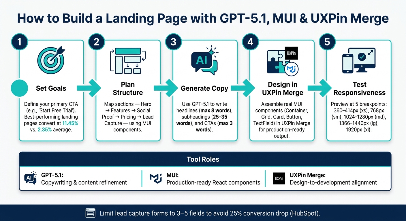
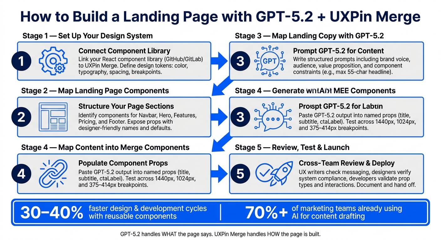
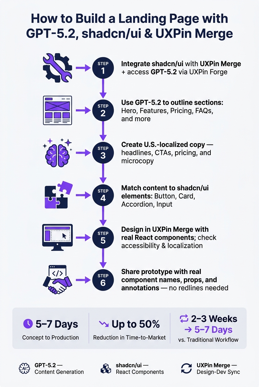
You can go from a blank page to a code-backed landing page prototype in one workflow: use GPT-5.1 for the page brief and copy, shadcn/ui for React components, and UXPin Merge to assemble the prototype without redrawing the UI.
In plain English: I’d use GPT-5.1 to map the page, pick sections like hero, feature grid, pricing, FAQ, and CTA, then build those sections with shadcn/ui components such as Button, Card, Accordion, and Badge. After that, I’d pull those same components into UXPin Merge and edit props on canvas. That cuts handoff drift and keeps design closer to code.
Here’s the whole article in a few points:
- Start with a one-page brief
- page goal
- primary CTA
- section order
- message for each section
- component notes
- Use GPT-5.1 for planning, not just writing
- section flow
- visitor intent by section
- headline and CTA options
- prompts tied to allowed shadcn/ui components
- Build reusable sections in shadcn/ui
- hero section
- feature grid
- pricing cards
- final CTA block
- Use prop-driven components
HeroSectionFeatureGridPricingSection
- Assemble everything in UXPin Merge
- connect your library
- place merged components on canvas
- edit labels, plans, icons, and states without rebuilding screens twice
- Review before handoff
- tighten copy
- check spacing tokens
- use built-in button states
- confirm focus order and color contrast
- keep pricing in U.S. format like $49/month
A few numbers from the workflow stand out:
- Hero headlines should stay around under 12 words
- Feature copy should stay near 35 words per card
- Motion should stay around 150–200 ms
- A sample goal is getting visitors to start a 14-day free trial
- A sample demo CTA is 30 minutes
If I had to sum it up in one line: GPT-5.1 plans the page, shadcn/ui builds the parts, and UXPin Merge turns those parts into a prototype your team can review and ship with less rework.
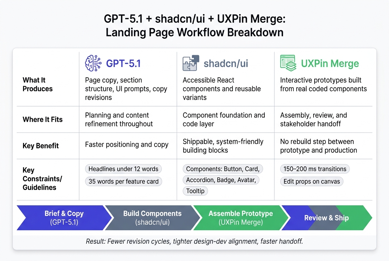
GPT-5.1 + shadcn/ui + UXPin Merge: Landing Page Workflow Breakdown
Build Beautiful Landing Pages FAST with Next.js and shadcn/ui
1. Define the landing page structure with GPT-5.1
Use GPT-5.1 to map the page message and section order before you pick components. Give the output a clear name: page brief. That brief should feed straight into the component build. After that, turn the structure into component-level prompts for shadcn/ui.
Prompt GPT-5.1 for positioning, copy, and section order
Start with a master prompt. Don’t ask for full copy yet. Ask for the sections, what each one needs to do, and what the visitor is thinking at that moment. Here’s a prompt that works well for a B2B SaaS product aimed at U.S. product and design teams:
"You are a senior UX writer and conversion copywriter for a B2B SaaS company selling a landing-page prototyping tool to U.S.-based Product and Design teams. Propose the full content structure for a high-converting landing page. Include sections in order: hero, social proof, feature grid, workflow explanation, pricing, FAQ, and final CTA. For each section, describe its purpose, what the visitor is thinking when they reach it, and the primary message. Use U.S. English and clear B2B SaaS language."
Ask GPT-5.1 to return the output as a bullet hierarchy or table so it maps cleanly to UI sections later. Then have it generate hero headlines, subheads, benefit bullets, and CTA labels.
Ask GPT-5.1 for UI prompts mapped to shadcn/ui components
Once the content structure is locked in, ask GPT-5.1 to translate each section into a component-level blueprint. Set the allowed components up front so GPT-5.1 stays inside your system:
"Use only these shadcn/ui components: Button, Card, Input, Tabs, Accordion, Dialog, Badge, Avatar, Tooltip. For each landing page section, recommend which components to use, how many, and the layout pattern (e.g., ‘3-column grid using Card components’). Return the output as a structured outline – no HTML, component suggestions only."
For the feature grid, ask GPT-5.1 to define each Card’s structure: title, icon placeholder, one to two lines of body text, and whether it should include a Badge for a “New” label. That keeps GPT-5.1 focused on section planning instead of drifting into copy.
You should also ask GPT-5.1 to tag each section as a reusable pattern – for example, “Pattern: 3-up card grid” – and suggest two to three variations for each pattern. That makes reuse much easier across other pages and helps you avoid one-off layouts that fall apart later.
Turn AI output into a buildable page brief
Pull GPT-5.1’s output together and compress it into a one-page brief. The brief should include five things:
- Primary message: one sentence
- Target user action: for example, start a free trial or book a demo
- Required sections in order
- Content hierarchy per section
- Component list with layout notes
Use that brief to build the page in shadcn/ui, then bring those components into UXPin Merge.
2. Build the page with shadcn/ui components
Build each section as a reusable component.
Build the hero section and feature grid
Use the brief to set up the hero as a two-column grid on desktop with grid grid-cols-1 md:grid-cols-2 gap-8, then switch to a single column on mobile. Put the headline, supporting copy, primary and secondary CTAs, and any social proof in the left column. Put the product screenshot or illustration in the right column, wrapped in a Card.
For type, use text-4xl md:text-5xl font-semibold for the headline and text-lg text-muted-foreground for the supporting copy. Keep the text stack tight with space-y-4, and add mt-8 before the CTAs so the actions have a bit of breathing room. For the buttons, use <Button size="lg"> for the main action and variant="outline" for the second one. A simple pair like Get started free and Book a demo works well. Under the buttons, add social proof with Avatar components in a horizontal stack using flex -space-x-2. Build the section shell first, then pass the same props into UXPin Merge.
Place the feature grid right under the hero. Use Card, CardHeader, CardTitle, and CardContent in a grid md:grid-cols-3 gap-6 layout. Each card should include:
- A Lucide icon at the top inside a
p-2 rounded-full bg-mutedwrapper - A short title with 2–5 words
- A description capped at about 35 words
Inside each card, keep spacing steady with space-y-2, and keep gap-6 between cards so the layout feels even.
Add a pricing block and CTA area
Use the brief to build the pricing section as a responsive grid of Card components, with one card per plan, inside a max-w-5xl mx-auto space-y-8 layout. Each card should include the plan name, a price in standard U.S. format like $29/month or $49/month, a short billing note such as Billed monthly. Cancel anytime, a feature list with Lucide’s Check icon, and a CTA button.
For the recommended plan, add border-primary shadow-lg, include a <Badge>Most popular</Badge>, and use a CTA tied to the result, like Start for $29/month, instead of something flat like Choose plan. For higher tiers, use an outline button labeled Contact sales. Add small bits of copy inside each card, like No credit card required and Cancel anytime. They do a lot of work in a small space.
The final CTA section should be a full-width section with a bg-muted background, a one-line headline, 1–2 lines of supporting copy, and one primary Button. Once these sections are built as reusable blocks, bring the same blocks into UXPin Merge.
Keep sections reusable and system-friendly
Define HeroSection, FeatureGrid, and PricingSection as prop-driven components. HeroSection should accept headline, subheading, primaryCta, secondaryCta, and socialProof. FeatureGrid should take a features array with icon, title, and description. PricingSection should take an array of plans with name, price, billingPeriod, features, recommended, and cta.
Use steady spacing tokens like gap-6, space-y-4, and max-w-5xl so the sections stay visually in sync no matter how you arrange them. Each component should let you swap content without touching the component code. Then import those shadcn/ui components into UXPin Merge and assemble the prototype on canvas.
sbb-itb-f6354c6
3. Bring the components into UXPin Merge

Now that the sections exist as prop-driven shadcn/ui components, it’s time to pull them into UXPin Merge. This is where the page starts to feel less like a mockup and more like the product team’s shared source of truth.
Bring those components into UXPin Merge so teams can build the landing page with the same UI structure engineers will ship, instead of rebuilding the interface from scratch.
Connect your component library and use merged components on canvas
If your shadcn/ui library is already connected through UXPin Merge, the components will show up in the component panel and are ready to drop onto the canvas.
If your team uses a custom React component library, like a shadcn/ui-based system with custom tokens, patterns, or extra components, you can connect that through UXPin Merge by linking it to your Git repository. Engineers then add the Merge config that tells UXPin which components to expose and which props should appear in the properties panel. After the build finishes, those custom components show up in UXPin just like any other merged component, and designers can use them without going into the repository.
That matters because designers aren’t guessing how a component should behave. They edit the same props engineers define in code, like variant, size, and disabled, so the prototype stays in sync with the system.
Assemble a realistic prototype without rebuilding the UI twice
Once the library is connected, you can build the prototype section by section. Drop the hero section onto the canvas and use the properties panel to match the GPT-5.1 copy, button labels, and any media or screenshot placeholders. Then add the feature grid underneath and set each card’s icon, title, and description in the panel.
After that, insert the pricing block and update the plan names and prices, such as $49/month and $99/month. Mark the most popular tier, then add the CTA section to finish the flow.
Because the prototype uses the same components engineers use, the landing page structure, props, and states are much closer to what will go live. In practice, that cuts down on back-and-forth around spacing, variants, and responsive behavior.
4. Iterate, review, and ship a stronger prototype
This is where the page stops looking merely "put together" and starts feeling ready for stakeholder review and developer handoff. The goal is simple: tighten the message, clean up the layout, and make interactions feel consistent.
Refine copy, spacing, and interactions inside the prototype
Start with the hero section. If the headline still sounds generic, shift to outcome-first copy. For example: "Ship production-ready landing page prototypes in under 48 hours." That tells people what they get, fast.
Then tighten the CTA. "Get started" doesn’t say much. "Start a free 14-day trial" gives a clear next step and sets the expectation right away.
You can use GPT-5.1 to speed this up. Feed it your current copy and give it a tight prompt like: "Rewrite this hero headline for US enterprise design leaders, under 12 words, with a clear outcome." That’s a simple way to get sharper options without staring at a blank screen.
Once the copy is set, move to spacing and motion. Give your primary CTA block more room so it stands apart from the feature and pricing sections. Don’t eyeball it. Use your system spacing tokens, like 24 px, 32 px, or 48 px, so the layout stays consistent.
For interactions, keep things grounded in the component library. Use the Button component’s built-in hover and focus states exposed through UXPin Merge instead of adding custom interaction layers. Stick with 150–200 ms ease-out transitions across interactive elements so the page feels steady from top to bottom. If you need a new interaction pattern, document it in UXPin so engineers can build it with the same props and states.
After spacing and interactions are in place, run a component audit. Make sure every major section still uses Merge-linked shadcn/ui components. Then do an accessibility pass:
- Check color contrast on primary text and CTAs
- Verify focus order on interactive elements
- Confirm all pricing uses U.S. format, such as $49/month or $99/month
Before you share the prototype with stakeholders, set the review lens. Ask them to comment on message clarity, narrative flow, and business fit, not pixel-level details. In UXPin, capture feedback on the exact merged component and mark which notes are copy-only changes versus structural changes that affect the design system.
Workflow table: what each tool does and where it fits
| Tool | What it produces | Where it fits | Key benefit |
|---|---|---|---|
| GPT-5.1 | Page copy, section structure, UI prompts, copy revisions | Planning and content refinement throughout | Faster positioning and copy |
| shadcn/ui | Accessible React components and reusable variants | Component foundation and code layer | Shippable, system-friendly building blocks |
| UXPin Merge | Interactive prototypes built from real coded components | Assembly, review, and stakeholder handoff | No rebuild step between prototype and production |
Conclusion: From AI prompt to a reusable landing page prototype
The payoff is faster iteration, tighter design-dev alignment, and a prototype that’s ready for handoff. GPT-5.1 shapes the positioning, copy, and structure. shadcn/ui supplies accessible, prop-driven components engineers can ship. UXPin Merge brings those components into one shared canvas.
When the prototype is already built from production components, the gap between what design shows and what engineering builds gets smaller. You end up with fewer revision cycles, less back-and-forth over spacing and variants, and a cleaner path from early concept to a live page.
FAQs
How do I turn a GPT-5.1 page brief into reusable shadcn/ui sections?
Map GPT-5.1 output straight to specific shadcn/ui components in the UXPin canvas. The cleanest way to do that is to ask the AI for structured JSON with fields like headline, subheadline, and ctaLabel so each value lines up with your component props.
Be explicit in the prompt. Use exact component names like Button and Card instead of vague labels. That gives you cleaner output and cuts down on guesswork when you wire things up.
Then bring those pieces into UXPin Merge and assemble them as reusable patterns, JSX presets, or grouped layouts. Think of it like giving the AI a form to fill out instead of a blank page – it makes the handoff much smoother.
What props should I expose in UXPin Merge for a landing page prototype?
Make sure your React components have a stable API with clearly defined props in TypeScript or PropTypes. UXPin Merge reads those props and surfaces them in the property panel, so editors can change them without digging through code.
For landing page components, expose clear props for the pieces people swap most often, like headline text, subheadings, CTA labels, and media slots. That makes the component easier to use and a lot harder to mess up.
It also helps to keep inputs tight. Instead of letting people type anything they want for styling, use variant props like light or dark. That gives teams a cleaner setup and keeps the UI from drifting off course.
And if you want spacing controls inside UXPin Merge, turn on useUXPinProps: true in uxpin.config.js. That lets people adjust things like padding, margin, and spacing right from the property panel.
How can I keep the prototype accessible and developer-ready?
Use UXPin Merge to build with production-grade React components from your repository. Because shadcn/ui components are built on Radix UI primitives, they come with accessibility support like proper state handling for dialogs and checkboxes.
To keep handoff quality high, define component APIs and props clearly, expose the props your team needs in the Properties panel, use token-first prompting for approved design tokens, and test interactions in Spec mode and Simulate before handoff.