Animation and motion in web design is proving to be the biggest thing in recent years. Everywhere you look, there is some hint of movement – or actual movement in the form of a video or animated tidbit.
But how do you use it? Motion is more than just a good video clip or cartoon character. Creating real motion requires a directed approach and can combine still and moving objects. Here’s how you do it. (And each tip is paired with an example to help foster your imagination.)
1. Be Subtle
As described in the free e-book Interaction Design & Animations, sometimes the best motion is hardly noticeable.
It can be a little animation that happens as you move from one moment to the next or the twirl of text as you hover over a button.
Photo credit: http://www.andyhau.com/
Designers can easily obsess over movement and animations, but users just consider them part of the experience. In either scenario, the key is that movements happen naturally without distracting from the experience. The actions should be subtle elements that contribute to the overall look and feel of a website design.
Case study: The animation is visible in Andy Hau’s website (seen in the image above) but it is not in your face. The large images work in an almost slider fashion as they zoom out from each image. If you click through quickly, you might miss it. But sit on the site a few minutes as the images cycle past, and it is almost soothing with its slow easy movements.
2. Be Direct
Use a hero video or full-screen animation to convey motion and movement. However, you’ll want to consider how you convey intent with big movements on the screen.
The caution with big movement on the screen is intent. Does the motion look like it is supposed to? Does it work with the rest of the design and overall message?
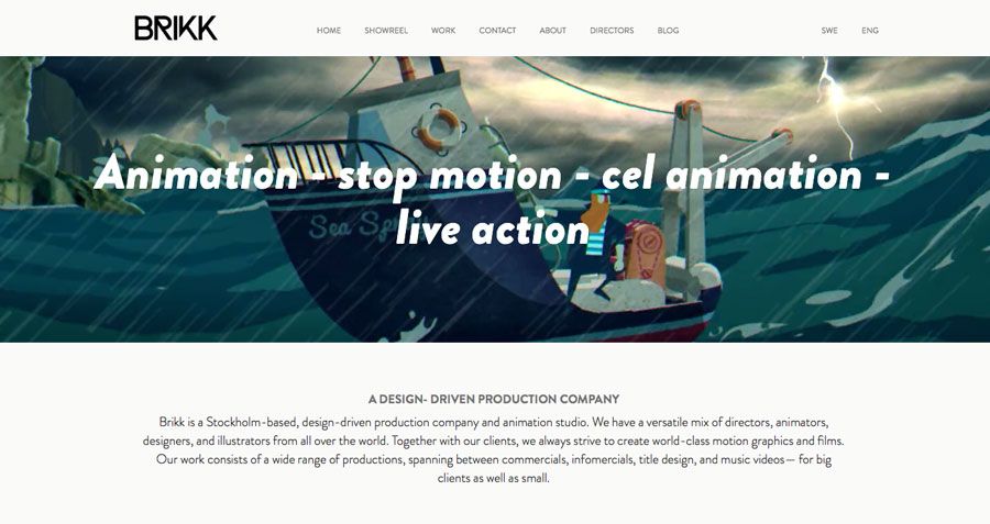
Photo credit: http://brikk.se/eng/
While this usage directly contradicts the subtle approach, either technique can create a lasting impression. When taking the direct approach, test movements to ensure that they work properly across all devices and make logical sense to users. Going with something direct like this only to fall flat, will cause users to abandon your site.
Case study: Brikk, a website animation company, uses a large video to showcase their work (see the above image). The high-color, high-animation reel is a classic example of what you think of when you hear animation. And it works for them in concert with a super simple website for all other elements. When you view the site on mobile, the animation is replaced with a static image. A smart move on their part as the heavy animation could hamper the mobile experience.
3. Imply Direction and Create Balance
Direction, balance and depth are techniques that you can use with motion, or with still objects or images (to imply motion). These elements are often used within an image, video or dominant visual to convey a specific message.
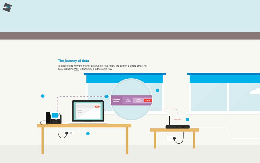
Photo credit: http://www.akita.co.uk/movement-of-data/
- Direction: Use directional “pulls”— such as arrows, people looking in a certain direction or weighted objects — to make a user look across the screen in a certain way to focus on a specific action.
- Balance: Lack of balance also creates a sense of motion. When objects lack balance or the appropriate weight, they create anticipation for falling (which is, of course, a type of motion). Object placement is also important to balance. For example, an asymmetrical framework can still lead users across the screen while at the same time creating visual interest because everything isn’t so even.
- Depth: Motion can happen in a three-dimensional space as well. Depth can create a feeling of distance, which can give a user the feeling of being in the place where the motion is happening.
Case study: The Journey of Data uses subtle animations that guide you through the website from element to element with the goal of teaching users how email works. But even without the small bits of animation, the dotted lines create an almost moving path that directs the eye on how to navigate through information.
4. Do the Expected
Objects in motion should move as expected. Actions and interactions should mirror reality, making digital objects work just like their physical counterparts.
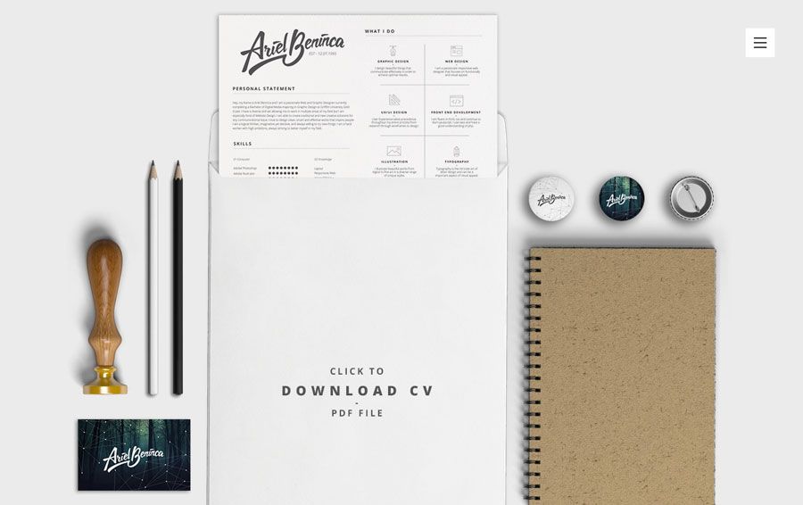
Photo credit: http://arielbeninca.com/
This is a vital concept, especially for app and mobile elements where users will constantly touch the screen to perform tasks or actions. .
Think of it this way. You have a music app with a volume knob on the screen. It should turn clockwise to increase the volume and counterclockwise to decrease the sound because that’s how it would work in the physical world. As described in the free -ebook Consistency in UI Design, your site or app should remain consistent with familiar patterns so users don’t get confused.
That’s one of the reasons gravity, for example, is so important for motion. Great user experiences are rooted in reality and great digital interfaces work similarly.
Case study: While there are varying scroll animations taking you through Ariel Beninca’s website, the most on-point movement is near the end of the scroll when the resume is placed inside (or pulled out of, depending on which way you scroll) of an envelope. The motion is in perfect sync with how it would actually happen on a screen with other perfectly realistic objects.
5. Watch Your Speed
The biggest missteps when it comes to motion are often speed and timing. When things work too quickly), it’s jarring and can make users feel uneasy, even if they can’t identify the root of the issue.
Users will feel like they’re losing control if everything works too slowly.
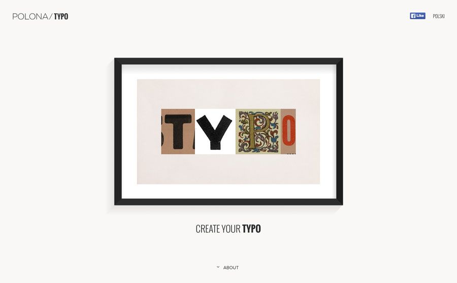
Photo credit: http://typo.polona.pl/en/
You can think of timing and speed almost like you would think of a movie. Imagine you are filming and then watching the motion from your screen frame by frame. Can you take in all the information before the next action occurs? Are you waiting for the next thing to happen?
Speed also creates an emotional and physical response from users. Quick-paced action can feel chaotic and rushed, while slower movements are relaxed or could be considered lethargic. Match the pace of movements to the speed of actions you hope users will take: Do you want them to do something quickly (such as sign up for a form or make a purchase) or hang around the site for a while and explore?
Case study: Polona Typo uses animated lettering, shifting between different typefaces inside a photo frame to encourage you to perform an action. The speed of these motions is what makes this site successful – the letters are odd bits of typography that are still easy to read and understand because they move slowly. (Play around with this site — it will combine letterforms and make any word of your choosing.)
6. Tell a Story
For motion to have purpose and intent, it is should do something.
When it comes to your message or brand, that “something” is to tell a story.
Photo credit: Washington Post
But don’t overthink it. Motion does not have to tell the history of your company. Motion can tell a story that happens in an instant or moment, such as how to click a button or how to interact with your site. When it comes to your story, think about what users should take away – is it to perform an action based on the message (call to action) or to remember who you are (informational)?
Let the answer determine the type of story you tell.
Case study: This history of icon design from The Washington Post blog above shows us how each famous logo has changed over the years. The quick animations for each logo blend so you can see the changes from logo to logo. While the speed of motion might be a tad fast, the end result is a beautiful visual story.Without even reading the text, you can see the evolution of each company mentioned.
7. Determine How to Use Motion – For the Interface or for Aesthetics
Proceed with caution. Too much movement can make a user motion sick. Seriously.
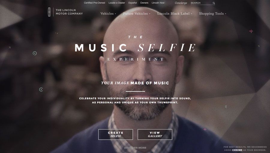
Photo credit: https://securemg.lincoln.com/musicselfie/
Do you want to visit a website that uses parallax scrolling effects with dancing characters on the screen and buttons that change shape every time you whisk the cursor by? Probably not. It would be quite overwhelming.
So decide how movement is used in your framework – is it a tool or a visual?
Case study: The Lincoln Motor Company does something here that breaks all the rules. The site uses motion as part of the interface and for aesthetics. It’s a difficult design to pull off, but here it comes together.
Think of it this way. The small divots – did you see them before we pointed them out? – are purely visual. There are other visual cues as well, including the main hero video. Then there are the user tools, such as hover states for the buttons and a cool loading animation. (And if this concept does not work for you, any click takes you to a more traditional cars sales site.)
Conclusion
There’s plenty of ways to use actual or implied movement in web design projects. Work with purpose and intent to find the most success. Remember that motion, movement and animation should have a life-like quality (or be so fantastic no one would ever mistake it as an attempt at reality). Whether you’re building web applications, mobile apps, or simple websites, tools like Adalo can help you implement these motion design principles effectively through its no-code app builder that supports visual design with smooth animations and transitions.
Motion and movement in web design will only continue to grow and evolve in the years ahead. Don’t forget that motion is just as powerful a tool for transitioning users between content as it is for adding a bit of background visual delight.