
With examples from Dropbox, Gmail, and more, here’s a no-nonsense guide to creating user experiences that are so natural, they feel invisible.
When you examine the most successful interaction designs of recent years, the clear winners are those who execute fundamentals flawlessly, like Gmail’s autosave function and Uber’s credit card entry form. They feed off natural human behavior, then quietly remove barriers without us ever noticing.
When we talk about invisible design, we aren’t just describing minimalism. Minimalist interfaces are certainly a way to achieve invisible design, but they are not the goal.
The goal is to create an interaction system that naturally aligns with the user’s mental models. Simple user flows, clear visuals, and forgiving design help create the illusion that the user’s abilities, not the designers’, allowed for a seamless experience. Remove any sign of your ego from the interface, and the user will start to feel like the hero.
Simplify your user flows
A simple user flow doesn’t always show off your design skills, but it does help users achieve their goal. Here are some ways to get users to their goals faster:
- Fewer steps — List out the steps required to complete a task, then remove redundancies. For example, to log in a user (1.) clicks in the username field, (2.) types their username, (3.) clicks in the password form field, etc. You can see how, if you make the default cursor position start in the username field, you shave off an unnecessary step. Try listing them out backwards for a fresh perspective.
- Simpler steps — The goal is not to make as few steps as possible, but the simplest steps. Make an interface that’s self-explanatory, and don’t bog down users with too many decisions. Don’t obsess over the three-click rule, the idea that users will leave your site if they have to click more than three times, but recognize the spirit behind it.
- Map user flow — Jessica Downey has a helpful method for mapping user flow. Ryan Singer of Basecamp has a similar but faster approach.
- User testing — Guesswork is unreliable. Test at least five users to see how they instinctively try to complete a task. This gives you more informed data when applying the other steps above.
Let’s look at three examples of simplified user flows in action (as further detailed here):
1. Uber
Credit cards are notoriously tedious to enter, especially on a mobile phone, but Uber lets users snap a photo of their card to capture all of the information.
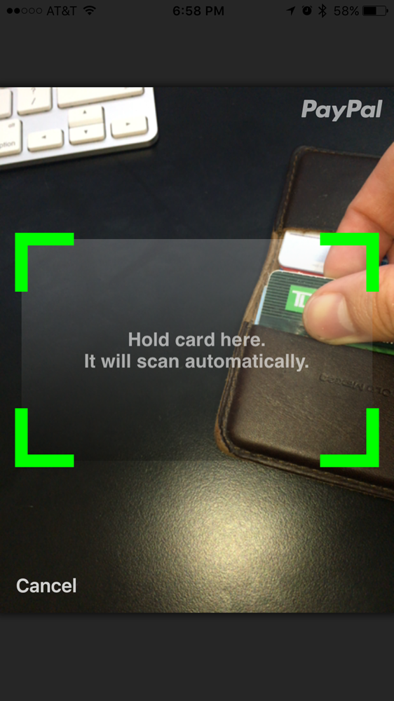
They’ve shortened the payment user flow from:
- Type in First Name
- Type in Last Name
- Type in all digits of credit card
- Type in security number
To simply:
- Take photo of credit card
For a user, the experience isn’t just useful, it’s nearly magical.
2. Dropbox
Dropbox’s entire service is a simplified user flow of the otherwise tedious task of uploading and downloading a large number of files individually.
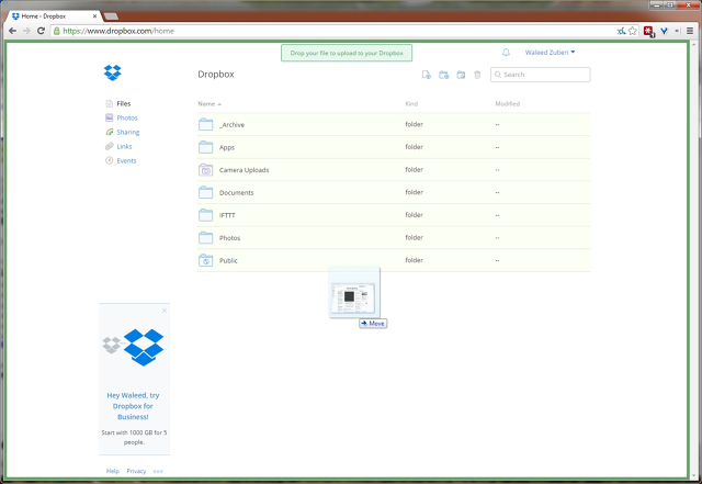
Dropbox created a much faster shortcut by introducing system folders.
Going in, most users are already familiar with how folders work, so this is simpler for them. But more importantly, they can upload/download all their documents in one or two folders. Add to that a simple drag-and-drop functionality.
3. Oscar Insurance
Other insurance sites typically have multiple form fields with information that’s not always relevant. Oscar Insurance brings the industry up-to-date with a modern—and simple—form entry.
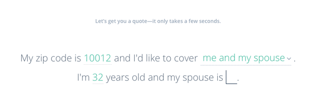
Other form fields aren’t revealed until the current one is answered.
This prevents too many fields from overwhelming the user, and clearly shows him or her the next step. And the entire process is simplified with the use of a “Mad Libs” UI pattern—this makes getting an insurance quote almost enjoyable, something no one would’ve ever guessed possible.
The semantic forms match the way users think, making the design feel invisible. The barrier between the user wanting a quote and completing the process is dramatically reduced.
Communicate clearly
Every time a user is confused, it adds friction. Clear communication is the ultimate goal of invisible design.
Everything in an interface is communicating something—spacing and size communicate importance, colors communicate mood, styles communicate atmosphere, and so on.
All the individual messages must combine to communicate in sync. With as little thought as possible, a user must know what a site or app does and why he or she should care.
Follow this checklist to make sure your meaning is clear, and therefore the design invisible:
- Interactions rooted in reality — Whenever possible, use human mentals models from everyday life. For example, increasing volume is often represented in images moving upwards or getting bigger. This just feels “right.”
- Legibility — For clear communication, all text must be readable. Stick to the proper guidelines for spacing between lines/letters, and useColor Safe to determine the ideal font colors to contrast clearly against the background.
- Consistent mood — You wouldn’t use a casual typeface for the subtitle to a tragic photograph. Keep a unifying theme for all imagery, typefaces, and colors to set the mood you want, and tie everything together nicely. This includes content, like the subjects of images and the tone of the copy.
- Signifiers — Easily recognizable UI patterns are automatically understood from the user’s previous experience on the web. Signifiers, like a play button over an image to signify video, send a universally understood message without wasting time.
- Microinteractions — Small design choices, like an interactive element changing color when hovered over, can fill in the cracks in how your interface works. These subtle cues often communicate without the user even realizing it.
Let’s see how these principles are applied in the examples below:
1. Integrated Podiatry Clinic
Long scrolling sites must immediately communicate their method of navigation, otherwise users might be confused by a lack of menus.
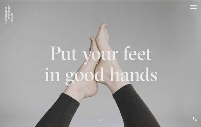
The Integrated Podiatry Clinic solves this problem using signifiers and users’ own mental modes. The door arrow at the center bottom is enough to suggest scrolling, especially with a minimal design, which keeps users from getting distracted. Some users may even recognize the signifier from other sites.
Notice what the visuals say about the site and the company: the gray color has the appropriate professionalism of a clinic, while the feet image and clever tagline make it feel human at the same time. The step lego in the bottom right maintains the podiatry theme.
From the clever copy to the soft tones, the interface is designed to communicate that the clinic is staffed with experts who care about their patients.
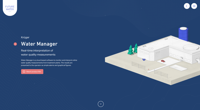
2. Future Water City
Future Water City uses microinteractions and signifiers to explain what would be an otherwise confusing interface.
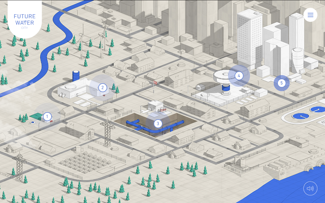
Because the circled numbers aren’t a strong enough signifier on their own, they periodically pulse with color to show that they are interactive.
Microinteractions with the cursor also show how the site work. When it hovers the map, it turns into an open hand (signifying click-and-pull navigation). When it hovers over a number it turns to a single finger (signifying clickability).
From a user flow standpoint, the interaction design also shortens the perception of distances between different types of content. For instance, when you click on a numbered bubble, a slideout appears on the same page, which you can click to trigger another slide-out that explains the product.
You don’t move from page to page. You move between frames on the same page.
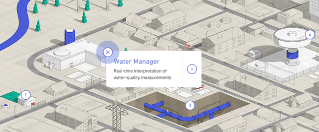
Technically, the content is presented in the same number of steps, but the smooth transitions between frames creates the illusion of weightlessness.
Forgive your users
For a truly invisible design, the UI must always forgive user errors. If a user makes a mistake that can be fixed easily (or the design prevents a mistake), the user feels empowered.
Consider the following tips:
- Undo vs. Confirm — Popular opinion is that Undo creates a smoother interface than Confirmations about consequential actions. AsAza Raskin explains, users develop a habit loop with popup windows, where they might click “Okay” before fully understanding what they’re confirming. Moreover, making confirmation windows flashy or embedding them with an activity that requires thought (like typing a specific codeword) doesn’t work either—such bells and whistles only distract the user from her decision, or irritate her so that she leaves the window even faster. An Undo feature accounts for the habit loop instead of challenging it. There are some exceptions, namely when undoing is complicated, as with publishing something publicly, or for critical actions (like deleting a whole email database).
- Forgiving format for inputs — Input forms can be confusing: for example, in Yelp, users may want to search for type of food or a specific restaurant. The forgiving format UI pattern allows users to type in what they want, then sorts it out on the back end. Announce this feature through input hints, like Yelp’s placeholder text, “tacos, cheap dinner, Max’s.”

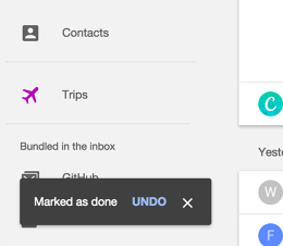
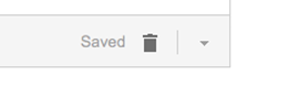
- Autosaving — Cheap data storage makes autosave a great protection against users losing data, whether caused by human error or something else, like a browser crash or power outage. To maximize its effects, create a subtle indicator (see Gmail’s example below)—something that doesn’t require interaction, so not to distract.
- Exceptional error feedback — You can’t always defend against errors. When they do occur, provide feedback in a helpful way to get users back on track. Clearly explain what happened and how to rectify the situation. Provide a call-to-action for the next step. Keep it succinct; users will likely be skimming anyway.
Conclusion
The point of invisible design is to get out of the way as much as possible.
Any elements that threaten to distract the user from his goals should be removed, no matter how much the designer likes them. Learn to separate which aspects are genuinely impressive, and which are only impressive to other designers. If your users don’t notice how much effort you put into the design, that means it’s working.
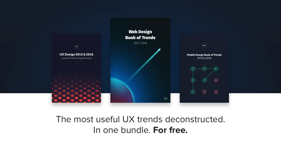
For more UX best practices, check out the free 2016 UX Design Trends Ebook Bundle. The bundle includes 350+ pages of advice and 300 examples of the best UX, web, and mobile designs.
“Originally posted on FastCo. Design”

