Hick’s law basically states that the time it takes to make a decision increases as the number of alternatives increase.
Origins of Hick’s Law
It is named after American and British psychologists Ray Hyman and William Edmund Hick. In the 1950s, they sought to study the effect of the number of stimuli present on a person’s reaction time to an individual stimulus.
Their findings suggested that users given more options take longer to choose which to interact with.
Hick’s Law & Web Design
This law found broad application in user experience design, because not only did it reduce users’ confusion, but also increased conversion rates of call-to-action UI elements.
It basically boils down to scaling down the number of options available to streamline decision-making and reduce user response time. It’s become one of the strongest user experience and design principles we have.
Does Hick’s law enforce reduction at all cost?
Imagine a credit card form that would allow payments by one type of card only or an online t-shirt store that lets you buy only one size. :) That seems not to be the case here.
A very similar problem of choice paralysis was described in a study called: “When Choice is Demotivating”. In a famous “jam experiment” the researchers set up a display featuring a line of exotic, high-quality jams, customers who came by could taste samples, and they were given a coupon for a dollar off if they bought a jar. In one condition of the study, 6 varieties of the jam were available for tasting. In another, 24 varieties were available. What did they find?
Of the 242 customers who passed the extensive selection display of jams, 60% (145) actually stopped at the booth. In contrast, of the 260 customers who passed the limited-selection
display of jams, only 40% (104) stopped.
However, that doesn’t tell the whole story.
“Is the initial attractiveness of extensive choice also reflected in subsequent purchasing behavior? Our findings suggest not: Nearly 30% (31) of the consumers in the limited-choice condition subsequently purchased a jar of Wilkin & Sons jam; in contrast, only 3% (4) of the consumers in the extensive-choice condition” (Source)
So how to avoid the choice paralysis and Hick’s law adapt to contemporary web design needs?
Adapting Choice Paralysis & Hick’s Law To Modern Design Needs (with Examples)
We took some of the best work from the UX Patterns gallery to illustrate some ideas to answer that question. Click the wireframes to upload them completely free to your UXPin account and start tinkering right away. If you’re new to UXPin, it’s a good way to start a free trial, click the wireframe you like to sing up for free.
Dropdown menu from Dishizzle
How to apply Hick’s law to a drop-down menu design where you’ve got to expose several content groups? Well, here’s an idea from Dishizzle – good categorization and corresponding visual code.

Header from Typecast
This one is quite obvious – the signup button stands out quite clearly and the only other alternative within the nearest area is the “Find out more” link, which visually has inferior visibility. It’s a good idea to resist the temptation to fit everything-that-is-important in attention drawing hot spot. :)

If you want a yet clearer example of this technique, check out the next wireframe:
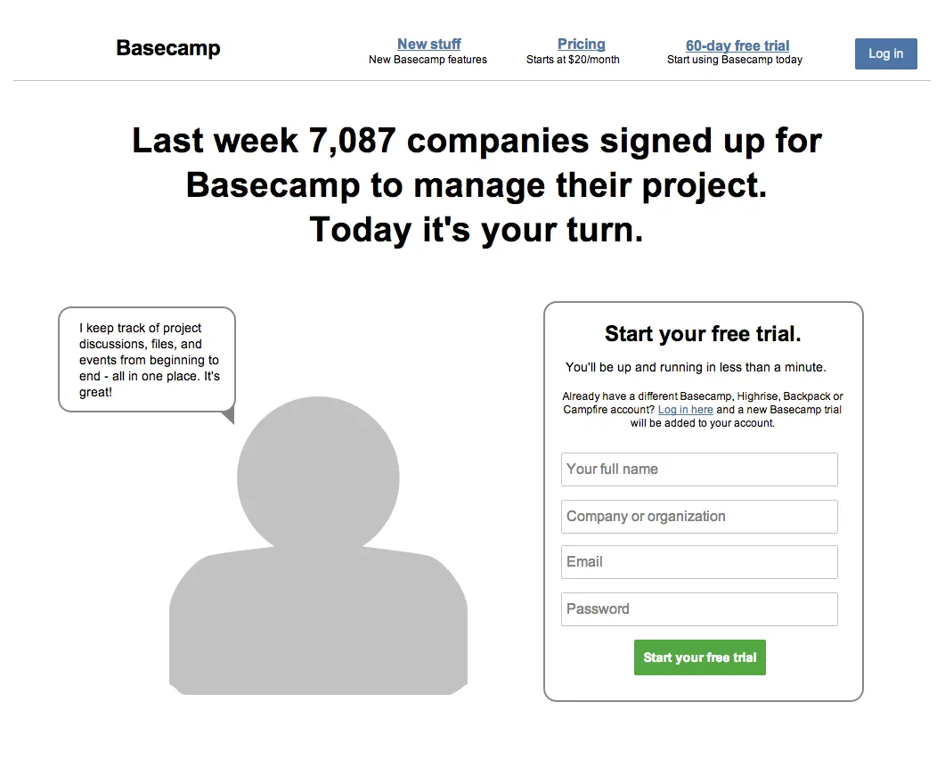
Sign up from Basecamp

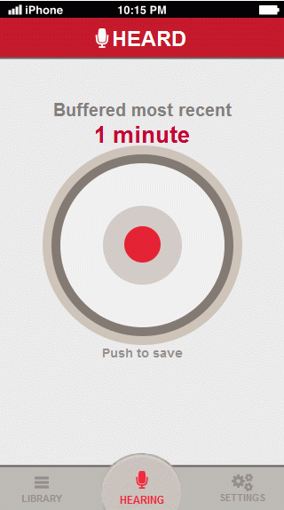
Main screen from Heard
Heard is a type of app where time really matters. Thanks to the visual “hegemony” of the record button there is really just one thing to do here.

Search from Gigfi
No tags, no categories, just a search bar. There’s nothing more frustrating than setting up an “advanced” search that eventually goes wrong (and when you go back and discover all that carefully customized search is gone – that’s a true “Hulk moment”). If you want your customers to try the app and discover its functionality themselves, then you should let them do it. :) Gigfi bet on simplicity and curiosity that drives even the most daring decisions in people’s lives. See if you this would work your service, here’s the wireframe:

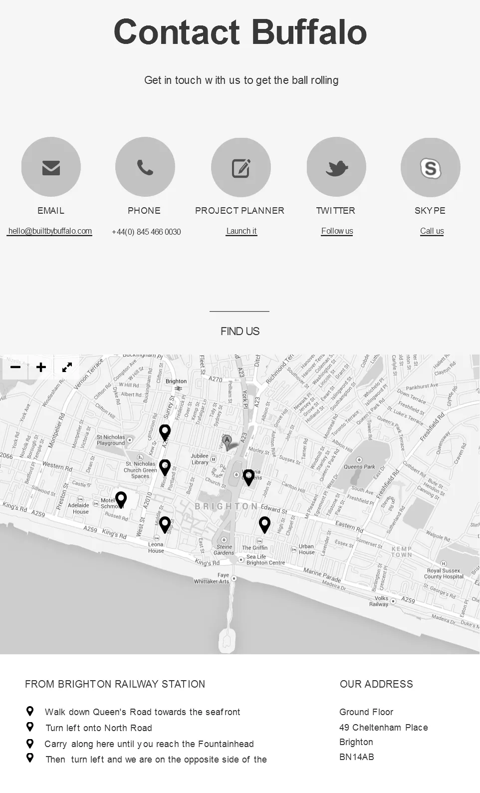
Contact Page from Buffalo
Another way to incorporate Hick’s law to your web design is segmentation. You will make your 40ish elements more clear if you put it into groups, just how Buffalo divided its contact page:

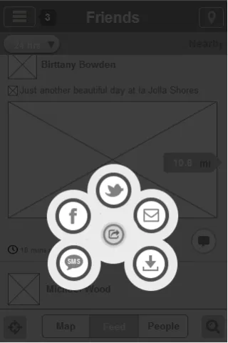
Multishare button from Ban.jo
Another technique of applying Hick’s law to web design – moving out of the context or layering. This wireframe simulates the lightbox effect that sets everything that’s not a part of the multi sharing button to background, so you don’t have any unnecessary alternatives.

Apply Hick’s Law To Your Own Designs
As interesting a concept as it is, Hick’s Law is difficult to use in design practice.
Whether you’re designing a homepage, menu items, a shopping cart, payment process or something else, it’s difficult to nail down a UX or interface design that captures this concept perfectly.
…But you can try. If you’re interested in getting started, check out our ebook on UX design for beginners for some other tips.


