App Icon Design – 5 Amazing Ideas from Tech Companies
One of the most critical choices any app development company will make is the design of the app icon. Good icons are inviting and will increase interaction, while a bad design can slow down adoption and make users less likely to use it. Their first impression will be your app’s icon – it’s what they’ll first see from whatever store they first download your newly-released product, and it’s what they’ll look at every time they launch it.
Getting the right depiction is not just nice to have; it’s essential if you want your app to be successful. Fortunately, when it comes to crafting icons, there are plenty of places and companies from which to draw inspiration. In this article, we’ll talk about what five top tech companies are doing for app icon design – and what you can learn from these amazing designers.
Key takeaways:
- App icon design needs to meet a combination of criteria, including aesthetics, functionality, brand representation, and platform-specific considerations.
- When considering designing your own icons, consider tips by top companies, such as Apple’s emphasis on simplicity or Microsoft’s Fluent Design System balancing innovation with legacy.

What is App Icon Design?
App icon design involves creating the perfect icon for your app. It often encapsulates the app’s brand, purpose, and primary features, distilling these elements into a simple, memorable image. Consider color choice, shape, and scalability factors when designing an app icon.
Furthermore, designers must keep in mind platform-specific guidelines. iOS, Android, and other operating systems have unique design standards to ensure a coherent user experience. We’ll discuss those in more detail when we look at what popular tech companies do for their app icons.
In essence, app icon design is a blend of aesthetics, functionality, and brand representation, all confined within a small visual space. Given its impression on users and the limited pixel space, getting the best app icon design is crucial.
What Top Companies Say about App Icon Design?
When it comes to design, there’s a lot to learn from the top tech companies as they often employ some of the highest-talent designers on the market. And their market leader position means they usually can set some of the trends. Here’s what Apple, Microsoft, IBM, Atlassian, and Google are doing for app design.
1. Apple
Many people regard Apple as the leader in design. From iconic devices to amazing apps, countless companies look to them for inspiration. Like many platform developers, Apple lists their best practices online. In terms of icon design, here are the three key takeaways from the brand.
First, simple is better. Think about all the memorable icons you’ve seen. Let’s take Facebook or Twitter’s old logo. These are simply a bird and an “f,” respectively. Now, think about Apple’s designs. Apple Music, for example, is nothing but a couple of notes. Each of these icons embraces simplicity. Remember, these graphical depictions tend to be pretty small on user devices. Crafting intricate details gets lost quickly. Great app icon design is bold and recognizable – it’s simple and easy to spot in a sea of apps. Think about how you can make your icon design process result in something simple!
Next, remove text, if possible, or at least keep it to a minimum. Only include text if it is a vital part of your brand. Too many people want to include a company name or a tagline, but that’s often hard to read, especially on smaller devices. Keep your app icon graphical, if possible.
Finally, consider your platform and create alternate app icons if necessary. What looks good on iOS with the rounded corners may not look as good on Android with the circular design. By considering (and tailoring your app icon, too) the platform, you’ll create a unique but unified experience, no matter where people use your app.
2. Microsoft
Microsoft’s Fluent Design System encapsulates the future of user interface and experience design, all while ensuring a profound connection with the company’s historical roots. Regarding app icon design through Fluent, there’s an evident synthesis of past, present, and future – something that designers of modern apps should consider!
Fluent-based icons go beyond mere aesthetics. While they embrace depth, light, motion, and materiality for a modern and interactive user experience, there’s a foundational respect for Microsoft’s legacy. The challenge lies in striking a balance: how does one innovate while respecting and recalling the iconic imagery from earlier software generations? Microsoft wanted to create a facelift for their products while keeping much of that history. Here are a couple of rules they applied:
Going beyond monochrome. Microsoft’s answer is layered and dynamic icons that nod to the past. These icons maintain familiarity, ensuring long-standing users feel at home while drawing new users with their contemporary look. Color palettes resonate with both legacy themes and modern design paradigms. The textures and materials are current and modern but reminiscent of a tactile, real-world experience.
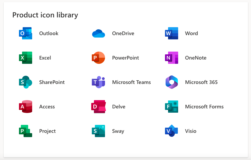
Balancing legacy with innovation. If your company is not entirely new, there’s much to learn from what Microsoft did with Fluent. In the design process for your app icon, nodding to your company’s history while simultaneously conveying your company’s fresh, new app is vital. By looking at what Microsoft did with Fluent, you can see how to balance that rich history while conveying the bold future you want for your app and company.
3. IBM
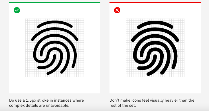
People may not think of IBM when they think of apps, but they have developed a compelling design system called the IBM Design Language. Designers should consider a few things that IBM has noted, as these concepts serve as guidelines for our app icons.
Central to their icon design philosophy is the categorization into four distinct groups: “stroke” and “fill” icons, hero brands, third-party logos, and the unique IBM Plex app icons. This concept hints at something very critical for app icon design – space. Is your icon a stroke icon? A fill one? How are you using the app icon’s available space, or are you using negative space? These are essential considerations.
Additionally, IBM applies the same grid for all icons. Designers craft every IBM icon on a pixel-based grid measuring 32px x 32px for uniformity. This serves as a foundational guideline, ensuring each piece of artwork snaps perfectly into place. However, designers are encouraged to make fine-tuning adjustments during creation to achieve the desired shape.
IBM also maintains icon consistency by creating icon groups. This is vital if you have more than one app because it lets people subtly know that your company is behind all of them. It is not just IBM that does this, of course – so do Apple and Microsoft. You can often tell which company is behind an app just by looking at the icon!
If you’re a designer, it’s worth flipping through the IBM Design Language, as it has many fantastic pointers to achieve the perfect design.
4. Atlassian
As is often the case with any visual art form, various designers and companies have different perspectives. Atlassian emphasizes some things the previous companies have not mentioned – accessibility and avoiding inundating users.
In today’s modern world, accessibility is not a nice to have. It’s a must. Ensure your app’s icon is accessible. This means it should adhere to WCAG contrast ratios and there should be no text with unfamiliar icons. You want people to immediately grasp what your icon and app are about, regardless of their abilities.
Additionally, Atlassian also encourages people to avoid going overboard with icons. Keep them simple and clean to minimize “icon fatigue.” People look at dozens of app icons daily, and if yours is too visually cluttered or intricate, they will tune out from your app rather than lean into it.
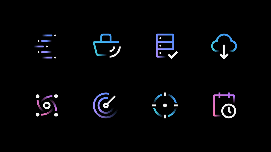
5. Google
Like all the companies above, Google also significantly emphasizes its icons through Material – Google’s app icon design system. While Material has numerous paradigms, three that designers should consider stand out.
First, think about color. The Material guidelines specify which colors to use for active and inactive icons. Additionally, you should differentiate between active and focused versus just active. Designers often leave out the focused state, especially for apps with touch capabilities.
Next, make complex icons legible. As the companies above note, these must be readable, and Google is no exception to this policy. If you need to adjust icons to ensure they are legible and clear, do so, even if they are system icons.
Finally, Google’s system icons with Material are bold, symmetrical, and minimal. They convey just the amount of information necessary for the user to determine what the action behind the icon does. This design principle is worth considering with your app icon design.
For example, the icons below show just enough information to convey their meaning without being overly complex.
Use UXPin to Prototype Your App Icons
UXPin is the leading solution for crafting user interfaces and prototyping apps. It is also one of the best ways to prototype your app icons and see how users will react to them before finalizing every single little detail across multiple platforms. As you can likely see from the examples above, companies put tremendous thought into app icons to ensure they convey the right message and feel for an app. For teams building apps without developers, Adalo’s no-code app builder pairs icon design with full app creation capabilities, letting entrepreneurs and business teams design, build, and publish custom apps to the Apple App Store, Google Play Store, and web from a single project.
If you’re in the design phase for your app, try UXPin for free and prototype your perfect app icon!


