

How to build a landing page using Claude Opus 4.5 + shadcn/ui – Use UXPin Merge!
Use AI for copy, map a 6-part blueprint, then assemble code-backed components in UXPin Merge to speed prototypes and handoff.
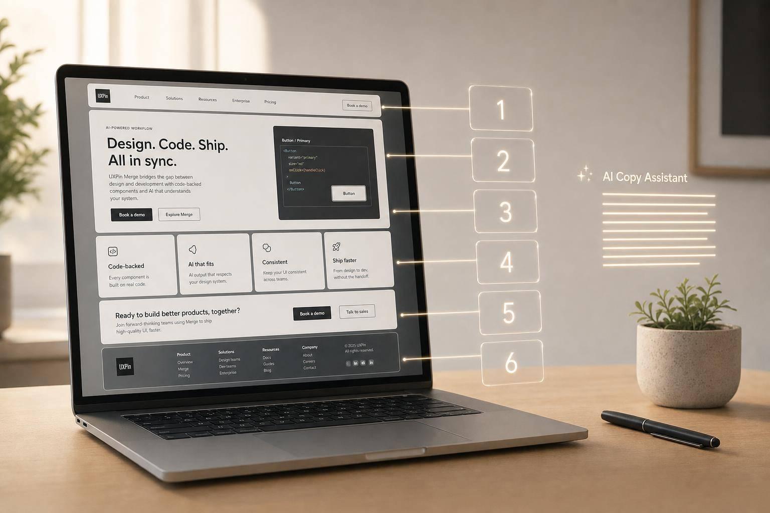
You can build a landing page faster when you split the job into two parts: first, I use Claude Opus 4.5 for copy and page flow; then I build the page in UXPin Merge with shadcn/ui components. That cuts rework, keeps the prototype close to shipped code, and makes handoff simpler.
Here’s the core idea in plain English:
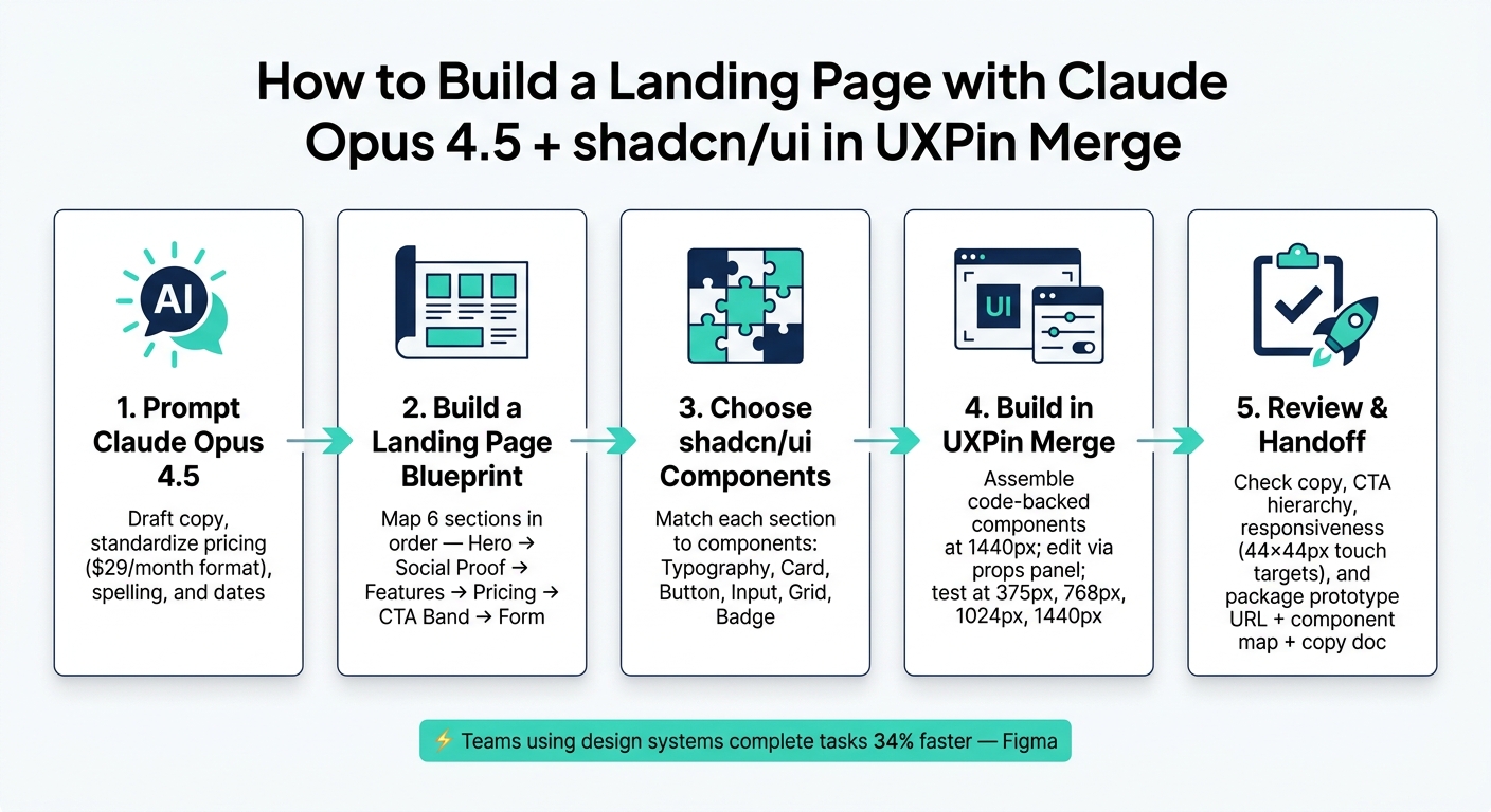
- I use Claude to draft and clean the message
- I turn that draft into a 6-part page plan
- I match each section to shadcn/ui components
- I assemble the page in UXPin Merge
- I review copy, layout, CTA order, and mobile behavior before handoff
One stat stands out: teams using design systems complete tasks 34% faster, according to Figma. And that matters because landing page work often slows down after design – when spacing drifts, parts get rebuilt, and developers have to guess what the mockup meant.
The article walks through a simple page structure:
- Hero
- Social proof
- Features or benefits
- Pricing
- CTA band
- Lead form
I like this workflow because it keeps the page focused. One section, one job. The hero states the offer. Social proof builds trust. Pricing explains cost. The form asks only for the fields needed to convert.
It also stresses a few formatting rules that save time later:
- Keep pricing in forms like $29/month or $29/year
- Use U.S. spelling
- Keep hero copy short
- Limit pricing to 2–3 tiers
- Check layouts at 375 px, 768 px, 1,024 px, and 1,440 px
- Keep touch targets at 44 × 44 px or larger
There’s also a strong build rule here: use component props and spacing tokens instead of drawing loose shapes or manually nudging items. That helps the prototype stay close to what developers will build.
One note: the source text appears to include a pasted error inside the form-formatting part. The intended point is still clear: use realistic field formats for phone numbers, dates, and money values before review and handoff.
If you want a short version, it’s this: write with Claude, structure the page, build with code-backed shadcn/ui parts in UXPin Merge, then review for reuse, spacing, and responsive behavior. That’s the full workflow in one line.
How to Build a Landing Page with Claude Opus 4.5 & shadcn/ui in UXPin Merge
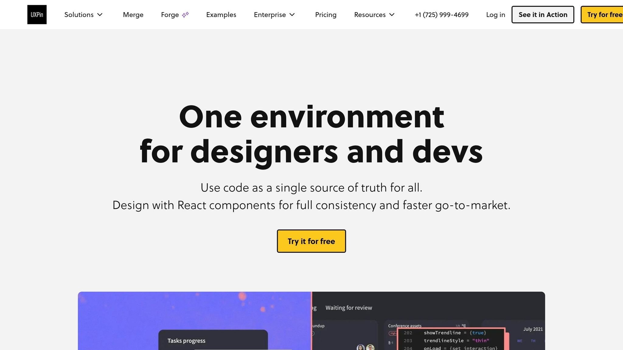
UXPin Merge Tutorial: Intro (1/5)
sbb-itb-f6354c6
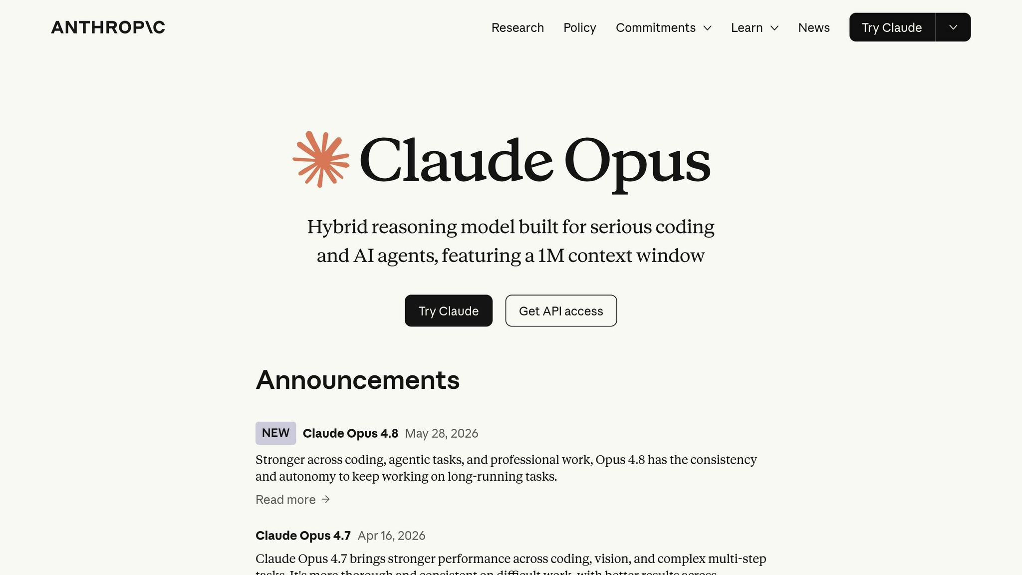
1. Prompt Claude Opus 4.5 for copy and page structure
Keep prices in $29/month or $29/year format. Standardize spelling and dates before handoff. Those small formatting checks cut review delays and help the same content move cleanly into shadcn/ui components and UXPin Merge without extra fixes.
Once the copy, dates, and pricing are standardized, move the content into your blueprint.
2. Turn Claude output into a landing page blueprint
Once your copy is clean and standardized, the next move is to give it structure. A blueprint is a content map. It shows what goes where before design begins. That map helps you move from a rough draft to the right set of components.
Map the section order from hero to form
Give each section one clear job. A common high-conversion flow looks like this: Hero → Social proof → Features/benefits → Pricing → CTA band → Form.
Here’s how to use Claude’s copy in each part:
| Section | Job | What to pull from Claude |
|---|---|---|
| Hero | State the offer and prompt the first action | Strongest value proposition, concise subheading, primary CTA phrase |
| Social proof | Build trust after the hero | Customer quotes, logos, or metrics |
| Features/benefits | Explain how the promise is delivered | Feature and benefit bullets grouped by theme |
| Pricing | Make cost and value easy to compare | Plan names, price points in USD, short value descriptors |
| CTA band | Restate the main CTA for scrollers | Reuse the hero’s core benefit line and button label |
| Form | Collect only the fields needed to convert | Essential fields only, such as email, name, company, or role |
The order matters. Put testimonials before pricing, for example, and you build trust before asking for commitment.
Once the flow is set, you can pair each section with the right shadcn/ui component.
Define hierarchy, spacing, and content limits before designing
Before you open UXPin Merge, lock down three things: heading levels, spacing rules, and content limits per section.
For heading hierarchy, use one H1 in the hero, H2s for each main section, and H3s for cards or items inside those sections. That keeps the prototype semantic and accessible.
Content limits matter just as much. Keep the hero heading to 12–14 words max, the subheading to 20–35 words, and the primary CTA label to 3–4 words. For feature cards, aim for a short title under 6 words and no more than 2 supporting sentences. Pricing should stay at 2–3 tiers with 3–5 bullets each, shown in clear USD pricing like $49/month or $199/year.
These limits help the copy fit inside shadcn/ui layouts and reduce truncation. They also make the next step – component selection in UXPin Merge – a lot faster.
3. Choose shadcn/ui components for each landing page section
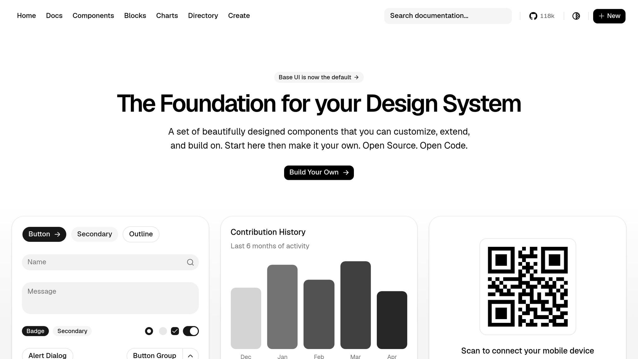
With your blueprint locked in – section order set, heading levels in place, and content limits agreed on – the next move is choosing the right shadcn/ui components. Match each blueprint section to the components that fit it best. Start with the hero, then use that same decision process across the rest of the page.
Match hero, testimonial, pricing, CTA, and form sections to components
Use the table below to pair each section with a component pattern.
| Section | Core shadcn/ui components | Key design decisions |
|---|---|---|
| Hero | Typography, Button (primary + ghost), Card or image container, responsive layout | Choose a centered stack, split layout, or full-panel visual based on product complexity |
| Testimonials | Card, Avatar or Image, Typography, Grid or Stack | One card pattern repeated across the grid; consistent quote and attribution placement |
| Pricing | Card, Badge, Button, List, Grid | Multiple tiers in a responsive grid; Badge for "Most Popular"; clear USD pricing |
| CTA band | Typography, Button (primary + link-style), Section container | Full-width band using shared background and spacing tokens; one primary action, one secondary |
| Form | Input, Label, Select, Checkbox, Button, Form wrapper | Pair every input with a Label; model validation and error states using the same props developers use |
For a simple offer, a centered stack usually does the job. If the product needs more context, use a split layout so the copy and visual can work side by side.
Testimonial and pricing sections use almost the same thinking. For testimonials, set one card pattern – quote text, name, role, company, and an optional avatar – then repeat it across the grid. For pricing, the Badge component handles the "Most Popular" callout neatly, while the Grid drops from three columns on desktop to one column on mobile using shared spacing tokens.
Keep the page consistent with shared tokens and repeated patterns
Use the same spacing, type scale, radius, and button variants across sections to keep the page consistent and easy to build. Shared rules also make the prototype faster to put together and simpler for developers to extend later.
4. Build the landing page in UXPin Merge with code-backed components
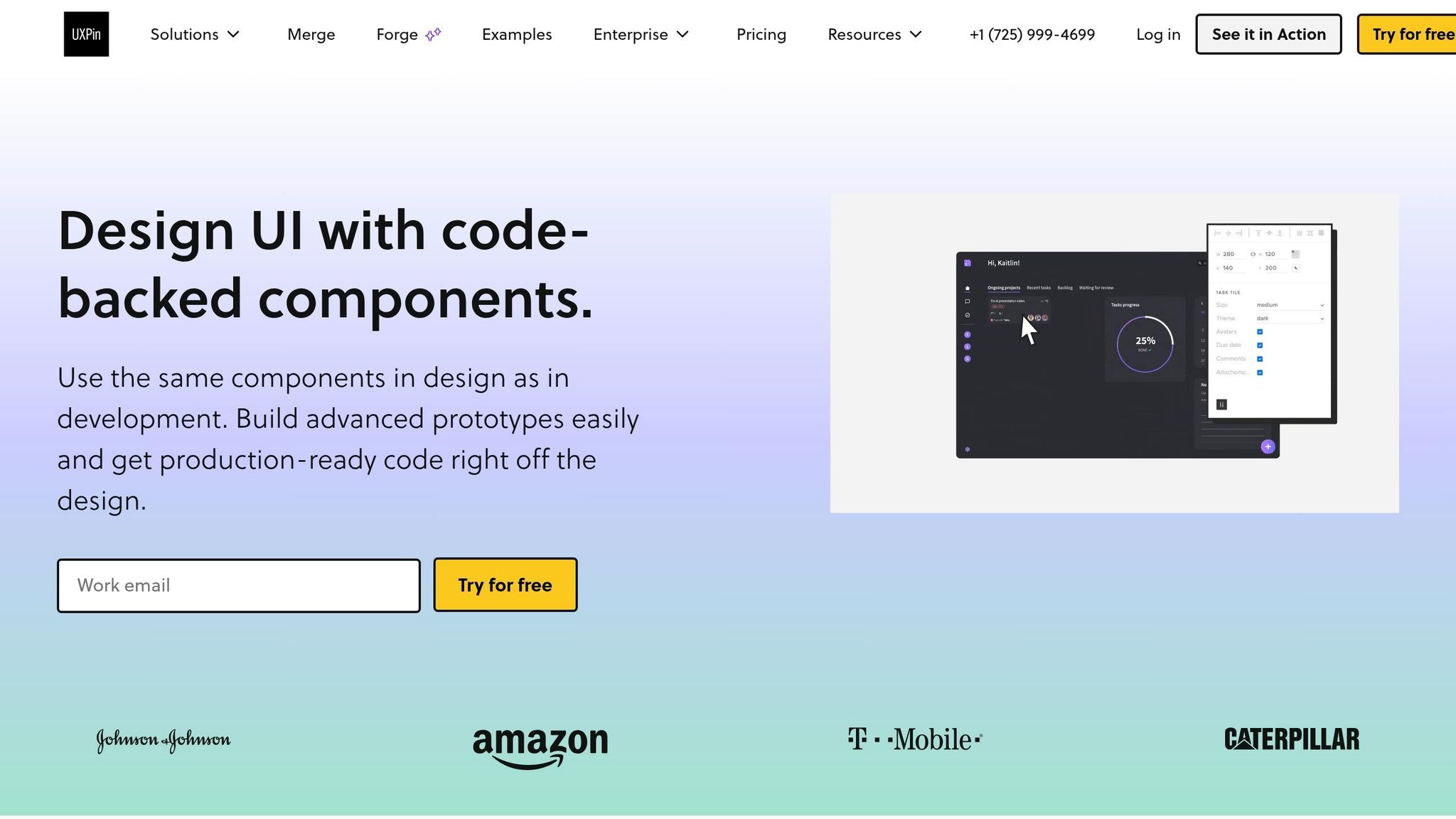
Now it’s time to move from planning to the actual build in UXPin Merge. This is the part where your outline turns into a working prototype built with the same components your engineers will ship.
Use built-in shadcn/ui support and place components on the canvas
UXPin includes shadcn/ui right in the canvas, so you can start without importing anything. Set your desktop frame to 1440 px wide, open the Merge panel, and search for the pieces from your blueprint: Container, Grid, Section, Card, Button, Input, and Typography. Then place them on the canvas one section at a time, from top to bottom.
Build the page in sequence: hero, testimonials, pricing, CTA band, and form. As each piece goes in, replace the placeholder text with the refined copy Claude generated.
This matters because you’re not working with loose vector shapes. These are code-backed components with real props and constraints. A Button, for example, includes a variant prop like primary, secondary, or ghost, along with size and label values. It’s not just a colored box you can stretch however you want. That’s the whole point. The limits keep the prototype honest.
Edit content, spacing, and states without breaking system consistency
In Merge, most edits happen through the properties panel. Select a Card to change its title, subtitle, and body text. Select a Button to switch its variant from ghost to primary when the hierarchy needs it. Each update runs through the component’s exposed props, so the structure stays intact.
For spacing, stick with the system’s built-in tokens instead of manually nudging things around. Use padding-y-lg for standard sections and padding-y-xl for high-emphasis areas like the hero or the main CTA band.
For forms, set up each Input with its label, placeholder, helper text, and error state so stakeholders see how the form will actually behave, not just a static mockup. Keep field formats realistic:
- Phone fields should use
(555) 555-1234 - Date fields should use MM/DD/YYYY
- Pricing or budget fields should show a leading
$and two decimal places
Before moving to the next section, set button priority clearly. Use one primary action for the main goal, such as "Start your free trial." Use a secondary variant for lower-priority actions, such as "Talk to sales." Use ghost buttons for the lowest-priority actions. That simple rule keeps the page easy to scan and makes the next section easier to build.
Use Forge when teams want AI inside UXPin
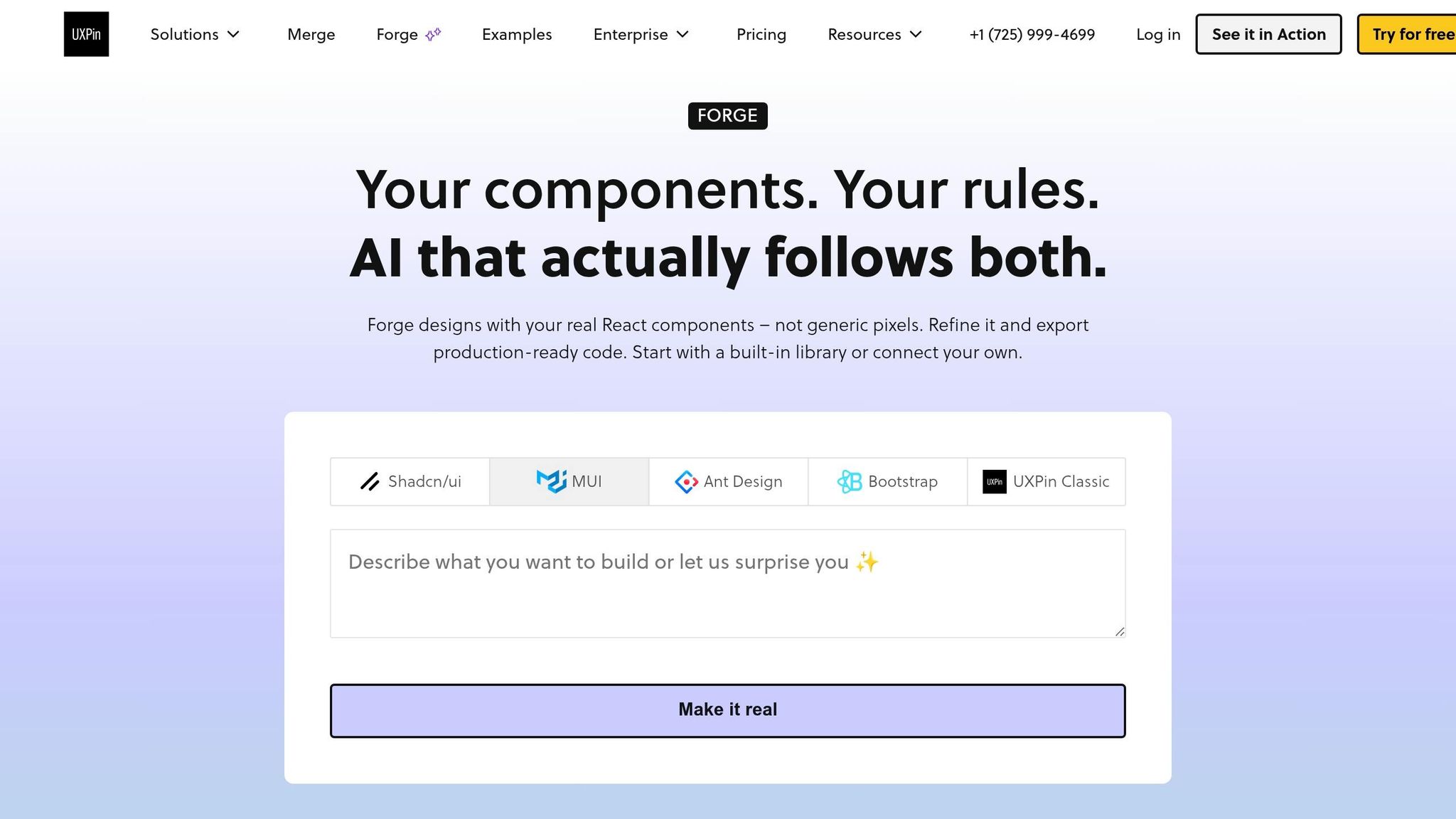
If your team wants help putting sections together faster, use Forge. It’s useful in early exploration when you want AI-generated layouts directly inside the canvas. You can prompt it to create a pricing section or a testimonial grid, and it assembles the result with your shadcn/ui components.
Forge can also show the JSX it generates, which gives developers a direct path to review the output before handoff. For teams that want AI help without drifting outside the design system, that’s a strong fit.
5. Review the prototype and prepare it for stakeholder and developer handoff
Before you share the prototype, do one last pass. This doesn’t need to be a formal audit. Just check four things: copy, section flow, CTAs, and layout clarity.
Check hierarchy, responsiveness, and component reuse
Start with the copy. Move section by section – hero, social proof, features, pricing, CTA, and form – and make sure each block says ONE clear thing. Check that the page uses U.S. spelling and terminology and stays in line with the brand voice.
Then do a 10-second scan test. Scroll from top to bottom and ask yourself if someone could explain the page in one sentence. If they can’t, the hierarchy likely needs a fix. The hero should carry the main value proposition and the primary CTA. Mid-page sections should back that up with benefits and social proof. Pricing and secondary CTAs like "Contact sales" should sit lower on the page, where users are closer to making a choice.
For responsiveness, preview the prototype at 375px, 768px, 1,024px, and 1,440px. At each width, check a few basics:
- Hero text shouldn’t wrap in awkward ways
- Multi-column layouts like pricing grids should collapse to a single column on mobile
- Touch targets should stay at least 44×44 px
Because the components are code-backed, breakpoint behavior matches production.
Then check component reuse. If your primary CTA uses a Button variant in the hero, that same variant should appear in pricing and form sections too. Apply the same check to Card components and shared design tokens. A quick look in the inspector can help you spot prop or token drift before handoff.
Package the prototype for stakeholder and developer handoff
Once the prototype passes that check, package it for stakeholder and developer review.
For developer handoff, prepare three things:
- The prototype URL, with notes on intended behaviors
- A component map that links each UI element to its shadcn/ui component and variant
- A finalized copy document that includes every heading, body block, button label, and form field
Since UXPin Merge mirrors the actual component API, developers can often carry the same prop configuration straight into implementation.
UXPin Merge speeds up page creation, keeps the UI consistent, and helps design and development stay in sync because teams build prototypes with the same shadcn/ui components engineers ship.
FAQs
How much copy should Claude generate?
{ "body": "Work in smaller chunks instead of generating the full page at once. That usually leads to cleaner copy and fewer mistakes.\n\nSet simple limits for each part so the output stays easy to use in design and dev handoff. Keep hero headlines under 60 characters, card titles under 40 characters, and aim for about 120 to 150 words for each body section. Those guardrails help the copy stay tight without feeling cut off.\n\nIt also helps to return everything in a structured format like JSON. That way, each piece of copy can map straight to component props without extra cleanup. For example, a hero block can include fields like headline, subheadline, and CTA, while cards can use title, description, and linkLabel. This saves time and makes the content much easier to plug into the page." }
Which shadcn/ui components should I use first?
Start with the core sections of your landing page: hero, feature grid, pricing, testimonials, and contact forms. Then map each section to the matching shadcn/ui components in UXPin Merge.
Keep the layout simple at first. Lean on basic building blocks like Button, Card, and Input to shape the page and move things into place.
Bring in components like Accordion, Tabs, or DataTable only if the page needs more interaction or a more structured way to show content.
What should I check before handoff?
Before handoff, confirm the design brief with your team so every component lines up with the set UI guidelines. Also run one last localization check to make sure spelling, date formats, and units follow U.S. conventions.
Then use Spec mode to review component properties, documentation, and CSS. After that, use Experimental Mode to preview interactions, states, and variants so you can spot rendering or styling issues.