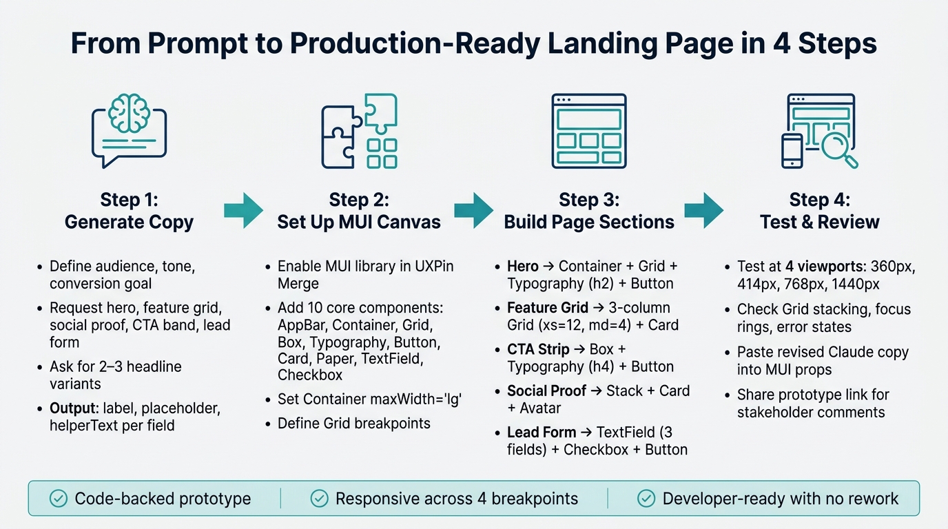
You can go from prompt to a code-backed landing page in four steps: write section copy in Claude, map it to MUI parts, build it in UXPin Merge, and test it at 360px, 414px, 768px, and 1,440px before review.
I’d sum it up like this: Claude handles the words and page structure, MUI provides the React UI parts, and UXPin Merge lets me place those same parts on a live canvas. That cuts rework because the prototype is built with code-based pieces instead of static screens.
Here’s the full flow in plain English:
- Set U.S. rules first so copy uses US English, dates like July 7, 2026, and prices like $29/month or $1,299/year
- Ask Claude for section-ready copy for the hero, feature grid, social proof, CTA band, and lead form
- Request tighter outputs like CTA text, feature card blurbs, and form
label,placeholder, andhelperText - Use MUI parts in UXPin Merge like
Container,Grid,Typography,Button,Card,Paper,TextField, andCheckbox - Build one page section per block so the layout stays easy to edit
- Test layout and form states across phone, tablet, and desktop sizes
- Revise copy inside the same MUI props instead of changing the whole structure
A few numbers make the process more concrete. The guide points to a 3-field lead form, a 3-column feature grid on desktop, 2 to 3 testimonial blocks, and 4 viewport checks before sign-off. That gives me a simple build path without a lot of guesswork.
What I like most is the handoff angle: the page is testable, responsive, and much closer to what engineering will ship. That means less translation work later.
If I were explaining the article to a teammate in one sentence, I’d say this: use Claude to draft the landing page, use MUI to shape it, and use UXPin Merge to turn both into a prototype that stays close to production code.
Claude + MUI + UXPin Merge: 4-Step Landing Page Workflow
Design To React Code Components
Step 1: Generate landing page copy and section structure with Claude Opus 4.5
Claude Opus 4.5 works best as a structured content and layout assistant. Use it to create section-ready copy that maps straight to MUI components. That output becomes the source material for the UXPin Merge build.
Write a prompt that defines audience, conversion goal, and required sections
A vague prompt leads to generic copy. A structured prompt gives you a blueprint. Before you type anything, lock in five things: your product summary, your target user, your main conversion action, your tone, and the exact sections you want.
Use this prompt:
"You are a conversion-focused UX writer. Create a landing page outline for [product] aimed at [audience]. Primary goal: [conversion action]. Tone: [tone]. Include hero, benefits, social proof, CTA band, and lead form. Return a section-by-section outline with headline, subheadline, body copy, CTA text, and form labels. Keep each section concise and suitable for a real UI component."
Keep the copy clear, concise, and focused on conversion. Ask Claude to label each block as conversion, credibility, or lead capture so every section has a clear role.
Refine Claude’s output into component-ready content
Claude’s first draft is a starting point, not the final version. Once you have the first outline, ask for 2 to 3 variants of the hero headline, CTA microcopy, and feature card descriptions. Use benefit-led, outcome-led, and technical variants. That gives you options, which helps when you’re trying to fit copy into an MUI layout without forcing awkward edits later.
For the feature grid, a strong result looks like three cards titled "Faster setup", "Design-system alignment," and "Prototype with real components," each with one to two sentences of support copy. That kind of output drops into cards much more cleanly.
As you refine, use negative constraints to tighten the writing. Tell Claude things like: "Avoid passive voice", "No exclamation points in the hero", and "Keep each feature description concise." For the lead form, ask for the label, placeholder, and helperText for each field as separate outputs so the content maps cleanly to MUI TextField props.
Use the table below to map Claude’s output to MUI components:
| Landing Page Section | Claude Output to Request | Target MUI Component(s) |
|---|---|---|
| Hero | Headline, subheadline, primary CTA label | Typography (h1), Button, Stack |
| Feature Grid | Icon name, short title, one-sentence description | Card, CardContent, Typography (h6) |
| Social Proof | Quote, author name, job title | Paper, Avatar, Typography (body2) |
| CTA Band | Verb-led headline, secondary CTA label | Box, Typography (h4), Button |
| Lead Form | Field labels, placeholder text, submit button label | TextField, FormControl, Button |
Once the output matches this structure, Step 2 turns into a direct build in UXPin Merge.
Step 2: Set up UXPin Merge with MUI and prepare a code-backed canvas
Use UXPin Merge to move Claude’s outline into real MUI components on a code-backed canvas. Step 1 gave you section-ready copy. Step 2 turns that copy into a live MUI layout inside UXPin Merge.
At this stage, you’re taking Claude’s section-by-section outline and mapping it to actual interface blocks. That matters because you’re no longer sketching with placeholders. You’re building with the same MUI components your team can use in production.
Use the built-in MUI library or connect your own component setup
Use UXPin’s built-in MUI library, or sync your own MUI-based component library through Merge.
If you’re starting from scratch or you don’t have a custom design system yet, open the Design System Libraries panel in the editor, choose MUI, and start building.
If your organization uses a custom MUI-based system, connect it through Merge by syncing your own React component library to your UXPin account. When your design system team updates a component in code, those changes show up in UXPin prototypes automatically. That keeps everyone on the same page. Designers can’t accidentally use deprecated variants or make off-spec styles, because the component library itself sets the rules.
Choose the essential MUI components for a landing page
Before you place Claude’s output on the canvas, bring these ten components into your workspace. They cover the core sections most landing pages need:
| MUI Component | Landing Page Role | Key Props to Set |
|---|---|---|
AppBar |
Top navigation with logo and links | position, color, elevation |
Container |
Centers content, sets max width | maxWidth="lg", fixed |
Grid |
Responsive columns across sections | container, item, spacing, xs/md/lg |
Box |
Spacing and padding utility wrapper | sx (padding, margin, display) |
Typography |
All headings, subheads, and body copy | variant (h1–h6, body1, body2) |
Button |
Primary and secondary CTAs | variant="contained", color="primary" |
Card |
Feature tiles and testimonial blocks | elevation, variant |
Paper |
Form surfaces and info panels | elevation, square |
TextField |
Lead form inputs | label, required, fullWidth |
Checkbox |
Marketing consent and preferences | required, accessible label |
Set Container to maxWidth="lg" and define your Grid breakpoints right away. It saves cleanup later. Once those building blocks are in place, you can map Claude’s hero, feature, proof, CTA, and form copy to the matching MUI components in Step 3.
sbb-itb-f6354c6
Step 3: Map Claude’s outline to MUI sections in UXPin Merge
Once your MUI components are on the canvas, match each Claude section to one MUI block. Keep it simple: one section, one block.
The hero should state your value fast and push the main click. The feature grid should explain benefits in short, easy-to-scan pieces. The CTA strip should cut friction right before conversion. Then social proof and the form help close the deal. Use Claude’s section labels as your build order in UXPin.
Build the hero, feature grid, and CTA blocks
Start the hero with a Container as the outer wrapper. That keeps the content centered and stops it from stretching too far on large monitors. Inside it, add a Box with py={8} to give the section some breathing room. Then use a two-column Grid: put the Typography headline (variant="h2"), supporting copy (variant="body1"), and primary CTA Button (variant="contained") in the left column.
On mobile, set xs={12} so the columns stack. Use that same layout idea for the feature grid too.
For the feature grid, use a parent Grid with spacing={4}. Render each feature as a Card with an icon, a short title, and a two-sentence description. Set each Grid item to xs={12} on mobile and md={4} on desktop. That gives you a clean three-column layout without extra work. Keep the cards short and visually even.
The CTA strip should stay simple on purpose. Use a Box with a contrasting background token, a Typography headline, and a Button. For U.S. audiences, direct copy tends to work best. Add a trust cue like no credit card required or book a 15-minute demo.
Add social proof and a lead form with real MUI elements
Place social proof after that so it supports the final decision. A logo row works well as a Box with Stack direction="row" and flexWrap="wrap" for partner or customer logos. For testimonials, use Card + Typography for the quote and role. If you want to make it feel more personal, add an Avatar next to the name. Stick to two or three testimonials. A long wall of quotes can water down the CTA.
For the lead form, less is more. Three fields – name, work email, and one optional qualifier like company size – are a strong starting point for a U.S. landing page. Use TextField with fullWidth and margin="normal" for each field, a Checkbox with FormControlLabel for consent, and FormHelperText for short validation guidance. Close the form with one Button using size="large" and variant="contained".
Plain, familiar labels lower cognitive load and help reduce drop-off.
Section-to-component mapping table
Use this table as the handoff between Claude’s output and your UXPin Merge canvas. Each row shows the MUI components to use, the layout pattern, and the type of Claude prompt that produced the content.
| Landing Page Section | MUI Components | Layout Pattern | Claude Prompt Type |
|---|---|---|---|
| Hero | Container, Box, Grid, Typography (h2, body1), Button |
Split Grid: text left; stacks on mobile | Value proposition prompt: headline, subheadline, primary CTA text |
| Feature Grid | Grid (container + item), Card, CardContent, Typography (h6, body2) |
3-column responsive Grid (xs={12} md={4}) |
Benefit-bullet prompt: 3–6 features with title and 2-sentence description |
| CTA Strip | Box, Typography (h4), Button, Stack |
Centered vertical Stack, contrasting background | Closing statement prompt: urgency-driven headline and button label |
| Social Proof | Stack, Card, Typography, Avatar, Box |
Horizontal flex-wrap for logos; Cards for testimonials | Testimonial prompt: quote, name, role for 2–3 customers |
| Lead Form | Box, TextField, Checkbox, FormControlLabel, FormHelperText, Button |
Single-column vertical Stack | Lead capture prompt: field labels, placeholders, consent copy |
Because UXPin Merge uses real MUI React components, the responsive behavior you set here works right away in the prototype.
Step 4: Test responsiveness, refine copy, and prepare the prototype for review
With the page built in UXPin Merge, take time to check responsiveness, interactions, and stakeholder input before review.
Check breakpoints, spacing, and interaction states
Open UXPin’s Preview mode and test the page at four widths: 360px for a small phone, 414px for a larger phone, 768px for a tablet, and 1440px for desktop. At each size, make sure the MUI Grid columns behave the way you expect. On mobile, the hero text and CTA should stack cleanly. On larger screens, feature cards should move from a single-column layout to multiple columns.
One big plus here is simple: Preview matches production because the canvas uses real MUI components.
Once the layout looks solid at each breakpoint, move on to interaction states.
Click every Button and check hover and active states. Tab through the lead form and look at the focus rings. Submit a blank required TextField to trigger the error state. Then confirm the error message stays visible on mobile and doesn’t get hidden behind the keyboard.
| Viewport | Width | What to verify |
|---|---|---|
| Small phone | 360px | Single-column stacking, CTA above the fold, readable font size |
| Larger phone | 414px | Touch target sizing, form fields not obscured by keyboard |
| Tablet | 768px | Multi-column wrapping, consistent gutters |
| Desktop | 1440px | Visual hierarchy, max-width centering, no excessive white space |
After that, use comments to tighten the copy without changing the component structure.
Use feedback to revise copy and layout without breaking system consistency
Share the prototype link with stakeholders and ask for in-context comments on specific components, like the hero headline, the CTA label, or a form field that feels unclear. When that feedback comes in, rewrite the affected copy in Claude. Keep the headline tight, write for the target audience, and hold on to the ROI message.
Then paste Claude’s revised copy straight into the right MUI component props, such as Typography children, the Button label, or TextField helperText. Don’t change the component structure. That’s what keeps the design system in place.
If someone asks for a layout tweak, handle it with existing props like Grid spacing or Box py instead of adding custom styles. Think of it like tuning an instrument instead of swapping out parts. The aim is to keep the prototype lined up with the shared MUI system before it gets to developers.
After the last round of edits, the prototype is ready for stakeholder review.
Conclusion: A faster path from prompt to production-aligned landing page
This workflow takes you from a structured Claude prompt to a code-backed MUI prototype in UXPin Merge. Copy, layout, and component behavior are already lined up before developers touch anything. The result is a developer-ready prototype with no extra translation step.
FAQs
Do I need coding skills to use UXPin Merge with MUI?
No. UXPin comes with a pre-integrated MUI library, so you can drag and drop production-ready React components right onto the canvas. There’s no manual setup to deal with.
You can then adjust props like variants, colors, and sizes in the Properties Panel using a visual interface. Under the hood, the system runs on real React code, but you don’t need to write any code yourself.
How do I turn Claude’s copy into editable MUI components?
Use structured prompts so Claude returns content that maps to component props like heroHeadline or primaryCtaLabel. Be clear about the MUI components and layout you want too, such as Container, Grid, Typography, and Button.
Then drag the matching live MUI components from the UXPin library onto the canvas and paste the generated copy into the Properties Panel. Those props update the components and stay in sync with the React code.
What should I test before sharing the landing page prototype?
Before you share your prototype, run it through three checks.
- Developer review in Spec Mode to catch architectural limits or unsupported props
- Usability testing to make sure interactions, ripple effects, and logic work the way you expect
- System compliance with Claude Opus 4.5 to audit edge cases and verify U.S. localization, such as currency symbols, date formats, and spelling