You can build a landing page faster if you plan the copy first, map it to Bootstrap, and assemble it with code-backed components in UXPin Merge. That is the core idea here.
I’d break the process into 4 simple steps:
- Use GPT-4.1 to plan the page
- Set the goal, audience, CTA, and section order
- Draft short copy that fits Bootstrap layouts
- Map each section to Bootstrap
- Hero, features, testimonials, pricing, CTA, and footer
- Use grid, cards, buttons, and form patterns
- Build in UXPin Merge
- Place Bootstrap components on the canvas
- Fill props like title, price, button labels, and plan state
- Test before design handoff
- Check desktop and mobile views
- Review hover, focus, form states, keyboard use, and tap targets of at least 44×44 px
A few details stand out:
- The sample page structure includes 6 main sections plus a footer
- Pricing follows U.S. format, like $29/month or $99/month
- Responsive checks cover desktop sizes such as 1,440 × 900 and 1,920 × 1,080
- Testimonial copy is kept short, with quotes capped at about 25 words
- Hero headlines are trimmed to under 10 words so they fit the layout
I like this workflow because it keeps copy, layout, and handoff tied to the same system. Instead of writing long text and forcing it into cards later, I’d shape the content to the grid from the start. That cuts edits, keeps spacing in line, and makes review easier for design, product, and engineering.
If you want the short version, it’s this: plan with AI, build with Bootstrap, and hand off from Merge using the same components your team already uses in code.
Build A Landing Page using Bootstrap 5 – Full Tutorial
sbb-itb-f6354c6
Plan the page structure and copy with GPT-4.1
Start with structure and copy first. That saves time and cuts down on rework later.
Prompt GPT-4.1 for goals, audience, and section order
Give GPT-4.1 three clear inputs: your business goal, your target audience, and your primary CTA. If you skip these, the model tends to fall back on generic marketing copy that doesn’t help a specific conversion goal.
A planning prompt that works well looks like this:
"Create a landing page outline for a design tool that helps product teams build responsive landing pages faster. Audience: product designers and front-end engineers at mid-size US tech companies. Primary CTA: ‘Start free trial.’ Goal: increase trial signups. Include sections in this order: hero, feature grid, social proof, pricing, FAQ, CTA, footer. Use US English and prices in USD like $29.99/month."
That gives GPT-4.1 enough context to build an outline with a clear message order and a direct path to conversion. For each section, ask it to return the section goal, key message, suggested headline, and the Bootstrap layout it should fit into, such as container + row + col-md-6.
Once the outline is locked in, map each section to Bootstrap containers, rows, and cards.
Generate copy that fits Bootstrap layouts
After you have the section order, ask GPT-4.1 for copy that fits Bootstrap from the start. The trick is simple: give clear length and structure rules for each section type.
For the hero, ask for a headline under 10 words, a subhead under 25 words, and a primary CTA label with 2–3 words. For the feature grid, ask for 3–6 benefit-led titles with 3–5 words each, plus 15–25 word descriptions that fit inside a Bootstrap card body in col-md-3 columns. For testimonials, ask for quotes capped at 25 words, along with a name, role, and company. That’s exactly the kind of content a card in a 3-column row can handle.
The table below pairs each section with the right GPT-4.1 rules and Bootstrap component:
| Landing Page Section | GPT-4.1 Copy Constraints | Bootstrap Component |
|---|---|---|
| Hero | Headline ≤10 words, subhead ≤25 words, CTA 2–3 words | Container + Row + col-md-6 |
| Feature grid | 3–5 word title, 15–25 word description per feature | Card in Row + col-md-3 |
| Social proof | Quote ≤25 words, name + role + company | Card in 3-column Row |
| Pricing | Plan name, USD price, 3 bullets ≤10 words each, CTA label | Card with ListGroup |
| Final CTA | One headline, one sentence, one button label | Container with centered text |
Prompts like "Write content that fits Bootstrap cards and columns. Avoid long paragraphs. Use short sentences and scannable bullets" often produce copy you can drop into layouts with only light editing.
Next, tighten the copy so each section matches US English, landing page design trends, and common production UI patterns.
Refine tone and consistency for a US audience
Do a focused refinement pass. Ask GPT-4.1 to rewrite the copy in clear US English, keep sentences under 20 words, and replace vague claims with plain, concrete benefits. Swap button labels like "Learn more" for direct CTAs that US SaaS readers see all the time: "Start free trial", "Book a demo," or "Get started." Also check spelling: use "customize", not "customise", and "color", not "colour."
Keep pricing the same across the whole page. Mixed formats can confuse readers and make stakeholder review messy. Paste all section copy into one GPT-4.1 prompt and ask it to flag mismatched terms, inconsistent pricing formats, and benefit language that shifts from one section to another. Then ask it to rewrite the copy with one shared vocabulary and a single pricing format, such as $29.99/month or $99/year.
Use the cleaned copy as input for Bootstrap section mapping.
Map the content to Bootstrap sections
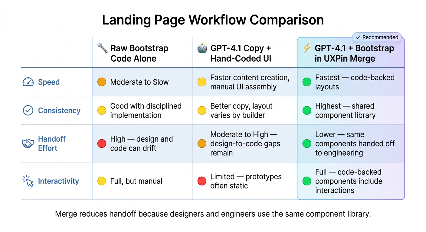
Landing Page Workflow Comparison: Code-Only vs AI-Assisted vs UXPin Merge
Now turn the approved copy into Bootstrap sections your team can assemble in UXPin Merge.
Build each section with Bootstrap patterns
Each landing page section maps to a clear Bootstrap structure. The hero fits a .container with a .row split into two .col-md-6 columns: text on the left, image or illustration on the right. Spacing is easy to handle with utility classes like py-5 and mb-3, so you don’t need custom CSS for basic layout.
The feature grid fits a .row made up of .col-md-4 cards. Each card should use .card-title for the feature name and .card-text for the description. It’s a simple setup, but it keeps things clean and easy to scan.
Use three-column card rows for testimonials and pricing too. For testimonials, place the quote in .card-text, the customer name in .fw-semibold, and the role and company in .text-muted. For pricing, put the plan name at the top, show a large price with fs-1, list feature bullets inside <ul class="list-unstyled">, and place a .btn in the .card-footer.
The CTA section maps to a .container.text-center with py-5, one headline, one supporting sentence, and a .btn-primary button. For forms, use .col-md-8 mx-auto and choose either an .input-group or a stacked .form-control plus .btn setup.
| Landing Page Section | Bootstrap Pattern | Key Classes |
|---|---|---|
| Hero | Container + two-column grid | .col-md-6, py-5, .btn-primary, .btn-outline-secondary |
| Features | Card grid | .col-md-4, .card, .card-title, .card-text |
| Testimonials | Three-column card row | .col-md-4, .card, .fw-semibold, .text-muted |
| Pricing | Three-column card row | .col-md-4, .card-footer, fs-1, .list-unstyled |
| CTA | Centered container | .text-center, .col-md-8 mx-auto, .input-group |
| Footer | Multi-column layout | .row, .col-md-3, .d-flex, .justify-content-between, .align-items-center |
Keep the page localized and ready for production
Keep the copy in US English. Use the same currency and date formatting already used above so the prototype lines up with production content. It sounds minor, but mismatched formatting can make a polished prototype feel off fast.
Workflow comparison: code-only vs. AI-assisted vs. Merge-based
The way you assemble Bootstrap sections has a big effect on handoff later. Some setups look fine at first, then slow everyone down once design and engineering need to sync. The table below compares three common approaches across the areas product teams care about most.
| Approach | Speed | Consistency | Handoff Effort | Interactivity |
|---|---|---|---|---|
| Raw Bootstrap code alone | Moderate to slow | Good with disciplined implementation | High – design and code can drift | Full, manual |
| GPT-4.1 copy + hand-coded UI | Faster content creation, but still manual UI assembly | Better copy consistency, but layout consistency depends on the builder | Moderate to high – design-to-code gaps remain | Limited, because prototypes are often static |
| GPT-4.1 + Bootstrap components in UXPin Merge | Fastest for assembling code-backed layouts | Highest, because sections are built from shared component library | Lower, because the same components can be handed off to engineering | Full, because code-backed components can include interactions |
Merge reduces handoff because designers and engineers use the same component library.
These mapped sections become the components you place on the UXPin canvas next.
Assemble the landing page in UXPin Merge
With your Bootstrap sections mapped and your GPT-4.1 copy approved, you’re ready to build the page itself. This is the point where Merge turns the outline into something you can click through and review.
Place Bootstrap components on the UXPin canvas
Use the section order and copy from the last step as your build map. Start with the hero, features, testimonials, pricing, and CTA you mapped earlier. Because Bootstrap is built into UXPin, you can open the Merge library panel on the left side of the canvas and drag components into place.
For the hero, add a Hero or Hero layout component. Set title, subtitle, primaryButtonLabel, and secondaryButtonLabel in props instead of making separate text layers. For the feature section, use a Row with three Col components, each with a standard feature card. Set icon, headline, and description for each card.
Testimonials can use a Carousel or CardGroup with props such as quote, authorName, authorRole, and avatarUrl. Pricing often uses a Card or card grid, with props like price, currencySymbol, billingPeriod, and isMostPopular.
That prop-based setup matters more than it might seem at first. Instead of editing text box by box, you’re feeding content straight into the component the way it was meant to work. It’s cleaner, and it cuts down on messy handoff later.
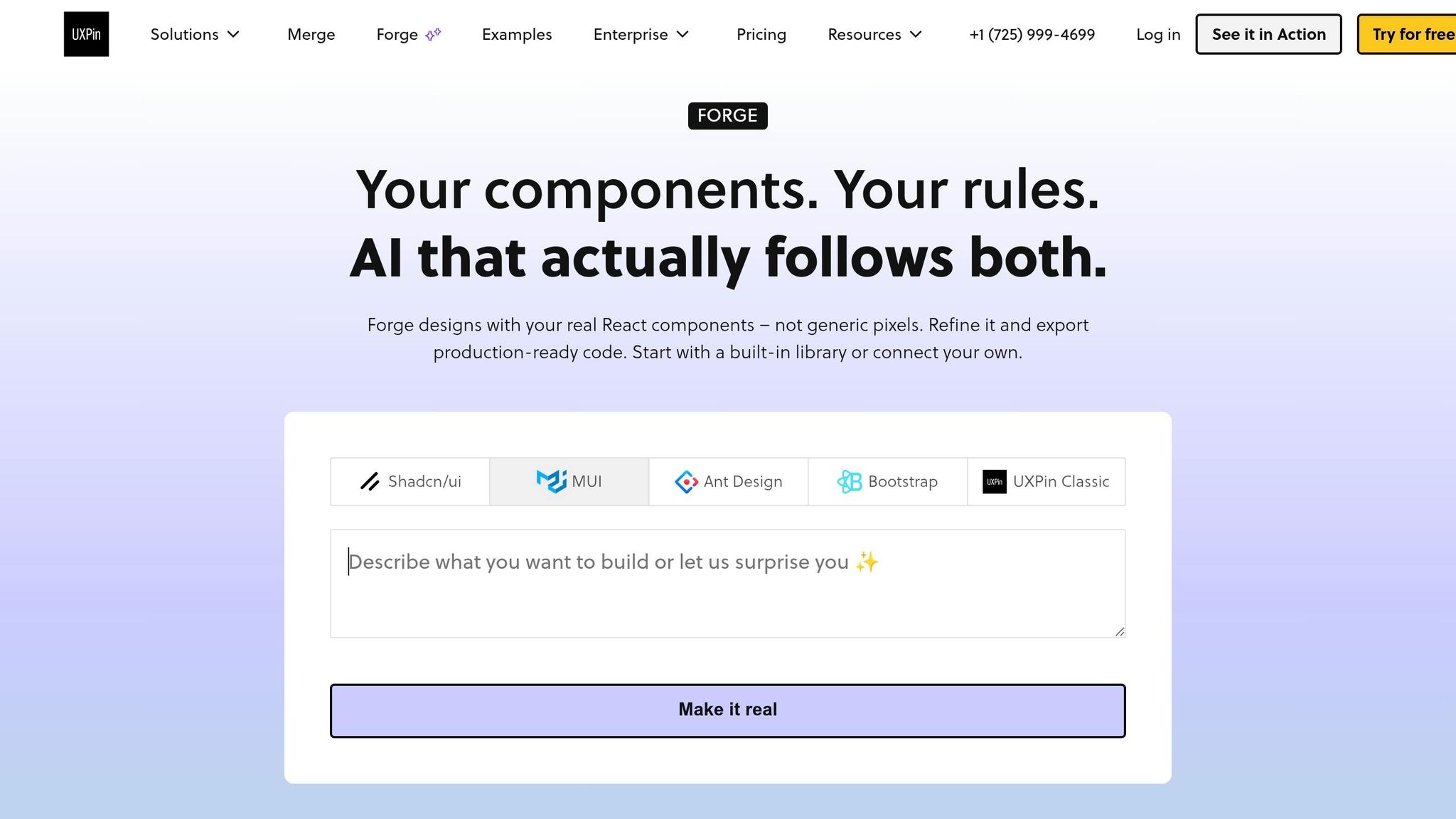
Apply GPT-4.1 output and iterate with Forge
Next, map the GPT-4.1 copy to component props. The hero headline – for example, Launch better landing pages in days, not weeks – goes into the title prop. Supporting text fills subtitle. Button labels like Start free trial and Book a demo map to primaryButtonLabel and secondaryButtonLabel.
For pricing, pass price data as separate props:
currencySymbolas"$"priceas"49"billingPeriodas"per month"
Once the base layout is in place, use Forge to revise layout and copy without rebuilding the page. Forge is UXPin’s built-in AI assistant, so you can prompt it right from the canvas. Ask it to add a three-column features section below the hero, and it inserts the right components. Prompt it to move pricing above testimonials and highlight the Pro plan, and it reorders the containers and sets isMostPopular to true on the right card.
That’s the part that saves time. You’re not tearing the page apart every time you want to test a new layout. You’re adjusting the structure while staying inside the approved Bootstrap component set, which keeps handoff clean.
The next step is testing responsive behavior and preparing the page for handoff.
Test, share, and hand off the final page
Review interactions and responsive behavior
Once the hero, features, testimonials, pricing, and CTA are in place, use the page like a visitor would. Click the primary and secondary CTAs. Check hover and focus states. Try anchor links, sticky header behavior, and keyboard navigation.
Forms need a closer look. Make sure required fields show inline error messages. Make sure success states confirm submission. And check that the layout still holds up for people using a keyboard or screen reader.
For responsive checks, test common U.S. screen sizes: 1440×900 and 1920×1080 for desktop, plus iPhone and Android profiles for mobile. Look for the small things that often break late in the process. Feature cards should stack cleanly. Pricing tables shouldn’t clip. CTAs should stay easy to tap, with touch targets of at least 44×44 px on smaller screens.
Hand off with code-backed components
After the responsive checks pass, share a single UXPin link for handoff with the team. Marketing can review messaging and U.S. localization. Product can check the flow. Engineering can review the Bootstrap structure and form patterns.
Merge makes this part easier. Developers can inspect the set props and behaviors directly instead of trying to read static mockups and fill in the gaps.
If your team uses a custom library, Merge’s Git-backed publishing helps keep components in sync. When an engineer updates a card variant in the repo, that change moves into UXPin after the next build. That keeps design and code aligned, which saves a lot of back-and-forth.
Conclusion: what this workflow improves
When designers and engineers build and review the same code-backed prototype, fewer issues make it to QA. Review cycles get shorter, and implementation starts with less ambiguity. That means teams can iterate faster and hand off a cleaner page.
FAQs
How much copy should I prepare before building?
Start with a simple landing page brief. Spell out the target audience, value proposition, tone, required sections, and the primary conversion goal before you touch the design tool.
Tight copy matters here. Clean wording helps prevent layout problems later, so refine the text first.
A few guardrails make the page much easier to build:
- Keep headlines under 10–12 words
- Keep subheadlines under 20–25 words
- Keep CTA labels to 2–3 words
- Format pricing as $XX.00/month
- Keep testimonials between 18 and 30 words
Can I use custom Bootstrap components in Merge?
Yes. Along with the built-in library, Merge also lets you connect your own Bootstrap library for branded or custom components.
You do that by setting up a repository with your custom configuration and connecting it through an npm package or Git. From there, you can import specific React-Bootstrap components, expose custom props, manage design tokens, and keep prototypes in sync with your production codebase.
What should I test before handing off the page?
Before handoff, check both the code and the UI. Make sure your design tokens – colors, typography, spacing, and component variants – line up with the spec and with your SCSS or CSS variables. Then verify that Bootstrap breakpoints behave as expected on mobile, tablet, and desktop in Multi-Device View.
In Preview Mode, test the page like a user would:
- Hover states
- Clicks
- Form submissions
- Transitions
Also review pricing format, such as $29.00/month, headline clarity, CTA consistency, Bootstrap classes, React best practices, and accessibility.

