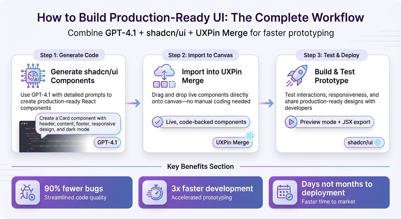
Want to create production-ready UI prototypes fast? Combine GPT-4.1, shadcn/ui, and UXPin Merge to design and develop with the same React components. This workflow eliminates inconsistencies between design and code, cuts down handoff time, and ensures your prototypes are ready for deployment.
Here’s how it works:
- shadcn/ui: A library of React components styled with Tailwind CSS.
- GPT-4.1: Generates clean, functional component code based on prompts.
- UXPin Merge: Lets designers use live, code-backed components directly in prototypes.
Why it matters:
- No manual coding or static visuals – designers and developers work from a shared source of truth.
- Faster prototyping: Move from idea to deployment in days, not months.
- Built-in Git integration for syncing custom libraries in enterprise workflows.
Steps to get started:
- Use GPT-4.1 to generate shadcn/ui components with detailed prompts.
- Import components directly into UXPin Merge for live prototyping.
- Test interactions, responsiveness, and share production-ready designs with developers.
This approach simplifies UI workflows, improves design-to-code alignment, and scales easily for teams using enterprise-level tools. Ready to streamline your process? Let’s dive into the details.
3-Step Workflow for Building UI with GPT-4.1, shadcn/ui, and UXPin Merge
UXPin Merge Tutorial: Generating Code From the Design (5/5)
sbb-itb-f6354c6
What You Need to Get Started
To dive in, you’ll need three key tools: UXPin Editor with Merge AI 2.0, shadcn/ui, and GPT-4.1. These tools are seamlessly integrated within UXPin’s canvas, so there’s no need for tedious manual setup. This integration ensures a unified source of truth between design and code.
Different subscription plans come with varying AI credit limits and features. For enterprise teams that need to connect their own component libraries via Git, Merge Enterprise provides access to Custom Library AI with flexible credit options. Regardless of the plan, all users can access shadcn/ui alongside other built-in libraries like MUI, Ant Design, and Bootstrap.
The technology behind this system is built on React, which powers all components. GPT-4.1 generates live React components, ensuring that designers and developers are always working with production-ready code. For teams with private design systems, Git integration (available in Enterprise plans) allows repositories to sync directly with the AI workflow. This ensures generated components align perfectly with your existing codebase.
Now, let’s explore how to set up shadcn/ui within UXPin Merge.
Setting Up shadcn/ui in UXPin Merge
To get started, open the UXPin editor and select shadcn/ui from the global library options. Because shadcn/ui is natively integrated, there’s no need to import files or deal with external dependencies. The library is instantly available in your component panel and ready to use.
If your team uses a custom component library, you’ll need Merge Enterprise to connect your Git repository. This allows the AI to use your team’s components for layouts instead of the built-in libraries. For standard shadcn/ui users, this step isn’t necessary – you can jump straight into designing.
Configuring GPT-4.1 for UI Code Generation
GPT-4.1 is already built into UXPin’s Merge AI 2.0, so there’s no need for a separate ChatGPT subscription or API keys. Just open the editor, ensure shadcn/ui is your active library, and start prompting.
UXPin includes a prompt library with ready-made templates for common components, layouts, and sections. These templates help you generate clean, functional code without starting from scratch. For instance, you can use templates like "Create a data table with sorting" or "Build a login form with validation" to speed up your workflow.
If the AI-generated layout isn’t exactly what you need, you can fine-tune it with AI Helper. Instead of regenerating everything, you can request specific tweaks – like "tighten table columns" or "change button variants." This saves time and preserves your progress while refining the design.
Once your code generation is set up, you’re ready to integrate components into the canvas.
Connecting Generated Components with UXPin Merge
After GPT-4.1 generates shadcn/ui components, they’re instantly available on your UXPin canvas as live, interactive elements. There’s no need for manual copy-and-paste because everything happens within the same design environment. The components come fully equipped with dependencies, functions, and styling, making them ready for deployment. This ensures consistency between design and development.
For teams using custom libraries, the generated components automatically sync with your Git repository. Developers can access the JSX code, dependencies, and functions directly via UXPin’s preview links, eliminating the need to rebuild from scratch.
"AI should create interfaces you can actually ship – not just pretty pictures." – UXPin
You can even upload screenshots or sketches into Merge. The AI analyzes the structure and recreates it using real shadcn/ui components, transforming rough ideas into functional prototypes in just a few minutes.
How to Build a UI Prototype: Step-by-Step
With your tools set up, let’s go through the process of creating a complete UI prototype from scratch. This guide will take you from an initial idea to a fully interactive, code-backed prototype that’s ready for developer handoff.
Step 1: Generate shadcn/ui Component Code with GPT-4.1
Start by activating the AI Component Creator in the UXPin editor, with shadcn/ui selected. Use clear, detailed prompts to define the structure, variants, and styles of your components.
For instance, instead of saying, “create a card,” try something more specific, like:
"Create a shadcn/ui Card component with header, content, and footer sections, supporting image props, responsive design via Tailwind, and dark mode using CSS variables."
This kind of prompt can generate production-ready code such as:
import { Card, CardContent, CardDescription, CardHeader, CardTitle } from '@/components/ui/card'; export function InfoCard({ title, description, image }) { return ( <Card className="w-full max-w-sm overflow-hidden"> <CardHeader>{image && <img src={image} alt={title} className="w-full h-48 object-cover" />}</CardHeader> <CardContent> <CardTitle>{title}</CardTitle> <CardDescription>{description}</CardDescription> </CardContent> </Card> ); } You can also use the prompt library for templates. For example:
"Generate a reusable shadcn/ui Button component with primary, secondary, and outline variants, including icons and disabled states, using React and TypeScript."
This ensures your components come with proper TypeScript typings, built-in variant support, and accessibility attributes, making them consistent and production-ready.
Step 2: Import Generated Components into UXPin Merge
Once GPT-4.1 generates your component code, it’s instantly available on the UXPin canvas. Simply drag and drop it into your prototype for immediate use.
You can fine-tune these components directly using the AI Helper. For example, you might adjust padding to 16px or change a color to #FF5733. After importing, you’re ready to test the interactive flows of your prototype.
Step 3: Build and Test Your Prototype
Now, start assembling your prototype by dragging the shadcn/ui components onto the canvas and adding interactions. These React components behave exactly as they will in production, so you can simulate real-world functionality like form validation, modal triggers, or dynamic tables.
Switch to Preview mode to test the prototype. Validate interactions, responsiveness, and accessibility features. For example, you can check button states, responsive breakpoints, or form submissions. When it’s ready, share password-protected preview links with stakeholders or developers. They can inspect the JSX code and dependencies directly – no extra rebuilding required.
Advanced Techniques for Enterprise Workflows
Building Custom shadcn/ui Components
Enterprise design systems often demand custom components tailored to specific needs. By leveraging GPT-4.1’s extensive 1-million-token context window, you can input your entire design system documentation to generate shadcn/ui components that align perfectly with your enterprise requirements.
What sets this approach apart is the complete control it offers over the source code. As Reddit user nayeem14 aptly describes:
"Shadcn is a starter kit for a design system that you maintain".
Unlike traditional libraries where you’re tied to upstream decisions, shadcn/ui puts the power in your hands. GPT-4.1 can adapt these components to fix bugs or integrate enterprise-specific logic without waiting for updates from the library’s maintainers.
For example, if your design system needs a component with specialized functionality, you can prompt GPT-4.1 with your precise requirements. The AI will craft a component using shadcn/ui’s framework – built on Radix UI for accessibility and styled with Tailwind CSS – while adhering to your specifications. Because you own the code, your team can maintain, refine, and expand it as needed.
These tailored components integrate smoothly into your overarching design system, enabling efficient collaboration across teams without compromising on quality or flexibility.
Managing Design Systems Across Teams with UXPin Merge
Once you’ve created custom components, managing your design system across multiple teams becomes crucial for maintaining consistency and agility. Enterprise workflows benefit greatly from tools like UXPin Merge, which streamlines component management and ensures system-wide uniformity.
Governance and consistency are key for enterprise teams. Merge links directly to your component repository, ensuring that updates are instantly reflected across all prototypes. For instance, if you modify a button variant in your codebase, the changes will automatically propagate to every workspace, eliminating the risk of version mismatches.
GPT-4.1 further enhances this process by serving as a virtual "maintainer" for your components. When dependencies like Radix or Vaul introduce breaking changes, the AI can refactor affected components, saving you from manually updating numerous files. As danielkov points out:
"LLMs work well with Tailwind… All of the pain points you mention are easily solvable by modifying the code".
This ensures your design system remains adaptable while upholding enterprise-level quality standards.
For teams using UXPin’s Enterprise plan, additional features like custom AI credit limits and dedicated Git integration allow you to scale operations seamlessly. You can generate, test, and deploy components without bottlenecks. With roles and permissions in place, you maintain strict control over who can alter system-level components, while empowering teams to prototype quickly using the same live, code-backed components that drive your workflow.
Key Benefits of This Workflow
Better Design-to-Code Alignment
When designers and developers work from a shared source of truth, they can avoid the typical handoff issues and misunderstandings. As UI Designer Bryson M. puts it, "When you use consistent spacing, it’s easier for developers to bring your design to life without any hiccups". By following clear spacing guidelines, teams can cut down on miscommunication, which means fewer revisions and faster approvals. Plus, with shadcn/ui components integrated directly into your project’s codebase, your team has full control over the API and every design detail. This kind of unified setup ensures prototypes are not only faster to build but also more reliable.
Faster Prototyping and Deployment
In fast-paced enterprise settings, speed is everything – and this workflow delivers. AI-driven workflows using shadcn context have been shown to reduce bugs by 90% and boost UI development speed by 3x when AI tools have full knowledge of your component library. Prajwal Tomar from IgnytLabs highlights this efficiency: "If you’re still copy-pasting Shadcn components manually, you’re wasting 80% of your dev time". With GPT-4.1, production-ready code is generated automatically, complete with responsive layouts and accurate properties, eliminating the need for tedious manual work. UXPin Merge further speeds things up by allowing designers to work directly with real shadcn/ui components on the canvas. This means prototypes can move from idea to deployment in days, not months.
Easier Scaling for Enterprise Teams
The workflow’s focus on speed and consistency also makes it easier for enterprise teams to scale across multiple projects. By prioritizing ownership and structured design over external dependencies, teams can maintain clarity and control. Vaibhav Gupta from Write A Catalyst explains it well: "Shadcn UI in 2026 is about ownership, discipline, and clarity. Teams that succeed treat UI as product infrastructure". A streamlined folder structure for raw components, modifications, and product compositions ensures predictable updates and reusability. On top of that, UXPin Merge’s Enterprise plan includes features like Git integration, role-based permissions, and custom AI credit limits. By defining design tokens as CSS variables early on, teams can support multi-theme applications and white-label projects, ensuring brand consistency while cutting down onboarding time for new engineers by weeks.
Conclusion
GPT-4.1, shadcn/ui, and UXPin Merge simplify UI development by tackling common hurdles like slow handoffs, mismatched designs, and scaling issues. Starting with production-ready components bridges the gap between design and code, cutting down on revisions, speeding up approvals, and enabling prototypes to move into deployment much faster.
UXPin Merge takes this a step further by letting you design directly with live shadcn/ui components on the canvas. This tight integration ensures your designs align perfectly with your codebase, improving consistency across the board.
For enterprise teams, this workflow provides the clarity and control needed to manage multiple projects effectively. Features like Git integration, role-based permissions, and custom AI credit limits in UXPin Merge’s Enterprise plan help maintain brand consistency while making onboarding for new engineers smoother. The result? A design system that acts as a solid foundation, supporting faster prototyping and ensuring consistency throughout the process.
To connect your shadcn/ui components or explore the built-in ShadCN library, and for custom integration options or advanced AI controls, visit uxpin.com/pricing or reach out via email at sales@uxpin.com.
FAQs
What should I include in a prompt to get reliable shadcn/ui React code?
To get accurate and functional shadcn/ui React code from GPT-4.1, you need to craft a clear and detailed prompt. Here’s what to include:
- List the specific shadcn/ui components you need and describe any customizations. For example, mention if you want a modal, dropdown, or navigation bar, and specify how they should behave or appear.
- Define the component types and functionalities. For instance, if you’re asking for a button, clarify whether it should handle form submissions, trigger modals, or perform other actions.
- Mention styling preferences, such as using Tailwind CSS. If you have a design system or specific guidelines, include those details to ensure the generated code aligns with your project’s visual identity.
- Request production-ready and accessible code. Emphasize the need for code that integrates seamlessly with tools like UXPin Merge and adheres to accessibility standards.
The more precise your prompt, the better the results. A well-structured request ensures the code GPT-4.1 generates is tailored to your project and ready for immediate use.
How do I connect my Git-based component library to UXPin Merge for AI generation?
To link your Git-based component library with UXPin Merge, integrate the library using Git, Storybook, or npm, and then sync it with UXPin Merge. This process lets UXPin pull production-ready components straight from your version control system, ensuring your prototypes stay updated and consistent.
How can I validate responsiveness and accessibility in a live UXPin Merge prototype?
When working with UXPin Merge, you can use its device toggling feature to see how components behave across different screen sizes. Testing layouts and interactions on various frames ensures your designs adjust properly for responsiveness.
For accessibility, UXPin offers built-in tools like contrast checkers, keyboard navigation testing, and screen reader compatibility to help you align with WCAG standards. Pair these features with real user testing or specialized evaluation tools to confirm your designs meet accessibility requirements effectively.

