Want to build production-ready UI faster? Combining GPT-5.1 with UXPin Merge simplifies the process by generating code-based components directly aligned with your design system. This approach eliminates design inconsistencies and reduces time spent on manual coding or revisions to your design workflow.
Key Takeaways:
- GPT-5.1 generates UI components using natural language prompts.
- UXPin Merge ensures these components align with your design system and production code.
- Teams can create, prototype, and test functional UI without the usual back-and-forth between design and development.
Why It Works:
- GPT-5.1 creates JSX/TSX components with precise instructions.
- UXPin Merge syncs components with libraries like MUI, Ant Design, or custom React setups.
- Design tokens ensure consistent branding and styling across all components.
Steps to Get Started:
- Set up GPT-5.1 and UXPin Merge accounts.
- Connect GPT-5.1 to your design system via UXPin Merge.
- Define design tokens for consistent styling.
- Generate components with GPT-5.1 and integrate them into UXPin Merge.
- Prototype and test your UI directly in UXPin.
This workflow is ideal for enterprise teams using React-based libraries, helping designers and developers stay aligned while saving time and effort.
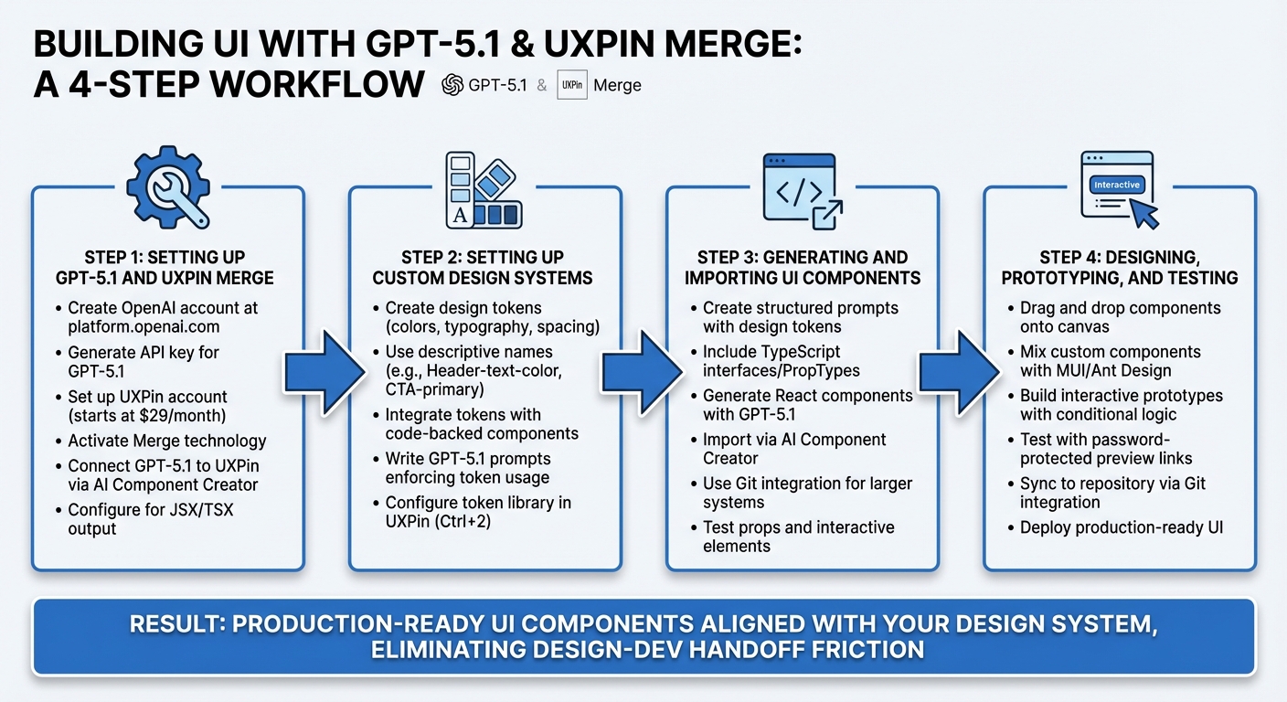
4-Step Workflow for Building UI with GPT-5.1 and UXPin Merge
Step 1: Setting Up GPT-5.1 and UXPin Merge
To generate UI components with AI and sync them with production-ready code, you’ll first need to configure both GPT-5.1 and UXPin Merge. This involves creating accounts, enabling the right features, and linking the AI model to your design system. Here’s how to get started.
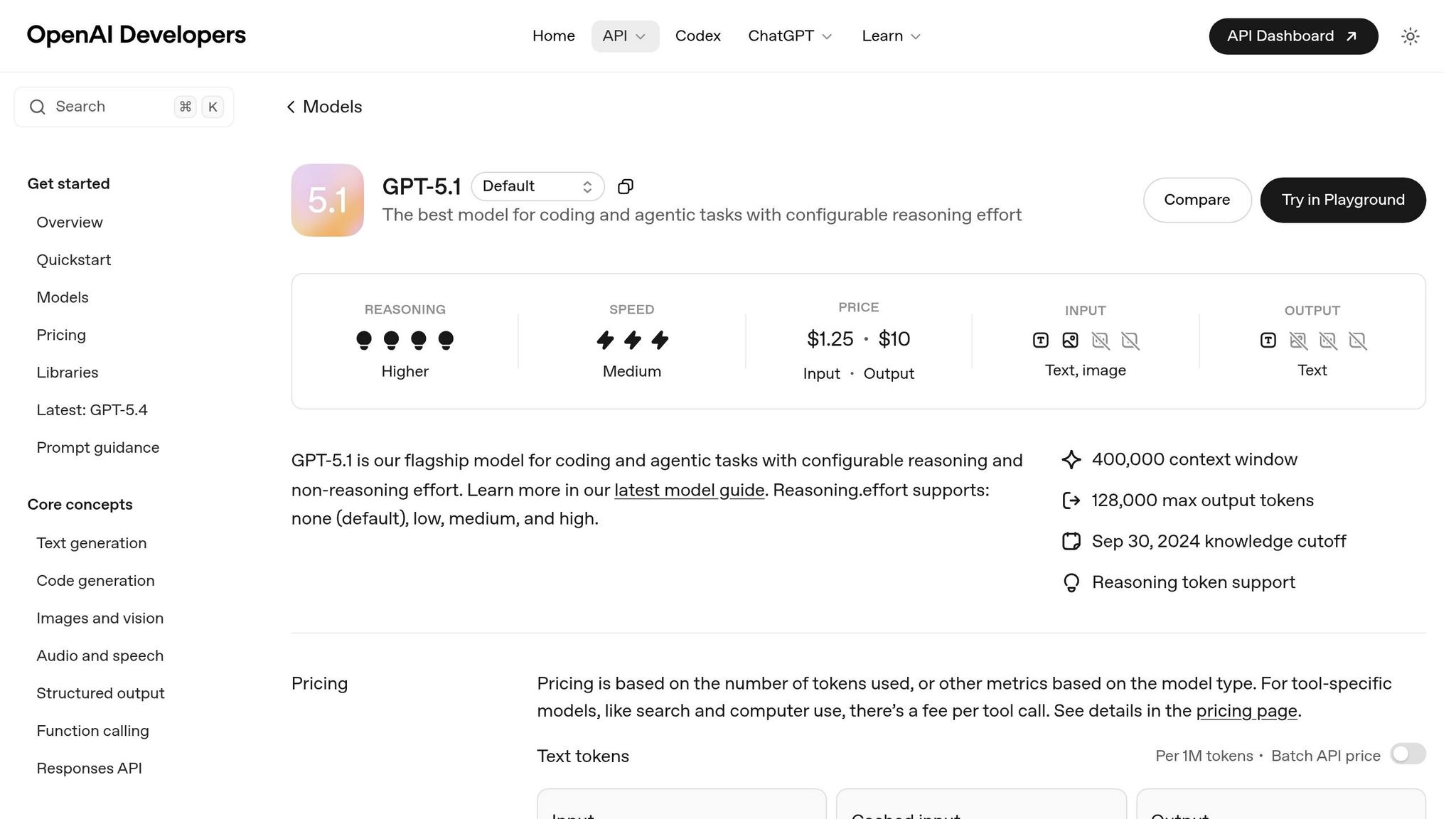
Getting Access to GPT-5.1
Start by creating an OpenAI account at platform.openai.com. After logging in, navigate to the API section of your dashboard to generate your API key. This key is essential for connecting GPT-5.1 to UXPin and monitoring usage. Check the Usage tab to confirm your account has access to either gpt-5.1-turbo or gpt-5.1. Also, ensure your account has enough credits to handle token-based pricing, which charges per million tokens used.
Setting Up UXPin and Activating Merge
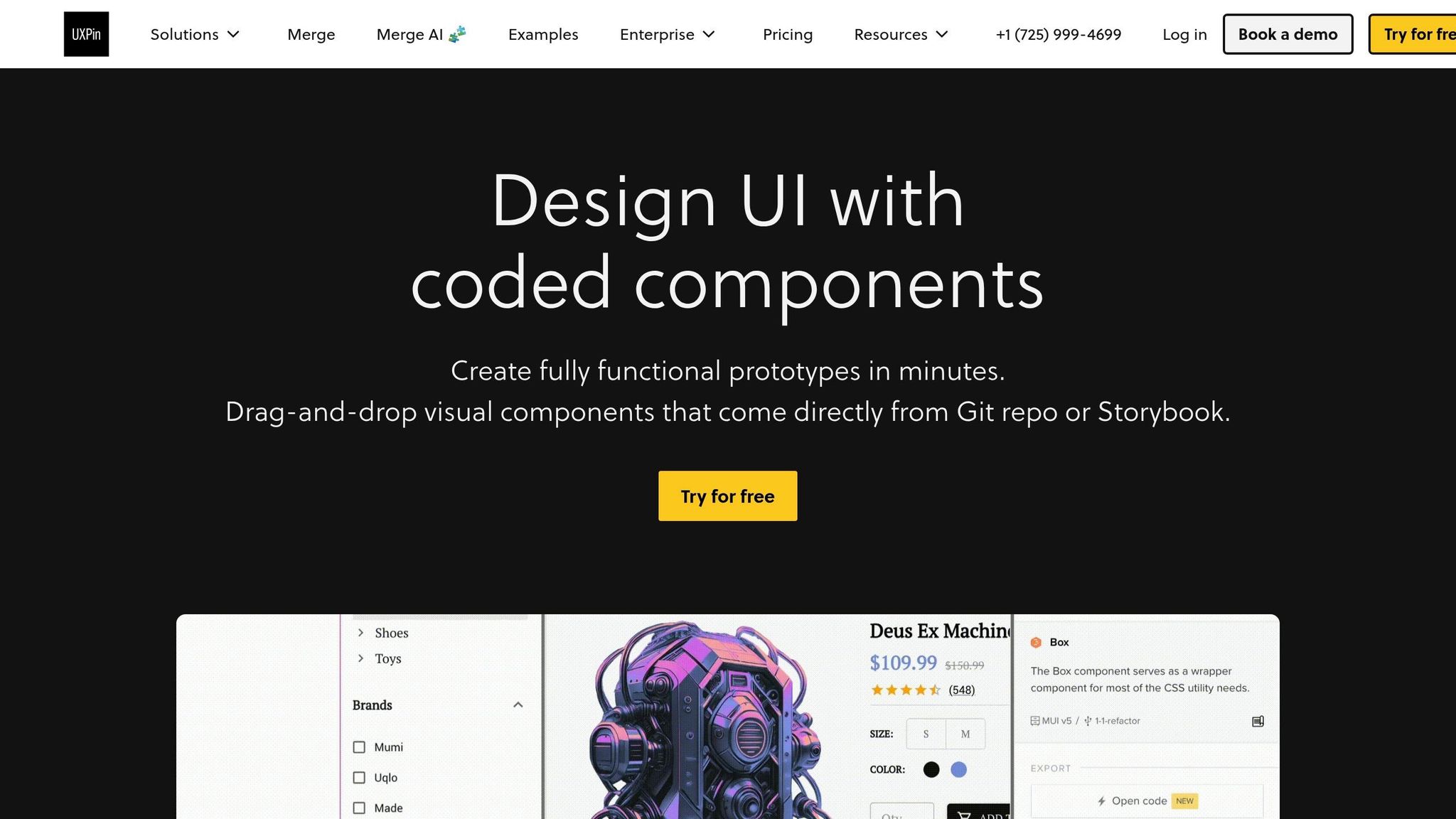
With your OpenAI account ready, move on to setting up UXPin. If you don’t already have an account, visit uxpin.com to create one. UXPin includes Merge technology across all pricing tiers, starting at $29/month. For advanced features or custom libraries, consider the Growth or Enterprise plans.
Once logged in, create a new project and go to the "Merge" tab in your project settings to activate Merge. UXPin natively supports libraries like MUI, Ant Design, Bootstrap, and ShadCN, meaning you won’t need to import these manually. If you’re using custom React-based libraries, you can link your GitHub repository or Storybook instance to sync components directly into the UXPin canvas using this design with code workflow.
Connecting GPT-5.1 to UXPin Merge
The AI Component Creator in UXPin acts as the bridge between GPT-5.1 and your design system. To set it up, input your OpenAI API key in the UXPin settings. This enables GPT-5.1 to generate components that align with your design rules and are production-ready. Configure GPT-5.1 to output JSX or TSX code, ensuring compatibility with UXPin Merge’s React-based environment.
For consistent component generation, define your design tokens within UXPin. Use the Merge Component Manager to preview the React code before adding it to the canvas. This step ensures the generated components meet your production standards and avoid design inconsistencies.
sbb-itb-f6354c6
Step 2: Setting Up Custom Design Systems in UXPin Merge
After connecting GPT-5.1 to UXPin, the next step is crafting a custom design system that serves as the backbone for all AI-generated components. This approach uses design tokens to replace static values with variables, ensuring every component – whether manually created or AI-generated – aligns with your team’s branding and development design system best practices.
Creating Design System Tokens
Design tokens are essentially variables for UI properties like colors, typography, and spacing. Instead of hard-coding values like #3B82F6, you define tokens such as --primary or Background-primary-button. These tokens ensure consistency across platforms and make updates easier.
To set up a token library in UXPin:
- Open the Design System Libraries with Ctrl+2 and select "New Library".
- Add tokens by selecting elements on the canvas or entering HEX codes directly.
- Use descriptive, functional names like
Header-text-colororCTA-primaryto clearly indicate the purpose of each token, making it easier for designers and developers to understand their use.
For teams leveraging UXPin Merge, you can integrate tokens with code-backed components. Add the @uxpincontroltype color attribute in your React library, enabling designers to apply tokens directly via a color picker in UXPin. Tokens can also be imported through copy-pasting or linking JSON/CDN files.
To keep your token library organized, group tokens into categories like buttons, text, and backgrounds. Use prefixes to maintain order and clarity. When updating tokens, UXPin provides a "Before/After" modal displaying HEX values and token names, making it easy to preview changes before applying them globally. This ensures you can avoid unintentional design inconsistencies.
Once your tokens are set up and categorized, the next step is configuring GPT-5.1 to use these tokens exclusively during component generation.
Writing GPT-5.1 Prompts Based on Design Tokens
To ensure GPT-5.1 generates components that align with your design system, you’ll need to craft prompts that enforce token usage and prohibit hard-coded values. An effective prompt might look like this:
"Tokens-first: Do not hard-code colors (hex/hsl/oklch/rgb) in JSX/CSS. All colors must come from globals.css variables (e.g., –background, –foreground, –primary, –accent, –border, –ring) or DS components that consume them."
For teams using Tailwind CSS with UXPin Merge, you can guide GPT-5.1 to use utilities tied to tokens, such as bg-[hsl(var(--primary))] or text-[hsl(var(--foreground))]. If your brand has specific requirements, include instructions to map those brand elements to tokens (e.g., --brand or --brand-surface) before creating UI components.
You can further refine GPT-5.1’s behavior by using XML-based instruction structuring, incorporating tags like <design_system_enforcement> to encapsulate design rules. GPT-5.1 responds well to structured and detailed guidance, so always provide clear directives. If no specific brand style is mentioned, default to your system’s neutral palette and ensure token usage is consistent throughout all generated components.
Step 3: Generating and Importing UI Components
Once your custom design tokens and GPT-5.1 prompts are set up, the next step is to generate and integrate UI components into your system. With the design framework established in Step 2, this stage focuses on turning those design rules into functional UI elements that both designers and developers can use seamlessly within UXPin Merge.
Creating UI Components with GPT-5.1
GPT-5.1 Instant is a powerful tool for creating UI components that align with your design guidelines. To get the best results, your prompts should clearly outline the necessary design tokens and component specifications. For example, a well-structured prompt might look like this:
"Generate a React button component using our design tokens. Use
bg-[hsl(var(--primary))]for the background andtext-[hsl(var(--foreground))]for text. Include TypeScript interfaces with props for variant (primary, secondary, outline), size (sm, md, lg), disabled state, and onClick handler. Ensure all interactive elements expose onChange and onClick props for UXPin interactions."
Including TypeScript interfaces or PropTypes in your requests is crucial. These definitions allow UXPin Merge to automatically create UI controls in the properties panel, making it easier for designers to adjust components without needing to modify the code.
Denis Shiryaev, Head of AI DevTools at JetBrains, highlights this capability, stating that GPT-5.1 "writes and codes like a human developer while effortlessly following complex instructions". This precision makes it ideal for generating components that fit seamlessly into your existing codebase while adhering to strict design system rules.
For more advanced components that involve multi-step logic or complex state management, GPT-5.1’s adaptive reasoning allocates additional computational resources to ensure accuracy. While simpler components like buttons or cards are generated quickly, more intricate elements like dashboards or forms receive the deeper analysis they require.
importing React components into UXPin Merge
Once your component code is ready, the next step is to bring it into UXPin Merge. Use the AI Component Creator in UXPin Merge to paste the generated code. This tool validates the code, checks for compatibility, and prepares it for inclusion in your Merge library.
For individual components or quick iterations, the process is straightforward: paste your React code, ensure the props are correctly mapped, and your component will be added to the UXPin library, ready for use.
For larger design systems with multiple components, a Git integration workflow may be more efficient. GPT-5.1 can generate files for a GitHub repository that’s connected to UXPin Merge. This setup allows for version control and automated updates – when you push changes to your repository, UXPin Merge syncs the updates to your library.
Before importing, ensure that external libraries (such as MUI, Ant Design, or Framer Motion) are properly configured in your UXPin Merge environment. GPT-5.1 may reference dependencies that need to be declared in your package.json or uxpin.config.js file. Providing GPT-5.1 with your manifest file beforehand helps the AI understand your setup and categorize components appropriately. After importing, test each component in the UXPin canvas to ensure all props display correctly in the properties panel and that interactive elements function as intended.
Step 4: Designing, Prototyping, and Testing in UXPin Merge
With your UI components integrated, it’s time to move on to prototyping and testing. This stage takes your design system components and turns them into interactive prototypes. These prototypes aren’t just visual – they’re functional, ready for testing, validation, and seamless handoff to development without needing additional translation or adjustments.
Building Prototypes with MUI or Custom Components
UXPin Merge offers native integrations for MUI, Ant Design, Bootstrap, and ShadCN, so you can start designing right away. These libraries are preloaded and fully functional, allowing you to pair them with any custom components you’ve created using GPT-5.1. There’s no need to set up external accounts or import anything extra.
To create a prototype, simply drag and drop components from your library onto the canvas. These components behave exactly as they would in production. You can mix your custom GPT-5.1 components with MUI elements to craft intricate layouts. For instance, you might use MUI’s Grid system to create a responsive structure, then populate it with branded card components that align with your design tokens. This ensures consistency in using your custom tokens and production-ready components throughout the process.
UXPin also supports conditional logic, variables, and expressions, enabling you to build advanced interactions. Whether it’s form validation that displays error states, multi-step wizards that adapt based on user input, or dashboards where clicking a chart dynamically filters data in a table, these prototypes function like the real product. Once your prototype is ready, it’s time to validate its functionality.
Testing for Code Compatibility and Deployment
Testing your prototype is essential to ensure everything works as intended. UXPin Merge provides password-protected preview links, allowing stakeholders to interact with the design on any device. Share these links with product managers, developers, and users to gather feedback focused on functionality rather than just visual appeal.
Make sure to test interactive elements across devices to confirm they perform correctly. UXPin’s preview modes let you check responsive layouts on different screen sizes. Developers can also inspect the code directly within UXPin, reviewing the exact props, states, and logic they’ll need to implement.
For teams using Git integration (available with Enterprise plans), UXPin Merge syncs directly with your repository. This means that when developers pull the latest version of your design system, the components used in your prototype are already included, tested, and approved. This eliminates the traditional handoff process – designers and developers work from the same source of truth, ensuring what’s designed is exactly what gets deployed.
Example: Building a Dashboard UI with GPT-5.1 and UXPin Merge
Create an analytics dashboard that showcases performance metrics, data visualizations, and user activity tables. This example highlights how GPT-5.1 and UXPin Merge combine to deliver a production-ready interface that aligns seamlessly with your design system.
Generating Dashboard Components with GPT-5.1
Start by crafting prompts that incorporate your design tokens and component patterns. For instance, to create a line chart component, you could specify:
"Generate a React line chart component using our primary color token --color-brand-blue and spacing tokens --spacing-md for padding. The component should accept props for data array, x-axis label, and y-axis label."
For a data table component, try a prompt like:
"Build a sortable table component that uses our typography token --font-body-sm for cell text and --color-neutral-100 for row borders. Include props for column headers, row data, and an onSort callback function."
Need navigation elements? Prompt GPT-5.1 to generate them in line with your design system:
"Create a vertical navigation component with our icon library references, using --color-surface-elevated for the background and --color-text-primary for labels. Include active state styling with --color-accent-primary."
Assembling and Refining the Dashboard in UXPin Merge
Once your components are generated, bring them into UXPin to assemble the dashboard layout. Use MUI’s Grid system to structure the layout efficiently. For example:
- Arrange metric cards in a three-column layout at the top.
- Place chart components in a two-column section below.
- Add a data table component spanning the full width at the bottom.
UXPin’s AI Helper simplifies adjustments. Describe your changes in plain language – like "Increase the height of the chart section and set the spacing between metric cards to 24px" – and the AI updates the layout while maintaining consistency with your design system. This ensures you stay within the bounds of approved components, avoiding any inconsistencies.
Preview the dashboard with password-protected links to test responsiveness across devices. Since the components are real coded elements, the responsive behavior you see in previews mirrors what will appear in production. Developers can inspect the React code directly in UXPin to confirm props, state management, and overall structure before moving to implementation.
For teams using Git integration on Enterprise plans, the entire dashboard – including all GPT-5.1-generated components – syncs directly to your repository. This ensures a seamless transition from design to deployment, with no surprises for developers.
Conclusion: Building Faster with GPT-5.1 and UXPin Merge
Main Benefits of This Workflow
Pairing GPT-5.1’s AI capabilities with UXPin Merge’s code-backed design systems creates UI that’s ready for production right from the start. By working directly with real React components, you skip the usual back-and-forth between design and development. This integration ensures speed and precision throughout your design-to-code workflow.
Using design rules and token-based outputs keeps things consistent and reduces rework for enterprise teams. GPT-5.1’s JSON mode aligns outputs with your custom tokens, while UXPin Merge ensures the AI sticks to approved components from your design system.
GPT-5.1’s multimodal capabilities take things a step further. It can turn Figma mockups or screenshots into React components, maintaining design system consistency across your codebase. Plus, it identifies overlapping elements and suggests fixes, cutting down on manual QA in your pipeline.
Altogether, this workflow simplifies and accelerates the path from design to production.
Getting Started with This Workflow
To try this workflow, start by creating a UXPin account and accessing the Merge AI editor. You can choose from built-in libraries without needing imports. For enterprise teams with custom design systems, connect your component library via Git. This ensures the AI generates UI using your exact production components.
Use the AI Component Creator to turn text prompts or uploaded images into functional layouts. Then, leverage GPT-5.1’s JSON mode to produce components that match your custom tokens. Refine these in UXPin with the AI Helper and export React code that’s ready for developers to implement.
For advanced enterprise integration and tailored AI controls, reach out to sales@uxpin.com or visit uxpin.com/pricing for detailed plan options. Start streamlining your UI development process today.
FAQs
How do I make GPT-5.1 use only our design tokens?
To make sure GPT-5.1 sticks to your design tokens, explicitly include them in your prompts or setup configurations. Connect your design system to UXPin Merge using Git, Storybook, or npm. Once synced, configure GPT-5.1 to reference these tokens. You can then use the AI Component Creator to build components that align perfectly with your tokens, keeping your UI consistent and on-brand.
What React setup do I need for UXPin Merge to sync components?
To sync your components with UXPin Merge, your React environment needs to meet a few specific requirements:
- React.js version: ^16.0.0 or higher
- webpack version: ^4.6.0 or higher
- Directory structure: Each component should have its own folder
Additionally, your components should include a default export and support JavaScript with either PropTypes, Flow, or TypeScript.
Once you’ve confirmed your setup meets these criteria, you can connect your repository using npm, Git, or Storybook. The entire initial setup process usually takes around 30 minutes.
How do I safely import AI-generated components into our Git workflow?
To securely integrate AI-generated components into your Git workflow, UXPin Merge offers a straightforward way to sync production-ready components with your version control system. This approach ensures your components align perfectly with your design system while maintaining consistency across your workflow.
Here’s how it works:
- Connect your design system: Link UXPin Merge to your design system using Git, Storybook, or npm.
- Generate components: Use GPT-5.1 to create components that adhere to your design system’s guidelines.
- Sync and commit: Regularly sync these components to Git and commit updates to keep everything under version control.
This process keeps your workflow organized and ensures the integration of AI-generated components is smooth and reliable.

