
Goal setting is an essential starting point for any design task. Defining sharp goals to design helps you express the problem your product is solving, and the value it provides to help people.
A good design satisfies your design goals and your user goals at the same time. A design that reflects your product intent solves users’ problems entices them into an action that grows your business.
An empowering design is one that makes the user a better version of themselves. The most reliable way to earn customer loyalty is providing them a product or service that improves their lives, and a good UX designer knows this.
In this article we’ll analyze 6 sites, products, and apps that exemplify what an empowering UX should be. You can use these sites as models on which to base your own empowering design.
But before we start, lets talk a little about what makes a UX empowering. While “what empowers users” is an abstract and subjective topic, we can pinpoint 7 aspects that most empowering designs share.
Aspects of Empowering UX Design
- Makes the user’s life easier — This is the heart of empowering design, without which the entire UX is fragile. The best way to accomplish this is through knowing your users: what they’re problems are, and their preferences for how to solve them.
- Goal-focused — A design should be centered around the user accomplishing their tasks. This requires stripping away any secondary or unnecessary features, and highlighting the features that will help.
- Invisible UI — Controls and functions should be intuitive and self-explanatory, and not draw attention to themselves. Remove all distractions and potential hurdles so that the user has a clear path to their goal.
- Forgiving — User errors are bound to happen, so design in a way that these won’t derail or their progress. This typically involves clear and friendly communication, like warnings before critical actions or potential errors.
- Consistent — Consistency cultivates security and trust, whereas inconsistency is distracting and forces the user to question aspects unnecessarily. A consistent UI will essential for lulling your user into a fuller immersion.
- Smooth Onboarding — The onboarding phase, when a user learns how to use the product, greatly affects the opinion they form about it. Use this phase to point out features they may not notice or understand on their own, but don’t take too long so they can get to using the product as soon as possible.
- Create Meaningful Delight — A happy user is a productive user. As long as it doesn’t take away from usability, delightful additions can improve the user’s mood, and even comprehension of the functionality. Polished aesthetics, a human tone, and small discoverables are small additions with big results.
When we discuss the examples below, consider how they apply these 7 principles.
UX Design Examples That Put Users First
1. Medium
One of our favorite examples of empowering UX design is Medium. Few sites better execute the 7 principles.
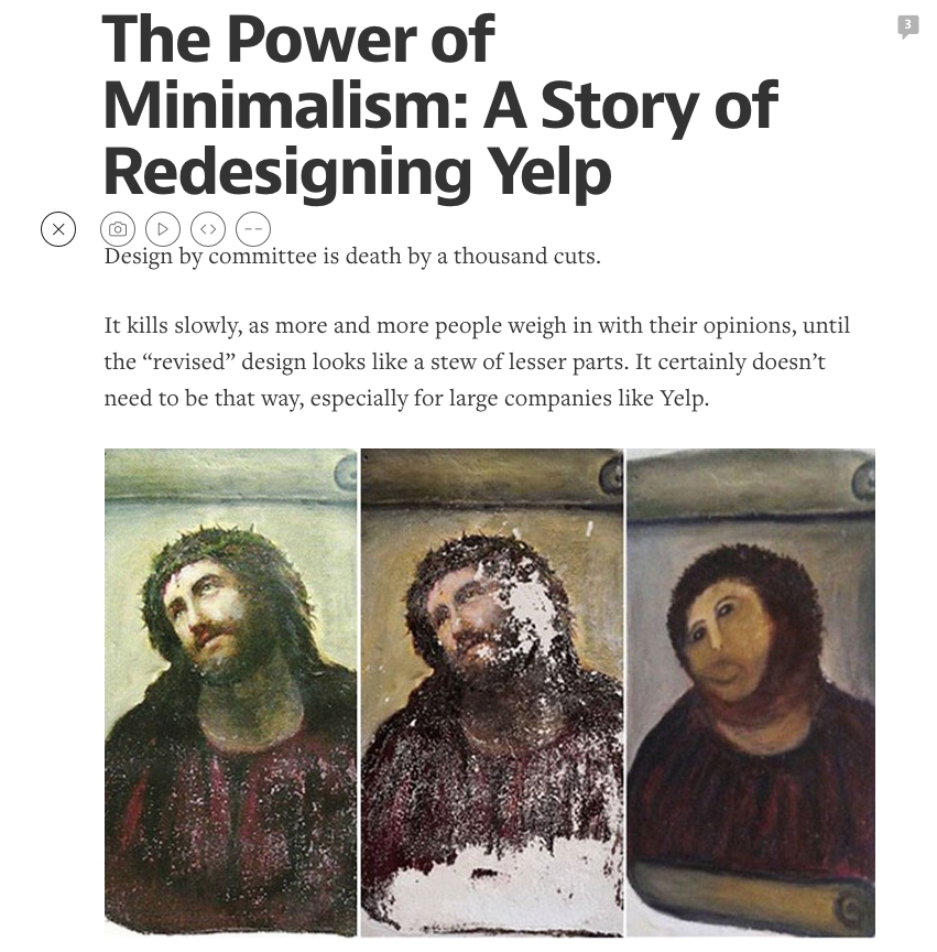
Photo Credit: “Power of Minimalism,” via Medium
The visual style of the site is empowering on its own: its stark black-and-white minimalism combines with a very literary typography to make all users feel like Hemingway.
The spacing between letters and lines, the weight of the fonts, the choices in indentations — all make the user feel like what they’re writing is important.
Which brings us to the next point: Medium’s invisible UI. The absence of widgets, hover controls, and the extensive white space all free the user of distractions, which are especially detrimental when writing. Still, everything the user needs is evident and clearly displayed (glanceability): the user does little more than click on one of several CTAs to start writing a new post.

Photo Credit: Medium
This makes the UI goal-focused as well. The UI takes a backseat and funnels everything towards one central user goal — writing a post. Secondary elements like browsing and reading other posts are just that, secondary.
As an extra touch, the site is full of delightful discoverables as well, such as the reloading picture option, a nice change from traditional blogging platforms.
What Medium does is not new — there’s thousands of blogging platforms to choose from. It’s how it does it, through empowering the user and making them feel like a better writer, that makes the site a success.
2. Carbonmade
The portfolio-helpers Carbonmade combine an empowering service, invisible UI, and pleasing visuals to offer a model user experience.

Photo Credit: Carbonmade
Carbonmade’s service itself is empowering, allowing users to create online portfolios cheaply and easily (the creators’ own troubles with this inspired the site). Moreover, it’s the way they offer this service that’s important. For entrepreneurs looking to showcase their work, platforms like Carbonmade and no-code builders such as Adalo demonstrate how visual, intuitive interfaces empower creators to build professional digital presences without requiring extensive technical skills.
First, the invisible UI takes a lot of the hassle out of portfolio creation. The true WYSIWIG interface includes drag-and-drop functionality, seamless text input, and easy editing — they deliver on their promise of simplifying the process, making the user’s life easier.
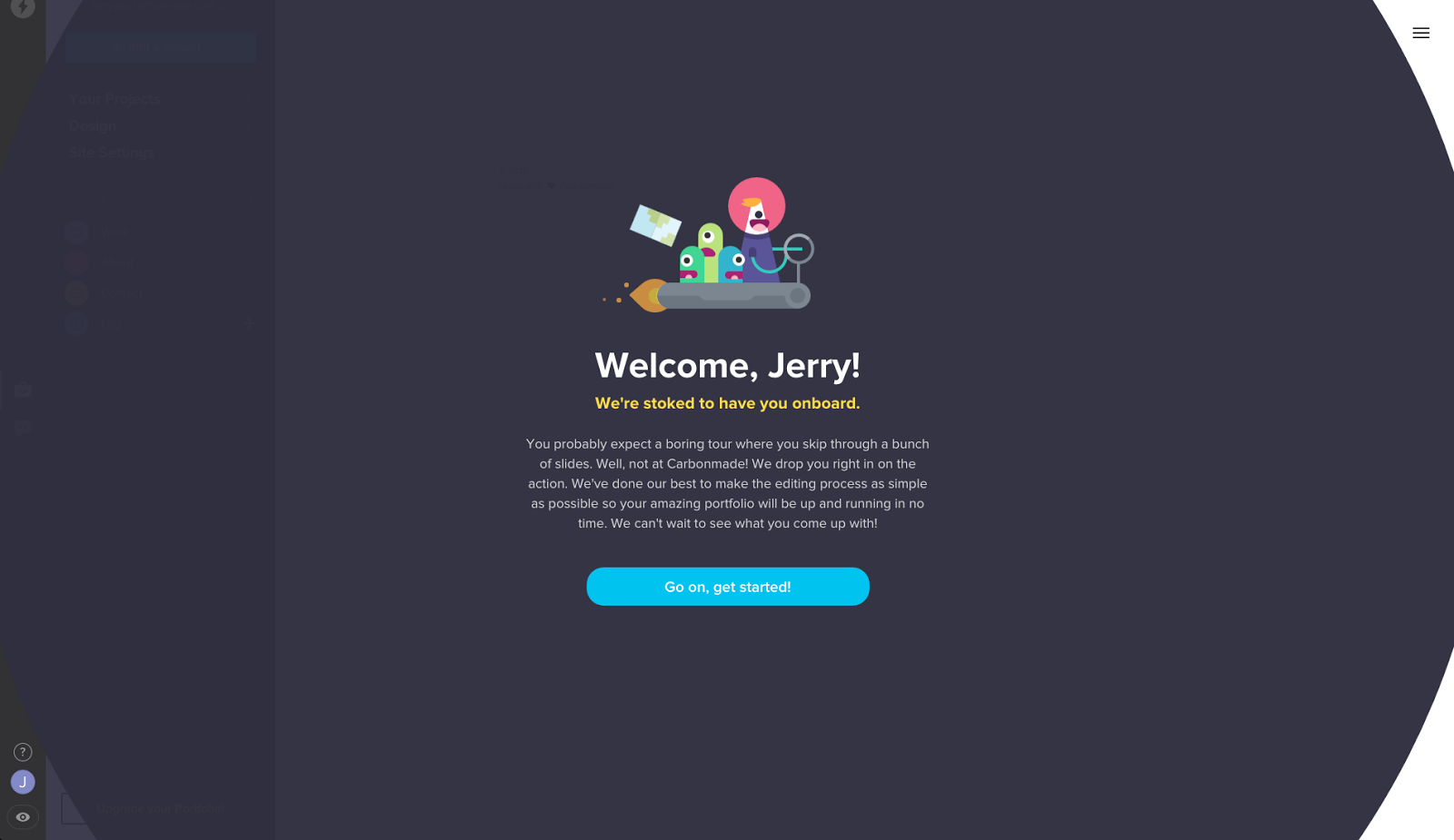
Photo Credit: Carbonmade
Second, the cartoony aspect makes the site that much more fun to use. While colorful unicorns and aliens may not always be appropriate, for a artistic site targeting creative professionals, it creates the right kind of atmosphere.
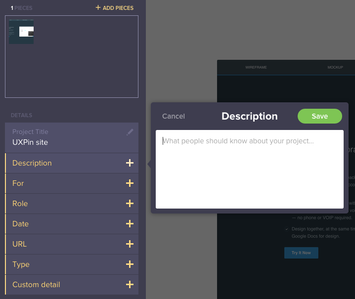
Photo Credit: Carbonmade
Even if your work itself isn’t that great, Carbonmade certainly helps you present in the most polished manner with the least effort possible. The interface is stupidly simple and incredibly fast.
3. Apple Watch
The Apple Watch embodies a lot of the principles of empowering UX. Its very purpose is to make the user’s (wearer’s) life better without drawing attention to itself.
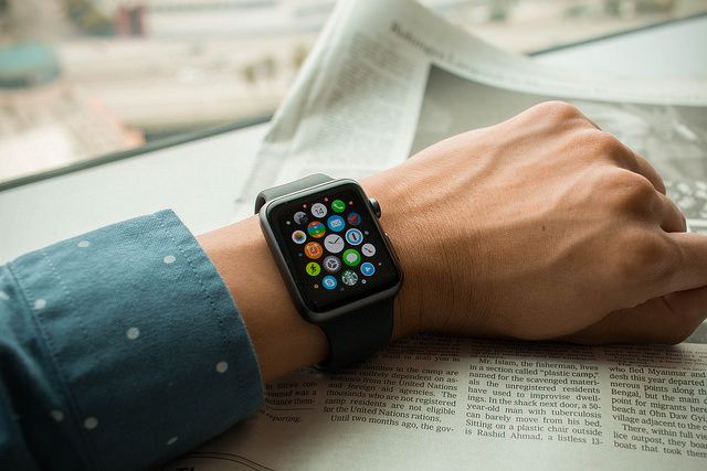
Photo Credit: “Apple Watch Sport.” LWYang. Creative Commons. (Cropped)
What’s important to point out, however, is that we feel the Apple Watch is empowering for reasons that may stray from its original design purpose. Aside from the apps, the Apple Watch can be quite useful for busy professionals (e.g. C-level) to manage daily logistics.
- Instead of pulling out your phone and checking email constantly, you can immediately scan and archive email in a matter of seconds.
- The calendar notifications serve as friendly and fast reminders
- The “Do not Disturb” mode is easy to activate, allowing the user to focus on main tasks at hand
Like car UIs and watches in general, the Apple Watch has glanceability as a main concern. The small screen limits the amount of information. App notifications and messages are treated like time on normal watches.
But the Apple Watches also embodies the principle of enhancing the user’s life from the background. Most of the day you forget you’re wearing it, but when you need it, it’s there. Any good app, site, or device should act the same way.
While we don’t think it’s reached its full potential yet, watch OS2 should make the wearable more aligned to its intended purpose of making the world available at all times.
4. Amazon Prime
Less subtle than the Apple Watch — but a lot more powerful in its current usage — Amazon Prime seeks to improve every corner of the user’s life.
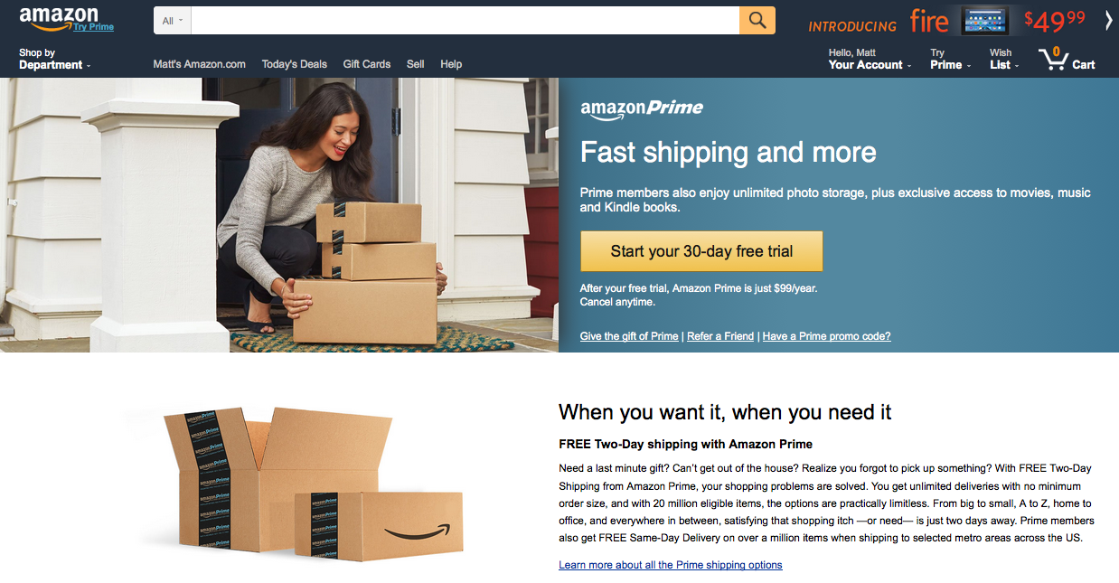
Photo Credit: Amazon
What’s empowering about Amazon Prime is that they’re capable of solving user problems in many different fields, from shopping to TV. Here are some of the most empowering features that Amazon Prime offers:
- Free two-day shipping
- Music streaming
- Video streaming (including exclusive Amazon content)
- Unlimited cloud storage for photos
- 5GB general cloud storage
Much like a butler or assistant, having Amazon Prime just seems to make everything easier.
The free two-day shipping alone enhances the user’s life, allowing them to buy virtually anything without the delay of online shopping or inconvenience of store trips.
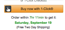
Photo credit: Amazon
With 1-click shopping activated, all user flows are dramatically shortened. Customers can find what they need, click on it, and see the product on their doorstep 2 days later. That process puts a tremendous amount of power in the mind of the user, making the experience quite addictive.
5. feedly
The designers of feedly took a good idea and ran with it.
They collect updates from all your favorite sites — news, blogs, Google alerts, even YouTube — and organize them into one, so you never miss anything. They go beyond entertainment, though, and integrate collaborative communications with co-workers. Think of it like your own personal town crier.
Photo Credit: feedly
Such a service would not be workable unless the UI was up to the task. feedly’s tidy menu keeps everything organized and easy to find (close to glanceable), and is tucked away on the side so the user can focus on the content center-stage.
6. Tile
Last is Tile, an example of how an empowering service alone can make a purchase worth it.
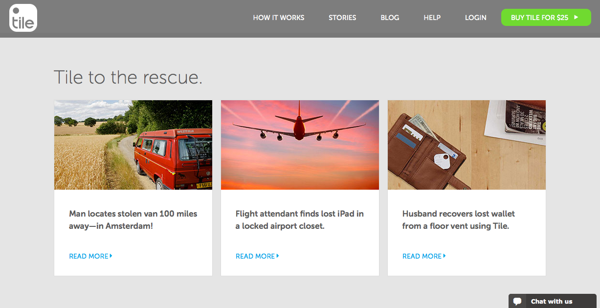
Source: Tile
Tile is a useful product for anyone who gets frustrated about losing items. It comes with a small plastic tile that you can attach to your keys, the remote control — anything really. When the object is lost, use your phone to make the tile give off a sound so you can find it.
A nice little discoverable is that this works two-ways. If your phone’s lost, you can press on the tile to make it ring.
For people prone to losing things, it’s easy to imagine Tile’s effect on their life. The product doesn’t just help you locate lost objects, it makes you feel less frustrated and anxious when you lose important property. Products that transform emotions are always more memorable and successful.
What You Should Take Away From These UX Examples
If you can look at these 6 products together and isolate what they have in common, you can touch upon the essence of empowering UX. While they all provide widely different services for their users, they’re all alike in how they make their users feel.
Another takeaway from these examples is that their service itself is empowering — no amount of clever design tricks can turn a lackluster service into an empowering experience.
To sum up:
- Setting business objectives and prototyping your solution boosts your product success.
- Communication establishes trust, and mockups help to show the essence of your work.
- Disagreements might occur, but effective communication will lead you to a win-win situation.
- Be clear on deliverables and deadlines. If a deadline is unattainable, reach out to your partners.
- Innovate in your work, and track your progress.
For more tips and resources on setting a successful design strategy, check out our UXPin blog.
If you’ve found this article helpful, go ahead and download the free guide to UX to get a better idea behind documentation and process.

