Examples of Interaction Design — Patterns and Best Practices
Interaction design is the discipline of creating intuitive interfaces that promote seamless interaction between users and products. It’s not just about UI design and visual appeal; it’s about functional, efficient, and enjoyable usage.
Consider the swipe gesture on Tinder or the pull-to-refresh on Twitter or Instagram. These are the results of careful interaction design that facilitate user engagement. A well-designed interaction doesn’t merely look good—it feels intuitive, creating a more enjoyable and satisfying user experience.
Effective interaction design is key to user satisfaction, engagement, and product success. Interaction design elevates usability, information architecture, and user needs to make products more intuitive and user-friendly. It can even introduce elements of delight, contributing to a memorable user experience.
Conversely, poor interaction design leads to confusion and user frustration, no matter how attractive the product might appear.
Build fully interactive prototypes with a single source of truth shared across design and development. Supercharge your design process and speed up design handoff. Discover UXPin Merge.

Elements of Interaction Design
These five elements of interaction design come from Don Norman’s 1988 book, The Design of Everyday Things, where he introduced concepts like affordance and visibility.
- Visibility involves making critical components and navigation options clearly visible to users. Visibility promotes intuitive use by allowing users to perceive possible functions without needing instructions or a guide. This visibility enhances user experience as it reduces confusion and promotes user self-sufficiency.
- Feedback is about informing users about the results of their actions or decisions. Feedback could be a simple color change, a vibration, or a message indicating success or failure. This feedback helps users understand whether their interactions have been successful, making the interface more transparent and reliable.
- Constraints are limitations that prevent users from performing specific actions, reducing the likelihood of errors. Constraints could disable certain functions until users complete a required action or guide user input through specific formats. Constraints help streamline the user experience by reducing errors and ensuring users only make appropriate interactions.
- Consistency promotes similar patterns and designs throughout the user interface. This user interface design consistency could involve maintaining the same color scheme, typography, or button design across all screens. Consistency helps users quickly learn and understand the interface, making navigation smoother and more comfortable.
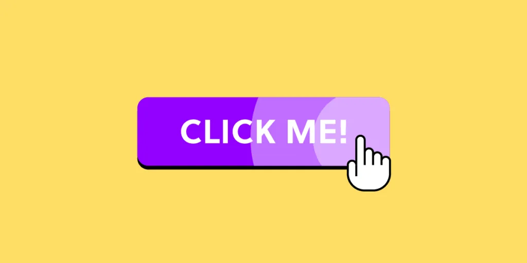
- Affordance refers to design attributes that suggest how someone must use an element. For instance, a 3D effect on a button suggests it’s clickable, or a hand icon on mouse hover implies an interactive component. Affordances enhance usability by providing cues about how users interact with different elements, making interfaces more intuitive.
Further reading on interaction design:
- Improve Your UX with Interaction Design Elements
- What is Interaction Design?
- Interaction Design (IxD): The Next Step for UX Designers
- A Review of the Interaction Design Foundation
Types of Interactions
Interactions typically fall into two primary categories: desktop and mobile. Here are the interactions available to designers in each category:
Desktop interactions
- Click: Users use a mouse or trackpad to interact by clicking elements like buttons or links. Essential for navigation and performing actions.
- Hover: Users move the cursor over a component, triggering a reaction. Common for revealing additional information, tooltips, or options.
- Drag and Drop: Users click, hold, and move an item to a new location. Often used in file explorers and graphic design tools.
- Keyboard Shortcuts: Combinations of keys execute commands without navigating menus. Enhances efficiency and speed.
- Scrolling: Users roll the mouse wheel or swipe on a trackpad to navigate vertically or horizontally. Primarily used for browsing content.
- Right-click (Contextual Menus): Offers additional options relevant to the selected object or area.
Mobile interactions
Mobile interactions are typically called gestures because users interact with a device using hand and finger motions.
- Tap: The primary interaction method on mobile, equivalent to a click on a desktop device.
- Double-tap: Two quick taps are often used for specific actions, like zooming in on maps or liking posts in social media apps.
- Swipe: Users touch the screen and move their fingers in a certain direction. Widely used for navigation, like scrolling or moving between screens.
- Press, hold, drag: Users can reorder items in a list or move content around the interface.
- Pinch (Zoom in/out): Users touch the screen with two fingers and move them closer or apart. Common for zooming in or out.
- Long Press (Press and Hold): Holding down a tap for an extended period reveals additional options or functions.
- Pull Down (Refresh): Users drag content downwards to update or refresh the content. Common in social media or news apps.
Examples of Interaction Design
iOS swipe back
iOS devices offer a convenient swipe-back feature where users can swipe from the right edge of the screen to return to a previous interface. This swipe feature means users don’t need to return to the top of the screen to hit the back button, creating a more efficient user experience.
Pull to refresh
Many apps use a pull-to-refresh feature for mobile devices. This interaction enables users to load more content with minimal effort.
Pinching to zoom
Pinching is a quick way to zoom in and out of content on mobile devices. This interaction is available on Google Maps, but users can also pinch to zoom in on images, including social media apps like Facebook, Pinterest, Instagram, etc.
Communication through states
Component states are crucial for interaction design because they inform users about completing tasks, successes, and errors. For example, a simple checkbox example from MUI’s design system demonstrates how states help users complete a task successfully. The user must only select two options. The component changes color and displays an error message if the user selects more or less than two choices.
Cross-platform consistency
One of the challenges with interaction design is creating a consistent and cohesive user experience across multiple devices, operating systems, and platforms. LinkedIn, and other social media apps, offer ‘reactions’ to posts—an evolution of the simple like button.
LinkedIn shows how designers have used familiar user interactions to create an intuitive and cohesive user experience between their web and mobile applications. On LinkedIn’s web app, users hover to reveal reactions, while on the mobile app, they press and hold to achieve the same result.
LinkedIn’s desktop reaction interaction:
LinkedIn’s mobile app reaction interaction:
Voice interactions
With the rise of voice user interfaces (VUI), interaction design extends beyond the physical to verbal interactivity and commands. For example, users can initiate VUI’s like Amazon’s Alexa or Apple’s Siri by saying “Alexa,…” or “Hey Siri,…”
A voice command like “Hey Siri, what’s the weather like today?” is similar to a user opening the weather app on their device. Instead of viewing the weather, Siri describes the conditions to the user.
These voice commands initiate actions, making interaction hands-free and efficient, particularly useful when the user’s hands or eyes are occupied.
Auto-complete interactions for efficiency
Auto-complete uses machine learning to help users create content or write faster. The most famous example is Gmail, which allows you to compose emails quickly by providing suggestions.
Users can complete common phrases like “I trust you are well” or “I’ve attached proof of payment” simply by typing the first few letters and hitting tab or desktop or tapping the suggestion on mobile.
This auto-complete functionality is an excellent example of human-computer interaction (HCI) and how machine learning can predict our behavior to provide efficient, intuitive, and user-friendly interactions.
Interactive Digital Product Design With UXPin Merge
Unlike image-based design tools, which create visual representations of user interfaces, UXPin renders HTML, CSS, and Javascript, giving designers more fidelity and functionality to create fully interactive prototypes. Tools like Adalo take the no-code approach even further for app development, while UXPin Merge focuses specifically on empowering designers with code-based prototyping capabilities.
UXPin Merge takes this code-based design approach one step further with a code-to-design workflow where designers import UI components from a repository into UXPin. Designers can use these repository components like any other image-based UI element, only the outcome changes—a far superior prototype that looks and feels like the final product.
Interactive Merge components
Merge components are interactive by default. Whatever animations, states, and other interactivity developers program and save to the repository are available to designers in UXPin.
To demonstrate this interactivity, we’ve dragged four random Merge components from the built-in MUI design library and previewed them. The input field, checkbox, star rating, and select menu are interactive with states and default content defined by the repository. None of these interactions were created in UXPin, meaning you can build interactive prototypes in minutes.
To replicate this functionality in an image-based tool, designers must spend time setting up the components. They may have to use multiple frames, plugins, and other tools to mimic a UXPin prototype. Even then, they can’t achieve comparable results.
With UXPin Merge, designers accomplish this high level of interactivity simply by dragging and dropping Merge elements from the library onto the canvas and make adjustments via the properties panel.
With this code-like fidelity and functionality, designers can prototype and test complex interaction design ideas during the design process—something they can’t do with image-based design tools.
Take your interaction design prototyping to the next level with a code-to-design solution from UXPin. Visit our Merge page for more details and how to request access.


