Form Input Design Best Practices
Form inputs allow users to engage with digital products, brands, and other users. Choosing the appropriate input field and structure is crucial for designing a good form UX so users can complete tasks efficiently.
This article looks at individual input elements, the problems they solve, and how UX teams use them. We also provide tips on designing form inputs and common mistakes that could introduce usability or accessibility issues.
Increase prototyping speed and testing capabilities with fully functioning form input fields using UXPin. Bring interactive components to UXPin and assemble your prototypes, using those elements as a single source of truth between designers and engineers. Achieve parity between design and code. Explore UXPin Merge.

What are Form Inputs?
A form input (form field) is a UI element for capturing user feedback and data. Input types or form controls include checkboxes, date pickers, radio buttons, text inputs, toggles, and selects/dropdowns. Forms must also have a submission method like a submit button, link, or keyboard action (enter).
What are Form Input Attributes?
Form input attributes create rules and context for users. These attributes also provide the appropriate controls–like displaying a numeric keypad on a mobile device for a phone number field.
Five essential HTML form input attributes UX designers must pay attention to:
- Required: means the user must complete the input to submit the form
- Disabled: an input state that prevents a user from making changes–usually until they perform another task or for “readonly” inputs
- Type attribute: the type of input that defines the formatting–for example, a password type hides the characters while an email type requires the @ symbol and domain extension (.com, .co.uk, etc.).
- Label: tells users what the input is for–i.e., Password, Name, Email, etc.
- Helper Text: provides an additional label for context and accessibility.
Types of Form Inputs
Here are several common form inputs and how designers use them.
Text Input
Text inputs (or text input fields) allow designers to capture a wide range of information, most notably names, emails, passwords, addresses, and other text-based user data.
If you need a user to enter information that’s longer than one sentence, it’s better to use a text area over a text field. Text areas are larger and allow more text–like the message section of a contact form.
Date Pickers
Date pickers provide a format that makes it easy for users to select a day, month, and year. They also ensure that users use the correct separators like commas, backslashes, and dashes.
UX designers have several date picker UI options and configurations. Choosing the right one depends on the user, device, and operating system (iOS, Android, Windows). This article offers helpful tips on designing the perfect date picker.
Selects/Dropdowns
Selects or dropdowns allow designers to present users with a collection of choices. Dropdowns work best for fixed variations or options–like a list of countries or t-shirt sizes. For long lists like countries or states, providing a search field allows users to find their choice quicker.
These dropdowns give users choices while ensuring they provide an accurate answer. For example, misspelling a country or state could result in an eCommerce order not reaching the customer.
Checkboxes
A checkbox performs two primary functions:
- Allows users to make two or more selections
- Provides a method to acknowledge legal requirements–like accepting terms and conditions or email newsletter opt-ins
Radio Buttons
Radio buttons perform a similar function to checkboxes but only allow one choice instead of multiple. For example, choosing a shipping option or answering yes/no questions.
Toggles
Toggles or toggle switches are basic on/off (boolean) form inputs. Switches offer users a quick method for making yes/no, on/off decisions. If you’re looking for an example, both Android and iOS mobile devices use toggle switches in their settings.
File input
File inputs allow users to upload images and documents. UX designers must use helper text to tell users which format the file input will accept, i.e., PNG, JPG, PDF, etc.
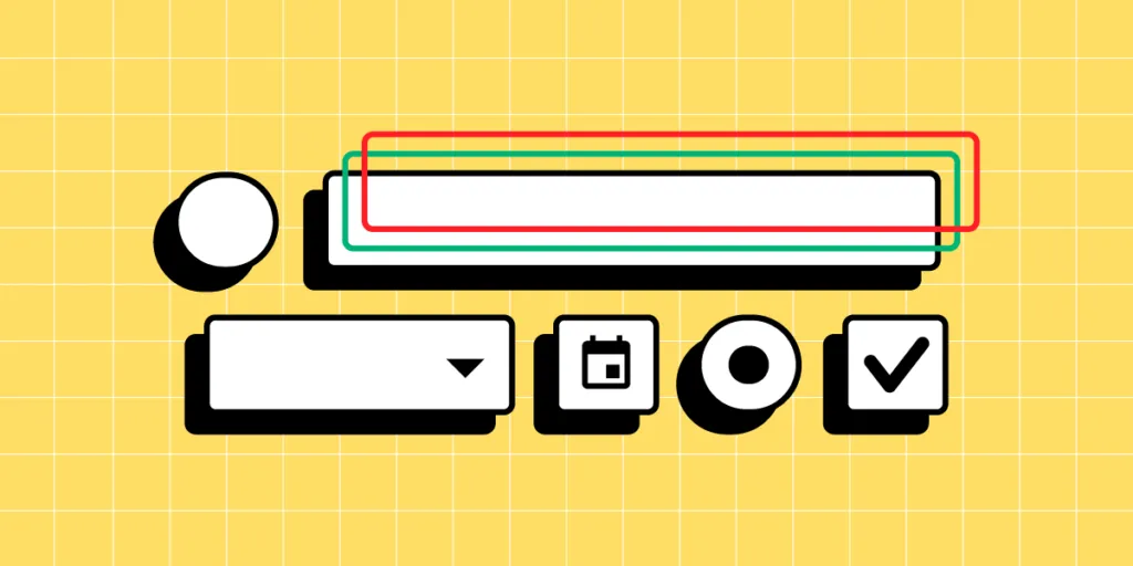
Understanding Form Input States

Input states allow UX designers to communicate with users through color and messages. The example below from Material Design Form shows how designers can use states for context and guidance.
- Inactive: an input where the user has entered information
- Focused: highlighted to show the user’s current selection
- Activated: a completed input
- Hover: shows desktop users that this is an interactive input when they move their cursor over it
- Error: alerts the user to a problem–i.e., an incomplete field or incorrect information
- Disabled: tells the user they can’t interact with the input
Every input element offers similar state variations to help users navigate and complete forms.
Using Form Input Prefixes and Suffixes
Prefixes and suffixes help users enter the correct information and format. For example, if you need the weight of something, adding lbs or kg suffix tells users explicit instructions for entering the right numbers.
UX designers can also use dropdowns for prefixes and suffixes to allow users to enter the data in a familiar format. For example, United States users might choose lbs and Canadians kg.
Prefixes are most commonly used for county code selection to capture the correct telephone numbers.
Why Good Form UX is Important?
Forms offer significant business opportunities, but poor design or too many form inputs can hinder user experience, adversely impacting conversions.
The first rule for good form UX is only requesting the information necessary for users to complete a task. For example, an eCommerce checkout form needs a customer’s full name, delivery address, email, contact number, and payment details (including billing address if different from the delivery address).
While capturing your customer’s age and gender might be valuable for marketing purposes, this additional form data adds to the completion time, is intrusive, and may prevent people from completing it.
The same rule applies to any form. Do you need a user’s name to create a new account, or will an email for verification suffice? UX designers must reduce form inputs and avoid capturing irrelevant data as a foundation for a good form user experience.
How to Design Great Form Inputs
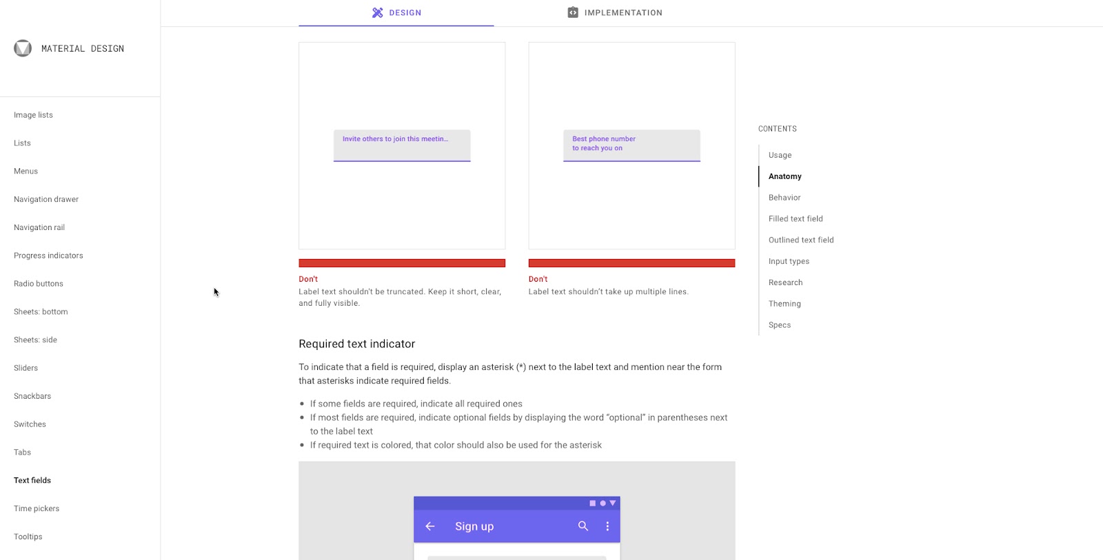
1. Use short, descriptive input labels
Input labels must be short, descriptive, and fully visible. This example from Material Design shows how long labels can confuse users.
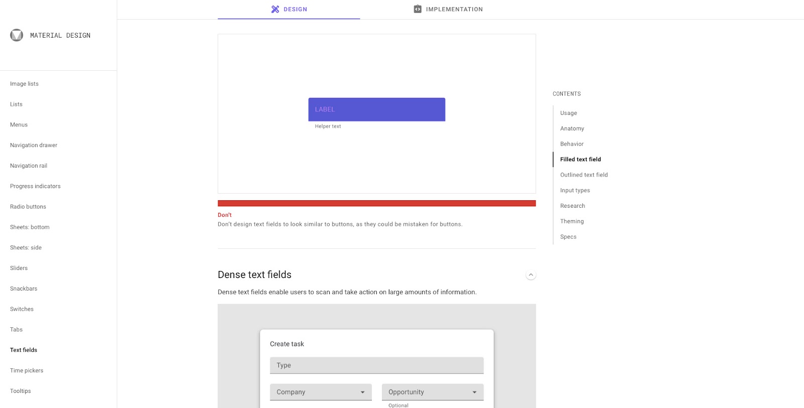
2. Use an appropriate color contrast
Form inputs are not the place for branding or creative color schemes. Choose a background color that contrasts nicely with the placeholder and input text.
3. Convey input requirements
Passports can cause confusion and frustration if UX designers don’t tell users the field’s requirements. UX Designer Salim Ansari shows how to design a password input field with explicit instructions.
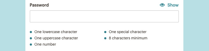
Adding a “Show” button allows the user to double-check they have entered everything correctly, avoiding a potential time-wasting error.
4. Distinguish between required and optional
Telling users which fields are required and optional can reduce errors while allowing people to choose what they want to share. The standard practice is to add an asterisk (*) for required fields, but many designers place (required) in brackets next to form labels to be more explicit and help with accessibility.
UX designers must also consider the impact optional fields have on cognitive load and conversions. If a form field is optional, should you include it at all?
5. Put placeholder text
There is some debate about placeholders and their usage. UX Designer Andrew Coyle (formally Google, Flexport, Intuit) outlines several scenarios in this article about the dos and don’ts of placeholder text.
“It is tempting to provide text help for complex forms or omit input labels to improve aesthetics. However, employing placeholder text to do so causes many usability issues.” – wrote Andrew Coyle in the linked article.
Some highlights from Andrew’s article:
- Don’t use placeholders or inline labels in place of labels
- Don’t use placeholders in place of helper text
- Use a lighter color shade for placeholder text to differentiate from the entered text
- Placeholders should not disappear when a user clicks inside the input field, only once they enter the first character
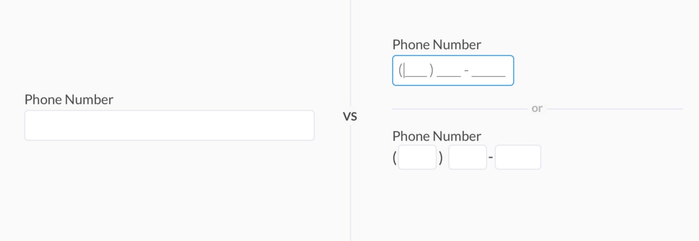
6. Structure inputs to reduce thinking
Structured inputs tell users exactly what data and format you want. It also reduces thinking to complete forms faster. This example from Andrew Coyle shows a typical telephone number input field in a US format with an area code and two parts for the number.
7. Enable autocomplete
Autocomplete (autofill) allows users to complete forms much faster, especially for addresses–like using the Google Maps API to find an address.
If a user has an account, using this data to autofill a form saves significant time, increasing conversions while creating a positive user experience.
8. Use default values with caution
Default values offer similar benefits to autocomplete, allowing users to complete forms faster. However, default could result in errors or confusion. For example, location tracking to set a default value for a user’s country might be incorrect if they’re away from home or using a VPN.
9. Design mobile-friendly input fields
Mobile-friendly or responsive design is crucial for good form UX. Designers must use one-column layouts and optimize all form elements for touch/tap interactions.
Design Fully Functioning Form Inputs in UXPin
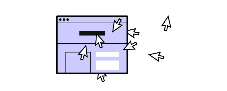
The problem with using a design tool to prototype input fields is that they don’t provide the same fidelity and functionality as code, limiting what designers can test during the design process.
With UXPin, input fields, including text inputs, function as they do in the final product. Instead of rendering static images like most design tools, UXPin renders HTML, CSS, and Javascript, giving designers the superpowers of code without writing a single line!
These superpowers enable design teams to build form prototypes indiscernible from code for accurate, meaningful feedback from usability studies and stakeholders.
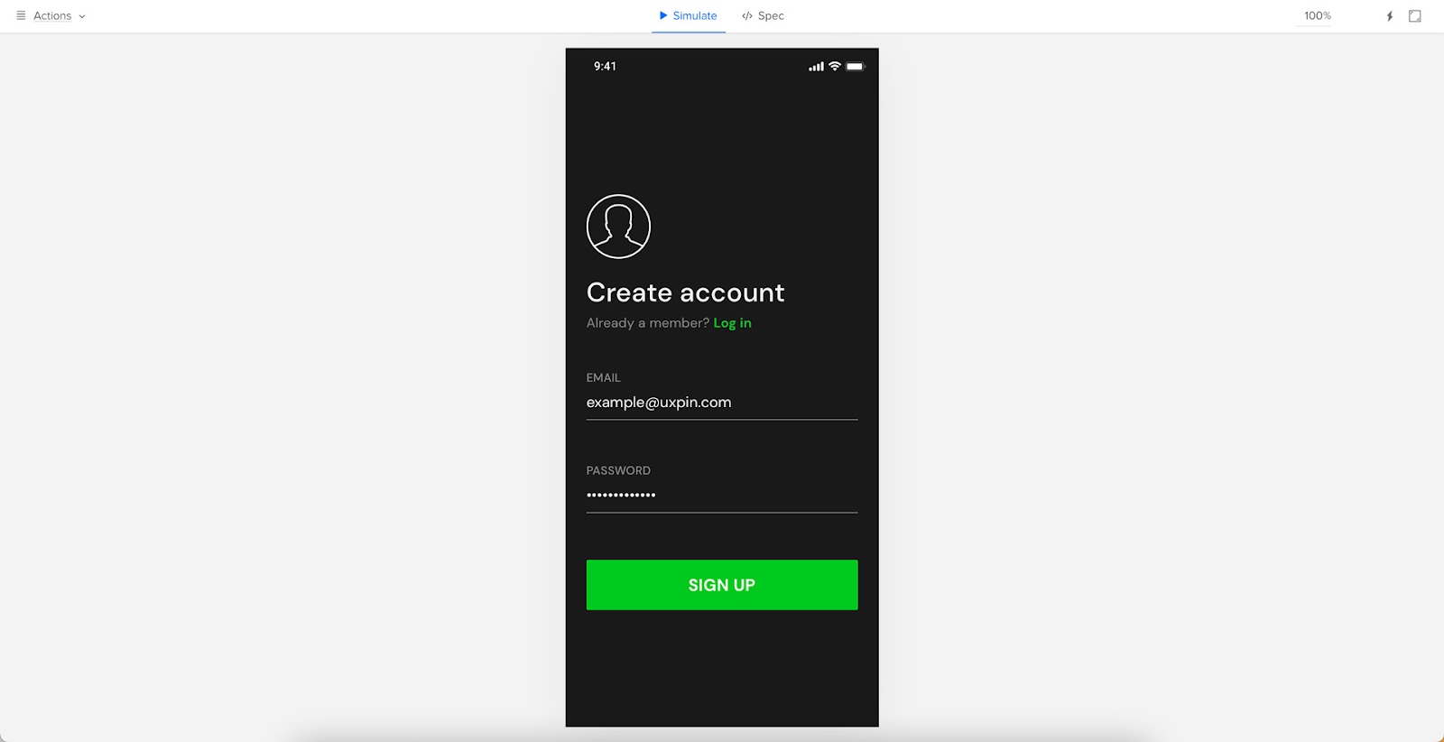
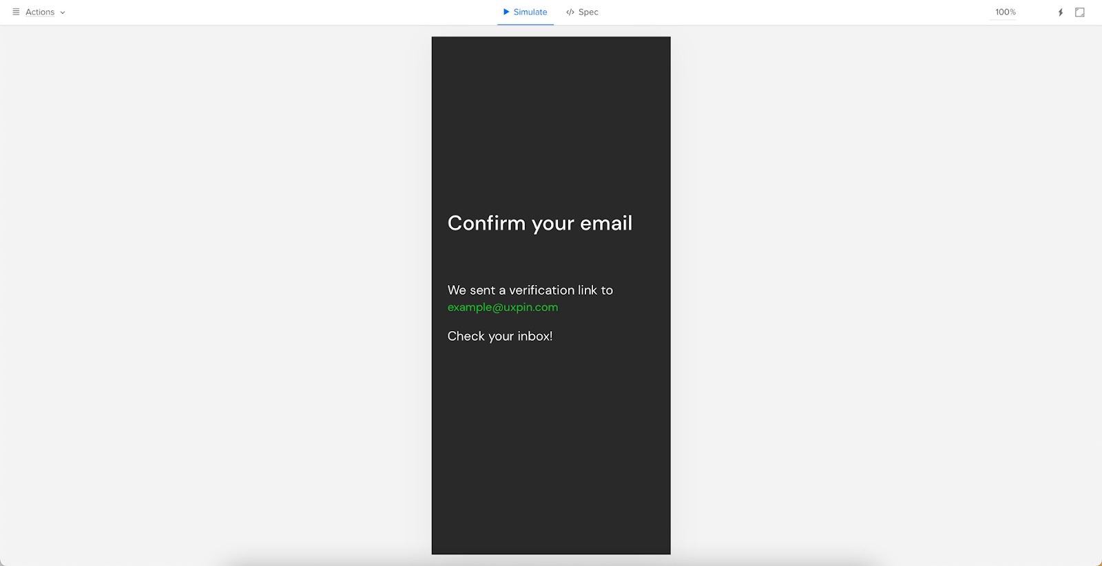
Variables allow designers to capture user input data and use it elsewhere in the prototype, like personalizing a welcome message or populating a user’s account profile.
This example sign-up form created in UXPin shows how designers can use an email variable to personalize the confirmation screen after form submission.
Design teams can take form input testing to the next level with Expressions. In the same example, we see dynamic error messages when users don’t complete a form correctly.
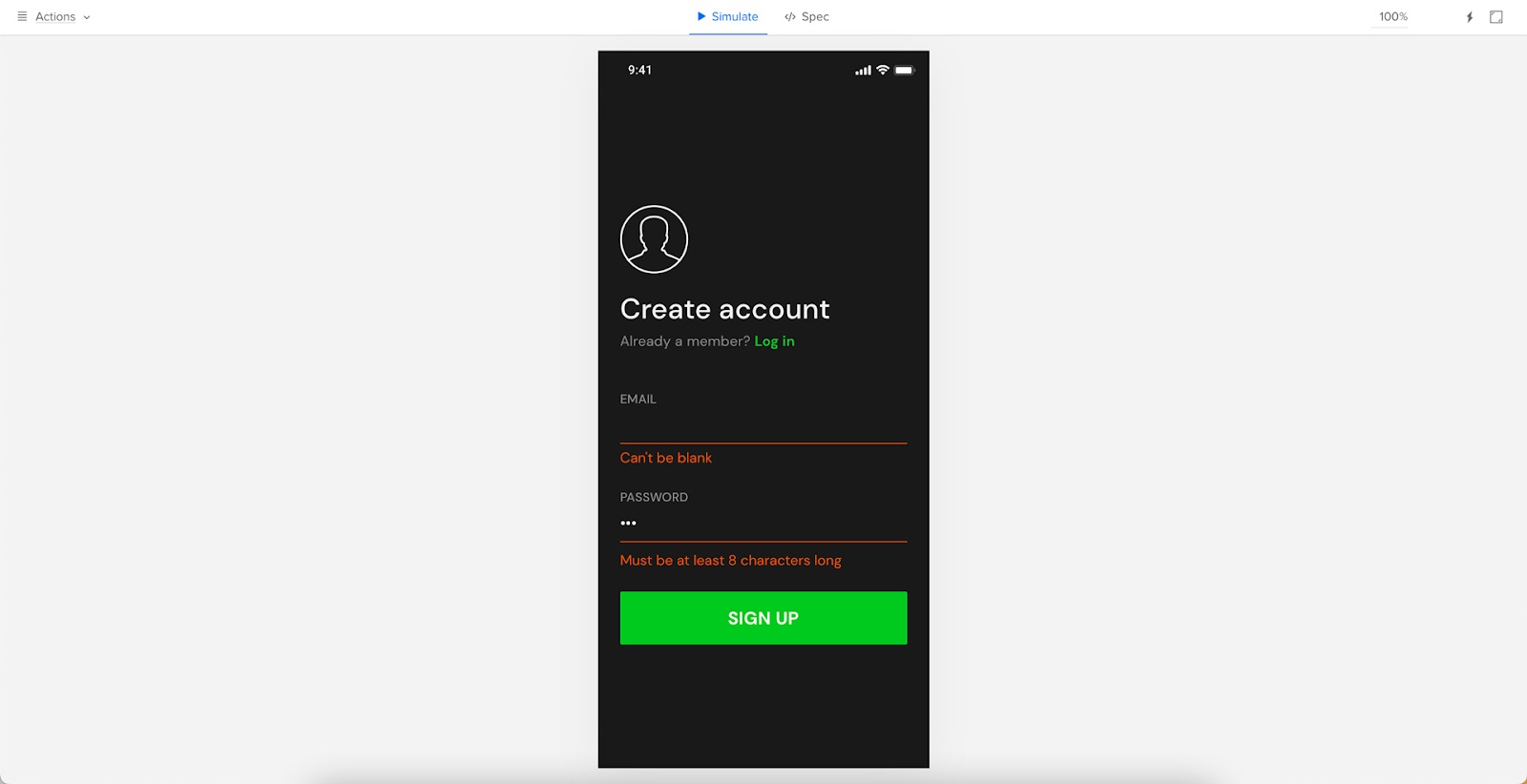
You can also use Expressions for form validation, computational components, and matching password criteria to create realistic prototype experiences.
Use UXPin Merge and Import UI Components
Stop designing form inputs from scratch. Find ready-made components, such as Material Design forms, and enjoy their full interactivity and function thanks to UXPin Merge. It’s a technology that allows you to share a single source of truth between designers and devs, so the work of putting forms and other UI design elements doesn’t get duplicated by two teams. Visit Merge page to learn more.


