How to Use Tailwind to Build Responsive UI Design
Tailwind provides a set of pre-designed and pre-built styles that you can apply directly to your HTML markup. Unlike traditional CSS frameworks, which often come with pre-defined components and styles, Tailwind focuses on providing low-level utility classes that you can combine to create custom UI designs.
To start a project, front-end developers typically install it via npm or yarn and then include the generated CSS file in your HTML. Once installed, they start applying utility classes to HTML elements to style them according to UI design requirements.
Tailwind CSS is often used to build a wide range of web applications and websites, such as landing pages, dashboards, admin panels, eCommerce sites, and of course, rapid prototyping.
Want to create interactive prototypes with Tailwind UI components? UXPin Merge gives you a library full of official Tailwind UI components that you just drag and drop on the canvas. Then, you just copy the code and paste it into your project for product development. Try UXPin Merge for free.

What is Tailwind CSS?
Tailwind CSS is a different way to style your website from traditional CSS framework. Think of it as a set of predefined building blocks (or Lego pieces,) but for your website’s style. Instead of writing a bunch of CSS rules, you could use pre-made classes directly in your HTML code.
Imagine you want to style a website, and you’re faced with the task of writing a lot of CSS code to make things look good. Now, traditional CSS involves creating rules for each element, defining margins, paddings, colors, and more. It can be time-consuming and sometimes a bit repetitive.
Tailwind simplifies styling by providing a set of pre-made classes that you can apply directly to your HTML elements, making the styling process more efficient and flexible.
For example, instead of writing:
cssCopy code

.button { background-color: #3490dc; color: #ffffff; padding: 10px 20px; border-radius: 5px; }
You can just apply these styles directly in your HTML using Tailwind classes:
htmlCopy code

<button class="bg-blue-500 text-white p-2 rounded-md">Click me</button>
Here, each class (bg-blue-500, text-white, p-2, rounded-md) represents a specific style. So, bg-blue-500 gives the button a blue background, text-white makes the text white, p-2 adds padding, and rounded-md gives it rounded corners.
Tailwind is highly customizable. If you decide you don’t need a particular style or you want to add your own, you can easily tweak this framework to fit your needs. Tailwind has also a plugin system that allows you to extend its functionality. You can add third-party plugins or create your own to tailor the framework to your specific needs.
You can hear that web developers call Tailwind a utility-first CSS framework. In the context of Tailwind CSS, “utilities” refer to small, single-purpose classes that directly apply styling to an element. These utility classes are named based on their purpose, making it easy to understand what each class does. They are the building blocks of the framework and can be combined to create complex styles.
What can you build with Tailwind CSS?
Here are some examples of what you can build with Tailwind CSS:
- Responsive Websites: Tailwind’s responsive utility classes make it easy to create websites that adapt to different screen sizes, providing a seamless experience across devices.
- Web Applications: Tailwind can be used to build the user interface of web applications. Its modular utility classes allow for quick and efficient styling of application components.
- Landing Pages: Tailwind is well-suited for designing and styling landing pages. Its simplicity and ease of use make it a popular choice for quickly prototyping and building marketing pages.
- Blogs and Content Websites: Whether you’re building a personal blog or a content-heavy website, Tailwind’s utility classes make it easy to style text, images, and other content elements.
- E-commerce Sites: Tailwind can be applied to the design of product listings, shopping carts, and checkout pages in e-commerce websites. Its flexibility allows for customization to match specific brand requirements.
- Dashboards and Admin Panels: Web applications with dashboards and admin panels often benefit from the modular and customizable nature of Tailwind CSS. It provides the tools to create a clean and functional user interface.
- Prototypes and Rapid Development: Tailwind is popular for quickly prototyping ideas and for projects that require fast development. Its utility-first approach allows developers to iterate rapidly without needing to write custom CSS for every style.
- Portfolio Websites: Tailwind can be used to build stylish and responsive portfolios for showcasing personal or professional projects. Its utility classes enable the creation of visually appealing layouts.
- Documentation Sites: Tailwind can be employed to style documentation and help center websites. Its simplicity makes it easy to create clean and readable documentation layouts.
- Custom UI Components: Tailwind can be used to style custom UI components, allowing developers to create unique and visually appealing interfaces and responsive design.
Where to take Tailwind components from?
There are a few different sources where you can find Tailwind CSS components and resources. One notable resource is Tailwind UI, a premium set of professionally designed components and templates.
Tailwind UI was created by the founders of Tailwind CSS, Adam Wathan and Steve Schoger. The primary motivation behind creating Tailwind UI was to provide a set of professionally designed, ready-to-use UI components and templates that seamlessly integrate with Tailwind CSS. The goal was to offer front-end developers a premium resource for building beautiful and consistent user interfaces with ease.
One of the main selling points of Tailwind UI is the quality of its designs. The components and templates are professionally crafted by Steve Schoger, known for his expertise in design. This ensures a polished and visually appealing look for your web applications.
Here are some examples of the types of components and templates you can expect from Tailwind UI:
- Navigation Components — you can find navbars, dropdowns or mega menus.
- Form Components — components for building forms, such as Input fields, checkboxes and radio buttons, select dropdowns, buttons, and for gorups.
- Content Display Components — those include cards, modals and popovers, alerts, badges, and tooltips.
- Typography and Text Components — for adding headings, blockquotes, lists, and text styles.
- Grid and Layout Components — you’ll find container, grid system, and flexbox utilities.
- Media Components — they include image cards, galleries, and responsive video components.
- Utility Components — spacing, margin, flexbox, alignment and visibility utilities.
- Templates — the library has templates for landing pages, dashboards, eCommerce products, pricing, and blog layouts.
These are just a couple of examples, and Tailwind UI provides a comprehensive set of components and templates that cater to different use cases in web development. Each component is designed to be flexible and customizable, allowing you to easily adapt them to fit the specific needs and branding of your project.
The components in Tailwind UI are often built with the principles of good design and usability in mind, thanks to the expertise of Steve Schoger, who is known for his work in design and user interface aesthetics. Overall, Tailwind UI aims to save developers time by providing high-quality, ready-to-use components that align with the Tailwind CSS framework.
What makes Tailwind different from Material UI and Bootstrap?
Tailwind CSS, Material UI, and Bootstrap are all popular libraries in web development, but they differ significantly in their approach to styling and the user interface.
As we covered already, Tailwind follows a utility-first approach. It provides a set of low-level utility classes that you can apply directly in your HTML markup to build your styles. This approach is highly flexible and allows for more granular control over styling. It’s often favored for rapid prototyping and customization.
Bootstrap and Material UI are widely used for quickly building responsive websites. Bootstrap comes with a set of pre-designed components and styles. It follows a more component-centric approach, providing developers with a set of ready-made UI components that can be easily customized through a theming system. Developers can modify variables like colors and fonts to match their brand.
MUI, on the other hand, is a React component library that implements Google’s Material Design guidelines. MUI like Bootstrap is component-centric, providing a set of pre-designed React components. It’s easy to customize and it has a large and active community with good support and documentation.
How to create a responsive UI design with Tailwind
You don’t need to spend time reading documentation to create a Tailwind UI design. Here’s how you can do it quickly with UXPin Merge.
UXPin Merge is a prototyping tool that allows designers and developers to create and collaborate on interactive UI design seamlessly. It’s part of UXPin, which is known for its focus on collaborative design. UXPin Merge specifically emphasizes the integration of design and development workflows, enabling faster design and development processes.
In this article, we will show you how to create a UI design with Tailwind UI and UXPin.
Then, we will give you quick tips on installing Tailwind CSS. To follow along the article, sign up for UXPin and start your trial.
Step 1: Pull Tailwind UI components out of the library.
UXPin Merge comes with a built-in library of Tailwind UI components. This library includes a collection of pre-designed UI elements, such as buttons, cards, forms, and more, adhering to the Tailwind CSS styling principles.
To start designing, Design System Libraries in UXPin. Access them by clicking the Design System Libraries icon in the bottom bar or with the Option + 2 keyboard shortcut.
Then, scroll to Merge libraries and you’ll see Tailwind UI among React libraries like MUIv5 (see how to design with it,) Ant design or React Bootstrap. The Tailwind library isn’t React-based for now. You can copy HTML only off your design while using it.
Place components that you like on the canvas. It can be button, card, whatever you need to build an interface.
Step 2: Generate complex components with ChatGPT.
Up until this point, we were using children. Based on the atomic design principles, children are the smallest building blocks that together make up molecules and organisms. Atomic design, coined by Brad Frost, is a methodology that breaks down web design into its fundamental building blocks, facilitating the creation of consistent and scalable user interfaces.
To learn more about atomic design, follow our article Atomic UI Components or read Brad Frosts’s article.
For bringing the so-called “molecules,” use UXPin Merge’s AI Component Creator that assists in generating components. This can be particularly useful for creating dynamic or custom components that you may need for your project. The AI Component Creator leverages machine learning to understand design patterns and generate code snippets or components based on your design.
Read ou guide on speeding up design with AI Component Creator and ChatGPT.
Step 3: Use Custom Component to bring whole layouts in.
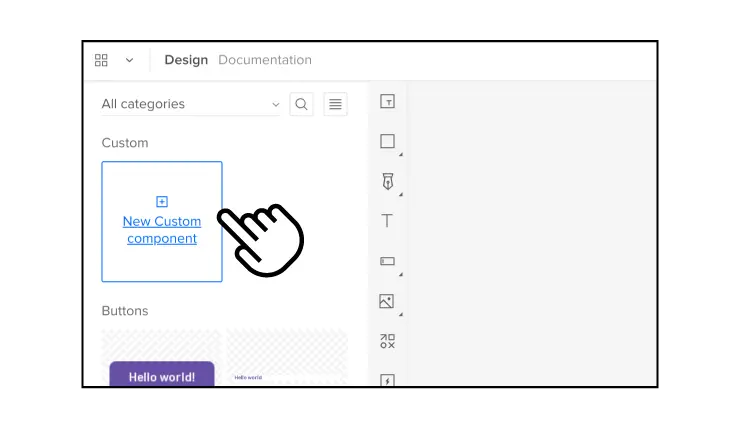
We’re not leaving atomic design methodology yet, because there is a way of importing organisms, that is combinations of molecules that form distinct sections or components of an interface, into UXPin.
The built-in Tailwind UI library has a New Custom Component option for directly copying UI components, patterns, and full layouts from the Tailwind UI website into your UXPin project. The components can be customized and themed in UXPin.
At the top of Tailwind library inside the editor, you will see a see-through component with a plus sign. It’s our Custom Component. Go to Tailwind UI website, copy a code from examples or components pages and paste it into UXPin’s Custom Component. Then, save the component to Patterns for future reuse.
See how Sage uses this feature in our Product Tour.
Step 4: Edit properties of components
Now that you have building blocks of your interface, adjust properties of your UI components, so your design feels consistent and professional. A properties panel appears on the right once you click on the component you want to adjust. You can change colors, text, add state, and any special styling that you have in mind.
This is also the place of switching themes. For that, you have two options.
- Global themes — pick a light or dark theme for the full page.
- Local themes — pick a light ot dark theme for each component.
Here you can also add interactions. Decide what should happen if a user clicks a button, such as take them to the next page, make a modal appear or disappear, etc. You’ll also be able to set a property for coded components.
Step 5: Copy the code to your dev’s environment
The layout is done, time to build the thing. Go to “Preview mode” > “Spec mode.” and click on the component you want to copy the code of, or export the full prototype in one click by using one of the export functions. That’s a good start for building the app.
If you haven’t yet, set up a new project that will use the Tailwind UI library. Create a new HTML file and link to the Tailwind CSS and Tailwind UI stylesheets in the <head> section. Alternatively, use our Stackblitz integration and have a project preconfigured there.
Build layouts 8.6x faster with Tailwind UI
Tailwind CSS stands out for its unique approach to styling. Unlike conventional CSS frameworks, Tailwind offers a collection of pre-designed styles through low-level utility classes, allowing front-end developers to craft custom UI designs effortlessly. Installation involves a simple npm or yarn setup, followed by the application of utility classes directly to HTML elements to meet specific UI design requirements.
Tailwind CSS finds its application in diverse web projects, ranging from landing pages and dashboards to admin panels, eCommerce sites, and rapid prototyping.
For those seeking interactive prototypes with Tailwind UI components, UXPin Merge presents an ideal solution. This tool provides a library brimming with official Tailwind UI components, facilitating a seamless drag-and-drop experience on the canvas. Copy the generated code and integrate it into your project for efficient product development. Try UXPin Merge for free.


