
Not all assets are created equally.
Every design system has its own style, whether it’s based on an existing framework or completely home-brewed. For example, some systems for websites and apps rely on plain HTML elements and let the browser display whatever they’re programmed to display. But they don’t have to.
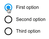
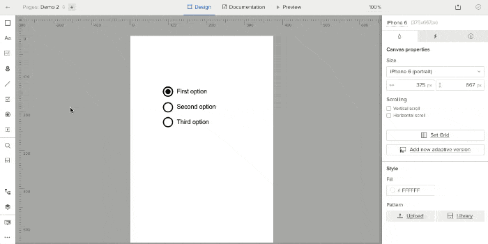
Take radio buttons. Radio buttons let people select one option from a series. They’re long-standing HTML elements that every major browser renders with ease. But certain looks, like Google Material Design Lite, don’t follow browsers’ built-in radio button styles.
If you want to stylize your forms, here’s how to make your own radio buttons.
1. Find radio elements
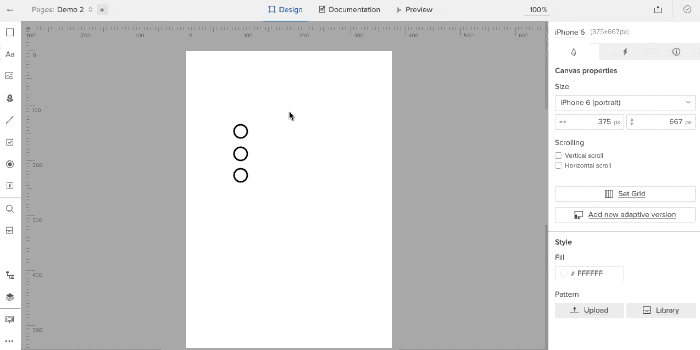
Aside from the traditional ones, many graphic radio buttons exist. Look no further than Google’s own set — of which you can find as simulated, colorable vectors in UXPin. Create one in your tool of choice and copy it for each option you want to give users.

Color them to suit your needs (although for demo purposes we’ll stick with black). Then repeat the process with three “on” buttons, placing them on top of the “off” buttons.
2. Create states
Each radio button has two settings: on and off.
In UXPin, select all pairs of radio buttons and give them two more states, turning them into a multistate element (MSE).
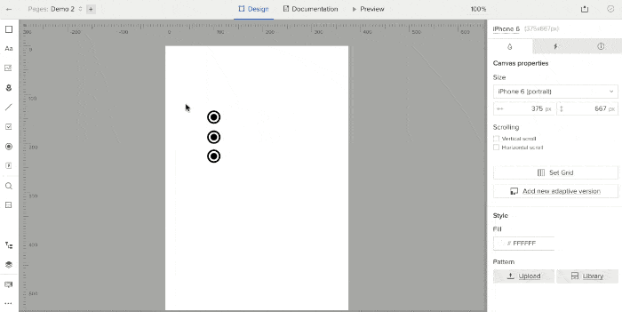
This turns the six radio buttons into one “element” with three views, one for each active button. But you need to edit each state to reflect that. To do so, go through each state and hide the appropriate radio buttons using the left-land layers menu.
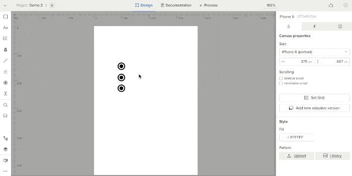
3. Add interactive hotspots
Hotspots are invisible layers that act as triggers for interactions. Since the entire set of radio buttons is effectively one design “element,” put a hotspot over each radio button and its label. Then add an interaction to each: on click, set state of “Multistate 1” to state 1, 2, or 3, depending on to which hotspot you’re adding the interaction.
The result: a set of radio buttons that fit into your customized design system better than plain ol’ HTML-based elements.
Every design system has its own style, whether it’s based on an existing framework or your own design. Some systems for websites and apps rely on plain HTML elements and let the browser display whatever they’re programmed to display. Others, like the custom set you’ve seen here, enhance your design system with its own aesthetic. If you’re building custom database-driven apps with their own distinct design languages, tools like Adalo help you design and publish those interfaces without requiring developers.

